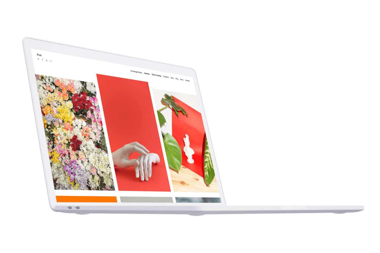
A website is seen by many as the gateway for so many aspects of one’s career—from discoverability, and the freedom to showcase your work, to being the place a potential client makes a decision whether to hire you or not. Depending on website tools and plug-ins, it can also help give you insights into your own work, like understanding what content your viewers are engaging in more. Ultimately, having your own website and choosing the right template gives you more autonomy over your business, like having the ability to collect an email address here and there so you can keep visitors of your site informed about your work.
Creating a website isn’t a walk in the park, but it also doesn’t have to be the monumental chore we think it is, thanks in part to website templates! After you’ve read through these tips and done a bit of homework, you’ll feel more confident in choosing a design template—one of the most important steps along the way to making your own site live.
Let’s Get Started
Ready to create your own website? Maybe you’re revitalizing an old one, or maybe you’re building one from scratch. Either way, there are so many website templates that allow you to personalize your own site, from different looks and feels to customization options. However, if you don’t have a clear direction it’s easy to overwhelm yourself with the plethora of website templates.
So make it easy. Here are a few points to help orient yourself in finding the right website for you.
1) Think About your Goals
Before even shopping around for website templates, consider what you want. Are you setting up shop right away and need an online store? Is the site more about your personal journey, therefore requires functionality similar to a blog? Is what you’re looking for more about showcasing your work and beginning to germinate potential clients?
A goal, or set of goals, will inform much of your site contents, from the look and layout, down to your menu bar and functionality. Be sure to write down your intentions as you consider them, so you can refer back as you look through template options.
Consider your industry along with your goals, as certain templates are more appropriate for one business over another.
2) Consider your Type of Business
If you have a highly visual profile and make your living as a photographer, you’re probably looking for a different template than say, a lawyer in a completely different type of industry. Going even further, understanding what type or genre within your business or industry you specialize in will help orient you in how you want to present your aesthetic and portfolio. Take into consideration your intended audience within that space and what they might be looking for and customize your website template with them in mind.
Looking to business owners and industry contemporaries you admire within your given genre or industry will help you. Find their sites and take some notes to help inform choosing your own template.
3) Research What Website Design you Like
You likely have some artists in mind that you look up to, a few social media accounts you follow. Do a bit of sleuthing to find a few websites of successful industry peers, then compare, contrast, and surface a few conclusions that will help you choose your own website builder. Maybe you notice websites work for you that have a very minimal theme, maybe they’re more editorial and include aspects of storytelling, maybe there are certain designs of online stores you find much more functional than others.
Want to see some templates used well by fellow artists and creators to understand more about web design for your own site? Learn about the different types of navigation for websites by seeing templates at work here and be sure to take note of what might or might not work for you.
4) Find a Template That’s Easy to Use
A somewhat recent change in website development is the relative ease of creation—many would say coding and design expertise are not critical factors in website creation anymore, and in a lot of ways they’re right! Many website builders have a plethora of easy to use website template designs to aid the most inexperienced user. For example, have a bunch of pre-existing text or content you need to move over? Most templates allow a simple copy and paste for you to see your words easily move into your new website, as well as drag and drop functionality for images and video, where you’ll see your template look more and more like your own website in seconds.
We do suggest bulking up on some free tutorials and introductory guides—hey you’re already reading this one, so you’re well on your way.
Talking to your friends, family, broader networks who already have experience and a website might also be a great step before choosing a template. Ask them for some tips on how they chose a template, their experience with website building, and how their site is making a difference for their business.
5) Nail Down Website Design Necessities
After you’ve pinpointed some business goals, grounded yourself in your work, and done some research on best in class industry contemporaries, it might be time to look more specifically at what your site will look like and what it can do.
Header Design
What first impressions do you want to make? A user’s first impression of your site is likely going to happen on your homepage header, which typically looks like a banner that occupies the most space on your homepage. Your homepage header design welcomes a user onto your site. Some need more than a logo to explain their business so this can be a place to do that or add a more direct call to action. This likely means their header design will look different than for say, a photographer. A photographer might want to use a header image for this area, where they choose to make an impact with a simple, beautiful photo that sparks or encourages the user to keep exploring their site. Consider your type of website when you make choices about your header layout.
Content Width Design
How much space in the browser window should your content occupy? Within web design, the space in your browser is known as content width. You’ll typically encounter two options here—full or boxed width. Many with visual portfolios will opt for full-width web design, so sample content from your portfolio will have more space to occupy in a bigger content area. Boxed-width may work better for a business with lots of copy and pertinent information relegated into subject-areas that need to be consumed or constrained in a more particular way.
Navigation Menu Bar Design
How do you want website visitors navigating your pages? Users often navigate to a site’s menu bar, so they can get to where they’re going quickly. Let’s say a site visitor wants a quick way of contacting you, or maybe they want an easy place to find all of your social media accounts. Maybe they want to go right to your store and make a purchase. In addition to items in your menu bar, shape, color, and placement are also important design considerations, and a website with a solid design template will have you in good hands already. Generally, menu bars will either run down the left side of the page or across the top of your website, which, depending on your template, experienced designers will have already made a considered decision on what’s best. Shape and color may be something in your control, but again, well-made templates will already have considered all of this, creating a menu bar in the right place and in legible fonts and colors with your visitors in mind.
Responsive Design Template
Making sure the template for your website is responsive to different formats is crucial. For example, being mobile-friendly is hugely important to (over half, in many estimates of users) experience navigating your site. Many builders incorporate this functionality on all their templates (Format’s templates are all mobile optimized), but it’s good to double-check your template is—look at both the mobile version and the desktop version so you can make a confident decision that you like both formats. After you’ve decided on your website template, and as you upload content, previewing both mobile and desktop versions can be a handy way of checking your content layout on both spaces. Format allows you to toggle back and forth between viewing either aspect live as you create.
6) Consider Website Template Functionality
Search Engine Optimization
Search engine optimization or SEO are tools that will help your website be discovered by users. For a lot of us, this means making it to the first page of search results to encourage more website visitors. Having good website SEO can sometimes mean the difference between nabbing a new client or losing one, so it’s crucial for your template to easily facilitate optimization. Format website templates all come with easy to incorporate SEO tools, which will help guide you through the process of maximizing your own search results.
Want to learn more? Check out our comprehensive guide to SEO photography. Even if you’re not a photographer, this guide includes tons of general SEO tips to keep in mind when looking to maximize your website search results.
Integration
Being able to integrate different tools into your website builder is important when choosing a template. For example, a photographer might appreciate a website design template that supports Adobe Lightroom. Again, when thinking of plugins, make sure the plugins supported by your template also support your business goals. Is setting up a store and selling your product one of your goals? You’ll likely want your website to support an online store. Make sure your template can integrate e-commerce so you can ensure ease of use and a simple path to purchase for your customers.
7) Dive in and Experiment!
Even if you don’t have all your questions answered, playing around with a design template or two will help move you forward in choosing a website template. Plus, many of the best website templates offer a try before you buy experience, so be sure to find one with a free trial. Once you’ve started your free trial, begin from scratch with a clean slate and upload your own content in a design template or use pre-existing high quality example images provided by the platform if you don’t have yours ready to go yet. It’s easy to start with one Format template then switch to other themes as you like. All of your content moves with you as you experiment. Plus, the versatility of Format templates will allow you to switch easily from one preview mode to another—from mobile to desktop, back to mobile.
What’s Next?
That’s it! By stepping through these tips, you should have a good grasp of your website goals, look and feel of some websites in your genre or industry you like and why you like them, and some ideas on what design and functionality might be important for your site based on your industry and goals.
It’s not rocket science, but this process can feel daunting at times. Choosing a platform that can help you through the process by offering things like a 24/7 customer support team, flexible pricing levels with an option for a free trial, are important to look for when even before you start looking for templates, so bottom line, be sure to choose a template for your website from a place that can support you.
Now it’s time to find the best website templates using all the tips you’ve just accumulated. Start here.
Looking for the perfect website template? Check out these pieces:
The Best Artist Website Templates For Dreamy Online Portfolios
