In the digital age, having an online portfolio is essential for showcasing your creative work to potential clients and fans. With today’s website builders, you can easily create a stunning and professional portfolio that accurately represents your style.
One of the most important design choices you’ll make is your website’s navigation. There are five different types of website navigation to choose from, each offering a unique user experience. From vertical and horizontal scroll templates to fullscreen, tiled, and slideshow designs, the right navigation can help your work stand out.
While there’s no one-size-fits-all approach, understanding the different types of website navigation will help you select the best option for your creative business. In this article, we’ll explore 19 website navigation design examples to inspire your online portfolio.
Best Website Navigation Design Examples
You might already have a sense of the different navigation types from their names, but there’s nothing quite like seeing some actual examples in action. When looking through the different website navigation templates, think about your portfolio and how your content would appear in each template. This way, you’ll get an idea of how you want your own portfolio to look, and you’ll have an easier time choosing a template and getting set up.
Vertical Scroll Website Navigation
A classic, foolproof navigation style, the vertical scrolling website is a great choice if you want something user friendly, familiar and intuitive. That’s not to say that this navigation style is boring: as you’ll see in these navigation examples, a wide range of website can be achieved with vertical scrolling.
Exhibition
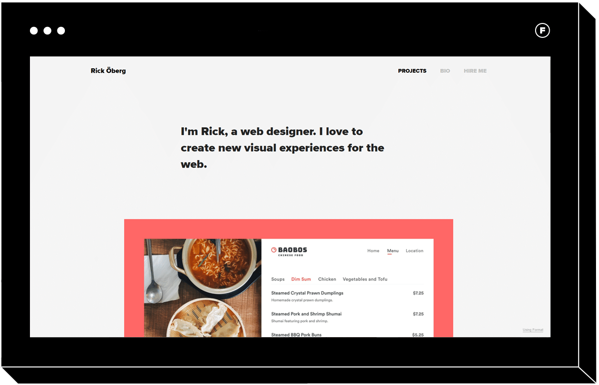
Those looking for an easy to use website that is still contemporary will love Exhibition. A primary navigation menu runs along the top of the page, ensuring your visitors can quickly access important information, such as your about page. You can fill the top landing section on the home page with a punchy, short blurb about what you do, and as you scroll down the page you’ll see sections for each project you create.
Once a project is clicked, you’re taken to another vertical scroll website with high-res images from that collection along with text and captions, if you choose to include these.
This vertical navigation structure is familiar to anyone who’s ever surfed the internet, so you can be confident that you won’t turn off users who don’t want to have to click around too much to find what they need. Exhibition would work well for a graphic designer, photojournalist, or any creative who wishes to contextualize their visual content with text and captions.
Meander
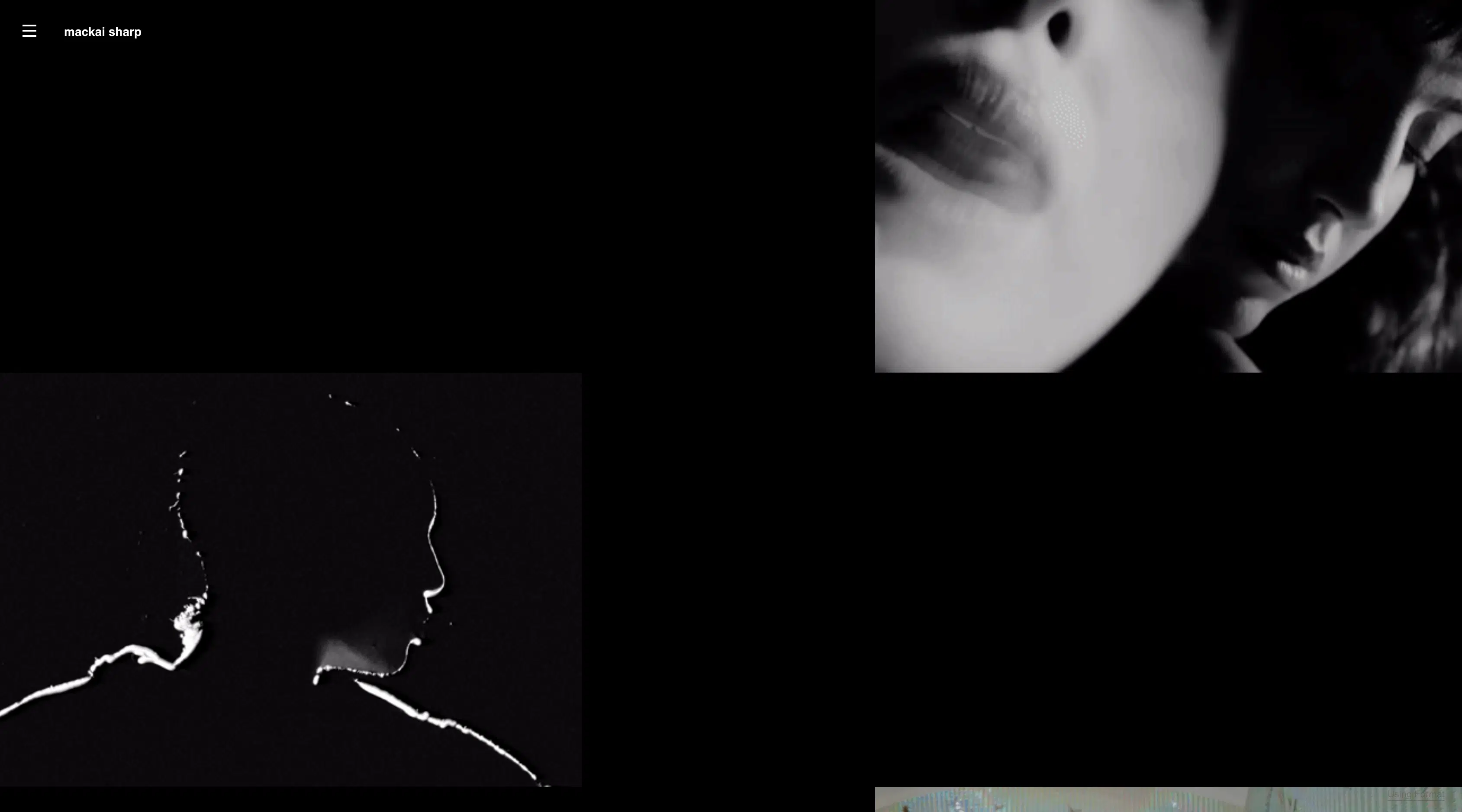
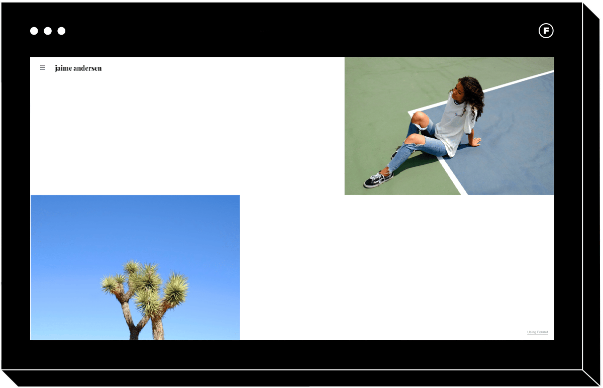
For a more playful take on this navigation style, check out Meander. While you still scroll vertically with this template, the staggered layout with varying image sizes makes for a fresh, hip experience. The white space evokes the feeling of high-end fashion print magazines, and clicking on an image takes you to a new page with more content from that collection. The colorful transition between pages is another unexpected and fun feature of this theme.
If you love a discreet menu, this template will deliver. In the left-hand corner there’s a hamburger menu that reveals a large navigation menu listing all of your site’s pages. It’s both subtle when unopened and legible once expanded, so you get the best of both worlds from a navigation perspective.
Mode
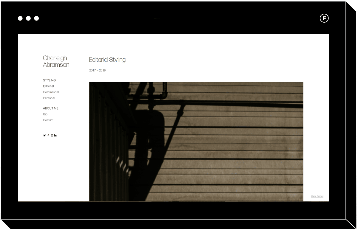
This elegant take on vertical scrolling websites is perfect if you want to make all of your collections visible from the home page. The left-hand navigation bar allows users to see how you’ve categorized your work, and the sidebar navigation menu remains expanded as you navigate the site, which some website visitors may prefer.
This template allows you to easily display pictures with different aspect ratios and orientations in a way that doesn’t look messy, since there is typically just one image in the frame.
Range
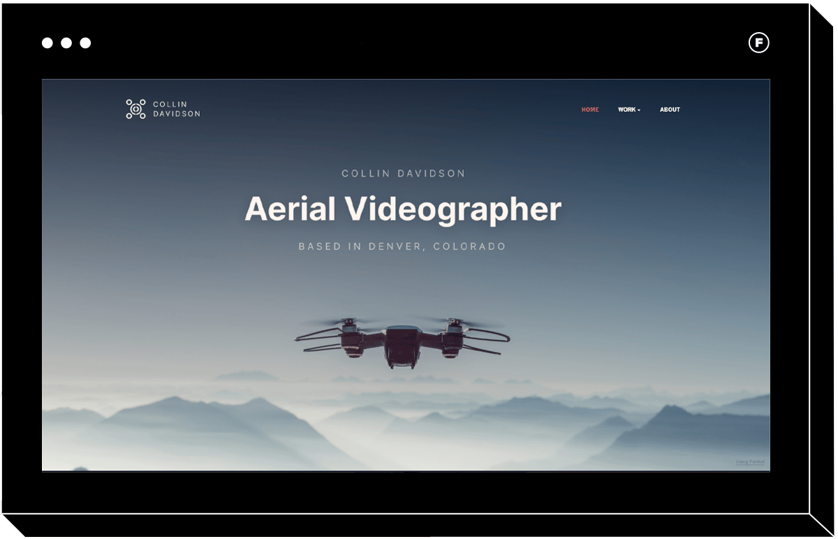
Videographers will enjoy the user experience offered by vertical scroll navigation templates as well. Range is the perfect example of how this design can be used to showcase your film work. The homepage features a primary navigation menu along the top where you can link to the most important pages on your site, and a secondary navigation dropdown menu for more specific items, such as specific projects.
You can show examples of your best work as the user scrolls vertically on the home page, and when they click on each project they’re taken to a new page where you can show gorgeously rendered video along with stills ad text. Responsive design means that the theme looks just as good on a small mobile screen as on a desktop, and the intuitive vertical scroll navigation functions the same way on both.
Horizontal Scroll Website Navigation
If you like breaking the rules with your navigation scheme, you might prefer horizontally scrolling websites. Forget what you’ve heard about horizontal websites being bad for user experience: the new generation of horizontal template is the result of careful navigation planning and feature elements designed to make sure your visitors intuitively know how to navigate the page.
While horizontally scrolling websites are often recommended for content with a portrait orientation, landscape orientation can look amazing too. A perk of this navigation style is that you can often fill more of the page with your work. It can also be that extra touch that makes your site more memorable, something all creatives hope for.
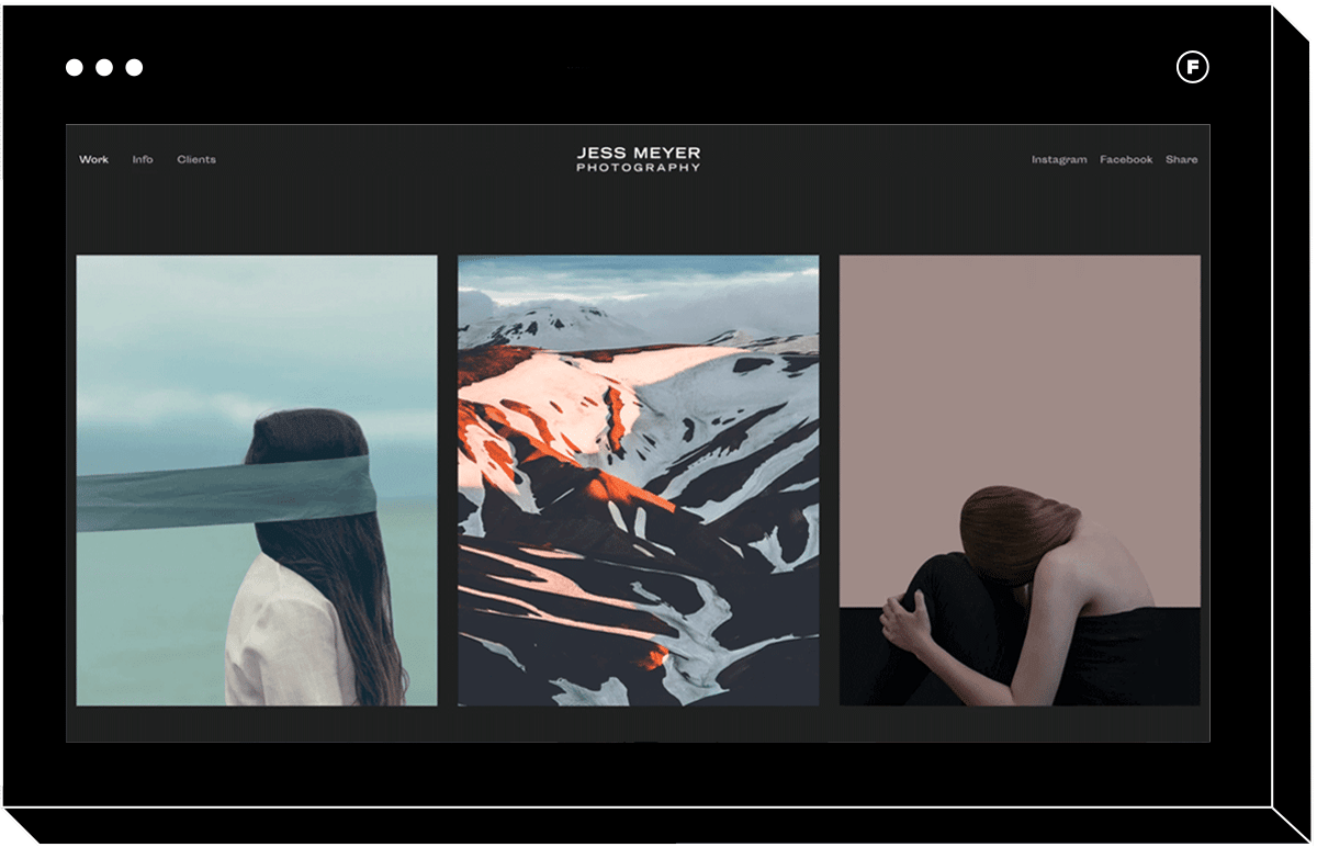
Reel
For an example of a seriously elegant and minimalistic horizontal scroll site, check out Reel. Its dark tones and the spacing between images make you feel like you’re unrolling a film strip as you scroll, making it an excellent choice if you do portrait photography or headshots. The website navigation menu runs along the top and is clear yet unobtrusive. All you have to do to access the secondary navigation is to hover over the primary navigation items on the menu, so users will have an easy time seeing how you’ve set up your portfolio website.
If you want to create a portfolio that’s both elegant and contemporary, and that lets your content shine, Reel is a great choice.
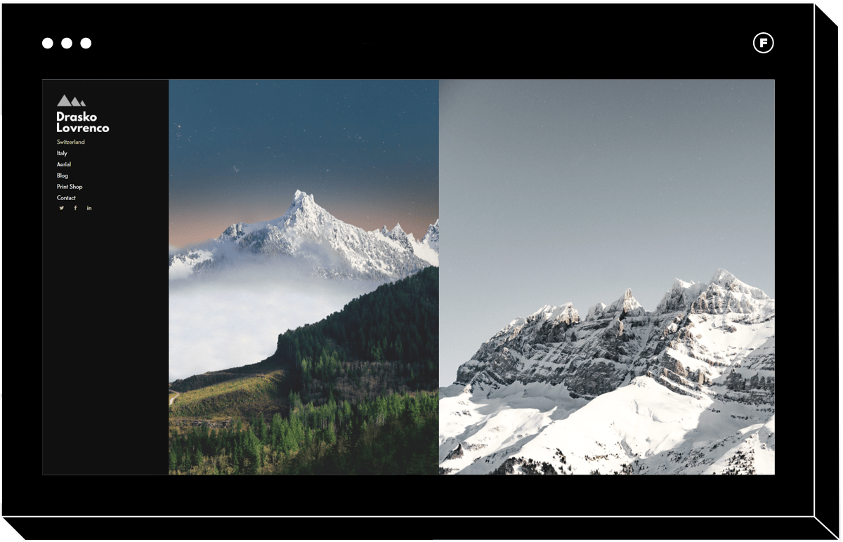
Skyline
A more maximalist take on the horizontal scroll navigation style, Skyline shows just how well this orientation can work when website navigation best practices are applied to the design. Notice that when you land on the home page, you can tell right away that more content is spilling over outside of the screen to the right. This lets users know right away that they’re on a horizontal navigation portfolio website.
Skyline is proof that this navigation style isn’t only for content with a portrait orientation. You can mix both portrait and landscape images and they’ll be displayed beautifully in this theme, filling the screen. Information is easy to access in the left-hand main menu, where you can even easily link your online store to sell prints.
This horizontal template is particularly stunning even on mobile devices, with edge-to-edge imagery showing every detail of your photos. The hamburger icon that you see on the mobile version opens up the same easy to navigate menu, for a seamless experience no matter the device.
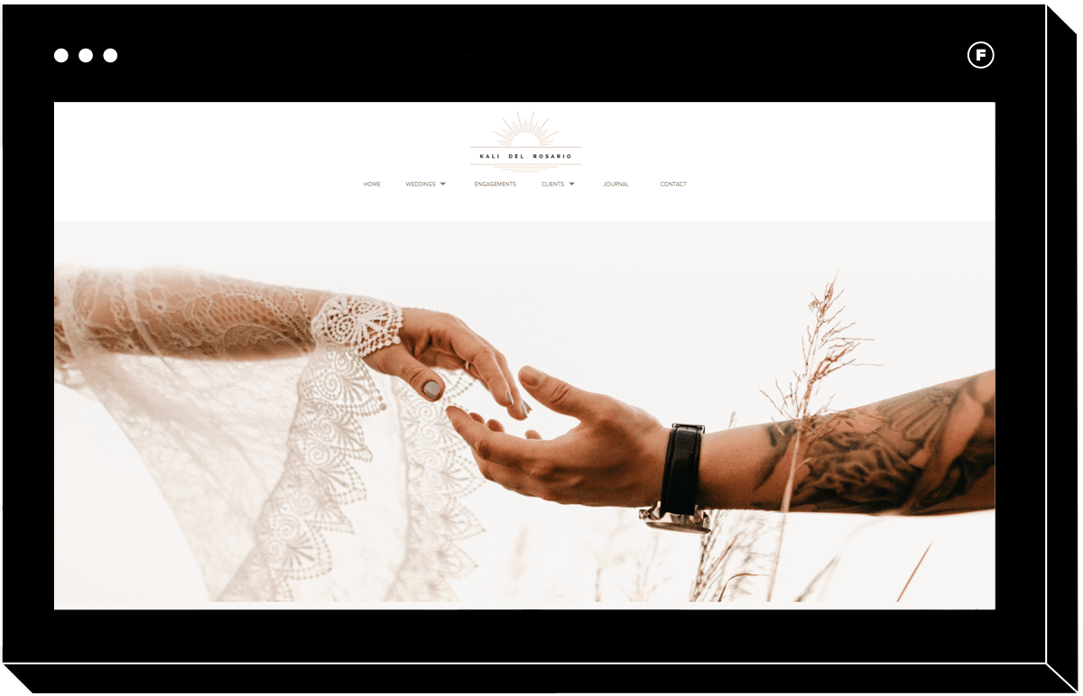
Dusk
If you want to create a wedding photography portfolio that incorporates horizontal scroll navigation, Dusk is a great choice. This is an example of how horizontal scroll can be coupled with vertical navigation for a robust website with a high-end feel. You can scroll vertically on the landing page to see different content blocks, while the image galleries themselves feature horizontal scrolling.
The navigation bar along the top is discreet and elegant but still noticeable, so you can include all those important pages a wedding site should have, such as a pricing page.
This template, combining vertical and horizontal elements, is ideal if your business requires that you include a lot of text in addition to your visual content, particularly on the landing page. Simpler templates may not have quite as much room for text on the home page, so if you want to include it then look for a theme like Dusk.
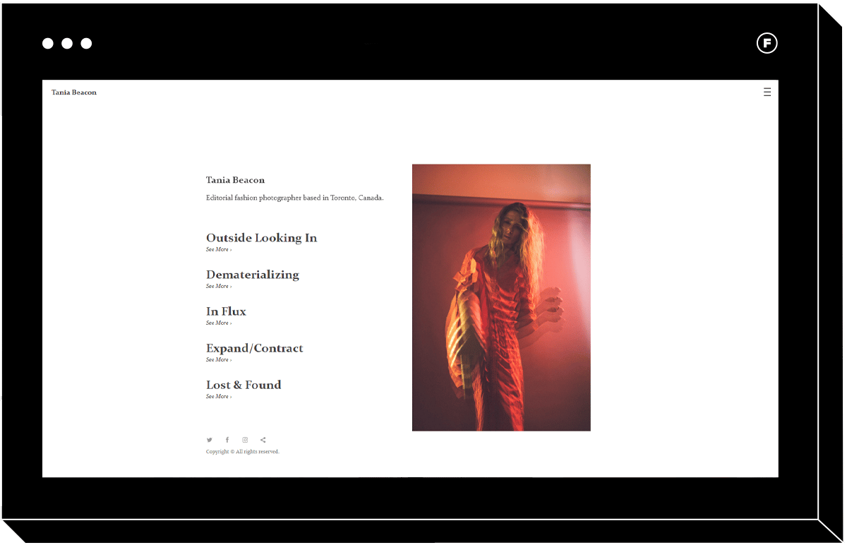
Beacon
This high-fashion take on the horizontal scrolling website proves that the right theme can make your portfolio look like it was designed just for you. The navigation bar is the stand-out feature of the landing page, evoking the table of contents of a glossy magazine. This navigation style is perfect for fashion and editorial photographers, and would even be great for a model portfolio.
When you hover over each item in the primary navigation, an image from that gallery is displayed. Once you click, you’re taken to a horizontal scrolling gallery that spaces the images apart so that each image is displayed one at a time, getting the users’ full attention.
You’ll notice this theme makes use of a secondary navigation, accessible through the hamburger menu in the top right corner. Here, you can include additional pages, such as your contact information, links to social media, and anything else you may want to include. By making use of two menus, Beacon puts the landing page focus entirely on your content.
Fullscreen Website Design Navigation
If you’re after maximum impact, full screen websites might be the perfect choice for your portfolio. These designs give your work a monumental quality and are anything but subtle.
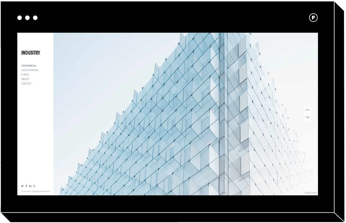
Industry
One photography niche that’s particularly well suited to the high impact effect of full screen websites is architectural photography. Whether you shoot architecture exteriors or interiors, the goal is typically to capture your subject in a way that makes it feel grand. That is why a full screen landing page template like Industry is a perfect choice.
Header menus allow for an even larger image since it can go from browser edge to browser edge, but they can also make the navigation a little less obvious since users might have to collapse part of the menu or read menu items in small font. Industry does an excellent job of combining full screen content with a navigation bar that you can’t miss, for a polished, professional and impactful effect.
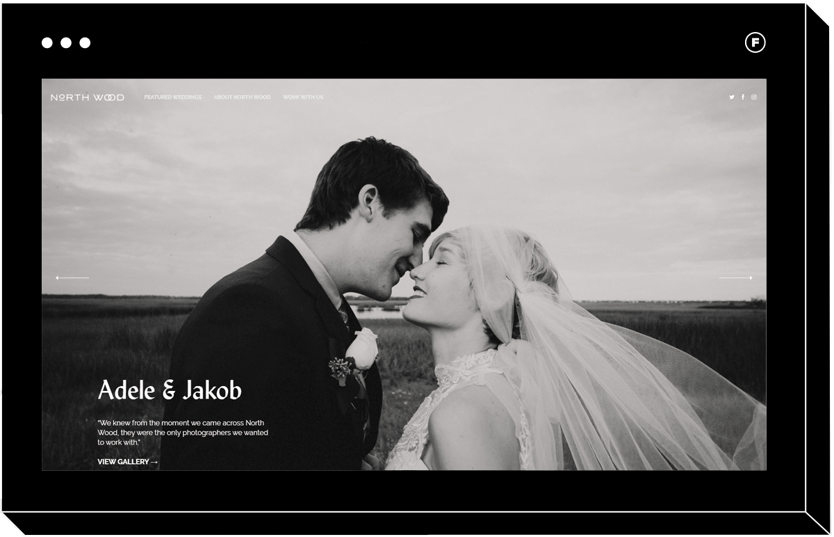
Fullframe
Here’s a fullscreen background website that really commits to the edge-to-edge image, with beautiful results. If you want to evoke emotion, as in this wedding portfolio example, fullscreen black and white images are an excellent way to do it. The navigation menu is discreet but legible, putting all the focus on the images themselves.
Subtle arrows on either side make sure that users know the navigation works when they’re on the landing section.
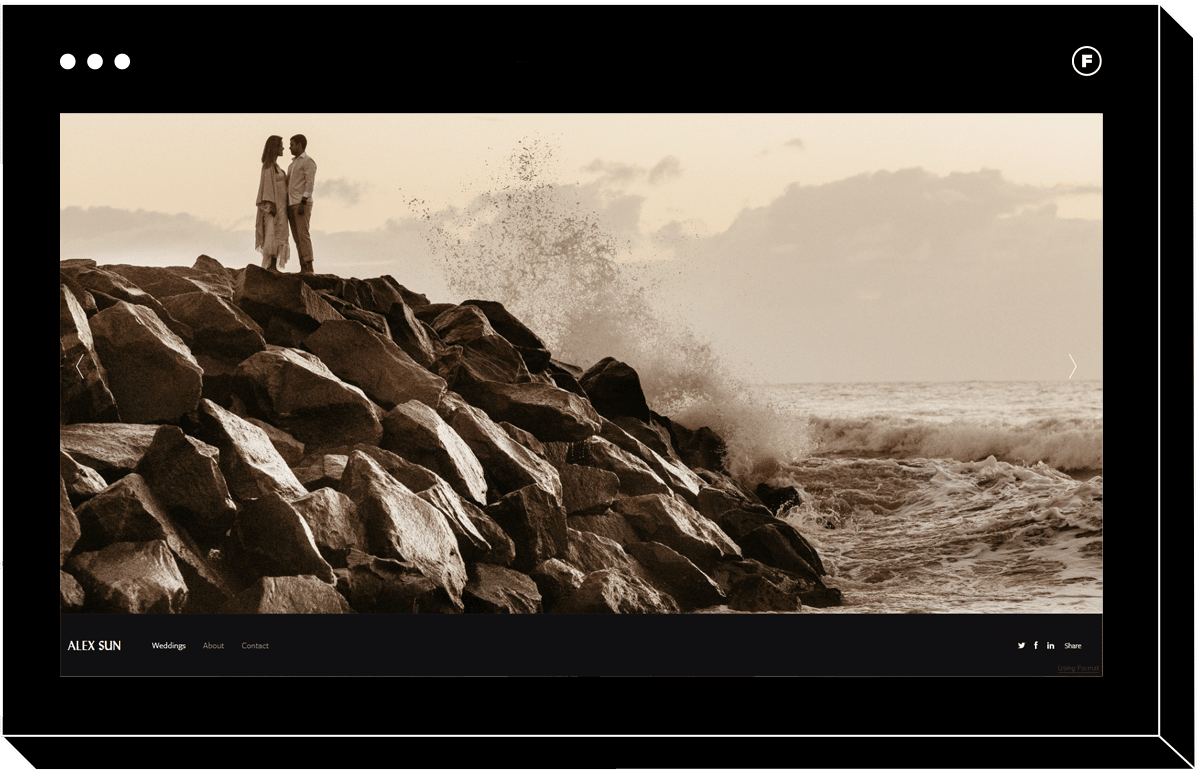
Sun
Navigation menus are often placed in the header or on the left of a site, but this website opts for footer navigation instead. This navigation choice means that the eye sees the landing page image before any information, so it’s a good way to lead with your visuals. The navigation bar design is noticeable but unobtrusive and offers an unexpected twist to this template that users will enjoy.
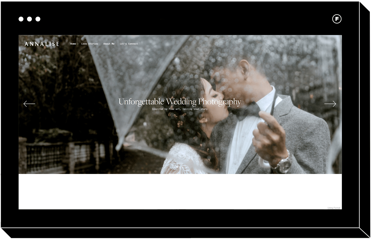
Ambience
There are many options within the category of fullscreen website templates, and they certainly don’t all look the same. This website navigation example makes use of a full screen web page, but as you scroll down you discover more details that users may want to know, such as an about blurb and client testimonials.
There’s a header navigation bar as well, so visitors won’t miss any of the important information contained in the website.
Tiled Website Design Navigation
There’s something about a tiled site that just makes you want to stick around and explore more. They’re playful and energetic and can lend themselves well to all kinds of photography businesses.
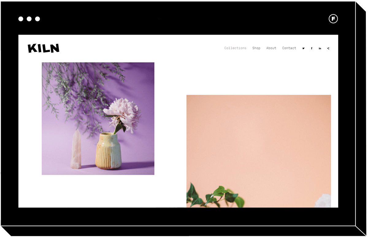
Kiln
This quirky theme makes use of a tiled vertical navigation style that’s totally customizable. You can change up the number of columns and the gallery spacing until you love how your images are displayed. The navigation bar is simple with nicely spaced out elements for a fresh, uncluttered user experience. It’s perfect for product photographers, ceramic artists, and anyone looking to inject a little bit of playfulness into their online experience.
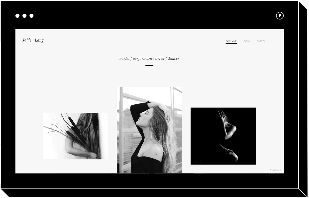
Collage
If you love the tiled look but are going for a more elegant design, Collage checks all of these boxes. Proof that less is more, each design element contributes to a sense of sophistication and artistry.
When visitors navigate to the image galleries, a unique feature of Collage is how the tiled images are interspersed with text, for an editorial look. This is an unconventional way to add some context or captions to your portfolio, while maintaining the broken grid look.
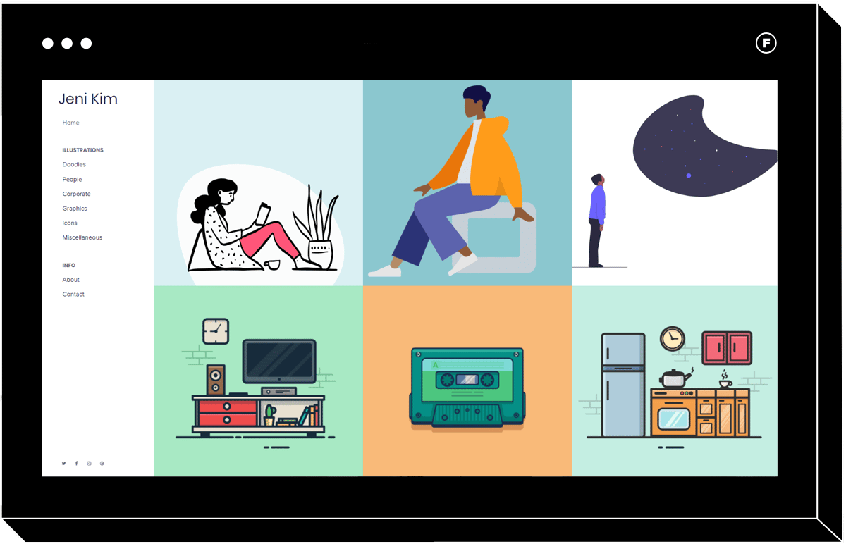
Detail
If you prefer neat vertical and horizontal lines, Detail is a grid style website that keeps everything looking neat, tidy, and properly aligned. Some sites are better off using this type of design, especially if they feature many images. Visitors can click squares of the tile on the landing section to arrive at various galleries, and the user-friendly navigation menu makes accessing your body of work foolproof.
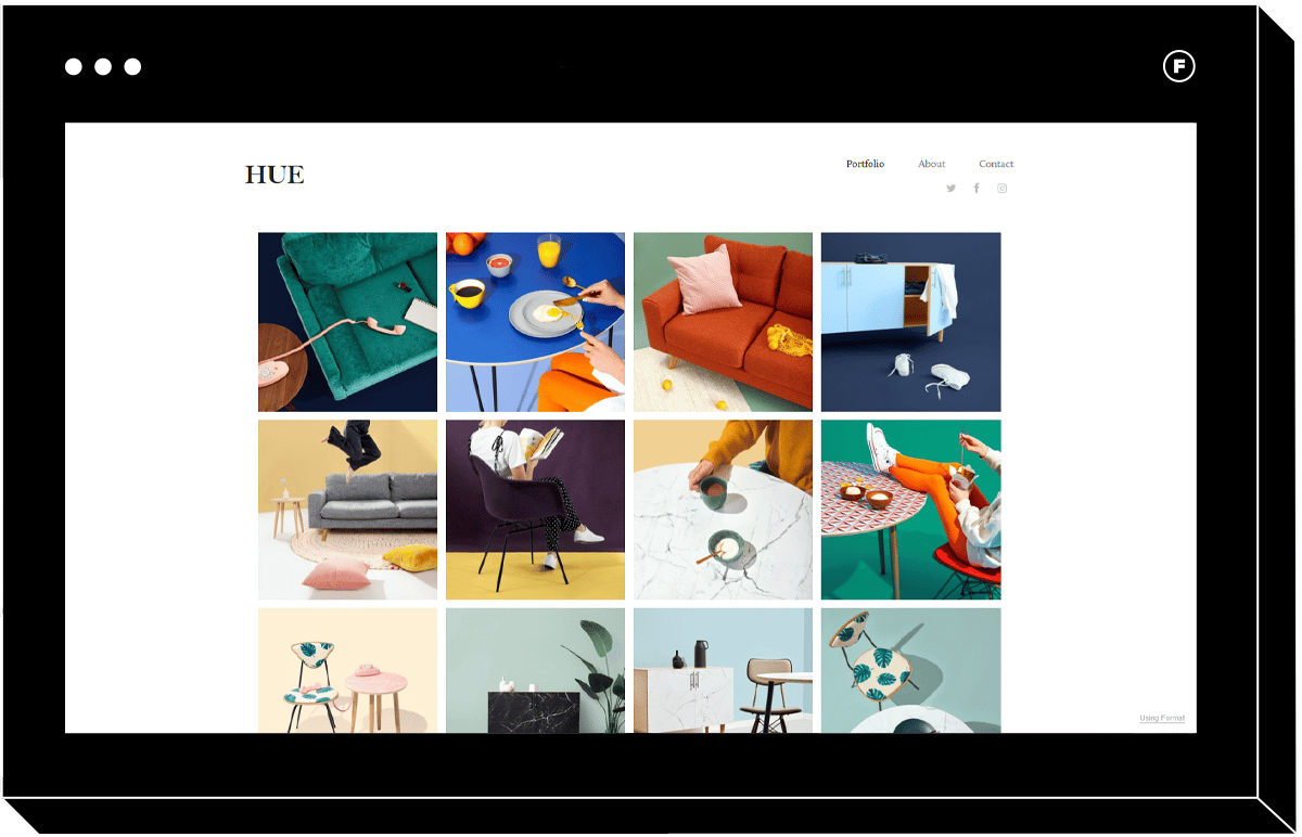
Hue
Single page sites can be highly effective, since they don’t require too much overthinking of the design and are very easy to navigate. Hue is proof that this type of tiled website design can be totally captivating. If your images look good cropped square, this design allows you to show a large gallery directly on the homepage, a little reminiscent of Instagram.
Sometimes designers overthink what visitors need when visiting sites: less can be more, and Hue is a great example of this. The navigation menu is simple yet functional, with all the info you need being just a button away.
Slideshow Design Navigation
A great slideshow can tell a visual story. Slideshow design sites are a great way to immerse people in the world of your images.
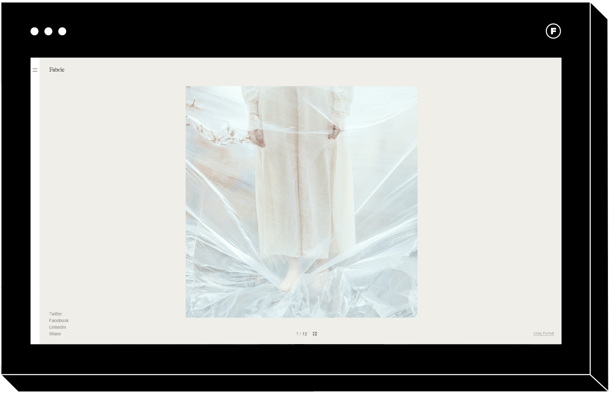
Fabric
In our hyper-digital world, people are drawn to online reminders of analog things. That’s why this theme, with its unique navigation and menus, is so much fun to click through. As you click through the gallery slideshow, photos are layered on top of each other so you can see the previous image peeking through. This feels like shuffling through a stack of photos, a nostalgic touch that draws people in. The background color also adapts to the current picture, for a subtle pleasant change as you click
While most website navigation examples involve a header menu or static left hand menu, Fabric has a dropdown menu that pops out from the left when you click the menu icon. Dropdown menus have the benefit of leaving more room for the main images until people are ready to look for more information. A secondary footer menu provides a subtle place to link to social media accounts, while the primary menu is extra large, clear, and legible.
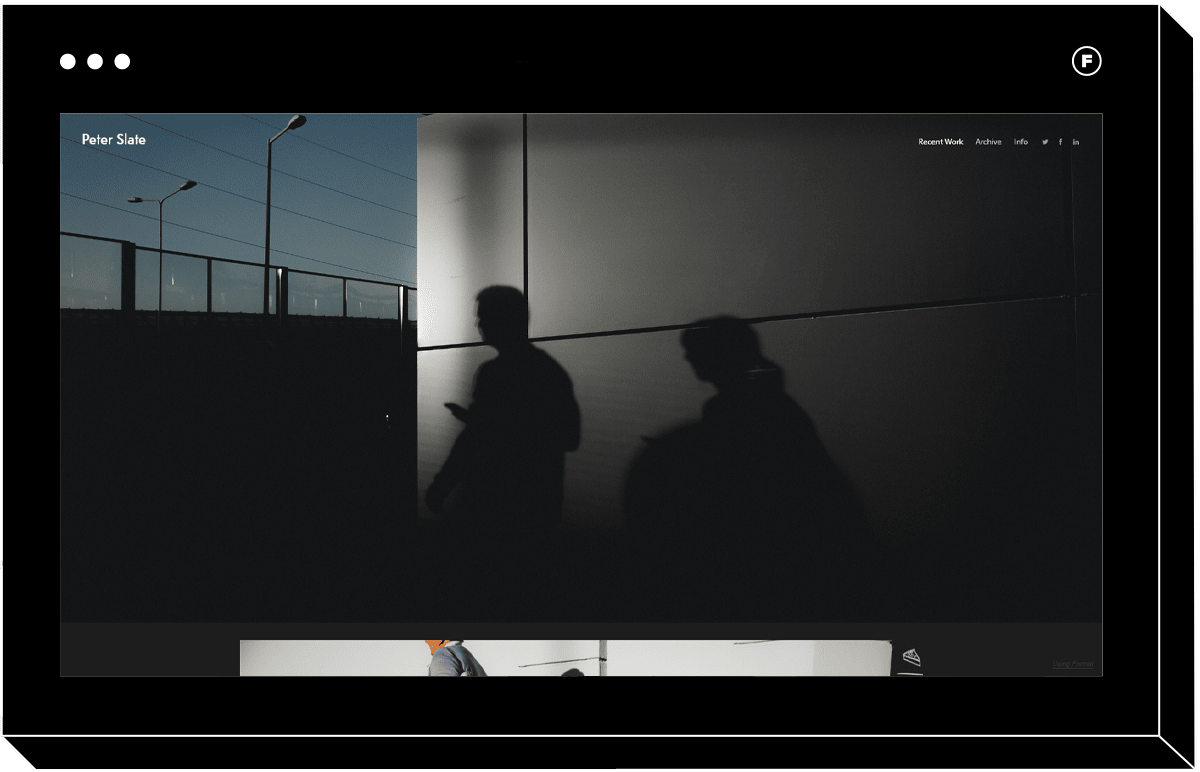
Slate
A template that will look like it was created by a design agency just for you, Slate is a dark and minimalist slideshow theme ideal for telling serious stories. It’s perfect for photojournalists, street photographers, or anyone who wants to immerse people in a visual story. It features two navigation menus, one along the top for page links and a second at the footer for social media links.
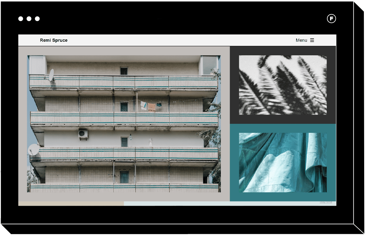
Spruce
This beautiful, gallery-inspired theme with a tiled layout would be a great choice for an art photographer. Each image is framed by a color that adapts to the content of the image, so as you update your portfolio the colors of your site shift as well. With two menus, it offers a painless user experience. Dropdown menus can sometimes end up cluttered as designers pack them with too much information, but this one is sparse and clear. The fat footer menu includes social links and a share button, so the user can share links to your portfolio far and wide.
With so many navigation designs to choose from, you’re bound to find one that suits your photography business. If you’re having a hard time visualizing how your images will look, you can always try out a 2 week free trial and take them for a test drive. Let’s bring that portfolio to life!
Want more design insights? Read on!
26 Totally Essential Website Design Tips
13 Qualities of Every Well-Designed Portfolio Website
How to Use Video Website Templates for Your Online Portfolio


