If you’re going to run a successful photography business or side hustle, you need to have a place where future clients can see what you do. Your online portfolio should do more than just act as a record of your work, though. An effective photography website should also be designed to communicate your brand and aesthetic to viewers, and it needs to be easy to use.
That’s where website templates come in. We’re going over everything you need to know about responsive website templates, including which features to look for and how to choose one that complements your photography style. Then we’ll take a look at the best 10 professional photography website templates, along with some examples of the professional photographers who use them.
Do I Really Need a Photography Website?
As a professional photographer, you’re going to need to create some sort of online presence where you can show off your work and connect with your ideal customers.
Social media can be a good tool for marketing and reaching new audiences, so is it really necessary to invest your time and money into creating your own separate website?
When you create a profile on social media, you are a client of theirs, and you do not own access to your account. That means that they control who sees your content and can even disable your account without warning. If that happens, you could lose access to all of the people you’ve connected with. That’s why it’s so important to start building your own email list and portfolio outside of your social media accounts so that you are prepared and all of your networking doesn’t go to waste.

Why is a Photography Website Better Than a Social Media Account?
Still not convinced that a photography website is a necessity for a professional photographer? Here are some of the main benefits that you can get with a photography website template in comparison to social media.
Personalized: The best photography website templates allow you to personalize your portfolio with custom branding, so you can design your website using your logo, color scheme, fonts, and brand photos. You can also select a gallery layout based on how you feel your work is best presented.
You own your contact list: When you create your site using a website template, your ability to communicate with your customers is not dependent on an ever-changing algorithm.
Professionalism: A website template that is specifically designed to show off your aesthetic will appear more professional to clients considering investing in your services.
SEO: Selecting a photography website template that integrates Search Engine Optimization will allow people to find your portfolio by searching for relevant keywords, so new people will see your work even if they don’t already know your name.
Online store: The best professional photography websites include the ability to create an E-commerce store, so that viewers can order prints, make appointments, and even download photos based on your settings.
Customer management: In addition to acting as a portfolio, choose a photographer website template that allows you to contact email subscribers, offer coupon codes, and provide client proofing, password protection and restricted downloads.
What is a Photography Website Template and Why Do You Need One?
Unless you’re already a pro at web design and coding, you’re probably not going to spend a ton of time learning how to create a website from scratch when you could be out there taking photos and connecting with new customers. Luckily, advanced technological knowledge is no longer a necessity when it comes to creating and designing your own photography portfolio. A good photography website template means that you can create a professional, fully customizable website in a matter of minutes.
How To Choose the Right Photography Web Template for Your Business
With so many options for website builders and photography website templates, it can be overwhelming to find the right one to showcase your unique style as a photographer. That’s why we’re breaking down everything you should consider when choosing between photography templates.
Before you get started, make sure that you’re clear on the type of photography that you specialize in, so that you can figure out how best to present your aesthetic using a website template for photographers. Consider who your current and ideal customers are and what they are looking for when they go to hire a photographer, and customize your website template to reflect that.
Here are some important features to look for when selecting your photography website template.
Fully customizable designs
A theme that corresponds with your branding and style as a photographer
Fast loading pages
Online store for product sales
Responsive photography portfolio
Mobile optimization
Use a domain name you’ve purchased for your site address
SEO and Google Analytics integration
Photo galleries that suit your photography
Contact form
Video hosting
Client proofing
Personal blog to take advantage of keywords
Depending on what you’re looking for, you may not require a responsive template that includes all of these features. That’s why it’s important that you carefully consider what you’re attempting to achieve with your photo gallery website, and choose a photography template based on that.
Best Photography Template Examples
Now that you have a thorough understanding of how a photography template site works, it’s time to take a closer look at our favorite photography portfolio website templates, as well as some of the talented photographers, artists and designers who are using them.
Reel
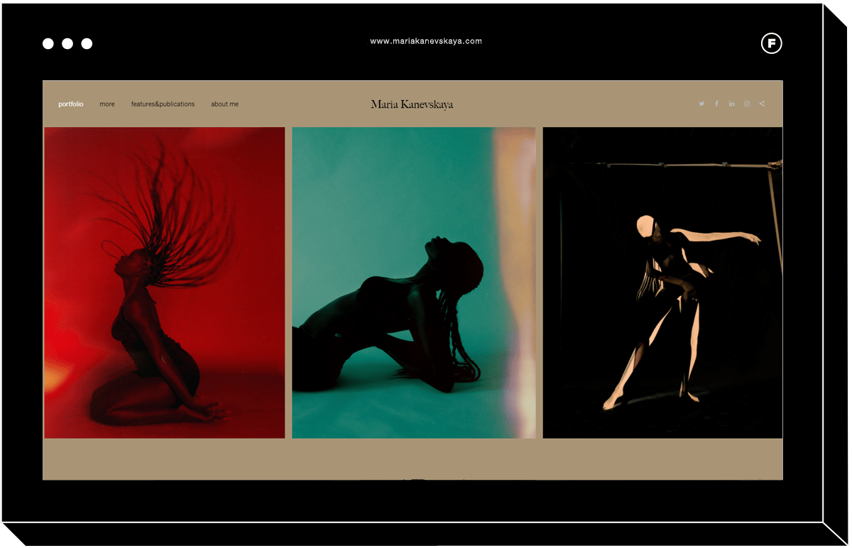
This minimalist photo gallery site uses horizontal scrolling galleries that resemble a film strip to display a few images on a single page. This responsive website can work well with any photo orientation, but the website design works best with portrait.
Photographer Maria Kanevskaya uses Reel for her online portfolio to highlight her colorful and striking images of women. She describes her work as “mostly exploring female subjects and their internal reality.”
Peak
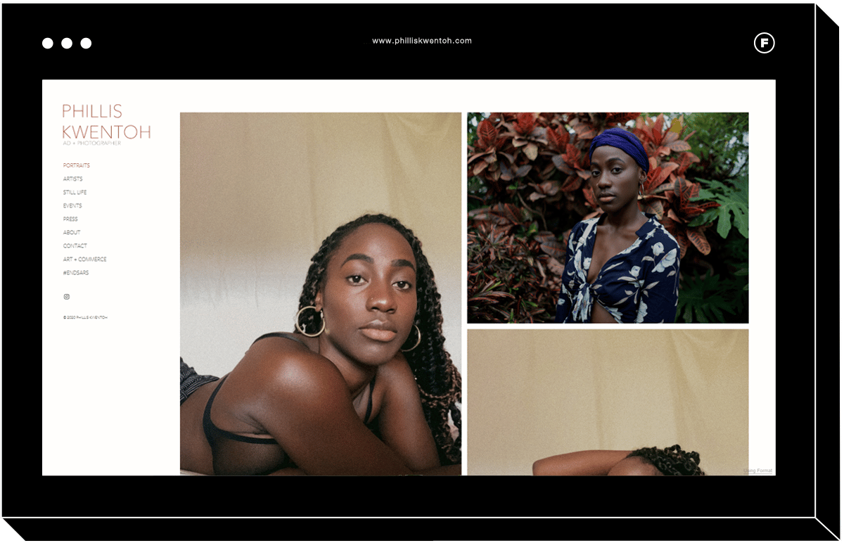
With a tiled gallery, this portfolio template allows photographers to showcase a variety of image sizes and shapes all at once, without having to crop their photos. You can even customize the layout with up to 4 columns, and when visitors click on one of the products, it pops out into a gallery view.
Art director and photographer Phillis Kwentoh make use of the Peak portfolio website template to showcase her photos inspired by her Nigerian heritage and her love of travel and portraiture.
Gloss
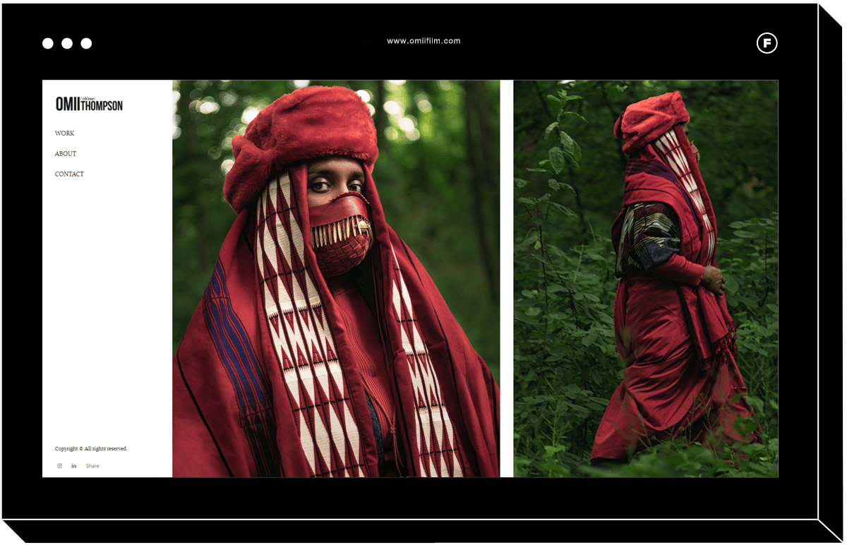
With a simple, clean portfolio design, left-hand menu, and a fully customizable slideshow of images, Gloss is the perfect responsive website template for fashion photography portfolios. The ability to add captions to each image using this website template means that you can provide extra context as well as make use of relevant keywords to enhance your website SEO.
Trained in Classical Animation, photographer Omii Thompson uses the Gloss website template to display his photos that encompass a “love for storytelling and illustration” in the form of beautiful portraits. The home page on his website features a series called “The Traveler,” portraits of the artist Rajni Perera.
Halogen
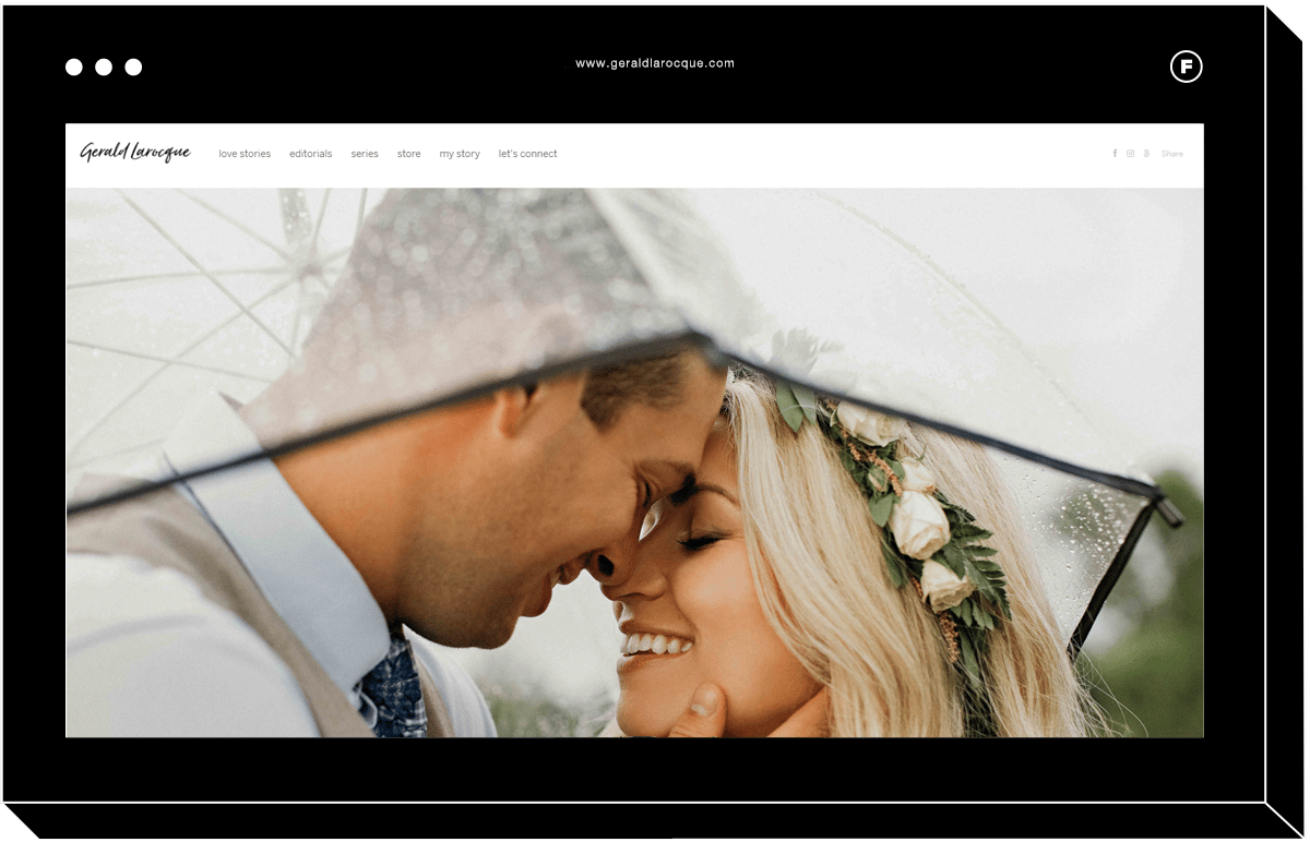
Halogen’s slideshow portfolio allows site visitors to experience your images in full screen, making it a popular website template for those who specialize in wedding photography.
While a website template that shows one image at full width will bring attention to the detail and quality of your photography work, keep in mind that the image will be cropped to the size of your viewer’s screen. That means that this website template works best with photos that have a horizontal orientation, and where the crop of the photo can be flexible.
With a background in fashion and fine arts, photographer Gerald Larocque uses full-width images on his portfolio website gallery to emphasize the romance and emotions in his intimate portrait photography.
Exposure
If you’re a photographer whose portfolio emphasizes a fun and youthful aesthetic, Exposure could be the ideal website template to show off your products.
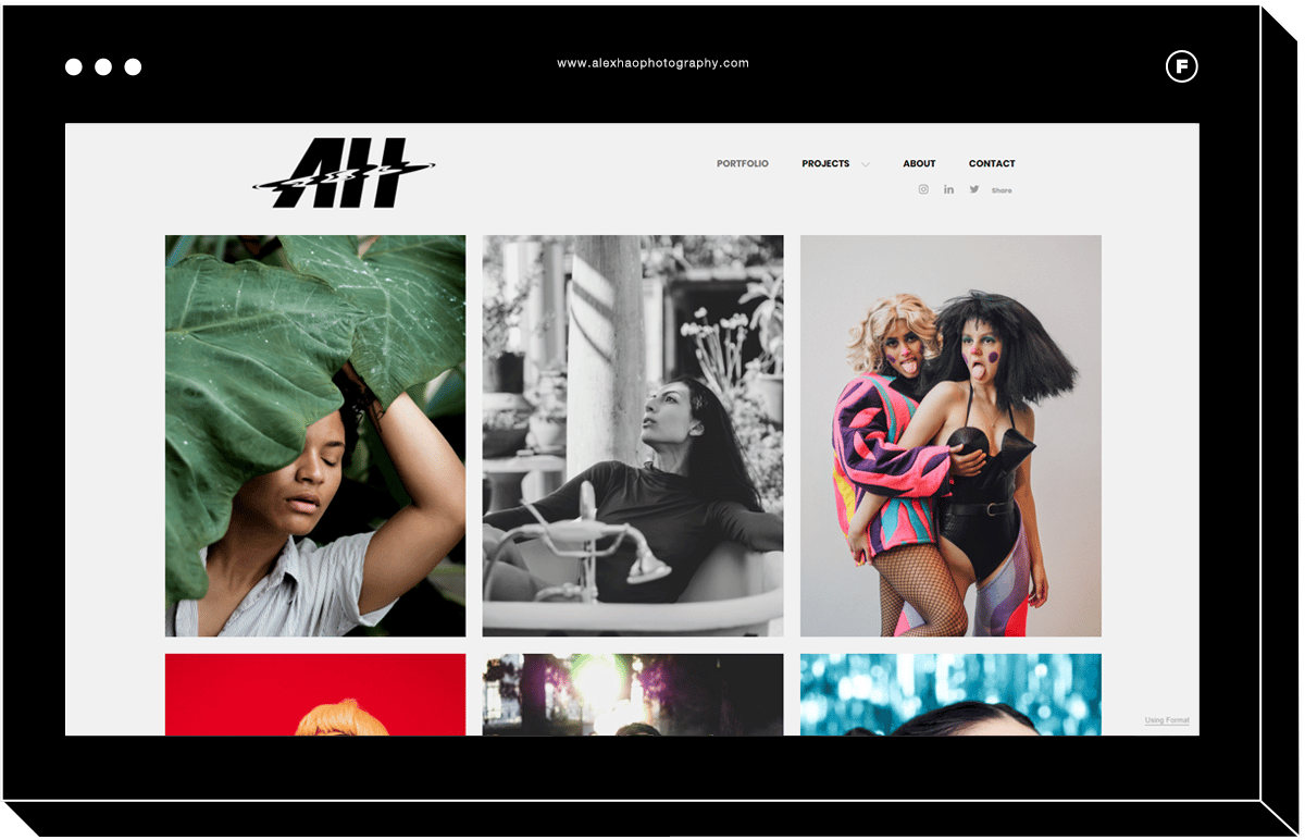
Since it is an image-forward portfolio website template, commercial photography portfolios will shine by using this template. This tiled website template opens up into a full-width gallery when visitors click on an individual photo.
Specializing in portrait and editorial photos, Bay Area photographer Alex Hao makes use of the tiled grid portfolio to show off his style in a variety of images at once, so site visitors can get a sense of his aesthetic immediately.
Illuminate
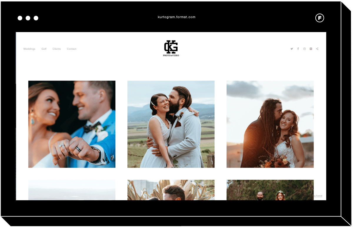
With a sleek header and horizontal scrolling galleries, Illuminate is a great option for wedding photography websites. This portfolio website template is characterized by a single row of images that scroll to the side so that visitors can browse photos from any device with ease.
Australian wedding photographer Kurtogram uses a grid home page to showcase multiple wedding photoshoots on one page, which open into horizontal scrolling galleries for an intimate look behind the scenes of each event.
Carousel
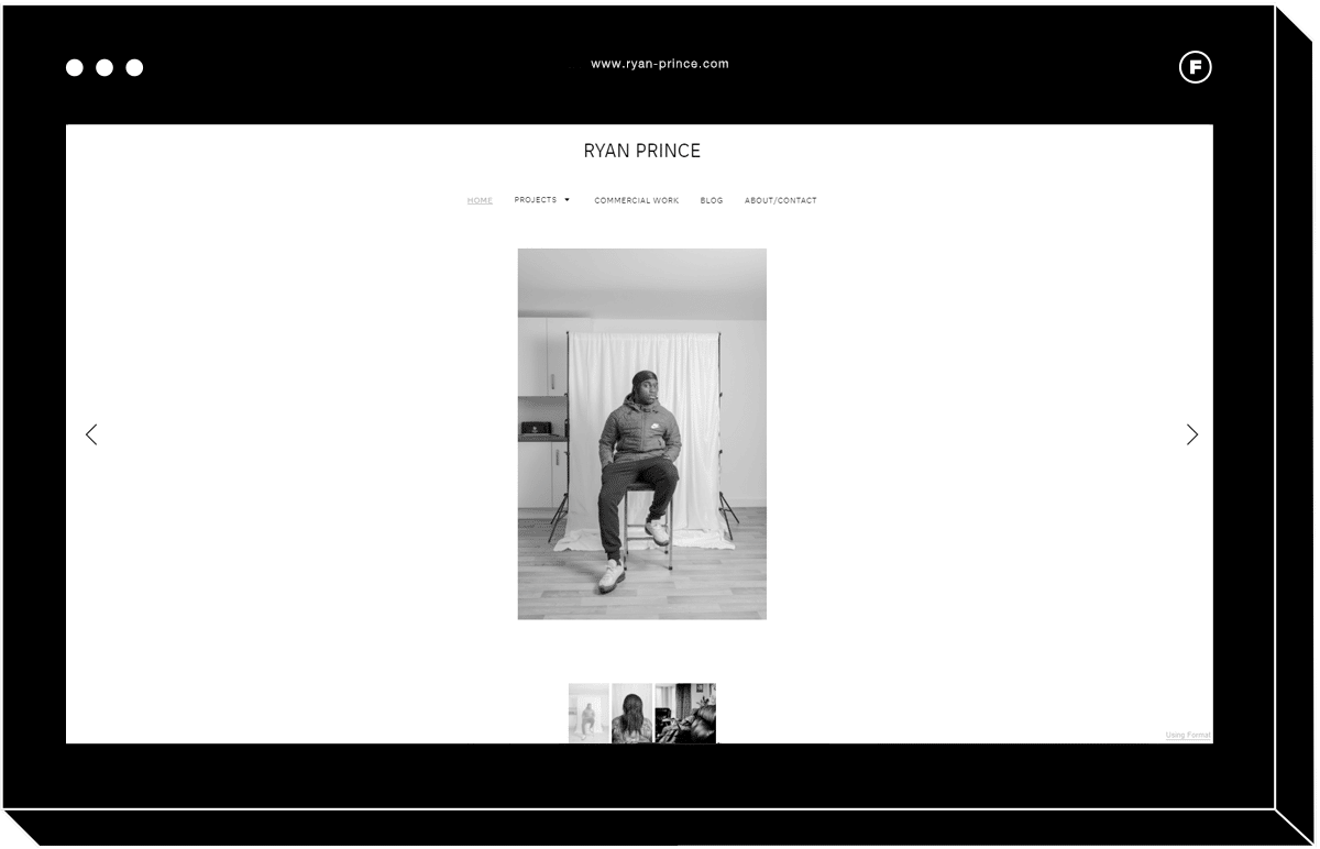
Simple and classic, Carousel is a website template that offers a traditional slideshow setup. Viewers will be able to focus on one large image at a time, along with a row or column of smaller thumbnails to click through.
London photographer Ryan Prince‘s portfolio website uses the Carousel template to emphasize each one of his documentary and portrait photographs. Prince uses photography to “explore themes that revolve around his own identity as a black British male from the Jamaican diaspora.”
Horizon
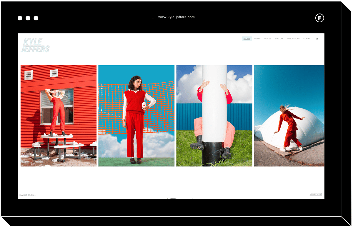
One of the most popular photography templates, image-focused Horizon brings attention to one full image at a time using horizontal scrolling, while keeping the website menu in view for simple, intuitive navigation.
Canadian photographer Kyle Jeffers uses the Horizon template to show off his bright, graphic, conceptual photos which reference nostalgia and the avant-garde through the use of industrial elements including pylons, crates, and warehouses.
Industry
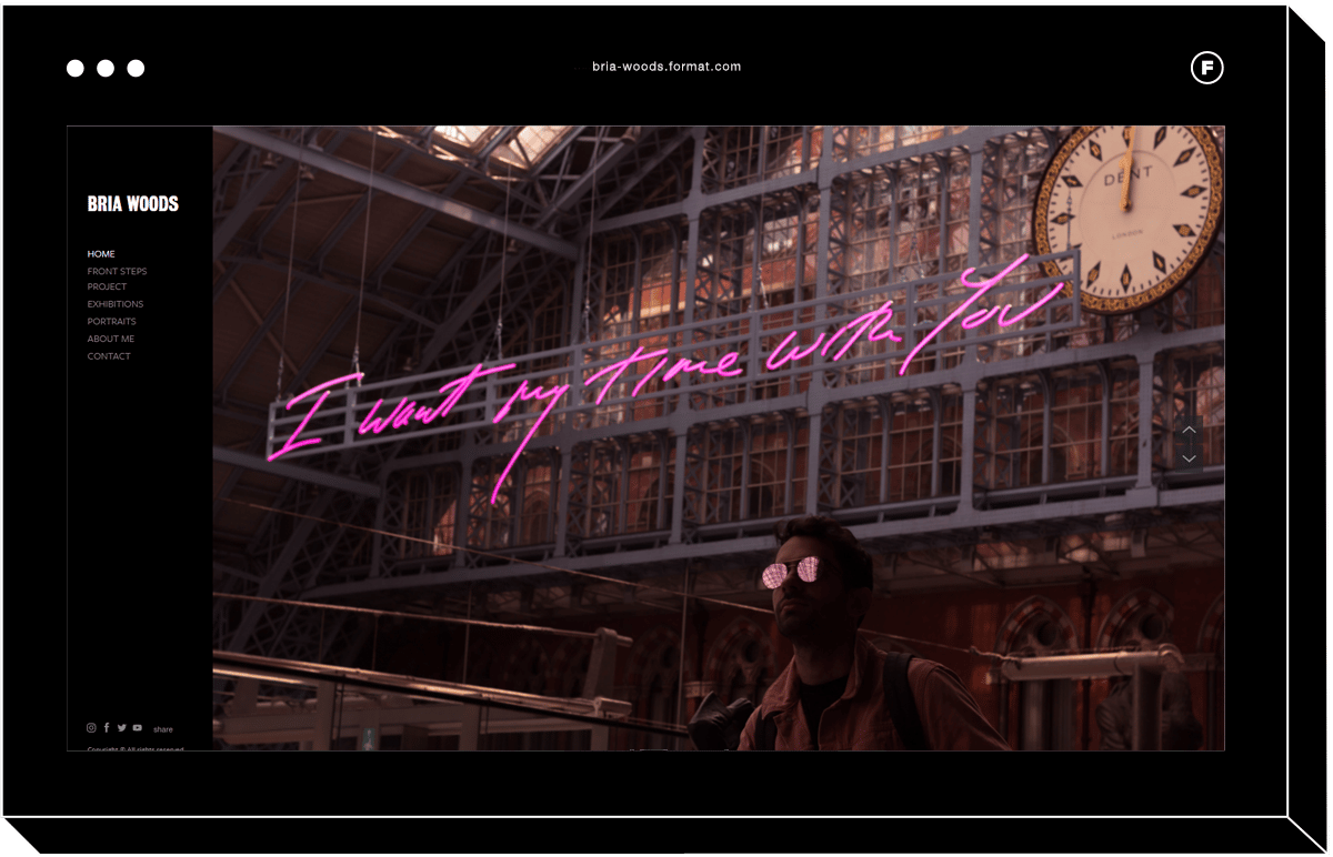
This vertical scrolling gallery template displays fullscreen images with a left-hand menu for a simple and clean aesthetic. Templates like Industry are best for photographers who want to show a few images at a time.
With a background in photojournalism, photographer Bria Woods uses the Industry template to tell people’s stories. She says that she is “inspired by genuine connection- capturing moments that transcend the basic photographer-model relationship.”
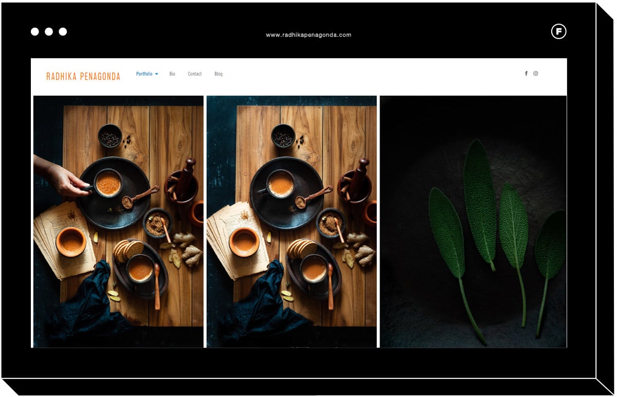
Panorama
With horizontal scrolling portfolios and full-bleed images, this template is ideal for a photographer who wants their photo to fill the entire screen without being cropped. The flexible layout of the Panorama template makes it ideal for landscape photography.
Indian recipe creator, food stylist, and food and product photographer Radhika Penagonda chose Panorama as her website template to effectively bring attention to the details of her colorful flay-lays using natural light.
How to Make Your Website Stand Out
Now that you know what a website template is and the different categories that templates can come in, it’s time to turn your attention to personalizing your online presence so that your portfolio stands out from all of the other photography websites out there. Here are some of our top tips to ensure that you are making the most out of your website template.
Think quality over quantity.
Even though it may seem natural to load your template up with all of the photos you’ve ever taken, this will lead to a very distracting portfolio. Instead, design your homepage to be eye-catching and memorable by showcasing 1-3 of your very best works. This way, viewers will be interested in visiting your gallery pages to see more, and they won’t be overwhelmed by visual clutter.
Make it easy for someone to purchase your products or services.
Your website should clearly explain what it is that you offer and how viewers can book you for a photoshoot using appointment scheduling or order prints from your online store. If they have to try too hard to figure out how to pay you, they’re probably going to look for a photographer elsewhere.
Use consistent colors, fonts, and layout.
Even if you use a great template, your portfolio is not going to appear well organized if you vary your design choices from page to page. Choose a simple color scheme, one font for headers and one for paragraphs, and use the same layout on each of your gallery pages to keep the viewer experience consistent.
Use image captions.
This is a great opportunity to add additional information to each of the photos that you’re showing on your website template. To make the most of image captions, make sure that you’re using relevant keywords so that your portfolio will come up first on the search engines.
Write a great About Me page
People like knowing that there’s a real human behind the screen. No matter how professional your website template looks, if you don’t let viewers in on what you’re all about, it may be harder to gain their trust. An About Me page is your opportunity to stand out by revealing your personality and what makes you unique. Include a self-portrait and write your copy in a friendly tone, as if you’re talking to a friend. It’s all about that human connection.
Include your contact information and social media links.
You never want to miss out on a job just because someone couldn’t figure out how to get in touch with you. Include all of your relevant links and your email address in the header so that viewers will see it on every page of your template.
Use separate galleries for different photography styles
You may have shot a lot of great pictures that fall into different photography genres, but no matter how great your images are, you need to ensure that the aesthetic is consistent across a single gallery. For example, even if you excel at both food photography and taking professional headshots, your potential customers might be confused if both are included on the same page. It may be sufficient to create multiple gallery pages using the same template, or you may prefer to create entirely separate websites for each of your photography styles. Some buyers could be put off by a photographer who appears to dabble in a variety of styles and not specialize in one specific thing, and your portfolio should always be designed to attract your ideal client and convert them into a paying customer.
Increase your product offerings
In addition to selling photo prints and photoshoots, you might also want to consider introducing passive or semi-passive income streams through your website template. For example, you could start selling Lightroom presets or online pre-recorded training videos targeted towards other photographers or those looking to learn a new skill.
What’s Next?
You already have a complete understanding of everything that you need to know when it comes to using templates to create a standout photography portfolio. Now it’s time to get to choose your best pictures and show them off using your new website template! Don’t forget to update your portfolio template regularly as you get more experience and your skills improve.
Want to learn more about creating and maintaining a high-quality creative photography website?
Update Your Portfolio: 6 Tips To Spring Clean Your Career & Portfolio
What’s the Best Portfolio Website for Photographers?
Instagram Portfolios: Why They Might Not Be Enough for Photographers
