Are you looking for ways to take your design work to the next level? Sometimes, the best thing you can do is go back to the classics. Have you heard of the golden ratio? Well, this simple, ancient principle is actually a great trick you can use to improve your designs. Read on for what the golden ratio is—and how you can utilize the golden ratio in design, taking your online design portfolio to new heights. But first…
What is the Golden Ratio, Exactly?
The Ancient Greeks were the first to discover the inherent beauty found in nature’s asymmetry, and expressed this golden-ratio phenomenon with the Greek letter “ϕ” (Phi). In application, artists and architects used Phi as a secret weapon in their creative arsenal, crafting works that have a sense of harmony and proportion in tune with the natural order.
The golden ratio is formed by a line that’s divided into two parts. The longer part is then divided by the smaller, equal to the sum of (a) + (b) divided by (a), which both equal 1.618.
Has that broken your brain yet? No? Excellent.
The golden ratio is closely related to the Fibonacci sequence. This was named after Leonardo of Pisa, who later became known as Fibonacci. This sequence was first used to figure out rabbit populations’ breeding habits.
Essentially, the Fibonacci numbers follow a sequence in which each number is the sum of the two preceding ones, starting from 0 and 1. Here’s a simple example: 0, 1, 1, 2, 3, 5, 8, 13, etc.
If you add two successive numbers in the sequence together, you’ll create golden sections—indefinitely.
Where Have I Seen Golden Ratio Examples in Action?
Chances are you’ve seen the golden ratio in nature countless times and never realized it. Similarly, you’ve come across countless classical paintings and never realized the Fibonacci sequence lurking beneath their surfaces.
Nature
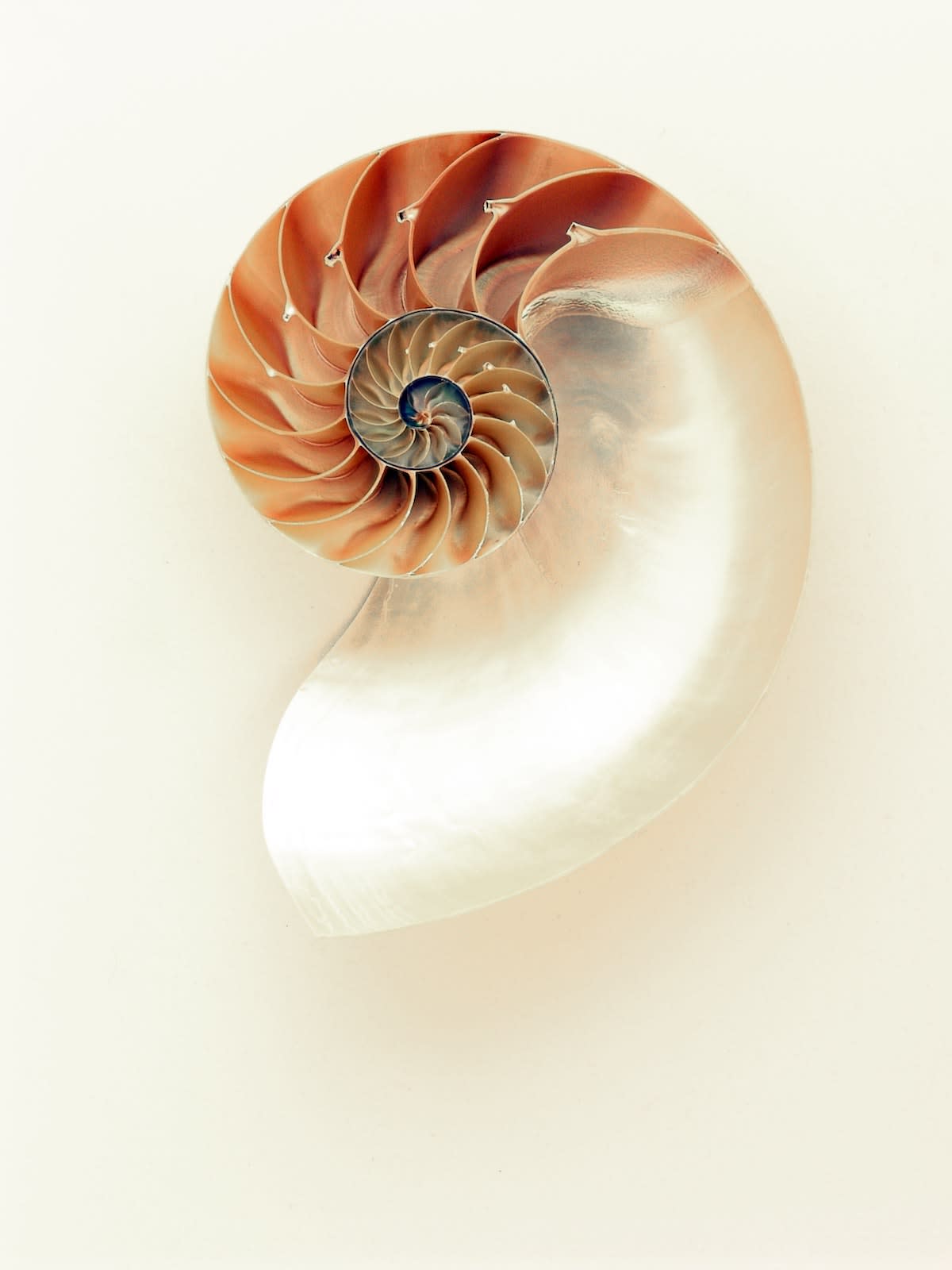
The golden section is like an underlying universal grid that can be found throughout nature. For example, did you know that nautilus shell chambers actually adhere to the Fibonacci sequence’s logarithmic spiral?
Your typical pinecone also contains that universal sequence. If you were to look at it from the top down, the number of spirals in either direction are two consecutive Fibonacci numbers!
The scale doesn’t matter: golden ratios are all around us. DNA molecules? They’ve got ‘em. They’re everywhere, from the smallest of seed heads, like in the patterns found in sunflowers, to mind-bogglingly huge spiral galaxies, like the Milky Way galaxy’s arms.
Classical Paintings
Leonardo da Vinci made use of the golden ratio in many of his works. If you were to overlay the golden spiral atop the Mona Lisa, for example, you’d find her body lines up perfectly to those swooping proportions. Even if the underlying golden ratio grid isn’t seen, our eyes are naturally drawn to a spiral’s center. In this example, her nose falls perfectly within the spiral. In your own work, be sure to place areas of high visual interest within that spiral’s arches.
Another enduring work with hidden math is The Great Wave Off Kanagawa by Japanese artist Hokusai. If you were to take out your rulers and plot some grids, you’d be amazed to discover it was drawn using ratios equal to the Fibonacci sequence. No wonder it’s one of the most recognized works of Japanese art in the world!
So how can you use the golden ratio in design?

How does Golden Ratio Graphic Design Work?
Setting Up Grids
Tackling page layout can be a daunting task. Instead of arbitrarily positioning things on a page, a more pleasing rhythm for the eye can be achieved with underlying grids. But how do you set them up?
J.A. Van de Graaf, a mid-century Dutch book designer, proposed such a strategy after analysing hundreds of Medieval manuscripts. The appropriately named Van de Graaf Canon is a geometrical solution that uses the golden ratio to divide a page into visually appealing proportions.
What he discovered was that his process always resulted in a text block that was 1/9th from the top, and 1/9th from the inside margin, no matter what size of page he began with. The end result is body copy that’s both balanced and proportional to the page, with wide, elegant margins.
Golden Ratio Website Design
Well-balanced content means creating pleasant compositions that relate to each other in beautiful proportions. Use the golden ratio to unite many components together in a harmonious way. For example, you can use it as a guideline for determining your website’s dimensions.
Break up the content area and sidebar so that it adheres to the magic 1:1.618 Fibonacci ratio. If you have a content area of 640px, sizing your sidebar to 400px, for example, will ensure that your layout will always adhere to those proportions!
The two-column layout is perfectly suited for web design, and a lot of online content utilizes this format to maximum effect. (Check out our website design tips for more intel on how to create beautiful sites!)

Cropping
Good golden rule design centers around controlling first impressions. An easy way to utilize the golden ratio in your own creative work is in cropping photos. Use the golden spiral to improve the composition of your images, a la the way classical paintings use underlying grids.
For well-balanced content, you should consider setting the image’s main focal point in the centre of the corresponding golden mean ratio. This technique can be used when you’re curating images for your own portfolio: this will help you pick photos that are most pleasing to the eye.
Photography Composition
Great photos rely on clever compositions to guide eyes to key visual elements.
The Rule of Thirds is a simplified version of the golden mean, but, luckily, the ratio of 1:1.168 is already very close to 35mm film and digital camera dimensions. This means you can arrange the main figures right in the camera without having to adjust the image size. It might not be as precise as the golden ratio, but it’s a quick way to get the job done!
Divide your image vertically and horizontally to 1:1:1 and align the action to one of the four intersections. This creates a dynamic photo with eye-pleasing tension—perfect for luring people into your online portfolio website.
Typography
We’ve been using the golden ratio as a means of determining composition, but did you know those numbers can also be used to flesh out typographical hierarchy?
Doing so will ensure your typographical elements share a proportional relationship that’s in synch with the universe at large. For instance, if you start with a body copy set at 10pt, you could spend all day trying to eyeball the appropriate size for headings. Use the Fibonacci sequence to take the guesswork out of it.
With the ratio, you simply multiply that size by 1.618, which gives us 16.18pt in this case. Set those headers to that size, or round down to 16pt if you prefer!
Congratulations: you just mathed your way to better type!
Afraid of Math?
Math can sometimes feel intimidating for people whose strengths lie in visuals creativity. Luckily, there are a bunch of online tools that will allow you to quickly—and painlessly—use the golden ratio in design.
Phicalculator
This is a simple golden ratio calculator that can take any number you throw at it and find its corresponding Fibonacci ratio value. And it’s free!
Goldenratio
Trying to figure out those Fibonacci numbers in the field can be brain-bending. Thankfully, there’s a golden ratio app for that. This app does the heavy math lifting for you when it comes to applying the golden mean ratio to UI interfaces, websites, and print layouts.
Or Try a Golden Ratio Template
You can also get up and running with these free downloadable vector templates.
Don’t Forget to Upload Your Golden Ratio Designs to Your Online Portfolio!
Now that you know how golden ratio graphic design works, you can apply it to your own glorious creations. Once you’ve made some cool work with the golden ratio, don’t forget to upload them to your online portfolio to share with the world.
Don’t have one? No worries—it’s easy to make one in minutes with a website builder. Choose an online portfolio that allows you to customize your fonts and offers clean, modern templates. Another feature to keep an eye out for is built-in client proofing; this will help will streamline your workflow, making client feedback way easier.
Once you’ve got this design trick mastered, you’ll be golden!
Want more design tips?
A Guide To Graphic Designer Salaries—And How To Negotiate Them
150+ Free PSD Mockups for Graphic Designers
63 Extremely Cool Adobe Illustrator Tutorials


