It may seem simple if your only experience with books is reading them, but designing the cover for a book is actually a complex and in depth process that demands a special kind of creativity, focus, and market research. If you’re the designer for a new bestselling book cover, you’ll need to pay careful attention to typography, text placement, and color scheme, not to mention selecting the perfect background image and placing the title in the best location. A good book cover will instantly engage the viewer by using visual elements to provide subtle hints about the book’s themes without giving away too much of the story.
What does it take to get your design work on the cover of the next hit novel? There’s a lot that goes into it, so if you want to learn how to design book covers, you’ve come to the right place. We talked to four well-established book cover designers to find out all of the best tips and tricks when it comes to learning how to design book covers. Michel Vrana, Anna Green, Martin Hinze, and Steven Attardo have designed book covers for a diverse list of successful authors including Anthony Trollope, Jeanette Winterson, Virginia Woolf, Alain Badiou, and Ian McEwan. Read on for their insights into the process of creating the perfect book cover design, no matter what the assignment.


How To Make A Good Book Cover
Every designer has a slightly different method when it comes to designing a book cover. That’s why we’ve gone straight to the source by talking with these four designers about their unique approaches to book design and how to create best selling book covers.
Michel Vrana
Michel Vrana is a book cover designer with a background in comics and graphic novels. He ran a boutique design studio for 10 years before deciding to concentrate on designing book covers full time in 2009. He also is an occasional speaker and guest lecturer.
“When I’m assigned a book cover the first thing I do is read. Be that the design brief, an excerpt from a non-fiction title, or the manuscript for fiction. I’ll take notes about ideas I have while reading. I might make some thumbnail sketches, write a list of words that describe the book, or do some research. Often, all three.
Then I let things stew. I try to get this first part of the process done early enough so that the background thought process is fully stoked and working away. That way, while I’m working on the execution phase of other covers, I’m still thinking about these nascent ones.
When it comes time to start executing ideas, I tend to prefer roughing things out quickly in InDesign. The goal is to just get the ideas out in a somewhat polished form. Play with typefaces to convey different moods. Try different images. Generate different images. Duplicate a concept and iterate on it. Explore. The iPhone is a great tool for quick photoshoots when stock isn’t available for a particular concept.
One of my favorite covers to put together was David Gilmour’s The Perfect Order of Things. One of the feelings conveyed through the book was that of trying to hold onto memories. While sketching I remember looking over at a library card catalogue I had inherited from a friend, who had found it abandoned outside the McGill library in Montreal. And I thought of memories literally spilling out of that card catalogue, unable to be contained by the order imposed upon them.
I roughed the idea out with some Photoshop work, but for the final cover, I dragged that card catalog out into the yard, put the garden hose in through the back and with camera set up on tripod, shot a good hundred or so photos of water spilling out of one of the drawers. The neighbors thought I was crazy. I had a great time!
If all that makes you think that book cover design is a fun way to spend your days, you’re right. It never gets boring, there’s always something new to do, and there’s always a new way to approach the visual problem of hooking someone’s attention with an intriguing visual. Sure, there are the occasional tangles with the other people involved in the process of getting a book to market, but everyone has the same goal: get readers for the book! So even when there are disagreements, there’s always this feeling that we’re all on the same team.
Where to start if you think book design is for you? Why not redesign your favorite novel’s cover? Come up with a theme, and start a blog where you post your covers. I’ve seen this work both as a promotional idea and as a way for designers to practice their craft. Go to bookshops, see what the trends are, see what you like, see what you don’t.”
Where to start if you think book design is for you? Why not redesign your favorite novel’s cover? Come up with a theme, and start a blog where you post your covers. I’ve seen this work both as a promotional idea and as a way for designers to practice their craft. Go to bookshops, see what the trends are, see what you like, see what you don’t.
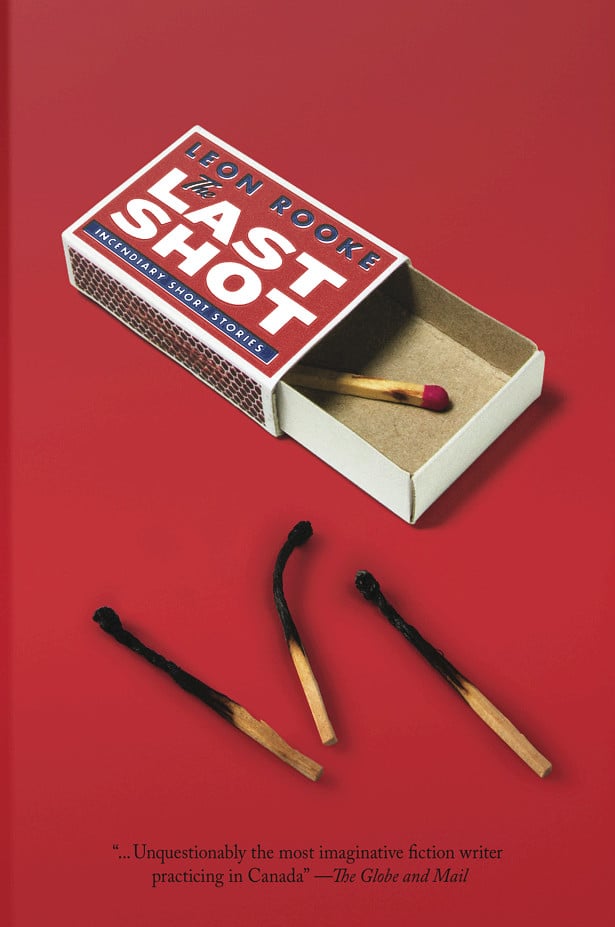
Michel Vrana’s Portfolio

Anna Green
Anna Green is a Manchester, United Kingdom based freelance book designer with Siulen Design. Prior to starting her own book design company, she spent six years working as a Senior Designer with Random House. She has an educational background in art and design and graphic arts.
“I started off as an intern at Random House UK and worked my way up to senior designer before going freelance in 2010. A love of books is essential. I’ve been lucky enough to work with some of my favorite authors and have discovered lots of new favorites along the way.
A good cover will distill the essence of a book. You’re looking to convey an element of the book (be it a central aspect of the theme, a more obscure detail or just a general feel) in a way that makes it both enticing and recognizable. Creatively, you tend to have more freedom than with a movie poster, but less than, say, an album cover. And you never want to reveal so much that the cover detracts from the reader’s experience.
There are a great many people whose visions of the book you are trying to fulfill: the author, the agent, the publishers, the booksellers, and of course the readers. It’s a fine balance trying to keep everybody happy.
Lastly, the cover design and print finishes need to work in three ways: they need to be effective on the bookshelf, be eye-catching at thumbnail size onscreen, and hopefully be lovely things to hold too.
My advice for new designers is this: read a lot, hang out in bookshops, generally get a feel for the kind of publishers you’re aiming for. Then do a bit of research to find out relevant design contacts for each publisher. Either send them a link to your website or online portfolio website, or printed samples. Cover projects are obviously the best thing to show, but other design samples are fine too, as long as you’re showing strong typography skills and fresh ideas.”
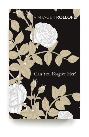
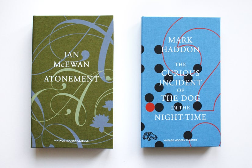
Anna Green’s portfolio
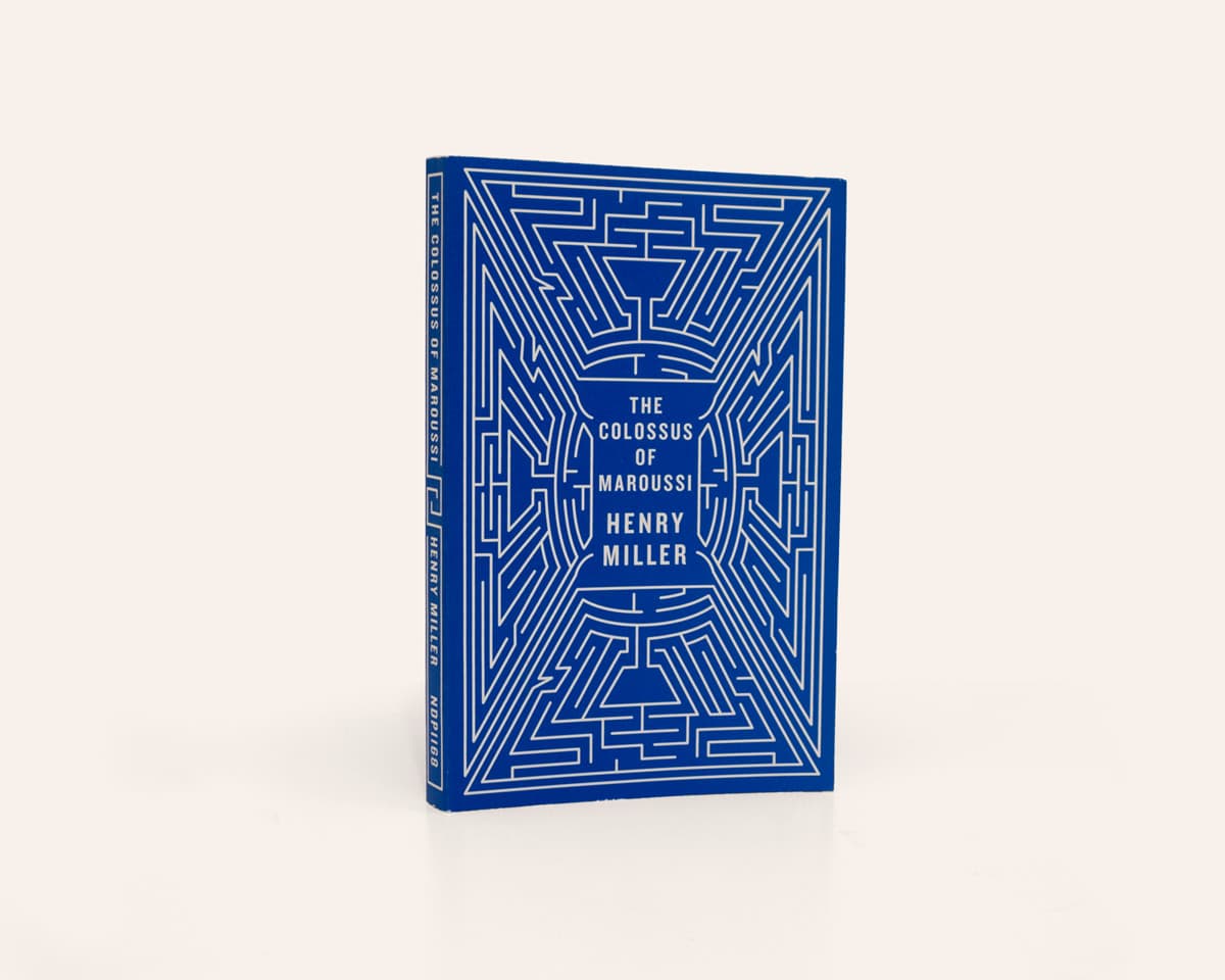
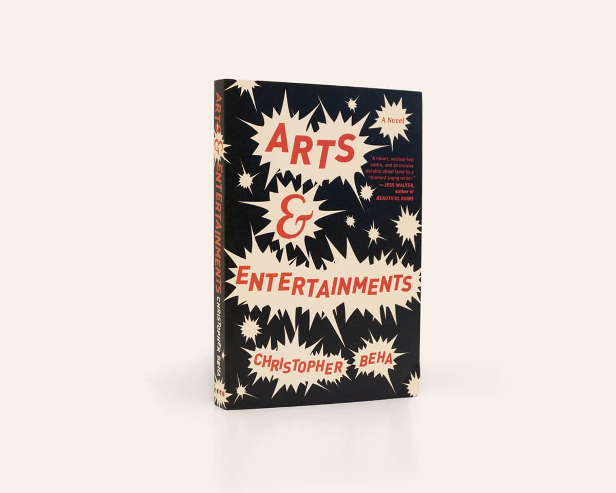
Steven Attardo of Ninetynorth Design
Steve Attardo is an art director, designer, photographer and educator based in New York. He works as the Design Director for W.W. Norton and Company’s trade book division. W.W. Norton is the world’s largest independent book publisher, and Attardo’s role includes leading and contributing to a team who create book cover designs for almost 200 books every year. Attardo also takes on freelance design projects, photography work, speaking opportunities, workshops, and other collaborative opportunities.
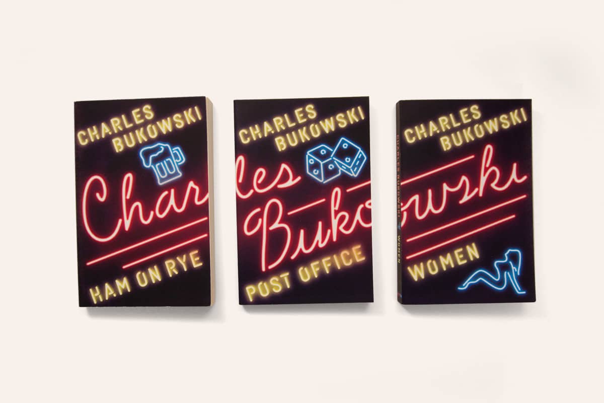
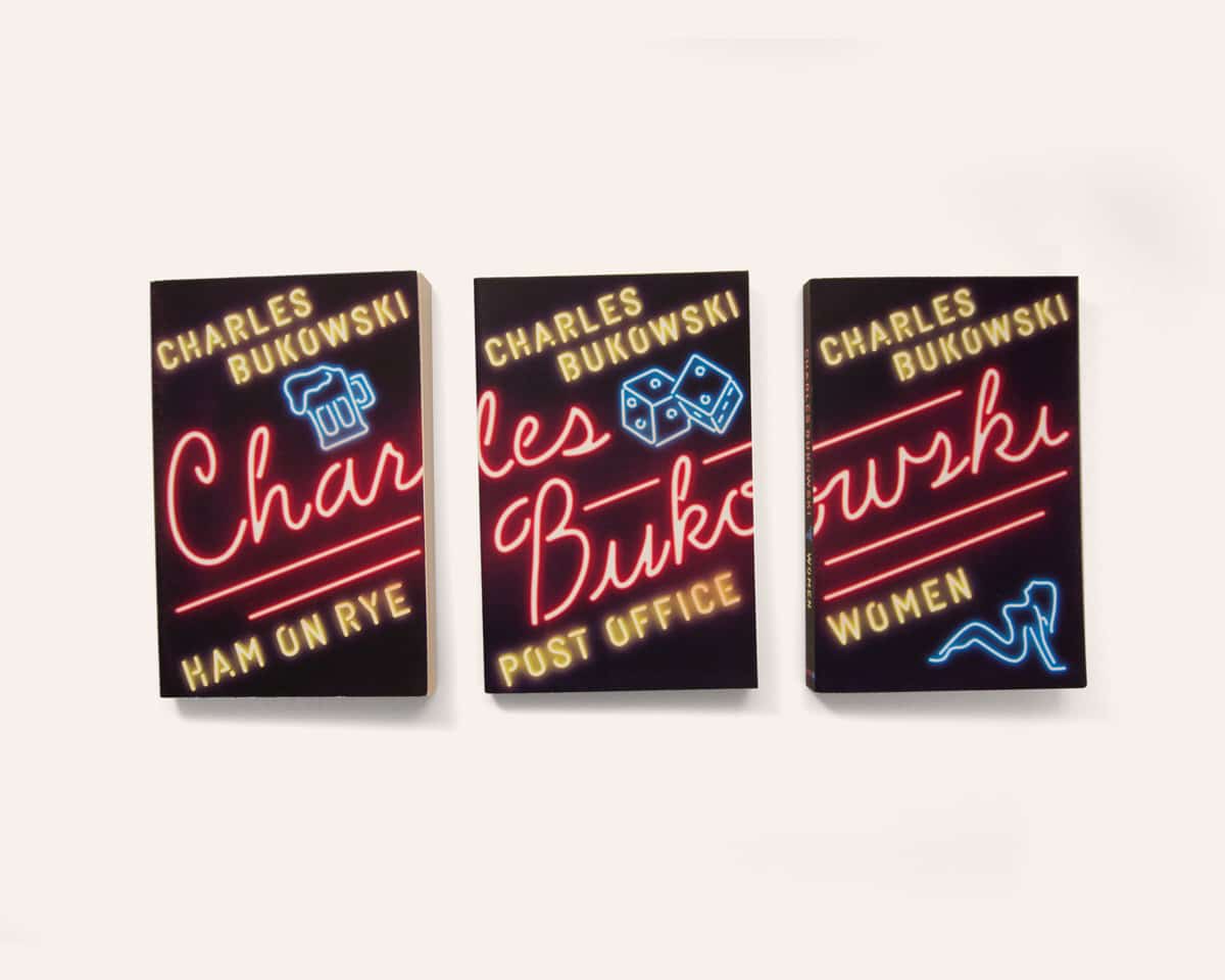
“I felt no pressure designing the Bukowski covers. Not really. At least, none that I don’t normally put upon myself. When I work, I believe the only way to create something genuine, unique, and authentic for the book is to study it as much as possible and really get to the guts of the story or the writing. The tone, narrative, and in Bukowski’s case his reputation, are all things I take into account.
The challenge here was less about telling a story and more about capturing an emotion. Add the fact that all three books were being published as a backlist series, and you have the juicy beginnings of a very fun project.
When I was starting off my career, I looked for every opportunity I could find that would allow me to learn from really smart people in their given field. It just so happened that my teachers and biggest influencers all designed amazing book covers or posters, and proved that the skill set of designing and communicating on a single surface was a skill that could cross over to every aspect of design.
There’s just something really special and alluring about being responsible for designing the face of a story, or the entry point into a portal to escape this world. It’s a privilege to sit in the seat us book designers are in and sometimes I forget how cool it can be.
At the end of the day, every designer faces the challenge between art and commerce. I’m of the mind that beautiful, original, unique, and eye-catching is always the best strategy to sell books and satisfy the designer in me. If, in the rare event all those at the table can agree what I’m proposing meets all those definitions, it’s not always looked at as something that guarantees sales. Far too often the uncertainty of selling books derails a great design. It leads to clichés and uninspired design.
If you want to get into book design, I’d say this: you have to love the process. You have to love the act of reading a manuscript and exploring ideas. You have to love the fact that every cover can look so many different ways and it’s your job to explore all of those avenues. You have to love making each and every type choice. You have to love looking for or creating the perfect imagery. You have to love the act of finding a way to give people goosebumps with your work, and you have to love that maybe a little more than you love getting covers approved.”


Martin Hinze
Martin Hinze is a graphic designer with a degree from the Savannah College of Art & Design. Hinze has worked in New York designing books for Columbia University Press and as a freelancer in Istanbul before settling in Germany.
“If you’re set on book design as your first job, I’d recommend a university press, where you’ll get to see all the aspects of book making. I got my start at a university press in New York. It was a good place to start. You get a great variety of book genres—minus fiction—sometimes with crazy titles and concepts. Otherwise, there are plenty of publishers around. Find them, figure out what types of books they do, and go talk to them.
The first step when designing a cover is always to understand the core idea of the book. Once you have the concept clearly isolated, then you can start thinking about visual solutions. Ideally you would read the book, but that rarely happens for me. Instead I get a summary, ask questions to the editor or author, and then expand my research. By then the title usually becomes clearer and may give additional clues as to the intention of the author. The aesthetic itself is both dictated by the book’s core idea and the book’s desired audience. Every audience has their preferences and expectations, and sometimes you can shake it up a little.
Challenges are many and varied. It can simply be the required use of really bad art, or an incredibly long title with subtitle—preferably with multiple authors. Or sometimes it’s seeing your prized cover design being changed into a mess, small change by small change.
Or it’s a person who designed their cover in Microsoft Word and wants you to recreate it. When I say recreate, I mean 1:1, no wiggle room. This generally happens with authors. Some authors have more influence on the design than others, but recreating a cover is an extreme case and has only happened to me twice so far.
Usually you may get a few images or ideas from the publisher after they’ve talked with the author and amongst themselves. Sometimes you’re told what not to use (‘No holding hands’, ‘No globe’, etc.), and I always try to add a sketch that’s outside of what they want. You never know, once they see it, they may go for your idea instead of their preconceived one, and then everyone is happier.”
Martin Hinze’s portfolio
