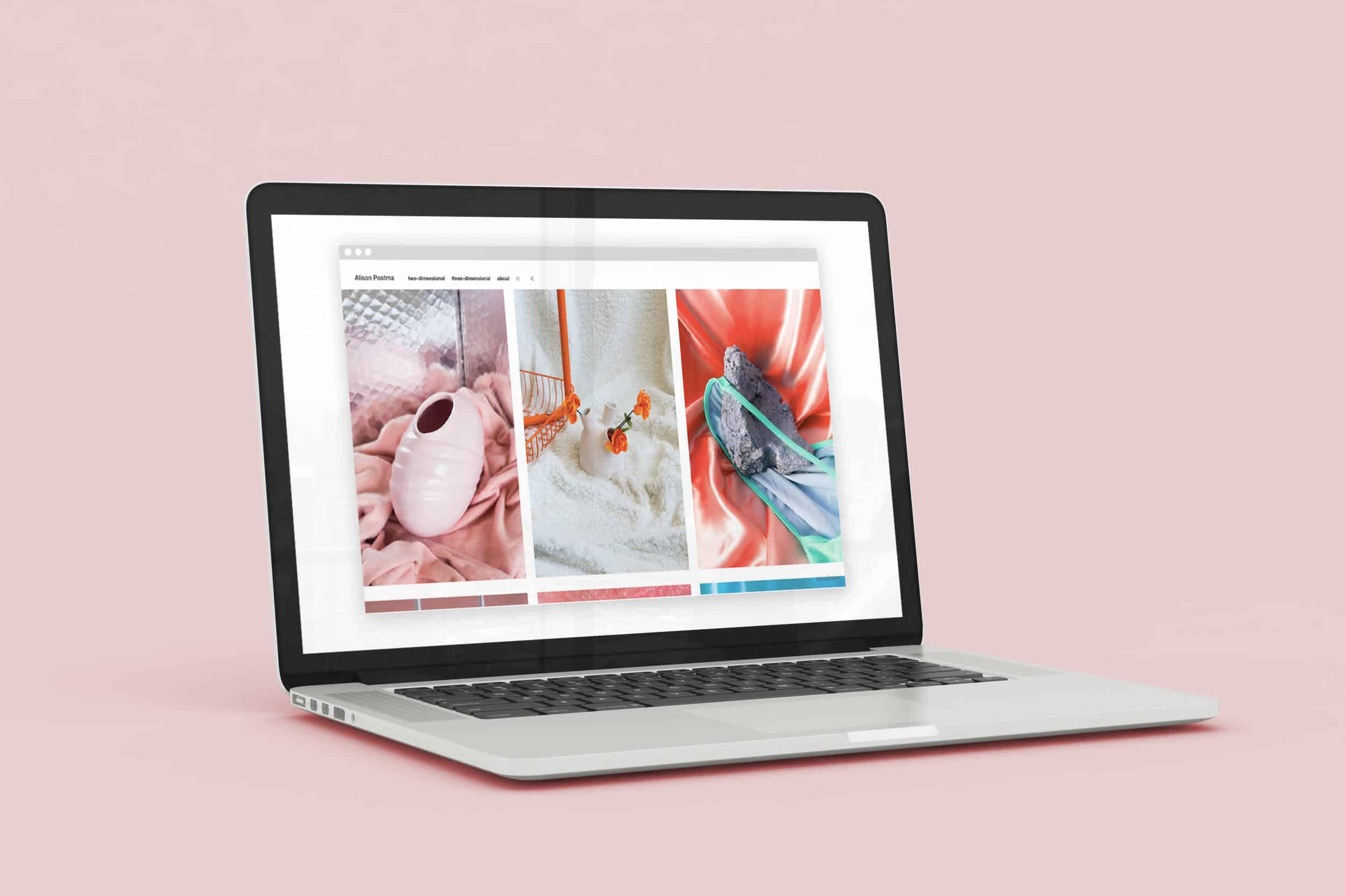
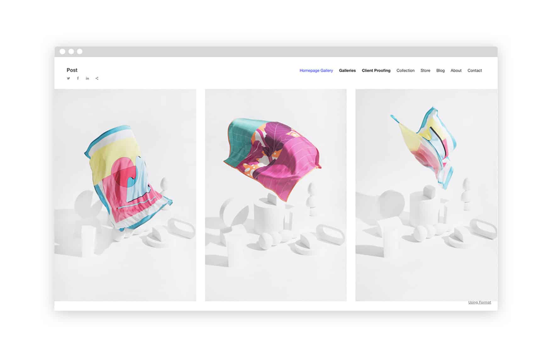
For our latest theme, Post, we teamed up with Toronto-based artist Alison Postma to create a unique update to the classic grid-style website layout. “We wanted to create a theme that would reflect her sensibilities,” says product manager Garry Ing. Ing and Postma worked together on this new theme, which is influenced by Postma’s creative work.
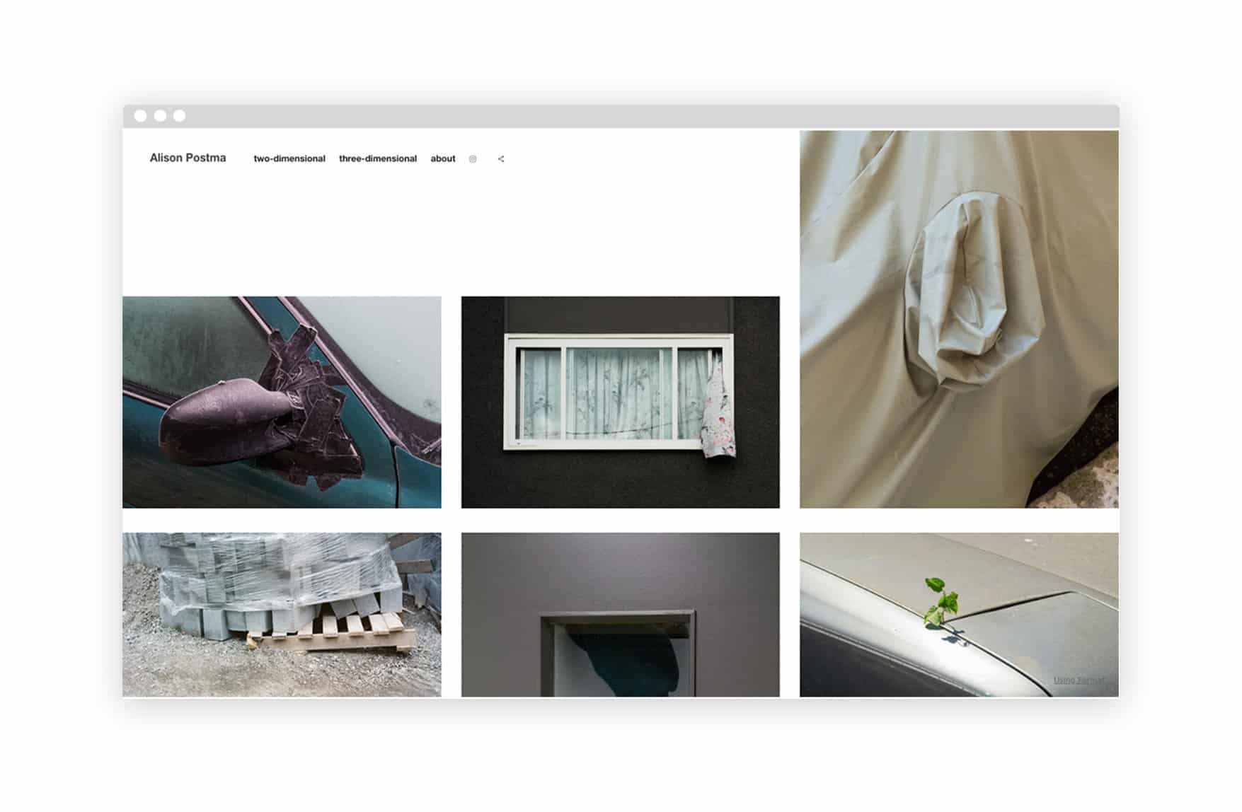
Combining photography, sculpture, and installation, Postma’s artwork inspired a non-linear theme that makes creative use of white space. “We asked her to bring in work, and she brought in prints,” Ing says. “We tried to do this sorting exercise to find out how projects fit, whether there were sorting qualities that were the same.” The physical process of sorting through images made for a theme that has a tactile feeling, like an online representation of prints spread out on a table.
Designing a theme was a new experience for Postma. “I didn’t really know what to expect going into it, and I think neither did Garry,” she says of the collaborative design process. “It was kind of a new thing. But it was definitely fun.”
“We met and just kind of talked about what the process would be and then the next time we met I brought a bunch of images of my work that I would be putting on my website so we could visualize what we thought would make sense. And then we went from there. It was pretty collaborative. I had ideas about what I wanted in a theme, but obviously Garry being the technical person, had to say things like, ‘No we can’t do that’, or ‘Yes we can do that, but we have to do it this way,’ kind of thing.”
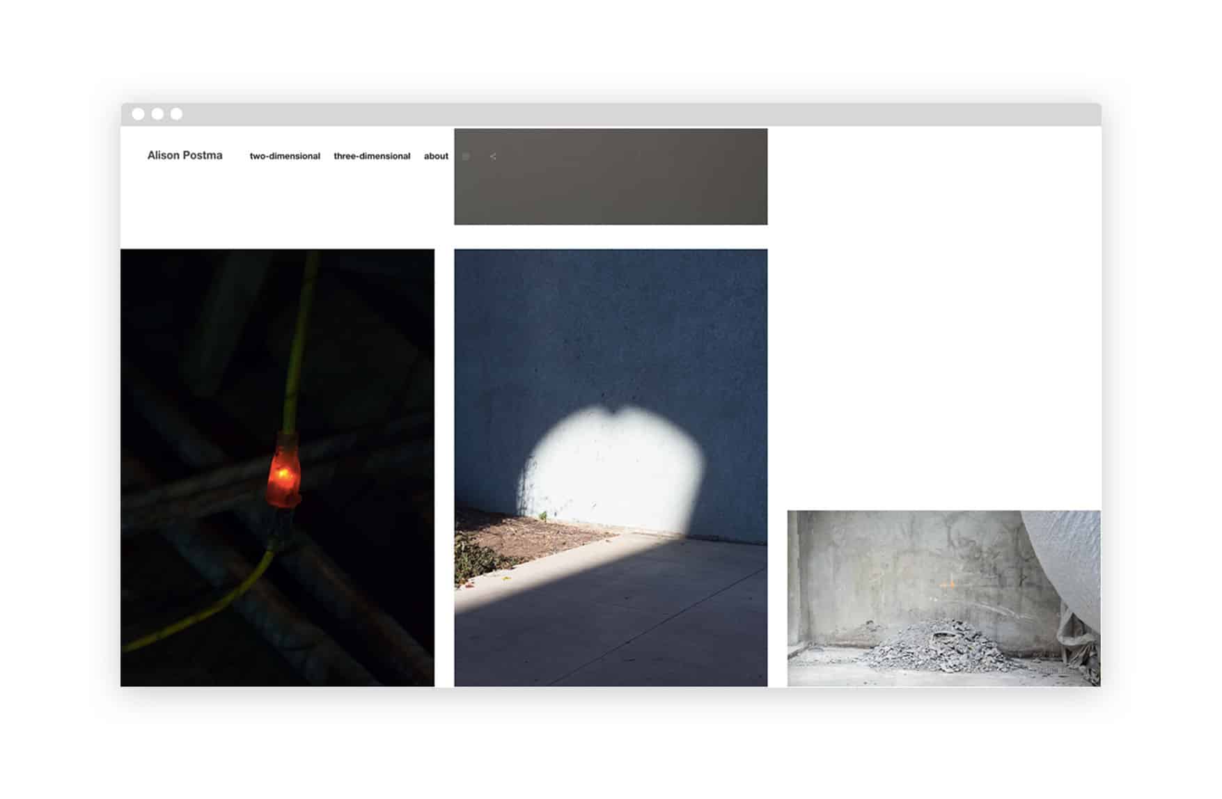
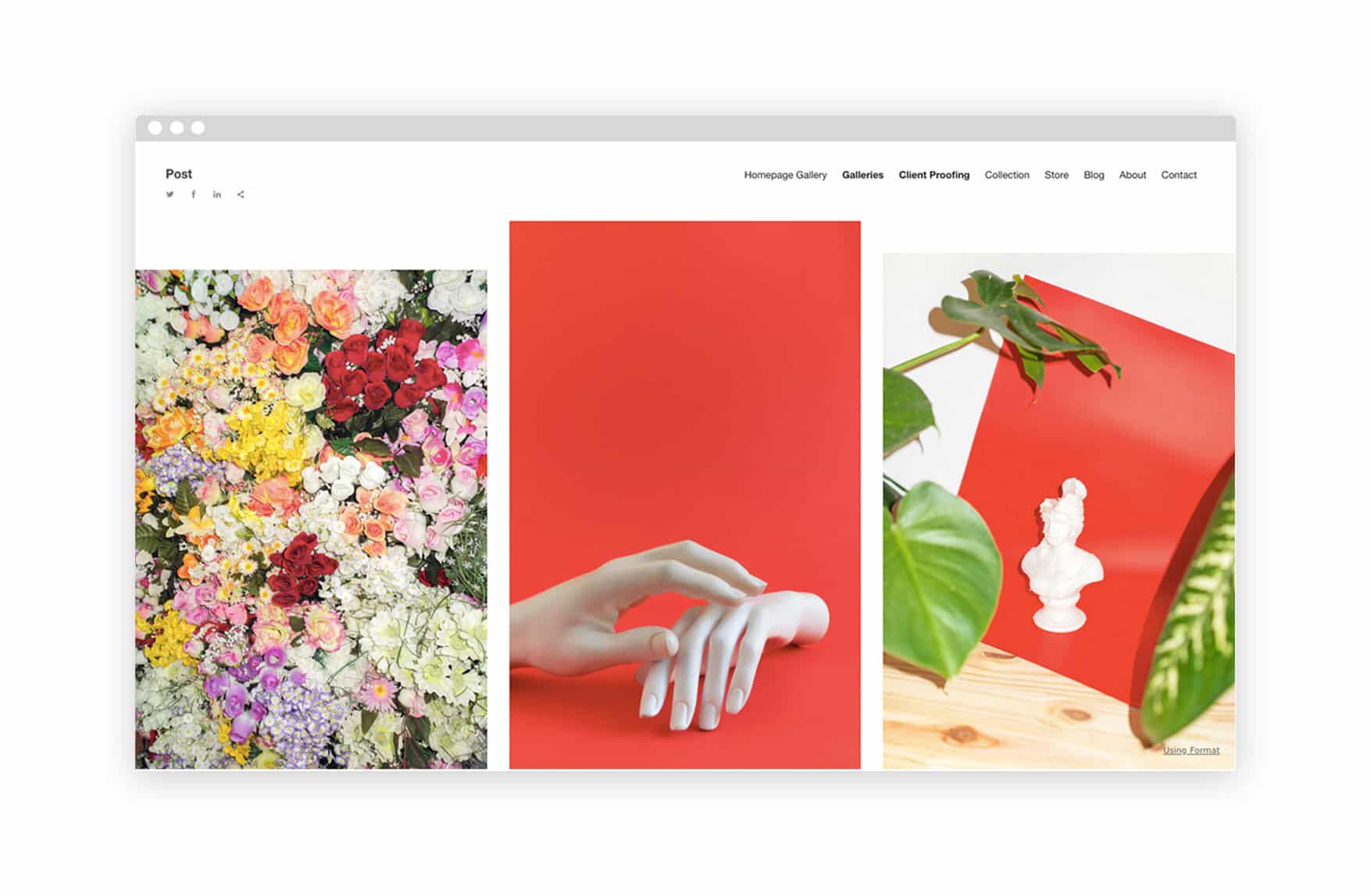
Ing emphasized that the non-linear rhythm of white space that Post creates sets it apart from other website layouts. On Postma’s personal website, this layout lends a unique feeling to her image galleries, and mirrors the practice behind her creations as well. “The stuff that I make is kind of an assemblage of different parts,” Postma says. “Right now that’s coming out in photographs, so it’s still life photographs with a mishmash of different objects. I was drawing from that when I was thinking of things I’d like in a theme—an assemblage of different parts. It was important to see multiple images on one page, not just a single image view.”
Post has some other special features as well. Its streamlined header menu neatly drops down to allow for easy navigation to a variety of pages without any disruption to the design of the site. And while the focus of Post is on sharing multiple images in one gallery, clicking on a single image will bring it forward, blurring the rest of the gallery, meaning that viewers can take in the full picture of a project but also easily zoom in on the details of one piece.
You can try out Post for yourself now. Be sure to tag us @useformat on Twitter and Instagram if you share your new Post site—we’d love to see what you build.
More website design inspiration:
How Pottery Inspired Our Latest Website Theme Design
6 Photographers with Unforgettable Website Splash Pages
11 Artists Keeping Collage Contemporary
