A creative splash page can make a huge difference in how visitors perceive your website and your work. The very first page people see when they click on your URL, a splash page acts as an introduction to your website, a little preview of your creative work.
Splash pages can be totally text free, or they can feature a menu allowing visitors to instantly navigate to different areas of your site. A splash page might have a brief bio about you on it, or simply your name, which provides a link to your actual website. The best splash pages offer a strong first impression of a creator’s work without too much text, acting as a visual teaser of the content to follow.
Splash pages aren’t a must for every creative website, but they are a great option to add personality and a professional feel to your online portfolio website. These six photographers all have beautifully designed splash pages that make for unforgettable visual additions to their websites. Each of them is minimal in the best way possible, going light on text but heavy on impact.
Here are five inspiring splash page examples, and tips for how you can use these ideas on your own splash page. And find even more online portfolio inspiration in our giant roundup of the best websites made using Format.
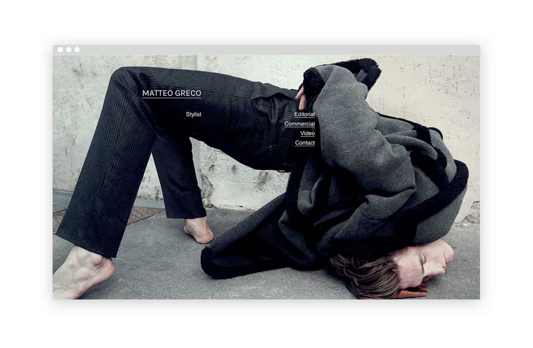
Be playful with composition
On his splash page, fashion stylist Matteo Greco creates a fun composition out of an interestingly-posed image and some well-placed links. Adding links to your splash page is a handy way to help visitors navigate quickly to your work. Take a cue from Greco’s website and get creative with where you place them, and your links will add to the design of your splash page rather than detracting from it.
Build atmosphere
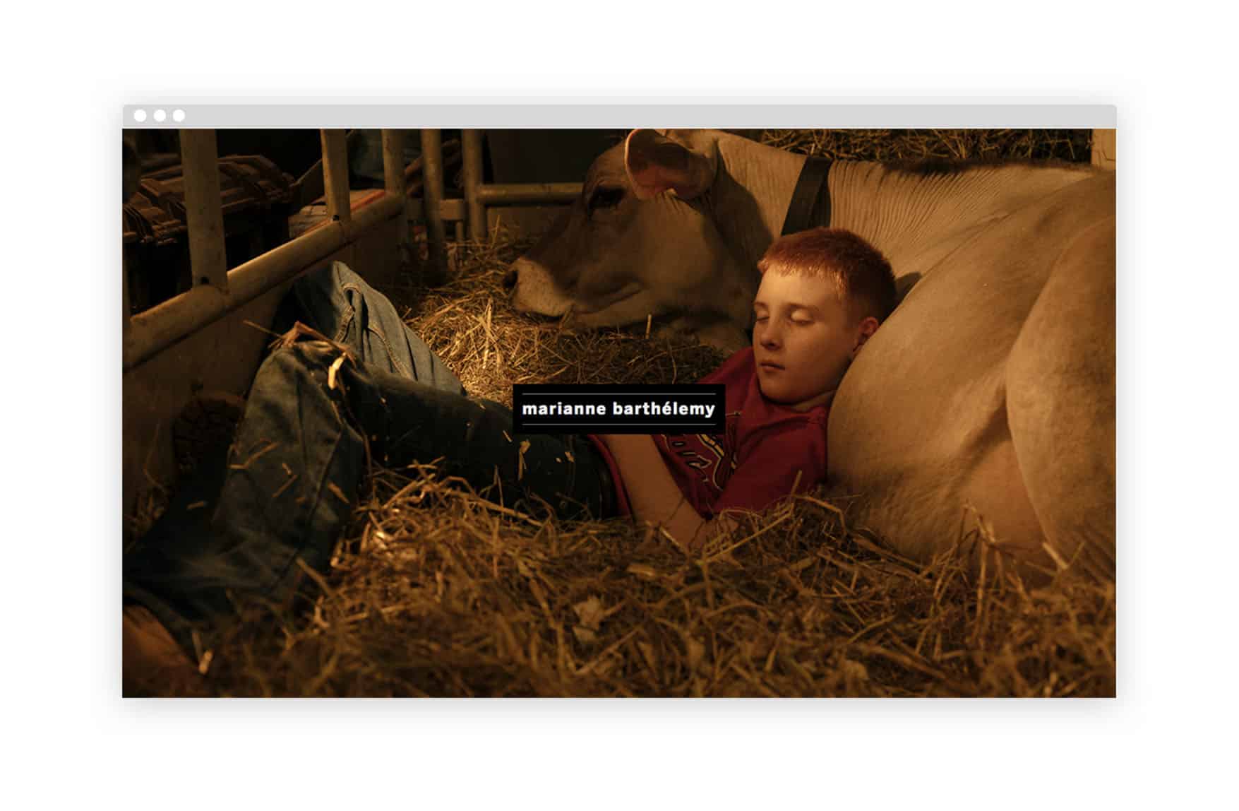
Photographer Marianne Barthélemy uses an image on her splash page that instantly piques the visitor’s curiosity. This beautifully-lit portrait of a boy sleeping in a barn seems to be part of a larger narrative, and leaves the viewer wondering what other images might be part of the story. Selecting an engaging image that draws the viewer in is always a good choice for a strong photography-based splash page.

Create contrast
The beautifully composed profile portrait on Damian Borja’s splash page makes for an ideal introduction to his photography, which tends to be polished and perfectly lit. The rich colors in the photo contrast well with the simple bold white text. A vibrant photo is always a good choice for your splash page, as the bold colors will instantly catch viewers’ attention. Even if you prefer to shoot black and white, choosing a high contrast image can be a good option for a memorable splash page.
Keep it simple
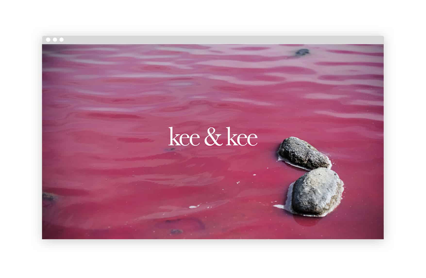
On their splash page, photographer duo Kiki Rigters and Karen van Duijvenbode use a simple yet eye-catching pink-hued image to set the mood for their website. Dreamy, pastel-colored imagery is the focus of Kee & Kee’s photo portfolio; this combination of a classic serif font and a minimalistic image is perfectly in line with their aesthetic. Consider the look and feel of your website overall when you select a splash page image, and remember that a simple photo can be just as much a good choice as a more detailed one, depending on the mood you want to create.

Go in for a close up
Photographer Amelia J. Dowd opts for a close-up portrait image on her splash page. The lush detail of this shot is a great introduction to Dowd’s work, enticing the viewer to click through to see more. If portraits aren’t your thing, a close-up of nature, a detailed product shot, or a well-composed still life are all other strong options for a zoomed-in splash page image.
