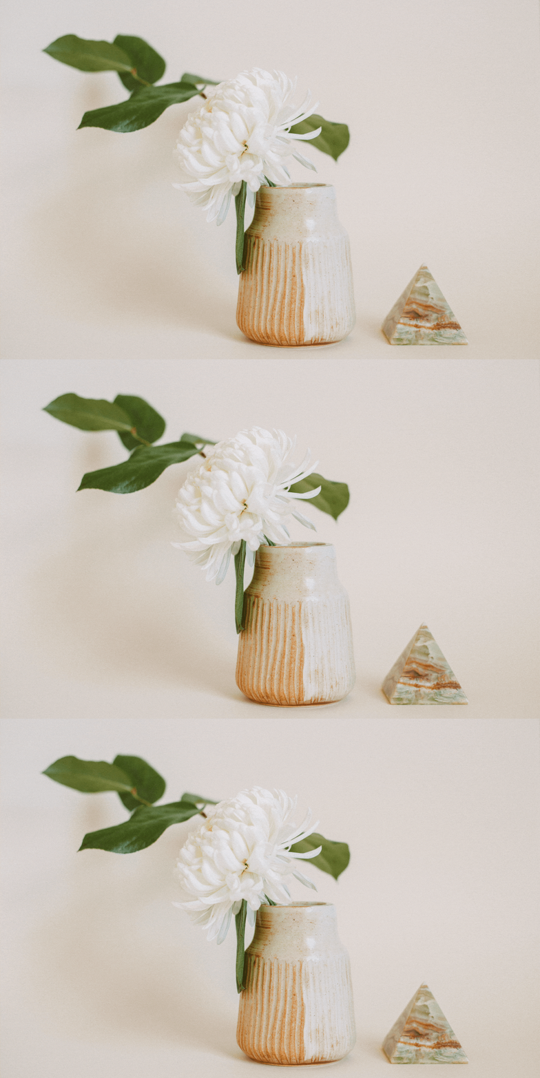
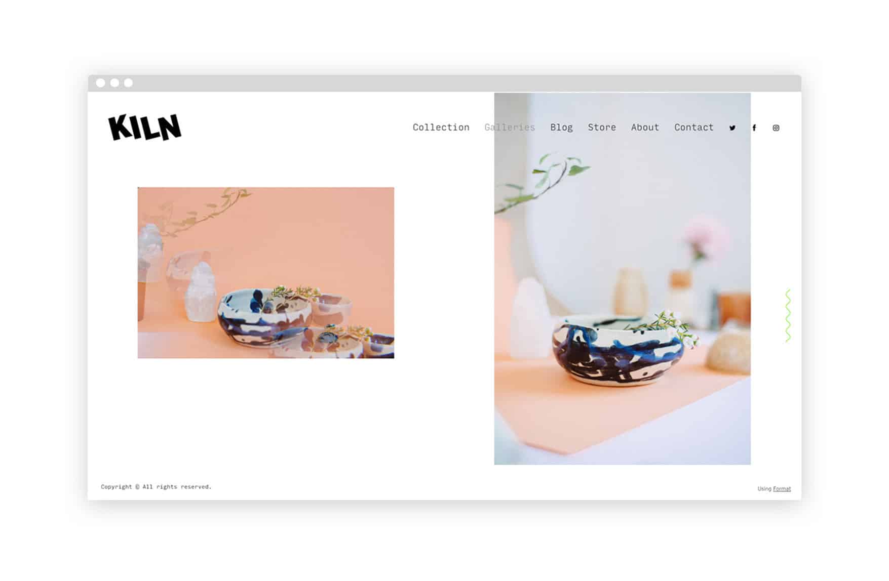
It probably doesn’t come as a surprise that pottery inspired our newest website theme. It’s titled Kiln, after all, and its sample images are a collection of handmade ceramics. But this theme’s theme isn’t just a fun idea—the pottery featured is actually the personal work of the designer who created the theme, and the photos were shot right here at Format by a photographer on our team.
As a front end developer at Format, Laura DeGroot typically develops themes. In her spare time, she makes pottery, and she’s also become interested in design—so when she decided to both design and develop a new Format theme, she drew on the quirky, handmade aesthetic of her artwork to give Kiln a unique personality.
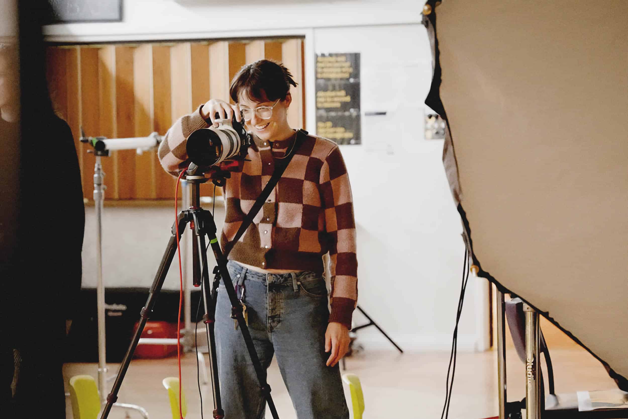
Many of Format’s team members do their own creative work outside of their day job; often this artistic experience ends up informing what they do at Format. As a photographer and a member of Format’s customer success team, Nicole Dee brings her creative perspective to helping people get their websites looking their best. “I made a joke one day about how I should shoot her pottery for the demo site,” Dee says of DeGroot’s Kiln theme. “It was a joke that turned into reality! We just kind of took that idea and ran with it.” The two decided to team up to photograph a selection of ceramics for Kiln’s demo site.
“We really put both of our aesthetics into the shoot,” says Dee. Gemstones and nature are major inspirations behind the Kiln aesthetic; the theme has a dreamy, 1970s feel that Dee describes as a “fantasy world.” She usually shoots film photos, but for this shoot went digital, making use of a 70s-era lens filter passed down from her grandfather to give the images a prismatic look.
To share some more insight behind how the Kiln theme itself was made, we sat down with DeGroot to talk about the challenges of creating a website theme and what the design process was like.
Format Magazine: What was the first step of creating the theme?
Laura DeGroot: I think I just had a vibe that I was going for, which ended up being demonstrated through how the collection page works: a random, masonry kind of feeling. I’ve never landed on the actual word to describe it, but a random, scrapbook-y feeling was what I wanted to accomplish. We had thought about this before, but it was kind of a technical challenge to make it look intentionally random when a user could add any size image and any variation of images. So it was just something that we hadn’t accomplished before that I wanted to try.
And it was a unique situation because I had never designed a theme before. I took a UX course recently, and I told Garry [Ing, product designer at Format] that I was interested in helping out with designing a theme. He was open to letting me do a theme, which was so awesome.
What was the design process like?
I made a mock-up of what I would want a collection to look like and brought it to Garry, and we talked through the technical issues that might come up; what the possibilities were; how he felt about the way that it would look. Then we just went through a few more iterations of that. He asked me to make like a mood board of inspiration of different sites that looked and felt the way that I was hoping to make the theme look and feel.
I was kind of learning what the design process was while we were doing it. I made a mood board for Garry to help me distill from those images what I was trying to accomplish. Then we just went and back and forth while I narrowed down the theme.
When I had a good deck ready, which was previews of what the store would look like, the gallery would look like, the collection would look like, the contact pages, everything, including the header and all the different header states and logo states, I presented that to the product design team. They gave me their feedback, and then because I was designing it, there wasn’t really like a handoff that had to happen to the developer.
Usually outlining what your expectations are as a designer, and communicating that to the developer is a tricky part of the process, making sure that communication happens. But I knew I could just sit down and build the theme, and I made some changes to it on the fly while I was building it—because there was a technical challenge or something—and I could just do that. It was really awesome to have that freedom.
What kind of sites were you inspired by?
I was really inspired by Brutalist styles. The logo rotation was inspired by a Format user who hacked her own site. Well, not hacked, but she made custom CSS to force the logo to rotate.
My argument for it was it would be a cool opportunity for users to make art with their site. I also wanted to have a sideways navigation, which this user did in her site, but it ended up being I think a little bit too complicated technically. Maybe one day we can do that, but it was kind of hard with this theme because I was arguing for things that maybe a lot of people wouldn’t be interested in. Like the random layout thing, some people just might not be down for that at all. So it was kind of a challenge to have those options in the theme, but also make the theme be able to be normal.
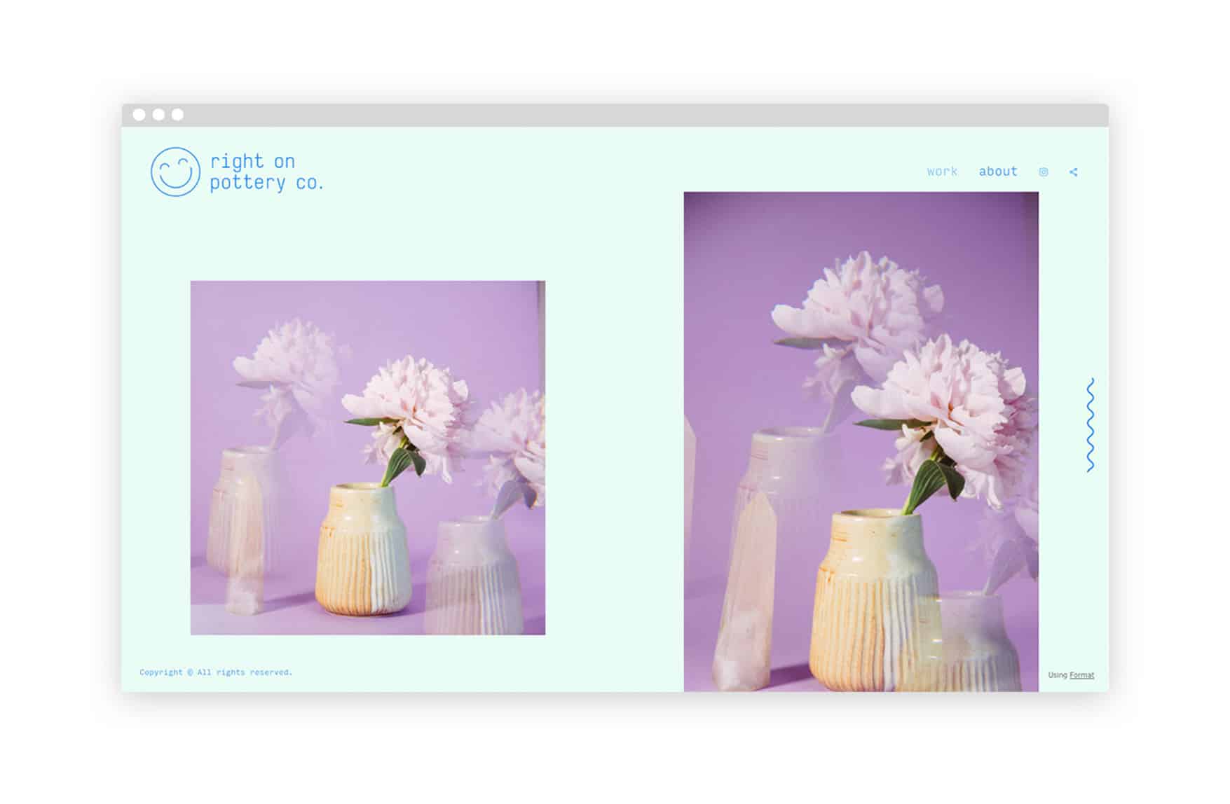
DeGroot’s ceramic work at Right On Pottery Co..
How do you balance that? This desire to add these creative touches and make the theme kind of different—but then also keeping it simple for those people who want simplicity.
I think we are lucky that we can work with variables, so people can make their theme into whatever they want. It was nice to that have the option to make it weird if you wanted, and it seems like a lot of people have done it, which I’m so excited about.
I went through just the list of all the Kiln users, and most of them have done some rotation with their logo, which is so exciting. I thought maybe people would go, choose a theme and then, when you pick a theme, it shows your content in that theme and I thought they would immediately see the logo thing and be like, “That’s weird. I don’t want that,” and be turned off by that because it’s kind of weird. But it seems like people have really embraced using it, which makes me super happy.
What’s it like seeing the different websites people have made? Are you surprised by things people have done with Kiln?
Yes. Yes, I didn’t expect people to use the logo rotation so much, but it’s so exciting. I almost cried the first day—because we launched it and then I went on vacation for a week. When I came back, there were like, 100 users using it.
I was looking at them all and they’re so beautiful. People are so creative, and making Kiln look ways that I never would have expected! That felt really nice.
Were there any challenges you didn’t expect being on the design side of creating a theme?
I think trying to stick to my original vision when I had the ability to just scrap stuff was kind of hard, as I was developing it and being like, “This thing is hard, like I’m just going to alter the design.” It was kind of hard to make sure that it would come out looking how I had envisioned. This gave me more empathy for designers, in a way, because I could feel that attachment they feel to their designs a little bit better. But also being able to weigh pros and cons and be the person in charge of that decision made it easier too.
Are there any other crazy features you’d want to add to future themes?
It’s not a crazy thing, but the logo font size right now has like a max font size of 60 pixels and I want to be able to make it huge. I wanted the Kiln demo site to have a giant, like 130 pixel logo. I think these big, heavy, black text logos would be super rad. That’s something I want to add, for sure.
I don’t know what the next thing will be, but it’s fun to add those little quirky things, like the little squiggle. That seemed like everybody’s favourite thing, at least on the team.
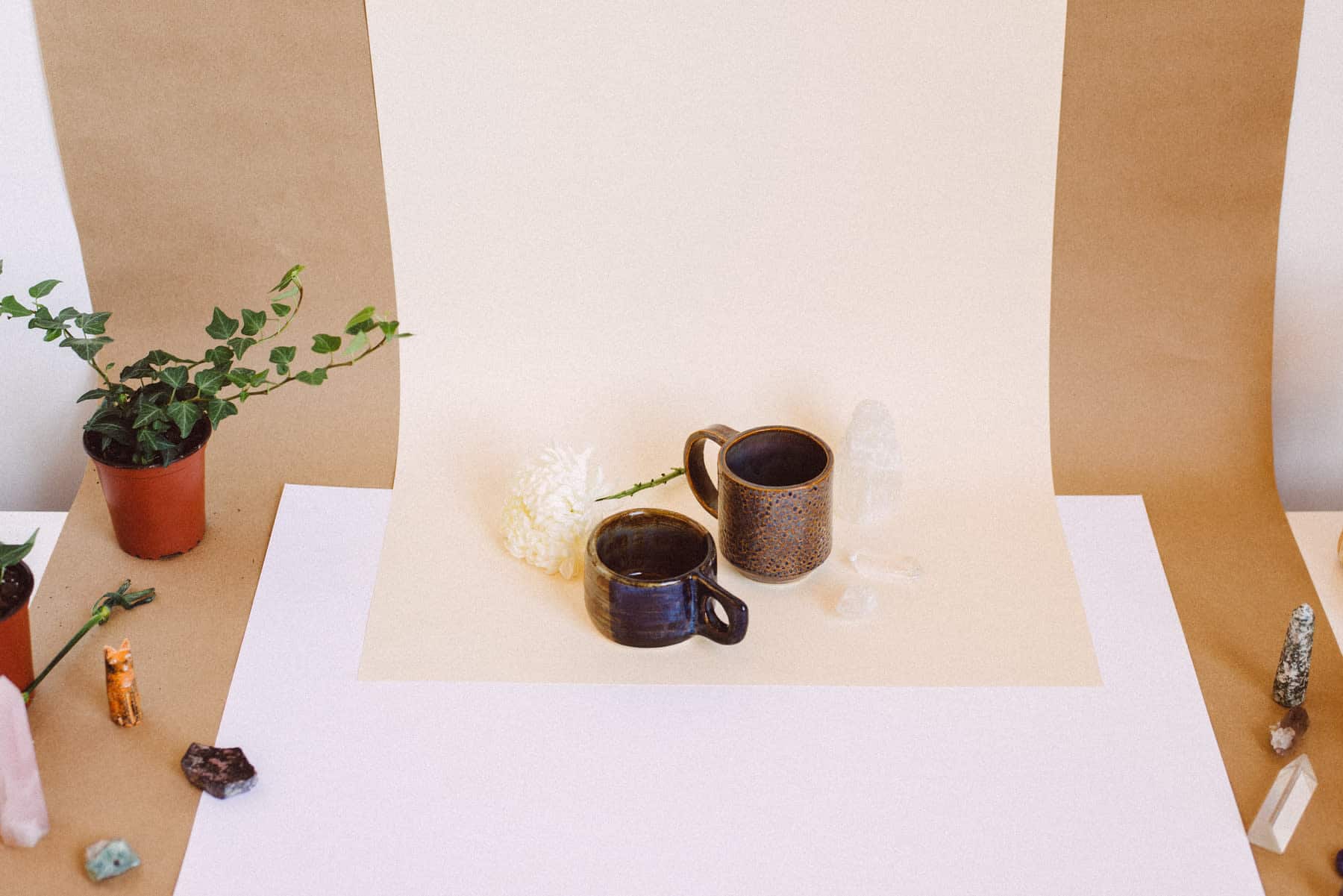
Behind the scenes at the Kiln photoshoot.
See more of Laura DeGroot’s pottery design work at her website, built using Kiln, of course, and find Nicole Dee’s photography at her website, built using Format’s Panorama theme.
