Building an impressive, effective website can feel daunting, especially if you are new to web design and aren’t sure where to start. Whether you’re a photographer, a visual artist, a graphic designer, or dabble in a little bit of all of the above, you’re going to need a beautifully designed, professional website to attract clients, land projects, and grow your career. Luckily, website templates offered through a website builder can help you get a head start on your website design, and take some of the confusion out of the design process.
To help you dive into the website design of your online portfolio website, let’s look more closely at the design elements needed to create an impressive website. Having a strong sense of the elements of a website, and how to use them effectively, will give you the tools you need to create a stunning site for your work. From your site’s color scheme to the layout to SEO, our comprehensive guide to website design will help you get started.
The Eleven Elements of Good Website Design
A thoughtful, detail-oriented approach to web design is important because it affects how visitors use your site. A positive user experience of your website is due in large part to the overall design and how it guides visitors through each page, highlighting your professionalism and presenting your work in the best light possible. With so much online content, it’s not enough to simply throw your work up on a website and hope for the best. To impress your clients and land your next project, make sure you include these eleven website design elements:

A Bold, Limited Color Scheme
When it comes to web design, a strong color scheme will help your site feel cohesive and polished. Rather than select a bunch of random colors, be specific and thoughtful with the color scheme on your website. Opt for two to three main colors for your website, as well as one to two secondary colors. This way, you have several colors you can use in your website design, but it is still limited and intentional.
Consider your brand when you decide on your color palette. Maybe you notice a lot of your photography has black, grey, and dark blue elements, so you decide to use these colors as your main palette. Or perhaps you tend to gravitate you white, beige, and pink in your visual art, so these become the primary colors for your website.
Many web designers will go for one to two grounding colors, such as white or black, and use one to two brighter or cooler shades as accents to create the site’s palette. Look at the color scheme used by brands that you like and notice how they integrate a primary color with accent colors. A simple but specific color palette for your website will give you the flexibility you need to be creative, without overwhelming visitors with too much color.
A Semi-Flat Font Design
A flat font design does not give the perception of three dimensions, or shadows. Thanks to major brands like Apple, flat font design has become the ideal approach for web design, as it is easy to read and loads quickly. This design approach can create a more positive user experience, whether someone is reading the text on your website on their phone screen or on desktop computers.
Many web designers also like a flat or semi-flat font design because it allows the other elements of a website to shine, such as the color palette, the graphics, and the layout. If you don’t love a completely flat font design, you can add subtle shadows and dimensions to the font so there is an element of depth, without going overboard.
Large Portfolio and Product Images
When it comes to the images on your website, go big and bold to catch the visitor’s eye. For your Portfolio page, curate your best content and make sure you include large images of your work for visitors to see and appreciate. They should be high-quality and well lit, so you may decide to hire a photographer to help you or invest in photo gear to take your own portfolio images.
If you plan to have an online shop page, go for large, high-quality images of products such as art prints or other merchandise. B2B customers are often expecting large product images so they can see the different features or details of products when they’re shopping.
Many website builders have a shop option you can add to your website template to make it easy for you to set up your online store and sell items directly to customers on your site.
User-Friendly Navigation
One of the key elements of good website design is a site that is easy to navigate in a few clicks, with no roadblocks, dead links, or confusing pages. To make sure your site’s navigation is user friendly, create a site map that covers every page on your website. Use the site map to help with the layout and organization of your website. Check that your site map accounts for the user and considers how accessible it is for users to navigate your website, finding each page or element with ease.
A Hamburger Menu
A hamburger menu, sometimes called a hidden menu, is a great way to organize the different web pages on your website, especially if you have a long list of options. A hamburger menu gets its name from its appearance, where each option listed in the menu is stacked on top of one another like a hamburger.
Nearly every website built in the last several years uses the hamburger menu, as it saves valuable screen space on your site. It also creates a clear path for a visitor to take and makes site navigation smooth, and distraction-free. After all, when it comes to site navigation, you want to create a positive user experience where they can find the information they want quickly and intuitively. This menu style will certainly help you do this.
Comprehensive Card Designs
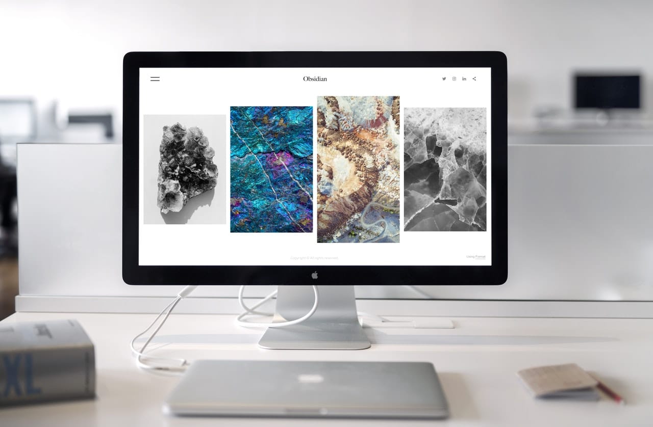
Card designs are a design element where the content appears in the shape of a card, with an image and a small amount of text. This approach is appealing to users because it breaks the content up into bite-sized pieces that are easy to understand.
For your website design, break up the content on your Home Page into design cards so users can choose which content they want to engage with or expand. This will keep your Home Page clean and organized, with just the right balance between the image and the text. It also allows you to list multiple products or links to other pages side by side without too much clutter.
Make sure your card designs are responsive, where the number and size of cards displayed adjust as a visitor makes the screen size smaller or larger. This will ensure they appear correctly and your site doesn’t look glitchy or unpolished.
Well-Placed White Space
White space is a term used to note the amount of empty space on your website. White space is a great design element because it acts as a buffer between the elements on your website, such as the sidebar, the web content, and the images. It creates some breathing room and prevents your site from feeling crowded or cluttered, making it user friendly for a website visitor.
Try to integrate white space in your overall website design, placing it between different design elements on your landing page to create room to breathe or between images and text to avoid clutter. Depending on how minimal you want your website to be, you may decide to include more white space to give your site a polished and clean look.
Responsive Hero Images
A hero image is an image that is used as a key focal point on a website, acting as a visual anchor for visitors. Hero images are often large and take up a large section of a web page. They should be visually compelling and tell a story, drawing a visitor into the site.
A hero image is a key website design element because it ensures your site is responsive and engaging to visitors, whether they are viewing it on their phone, tablet, or desktop computer. It also gives visitors a sense of the mood and tone of your website right away, encouraging them to engage and scroll down for more information about you and your work.
High-Quality Background Videos
Grab the attention of potential customers with a video that automatically plays in the background on the landing page of your website. This feature has become more popular, speaking to the rise of video marketing as a key element of web design, and a great way to draw visitors in.
Many web designers will hire a videographer to create a background video, or invest in video gear. You can also use website templates made specifically to showcase video content. The video should tell visitors more about your brand or business, as well as your approach as a creative person in your industry. Most videos are short, featuring images of your best work, with no audio or an option to turn audio on and off on the video.
A Strong Call to Action
One of the most important elements of a good website is the ability to connect visitors to your work. You may also want to connect them to the products on your online shop, the services you offer, your latest blog post, or your contact information.
To make these connections for users, you need to include strong calls to action (CTA), which are short 1-5 word declarative statements that guide users and compels them to act. Treat calls to action like the opening of a conversation, and think about how you can reach a user in the fewest words possible.
For example, you may include a call to action on your Homepage to connect users to your blog posts like, “Check out my latest post,” or “Find out more on my blog.” Or you may use one for your online shop like, “Browse my latest prints,” or “Shop for original art.” You could also create one for your social media to encourage users to follow your accounts, such as “We’re social, follow us,” or “Follow us for more.”
SEO-Boosting Content
SEO stands for search engine optimization and is a crucial tool for increasing traffic to your website. Search engines like Google are programmed to respond to well-designed websites that use SEO in their web content, often bumping them higher up in search results. Including SEO-boosting content can increase your visibility on search engines and drive traffic to your site, a definite plus for your business or brand.
Many website builders will have SEO features and tools that make it easy for you to pull the top searched words that relate to your field or business, and provide tips on how to integrate them into the web content on your site. You can also include SEO in the backend coding off your pages and posts, such as meta tags, title tags, and HTML coding.
Ready to Build a Successful Website?
Creating a stunning online portfolio website requires some thought and research, integrating the design elements noted above. Now that you have a better idea of the essential elements of a website, you’re likely ready to try your hand at creating your own. Whether you are a business owner or a designer, having an online portfolio will help you take your career to the next level.
When it comes to building a great graphic design portfolio website, you need a reliable website builder that can help you create a professional online portfolio easily. Format allows users to build and customize their site in just one day. You can even edit your site on-the-go with the iOS app and add special features like a photo proofing corner, a blog, and an online store.
Sign up for Format now and enjoy the first 14 days for free. Afterward, you can continue using Format for just $7 a month!
Want more tips on building a successful website? Check out these articles:
19 Website Navigation Design Examples For Your Online Portfolio


