It was after attending a typography conference in 1994 that design historian and educator Teal Triggs noticed the lack of women working within the font world. Remembering that moment clearly, she described it to writer Madeleine Morley in “The Women Redressing The Gender Imbalance In Typography”:
“At the end of the day, all the speakers were invited onstage for the last round of applause. It was at that point, when they were all visible in front of us, that we noticed the line-up was all white, middle-class men, many with glasses.”
Not only did that observation lead Triggs to ask where all the women were, but it convinced her and fellow designers Siân Cook and Liz McQuiston to start WD+RU (The Women’s Design & Research Unit) in response. It’s an initiative that attempts to shine some light on the inequality Triggs saw up there on the stage. WD+RU is only one of many projects aimed at supporting women and their work within the design, and specifically, typography world.
While studying at Beckmans College of Design in Stockholm, art director and photographer Kimberly Ihre also found herself stunned by the lack of information on women while researching typographers. So, like Triggs, Ihre decided to turn her frustration into an opportunity for change, and in 2015, launched the online platform Typequality.
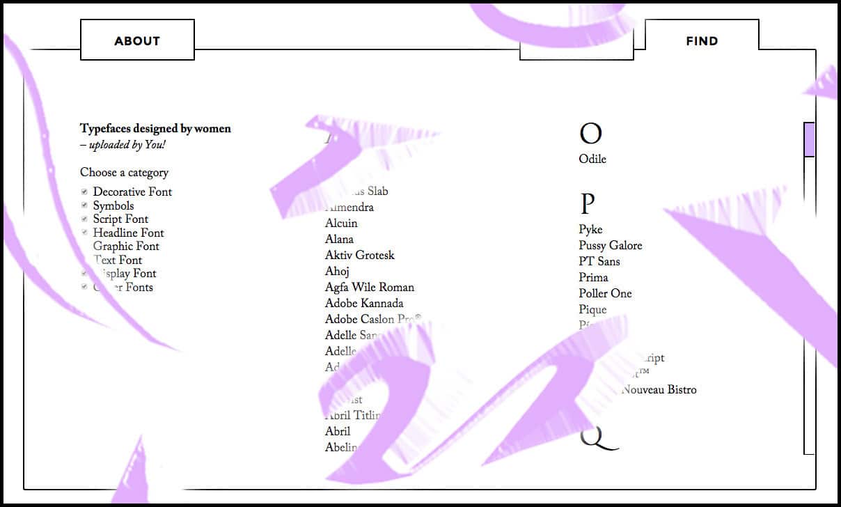
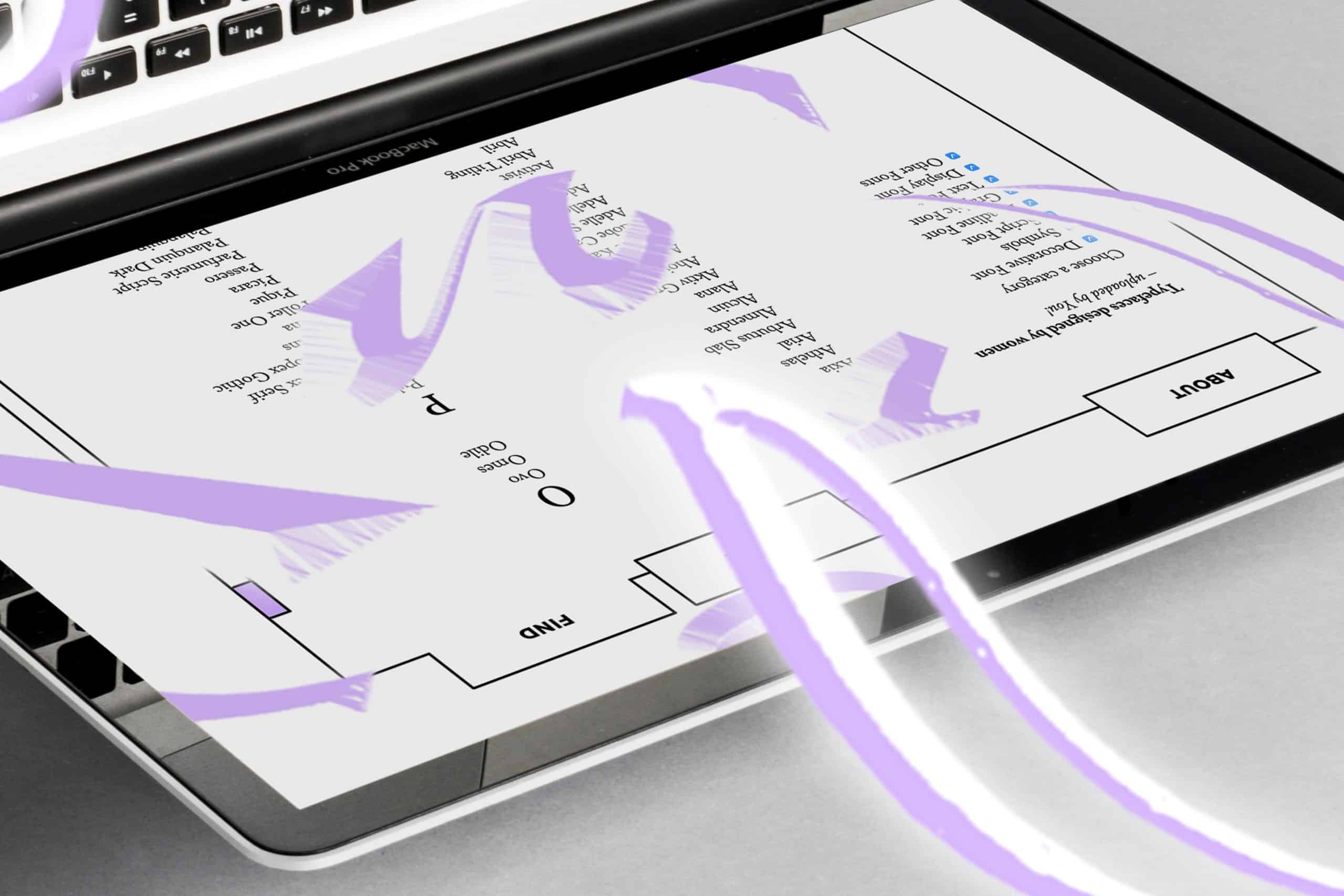
A website where users can share and discover typefaces designed by women, Typequality is an extremely useful design resource, easy to navigate and available for anyone to access. But on top of that, the site is a digital meeting place where women can showcase their work, that of their peers and generally support one another in an overwhelmingly male-dominated industry.
In 2017, the site has grown to include over 170 fonts, with more being added every day. Users can search the site for designs, either by name or by style, learn more about the design’s history and it’s creator, and have the option to purchase and use the design themselves. Hundreds of designers have contributed to the database already, and what started out as a graduation project is fast becoming the leading example of what a fairer, more balanced industry looks like.
Unfortunately, the lack of information that left Ihre wanting and the lack of inclusion of women typographers that Triggs saw, is nothing new. In 2015, in response to yet another public forum dominated by men, Hallmark Cards lettering artist Lila Symons sent out a tweet the read, “I just looked at the main conference schedule for @typecon and barely any women are speaking. Seriously what’s up with that?!”
It is certainly not the lack of female designers that’s the problem. There are not more males attending design college—it’s actually the opposite. There are more female students than male in the top United States art schools. Throughout the industry it is still more common for men to hold leadership roles. The problem of gender inequality seems to be much bigger, and more complicated than it first appears.
In her 2005 essay “Non-existent design: women and the creation of type”, Sibylle Hagmann discusses the history of the trade as one reason for the current situation. It could be, she says, that because printing, lead type design and metalsmithing were traditionally male-dominated professions throughout history, there just isn’t enough non-male experience to feed into the visual language, and the typographic language, that we still use today.
So it seems that the problem is two-fold. Not only is there a lack of females represented in the higher levels of the design world, but also the very system that the design world is built on is too limited in its scope, and non-exclusive by nature. The complexity of the problem is mostly due to our graphic language and it’s symbols—the look of language that we see everyday—reinforces a pre-existing, biased system.
So if a typeface was gender-neutral, what would it look like?
In typography alone, unpacking that system of symbols and how they function is extremely difficult. Everything from the font (or size) to the line length, the ornamentation, the spacing and repetition of the typeface subtly, even subliminally assigns “genders” to a design. Think of the t-shirts you see designed for boys and girls, and the typography they use. “The typographic style for prints aimed at girls are often decorative scripts,” the designers of Queertype T-shirts explain. “While the boys’ prints are set in neutral and bold sans-serif.”
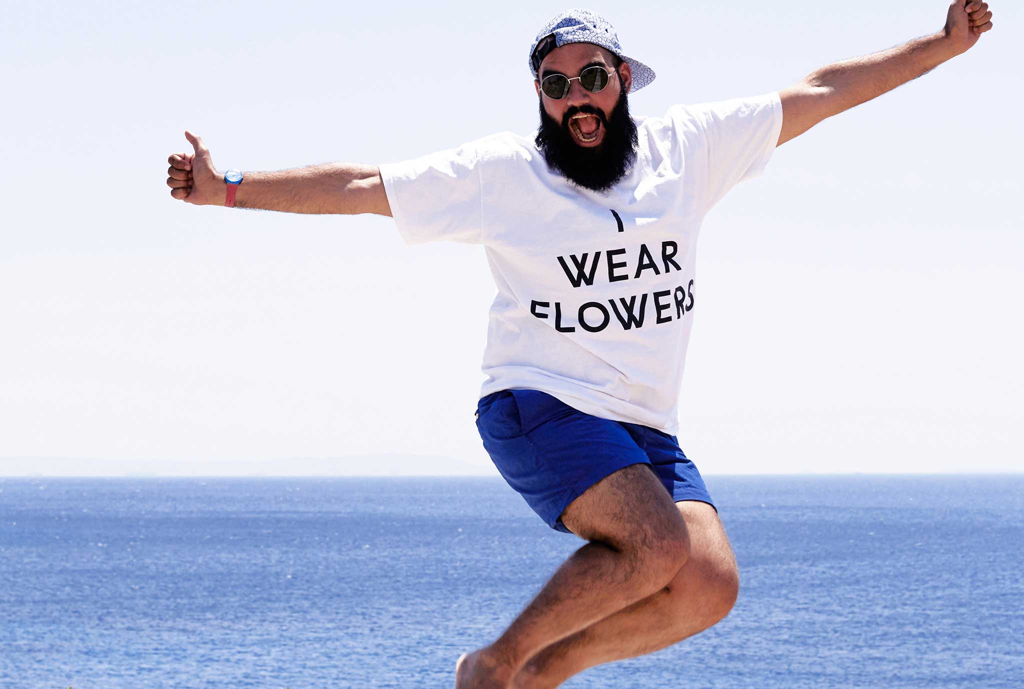
Queertype T-shirts, photo by Dionysis Livanis
Another project with, interestingly, the same moniker, Queer type is a bold typeface released by Russian designer Yulia Popova, featured on Typequality. As a continuation of her thesis essay “Monstrous Feminine” Popova plays with those genders and personalities we give typography. These letters are thick, colored an almost sickly green, written all-in-caps, and spell out words like “queer’”, “body”, “freak”, “yes”, and “round”.
Some of the fonts on Typequality are politicized, progressive and protest our societal structures; some are simply designed by women typographers who have been pioneers in their fields for years and should be known about.
Sibylle Hagmann’s own award-winning typeface, Odile (released 2006) is available to see and purchase on the site. Wingdings is up there, along with info about its co-creator, the prolific Kris Holmes, who is responsible for over 75 different fonts, including the 1986 Lucida series (the default font for Mac OS X interfaces).
You can find the new version of Lo-Res (the bitmap font that first appeared on early MacIntosh computers over 15 years ago), designed by the luminary Zuzana Licko. Adobe type designer Carol Twombly’s Lithos is also included in the list.
You can also discover WD+RU’s own experimental typeface Pussy Galore. It featuring tongue-in-cheek designs of flippy “dumb blonde” hair, pouting lips and feminine archetypes.
Fonts like these make it clear that not only can typefaces be gender specific, and loaded with stereotypes, but they also have personalities, and condition us from birth to see the world from a particular point of view. But with projects like Typequality, Alphabettes and Women of Graphic Design, the conversation around design and even the limited language it uses, is changing.
Simply by creating a platform and a space that has little to do with the existing structures of the industry (i.e. this exchange is not happening in universities, or at conferences), Ihre, the Typequality site and its contributors are changing the fundamental understanding of our visual language.
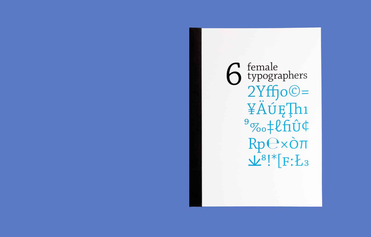
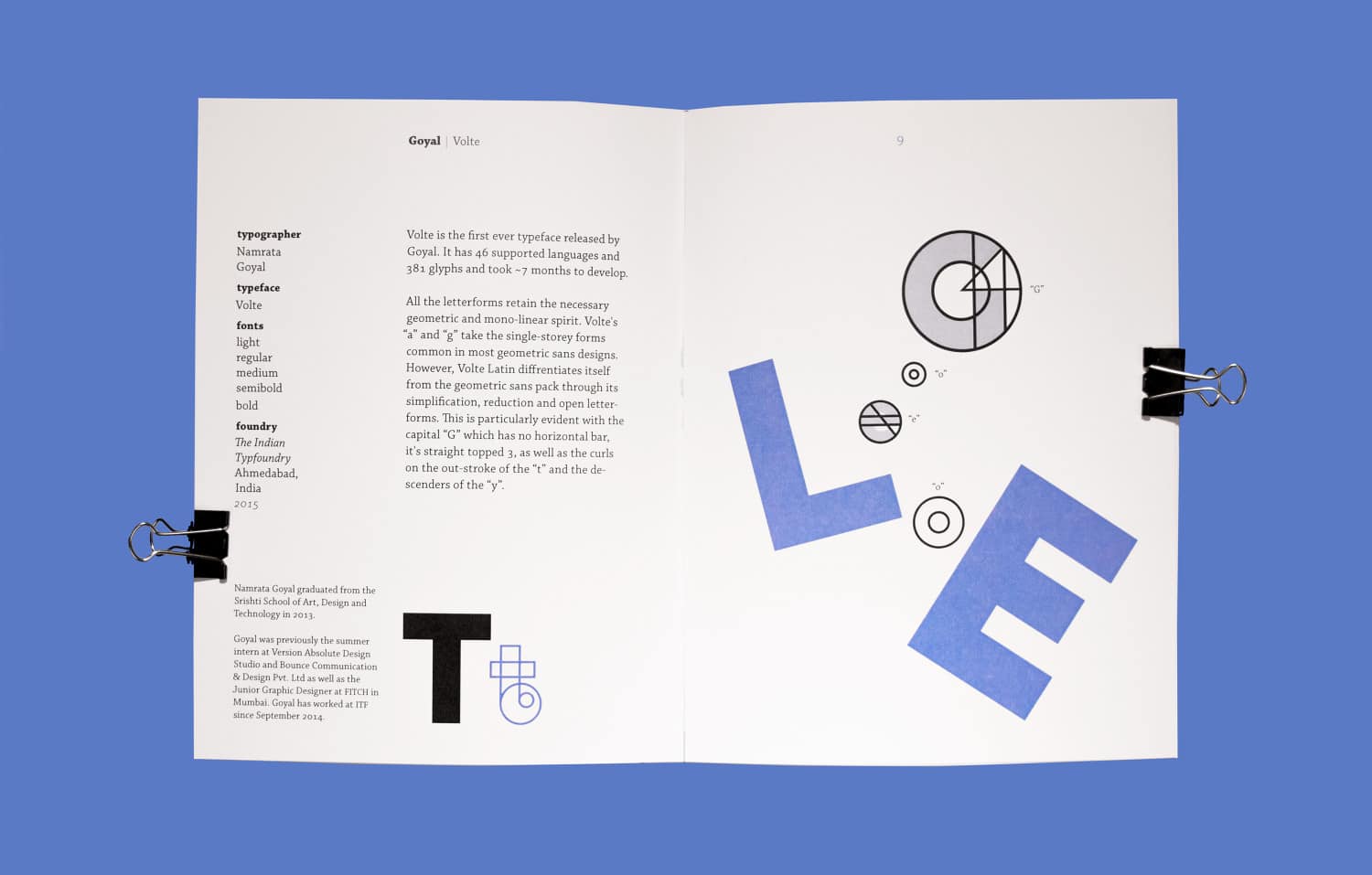
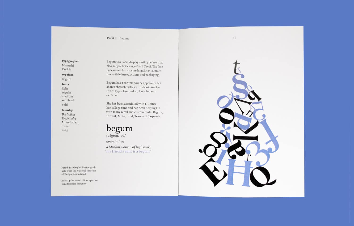
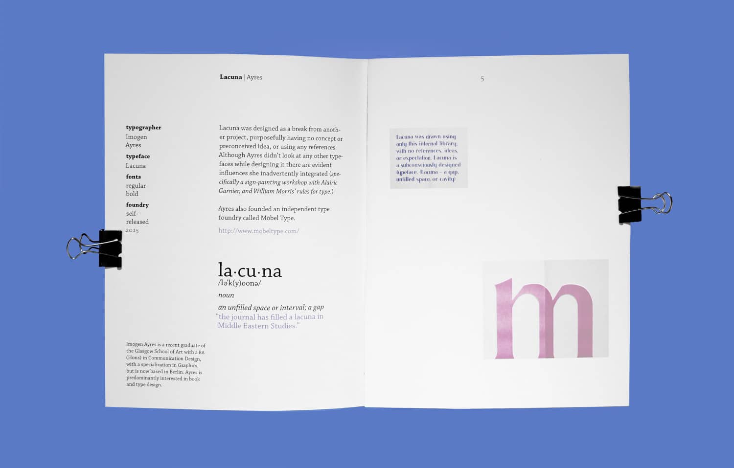
Take a peek at designer Nathan Levasseur’s project inspired by Kimberly Ihre and Typequality. It features six female typographers and their creations.
Other articles you might be interested in:
How to Design a Google Font
55 Women Making Work We’re Obsessed With
5 Designers Reveal How to Get Clients with Your Portfolio
