When it comes to landing your next client, your design portfolio is the most important tool in your professional arsenal. In fact, 63% of the decision to hire you for a creative job is influenced by your portfolio. In the eyes of the client, your portfolio is an impartial view of your work—something they might not get from an interview or even references.
Yet still, an overwhelming 93% of job seekers don’t have a personal website. “It’s a no-brainer in this day and age,” explains designer Steve Attardo of Ninetynorth Designs. “I emphatically believe that it is unacceptable not to have an online presence.”
Your portfolio is usually the first point of contact between you and your next job, so it’s important that it says all the right things. It should be a concise representation of you that highlights your skills, showcases your best work and communicates who you are as a designer.
Setting up a beautiful, professional design portfolio is one thing. Setting up a beautiful, professional design portfolio that attracts new potential clients is another. We asked five designers who’ve had success securing work through their portfolios for their advice on creating design portfolios that will attract clients and help you land your next job.
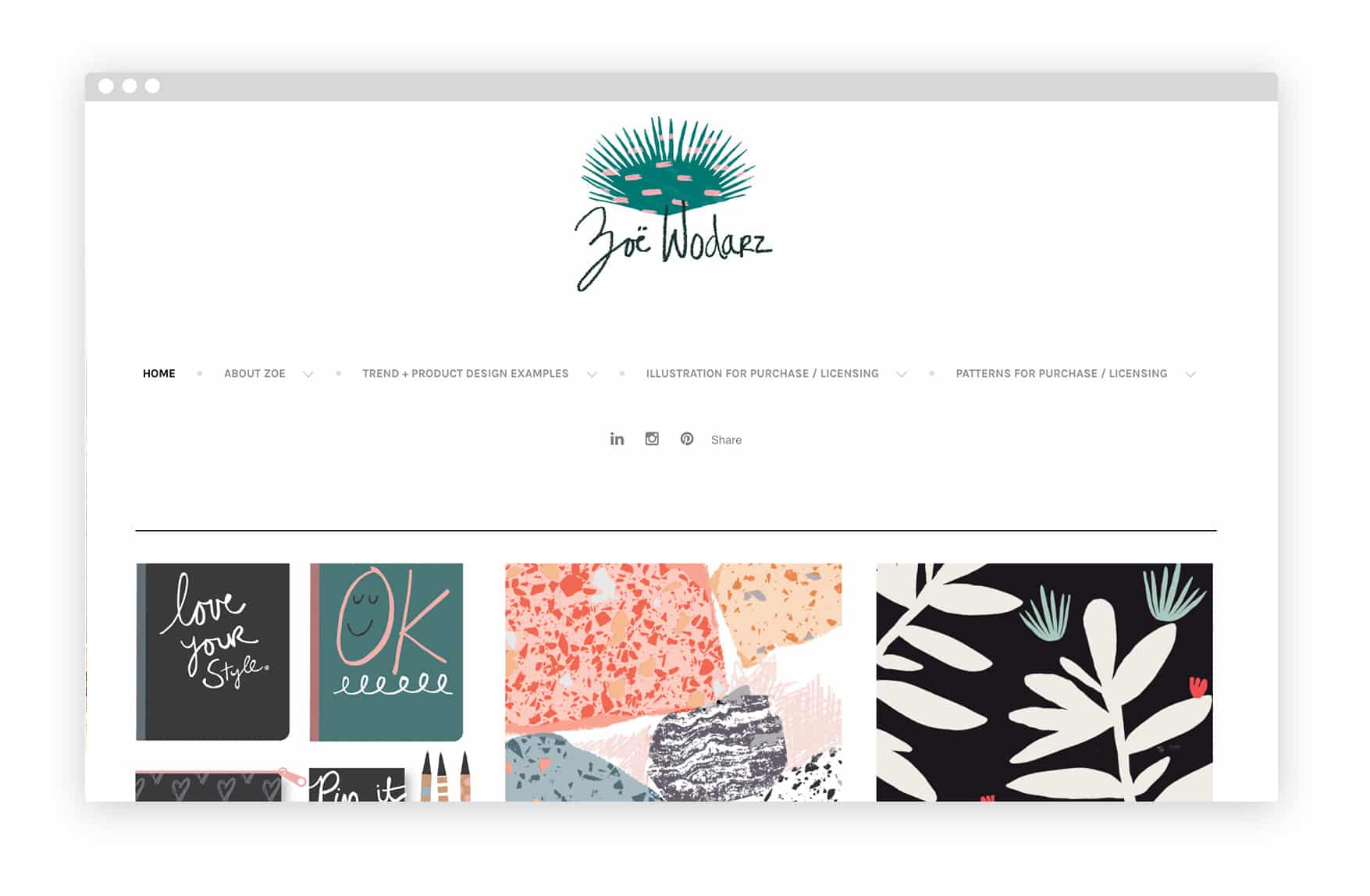
Zoe Wodarz
“I spent over fifteen years working in house doing everything from merchandising to product design. In the last three years I’ve gone freelance full-time which has driven home the point that my portfolio is absolutely my number one tool. The portfolio is my ticket to finding clients and keeping clients.
“It has to be professional, it has to have a great flow to it, it has to be easy to navigate and it has to look stunning. That’s the bottom line when it comes to portfolios.”
Leverage your client list
“Your client should be your voice. You don’t necessarily need a resume. The reality is that your client list is your golden ticket. It really shows your work and it intrigues people. I would encourage younger designers, as they are building their portfolio and business, every relationship counts, every client counts. Be sure to focus on that list.”
Create a visual journey
“When scrolling through a portfolio, you may see really powerful work next to weak work or really edgy stuff next to your friend’s mother’s cupcake business. It doesn’t really flow or have a structure. I encourage designers to break down the sections of their work. Look at other artists and how they structure their work. What are their titles? How does their work flow from one piece to the next? How do they give credit to people if they are part of a larger project? These are all really important, key professional things to have on your portfolio.”
Find the right kind of client
“At the end of the day, I am trying to find the client that wants to work with me because they love my work. The end goal is to have a stream of people looking at my work and seeing value in it.”
Zoe Wodarz’s portfolio
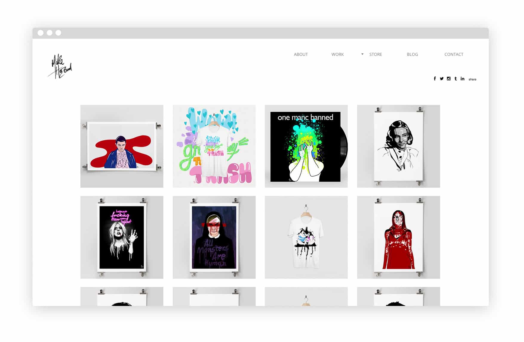
Mike Hazard
“I currently work as a freelance illustrator—and whenever I find a job that I’m interested in I send over my portfolio. The client can see the various styles of work available to them if they work with me. This is much easier than emailing a PDF or—god forbid—a printed portfolio, as the client can go straight to the sections of my website that they are interested in.”
Streamline your work
“The most important things in an online portfolio are galleries. I can split my work up into different sections and the client can go directly to the type of work that they’re interested in.
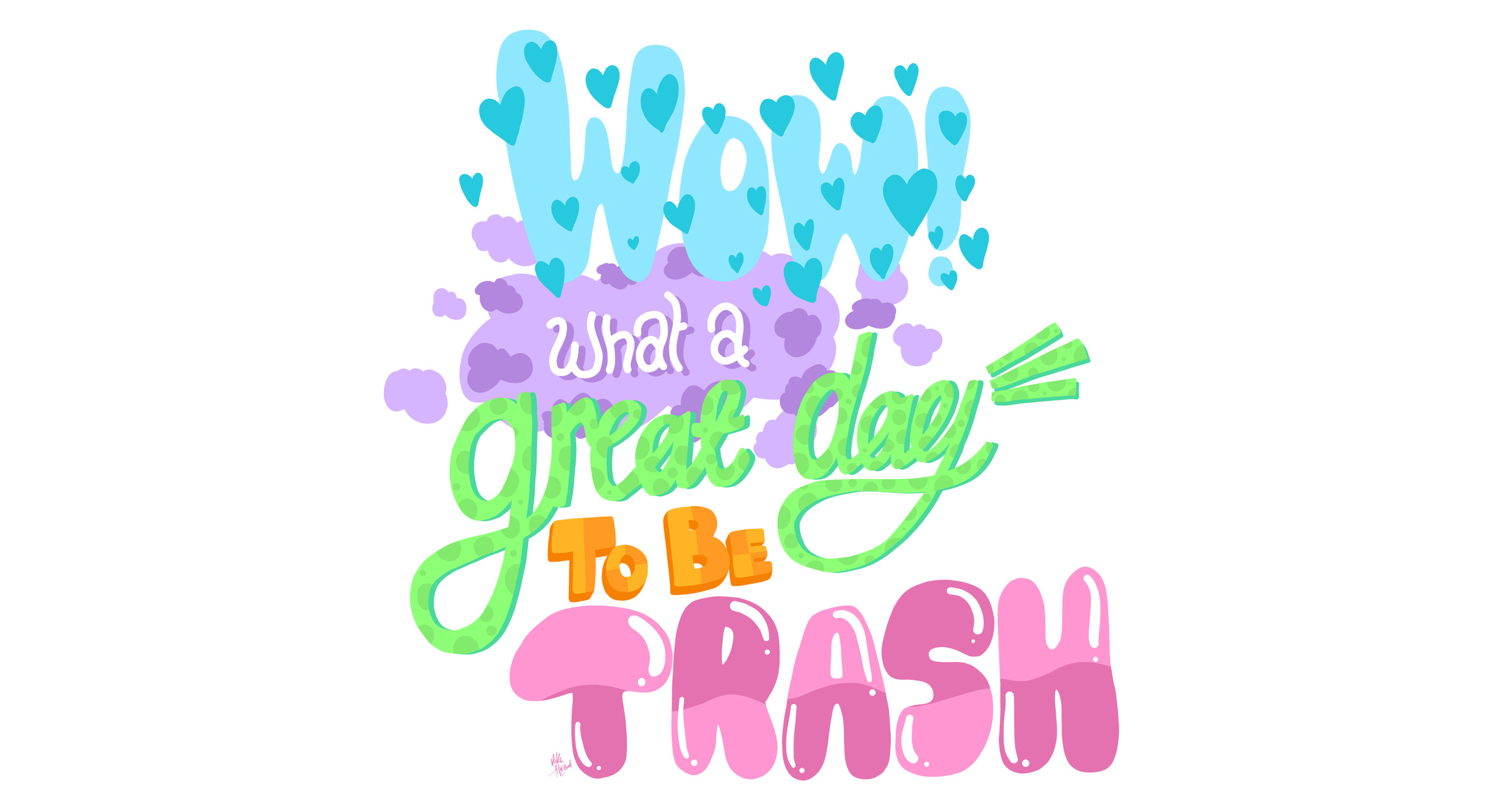
“Second to this has to be the About Me page—I can add a photo, a bio, and embed my Instagram feed so people know who they’ll be working with!”
Stay consistent
“Keep things consistent. If you’re an artist with various styles, then I would suggest splitting these up into different galleries. This way, if you know the job you’re applying for will only be interested in certain works, you can send them the direct link to that gallery. Clients will get hundreds of applications every day, so the quicker they can get to the work they want to see, the more likely they are to stick around.”
Mike Hazard’s portfolio
Make it easy for your clients
“Having an online portfolio website means potential employers can scroll through your work without the hassle involved in interviews—if they like what they see then they call you. It also makes it easier to leverage word-of-mouth recommendations—‘Hey! Check this designer out!’—and then they’re just one click away. I’ve secured many commissions this way.”
Keep your portfolio up-to-date
“I think it is really important to keep your portfolio up to date. Clients like to see you are an active designer, filled with ideas.


“But it is also important to select your best work and showcase a small selection of your five to ten best projects, always adding the latest updates. Review your portfolio once in a while—as your eye gets better you come to realize that what you actually thought was great, isn’t as great as you thought.”
Be your toughest critic
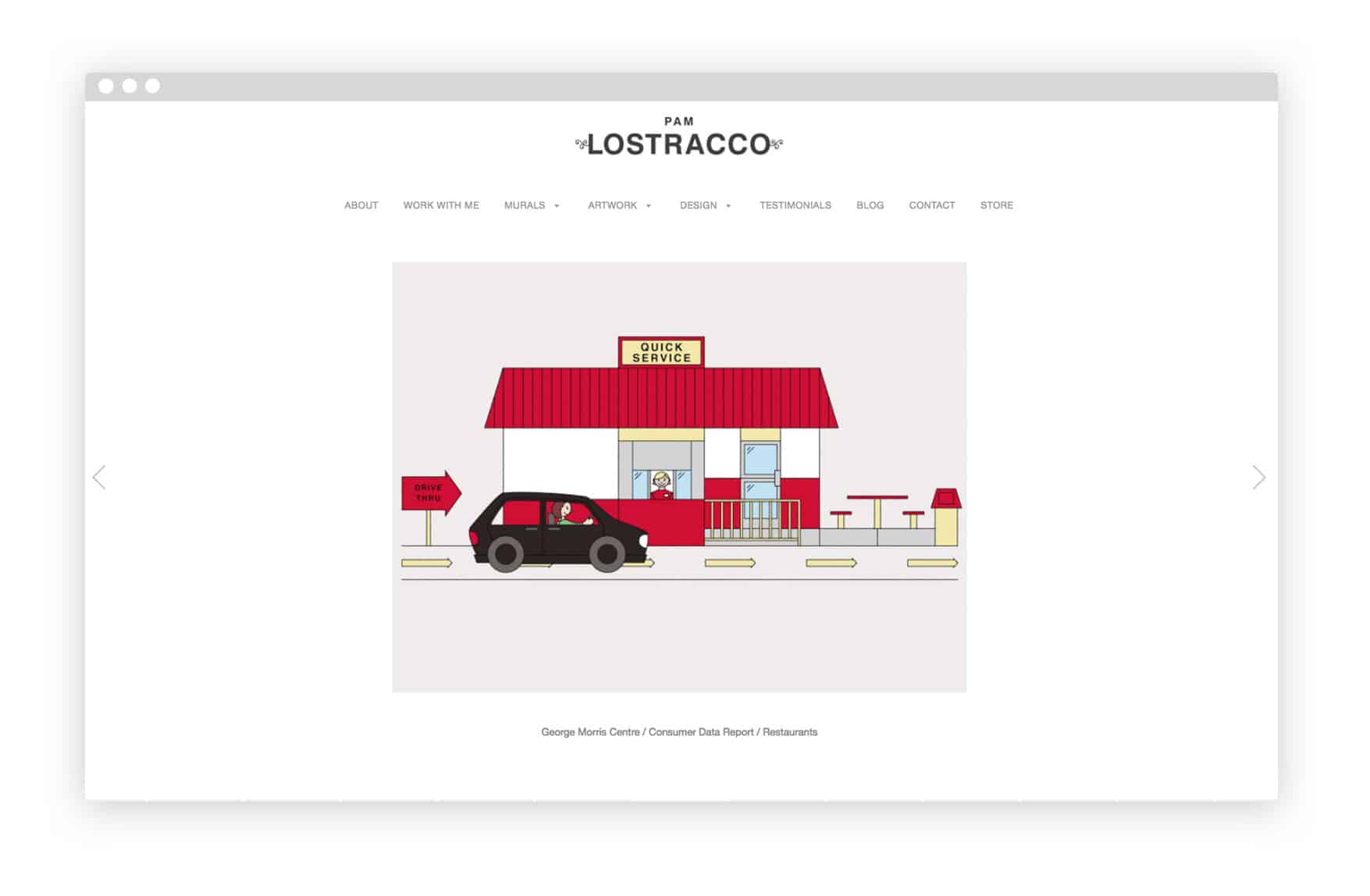
Pam Lostracco
“An online portfolio has been the best way to visually showcase all my work in one place. It gives people the flexibility to look through the work at their own pace and perhaps go back several times, before deciding to get in touch.
“My work is on a lot of social platforms which have been excellent for exposure, however I rarely get a job through them. I always add a link back to my website, which offers a professional place to browse through the rest of my work.”
Put your work out there
“Take your best work and get it up on a site you can manage yourself. Even if your work doesn’t feel “perfect”, it’s better to get it out there and revise as you go. You and your work will always be evolving—and so will your site.
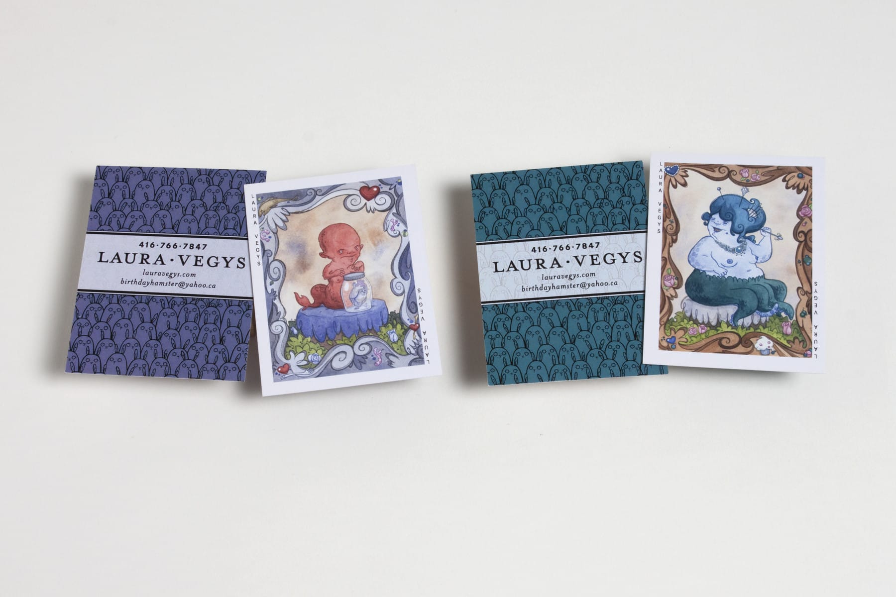
“People want to see what you create. Drive traffic to your website by linking it to your online shops and social media. They also love process—share photos of the middle stages of your creative process.”
Be available
“Your contact page is the most important element on your portfolio. Using an email template makes it easy for potential clients to quickly type a question. Email templates also look professional and they are extremely reliable. I’ve received emails from around the world—and don’t think I’ve ever had spam come through my contact page.”
Pam Lostracco’s portfolio
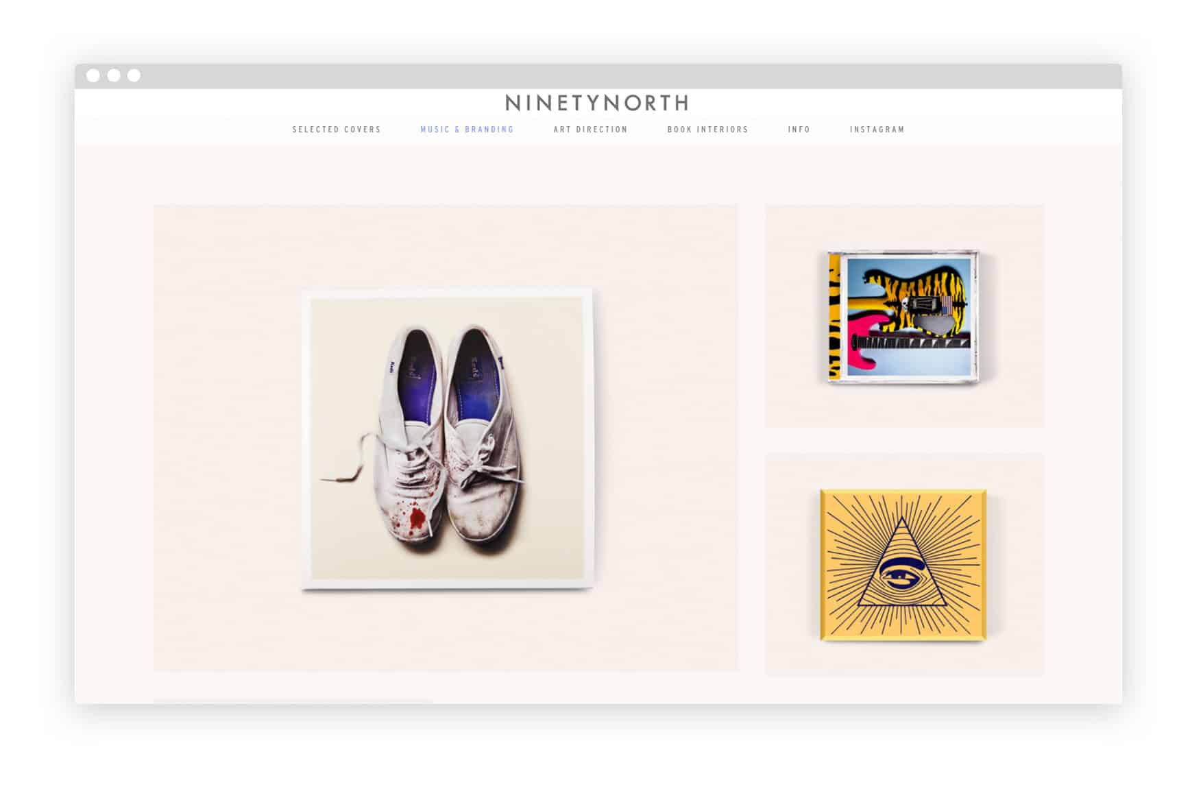
Steve Attardo
“Especially in this day and age, it’s sort of unacceptable not to have an online presence.
“There is something about a design portfolio that feels like it is a more professional than a PDF—the experience of looking at a well-designed website versus a slideshow PDF is definitely a better experience. So if you’re trying to get work or even trying to get your work in front of people, an online portfolio is a much better way of sharing your work with potential clients.”
Love the work you share
“When it comes to design, I don’t want to read too much before figuring out how to look at the work. The way people browse the internet, we are just so tuned to scrolling really fast. There has to be some sort of immediacy.
“The first few pieces people see on your website should be your favourite pieces. You can’t be sure how long someone is going to stay on your site and look at your work. If I’m not totally jazzed about the first ten pieces of work that people are seeing, then I need to rearrange it. There has to be something to get people to pause in the beginning. Don’t bury the good stuff, because you don’t know how long you’ll retain people for.”
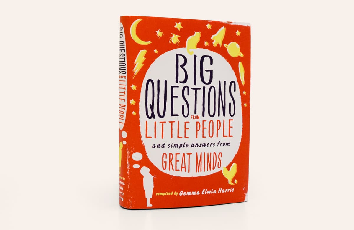
Focus on your speciality
“Keep in mind the kind of work that you want. If you want to do more hand lettering—even if you don’t think your current hand lettering work is as good as some of your other stuff—find a way of making sure people see that work. As much as you need to wow people, if you really don’t want to focus on a certain type of design, try not to focus your portfolio too heavily on that area.”
Think about the bigger picture
“Take a lot of care in how you present your work. Think about how you want the work to appear on the site. Taking a bit of time to, for example, put a screenshot in a desktop mock up instead of using a quick screen grab, shows off a side of you that your work can’t convey. It shows the meticulous, very careful and very considered aspect of you as a creator. It shows that you care about your work enough to consider all aspects.
“Then you don’t have to worry about quantity over quality. Ten amazing pieces that are displayed beautifully and cohesively is better than twenty pieces of work that are unconsidered.”
Steven Attardo’s portfolio


