In this digital age, people are more and more concerned with putting their best face forward. Family photos, headshots and even senior photographs have been taken to a whole new level. So how do you tap into this booming business? By having an amazing portrait photography portfolio, of course. Once you have one, you can use it to market your portrait photography—and get more and more clients. We’ll help you put together one of the best portrait photography websites you’ve ever seen—it’s easy!
Portrait Photography Portfolios 101
Here are the steps we’re going to walk you through so you can set up a gorgeous portrait photography portfolio so you’ll be ranking right up there with the best portrait photography websites in no time:
- Check your brand guidelines to determine who you want to appeal to.
- Choose your layout. Select a theme that is modern and timeless, and highlights your skills.
- Upload your portraits. You can have a fully fleshed out portfolio with as few as 20 images.
- Personalize your homepage. It should be eye-catching and dynamic. Keep the user experience in mind at all times!
- Craft a great About Me page.
- Add your rate card.
- Have a peer or colleague review your website. Ask them to look for spelling errors, rate the user experience and offer general feedback.
- Keep your galleries up to date with new, fresh content.
Ready? Good. Now let’s get started!
Get Your Branding Sorted Out
Every creative has two main goals: make art, and make money making art. Narrowing your field can help achieve both goals. Now that you’ve got the best portrait camera, the best portrait lenses and have started building an amazing portrait portfolio, it’s time to go all in and brand yourself as a portrait photographer. And your portrait photography website is a big part of this. Work begets work!
Refining your focus may sound like you’re backing yourself into a corner but, really, you’re just creating the most tantalizing selection of images to tempt your potential clients. This doesn’t mean that you are only going to shoot this style forever; it’s just what you’re putting front and centre for now.
Decide who your target audience is and how to appeal to them. Keep this demographic in mind when building your portrait portfolio. Check back on your branding guidelines frequently. Don’t have any yet? Check out our guide on [how to create a brand identity])/magazine/resources/art/creating-brand-identity).
Always keep those brand guidelines top of mind. Feature your beautifully designed logo on every page of your portrait photography website. You want clients to follow you on social media as well, so include icons that link out to your social media accounts in your header or footer menus; ensure your branding is consistent across all those platforms as well.
Design That Site
Create Your Portfolio
Feeling overwhelmed about starting your portrait website from scratch? Don’t be! Using an online photography portfolio builder to create a portrait photography website has never been easier. Pick one that offers you a free trial so you can see if it’s the right fit for you. You’ll have a fully functioning portrait portfolio website in no time at all! Thanks to prebuilt themes, your brand-new portrait photography website can be built in less than an afternoon.
Choose Your Theme
You want to make sure that your work is highlighted in the best possible way. So how do you decide on a theme? First, grab some inspiration from some amazing portrait portfolio websites. See how industry pros display their work and experiment with your own portrait photography site style. It’s important to keep the user experience in the forefront of your mind while building your portfolio. Pick a theme that is clean and timeless.
Other style choices to consider while building your portrait website are fonts and navigation. Keep it simple. Having a clean, sans-serif font and easy-to-find menu will boost the user experience. As most people are browsing on their mobile devices now, you want to ensure that your portrait photography website is fully optimized for mobile and is easy to browse.
Recruit Another Set of Eyes
Before launching your website, be sure to test it on all devices to ensure that it’s displaying how you want it to. Send your link to friends and have them give you their opinions of their experience using your website. Every set of eyes counts—you never know if someone will catch a spelling error or formatting snag.
Add Your Photographs
Now comes the fun part—uploading your work to your portrait website.
Need More Content?
Want a few more shots to beef up your portrait website? Here are some tips on how to generate the content you need to ensure an A+ portrait portfolio:
- Host a portrait marathon. Promote this deal on your business and personal social media accounts to drum up as many participants as possible. Headshots can be very expensive, so you’re sure to get a lot of takers. Book mini sessions that include one or two retouched photos, with an option to purchase more. Have your models sign a standard release and get shooting. A single day of shooting can stock your portfolio with a diverse array of faces, highlighting your talent.
- Collaborate! It pays to play well with others. Reach out to local model and photography groups on social media and join photography meetup groups. These are a great opportunity to find fellow shooters you can network and try out new gear with. You can also work within your community to set up trade-for-print shoots with budding models.
- Volunteer as a second shooter. Press and networking events, festivals, and even fashion shoots can benefit from having a second photographer on site.
Plug In Your Content
Every creative has their own style, and you’ll want to make sure that your portfolio reflects yours. The key to a successful portrait portfolio, however, is carefully curated content. Here are a few tips on how to make your portraits really pop:
Headshots, family portraits, and travel shots should all be filtered into separate galleries. Consider sub-galleries within each of these categories for studio and location shoots. Make it easy for clients to find what they are looking for within seconds.
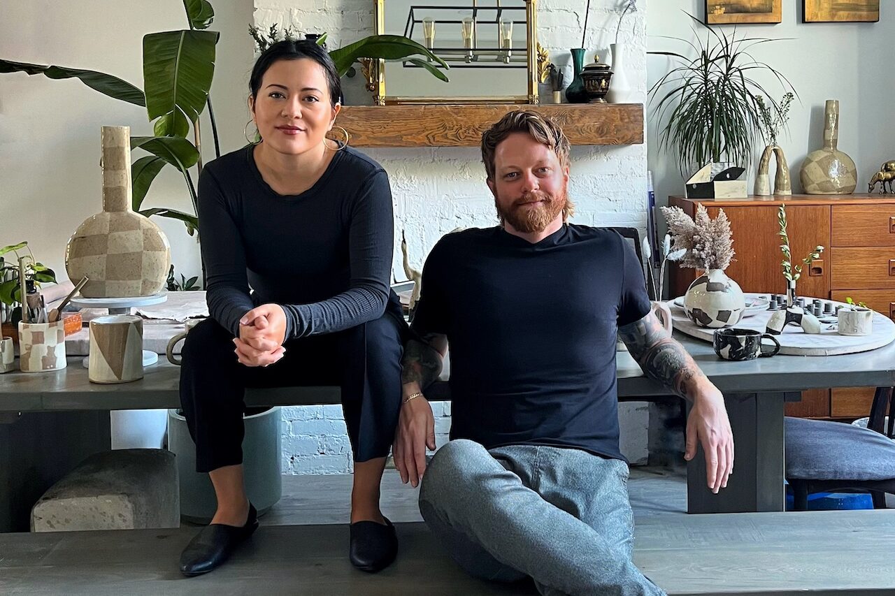
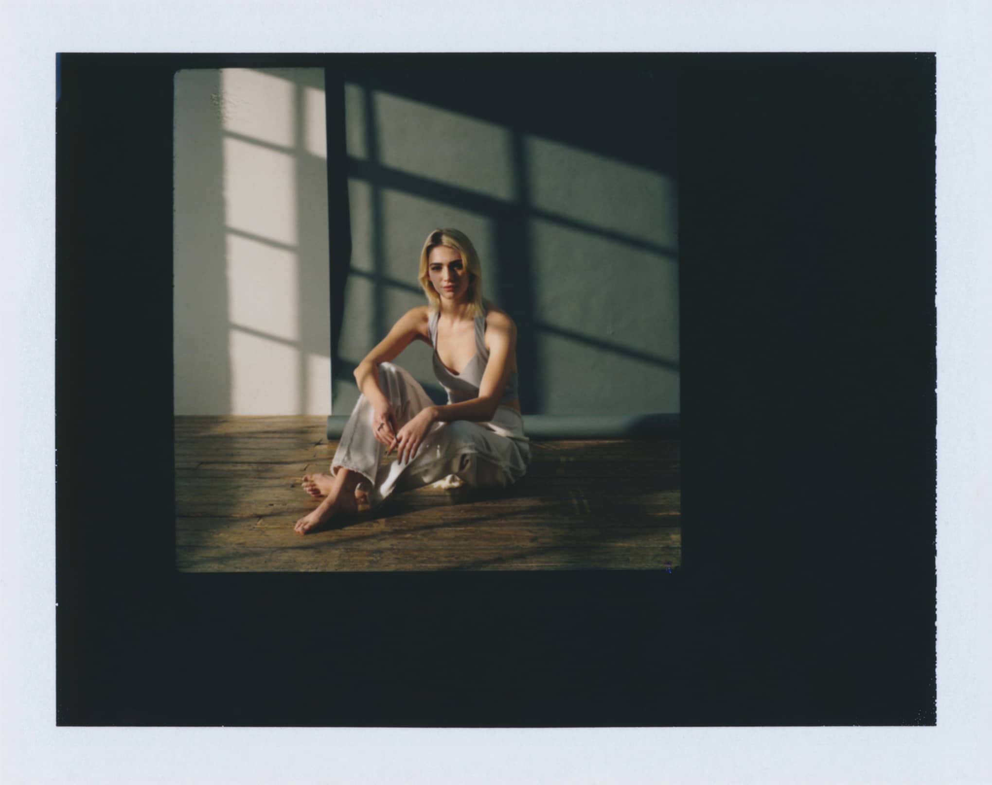
Modern-day portrait photography looks a lot different than the department store family portraits of the olden days. Clients are looking for a photographer to capture their distinct personalities and family dynamics, so favor the less stiff shots for your portrait photography website. Candids are key!
Range is also important. In theatre, there’s a something called The Rule of Three. When things appear in threes, the brain starts to recognize the pattern, so breaking the pattern can be very impactful. Include your top three images of each subject or mood. Use the third image to change the mood. Think smolder, smolder, smile. Posed, posed, chaos. It changes the way the viewer’s brain assesses the images and creates a personal connection to the content. Curating your portraits like this really shows potential clients what you’re capable of.
Having trouble choosing which photographs to include and want to include them all? Don’t overstuff your portrait portfolio! This can be very overwhelming for a potential client. Consider a few main galleries highlighting the images that paint your work in its absolute best light and then a few galleries that will house older work as well. If you’re still unsure which pics make the grade, poll your colleagues to see what images they like and why. Their responses can give you some insight and can help you look at your work with a more refined eye.
Creating captions for your work creates an additional layer of storytelling for your clients. A caption can be as simple as adding the location and crediting the model and hair and makeup team. Or it can be as whimsical as a lyric or quote from an artist that speaks to the mood of the photograph. Whichever method you choose, be sure to continue the treatment to all photographs in your portrait portfolio.
You want to make sure that your images are searchable. There’s a simple way to make sure search engines can “see” your images: add alt-text. Alt-text is an attribute added to an image tag on the back-end; it describes what the photo is showing. This text appears inside the image container when the image cannot be displayed. It helps search engines understand what an image is about, and potentially rank you more favourably. Alt-text is also utilized by screen readers for the visually impaired, making your portrait website more accessible to everyone.
Share Your Personality
A really great About Me page can mean the difference between landing a client and losing a client. Think back to the five W’s and make sure they’re all covered in this section of your portrait photography site so that you can give prospective customers insight into your photography experience and personality:
Who: Who are you? Keep it casual and friendly and share your accolades. Add your own headshot. People like to put a face to the name. Where have you traveled? What are your hobbies? Let potential clients really get to know you.
What: What do you specialize in? Chat up your portrait expertise and experience.
Where: Where are you located? Will you travel to a specific location for a portrait session?
When: How long have you been doing portrait photography?
Why: Why did you choose to specialize in portrait photography? Why should your client choose you?
Include Your Pricing
Our attention span has gone way down (a 33% decline in 15 years!) and if all the pertinent information isn’t at a potential client’s fingertips, chances are slim that they’ll actually reach out with their queries.
Having a pricing list on your portrait website means that any inqueries will be pre-vetted. If your portrait session is listed as x-amount with edited images starting at y-amount, your potential client already knows it’s going to be at least xy-amount, so there’s no sticker shock for them.
Keep your portrait photography website pricing list simple, with your different rates for different types of portraits, along with your starting prices for package deals. Having a hard time deciding what your services are worth? Check out this guide to pricing your photography to find some basic equations for session pricing.
Don’t Forget to Proofread
Before you take your page live, have someone read over it. Yes, again! Nothing should be published without at least two sets of eyes on it. Have a friend or trusted colleague look through your portrait photography website and ask them for critiques. Ask them what their user experience was like. Did they find any weird formatting or spelling/grammatical errors? Double- and triple-check that you have the correct spelling and contact information for any other talent you are crediting in your photographs. Make 100% sure your contact info is correct. Proofread twice, publish once!
Keep It Fresh
Put time aside every few weeks to add to or switch out older content from your portrait portfolio for fresh, new photographs. An interesting idea can be to think a season ahead. Do you work in an area that has brilliant fall foliage? Add some images of outdoor, fall portrait sessions in midsummer. It can have potential clients thinking ahead to their next portrait session with you.
You want to make sure that your most up-to-date work is available for your clients to see. If you’re between gigs, collaborate! Find some TFP (trade for print) projects and creative endeavours to keep you in the studio or on location. Having fresh content on your portrait website shows potential clients that you’re an active photographer and are in demand.
Once you’ve got your portrait website up and running, you certainly will be!
Want some more hot tips on creating the best portrait photography website?
10 Steps to Building Your Perfect Online Portfolio
Design, Curate & Attract: How To Build The Perfect Online Portfolio
The Ultimate Guide to Building A Photography Website


