For creative professionals, a successful online portfolio will become your most powerful marketing tool. Follow these ten steps and you’ll build a portfolio that takes your career to the next level.
If you work in the creative field, you need an online portfolio that showcases your work. A great online portfolio can help expose your work to thousands of potential clients and collaborators worldwide. Follow these ten steps to build an online portfolio that will advance your career.
How To Build A Portfolio
You know that having an online portfolio is important for creative success, but creating one can be daunting. With tens of thousands of creative portfolios in the Format community, we’ve seen it all. That’s why we’ve created this simple guide to help you build your online portfolio quickly.
1. Curate Your Work
Including work that you like can result in a weak online portfolio. You might end up overloading your site with images that mean a lot to you but distract from your best work. Alternatively, you may struggle to find images worthy of inclusion, and be tempted to abandon your portfolio altogether.
Let’s face it: you can’t always judge your own work objectively. We all have a blind spot when it comes to our favorite projects. Either our emotions get in the way of objectivity, or our perfectionist tendencies paralyze us.
Every image should make you think, ‘Wow.’
If you’re having trouble deciding what to include in your online portfolio, try viewing it from the perspective of your potential client. Which images catch your eye? Which ones do you skim? If you’re unsure about including an image in your portfolio, leave it out. Remember: Quality over quantity.
2. Think About Your Clients
Many photographers, illustrators, and artists believe that focusing on one specific niche will limit the number of clients they can reach. For most creative professionals, it’s the opposite. By identifying your niche and dream clients, you can better tailor your online portfolio to their needs.
For example, if you shoot a lot of weddings but want to branch out into fashion, create a portfolio of your fashion photography. A fashion client wants a photographer with a fashion portfolio, not a wedding photographer who occasionally shoots style editorials.
So only apply for jobs that you actively seek. If you don’t have much professional experience in a particular field or area, consider creating a gallery of personal projects to showcase your diverse skills and interests. Identify five dream clients you’d like to work with. Consider the photos they take and structure your portfolio accordingly.
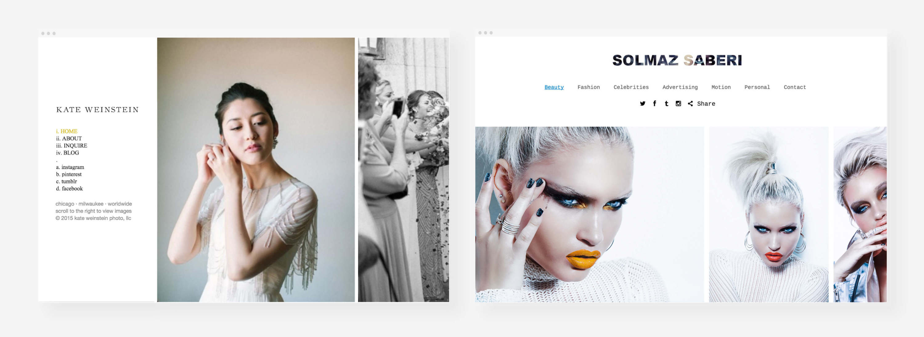
Kate Weinstein Online Portfolio and Solmaz Saberi Online Portfolio
By showing your preference or skill towards a particular type of work, you’ll attract the right clients to further your career in the right direction.
Clients will only consider you for the jobs that you actively seek out. If you don’t have much professional experience in a certain field or area that you’re interested in, consider creating a gallery of your personal projects to highlight your varied skills and interests.
Brainstorm five dream clients you’d like to work for one day. Consider the kinds of photos they shoot — then structure your portfolio to reflect the same.
3. Organize Your Galleries
Your online portfolio should support multiple photo galleries. This will help you sort your work by type, client, or creative series. Always make sure your online portfolio is easy to navigate and find what you want. You may lose their attention if they have to hunt too much (and potential sales).
Here are a few different ways that you can sort your portfolio using galleries:
Type
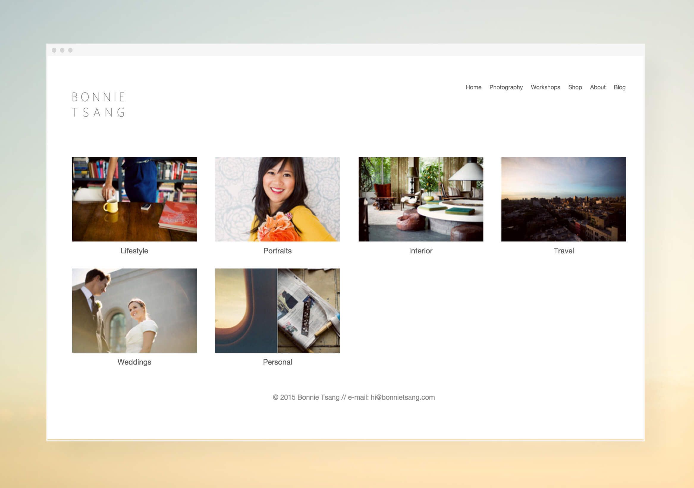
Bonnie Tsang’s Online Portfolio
Organize your work by creating galleries for each type or genre. For example, if you work in multiple photography niches, each should have its own gallery page. This will allow you to showcase your diverse interests and skills without overwhelming your portfolio audience.
Clients
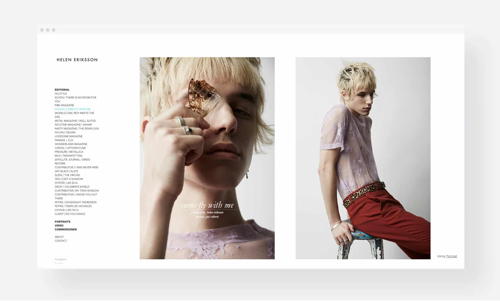
Helen Eriksson’s Online Portfolio
If your portfolio is primarily client-based, you can create a gallery for each client. This will help you keep track of all your clients’ work in one place. Your public image and desirability will improve if you can show off your high-profile clients.
Creative Series
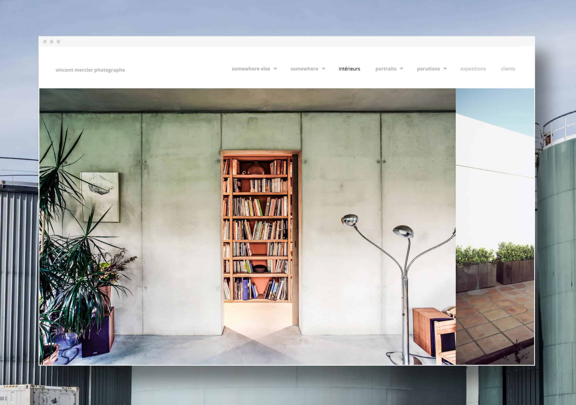
Vincent Mercier’s Online Portfolio
If your portfolio contains creative work, organize your galleries by projects and collections. This will help your audience see your work’s progression and creative range.
4. Follow The Rule of Three
Three is a magical number. Threes just seem to work better and feel more balanced. Why? Because our brains process information by identifying patterns, and three is the smallest pattern number.
Keep in mind the rule of three when organizing your online portfolio. The first image sets the tone, the second sets the pattern, and the third should break it. When the viewer thinks they’ve figured out the pattern, you surprise them with something new that leaves a lasting impression.
5. Caption Your Images
While a picture is worth a thousand words, carefully crafted image captions can enhance the visual impact of your stunning image. Image captions allow you to tell a story and evoke strong emotions in your online portfolio visitors.
Credit is due in captions. Take a moment to highlight the talent of the models, art directors, and other people who help you create your images.
Including specific materials or manipulations could enhance the viewer’s experience. Artist Name, Image Title, Year Created, Material, Size This extra information, especially the size, can help your visitors envision your work on their wall. A media outlet may also pull quotes from your captions and other content on your online portfolio if they decide to write about you, so make sure your captions reflect the story you want to share.
There’s a story, a place, a moment that will create a powerful connection for your portfolio’s visitors.
Not visible on your website, alt descriptions work behind the scenes to increase traffic to your work. Adding alt descriptions to your portfolio images allows search engines to “see” them. Don’t forget to add alt descriptions to each of your photos. It’s simple to add and update portfolio images on Format.
6. Choose The Best Portfolio Theme For Your Work
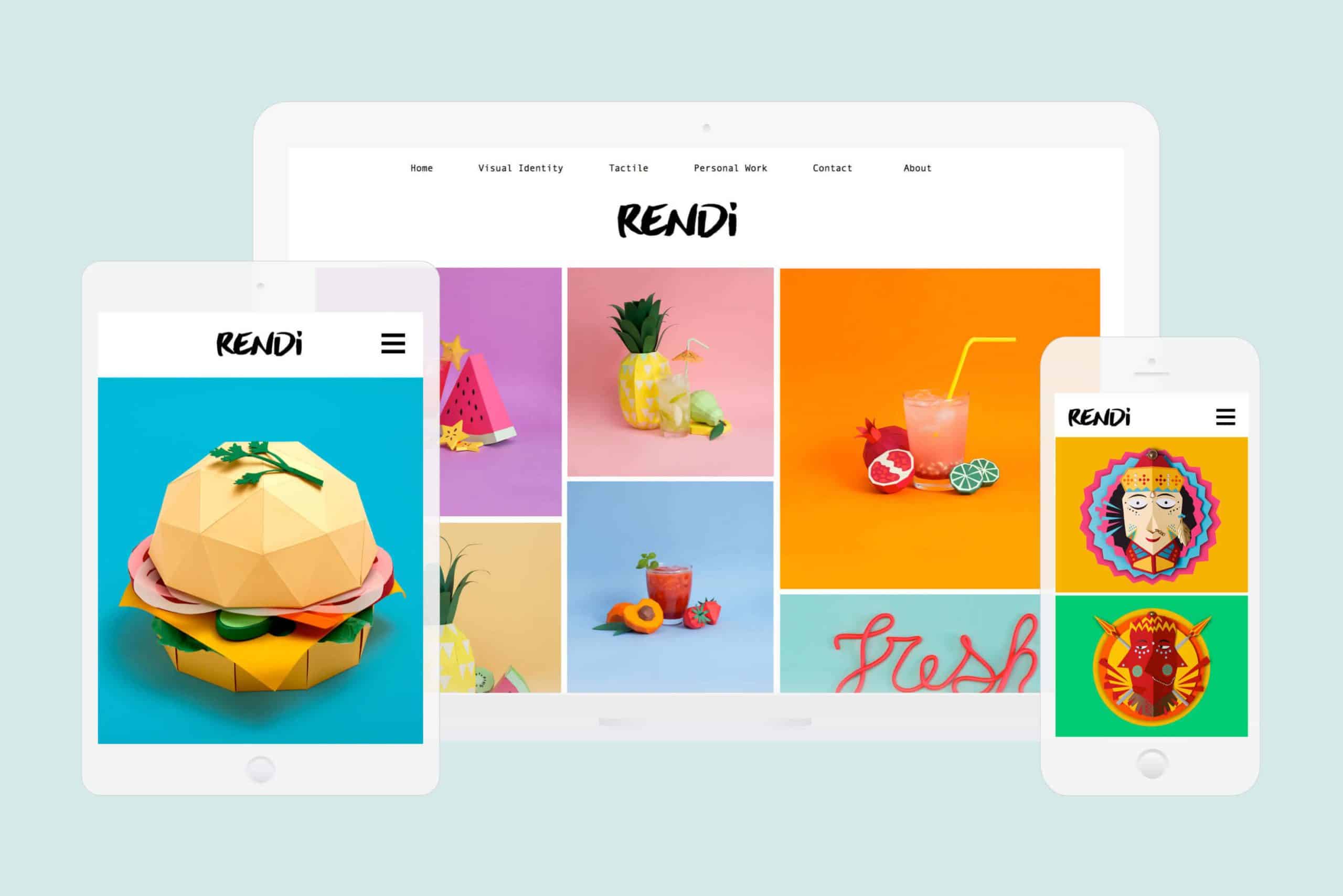
Portfolio themes for your new website are virtually limitless. Using a professionally designed theme that is fully customizable, you can create the perfect website to showcase your work. With the right portfolio platform, you won’t have to worry about coding or losing your work if you change themes in the future.
A well-designed portfolio can have a lasting impact even if your site visitors don’t immediately recognize the care and thought that went into creating it. According to a Stanford University study, 46% of respondents think web design is important in determining a company’s credibility. People are less likely to trust your business with their hard-earned money if your portfolio website doesn’t look professional.
A study by Stanford University revealed that 46% of respondents consider web design an important factor in how they determine the credibility of a business.
This means that if your portfolio website doesn’t look right, people are less likely to trust your business with their hard-earned money, so making a good first impression of your website is absolutely crucial to the success of your business.
Here are some of the different types of portfolio website themes:
Horizontal Themes
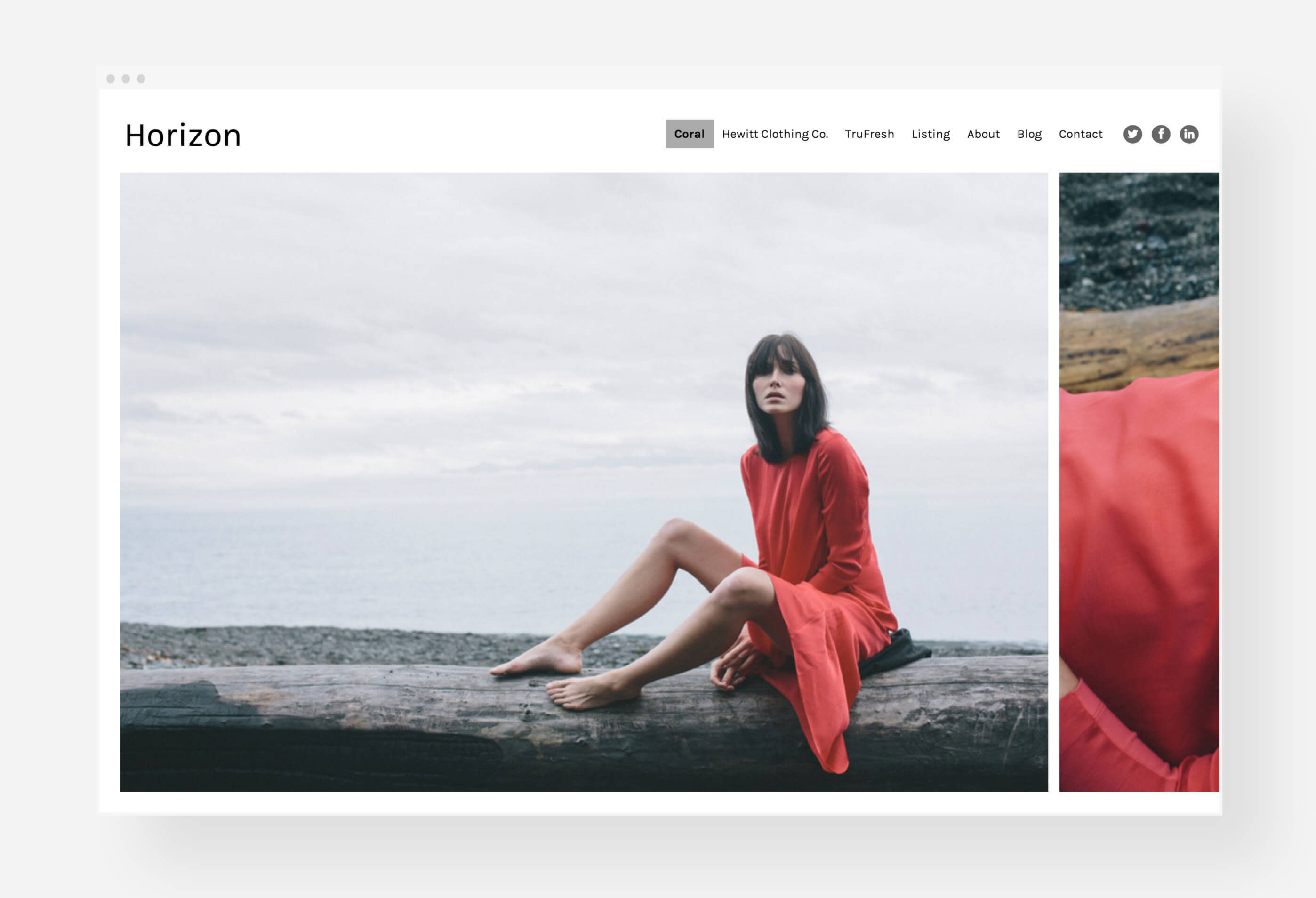
Horizontal-scrolling galleries are great for smaller collections of images or highlighting your very best work. Images are displayed side-by-side, uncropped, in a single row that viewers can scroll through like a film strip. This website template design works with all image formats, but is especially effective with portrait orientations.
Try: Panorama, Horizon Left, Horizon,
Fullscreen Themes
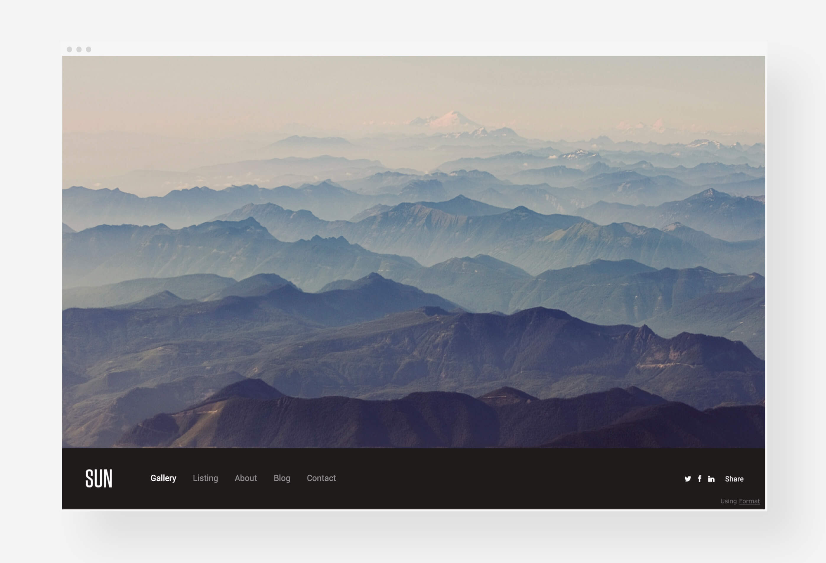
Fullscreen website themes ensure that your images always fill the dimensions of a browser window, no matter what size screen your viewer is using to browse your portfolio. These themes look best with high-resolution images in landscape format. Bring attention to each of your photos by filling the entire screen with one image at a time.
Slideshow Themes
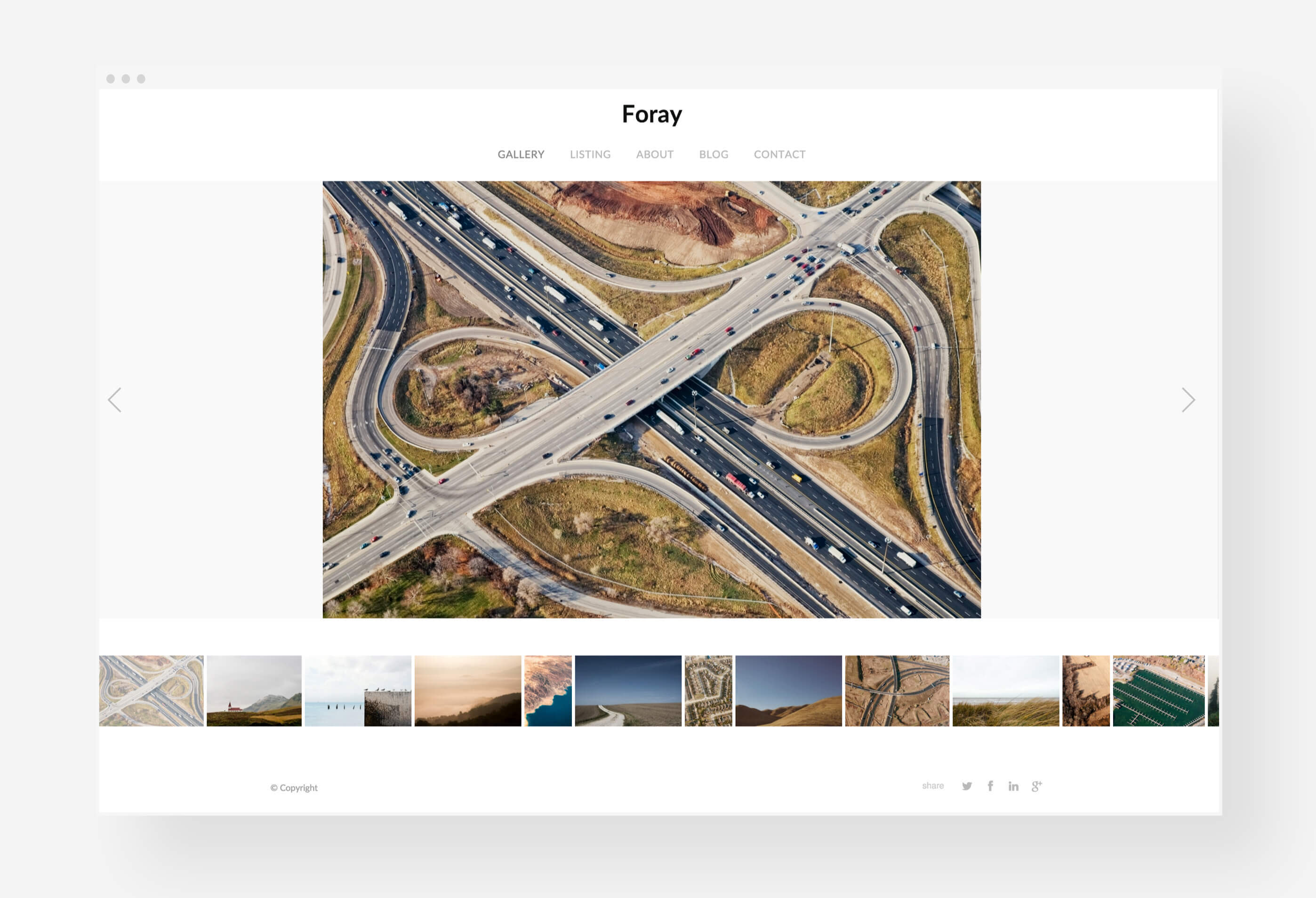
Slideshow themes display images on screen one-by-one, with the viewer navigating between images one-by-one. Ideal for galleries of stand-alone images or smaller images.
Try: Offset, Foray, Sun, Industry
Tiled Themes
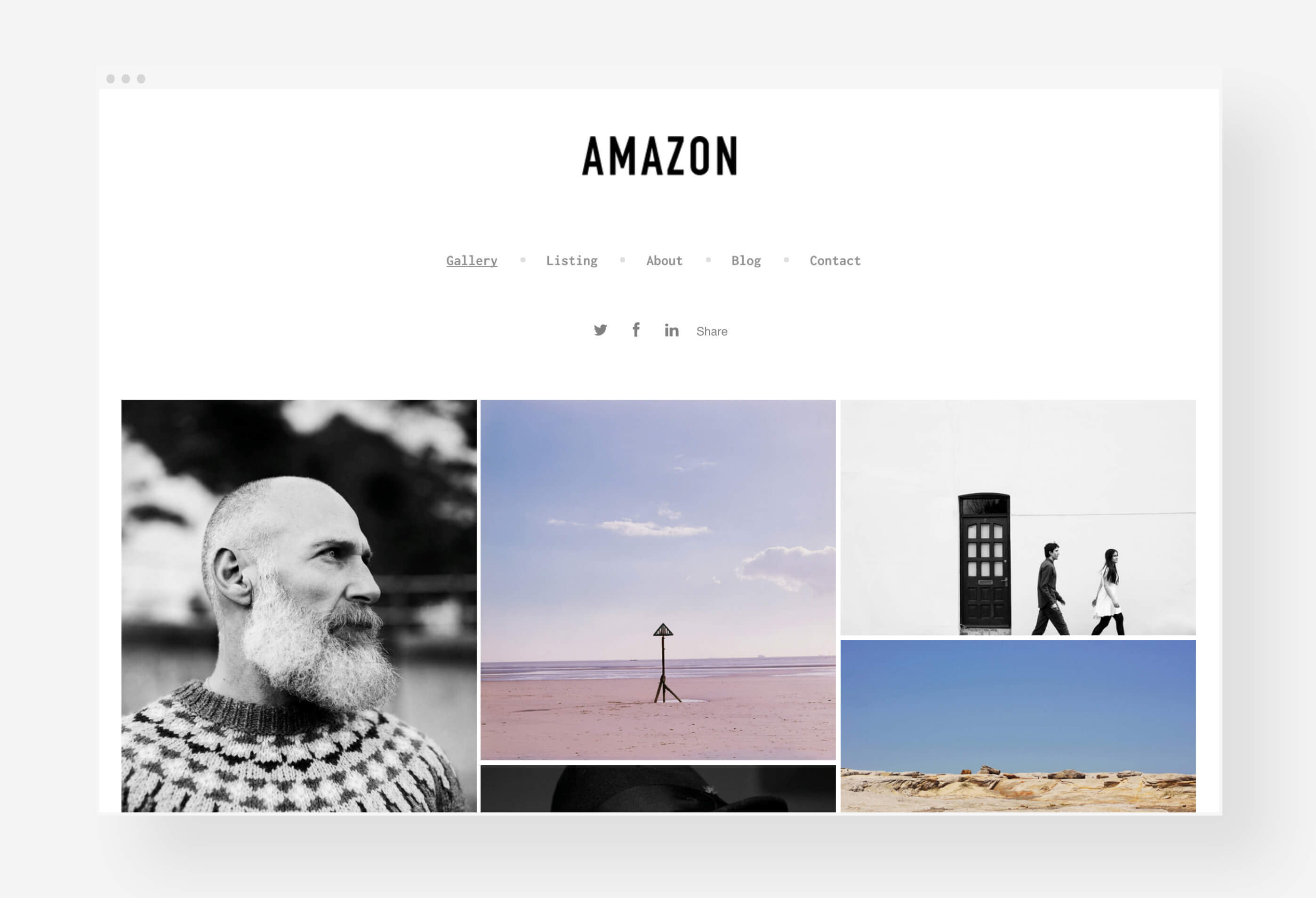
Galleries with large quantities of images look best in tiled themes. A visual overview with thumbnails of every image makes it easy to navigate through many images. Website visitors will see a grid of thumbnails, each of which opens up into a larger view.
Try: Order, Peak, Amazon, Monocle
Vertical Themes
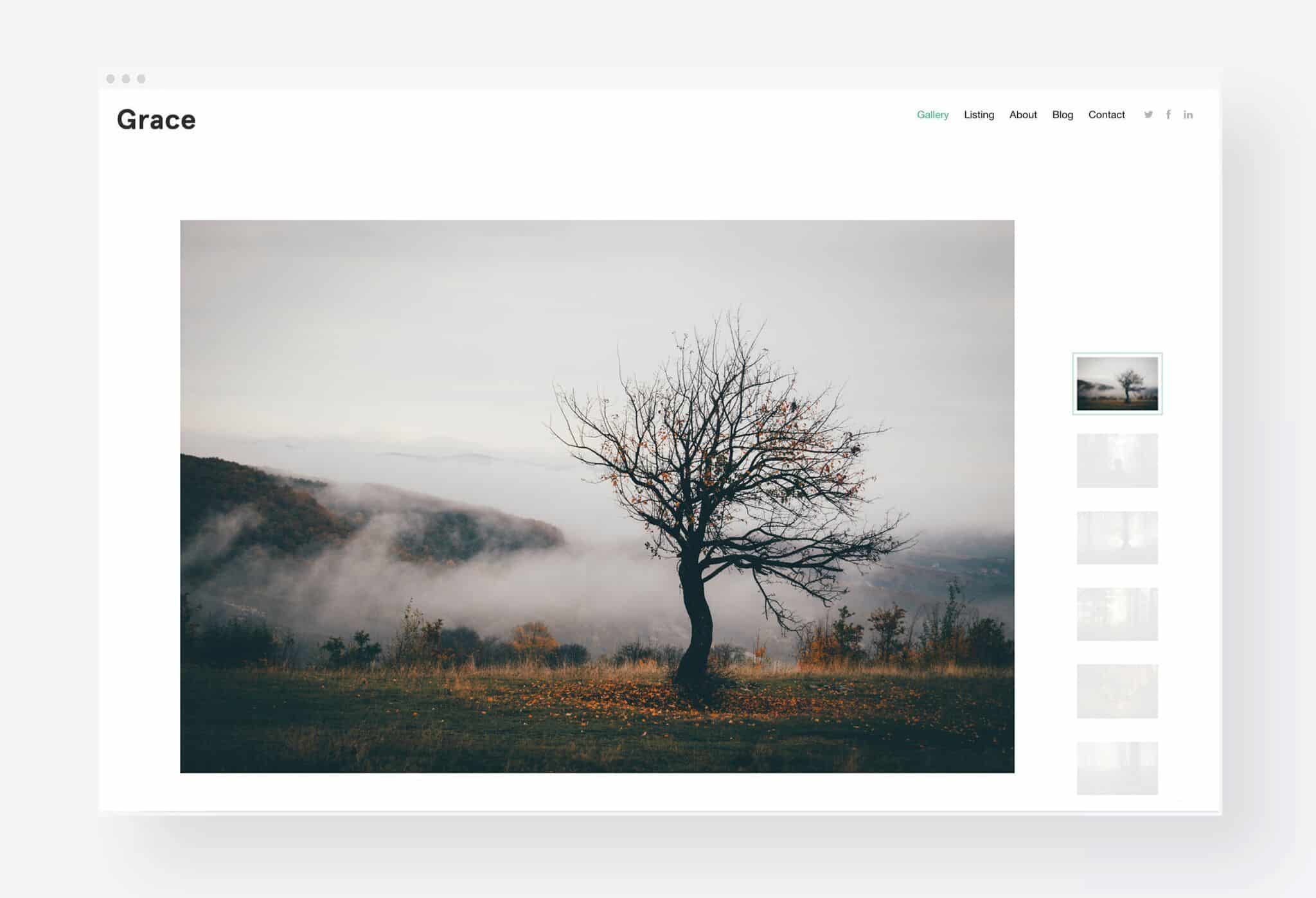
Vertical-scrolling themes display images one on top of the other, so site visitors can scroll down to view more of your content, similar to a blog. Images that work together to form a sequential narrative are best suited to this layout.
7. Treat Yourself Like A Client
Your portfolio theme design choices should always match your other branded collateral like business cards, logo, and general aesthetic. Creating a portfolio is often the first step in a long career creating editorials, lookbooks, and collections for others.
Treat yourself like your first client and focus on the big picture. Demonstrate your ability to think big while paying attention to small details. Is your brand’s material telling a cohesive story? Will your audience know who you are and what you stand for?
Consider your portfolio website as a physical storefront. Would you visit your portfolio if you saw it as a storefront? It should be clear to visitors what you sell (hint: you and your work).
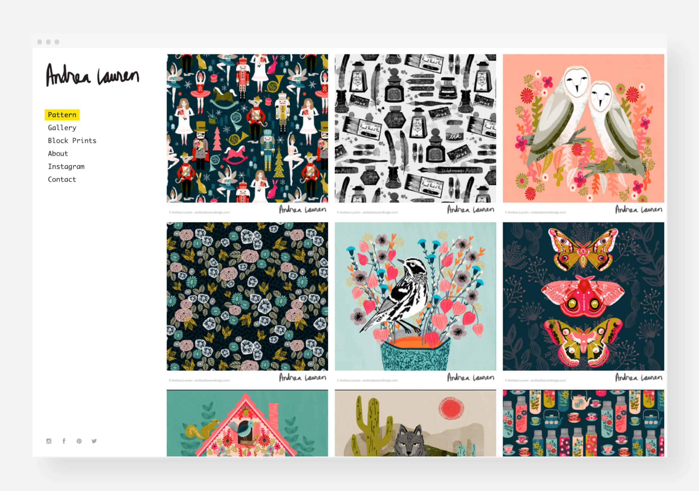
Andrea Lauren’s Online Portfolio
8. Make Sure Your Portfolio is Web-Ready and Mobile-Friendly
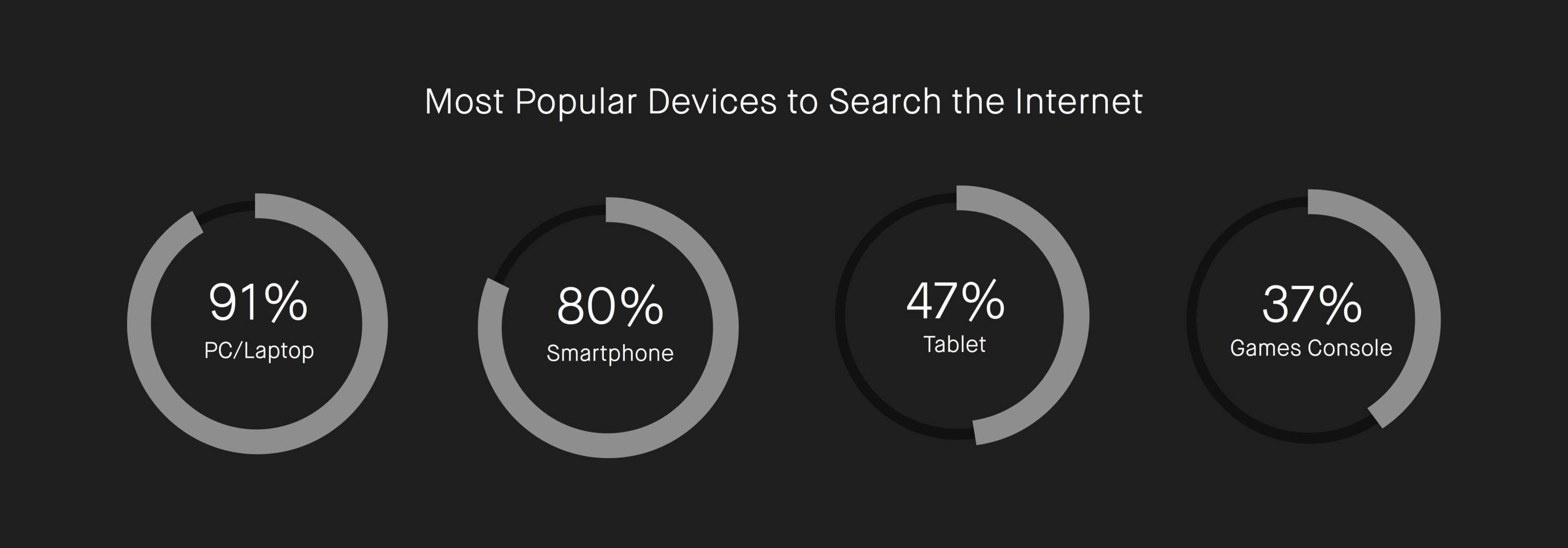
If you plan to use SEO to connect with potential clients, you must ensure that your website is always active and functional across all web browsers. These days, many people access the internet via smartphones, tablets, and laptops. Thus, your portfolio website must look just as good on a small screen as it does on a 30″ desktop monitor. Choose a website template that works well on all devices.
Your portfolio should create an engaging, easy, and natural experience. In other words, the more time someone spends trying to figure out how your site works, the less time they spend looking at your work.
9. Make It Easy To Contact You
Your contact information should be easily accessible on your portfolio. It can be added to your About Me page or a Contact page with your information and a contact form for visitors. Answer emails and contact forms within one business day. If you don’t respond quickly, clients may assume you’re too busy and move on to someone else.
When creating your portfolio, don’t forget to include an About Me page. Many Format users find their About page is their most popular link. That’s probably because it’s your chance to introduce yourself, your work, and your methods. In other words, your About page should give website visitors a quick overview of who you are and what you do.
Even if you think your work speaks for itself, the average person needs some context to form an emotional connection with you and your brand. Your company has a story to tell, and you are the main character!
For Format users, their About page is the #1 visited link on their portfolio.
Here are our four top tips for writing a memorable About page that makes you stand out:
- Write your About page as if you are talking to a friend. You should come across as confident and professional, while still maintaining a personal, friendly tone. Imagine you’re introducing yourself at a dinner party. You want to make a good impression while still allowing your personality to shine through.
- Share information about your professional background, expertise, education, or accolades. These details will help potential clients see what makes you the most qualified person for the job.
- Add personal details or anecdotes. When people feel like they know you, they’re more likely to remember you. Do you like mushrooms on your pizza? Are you an avid collector of antique dolls? Do you have a spouse, kids, or pet? A sentence or two about you as an individual is enough to leave a lasting impression.
- Post a portrait of yourself. Just as your potential customers want to get to know you, they also want to see the person behind the work. Choose a profile image that communicates your personality.
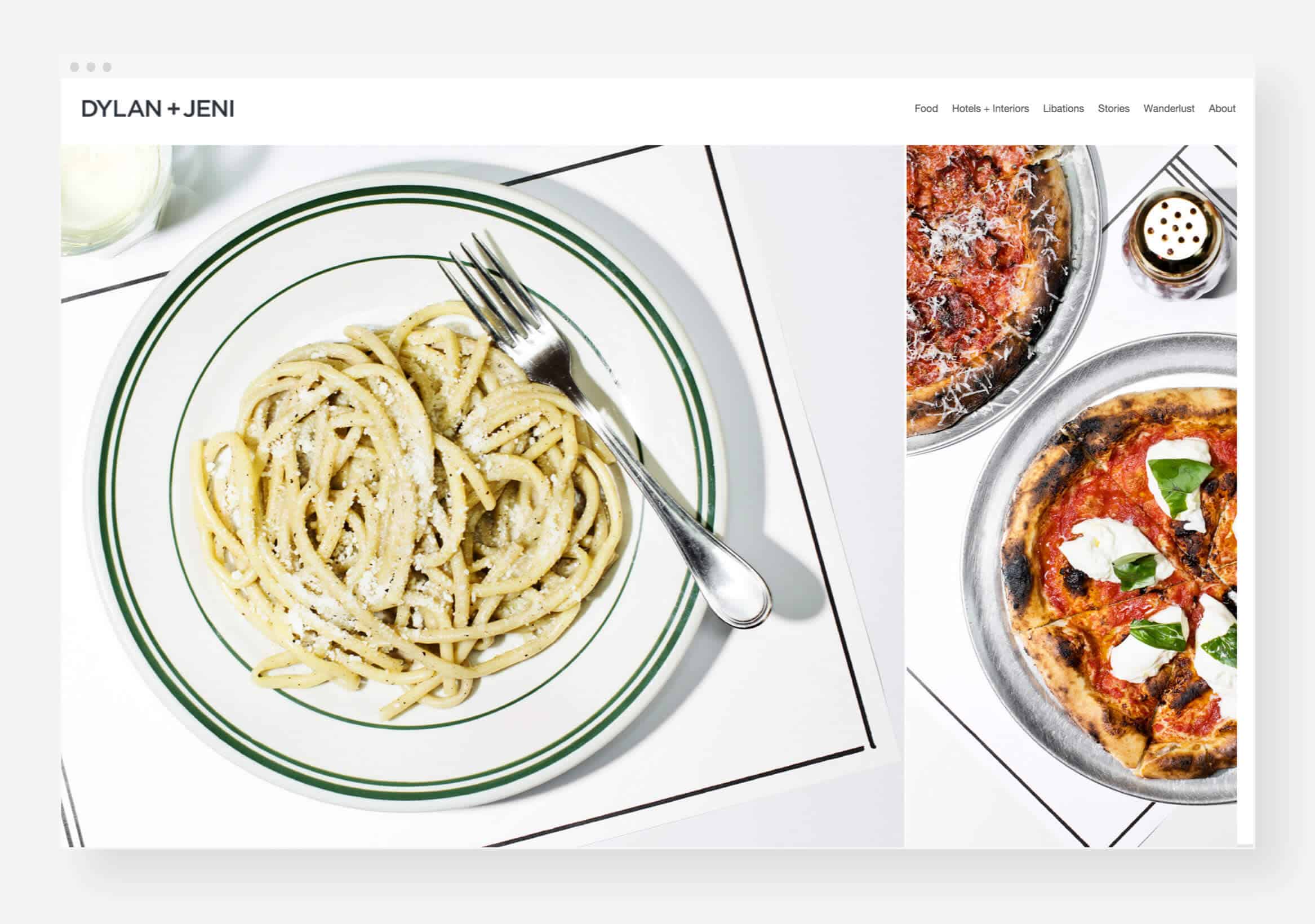
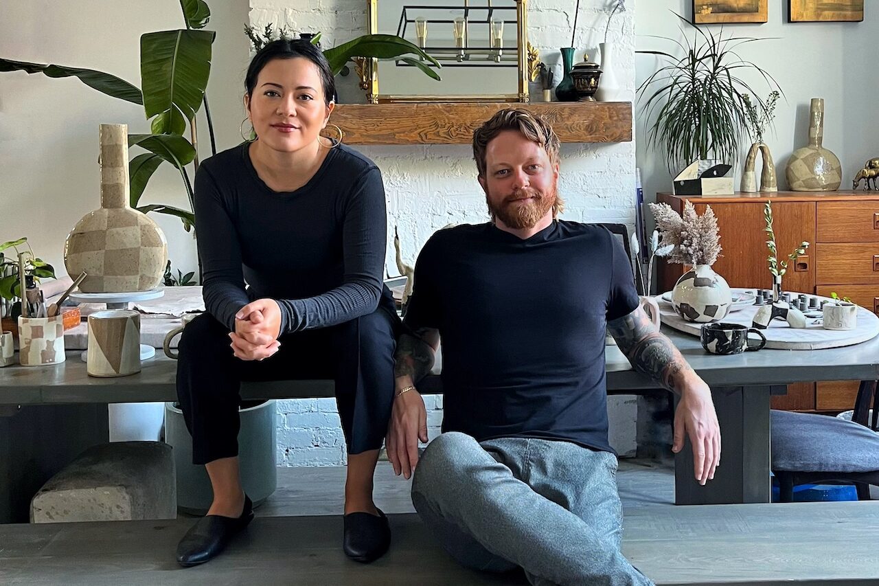
Dylan + Jeni’s Online Portfolio
10. Keep Updating Your Portfolio
Keep updating your portfolio to show off your new work. One of the advantages of an online platform like Format is the speed of updating your portfolio. Paying someone else to add new products to your online store or change your website’s layout costs a lot of money. Use a website builder with simple templates to manage your portfolio.
By not updating your portfolio in a long time, you may be sending the message that you are inactive or unmotivated. Try updating your portfolio once a month with new images. If you use social media, you might consider reformatting your posts and images as new website content.
If your portfolio hasn’t been updated in a long time, you could be communicating that you’re inactive or not committed to your work.
With Format, you can easily create a professional online portfolio to find your next job. Thousands of photographers, designers, illustrators, artists, and models use Format in over 149 countries.
- Beautiful, responsive themes professionally designed to showcase your work on all devices and browsers
- Flexible pages and layouts with customizable options
- Powerful image-based blogging built right into your portfolio
- Fast and friendly 24/7 support
Try a 14-day free trial. No credit card required.
Format Success Stories
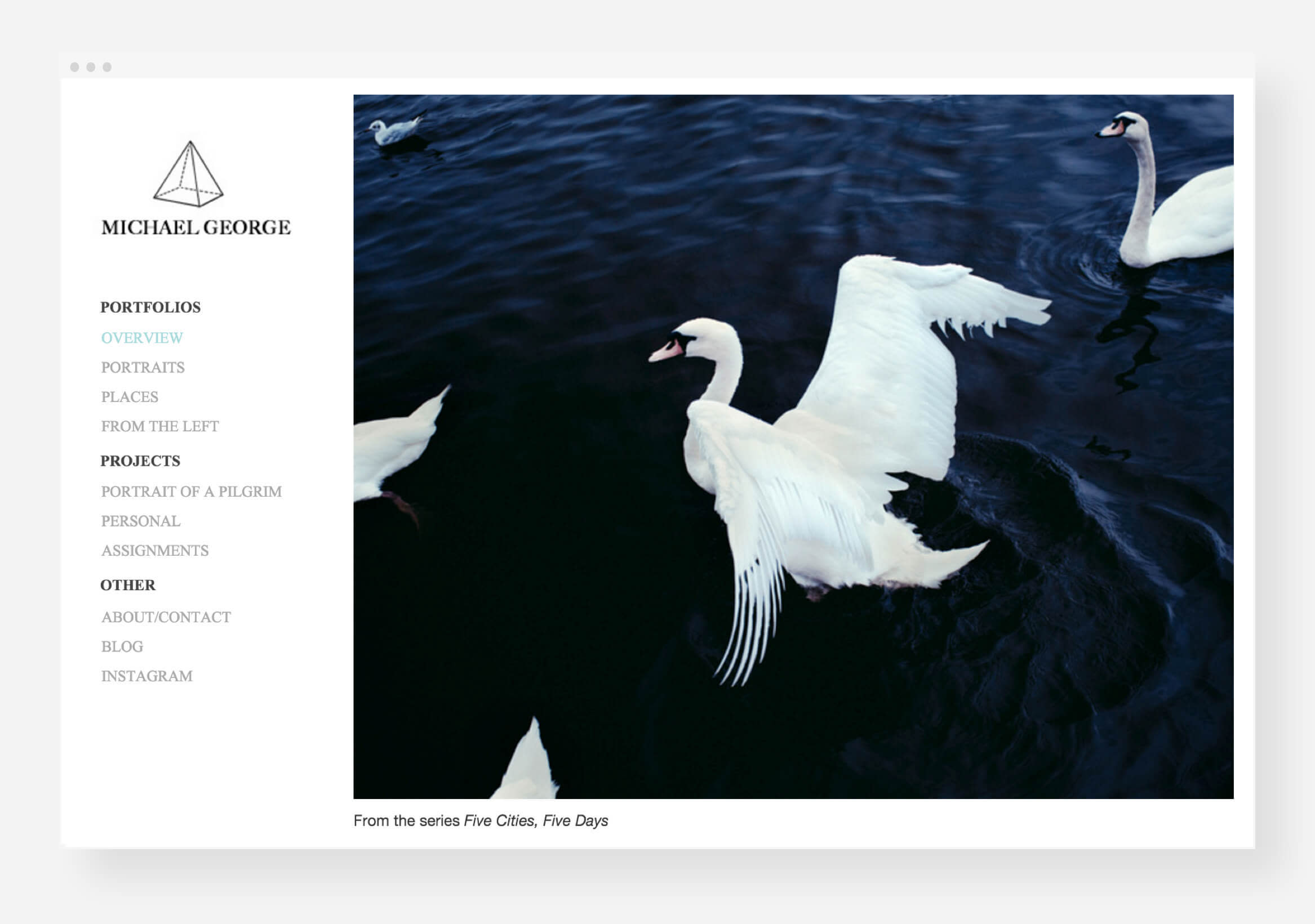
Michael George’s Online Portfolio
Within 48 hours of posting images to his Format portfolio, photographer Michael George was contacted by National Geographic. His series “Portrait of a Pilgrim” was printed in the magazine, and the rest is history. In a few short years, the Brooklyn-based adventurer has documented stories from London, Brussels, Tel Aviv, and across the USA. His work has been featured in Wired, Popular Mechanics, and Inc. Magazine.
“Everyone raves about how seamlessly ‘Portrait of a Pilgrim’ on my Format portfolio mixes photos, text and video. I’ve had so many people tell me that they love how it’s set up. I don’t know how in the world I would have designed it without Format. That series was published in National Geographic and they discovered it on my website.”
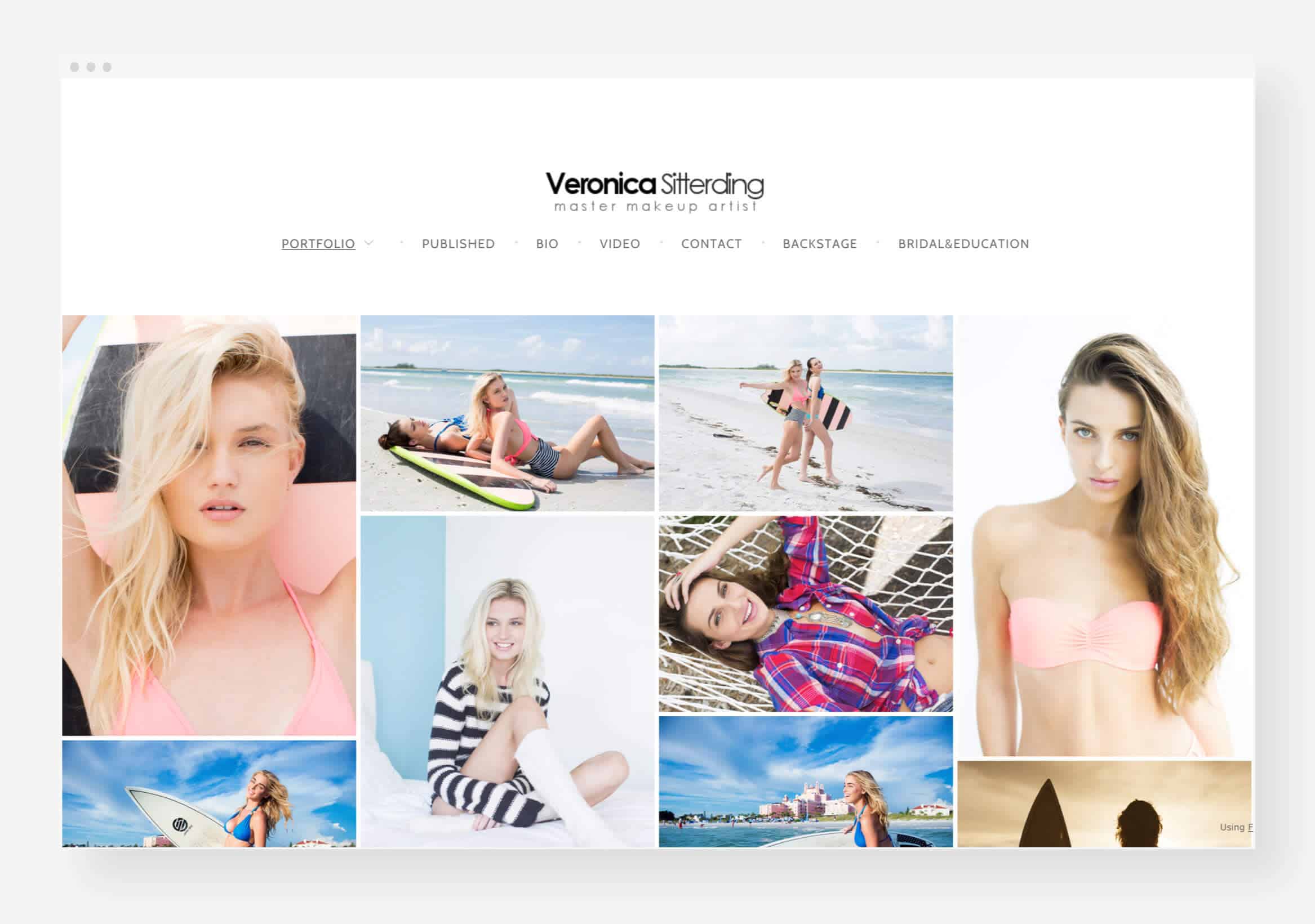
Veronica Sitterding’s Online Portfolio
Atlanta-based makeup artist Veronica Sitterding has been using Format since 2012. She believes that when you’re in a creative industry, you shouldn’t leave your website in someone else’s hands. A clean, simple design creates a lasting impression on potential clients.
“Format has changed my presentation, changed my business and changed my life! I immediately fell in love with the user experience and how easy it is to make edits to your content. When you are in a creative industry like I am, it is imperative that you are able to make changes instantly and frequently. My work is constantly changing, and I am constantly changing as an artist. People are constantly commenting on how great my site looks, how clean and easy to use it is and how much they love the simplicity. That is everything I wanted in a website.”
