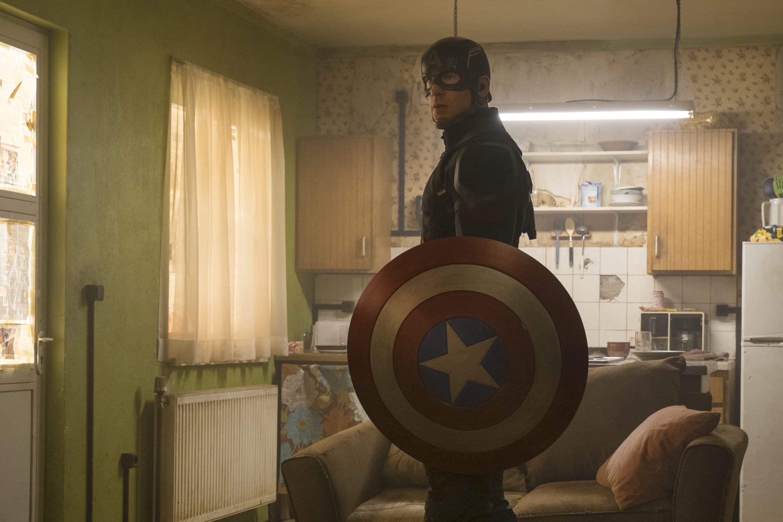
Ever wondered why Marvel’s notoriously action-packed films portray the explosive visuals of superheroism in dull, flat, milky cinematic color schemes? In a new YouTube video essay titled Why Do Marvel’s Movies Look Kind of Ugly?, Patrick Willems (creator of the YouTube hit What if Wes Anderson Directed X-Men?) explains the reasons behind this phenomenon, and offers insight into the challenges of digital cinematography.
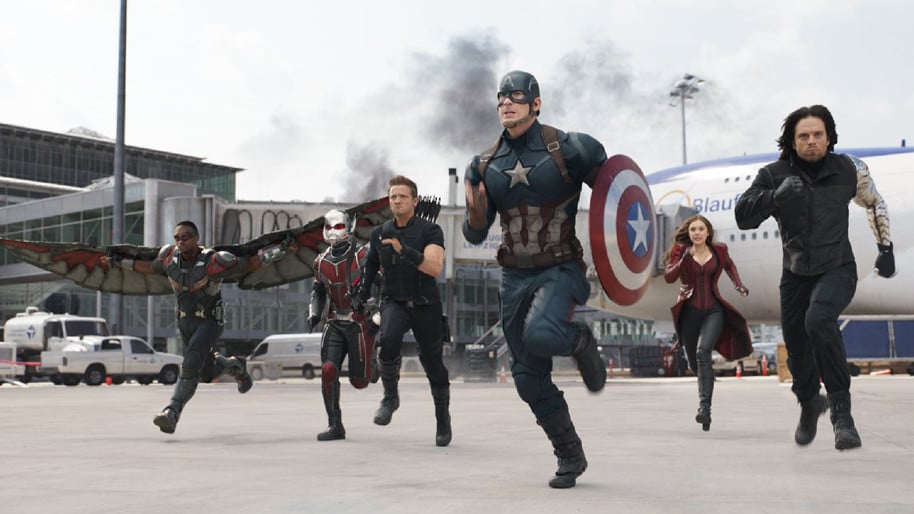
Why do all Marvel movies look like muddy concrete? Look at that. It’s a great scene—but that’s really ugly.
The problem begins with the difference between the ways that film and digital cinema cameras capture images. When shooting film, you start with a blank negative and specific parts are exposed to light during filming, leaving sections that will become pure black during processing. In contrast, when shooting digital, as virtually every filmmaker in the industry does today, the images are captured in log format which produces a grey, milky image that lacks pure black sections. Log images shot by digital cameras look like this because they contain a ton of information, have far less contrast, and acquire far greater dynamic range. After switching from film to digital upon completing their fourth film, Thor, Marvel Studios have predominantly used the Arri Alexa, which together with the RED series cameras comprise the industry standard for high-end digital cinema.
Capturing such a large range of information is desirable specifically so that when you color grade the movie in post-production there’s still a large spectrum of color tones left over in the finished images after manipulation. First applied to an entire feature film for O Brother, Where Art Thou? in 2000, the process of color grading, or the digital manipulation of the tones and colors of raw footage, lessens the quality of the image. Because of this, state-of-the-art digital cameras aim to capture as much information as possible so that the finished product is the highest possible quality after color grading.
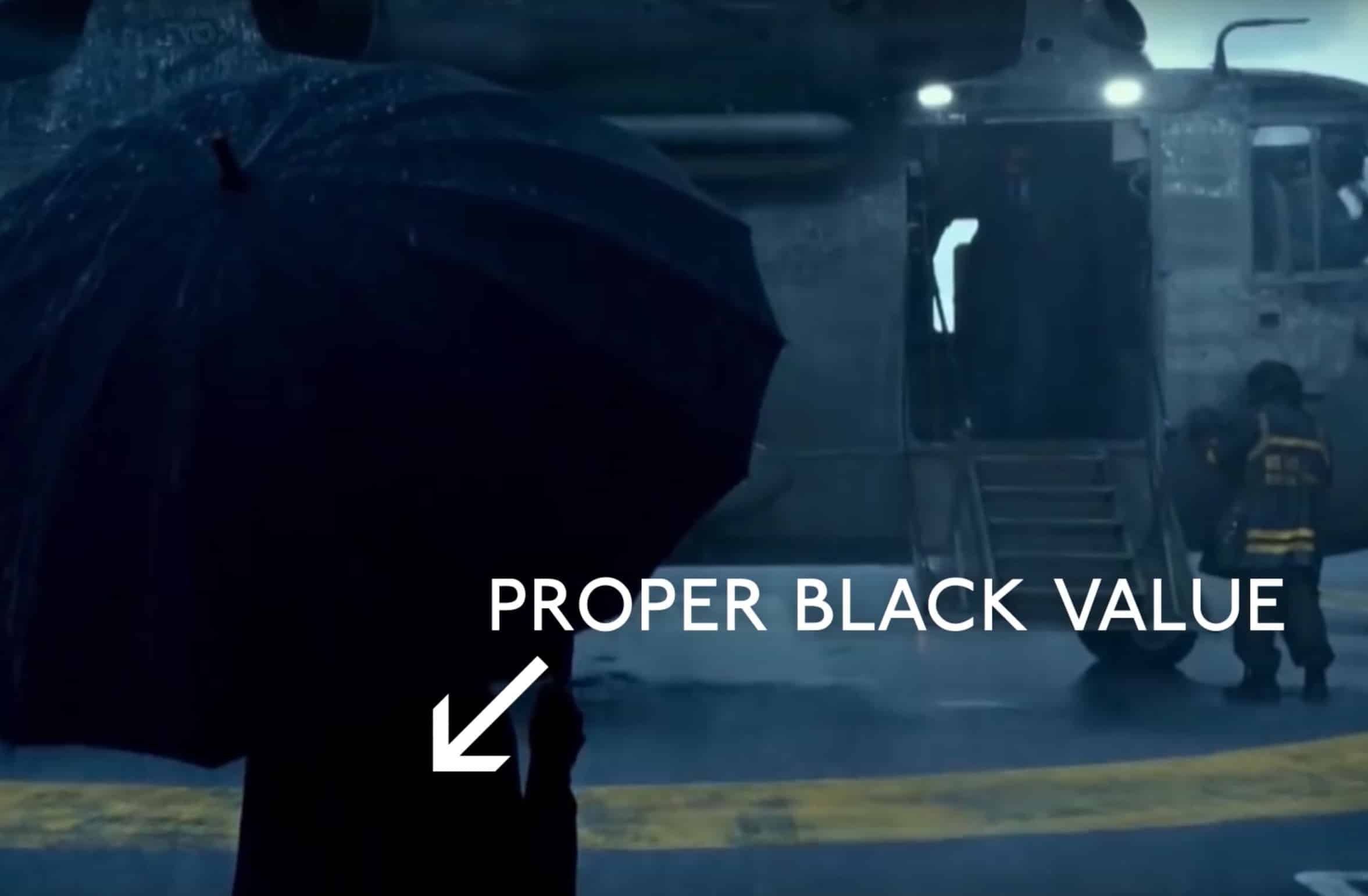
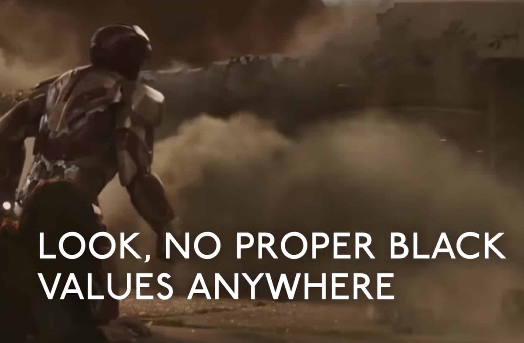
However, Willems explains in his video that the problem with Marvel’s latest eleven films, including Dr. Strange which was released last month, is that they don’t use color grading effectively to boost the digital footage captured by the Arri Alexa. The result is that they’re left with grey, flat, dull images which are, in Willems’ opinion, unbefitting to the superhero blockbuster aesthetic.
Many people will argue that digital cinematography can look just as good as film. Willems points out that films like Pacific Rim and Mad Max: Fury Road were both shot on the Arri Alexa and look cinematographically fantastic because the darkest parts of the images you see on screen have been reduced to pure black during color grading, making the surrounding colors pop.

A great illustrative example for the mechanics of Marvel’s color problem given in the video is the process of creating comics artwork. Comic books have traditionally been drawn in three stages: a pencil design of the image is overlaid with black ink and then filled in with coloring. The black inking is essential because it gives contrast and definition to the image. There was a trend in the early 2000’s of omitting the inking stage of making comics art, most notably in Salvador Larroca’s art in X-Treme X-Men. The result was this washed-out, flat imagery characteristic of Marvel’s films.
In an example of his own, Willems demonstrates the key role that pure black values play in making images deep and vibrant by briefly adjusting the saturation and color levels of a short segment of Marvel’s Guardians of the Galaxy. Comparing the before and after, he notes, “I know these are aesthetics, and thus are totally subjective, but I think that’s a much more vibrant image. It’s more dynamic, it has more definition, and it looks like what I think a superhero movie should look like.”
This subjectivity is critical in deciding whether highly boosted, stylized imagery is more desirable than subdued, more realistic coloration for any given project. Willems suggests that films like Spotlight and Sicario may be better suited to the more muted, flat visuals produced in uncompressed digital footage because their stories revolve around real worlds and events, while fantastical superhero epics should offer bright images that “pop off the screen.”
Nonetheless, Willems concedes that Marvel Studios, whose films have all brought in between $260 million and $1.5 billion worldwide, has probably done market research to support their color grading decisions. It’s even possible that they use this mundane color pallet to situate their superheroes and larger-than-life narratives in the real world and give the film a more realistic feel. Then again, The Dark Knight boasts deep blacks, electrifying pigments, and a low-key visual style and is widely considered one of the most realistic superhero films of all time.
The video concludes by anticipating that Marvel’s recent switch from the Arri Alexa to the new RED Weapon 8K camera will help them tackle the dimness of their color presentation. Marvel’s latest work in progress, Guardians of the Galaxy Vol. 2, is already using the RED Weapon 8K, and Willems pronounces preliminary footage a definite improvement that contains deeper blacks and more vibrant colors. Whether this really is the result of shooting with the RED in 8K is far from settled, as resolution is only one of many factors that contribute to an image’s ability to withstand heavy color grading.
One thing is for sure, Willem adds hopefully—Marvel makes enough money to simply revert to the glory days of shooting in film and circumvent this pitfall of digital filmmaking entirely.


Willem’s color grading edit of Guardians of the Galaxy. From the movie’s footage on the left, he tweaks the levels and adjusts the saturation to make his version on the right.
Watch the full video below:

All photos via Why Do Marvel’s Movies Look Kind of Ugly
