Commercial advertising has been changing over the last decade as the media maturity of viewers grows and advertisers work harder to improve the authenticity of their campaigns. Advertising delivered by a traditional format or to a modern digital platform now more than ever has to really stand out for that impression to be effective.
The audiences of today are incredibly attuned to the sincerity of ads. While it’s everyone’s job on a film set to make a campaign genuine, as a cinematographer the simplest way to communicate that sincerity is for it to look natural. And with that, the use of consistent and naturalistic lighting is paramount.
Like spending hours making yourself look like you just got out of bed, lighting something to look naturalistic in practice is actually quite an art. Naturalistic lighting is complex, and in the past hasn’t been favored much in advertising due to its traditionally slick and high tech look. As a cinematographer, it’s your job to tread that delicate balance and deliver images that are sleek but authentic.
Advertising schedules tend to favor designed looks and controlled environments to manage high expectations and risk, which leaves little room for exploring natural or found lighting on the day. However, the varying choice of formats and vast amount of information captured by cameras today allows for new exploration within lighting set ups. Formats can now read even the subtlest levels of ambience. Formats are so sensitive that ambient light can lay the foundation of a lighting setup. From there, it’s often a case of modelling with a focus on the following four areas: ratio, shape, softness and color temperature.
1. Ratio
When you walk back to the monitor to take a look after playing with some lights, how does everything sit together? How much darker is the background than the foreground? The subject with the ambience? How much darker is the fill side of the subject than the bright (key) side? These are the ratios you need to consider. Of course, these exposures can be very different, but our eyes have a natural ability to interpret dynamic range that makes it possible to see. Cameras cannot do this, and so to mimic what we see, it’s about getting close to an even spread.
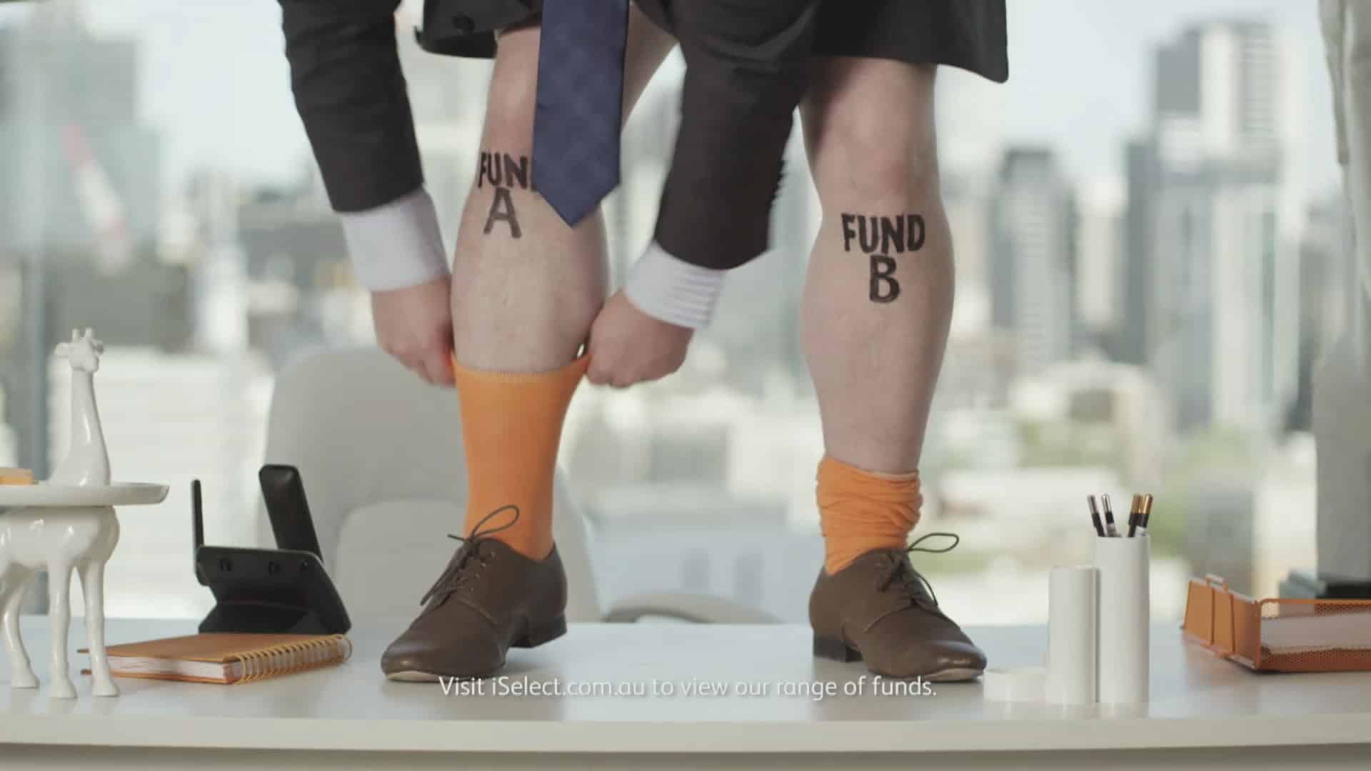
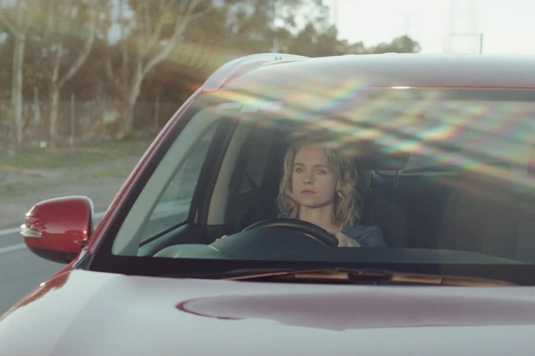
This iSelect commercial was shot in an office block with the Melbourne skyline as a real backdrop. The exposure difference was big, about eight stops. To ensure the background was not a sea of blown-out whiteness, the best option was to use a 6K as the key through a diffusion frame so that it matched the background. The end product is a very snug relationship between the subject and the background.
Take a look at this lighting set-up on a road safety TV commercial.
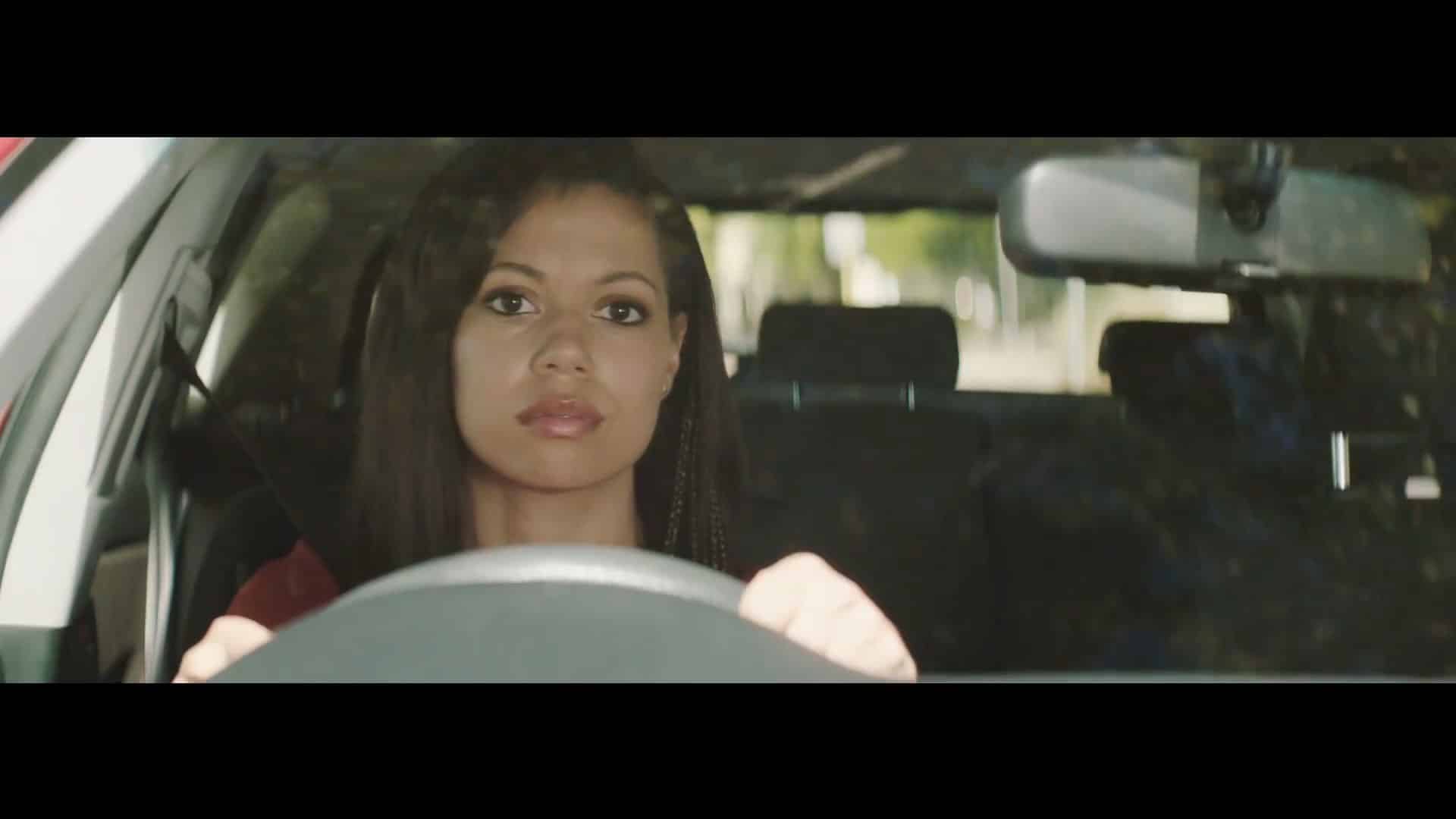
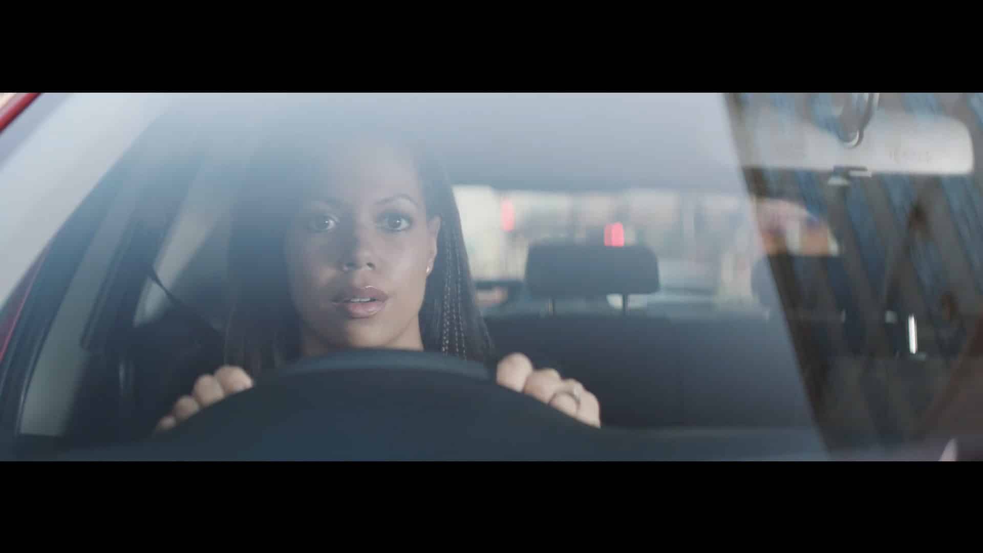
These lighting set-ups are identical in both shots. The one on the left is shot in an airy street at midday. The one on the right was shot in a dark street in middle of the CBD late in the day. The key light in both shots is a 4K through a 216 full diffusion frame. What’s different is the ratio, meaning that the key light has more of an effect on the right as the ambience outside is lower. Due to the fact that it is more effective, it in turn has more ability to be shaped.
2. Shape
Shape is the easiest way to maintain a high value aesthetic, delivering the advertising gloss that viewers expect. It can be as simple as shifting the relationship with the camera to the object to make it receive a fixed light source on a nice 1/4 angle. Or if the light is malleable, then shifting the key closer or further away from the camera on an arc.
You can also choose to remove light on the fill side to create shape. Cameras have native ISOs that are getting higher and higher, which means lighting is more about removing light than adding it.
Creating shape in a lighting setup is one of the most elementary parts of the work of a cinematographer. Just because something has shape doesn’t mean it’s an entirely fabricated look.
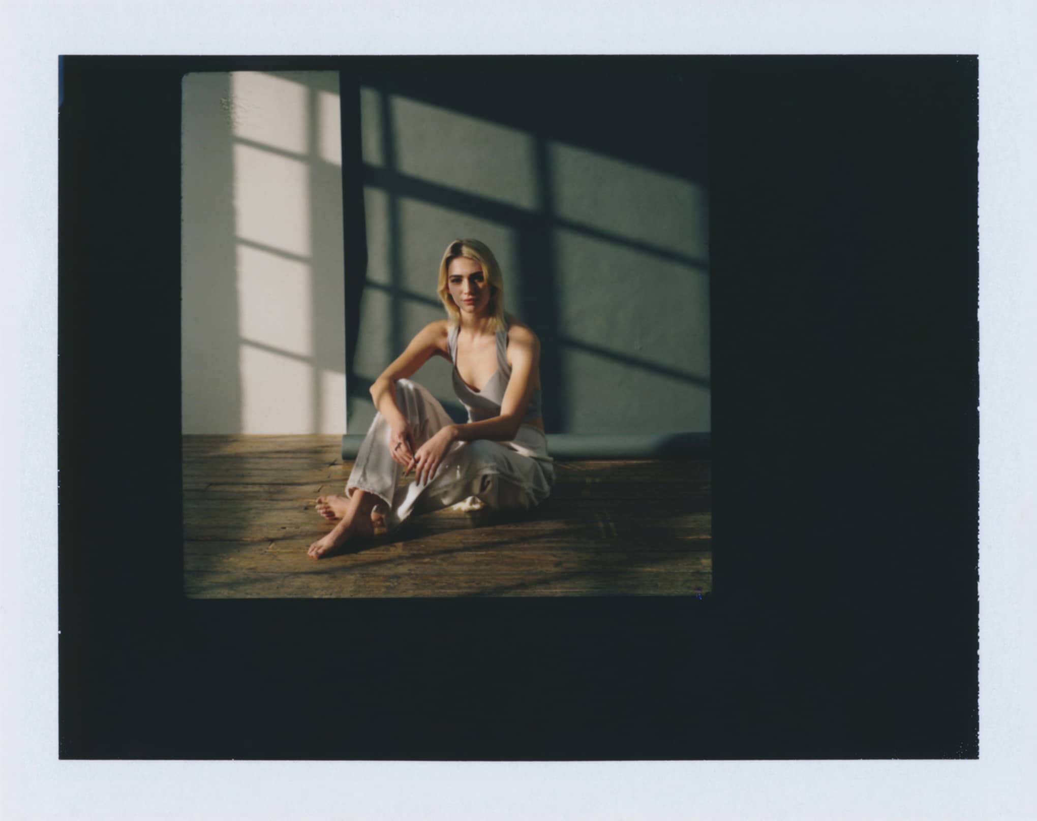
This shot was mostly lit with ambient light. The fill side of the face was made by using thick black fabric hung on the left side of the camera in an arc.
3. Colour Temperature
So much modern cinematography is about using existing light sources. When doing this, it’s important to remember that when you are mixing different types of light sources that there are different visible qualities.
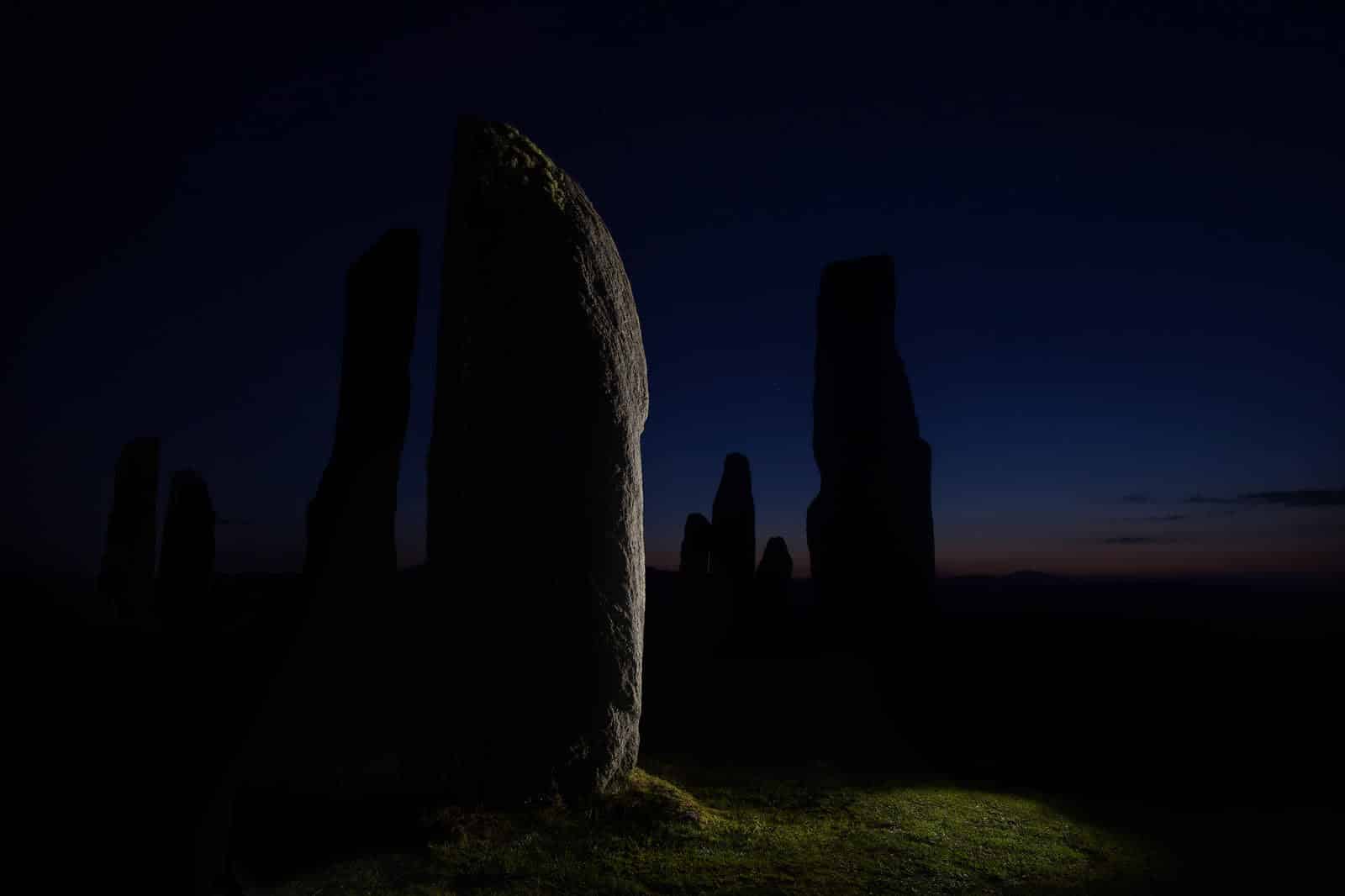
If you’re out shooting under street light, moonlight, first light, or disco light you’ll want to ensure that if you introduce another light source, it matches the overall feeling. To do this, you’ll need gels.
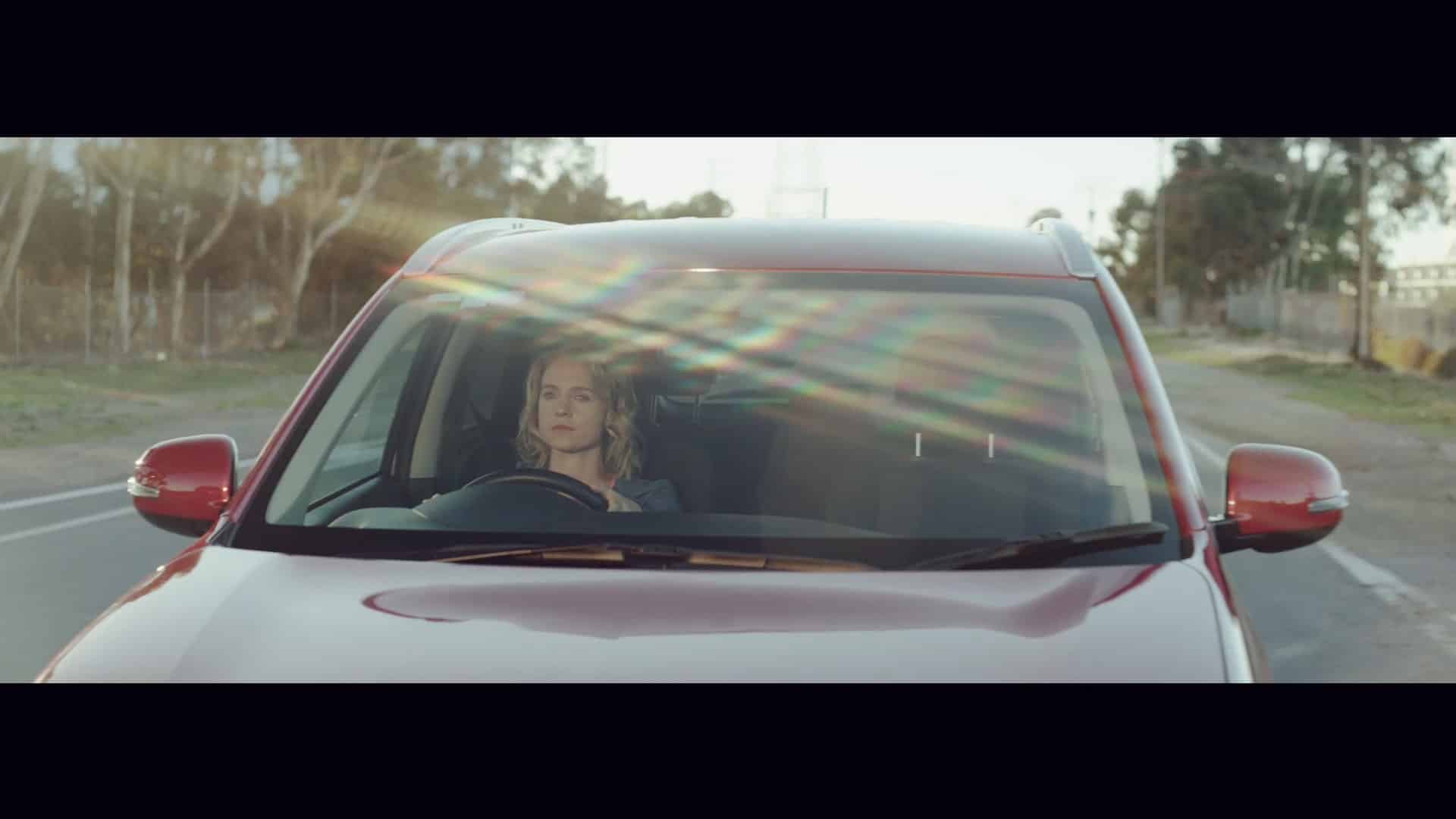
This frame is obviously shot at sunset. The fill light which was a 6K to the left of the camera has a straw gel on it to mimic the tones from the setting sun.
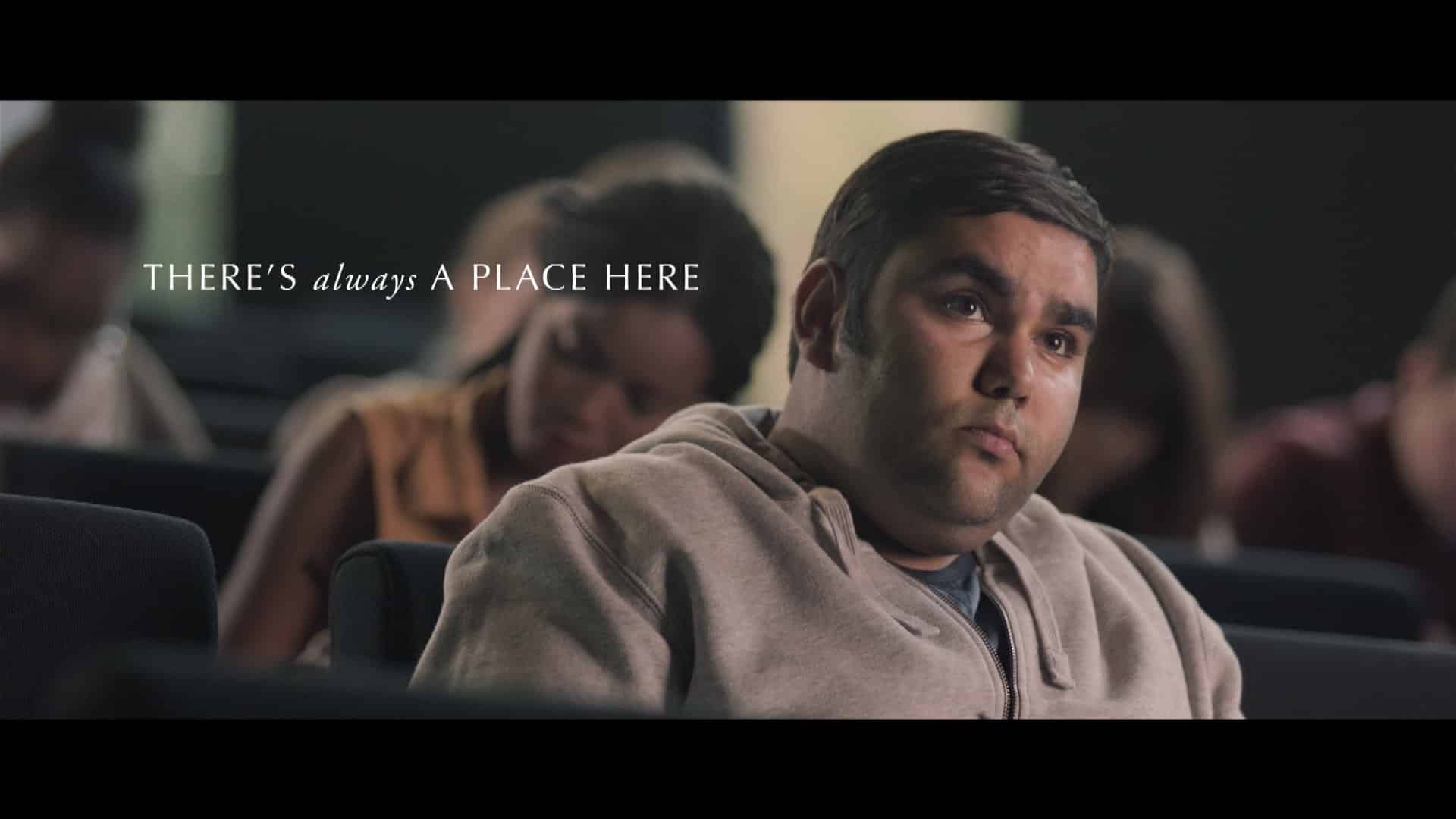
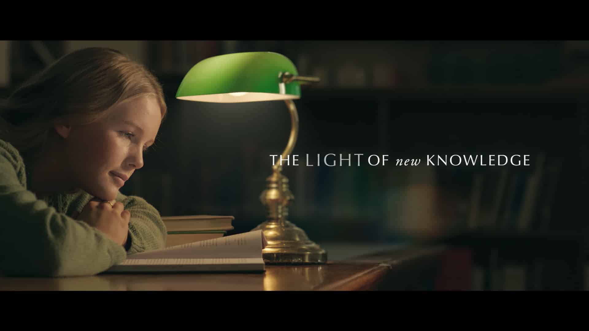
Similarly, this practical light in the shot below has a certain warmth. The student here was lit by a kino light that was made to match the feeling of the dimmed banker’s lamp.
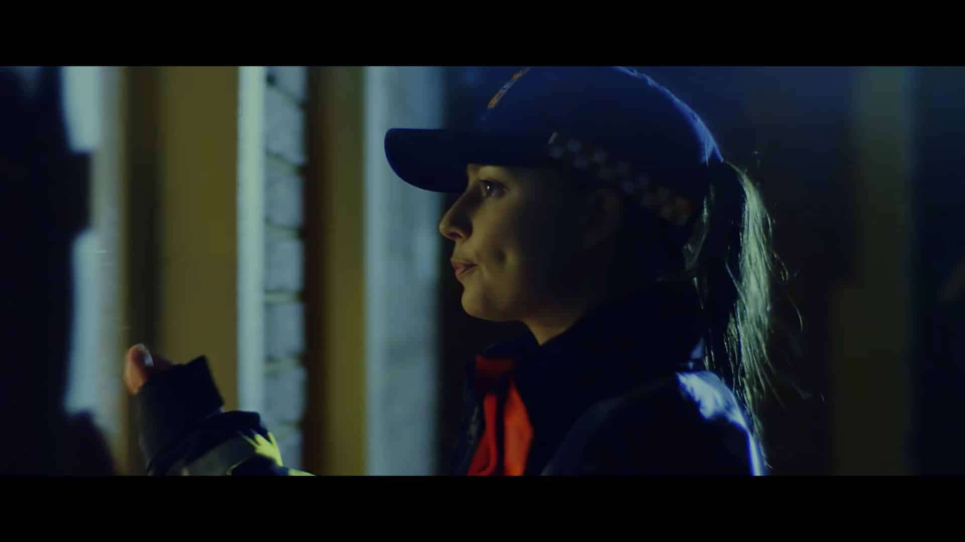
A lot of cinematographers prefer not to play with mixed colour temperatures, but this can help make a shot look more realistic. Here, an Emergency Services crew member is knocking on someone’s window. Street light is acting as a kicker hitting her hair, while there is a glow through the window. Both are different color temperatures and color tones, but still help deliver a scenario that feels true to life.
4. Softness
When the choice is available, softer light is better. It’s much more pleasing to the eye and suggests some degree of authenticity. All lights are inherently very different in their softness, and there are many ways of making a source softer: such as applying diffusion gel, introducing a scrim frame, or by simply bouncing it off something.
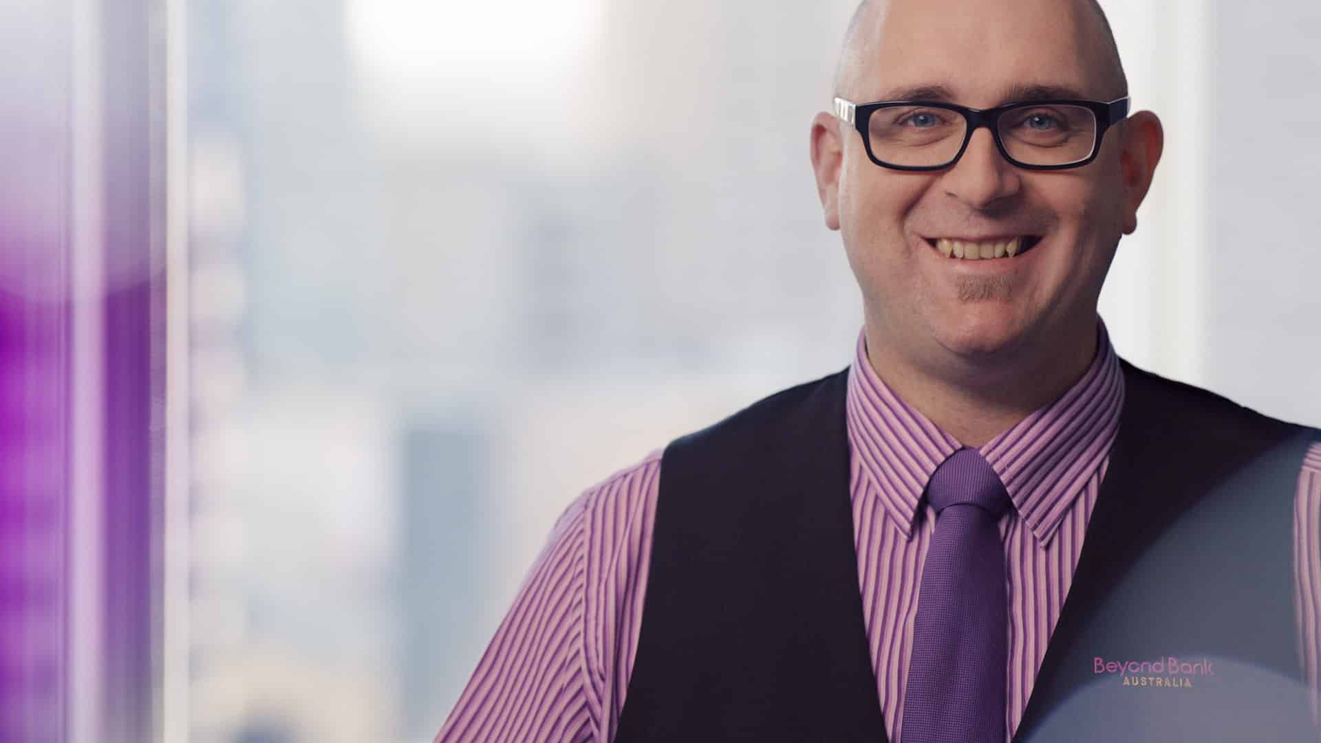
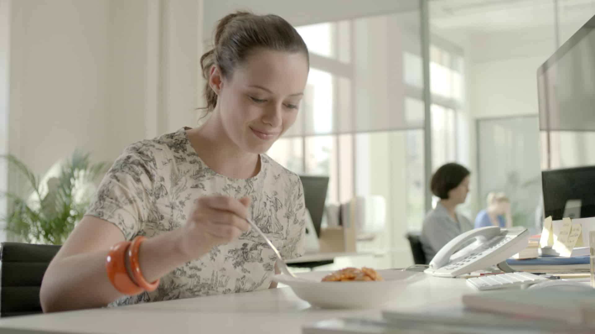
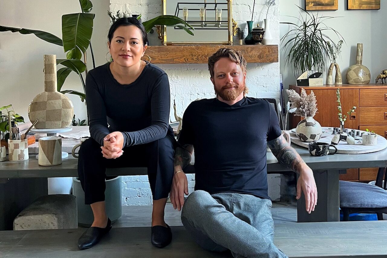
A simple kit of 800W Redheads can become a beautiful soft source by bouncing them off a bed sheet pinned to a wall, or my personal favourite: family-sized pizza boxes dropped into a pillow case.
As a cinematographer, whenever you are out and about in the world it’s worth taking a step back and looking at what is natural. Often you need to work twice as hard to keep a natural environment looking and feeling just that, natural.
Miles Rowland has shot campaigns for iSelect, Qantas Frequent Flyer, Tourism New Zealand, The University of Adelaide, Bank SA and Beyond Bank Australia and many others. His award-winning short films have been screened all over the world. Visit his portfolio here.
