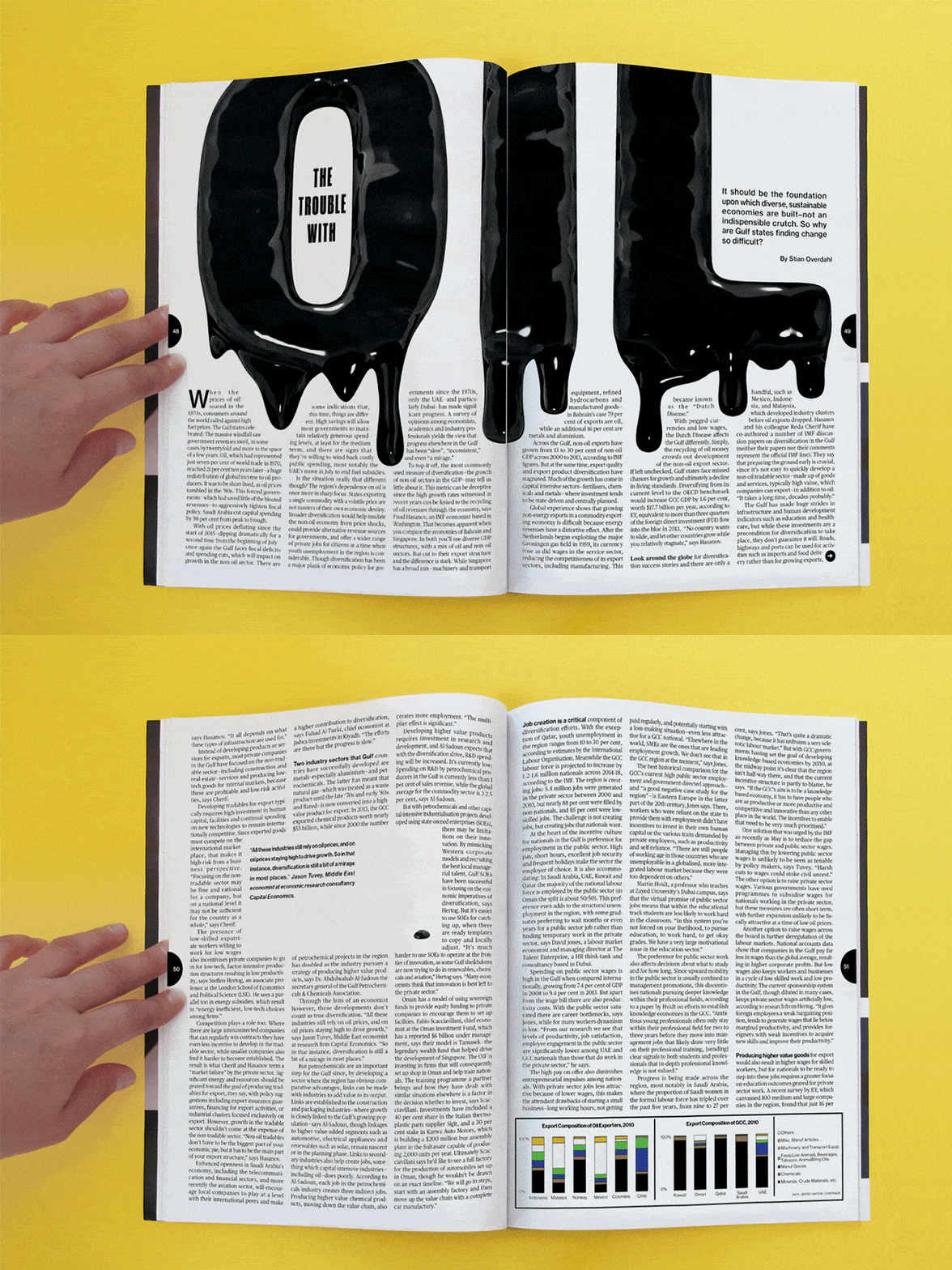
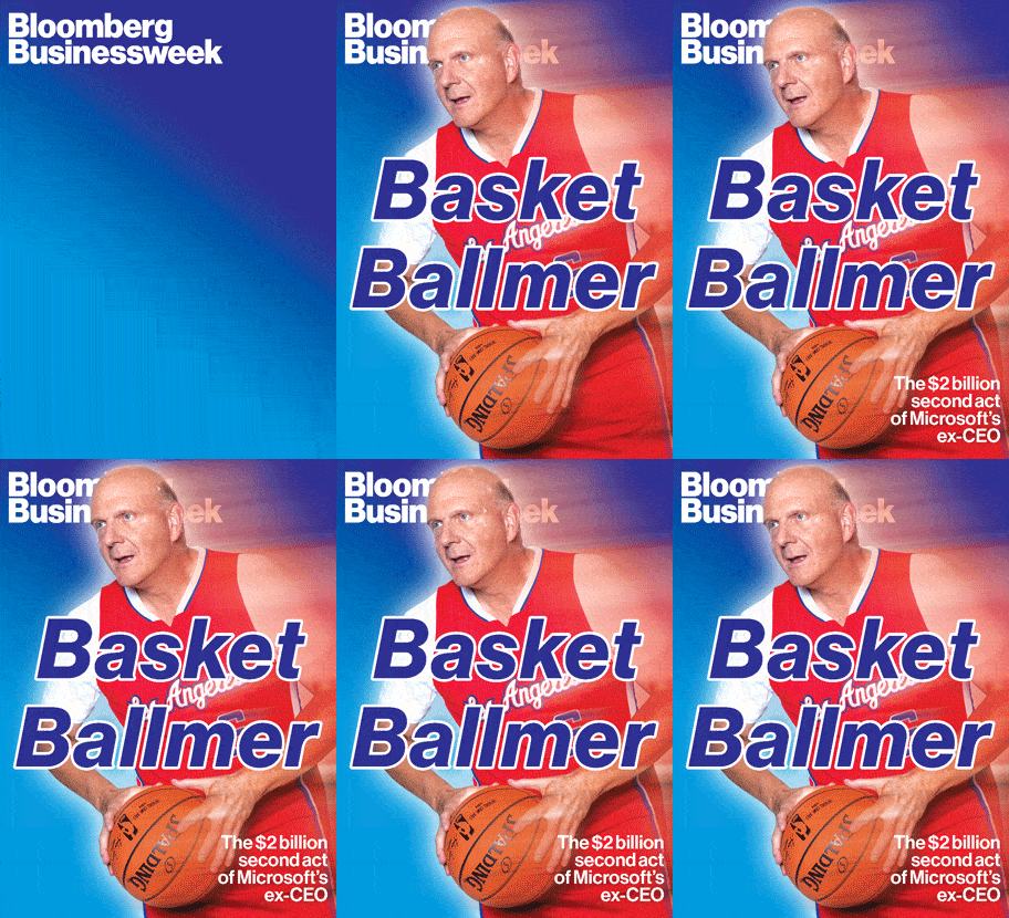
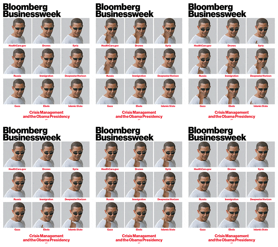
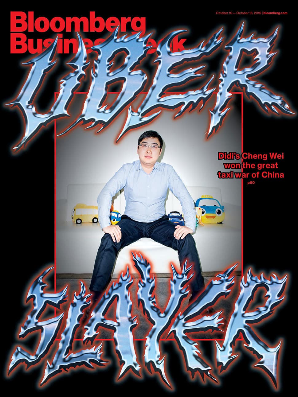
For a magazine that publishes serious coverage of global politics and financial issues, the design aesthetic of Bloomberg Businessweek might surprise you. They’ve become known for cheeky humor, ultra creative covers and online animations. This ain’t your grandpa’s newspaper stock reports. It’s something fresher for a new generation of readers that want business stories with a heavy dose of style.
Rob Vargas joined Businessweek in 2010 after stints at The New York Times and the now-defunct Details magazine. He become the creative director in 2014, taking over from Richard Turley, who originally spearheaded the magazine’s makeover. Turley’s facelift saw the 80-year-old magazine transform into a visually dynamic publication that shifts with ease between print and digital.
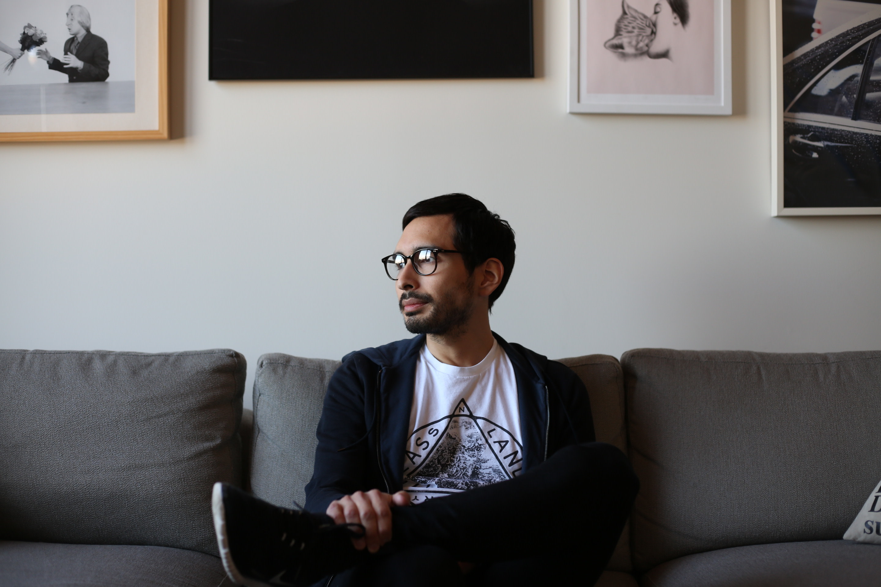
Vargas remembers the week they rolled out the redesign with some amusement. The fax machine was receiving nonstop outraged messages from older readers demanding to know why the cover looked so different. “We had one complaint—because we moved the page numbers from the bottom of the page to the middle of the page—wanting to know why we’d removed the page numbers,” says Vargas. “I think we probably lost some readers with the redesign, but I think we also gained some.”
It shouldn’t come as a surprise, given the irreverent nature of Vargas’s Businessweek, that the creative director is keen to work with emerging designers and photographers, and often turns to Instagram to scout out fresh talent. We talked to Vargas to find out what he looks for in a pitch, the design process that goes into Businessweek’s covers, and the redesign that’s rolling out in this May.
If everything is just doom and gloom all the time, you’re not necessarily serving the reader.
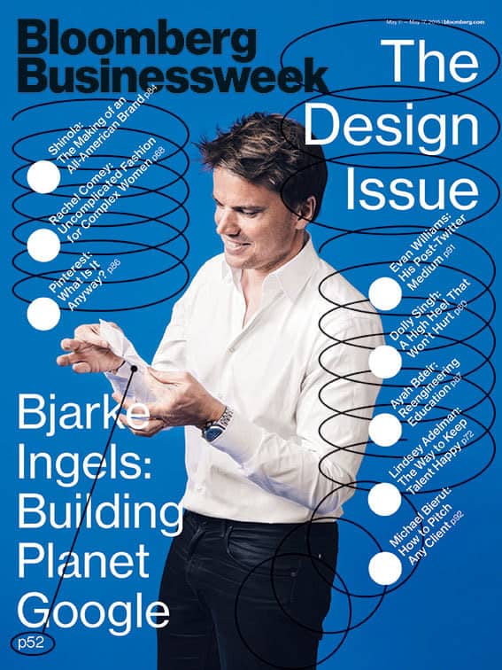
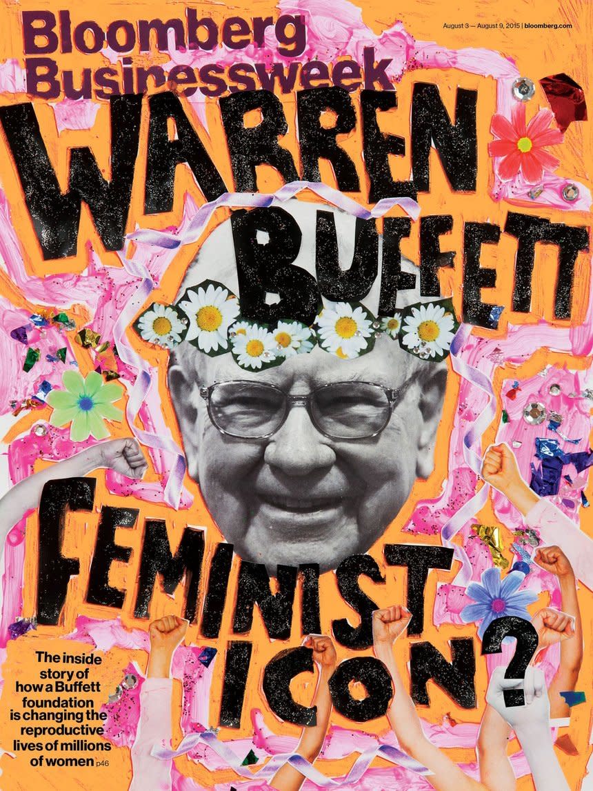
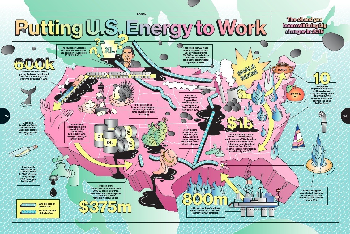
Format: Hi, Rob! The first thing that stands out about Businessweek is the humor. Do you have a design mission to be funny?
Rob Vargas: We have a sense of humor, but with certain exceptions. We’ll do serious covers when topics are about people’s lives being in danger, but we definitely contrast to other magazines that have a really angry and unabashedly critical tone.
Personally speaking, I think humor is really important. If everything is just doom and gloom all the time, you’re not necessarily serving the reader. If you give the reader serious and important information, but also make them smile a little with the design, I think there’s value in that. That’s the space our aesthetic exists in, and that’s what we’re adding to the content.
What does your commissioning process look like for freelancers?
The traditional method is that a magazine has art directors who are solely focused on commissioning photographers and illustrators. At Businessweek, we commission 97% of our photographers, but in terms of illustration and typography, we tend to do more of it in-house. We invest in getting people who can be here on a full-time basis.
That said, we do take pitches. It’s very fluid and there’s a fast turnaround. There are designers who’ve been here for years, there are freelancers who want to remain freelancers but just want to come in for six months, and then there are designers who work with us for small chunks of time. It’s very fluid. Like anywhere, there’s definitely a flow and turnover.
What kind of design is piquing your interest right now? Are there any specific trends or styles that you’re looking to incorporate into the magazine in the upcoming year?
That’s actually a tricky question, because this is our seventh year of the current iteration, and right now we’re exploring a redesign to roll out in May. It’s a little tough to have a good sense of what kind of aesthetic we’ll be looking for. Generally speaking, what excites us when we’re looking at illustrators, artists, and typographers is people who haven’t been over-used. Not to say that a person’s popularity makes them less valuable, but we’ve created a space for ourselves where we have this somewhat strange and unique aesthetic, so we like finding people who maybe have never done work for a business magazine, or maybe have never done work for a large circulation publication before.
We’re interested in approaching people who might give us a more unexpected result. We don’t like the idea of classic editorial illustration—the way we’d define that is men in suits climbing letters. We like illustrators who have a very strong voice and aesthetic, and who don’t necessarily do things that pertain to our content. We think that tension creates something interesting.
What does a great pitch look like to you?
Something surprising. There are different ways to define something great—it can be very beautiful or it can be ugly in certain ways. I think for us, we’re looking less for things that are classically beautiful. We’re looking more for things that have a very contemporary voice, and feel like they’re existing in today’s culture. Something that feels very current. And I think that’s always changing.
So a great pitch for me communicates that the artist is in a mode where they’re taking risks, where not every piece in their portfolio is polished. We want to see a lot of experimentation and a lot of playfulness. Those are the type of things that get us excited right now.
We like illustrators who have a very strong voice and aesthetic, and who don’t necessarily do things that pertain to our content. We think that tension creates something interesting.
Do you have a preference for analog versus digital work?
No, not really. It’s all dictated by the context and timing. For 3D rendering, we need more time to execute, and obviously analog styles can be executed quickly. So on a logistical level, analog is easier for us. We also really like when we have a strong sense of the artist’s hands in a piece and when we do 3D work it’s the same thing: we don’t want 3D work that looks too polished. We like imperfection. But obviously, it’s on a case by case basis.
Where do you look for new talent?
I’m on Instagram a lot. I’ll check someone’s profile out if they’ve liked a post of mine. Most of my posts are dumb, so I know if someone has liked my post they probably kind of understand my humor. I’ll go check out their profile, and a lot of times they’re very cool artists or illustrators, and then I’ll look through their feed, and find other artists who’ve commented on their posts. For me that’s the most organic way to discover people, but obviously I still look at agencies and also cruise Behance. It’s a mixture.
Do you ever work with totally fresh talent who’ve never worked with another publication before?
Oh yeah, for sure. I get the most excited about that. There are a few artists who we gave their first commission. I think that’s really important. There’s so much talent out there. Obviously, people who are getting a lot of work deserve it, and I’m not trying to take that away from them, but I’m happy to give as many people as possible a chance to get their work out into the world. I don’t necessarily think it’s a good thing if images are being put out by the same people over and over again. In some sense, it’s a bit more of a gamble to work with someone who’s less experienced, but I think it’s totally worth it. You can end up with something that feels a lot more unique.
How do you feel about someone pitching to you more than once?
I think it’s great and important! I mean, sometimes it’s the case that I’ll have someone contact me hundreds of times, and unfortunately I still don’t think they’re quite right for Businessweek. Other times, people are persistent, and then when something comes up, I remember them and reach out.
I get a lot of emails where they misspell the name of the magazine, but if I get an email from someone who has actually looked at the magazine and gets it, it’s kind of a no-brainer. A lot of the time it’s on the illustrator to not send me something that looks like it belongs in Good Housekeeping. Persistence definitely pays, but people also just have to be mindful of who they’re pitching to.
So you get a good pitch. What’s next? What’s the turnaround like?
It can be anywhere from four days to one day. Not longer than that. If we get a draft in early, there’s a 90% chance we’re going to run it. Usually there’s a lot of weekend work. Illustrators will send me sketches over the weekend, and I’ll approve them. So that extends the time we have a little bit. But usually it’s not more than four working days, and if we have a weekend it’s a bit longer than that.
What are some challenges you’ve faced as a creative director?
I’d say striking a balance between giving the designer or artist the freedom to express themselves while also making sure that the design does the story service and makes sense within the magazine. I think part of our specific challenge comes from the fact that we’ve set ourselves up with a pretty eclectic aesthetic, and so the overall feel is: start with the parameter of ‘Anything goes’.
Sometimes that yields something that’s absolutely perfect, but sometimes it’s not quite there. So there’s the challenge of making sure that people are being directed, but also really having the opportunity to put their imprint on it, because that’s part of what makes our magazine special. It isn’t all one homogenous vision. I feel like everyone who has come into the magazine has made unique contributions to it, and that’s something I’ve always wanted to preserve.
It isn’t all one homogenous vision. I feel like everyone who has come into the magazine has made unique contributions to it, and that’s something I’ve always wanted to preserve.
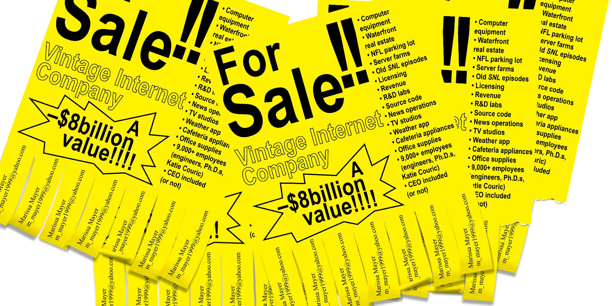
What does the process look like for conceptualizing a cover design?
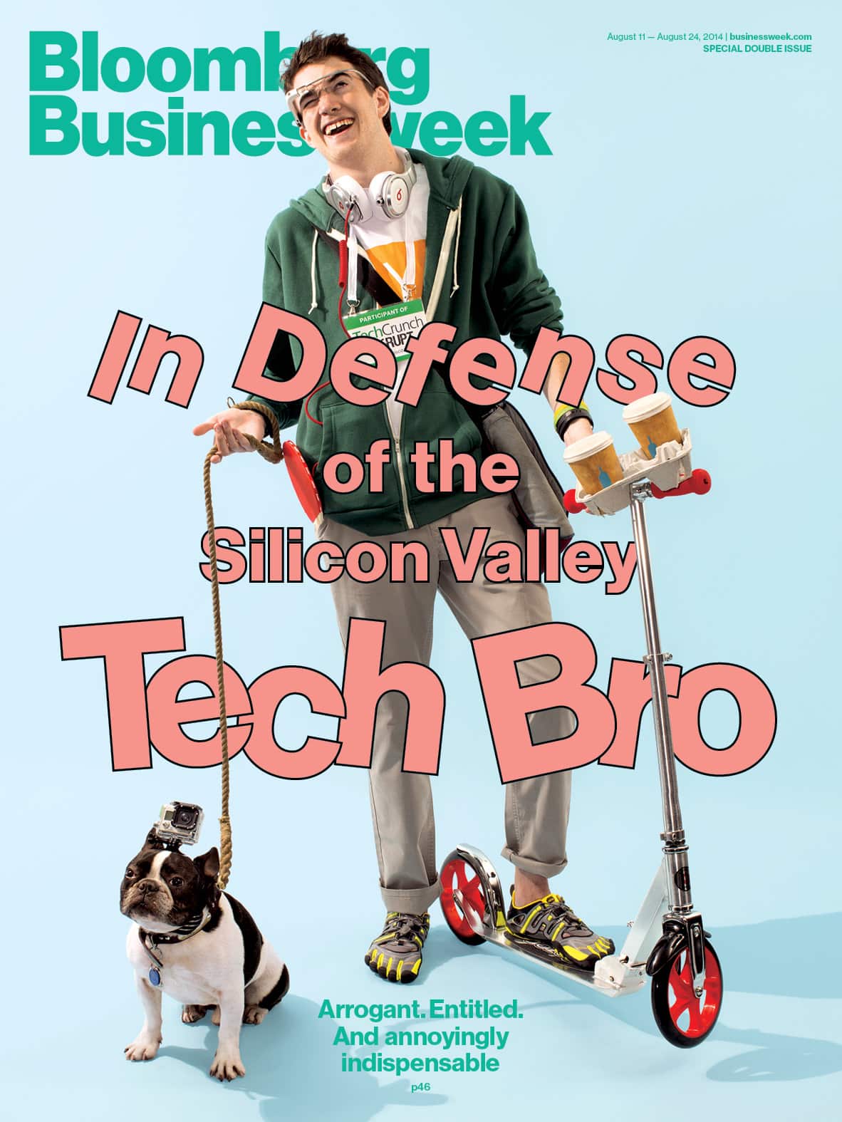
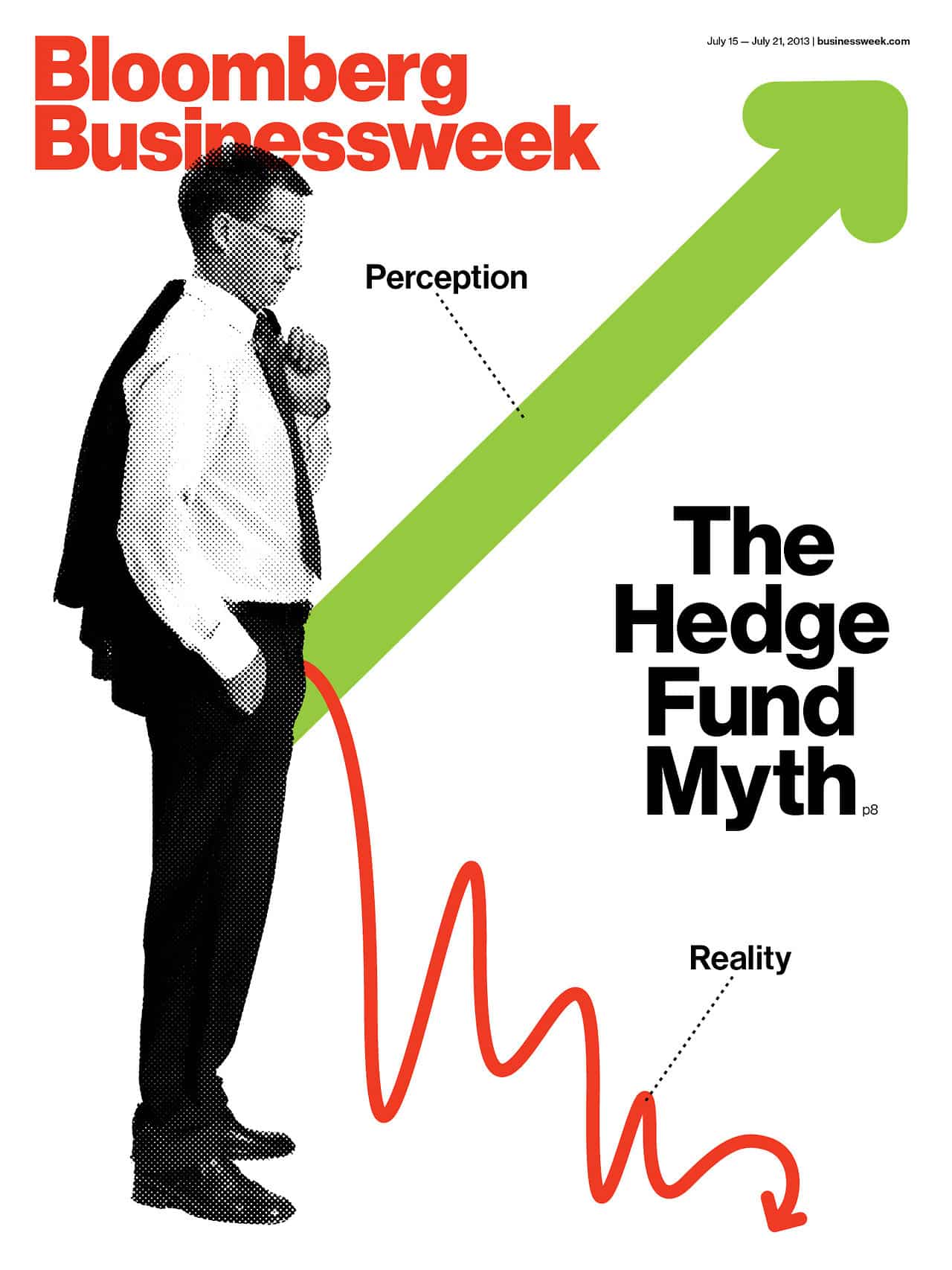
That’s also really flexible. Sometimes it comes from me, sometimes it comes from a conversation with the photo director, sometimes I’ll just send out an email to the entire design staff and have them send me sketches, and we’ll develop the cover from there. It can develop in so many different ways. It’s that lack of consistent process that yields interesting ideas.
I like releasing control a little bit, because from week to week, people’s workloads change, so you want the freshest minds on it. If it was my job to think of the cover every week, it would be a disaster. I rely on the entire staff. Sometimes we do the covers in-house, sometimes we commission them. It’s usually really a group effort.
What does it look like when a design isn’t working out and maybe needs to be vetoed?
There’s been a few times when we’ve been called out for crossing the line a little bit, but generally for really minor things. Sometimes we have a little too much fun with a headline, or sometimes you’re just approaching a tricky subject. Like I said, I always like starting at a point where anything goes, and there are times when maybe we go a little bit too far, and maybe the editors have to reel us in a little.
A lot of what we’ve done here is run stories that are critical of businesses, so we’re often looking at times when there’s factual evidence that a business has done wrong. That gives us a lot of freedom to be playful, and to take those topics and mess with them a bit, because we don’t necessarily have to be sensitive to them.
Do you have any personal projects you’re working on?
[Laughter.] No, not really. I mean, I have hobbies, but nothing that has to do with design. I love this job. It’s a huge rush every day, and I love working with the team I have now, but when I’m not in the office, I just like to disconnect. There are a lot of designers who have trouble unplugging, and I used to have that problem, but I definitely don’t any more. I can definitely easily shift into a mode where I’m not thinking about work or design at all.
Any last sage bits of advice? What do you wish you knew when you were younger?
I get pitches from talented people and just because they’re talented, it doesn’t mean they’re right for a given project. I think it’s important to really explore and educate yourself as to who is doing what and how they’re doing it and really focus your efforts on the people and companies and magazines that have a voice you agree with.
On one hand, it’s important to get your stuff out there as much as possible and to contact as many people as possible. But, you know, my feeling is that people’s success rates will be higher if they really try to find like-minded people. That requires a ton of research and exploration, and also really focused pitching.
So people should avoid throwing a really wide net, and instead do their research?
Exactly. I really think that focusing your effort can potentially pay off more than blanketing everyone. It’s important to identify your own voice before you can figure out who shares it.

Learn more about getting your work published here.
Header image via Nadia Mendez/Profile image via Framework.
