Whether you’re looking for inspiration for your next portrait photography project or inspiration for creating your own portrait photography portfolio website, these 22 portrait photographers are experts at displaying their composed and candid portraits.
Every portrait photographer knows that taking great photos can feel like only half the battle—figuring out a great way to display your work is equally important, especially when trying to book future clients.
In particular, if you specialize in shooting weddings, events, or portraits, your online portfolio is where you show off past projects and attract new clients. Neglecting your portrait photography portfolio could be a detriment to your career, so pay attention—we’ve got all the inspiration coming your way.
What makes a great portrait photography portfolio?
The best portrait photography are usually simple, utilizing plenty of white space, leaving the focus on the work and the faces of the people in it. The following outstanding portrait portfolio websites also tend to display a well-balanced combination of composed and candid images, demonstrating the photographer’s versatility.
When building your portrait photography portfolio website, the design of your portrait portfolio website should also speak and match your work. For example, a wedding or travel photographer might opt for a portrait portfolio with a photo gallery that has landscape orientations, versus a portrait photographer who might favor a design that emphasizes portrait orientation galleries.
Once you’ve curated your ultimate shot list of stunning portraits, don’t forget the finer details about making it easy for people to contact you!
Scroll down to get inspired by twenty-one of our favorite portrait photography portfolios. And see our selection of our favorite websites built using Format for even more online portfolio inspiration.
A few additional design tips to keep in mind for photographer websites:
- Portrait photography portfolios should be easy to navigate. Any visitor coming to your site should easily be able to find and look through your portfolio without having to click around.
- Be sure that your website is mobile responsive so that everything looks great, no matter what device a visitor is browsing with
- Choose colors that are easy on the eyes. While pink, blue, green, and yellow might be your favorite colors, you likely don’t want to use this many colors on your website. Ideally, stick to one primary color and one accent color. As mentioned, white space is your friend.
- While your images are the star of the show, you’ll likely have some text—especially if you’ve opted to add a blog to your website—so be sure the fonts you choose are easy to read and large enough on a mobile device.
Are you feeling overwhelmed? Scared you’re not going to remember all of these tips? First off, we’ve got a whole article all about the design principles you’ll want to keep in mind when building your portfolio website, but even more importantly, don’t forget, Format takes the work out of design by providing you with professionally designed templates that give your website that high-end look you crave.
Okay, enough talk, who’s ready to get inspired? Scroll down and get ready to be inspired by twenty-one of the best portrait photography websites. And, once you’re done, you can also check the selection of our favorite websites built using Format for even more online portfolio inspiration.
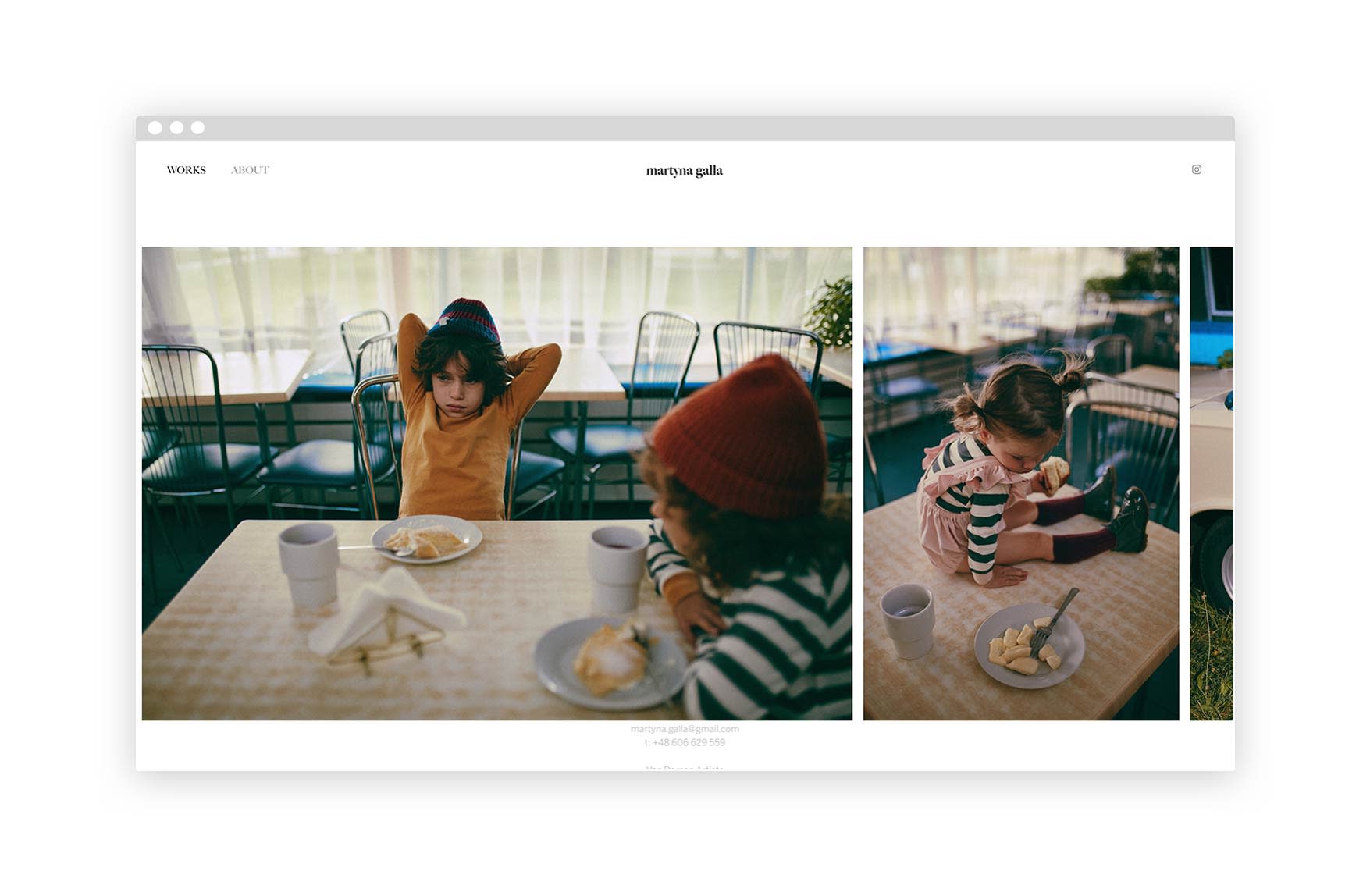
1. Martyna Galla
Polish photographer based out of Warsaw and Masuria, Martyna Galla’s portrait photography gallery combines many unique styles of portrait photography. One thing that can be said about all of her work is that it provokes many powerful emotions through the beautifully captured portraits. Her color pallet is clean yet vibrant, giving off a candid and editorial feel.
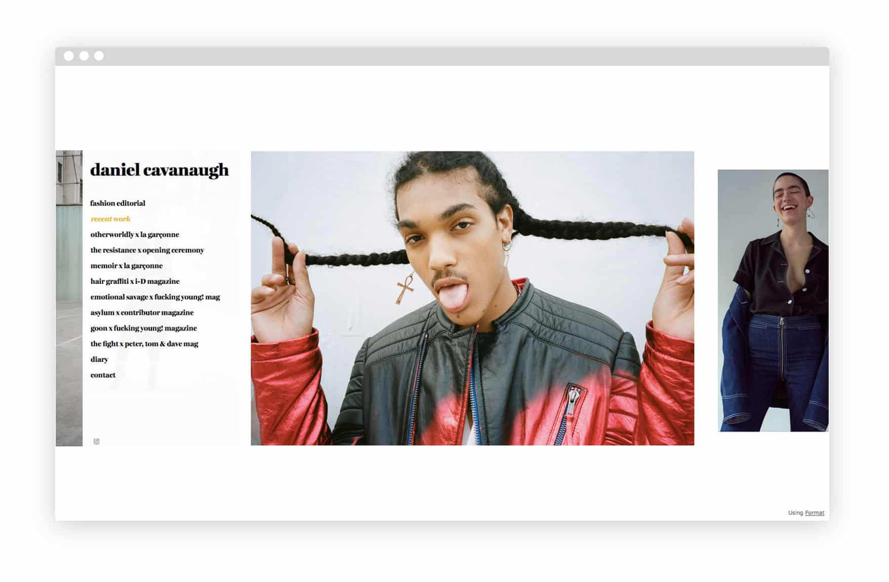
2. Daniel Cavanaugh
New York photographer Daniel Cavanaugh’s portraits are raw, personal, and color-saturated. He fills up the entire screen of his online portfolio with his work, creating a high-impact horizontal scroll that forces you to take a closer look.
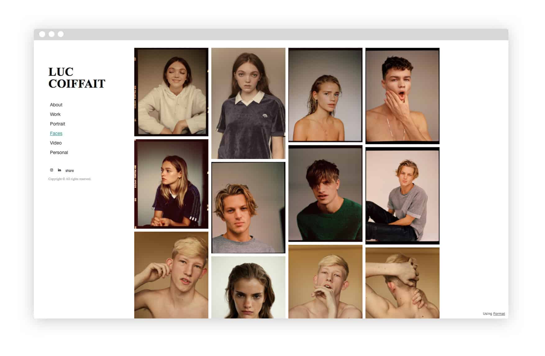
3. Luc Coiffait
Based in London, via Newcastle, Luc Coiffait has shot for brands like Adidas, Bentley, and Urban Outfitters, and his editorial work has appeared in publications like I-D and New York Magazine as well as Vogue in a range of countries. His portraits are polished and well-staged, and his displays his work in a close-cropped grid that gives an instant feel for his style.
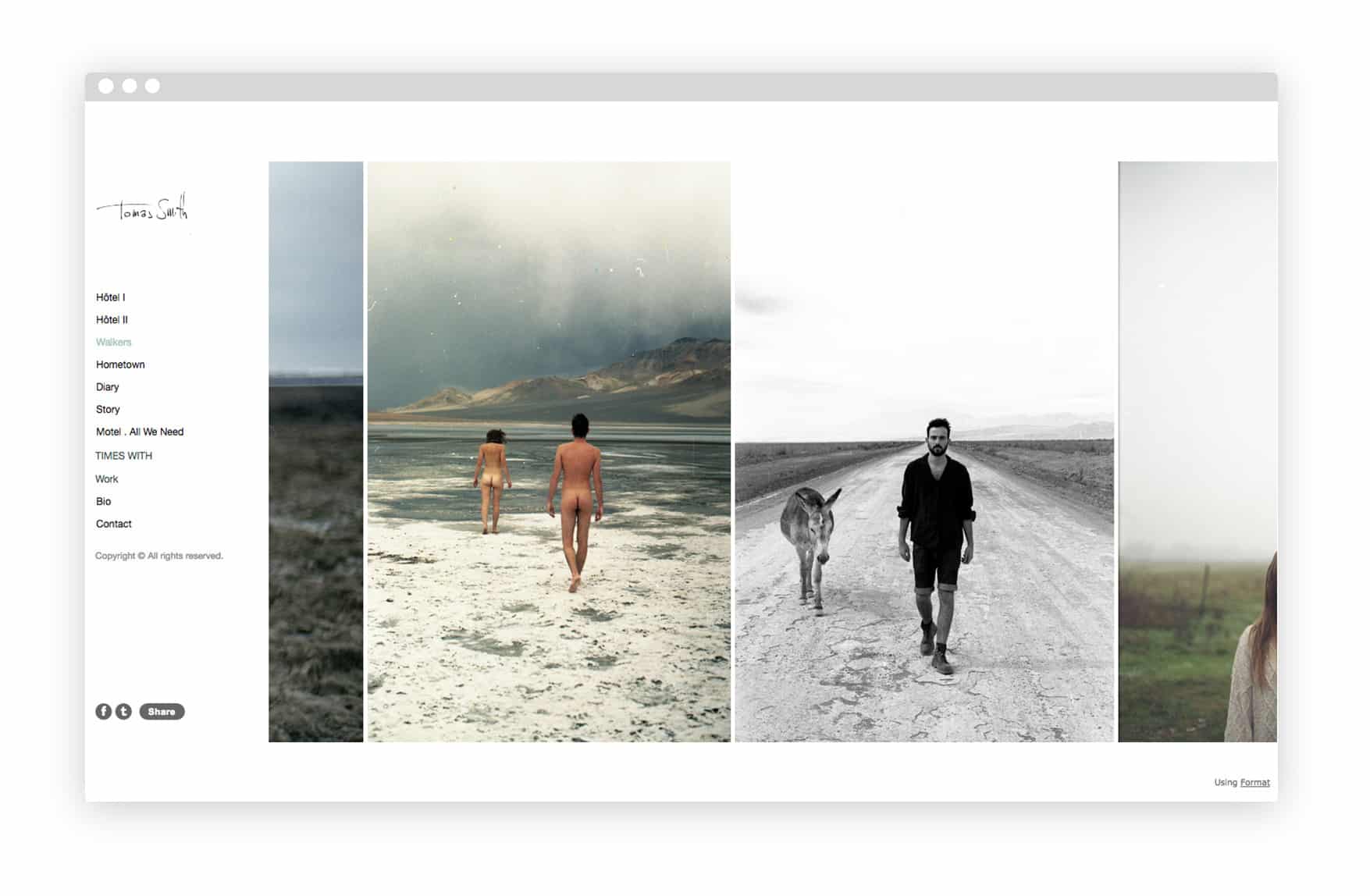
4. Tomas Smith
It’s easy to get lost browsing through Tomas Smith’s photos. The French photographer’s work is intimate, lush, and there’s loads of it to look through. Because different projects are arranged neatly, the volume of images isn’t overwhelming, though, and the way they fill the page in a horizontal scroll helps add to the immersive effect.
5. Justin Aranha
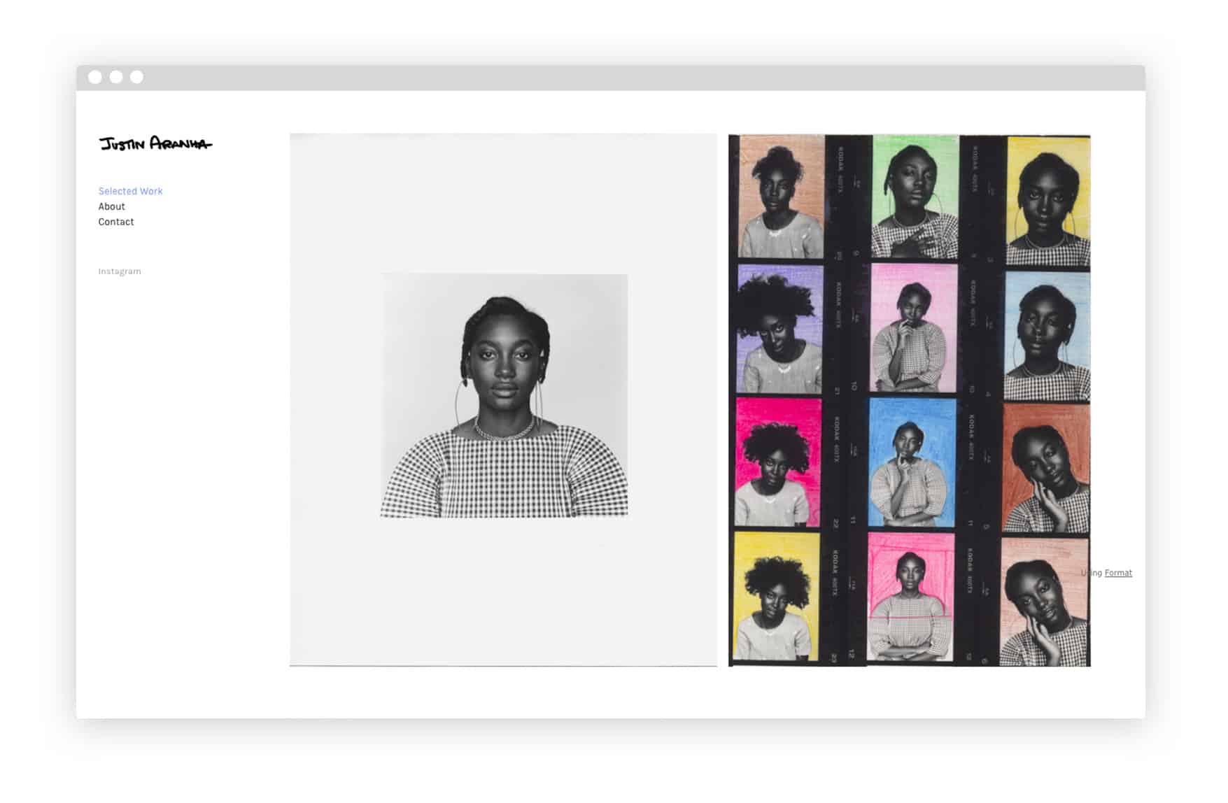
Canadian photographer Justin Aranha uses a vertically-scrolling theme to showcase his unique, creative portraits (this one was made by coloring photo paper with pencil crayon). A handwritten logo offers a memorable means of displaying his name.
6. Wardie Hellendoorn
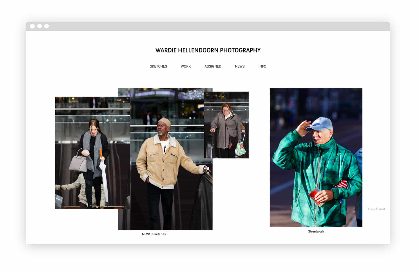
“I love photographs in which people are unaware of being photographed,” says Amsterdam-based Wardie Hellendoorn. Hellendoorn created an unconventional collage layout by layering images over each other, creating a fun and unusual main page.
7. Dy Duyen
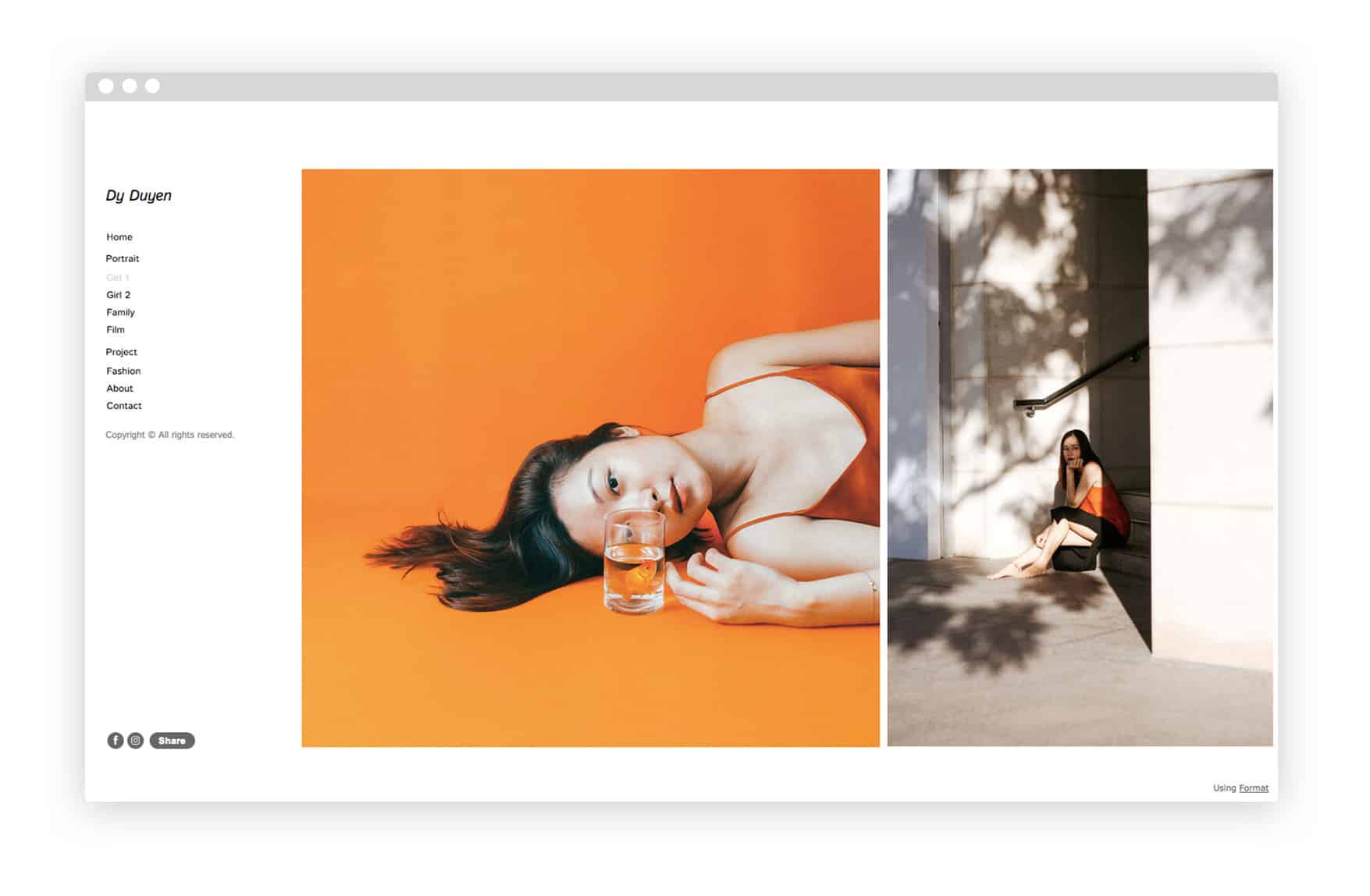
Photographer Dy Duyen works across a range of photography genres, but her uniquely composed, personal portraits really shine. The Ho Chi Minh City-based photographer uses a super clean theme to keep the focus of her website on her work, with large-sized images that grab the viewer’s attention.
8. Sam Tom Photo
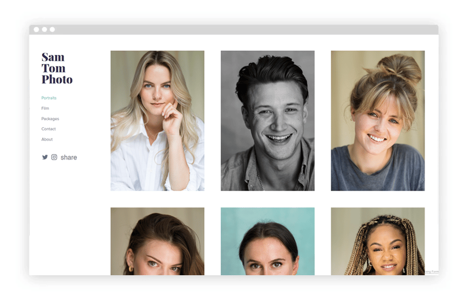
A drama school graduate, actor, and photographer, Sam understands the need for originality in photography. Same has combined his passion for acting and photography for Sam Tom Photos. A grid-layout template for his portfolio upts the focus on portraits.
9. Laura Kampman
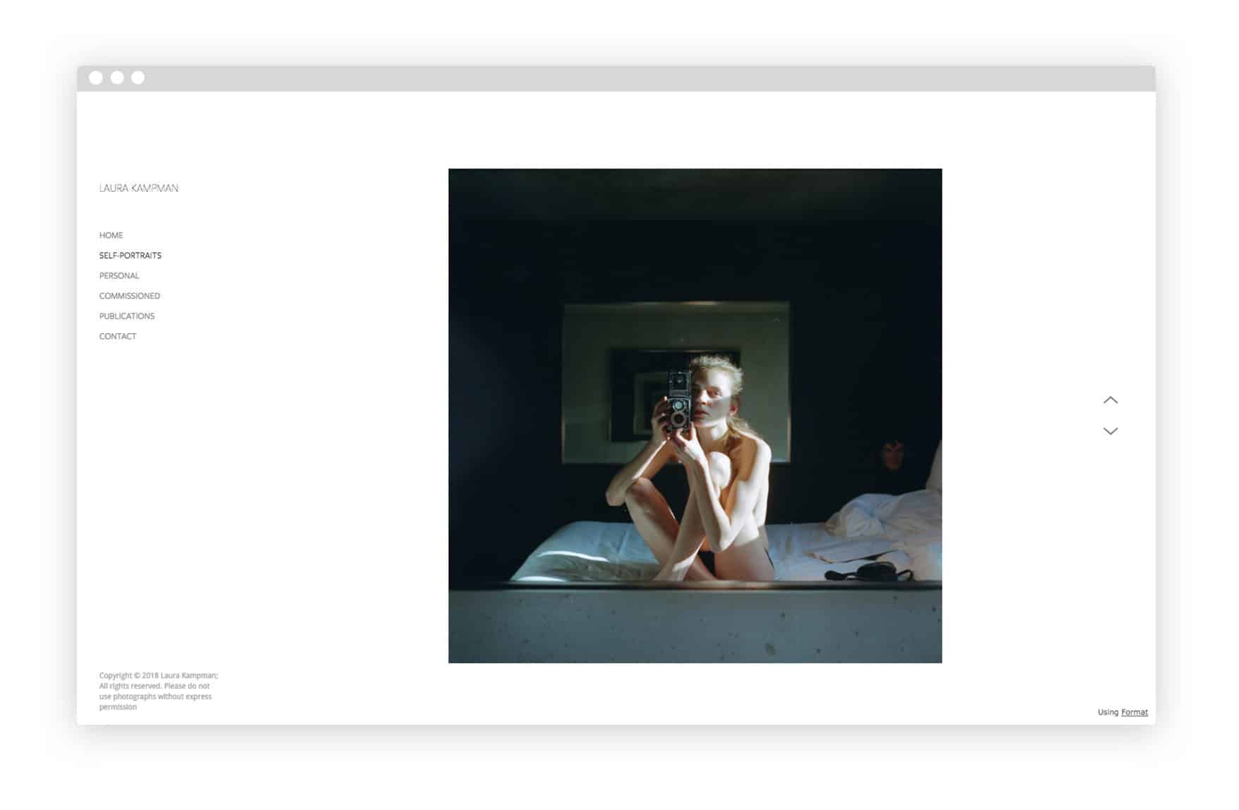
Currently based in Los Angeles, photographer Laura Kampman works with a focus on self-portraiture and editorial shoots. Kampman has worked with publications like Vogue and New York Magazine. Her website is clean and simple, with images displayed one at a time.
10. Kyle Dorosz
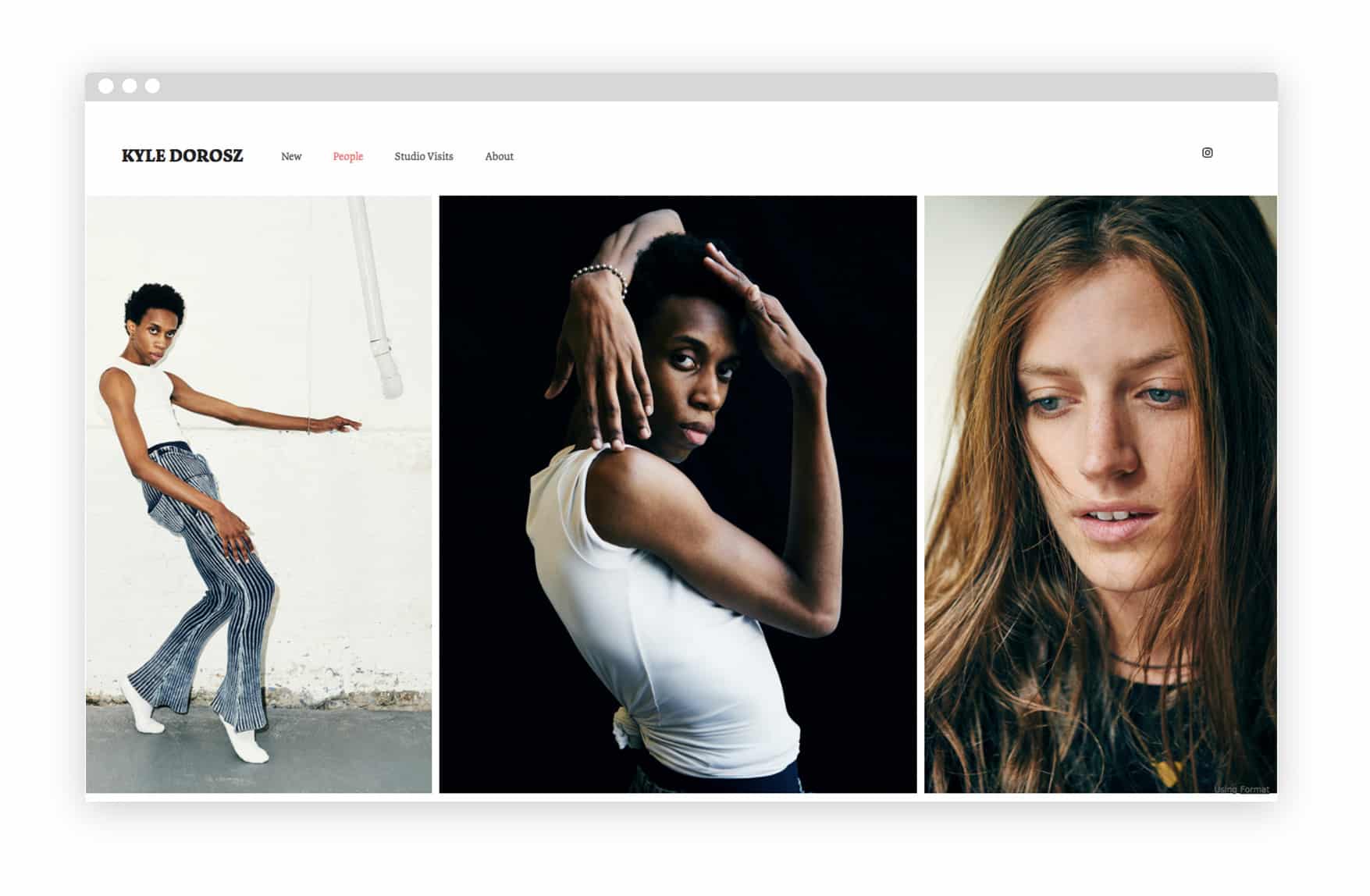
Brooklyn-based Kyle Dorosz fills up the whole page with his portfolio images. The first gallery visitors see when they open his website is a selection of new work, which is a good way of keeping his portfolio fresh and making sure viewers look at his most recent shots first.
11. Cameron Lee Phan
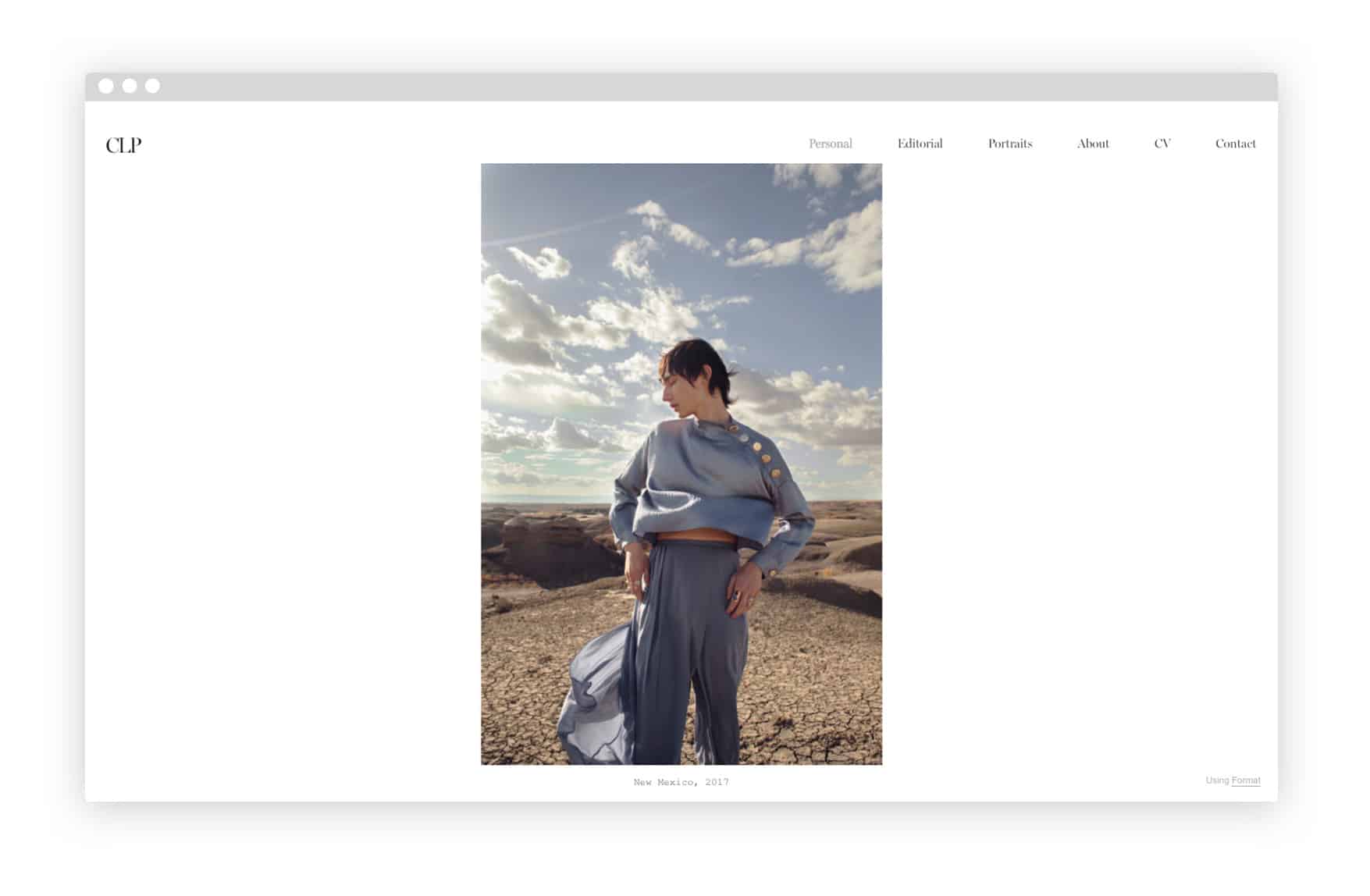
Whether he’s shooting self-portraits or fashion editorials, photographer Cameron Lee Phan always creates a memorable mood with his work. Born in Texas, he is now based in New York, where he is “focusing his work on portraiture, self-portraiture, fashion, and moments of synchronicity.”
12. Matilda Hill Jenkins
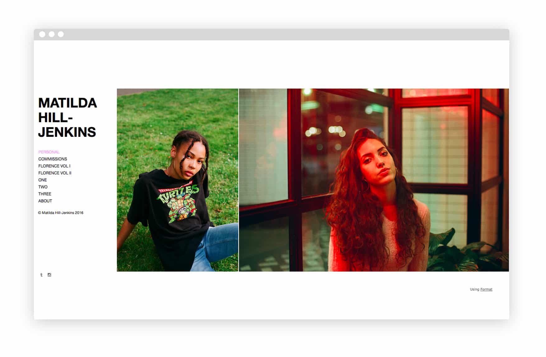
Matilda Hill Jenkins uses a horizontally-scrolling theme to show off her fresh, colorful portraits. Creating separate pages for personal and commissioned work allows this London photographer to effectively display her published shoots as well as more intimate portraits.
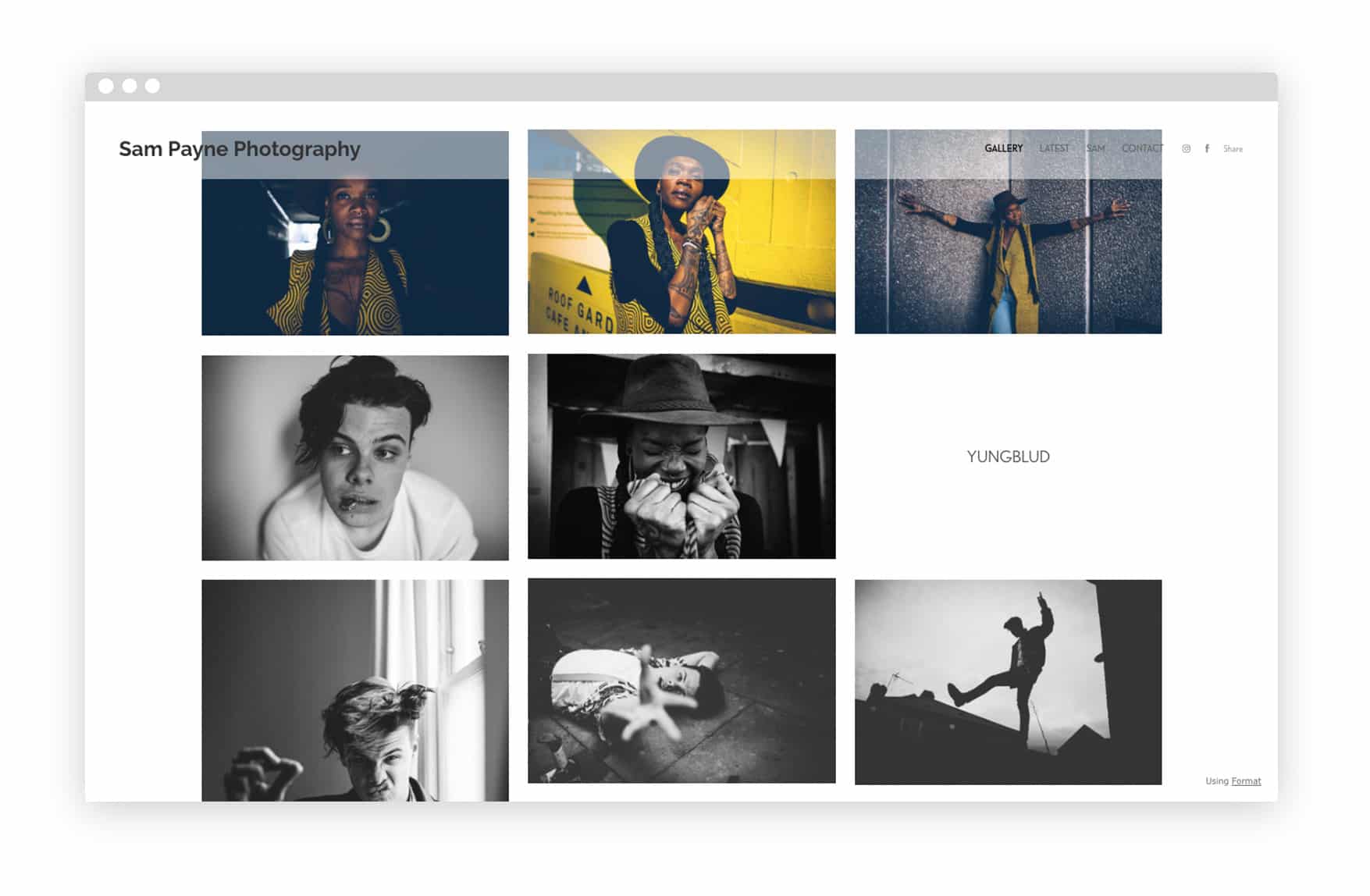
13. Sam Payne
Sam Payne’s portfolio website instantly lets visitors know what kind of work she does. The English photographer shows a sample of her portrait work with a grid layout that fills up the whole screen. A top right menu allows for navigation to her blog and contact page.
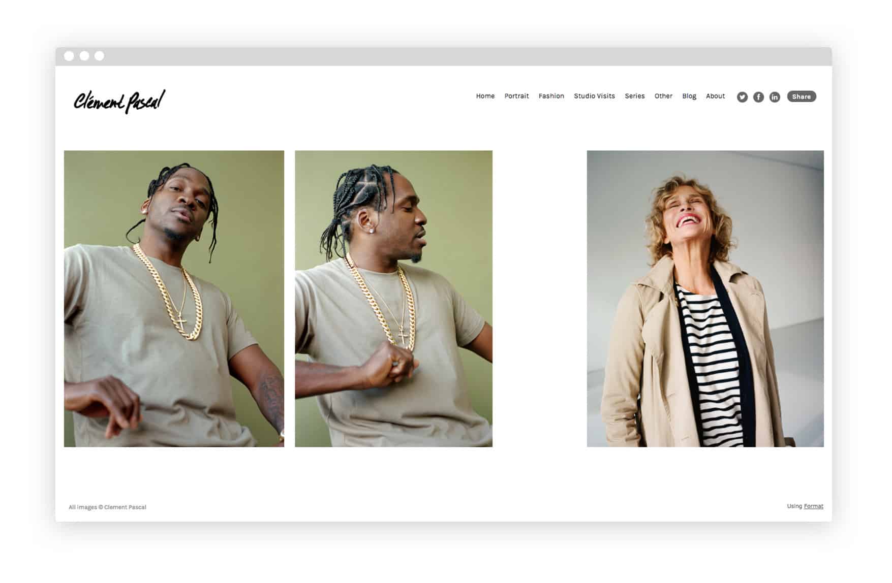
14. Clement Pascal
This French photographer’s portfolio includes work for brands like Nike, Urban Outfitters, and Dazed. Pascal divides his work into categories including portraits and fashion for ease of navigation. The creative spacing between gallery images adds a sense of dynamism to his website.
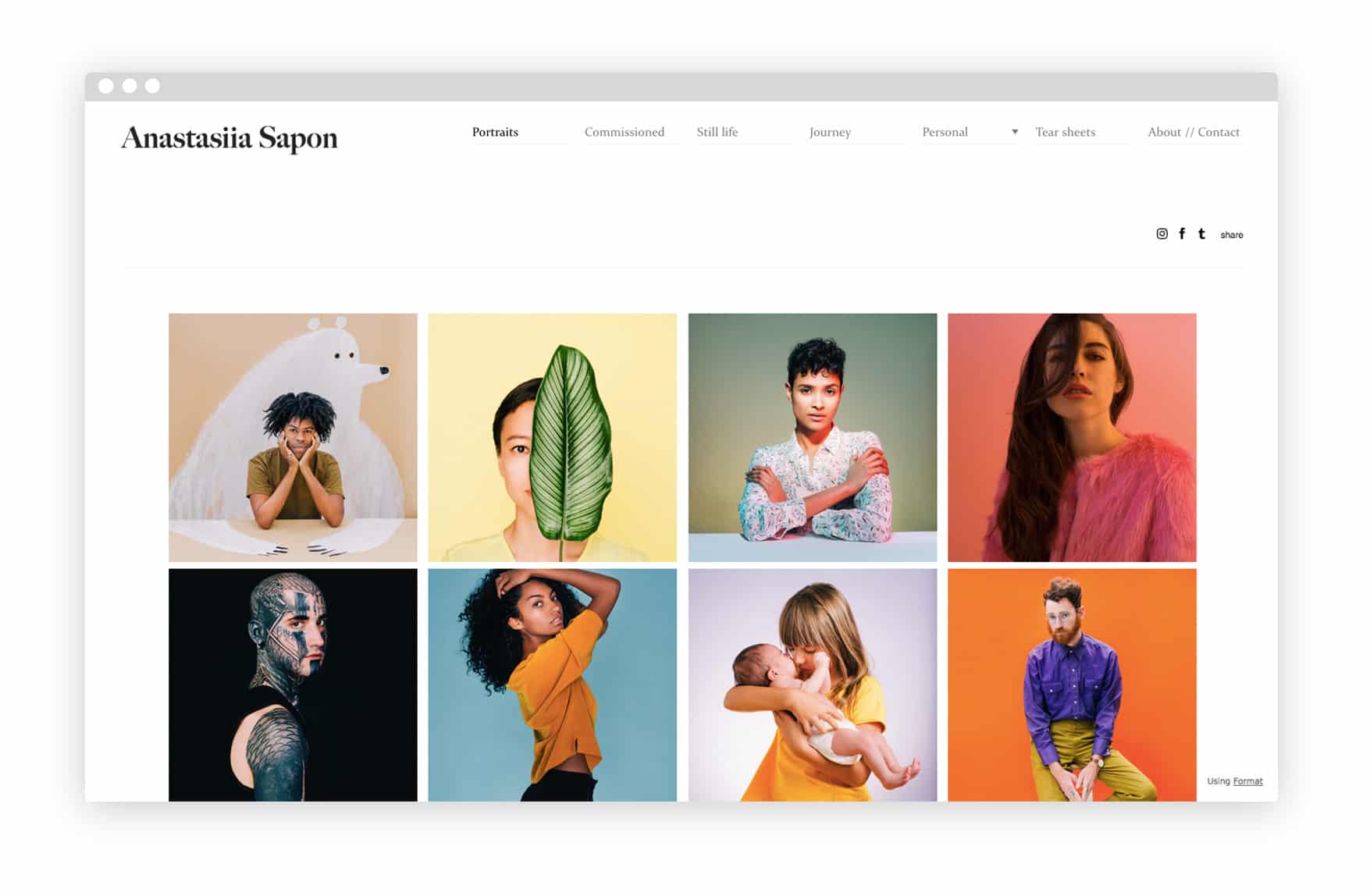
15. Anastasiia Sapon
Hailing from Kiev, Ukraine, photographer Anastasiia Sapon is now based in San Francisco, where she shoots portraits for a range of print and online publications. Her portfolio is tidily organized in grid format, with separate galleries for tear sheets as well as personal work.
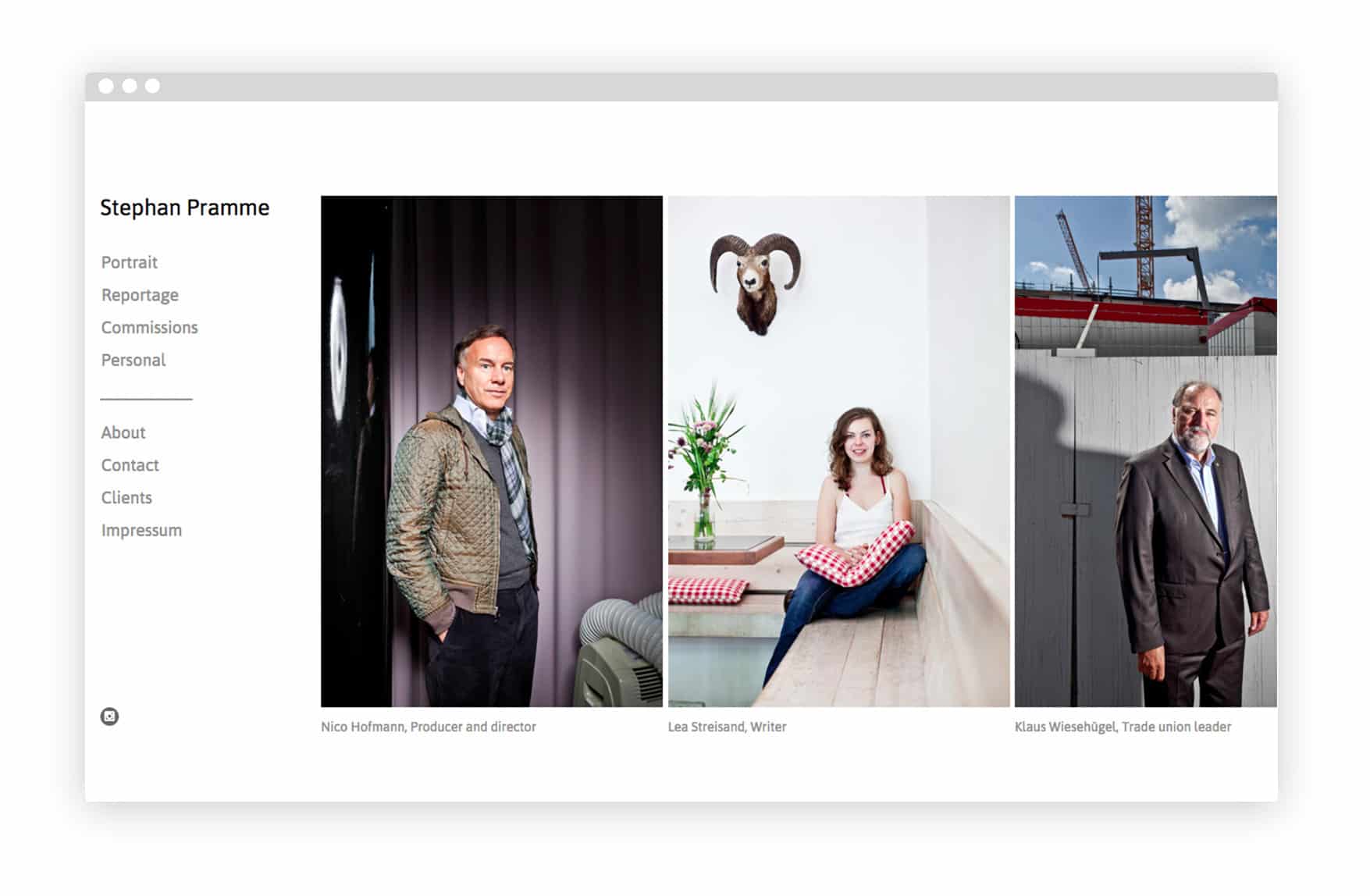
16. Stephan Pramme
This no-nonsense German photographer makes his portrait photography portfolio stand out by including a brief description of each photo subject. Depicting a variety of professionals, from actors to activists to trade union leaders, Stephan Pramme’s portraits are polished and crisp.
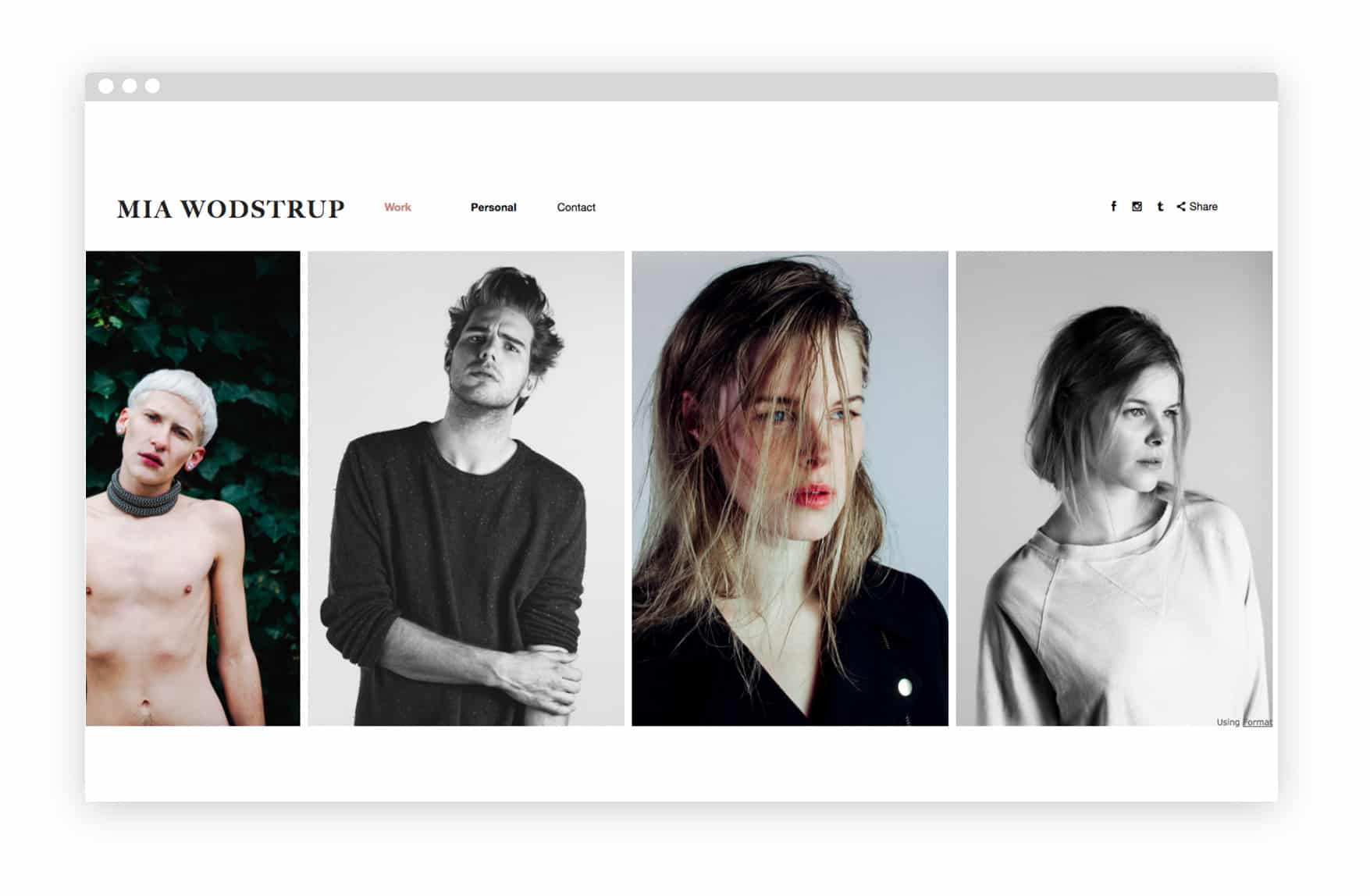
17. Mia Wodstrup
Danish photographer Mia Wodstrup keeps her portfolio simple by only including a few images in each category (“People,” “Products,” “Studio”). Selecting only the best images lets her work shine and keeps the viewer interested.
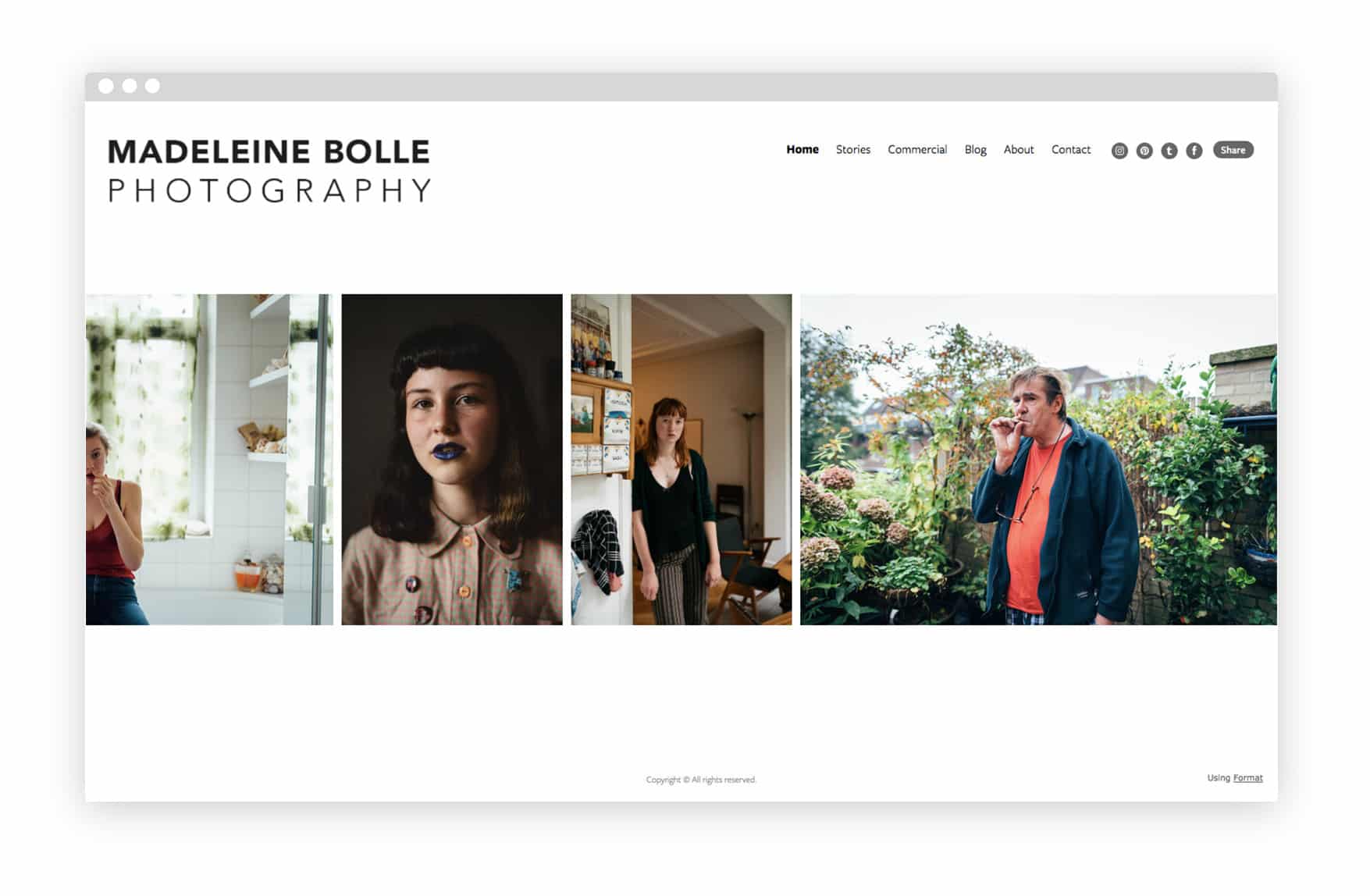
18. Madeleine Bolle
Netherlands-based Madeleine Bolle documents family and friends with warm, light-filled images that highlight the personality of her subjects. Her photo projects are simply divided into “Stories,” with minimal explanations, allowing her photography to speak for itself. She shares her commercial work in another website section to keep everything organized.
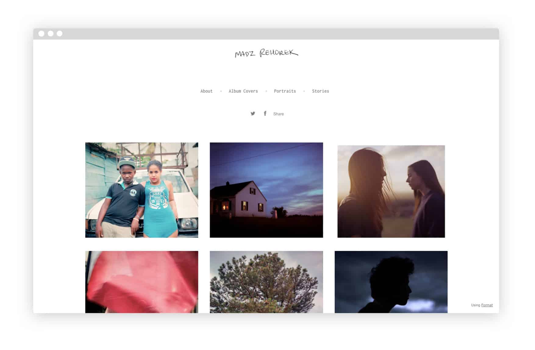
19. Madz Rehorek
Globe-trotting photographer Madz Rehorek has worked in France, Australia, and the United States, and is currently based in New York. Her sharply detailed portraits are arranged in a grid that makes great use of both color and white space.
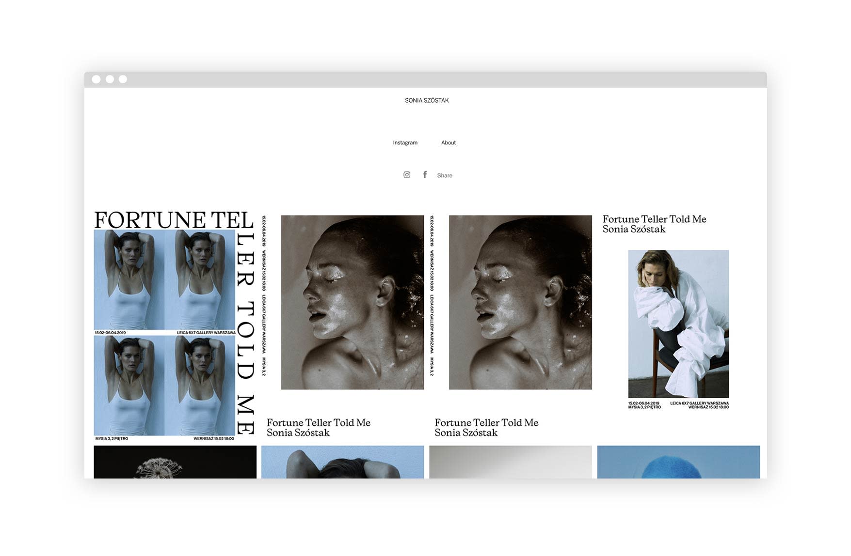
21. Sonia Szostak
Polish-born Parisian fine art portrait photographer, Sonia Szostak, has some of our favourite work we’ve featured. And her fan’s seem to think the same, as she’s amassed over 75K followers on Instagram. Her chic style and muted colors palette help her portfolio gallery really shine with a great aesthetic.
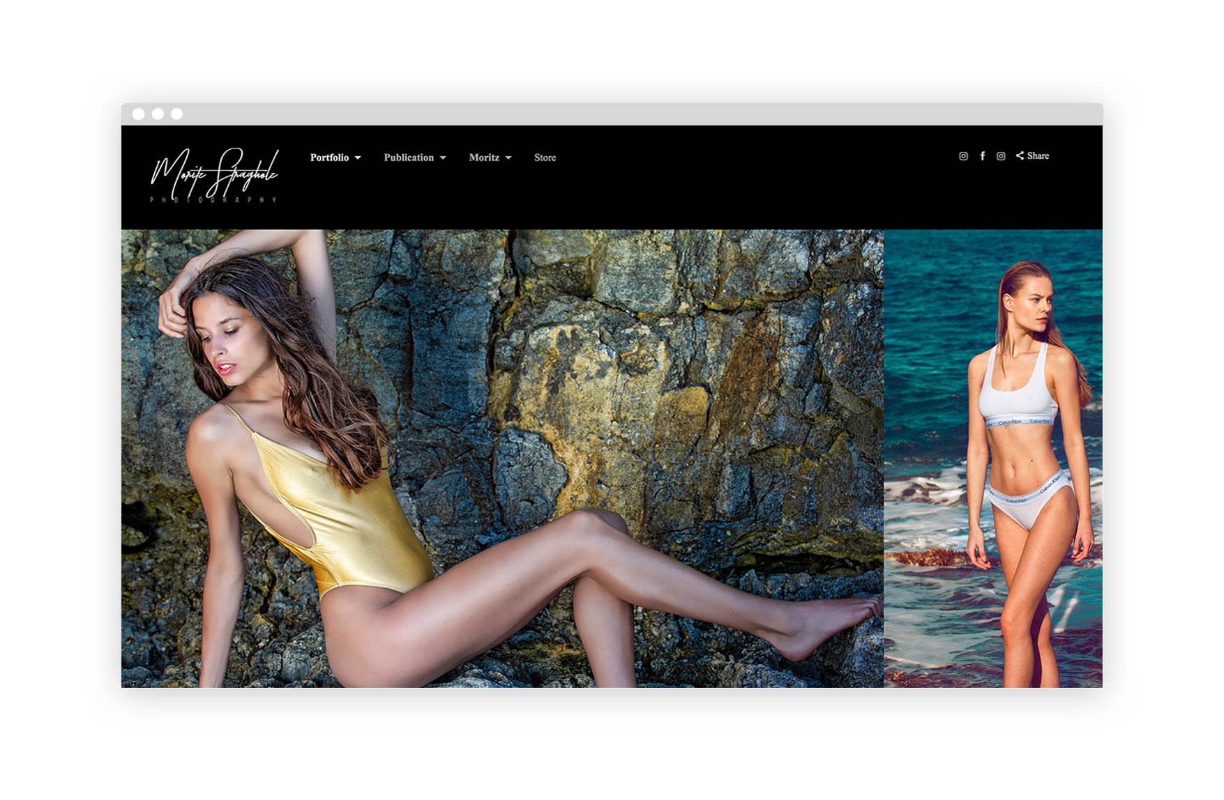
22. Moritz Stragholz
Malta-based photographer, Moritz Stragholz, combines his love for landscape photography and fashion photography to create stunning and organic editorial photography in a natural environment. His work has taken him all across Europe and all over the world.
Are you ready to build your own portrait portfolio?
We hope that by checking out some of these portrait photographers’ websites, you’re feeling more confident and inspired to build your own portrait portfolio.
Portrait photography portfolios can feel daunting, especially if you’re just embarking on your career. If this is you, we highly recommend looking through these best portrait photography websites and taking notes of what you like and what you don’t like.
Once you do, you’ll start to see patterns and be more able to easily identify what you would like from your own website.
So go ahead, start taking notes, grab that list, and browse through Format’s stunning assortment of templates.
Try Format free and you’re one click away from jumpstarting your career.
And hey, if you feel like you need some guidance on building an online photography portfolio, we’ve got you covered. Check out our very comprehensive guide to building a photography website.
Cover image by Dy Duyen. This article was originally published Sept. 8, 2016, and was last updated with new information on February 28, 2019.


