Who doesn’t enjoy a good GIF? They’re quirky and undeniably addictive to use in text messages or PowerPoint presentations.
GIFs are dynamic memes that convey motion and details that still images may not effectively communicate. Most people are familiar with their fair share of cat GIFs, but there’s a whole world of edgy and eye-catching GIFs that are used on websites, advertisements, and social media designed by truly talented creatives. As most artists know, GIFS are more than silly animations of cats or some weirdo’s dance moves. There’s a world of elegant, edgy and eye-catching GIFs designed by some truly talented creatives.
If you’re a graphic or motion designer looking to inject yourself into the niche of GIF design but don’t know where to start, this article is for you. We’re highlighting some of the best GIF artists on the web who use Format as their website builder to highlight their best work.
Why You Need A Portfolio For Your Animated GIF Art
Want to get paid to make fun GIFs?
Having a killer online portfolio website is incredibly important. It separates you from a hobbyist and demonstrates your professionalism as a digital artist. A solid online portfolio has the potential to get your animated GIF art noticed by clients, gain you notoriety in your field, or even take your career to the next level.
Your online portfolio should speak for itself—Devoid of unnecessary bells and whistles yet beautifully designed and easy to navigate. Your portfolio should showcase your work in a way that’s clear, engaging, and visually captivating. Here at Format, we’ve seen some of the most well-designed and striking portfolios on the internet.
They’re slick, stylish, and leave a lasting impression on the viewer. Scroll through these 14 GIF portfolio examples to see how animators have made the most of their Format websites.
1. Iveta Karpathyova
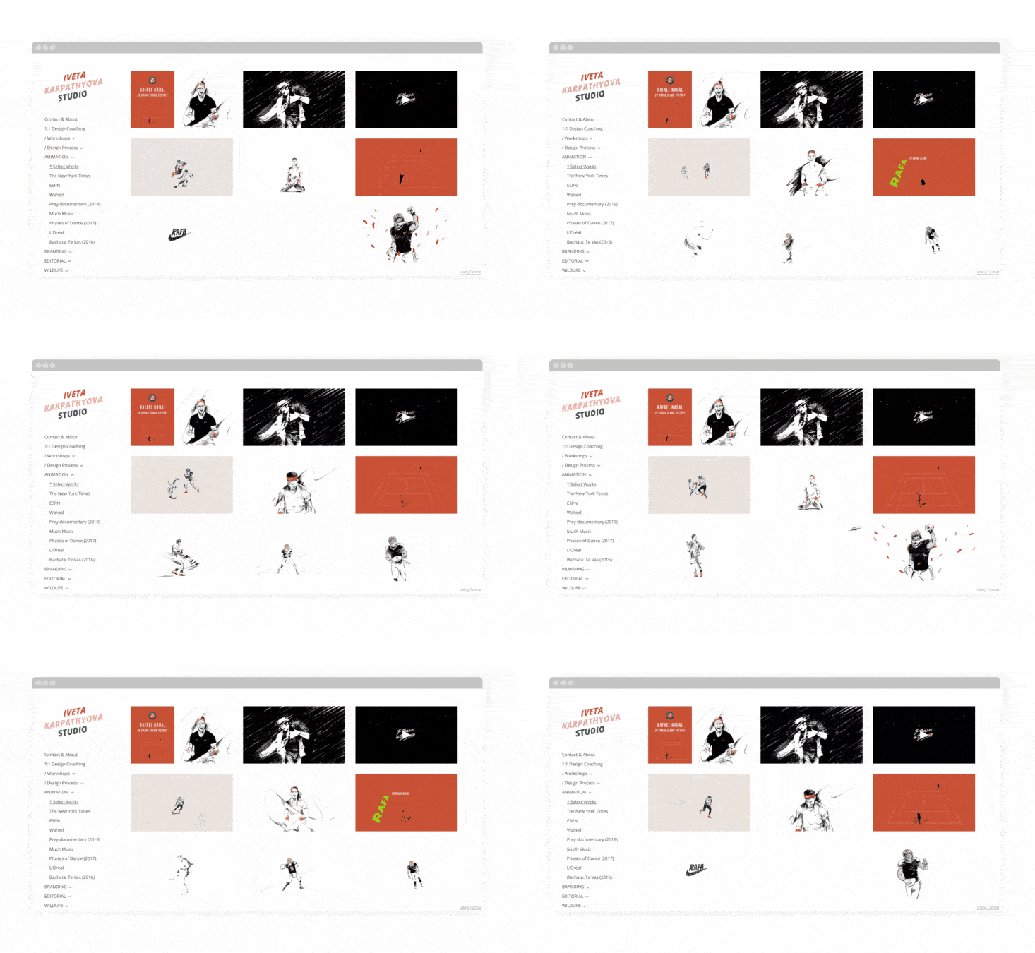
Iveta Karpathyova is an animator director, animator, and illustrator. Iveta specializes in rotoscoping animation technique and currently animation Netflix explainer series, as part of the creative team at Vox.
Iveta uses Format’s Peak theme to showcase her animation work and categorize them through the sidebar on the left. The grid layout allows viewers to see a snapshot of a number of her works all at once.
2. Daniel Stankler
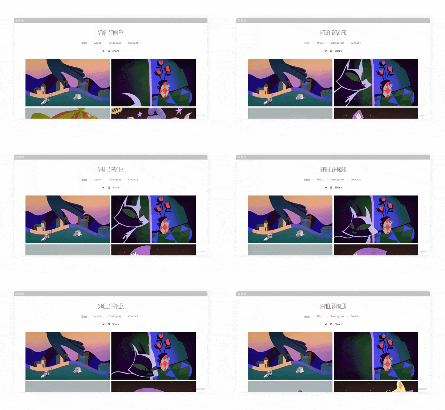
Daniel Stankler is a London-based queer animation director and graduate of the Royal College of Art Animation MA. Stankler’s animations stem from their love of stories, whether they are old, new, myths or murder mysteries. Stankler enjoys taking these stories to create bright, strange, and trippy animation with unexpected characters.
Using Format’s Amazon theme, Stankler utilizes a two-column grid to showcase their animation. The perfect size to view the work individually and experience their graphic as soon as they land on the home page.
3. Stephen Foster Meyer
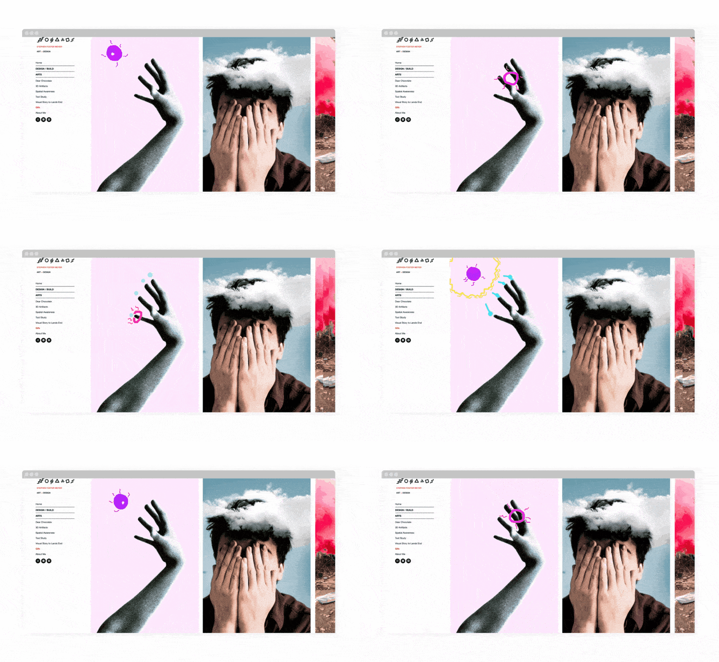
Stephen Foster Meyer uses Format’s Horizon Left theme to display a wide range of work, separating his design, photography, and artistic projects via the sidebar navigation.
Meyer shows how GIFs can truly be an evolution of art. The animations are subtle yet incredibly impactful to the experience of his graphic design or photography.
4. Jacqueline Mak
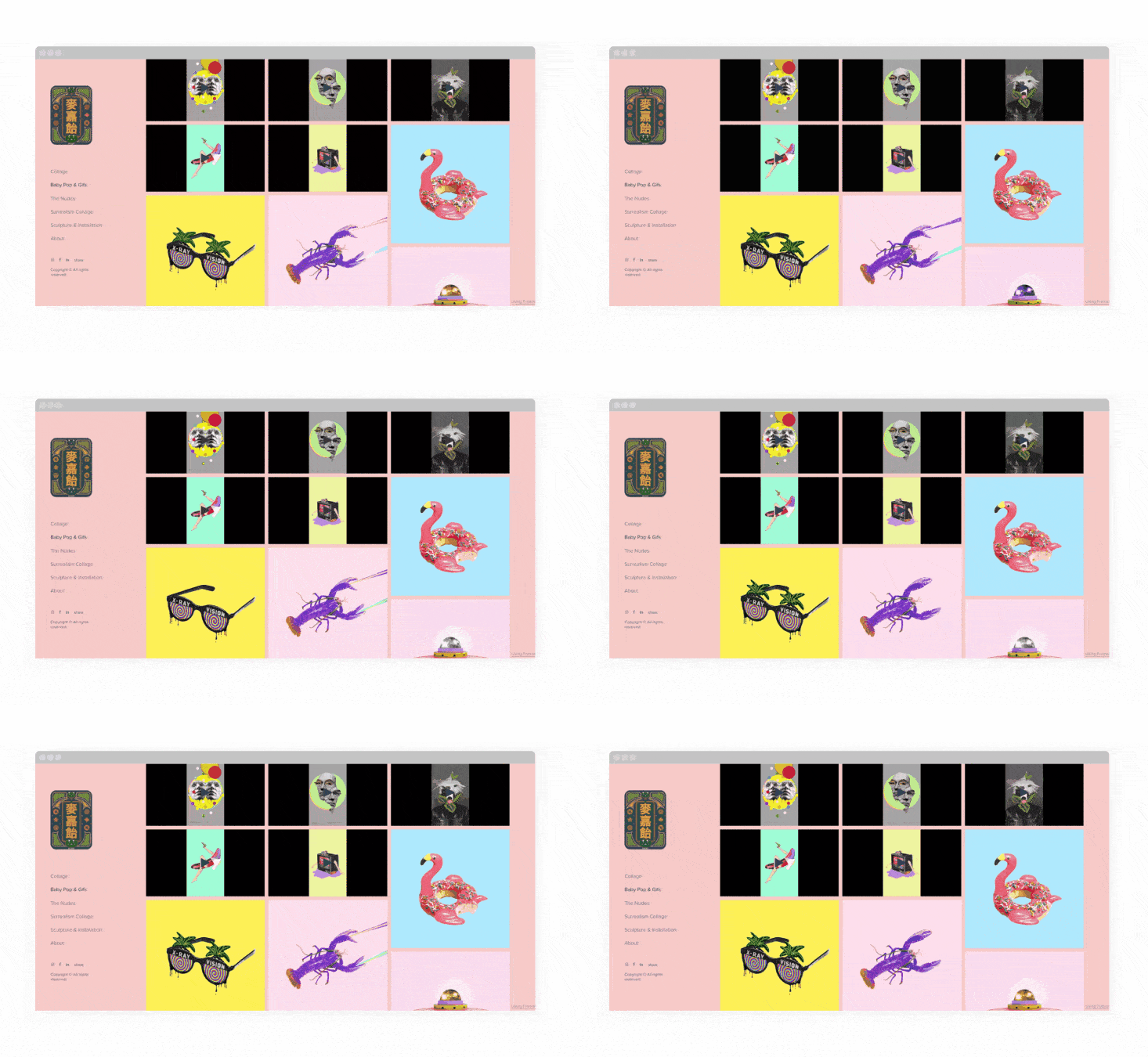
Jacqueline Mak’s bold and creepily surreal animated GIFs examples have found a perfect home in her Horizon-themed Format portfolio. This minimalist theme allows her dramatic work to be featured front and center.
5. Drew Brockington
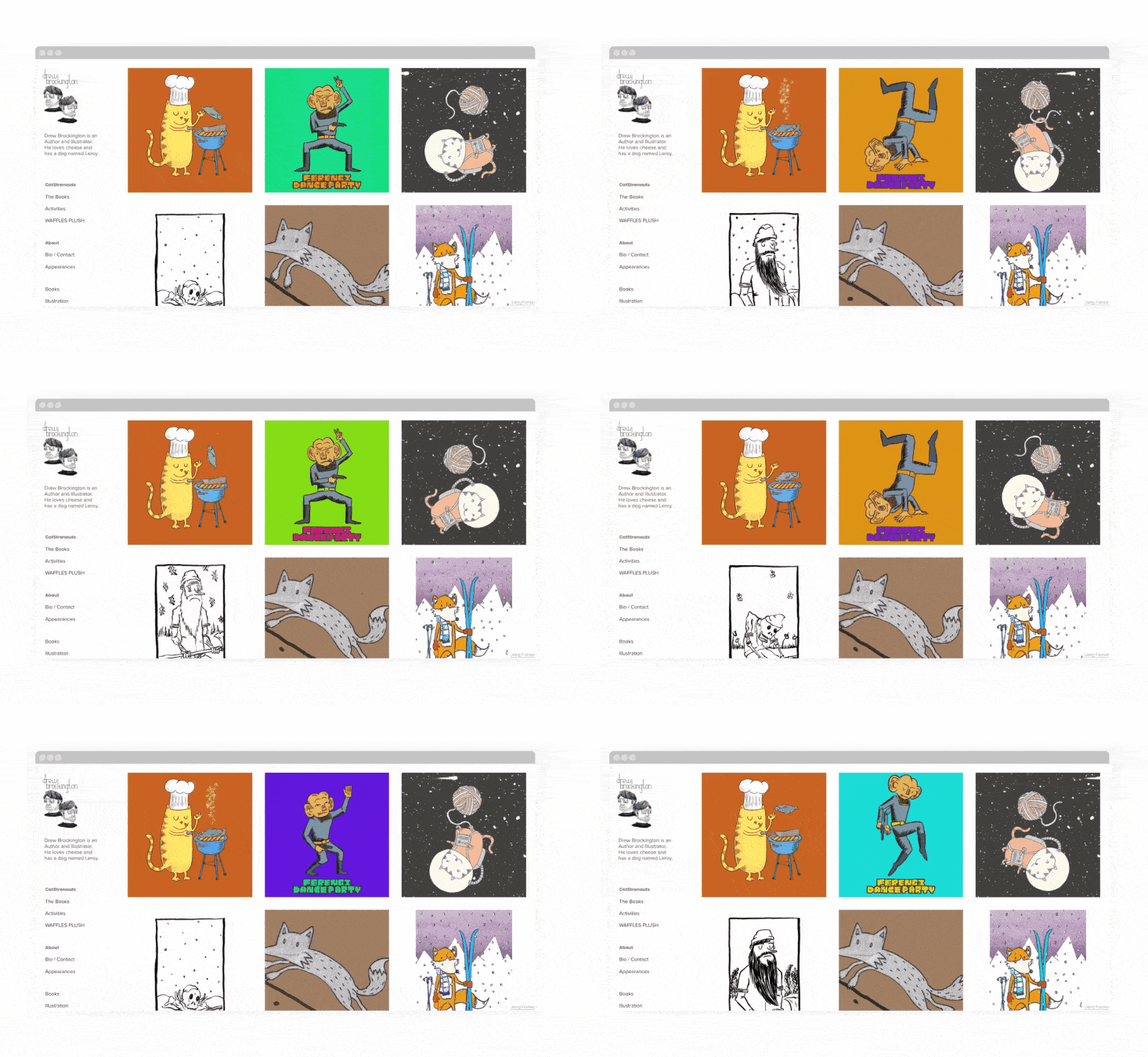
Drew Brockington uses Format’s Order theme to give his portfolio a similar look to the comic strips he illustrates. Blocked out and bold, his quirky animations really have a place to shine with this theme.
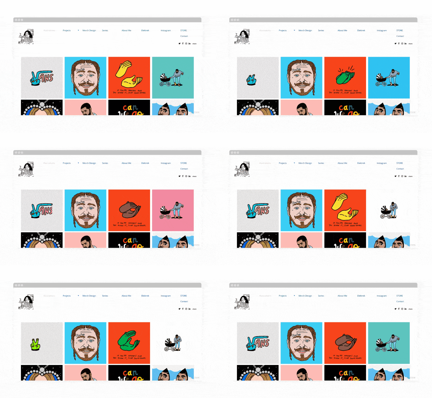
6. Amanda Di Genova
Amanda Di Genova’s 8 bit GIF art is cooler than cool. Using Format’s Peak theme, viewers can use the left sidebar to navigate through Amanda’s other (equally awesome) artwork.
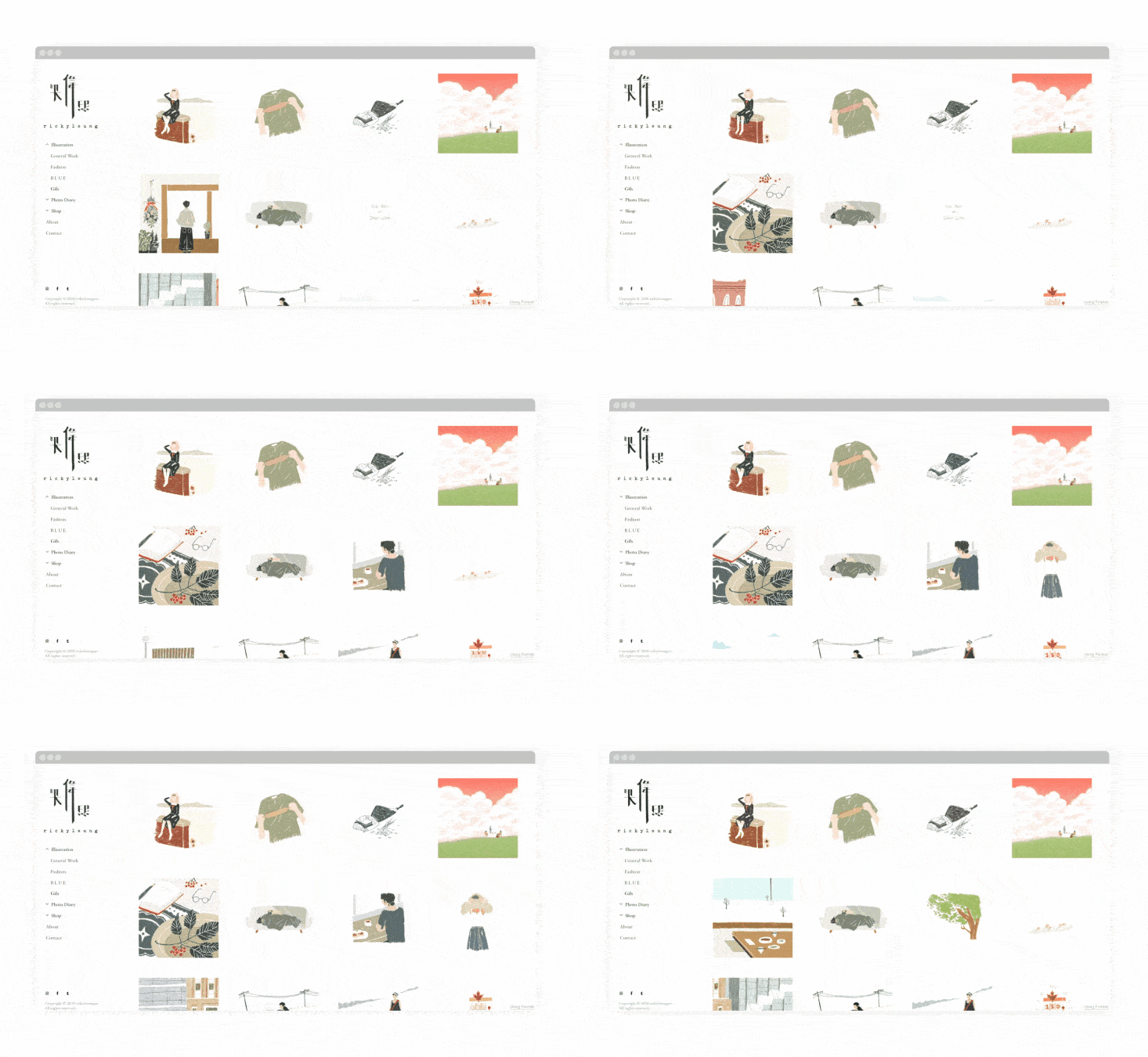
7. Ricky Leung
Ricky Leung’s unique style of hand-drawn art GIFs sits perfectly within his Order-themed Format portfolio.
Leung mainly uses pencil crayons to add texture to his illustrations and GIFs, which give off a sense of playfulness to his work. His GIF gallery reads like an animated book GIF, telling whimsical stories found in everyday life and dreams.
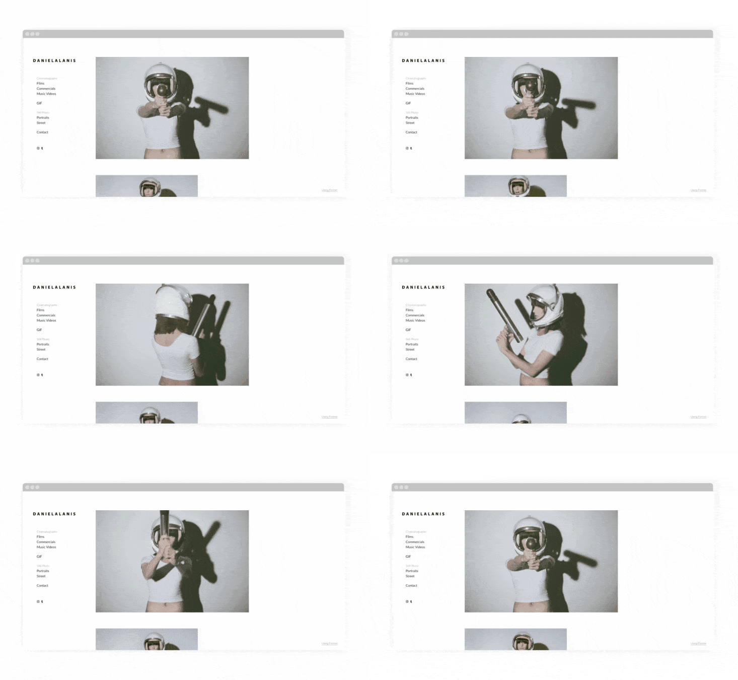
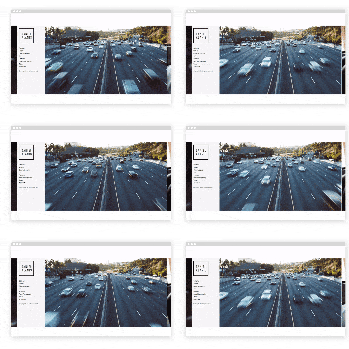
8. Daniel Alanis
Space themes and super-babes dominate Daniel Alanis’ GIF art, showcased seamlessly using his Horizon-themed Format portfolio. Alain’s portfolio site is clean and minimal, allowing his work to speak volumes.
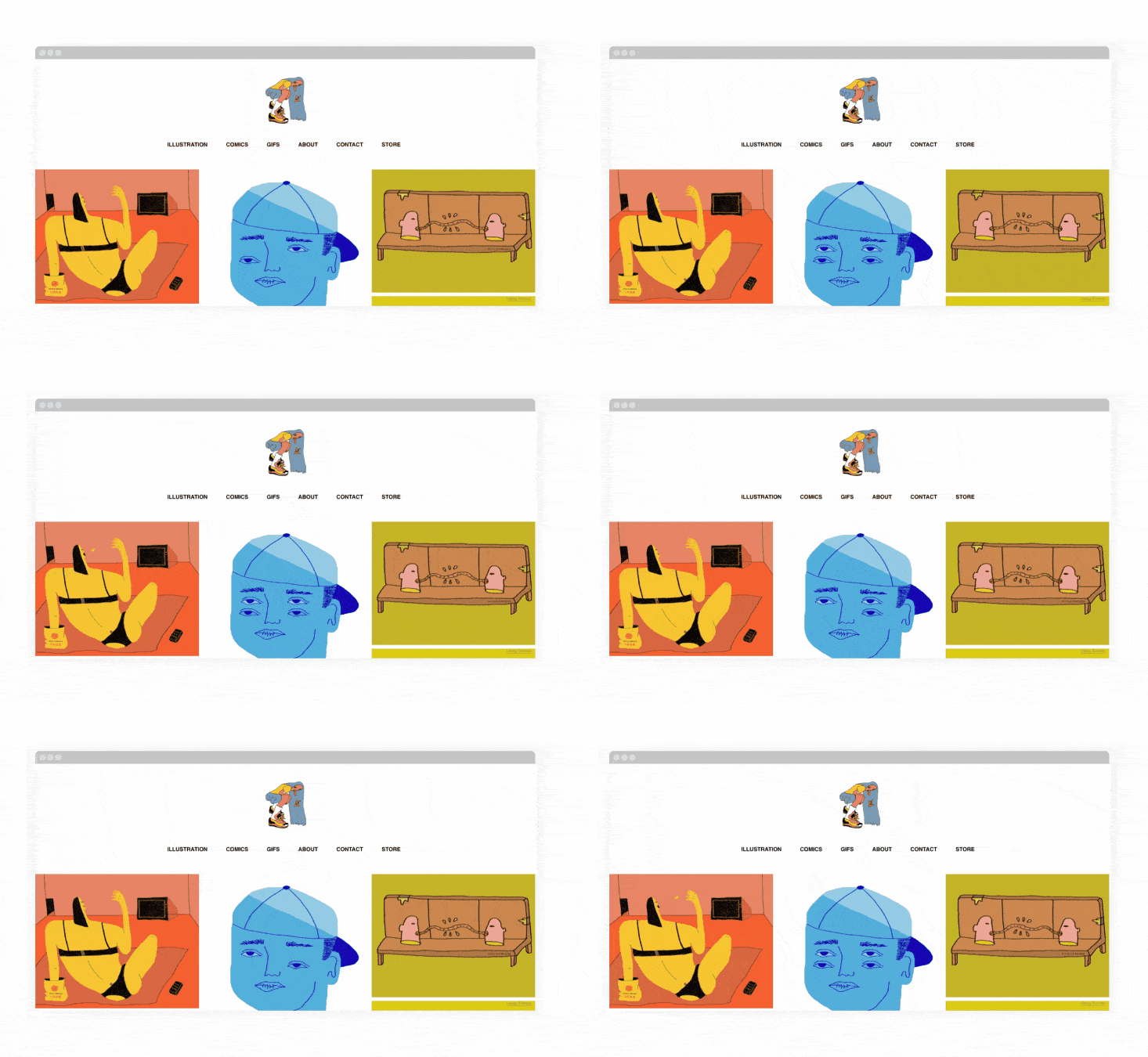
9. Nicole Zaridze
Nicole Zaride’s Amazon-themed Format portfolio features a tile-grid template to display her colorful and humorous illustrations and GIFs. This type of grid allows you to experience her current work as a cohesive collection similar to a comic book series.
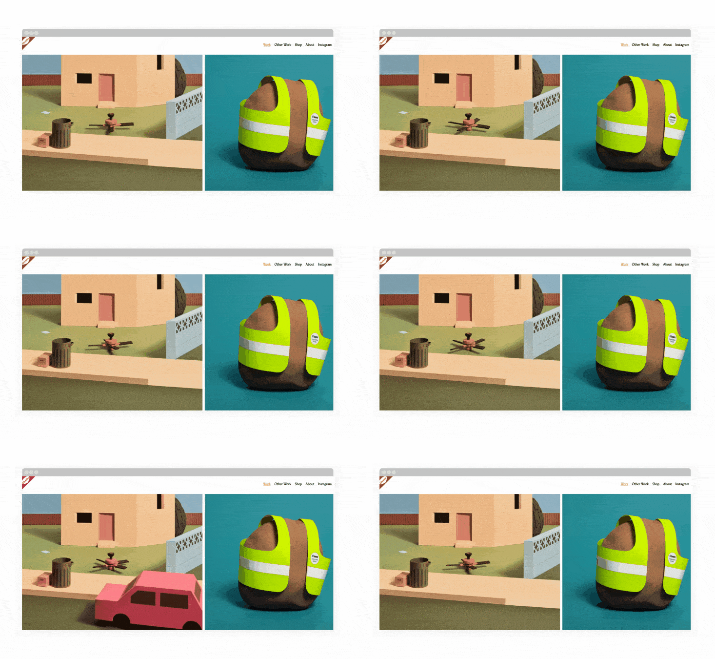
10. Hudson Christie
Canadian artist Hudson Christie creates whimsical illustrations and stop-motion animations using clay.
Hudson makes use of the caption option in Format’s Horizon theme to include useful background info about commissioned work without distracting from his portfolio.
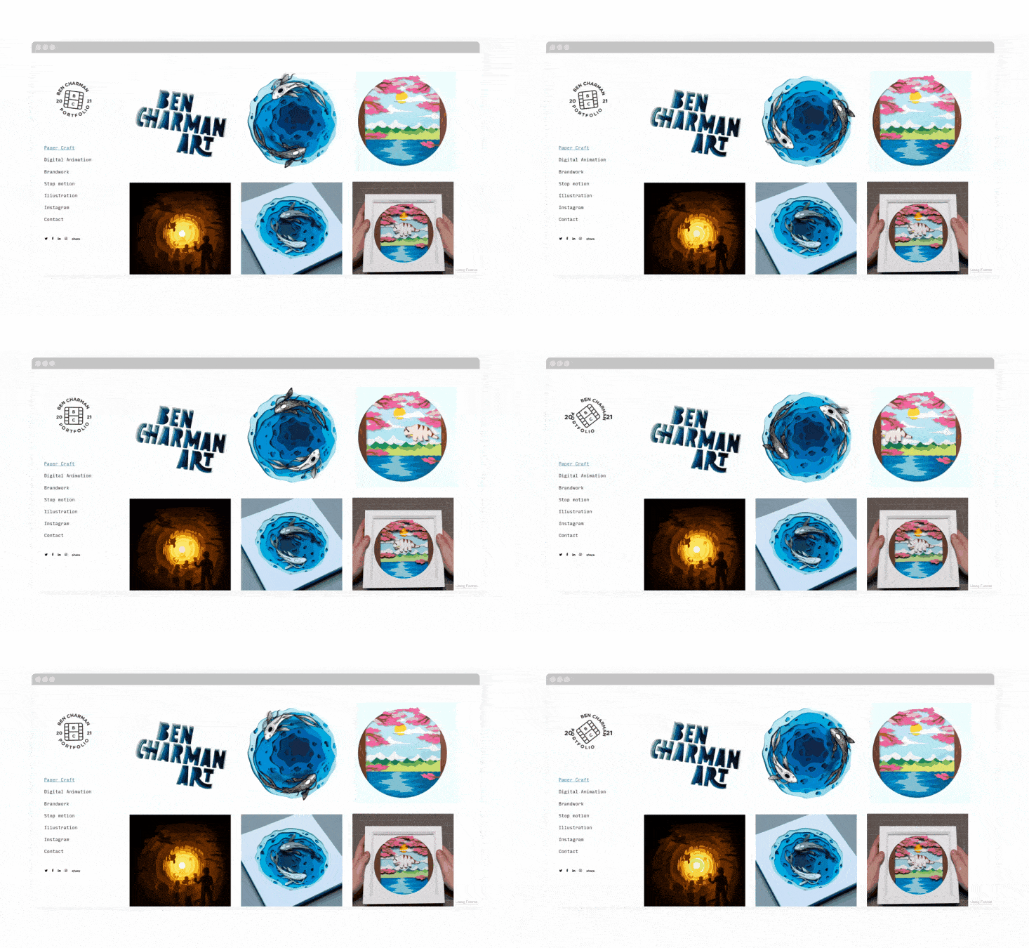
11. Ben Charman
Charman is a paper-craft artist who brings his work to life through digitizing his work and animating them. His digital portfolio uses Format’s popular Peak theme for an easy to navigate left-hand menu and neat, gridded gallery.
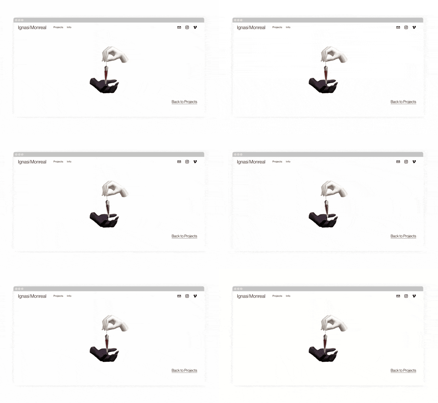
12. Ignasi Monreal
London-based, Barcelona-born digital artist Ignasi Monreal uses the sleek Sierra theme to display his paintings, GIF art, and film in an organized and simple way.
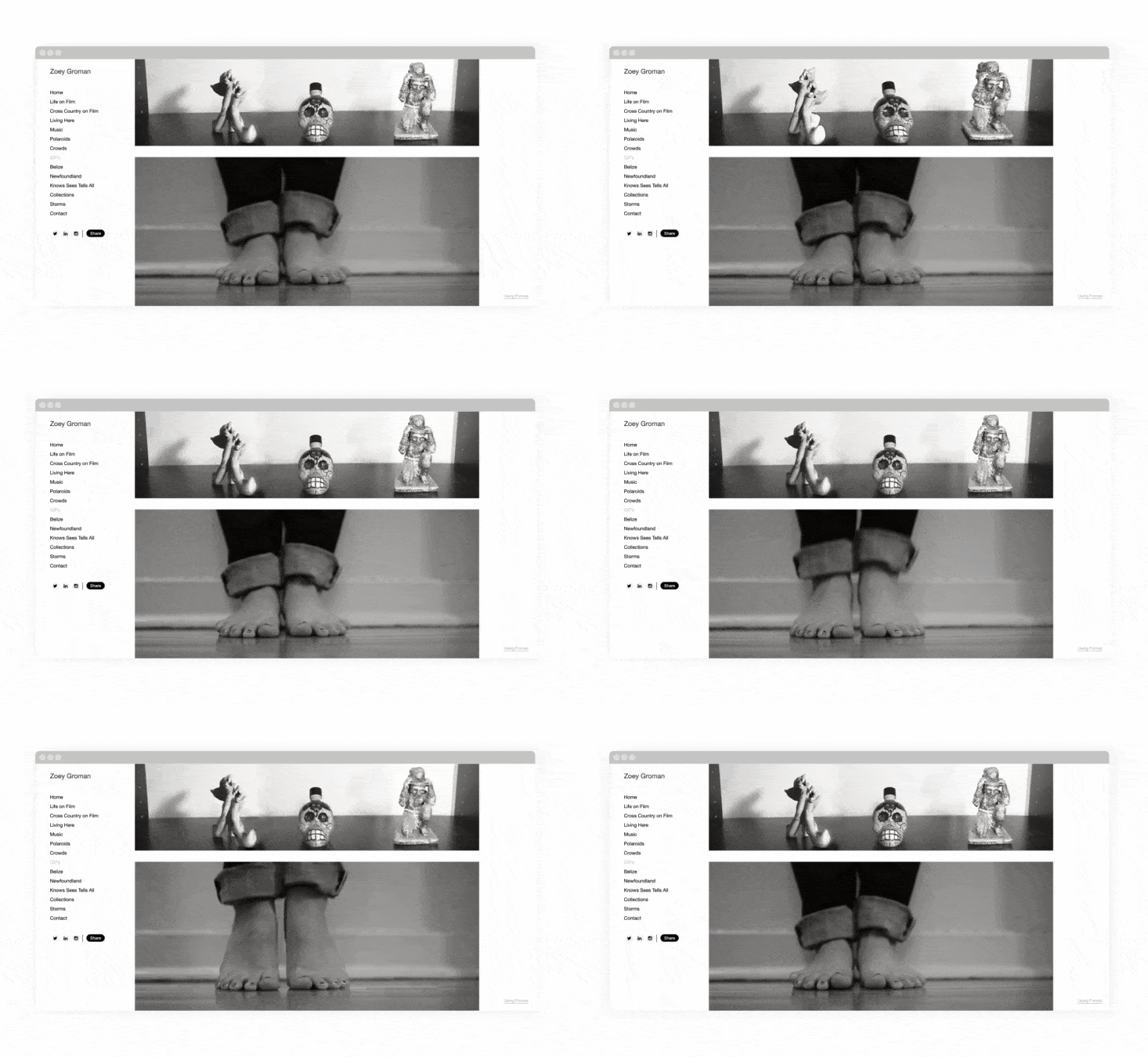
13. Zoey Groman
Groman has a love for film and polaroid photography, music, and animation. Because of the analog format of her photography, her work has a nostalgic feel—but she brings modernity and movement by animating the images making for unique photo-GIFs. Zoey uses Format’s Ora theme for her portfolio.
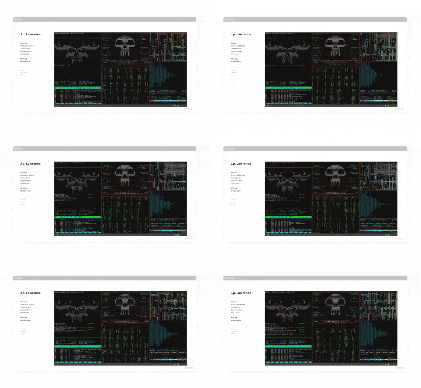
14. J. p. Lawrence
Lawrence is an award-winning journalist and multimedia artist. His work has been published in The New York Review of Books, Vice, The Intercept, and The Associated Press. His portfolio is built with Format’s Ora theme for a clean and minimalist aesthetic.
Build Your Animation GIF Gallery Portfolio With Format
Animated galleries add a lot of movement and interest to your portfolio. If you’re an illustrator or graphic designer, you may want to consider adding some GIFs to your portfolio to add energy and vibrancy to your gallery. Don’t have a website portfolio yet?
Build a beautiful and functional website portfolio within an afternoon with Format for free on a 14-day trial. You don’t even need to enter your credit card details to get started. There are over 70 templates to choose from that are mobile-optimized, so visitors can experience your work seamlessly no matter their device, and you can add customizations to make it truly your own.
Want more portfolio layout inspiration? Check out our favorite portfolios by Format’s top illustrators, designers, and wedding photographers.
Not sure how to get started building your own portfolio? Get our handy guide.
