Whether your animation portfolio includes clips of your work, examples of storyboard designs, or detailed concept artwork, a clean design and carefully curated selection are key to showing off your talents.
Especially for creators with diverse portfolios that are full of colorful work, it’s important to choose a website layout that helps your designs shine, rather than overpowering them. The best animation websites do get creative with custom logos and personalized about pages that make for a memorable online portfolio without distracting from the art on display.
We’ve rounded up nine standout VFX artist portfolio websites that are sure to inspire graphic artists and designers of all kinds. Including concept artists, storyboard artists, filmmakers, character designers, and more, these websites all have impeccable designs (and some stellar artwork, too, of course).
The 9 Best Animation Portfolio Examples
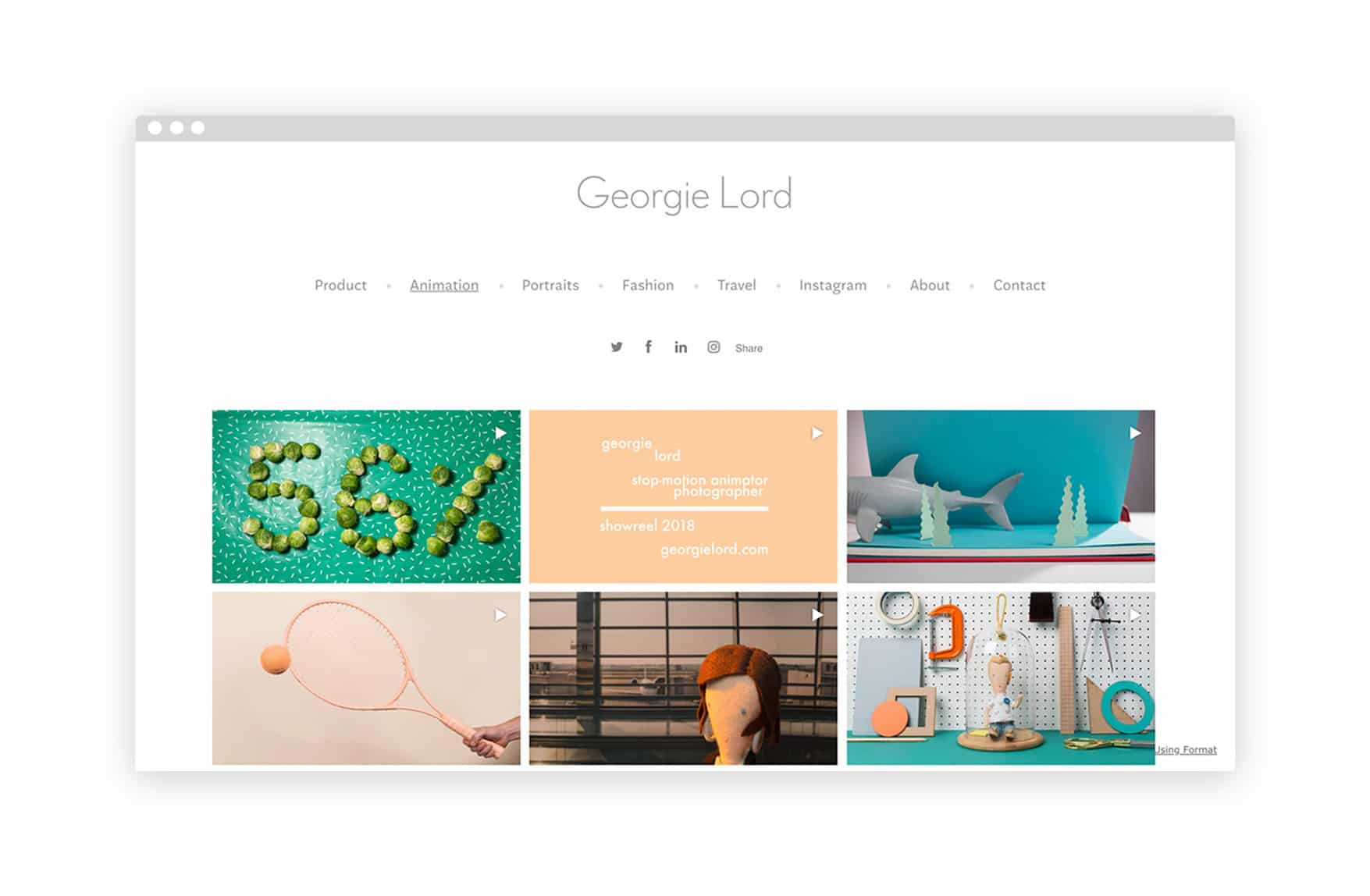
Georgie Lord
A photographer and stop-motion animator based in London, Georgie Lord, is a creator of many talents. She works in-house at Urban Outfitters and has also worked with clients including Moo, Twitter, Made, and more. A grid-based layout is minimalist yet effective. This style is great for keeping her artist portfolio neat and tidy.
www.georgie-lord.format.com
Format Theme: Amazon
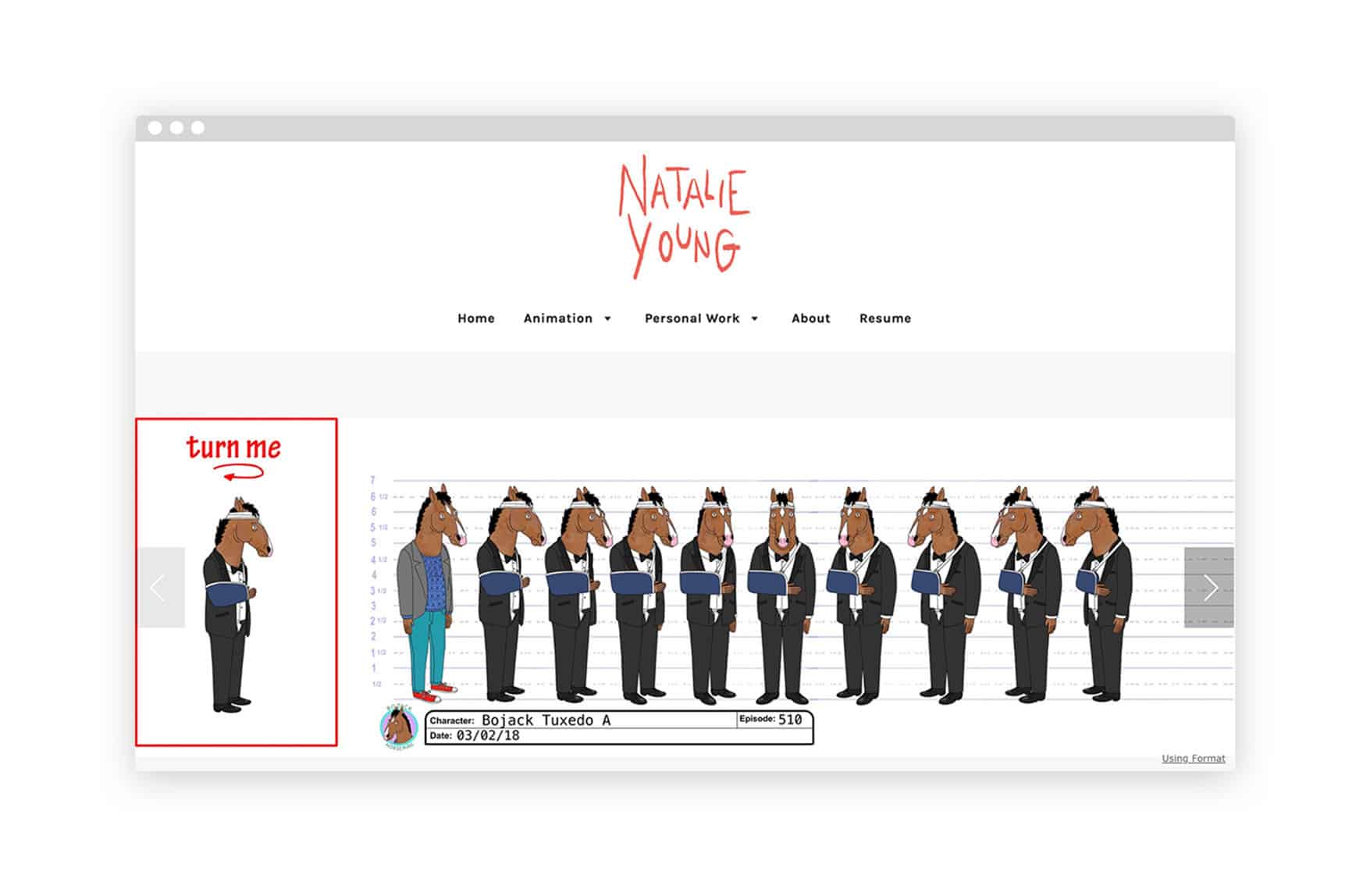
Natalie Young
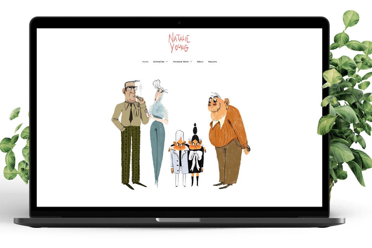
Character designer and artist Natalie Young is based in Los Angeles. She’s created character designs for Bojack Horseman and designed animated series by GQ and Adult Swim. Young keeps her portfolio feeling unique with a handmade logo and a personalized about page featuring a self-portrait.
www.natyoung.format.com
Format Theme: Foray
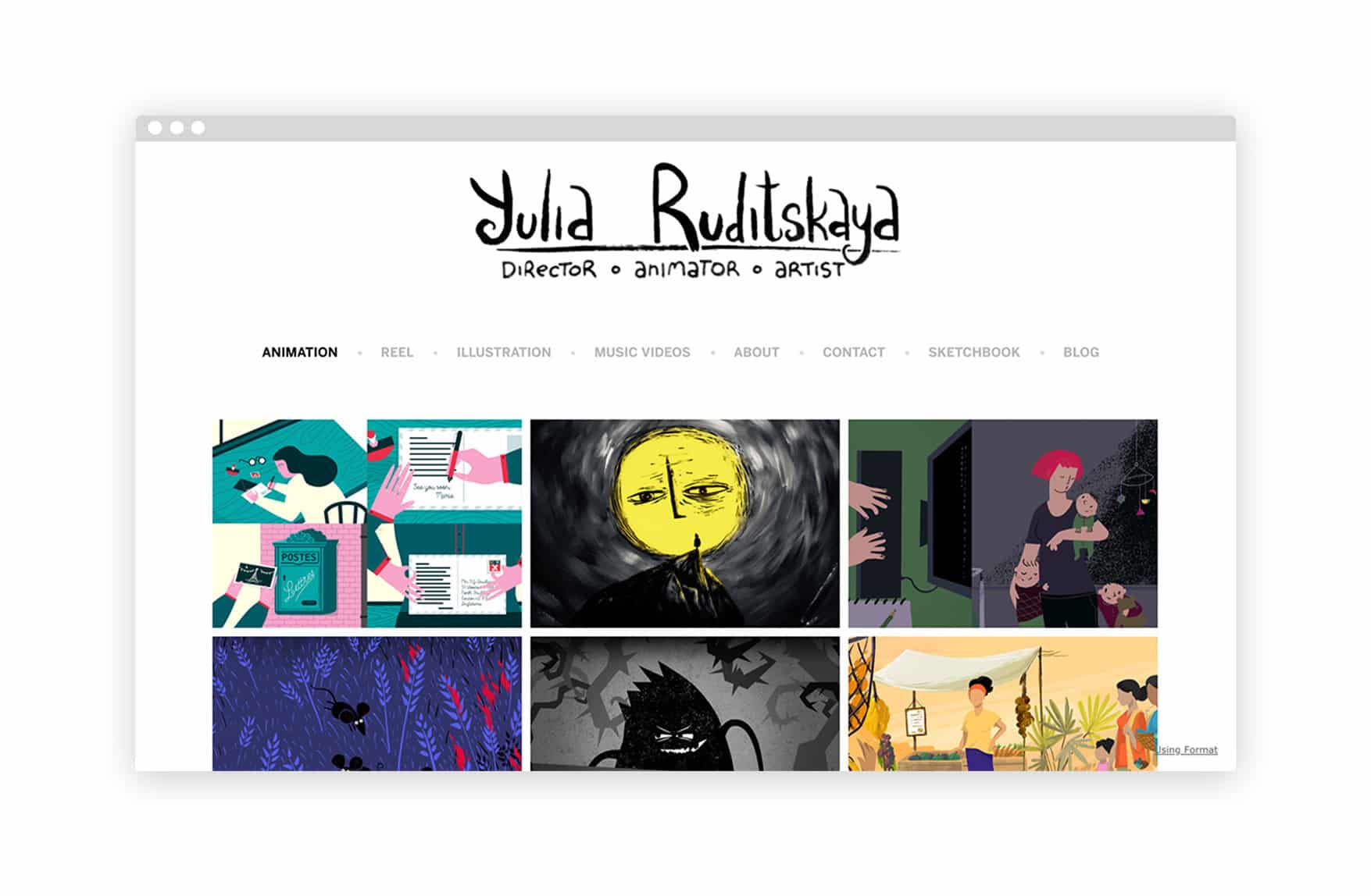
Yulia Ruditskaya
Yulia Ruditskaya instantly announces her work on her artist website with a hand-drawn header logo that reads: “Director – Animator – Artist.” The Brooklyn-based creator, originally from Belarus, has won many awards for her work, which has a unique, fantastical aesthetic. Separate gallery pages for her animation, illustration, and music video work keep Ruditskaya’s portfolio organized.
www.yuliaruditskaya.com
Format Theme: Amazon
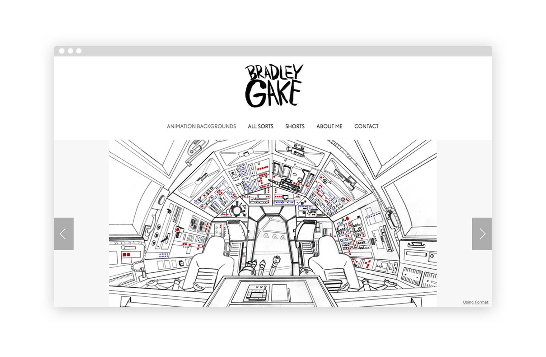
Bradley Gake
Bradley Gake is a background designer specializing in cartoons. Gake has worked for Disney XD, Warner Brothers, Cartoon Network, and designed for Nickolodeon’s much-beloved Fairly Odd Parents. Gake’s website design allows viewers to take in each image one at a time, helping the small details of his designs shine. We love creator website templates that let portfolio pieces take a large piece of screen real estate like this as it lets the work speak for itself.
www.bradleygake.format.com
Format Theme: Foray
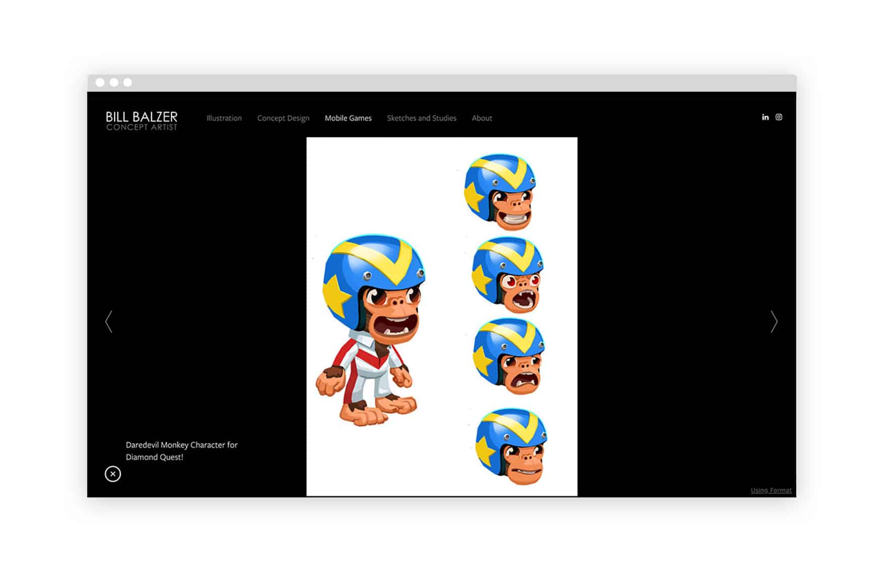
Bill Balzer
A concept artist and illustrator based in Boston, Bill Balzer uses a black background to help the artwork on his website pop, lending itself a more dramatic effect on a webpage. Balzer has worked in the gaming industry for years, notably creating concept art for the game City of Heroes.
www.billbalzer.com
Format Theme: Sun
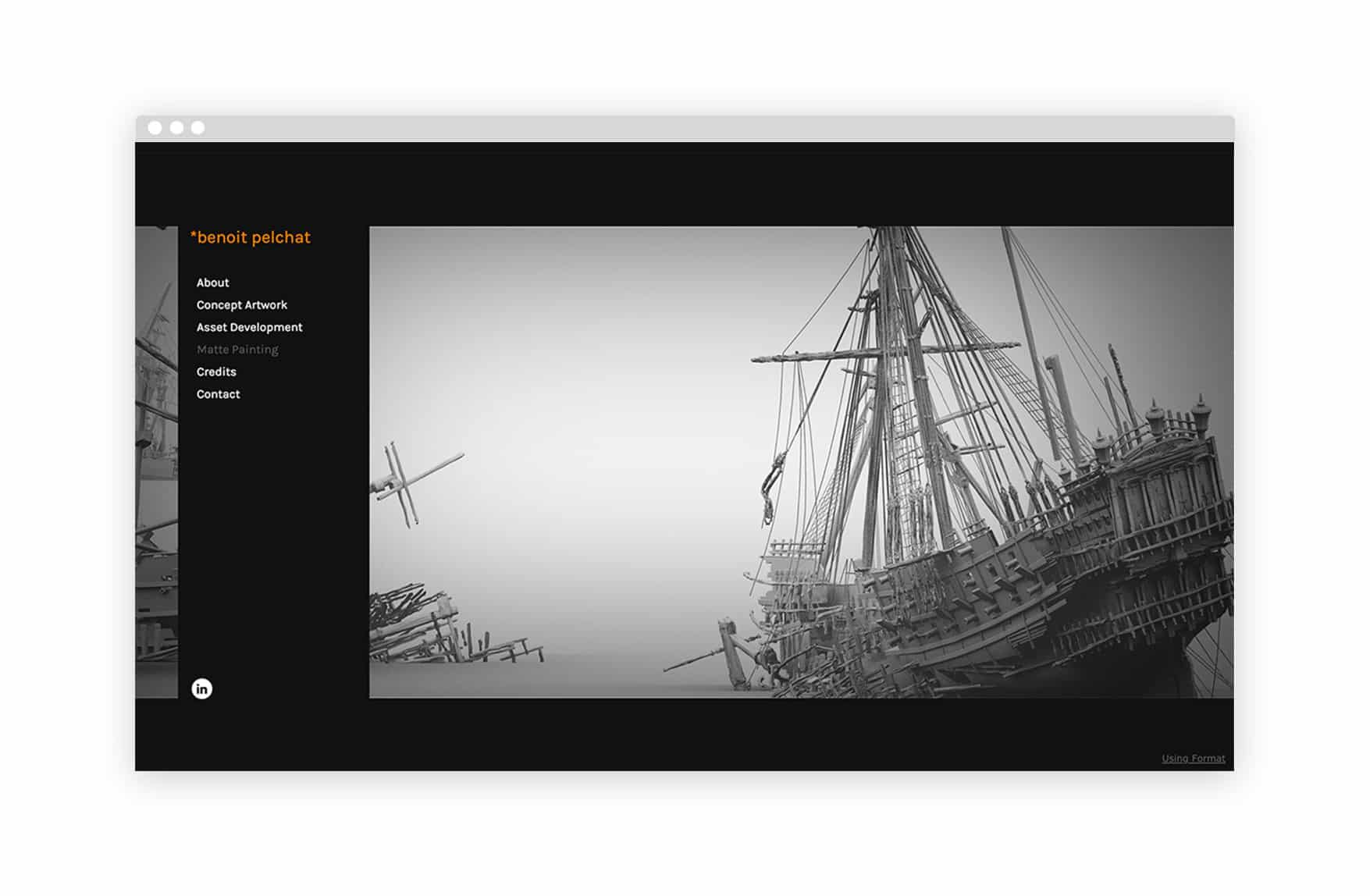
Benoit Pelchat
Established concept artist and matte painter Benoit Pelchat has created artwork for more than 30 films, including Star Wars Episode III, Harry Potter and the Goblet of Fire, The Chronicles of Narnia, Iron Man, and Pirates of the Caribbean: Dead Man’s Chest—which was honored by the Visual Effects Society and the Academy Awards. A dark grey website background and bold orange font help Pelchat’s portfolio stand out.
www.benoitpelchat.format.com
Format Theme: Horizon Left
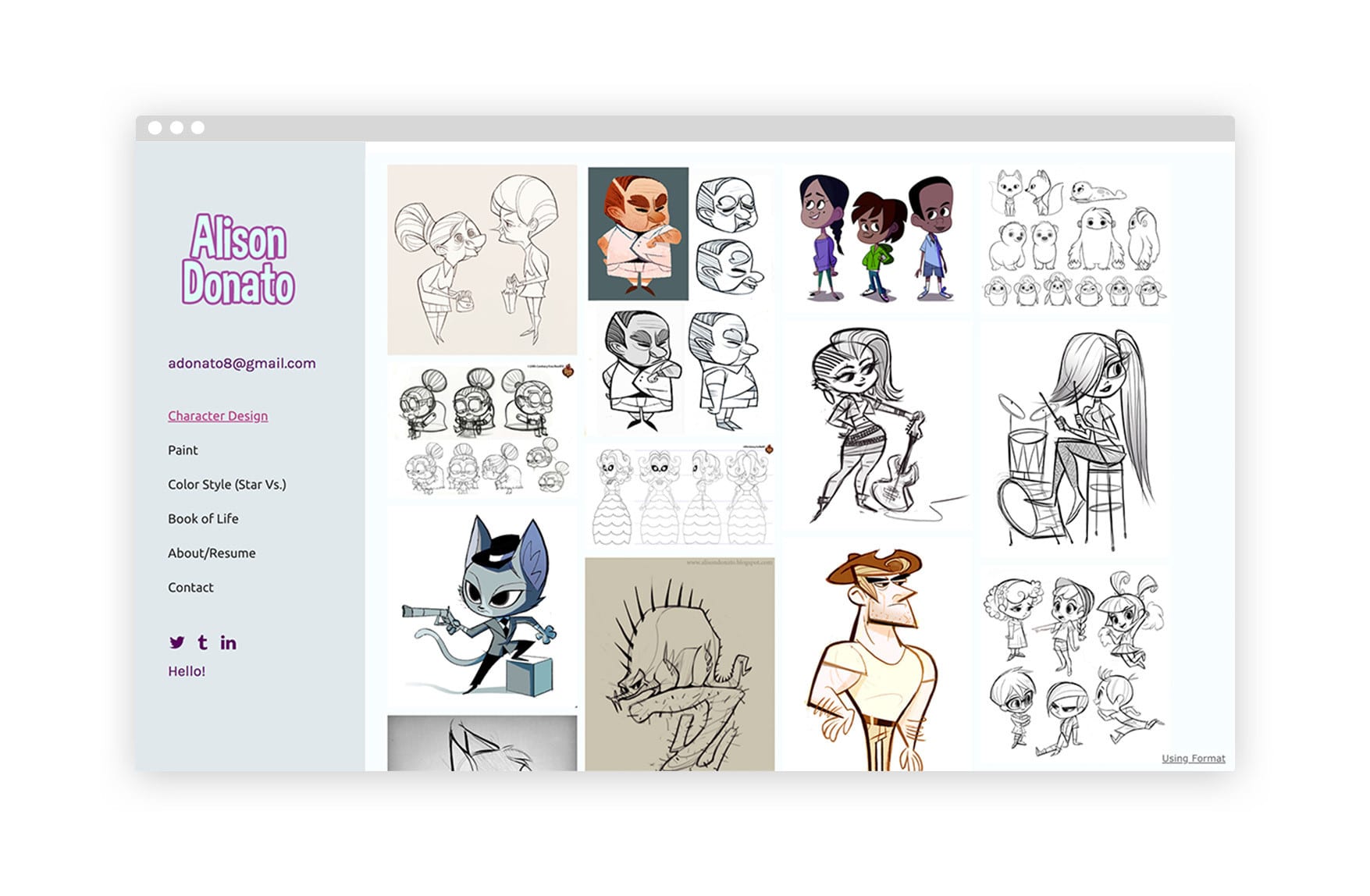
Alison Donato
Alison Donato has done character design, visual development, and color styling for Disney TVA, Nickelodeon, ReelFX, and Cartoon Network. Donato’s website is as fun and playful as her work, with a retro-styled logo bringing personality to her sidebar menu. Including a resume on her about page helps Donato showcase her professional background to potential future clients.
https://alisondonato.format.com
Format Theme: Peak
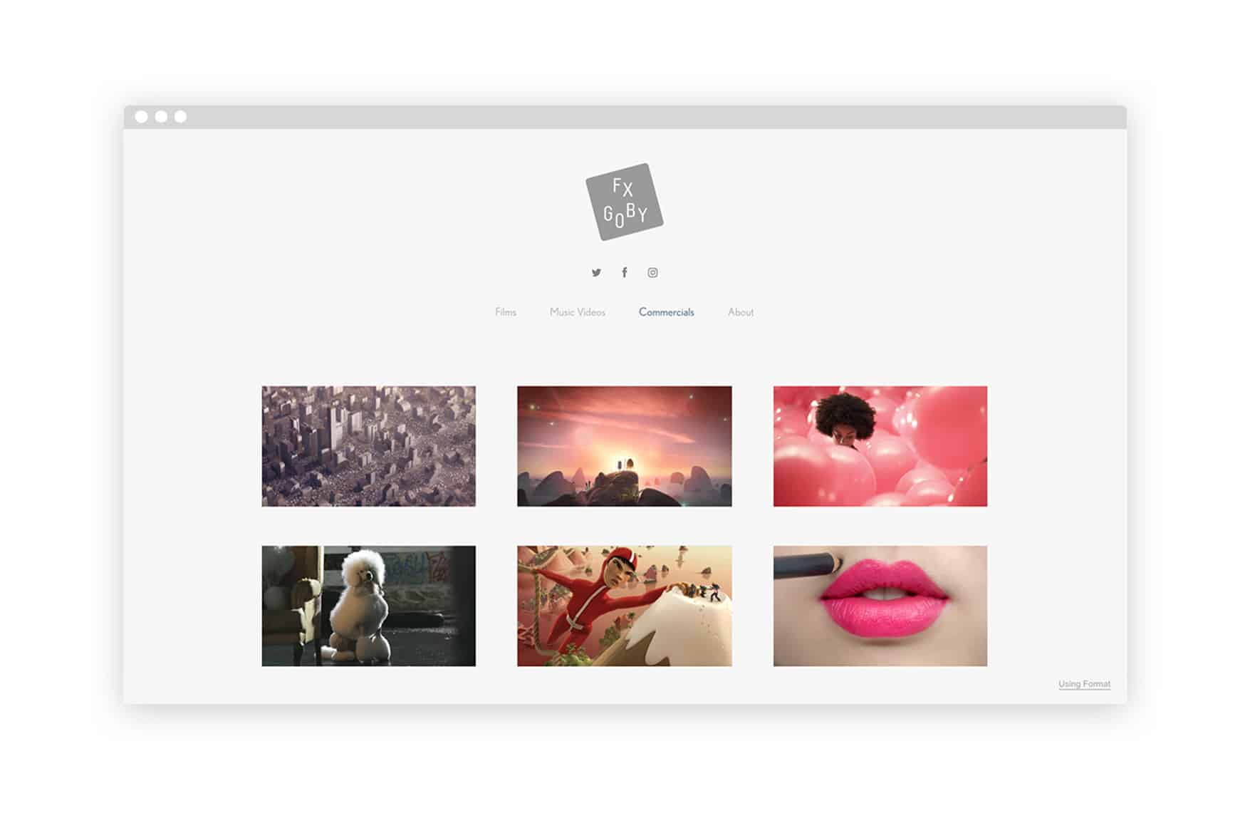
Fx Goby
Filmmaker Fx Goby was nominated for an Emmy for his 360/VR Google Doodle, an homage to French filmmaker Georges Méliès. Goby has also worked on commercials for Google and clients, including HMV, Tropicana, and Vodafone. He showcases his animation and film work using a grid layout website with lots of white space, allowing for an overview of his commercial and creative projects.
www.fxgoby.com
Format Theme: Mica
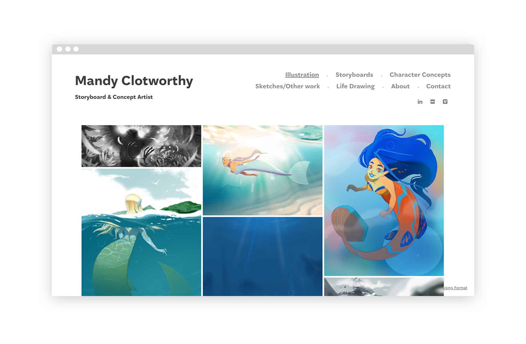
Mandy Clotworthy
Australian storyboard and concept artist Mandy Clotworthy has done 2D and 3D storyboarding for a range of projects, especially children’s TV shows—she most recently worked on a modern reboot of She-Ra and the Princesses of Power.
www.mandy-clotworthy.format.com
Format Theme: Amazon
Why You Should Make An Animation Portfolio Website
While social networking platforms like Instagram, Pinterest, and Behance are wonderful for exhibiting your work and communicating with an audience, you should still house your animations— whether you’re a working professional or have an animation student portfolio—on a website.
Having a storyboard artist portfolio website looks more professional, and allows you to better control how your work is presented. You can use Format’s customizable templates to showcase your creative work.
No design experience or credit card is required to build a professional-looking website. The drag-and-drop interface of Format’s templates allows for complete modification of color palettes, logos, and fonts, ensuring that no two websites appear alike.
To attract potential clients, your social media pages should include your personal website and links to contact information. As opposed to social media platforms, your website can completely be customized for the visitors’ experience, and share your work, creative process, and personality.
Types of Animator Portfolios
Now that you have seen a range of interesting and eclectic online portfolios for website animation, it’s time to begin creating your own. From 2D and 3D animator portfolios to student portfolios, there are many sectors of animation and stages of life that an online portfolio can cater to. We have included some key tips to ensure your portfolio matches your career path and objectives.
3D Animator Portfolio
Creating a compelling 3D animator portfolio is all about demonstrating your creativity and variety of work. As every 3d animation project differs from the rest, it is important to include a mix of eclectic examples of your previous projects while keeping it relevant and recent to your target audience. To begin, speak with your previous and current clients to understand what drew them to choose you for 3D animation. This will inform you of the key selling points to convey in your new 3D animator portfolio.
Animaker Portfolio
Animaker has taken the animation world by storm over the last few years. This has led to a sharp demand for animator designers to create compelling animation videos for clients. The best way to take advantage of this is to create an animator website that details all of your previous projects on Animaker. This will help clients learn more about your style and get in contact should they wish to discuss further.
Student Animation Portfolio
If you are looking to get into your dream design school, a student animation portfolio is an ideal tool to grab the attention of college admission teams. While you may not yet have a great deal of commercial work under your belt, a student animation portfolio is an excellent opportunity to show off your creative potential. Include your most recent animations, as well as any notable competitions or awards you might have won. References from teachers or internships are also a powerful asset to include in your portfolio.
Build Your Portfolio With Format
Rated #1 online portfolio builder for design and illustration.
How To Get Started With Building Your Animaker Portfolio
We hope that our collection of creative animator portfolios has sparked your interest in creating your own animator website.
Here’s how to get started building your professional portfolio.
Choose from one of Format’s simple templates to begin your 14-day trial—no credit card required.
Next, decide which of your works you want to feature in your gallery. Choose your strongest 6–8 pieces of work that best represent your style, work application, and experience. It’s important to limit your portfolio choices because your complete website will be judged on the strength of your weakest piece.
Don’t forget to include an artist bio on your About Page once you’ve submitted your gallery works to your site. Your About Page is your chance to tell your website visitors about yourself as an artist and the types of projects you’re interested in working on. Include a professional headshot as well as a mechanism for visitors to contact you about career opportunities.
It’s as simple as that, and you may expand your website as much as you like in the future by adding blogs and an online store.
Format’s platform also includes tools to assist you maximize the marketing potential of your website, such as SEO tools and the ability to capture email leads.
Begin developing your animation portfolio website with a Format free trial today.
If you’re looking for more resources to help your creative business take off, you’ve come to the right place. Check out these articles:
