Get Inspired With 22 Creative Web Design Ideas
Creative Web Design Ideas
So you want to build a website and you don’t know where to start. Or, perhaps you’re an aspiring web designer who wants to start marketing services, but you’re not sure what potential clients are looking for.
If either scenario applies to you, you’re in the right place.
Today we’re going to be diving deep into creative web design ideas that will not only inspire you to start building beautiful websites but will also help motivate you to step outside your comfort zone and experiment with new ideas.
Let’s start off with the basics.
Your basic web design ideas
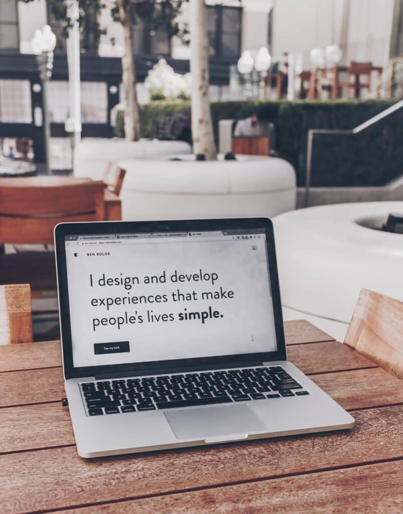
If you’re new to web design, mastering the basics is critical to your success as a web designer. While the more complex or out-of-the-box ideas might be fun to experiment with, until you’ve got a firm handle on these basics, you might struggle. Start slow and let yourself grow as you become more experienced.
1. Use simple, intuitive design
You don’t need to reinvent the wheel to become a successful web designer. In fact, most of the time, sticking with a simple design is what will end up being most intuitive for users.
Remember, you’re building a website to be used by other people. If the pages are cluttered, hard to read, or difficult to use, more often than not, users are going to click away.
Alternatively, if you keep the design clutter-free, easy-to-read, and intuitive to navigate, it’s much more likely that your user will be able to find the information that they are looking for, and they’ll be much more inclined to stick around on your website.

2. Consider typography
You can certainly have fun with fonts when designing a website, but first and foremost, you have to ensure that any typography you use is easy to read.
This includes not only selecting a legible font but also ensuring that font sizes are appropriate for the average web user.
Also, don’t forget to consider line spacing and line length.
While it might seem like you can simply write your text and copy/paste it into your website, the truth of the matter is there is much more that goes into making decisions about typography. Legibility is the primary concern.
3. Implement grid alignment
When you are first starting out, we recommend working with only a handful of elements and placing them into grids or blocks when planning your layout. Everything should follow a logical order and nothing should ever feel like it is floating in mid-space on your website.
When in doubt about how to layout your web design, keep the F-pattern in mind.
The F-pattern describes the most common path users’ eyes will take when landing on a web page (the same path you would take when writing out the letter F).
4. Colors matter
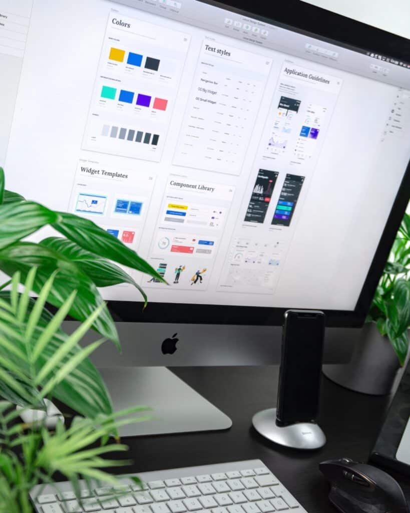
As a designer or aspiring designer, you’re probably already aware that colors are key to great design, but it’s important to really drive home this idea.
Don’t forget that while it might be tempting to use all your favorite colors, you’ll find that black and white really are your best friends when it comes to website design. This is because black and white are contrasting colors, which makes them stand out well (i.e. black font on a white background is always a safe choice).
Having said that, you probably don’t want to have a website that is entirely black and white. Coming up with a color palette of complementary colors and sticking with them throughout your design process will serve you well.
5. Consider the navigation
Remember how we said your website design should be intuitive? Don’t forget to include navigation in this formula.
As a designer, it can be tempting to only think about the visuals, but chances are, you won’t be designing a static page. You will be designing multiple pages that all need to link together. Consider where you place links, navigation bars, and blocks of text that lead to other areas on the website.
6. Where will you get imagery?
In some cases, animation might be the way to go, but in other instances, you’ll want to look at photography for images. As a designer, it likely won’t be your responsibility to source all of the imagery, but it is a good idea to get a feel for where the client plans on sourcing from.
Not only will this help you plan out your design in terms of layout, but it can also be a good indicator of the overall aesthetic of the webpage (i.e. if the client wants to use a lot of vibrant, colorful imagery, this might be a good clue that you should keep the rest of the layout more minimal to help the imagery stand out and avoid having things looked too cluttered).
Speaking of overall aesthetics…
7. Don’t forget branding
Again, it likely won’t be your responsibility to come up with the branding for the website, but it is absolutely something you need to be aware of when coming up with the design.
When you don’t consider branding, the website could have an entirely different feel than what the client wants to convey. For instance, if you design a fun, colorful, interactive website for a lawyer or doctor this might not match the more serious tone of the services offered.
8. And lastly, check for mobile responsiveness
Many people browse the internet on their phones and that means that it is imperative that your website design be mobile responsive. This means that when the web page is used on a mobile phone, all the elements of the design should fit, the fonts should be legible, and you should be able to navigate the website with the same ease that you would on a desktop.
Unconventional creative web design ideas
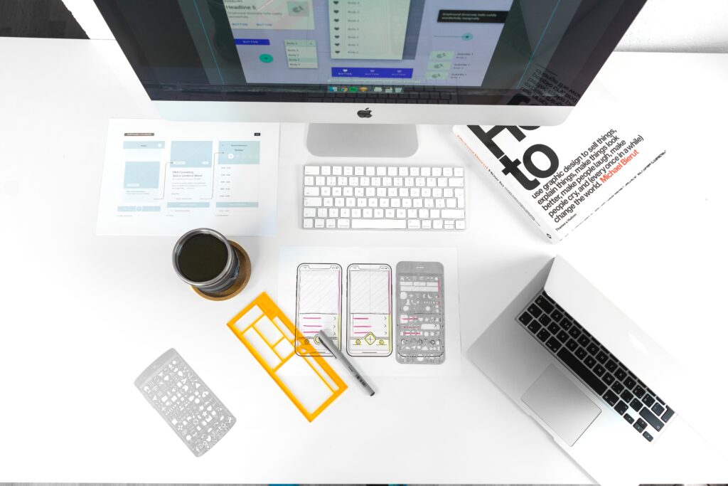
So you’ve got the basics down. Now let’s chat about some ways you can add some spice and flavor to your website design with some more advanced design techniques and trends.
1. Use playful typography
Our advice from above still applies: You absolutely still need to use legible fonts. This is especially true when you’re picking fonts for large, important pieces of content.
Having said that, you should still feel free to experiment with more playful fonts. For instance, bubble letters, handwritten fonts, retro fonts, kinetic (moving) fonts, or even custom fonts are all worth considering. Just be sure that when you pick these fonts, they match the branding and aesthetic of the client you’re creating for.
2. Drag interaction
Want to create a website that has an interactive feel? Why not try playing with drag interaction?
With this web design idea, you’re creating elements on the web page that actually require the user to “pick up” an item and drag it to another part of the screen in order to trigger another action. For instance, flipping through a portfolio by dragging the page rather than simply scrolling.
3. Movement
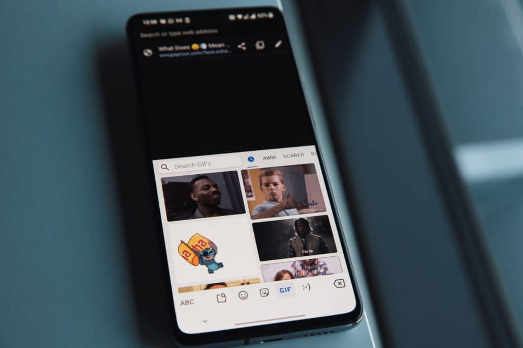
Gone are the days when websites had to be totally static. If you feel comfortable, adding a bit of movement to your webpage is a great way to spice things up. You can do this through animation or GIFs. Just be sure that you don’t go too overboard here or it could end up looking like an amateur design.
4. Brutalism
This style of design goes against everything that we suggested in the first section, but if you’re someone who really feels comfortable stepping outside the box, this web design idea is worth looking into.
Essentially, brutalism is all about providing eclectic design that is entirely the opposite of the more conventional designs. Nonconformist visuals, layouts that draw your eye around the page, and a lack of order are characteristics of this type of design.
5. Monochromatic gradients
Tired of white backgrounds? Gradient backgrounds are an easy way to spice things up while still keeping things relatively classic. You can do these gradients really in any color you want, just be sure that text remains legible on the page. In addition, monochromatic gradients tend to be what is most on trend right now.
6. Give us all the layering
While clean, neat websites can be easy to look at, if you want to add some depth to your design, adding in some layers is a great way to do so. Plus, you can play with layers in whatever way you want. Layer text over visuals, throw in some animation or even add in some shapes. You still want to avoid making things look too cluttered, but when done correctly, layering is an excellent strategy for visual interest.
7. Text only websites
Because designers tend to work with shape, images, and animation, this idea might seem very outside the box for a designer, but more and more we’re seeing a growing trend where text-only websites are popping up.
As a very modern, uncluttered way to approach web design, for the right brand, this can be an excellent option.

In need of web design portfolio ideas? Try these
As an aspiring web designer, you need to have a great portfolio. Not only because a portfolio is essential for any creative person trying to show off their work, but it’s particularly important for a web designer because your job is all about highlighting great design.
Let’s review some ideas you can use when setting up your web design portfolio:
1. Use a gallery format for your portfolio
One of the things we love most about the gallery format for a portfolio is that gives the viewer an overview of your whole body of work. They can simply click on your portfolio and see all your work without having to navigate to every individual piece.
For instance, we see this done beautifully in the Sharp template.
2. Show off the details
As a designer, you don’t want people squinting or having to try hard to see what you’re all about. Your style should be obvious to the viewer right when they click on your portfolio.
In our experience, one of the easiest ways to make your style obvious to the viewer is to use big imagery that is clear-cut and allows you to focus on the details.
When you want your imagery to stand out, you most likely want the rest of the elements of the web design to be fairly minimal. The Kiln template is wonderful for this.
3. Keep things clean
In some cases, going with a bolder and more unconventional design might be appropriate, but in general, we always suggest something clean and simple for your portfolio. It will keep clutter down and really allow people to focus on what matters—your work.
Check out the Exhibition layout to get a feel for this style.
4. Use layering
As we mentioned above, layering is a key component of a well-designed website and isn’t something to be dismissed.
If you want to ensure that your web design incorporates some of that must-have layering, don’t forget to check out Line.
5. Don’t forget to make your portfolio intuitive
If users can’t figure out how to actually navigate through your portfolio, there’s a good chance they are going to click away before they even get to take in all your hard work.
Make sure this doesn’t happen by using an intuitive design like Meridian.
6. You can still have fun with your design
Oftentimes, when putting together a portfolio, it’s easy enough to get stuck into the trap of thinking your design needs to be entirely professional. While we do recommend having an overall professional feel for your work, we also like to remind designers to have fun with their portfolios. Not everything has to be so by the book.
If you’re someone who wants to add a playful edge while still keeping an overarching professional feel, we highly recommend checking out Sierra.
7. Add a modern feel
While not every designer is going to want the modern feel, for the most part, it’s a designer’s responsibility to stay on top of trends and provide modern work. If you agree, we highly recommend adding a modern, hip vibe to your portfolio website. Something like Polarize will serve you well.
Examples of web designer portfolio ideas
Do you want to see some of these designer portfolio ideas in action? If so, we’ve got all the inspiration headed your way with these portfolio examples from our members:
1. Zineb Hamza
Minimal, easy to navigate, and with her work displayed front and center, Zineb Hamza is the perfect example of a designer who knows how to keep users on her website. With easy-to-use navigation that will direct you to all her various projects, you won’t struggle to find what you’re looking for on the designer’s website.
Theme used: Exposure
2. Ahmed Bokhari
We love a designer who knows how to keep it simple with minimalist design, and Ahmed Bokhari does this perfectly. With mostly text used on his homepage, there are no distractions and you’ll quickly be able to navigate to the designer’s portfolio without any confusion.
Theme used: Horizon
3. Arnis Putnis
This designer shows us exactly how to put that grid layout into action with his simple and minimalist design. With only a small left navigation bar and large grids for each project, you get a feel for this designer’s aesthetic right off the bat.
Theme used: Order
4. Ella Butler
One of our favorite examples of a designer who knows how to use classic design style, this website highlights all those classic design decisions that we love. There is plenty of white space, easy-to-read fonts, a grid layout, and a classic top navigation bar for intuitive use. What’s not to love?
Theme used: Rise
5. Lucy Yu
As a designer, Lucy Yu uses a lot of color and movement in her designs. And guess what that means for her portfolio website? That’s right—simple, minimalist, and with plenty of white space. Are you catching onto a theme here? You can’t go wrong with classic design when attempting to showcase your work.
Theme used: Ora
6. Chri Romero
If you want your work to speak for itself, following in the footsteps of this designer is your best bet. With limited text and simple intuitive scroll features, you won’t find all the bells and whistles with this example. Instead, what you’ll find is a website that beautifully displays this designer’s work. Plain and simple.
Theme used: Coral
7. Kelton Bumgarner
When you have a lot of different projects and you want users of your website to easily be able to navigate from one to the next, this designer shows us how to do it. With a left navigation bar, find the project you’re interested in and select. It’s that easy. No clutter or confusing animation to distract you. Direct, simple, and to the point. Again, you might be noticing a pattern with these portfolio website designs.
Theme used: Surface