It’s finally happened—science has determined the ugliest color in existence. Somewhere between earth brown and khaki green, with a hint of sewage tones, Pantone color 448C, aka opaque couché, has earned the title of worst color ever.
We have the Australian government to thank for this discovery: opaque couché was the result of a study aiming to find the most unappealing color for cigarette packets in Australia. Respondents tended to associate Pantone 448C with words like “dirty,” “tar,” and “death,” so it became the government’s color of choice to deter people from purchasing cigarettes.
The UK, Northern Ireland, and France have also recently decided to use the same color for their plain packaged cigarettes. No matter their preferred brand, smokers in those countries will be purchasing identical, opaque couché-colored cigarette packets, with brand and product information printed in plain font.
But is opaque couché really off-putting enough to stop someone from buying cigarettes? Was the Australian Olive Association right to complain when the Australian government initially referred to Pantone 448C as “olive green”? Is the color truly that terrible?
Here at Format, we decided to do a study of our own to see if opaque couché deserves the bad rap. We ran an image search of photographers using Format to find photos that showed this much-maligned shade in a more appealing light.
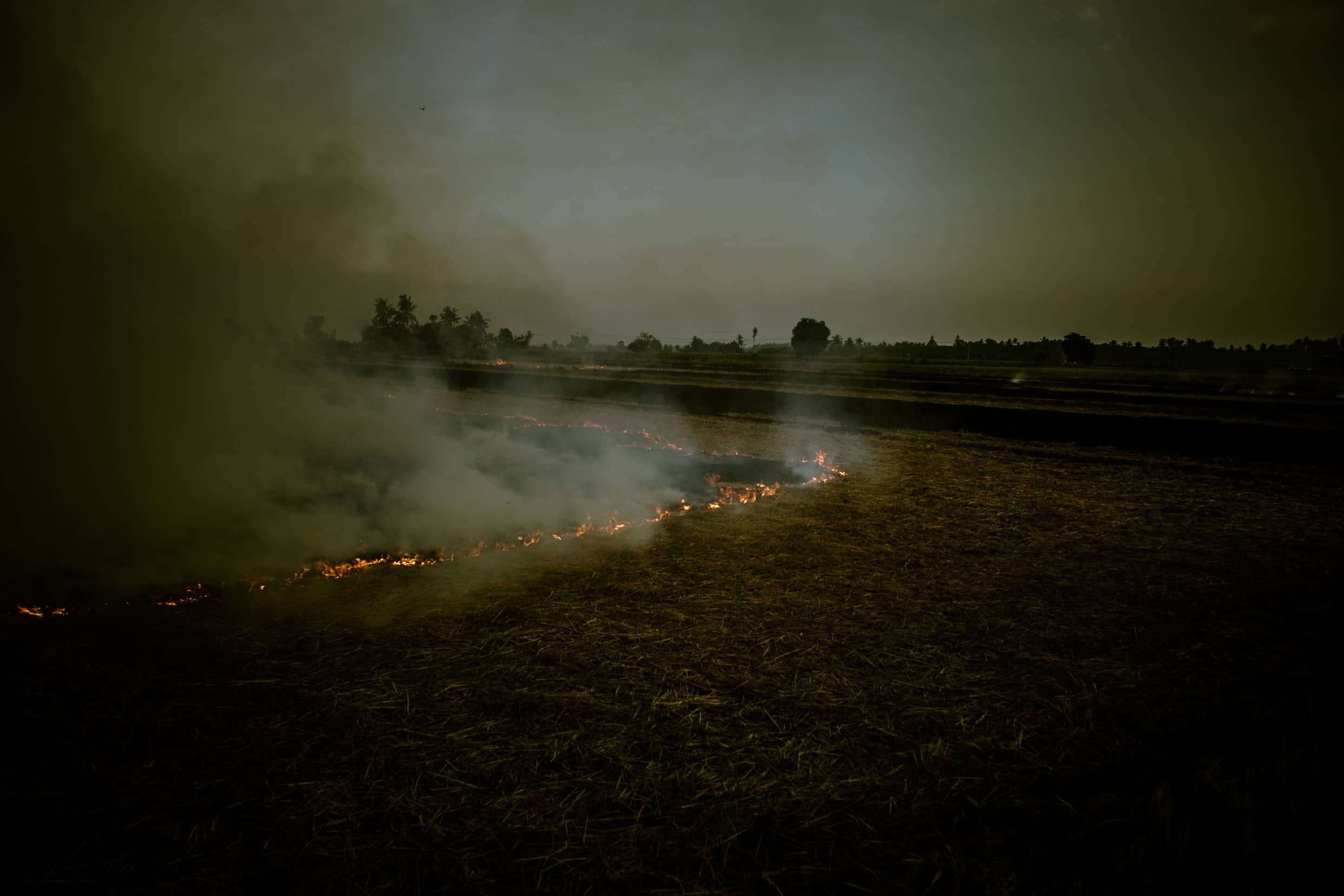
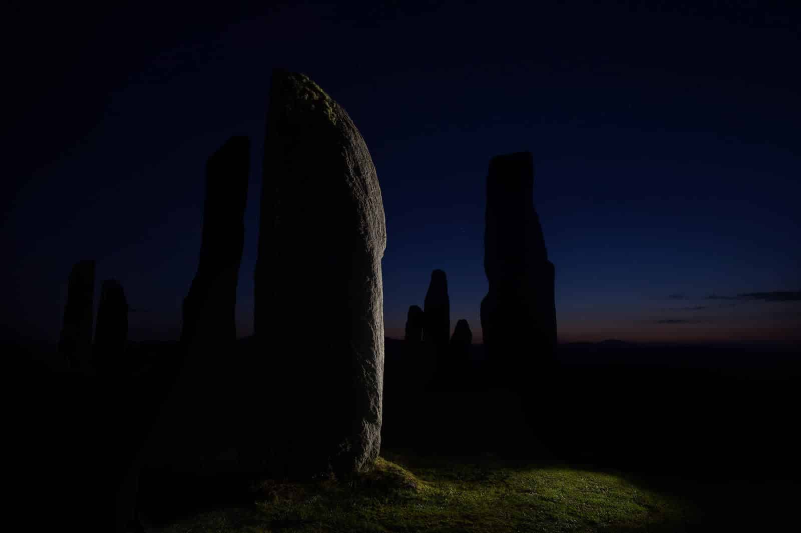
When it’s not on a cigarette packet, you can find opaque couché in a field at dusk, on the leaves of plants, darkening the sky at sunset and shading mountain ridges. Here’s our gallery of our favorite occurrences of Pantone 448C in nature. Maybe it’ll change your mind about the world’s “ugliest” color.
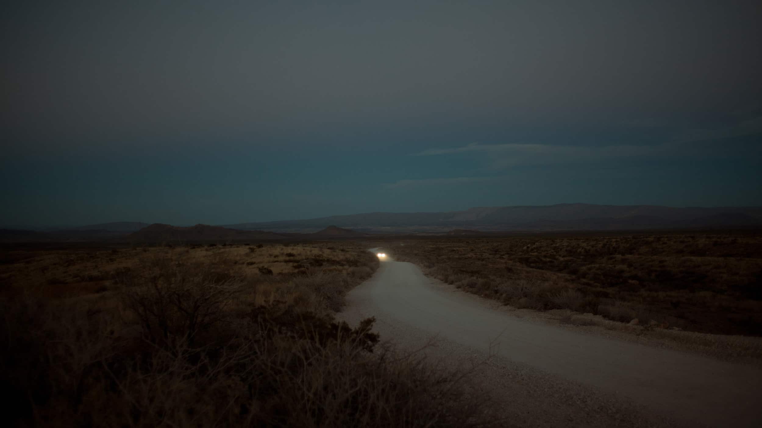
Lauren Withrow’s portfolio
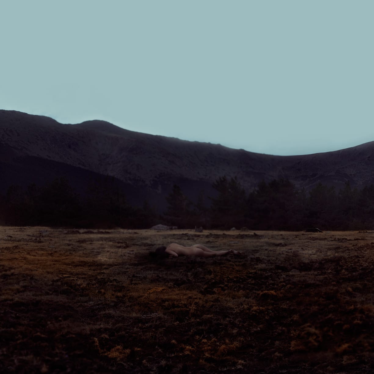
Rebeca Cygnus’ portfolio
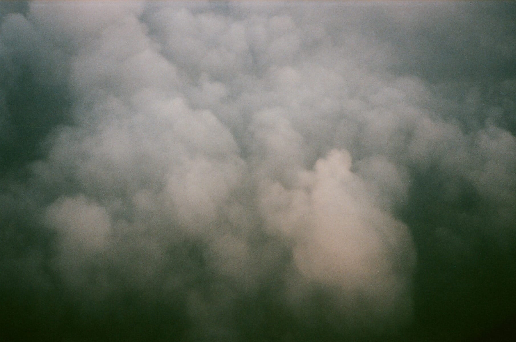
Naa Teki Lebar’s portfolio
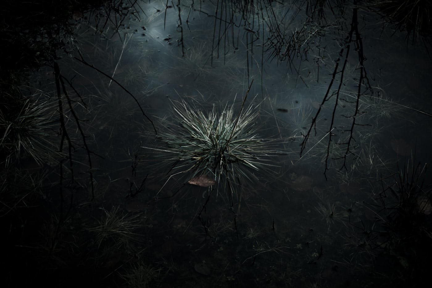
Lina Prokofieff’s portfolio
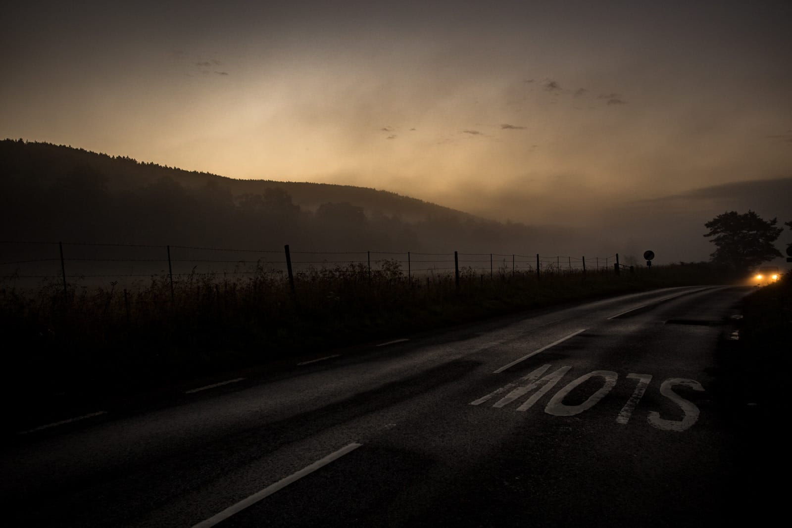
Josh Redman’s portfolio
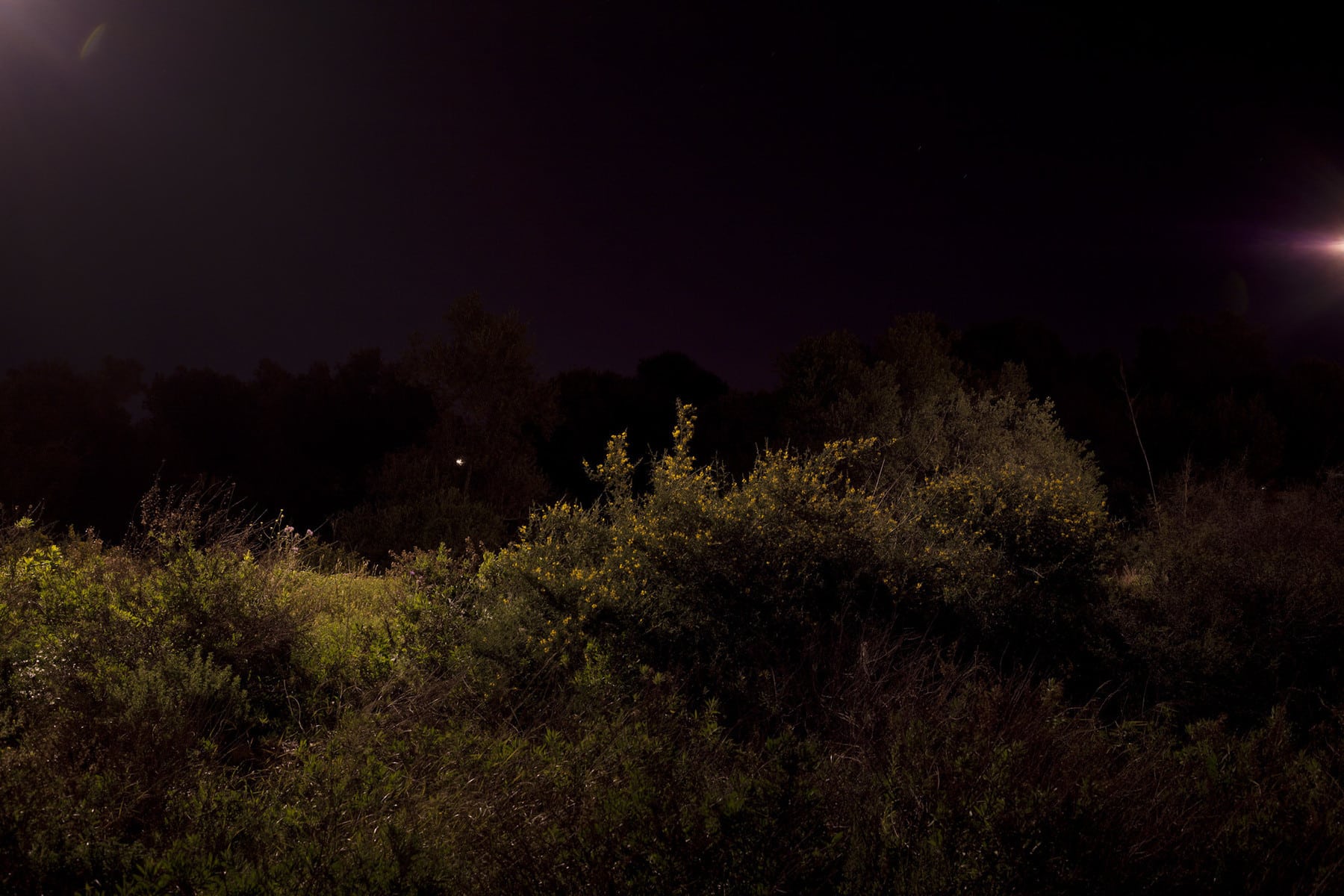
David Villalba’s portfolio
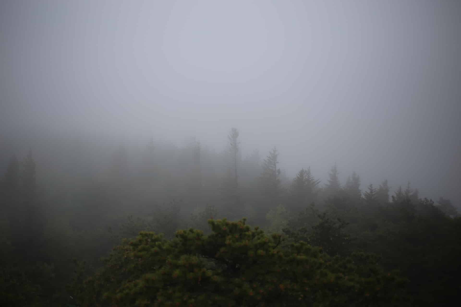
Malorrie Ann Nadeau’s portfolio
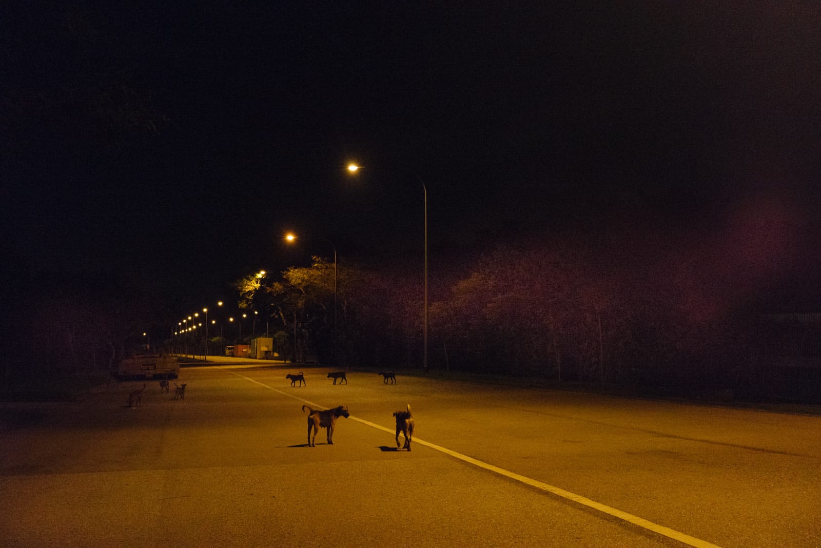
Kevin WY Lee’s portfolio

David Oliete’s portfolio

kG Krishnan’s portfolio
