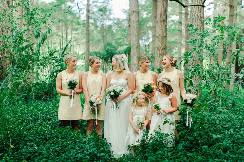
Whether you’re planning a wedding or planning to photograph one, these 20 wedding photography portfolios examples are full of ideas.
Ready to get into a lovey-dovey mood? We found the 20 best wedding photographers with online portfolios that showcase exceptional talent and capture the true spirit of each couple’s big day.
As all these photographers know, an online portfolio tells prospective clients who you are and what you do. Something as simple as the layout of your portfolio site or the images you choose can determine whether or not someone gets interested in your work and decides to keep browsing.
A professional logo, easy-to-navigate wedding photography portfolio, and beautifully curated photos can really make your work shine online.
These 20 wedding photography portfolios have all been designed with care and attention to detail. They show off wedding photos that range from classic and elegant to creative and silly. In the wedding photography business, it’s important to stand out from the crowd and these portfolios examples are definitely in a league of their own.
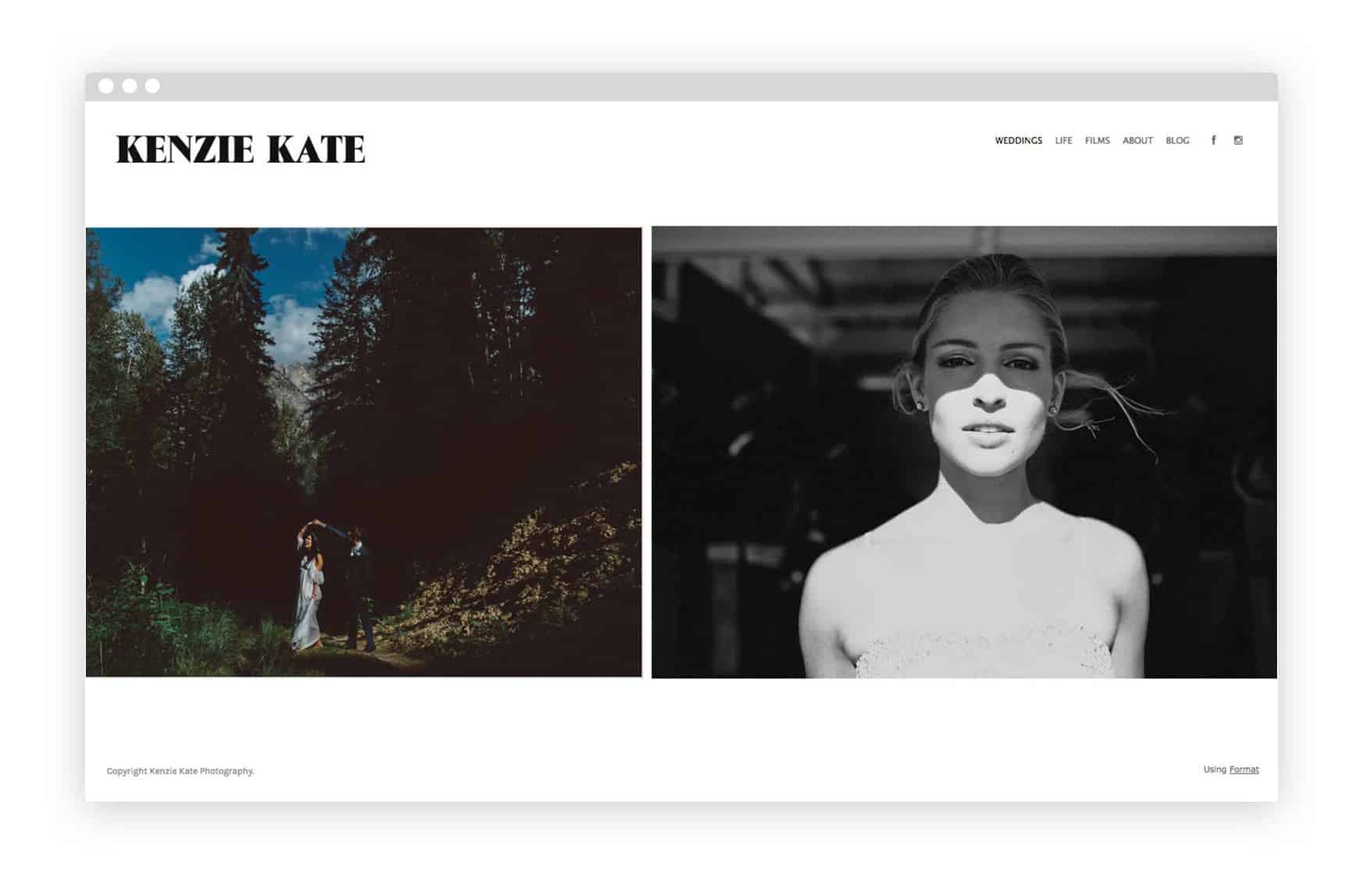
1. Kenzie Kate’s Online Portfolio
Kenzie Kate describes her work as “contextual and photojournalistic in approach.” Her choice of a horizontal scroll against a crisp white background lets her unique, up-close wedding photography speak for itself.
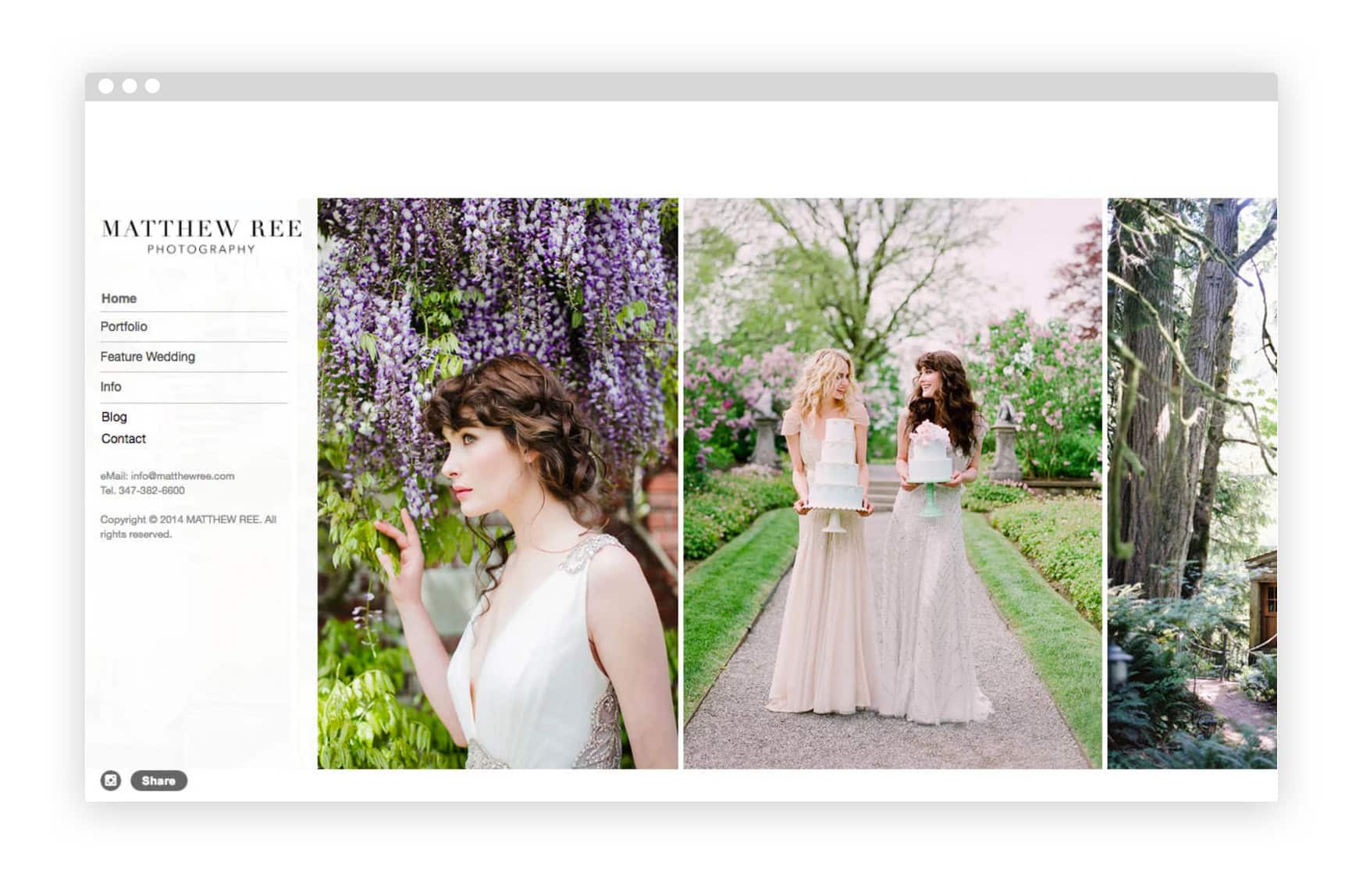
2. Matthew Ree’s Online Portfolio
New York-based Matthew Ree’s delicate, precisely focused photos lend a fairytale feeling to the weddings he captures. His floating sidebar menu stands out with a simple yet classic logo.
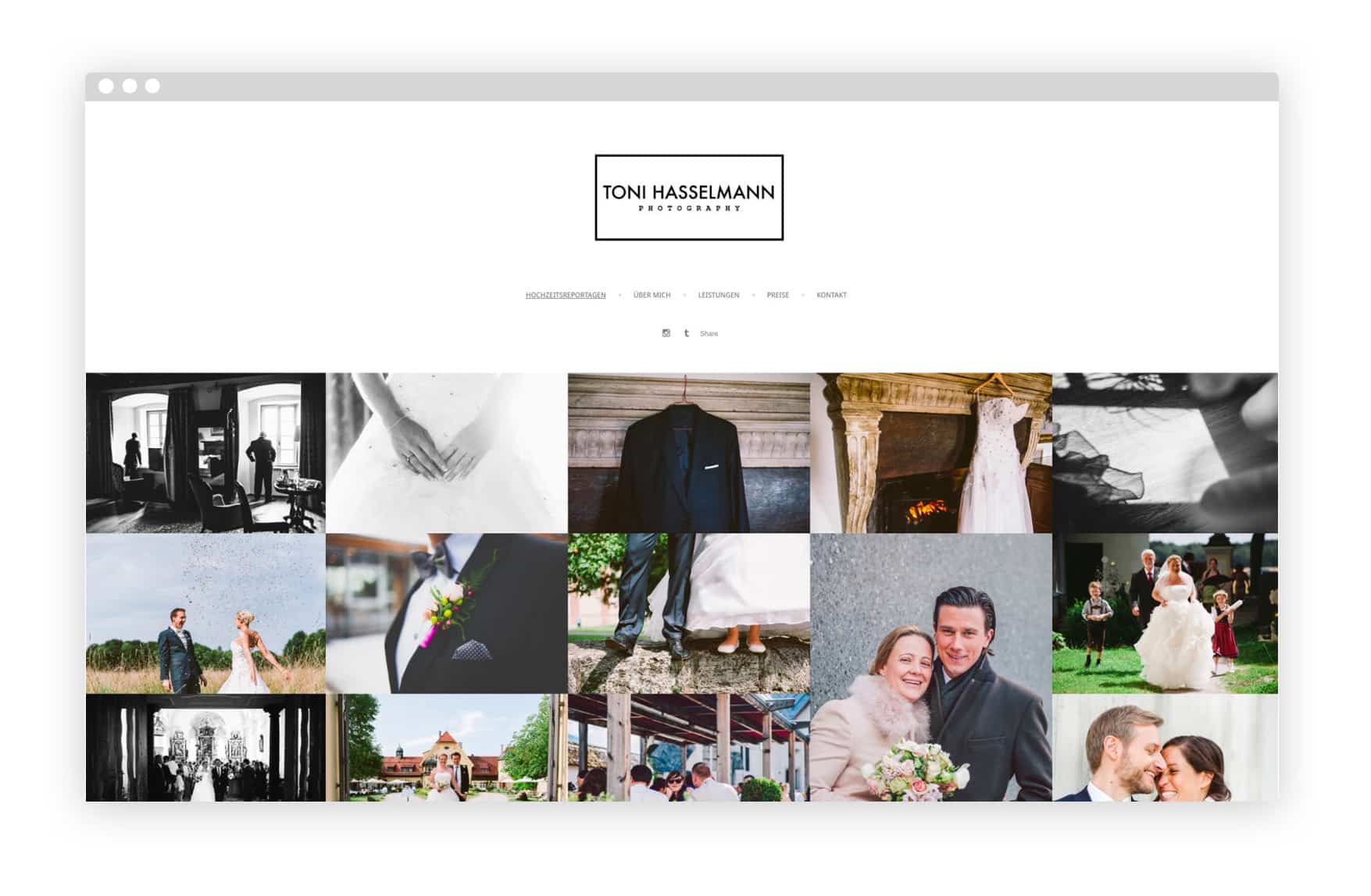
3. Toni Hasselmann’s Online Portfolio
German wedding photographer Toni Hasselmann fills up the entire screen with his lively, richly coloured photos. It truly showcases his talent in a single scroll.
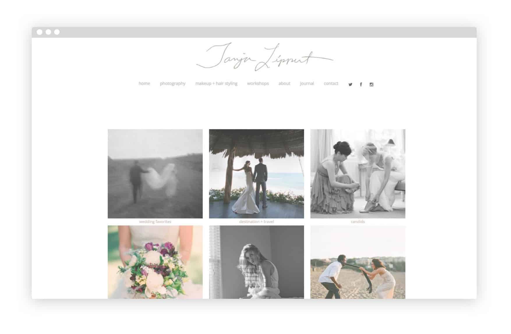
4. Tanja Lippert’s Online Portfolio
Tanja Lippert uses thumbnail photos to show off different locations and categories of her wedding photography: headings like “Candids,” “Details,” and “Published” make it easy to explore her work. The choice of pale brown text plays up the muted colour scheme typical of her intimate photo style.
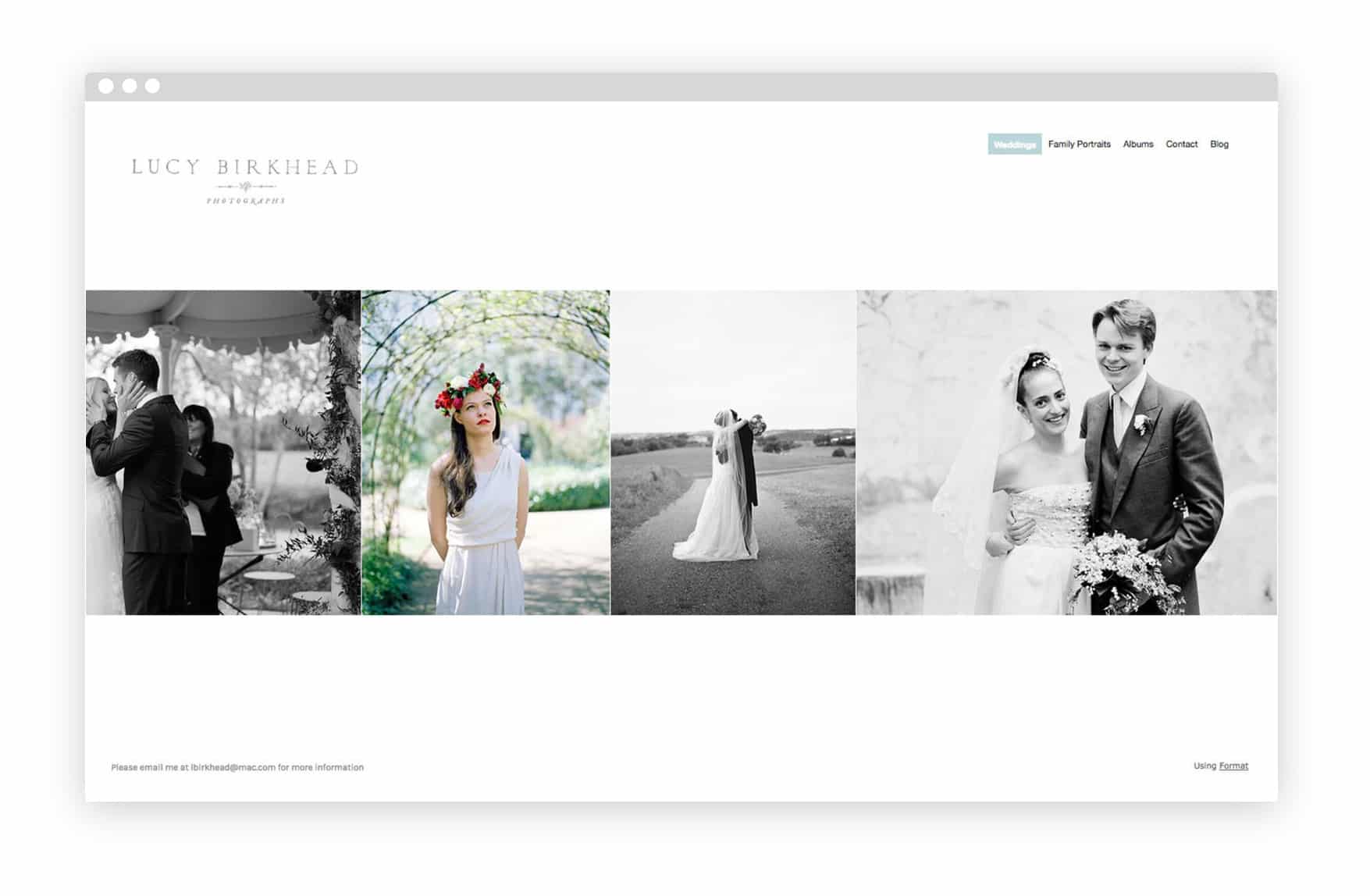
5. Lucy Birkhead’s Online Portfolio
Lucy Birkhead’s polished wedding photos stand out on an almost totally text-free page. A footer with her email address makes contact info clear, and a link to her blog page offers a chance to see more personal work.
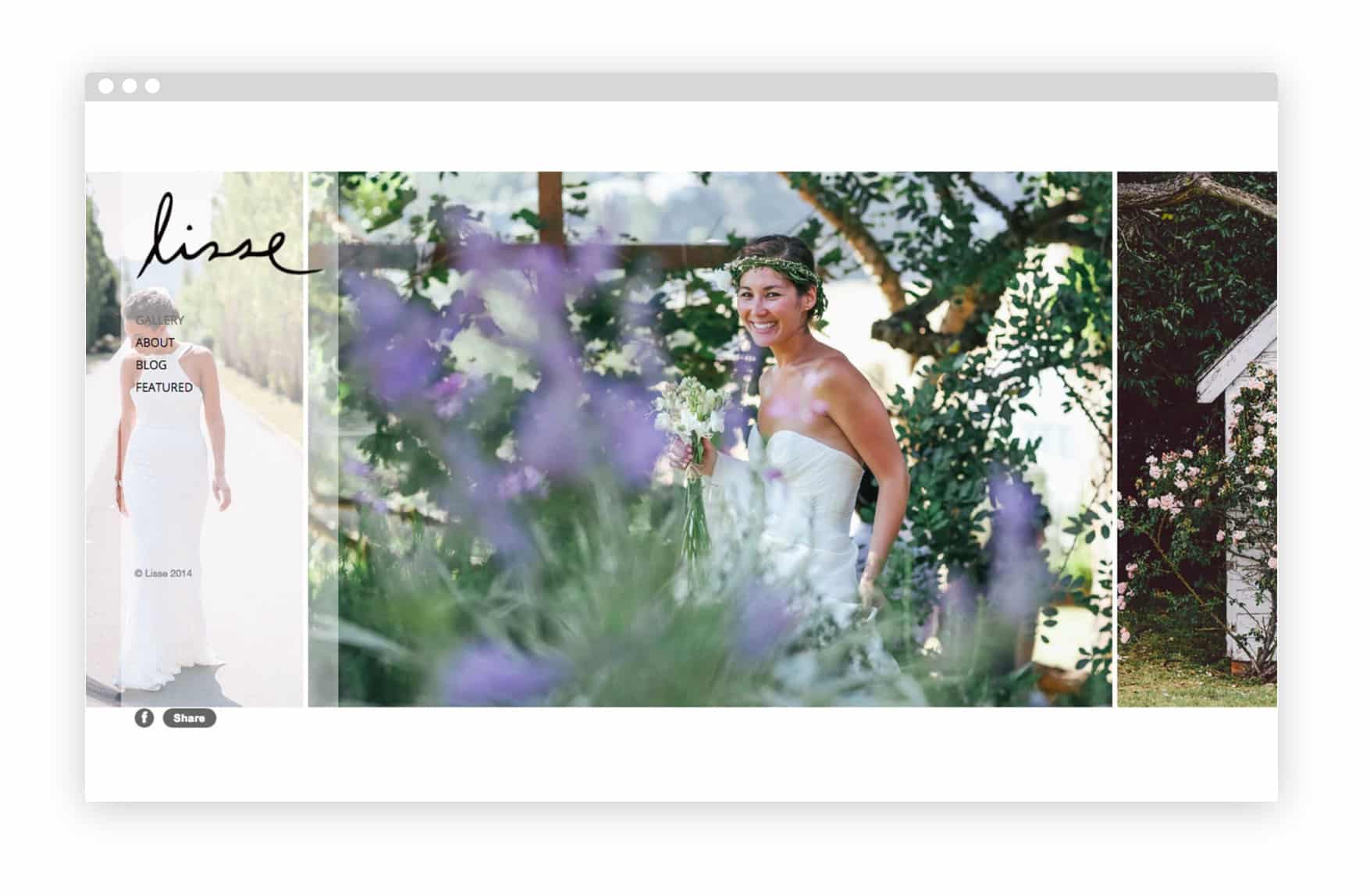
6. Lisse’s Online Portfolio
Australian photographer Elise Hassey has a diverse wedding portfolio. A “Featured” link shows off her work for publications like Vogue Brides by displaying the magazine spreads, giving potential clients a chance to see how her work looks in print.
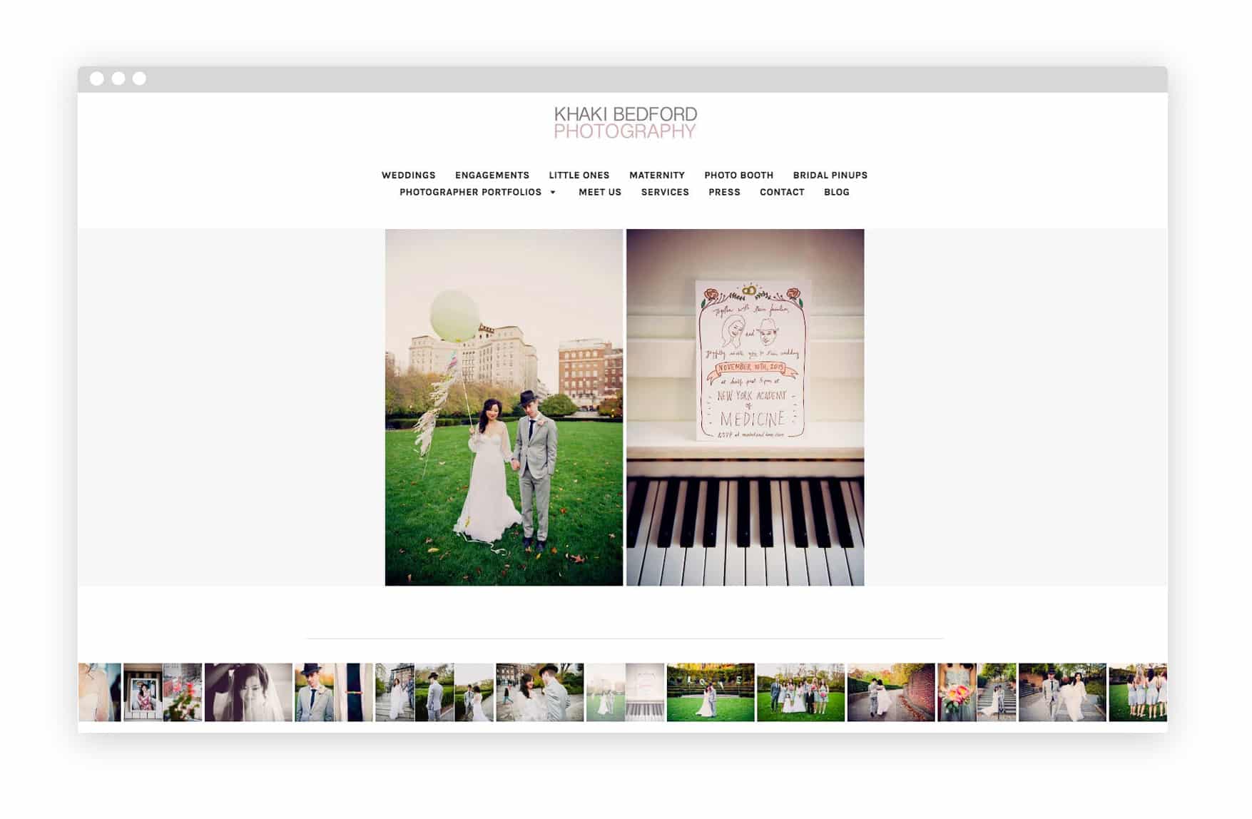
7. Khaki Bedford’s Online Portfolio
Based in Nashville and Brooklyn, Khaki Bedford loves photographing “quirky, non-traditional” weddings. She uses Format’s Foray theme to showcase her playfully composed wedding shots one at a time.
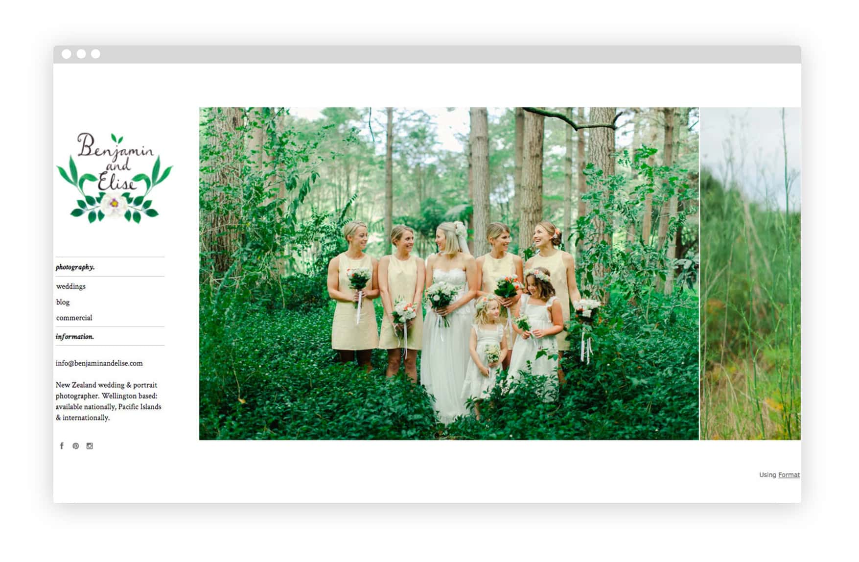
8. Benjamin and Elise’s Online Portfolio
New Zealand-based husband and wife team Benjamin and Elise pay attention to colour when organizing their wedding photography: shades of green, blue, and red dominate their horizontally-scrolling portfolio. An “About Us” page with a heartfelt bio adds a personal touch.
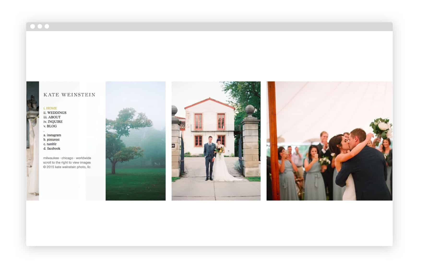
9. Kate Weinstein’s Online Portfolio
Kate Weinstein draws attention to the artful composition of her wedding shots by showcasing landscape and architecture shots alongside wedding party images in her portfolio. She uses Format’s Blog feature to highlight recent wedding shoots.
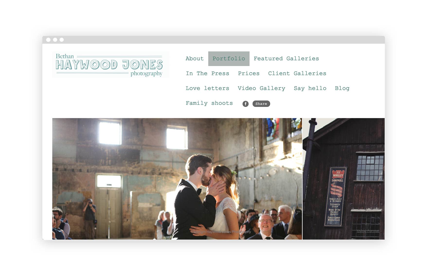
10. Bethan Haywood Jones’ Online Portflio
Based out of Coalbrookdale, Shropshire, a small town in England, Bethan comes with a big city wedding portfolio. Her unique and cool shoot locations are probably thanks to the area she lives in, but breathe a breath of fresh air in a sea of wedding portfolios. Her portfolio curates a perfect combination of candid shots, detail shots, and flexes a myriad of shooting and editing styles.
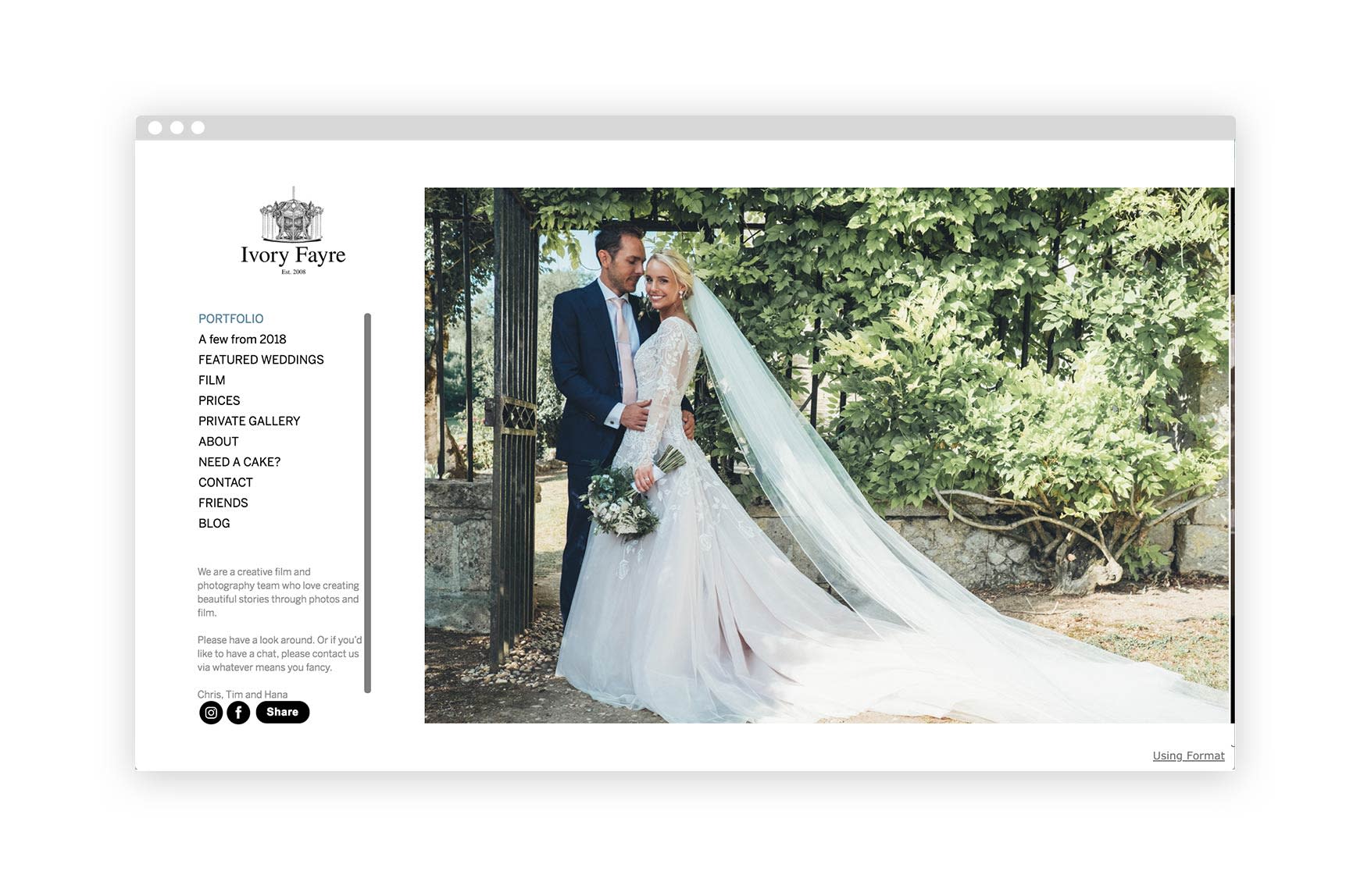
11. E&O’s Online Portfolio
E&O is a collaboration between Tim Easton and Jake Owens, a London based self-proclaimed wedding photographer extraordinaire. Their portfolio showcases their flexibility in different shooting and editing styles while keeping the overall look consistent. What helps bring the entire portfolio together is the unique use of a salmon color website background which is a dominant tone in a lot of their images, that helps marry the entire viewing experience together.
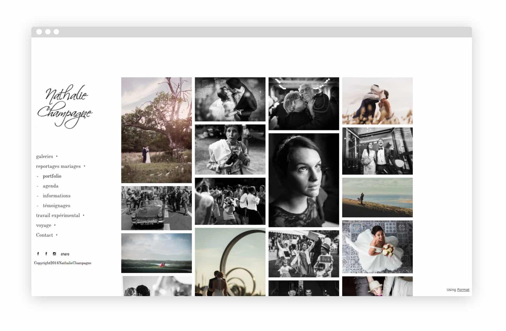
12. Nathalie Champagne’s Online Portfolio
French photographer Nathalie Champagne uses Format’s Peak theme to show off the variety in her wedding photos. Pages for information and client testimonials are carefully formatted for easy reading and a chance to display more of her photo work.
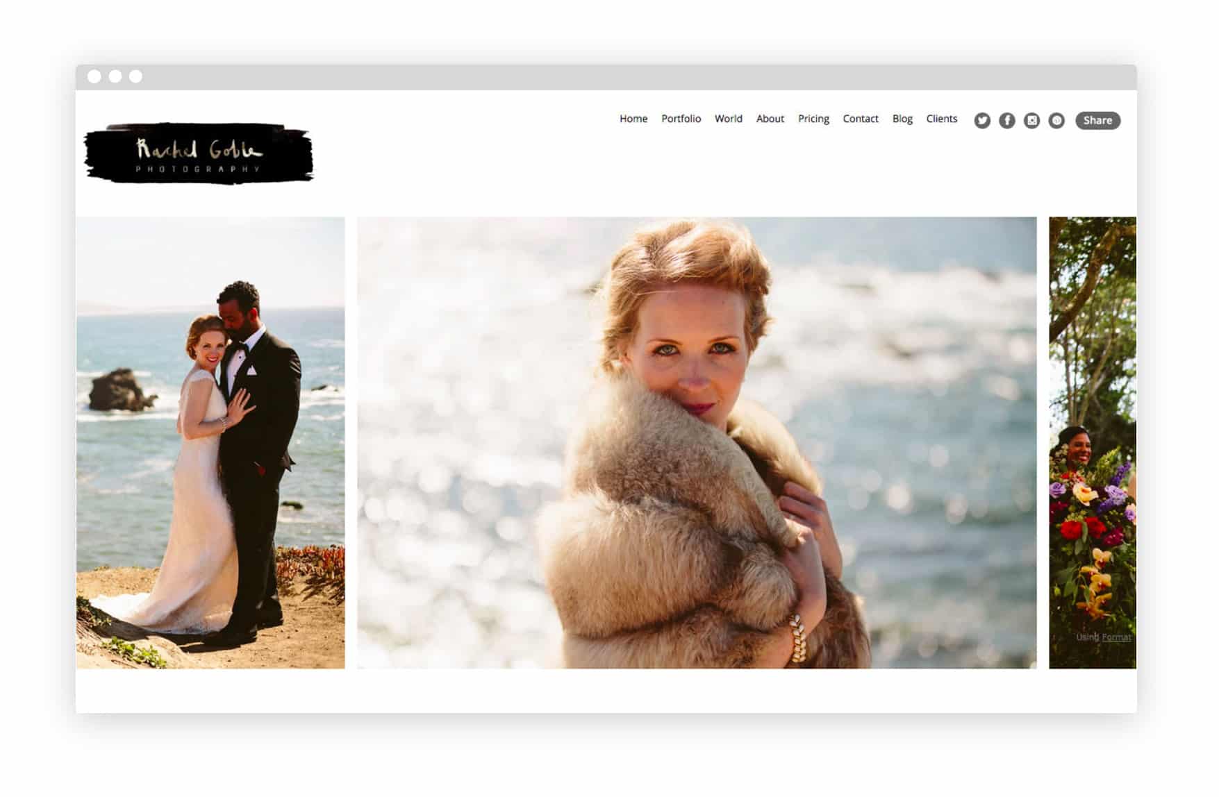
13. Rachel Goble’s Online Portfolio
Rachel Goble shows off an eye for fashion in her wedding photos: they’re all about small details and textures. She uses the Horizon theme to showcase a wide variety of different weddings on her homepage via a simple horizontal scroll.
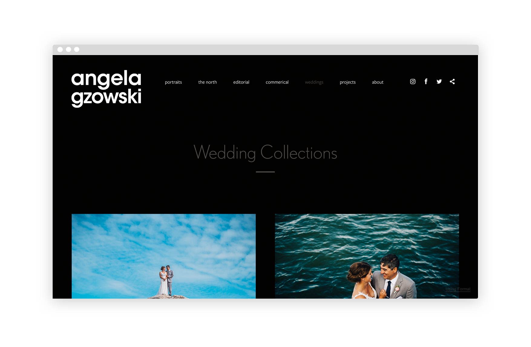
14. Angela Gzowski’s Online Portfolio
Based out of Yellowknife, Northwest Territories, Angela Gzowski brings the beauty of Northern Canada and her wedding photography to bring you some really stunning nature wedding photos that might make you reconsider your destination wedding to Yellowknife. Every shot in her portfolio is a breath of fresh air, as they all bring something new to the table keeping the viewers interested in seeing more. The combination of posed, candid and detail shots show off her flexibility to capture every right moment. No wonder she’s an award-winning photographer.
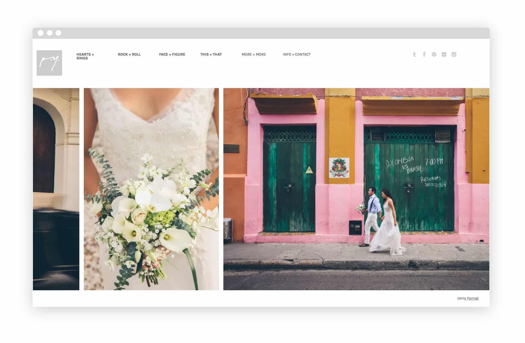
15. Parker Young’s Online Portfolio
Parker Young uses Format’s Panorama theme to showcase his extensive experience photographing weddings across the US and elsewhere. A detailed menu with lots of dropdown options divides his work into clear categories.
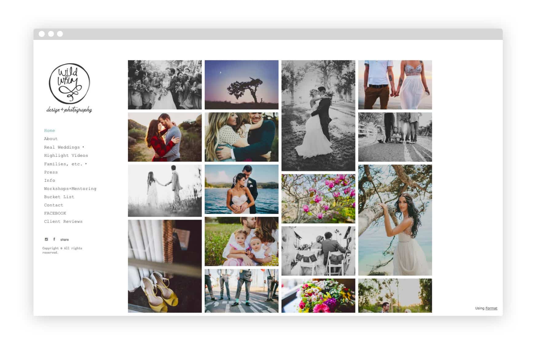
16. Wild Whim’s Online Portfolio
California-based wedding photographer Kelly Paulson’s fun, high-colour images pop in her grid-based layout. Her sidebar menu makes links to important info like client pricing and FAQ easily accessible without distracting from her photography.
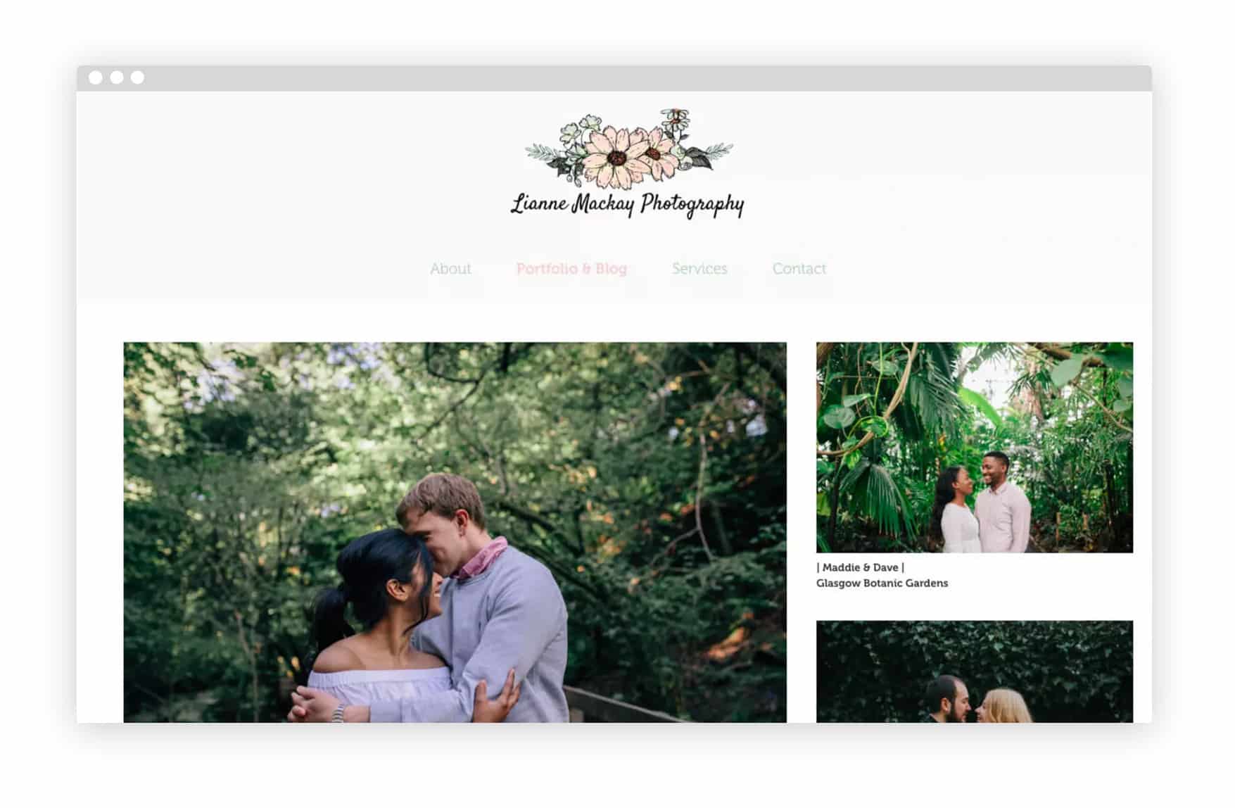
17. Lianne Mackay’s Online Portfolio
Edinburgh photographer Lianne Mackay uses Format’s Sierra theme to display her wedding shots in an easy-to-view vertical scroll, while keeping her header menu handy at the top of every page. She includes a short note about each shoot with her photos, adding character and background to her work.
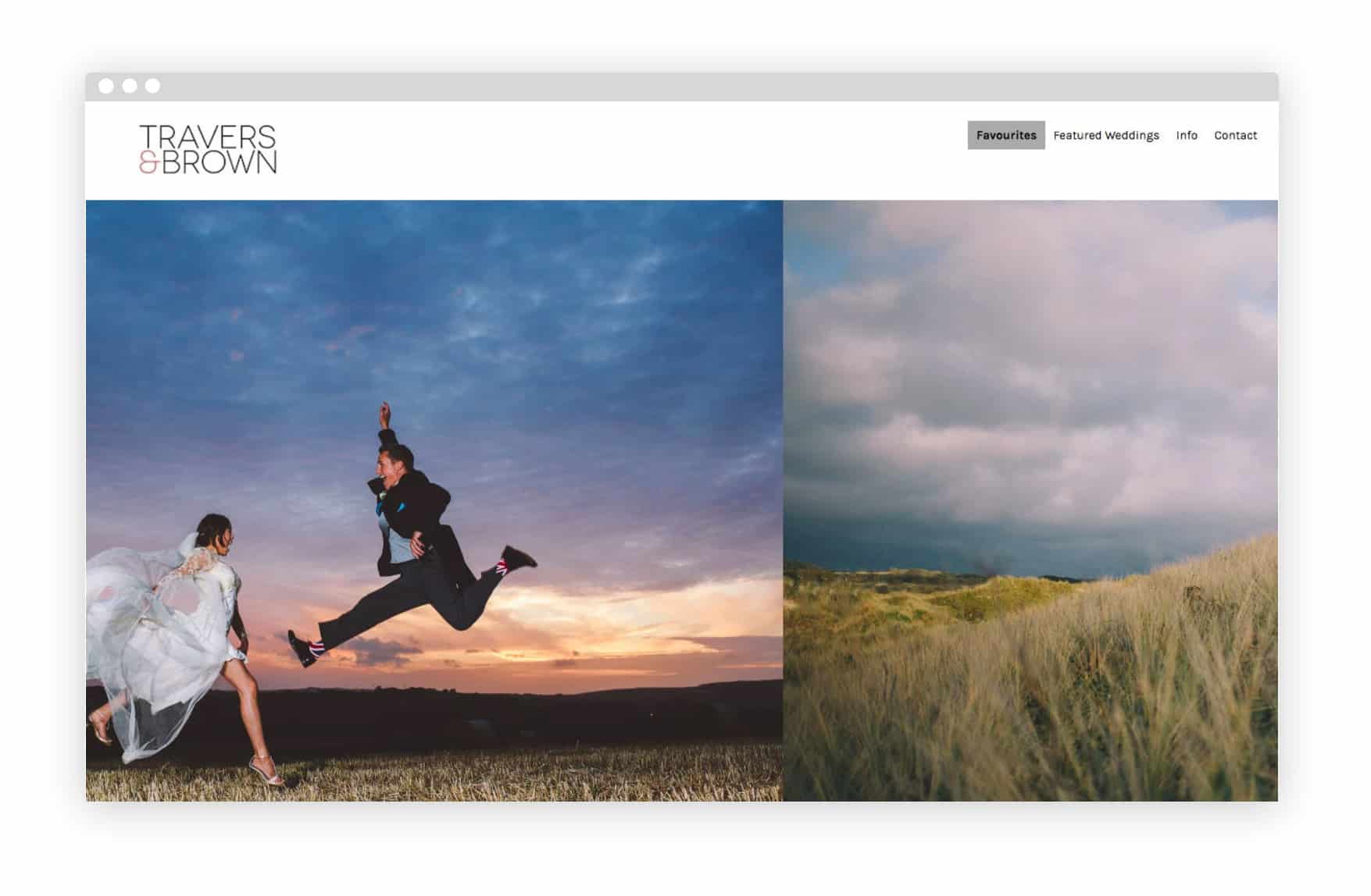
18. Travers & Brown’s Online Portfolio
UK-based Andrew Brown admits to owning “far too many cameras” on his About page, which also includes links to his other photography ventures. Creating separate portfolio pages for different work keeps things organized, letting his wedding photography shine on its own.
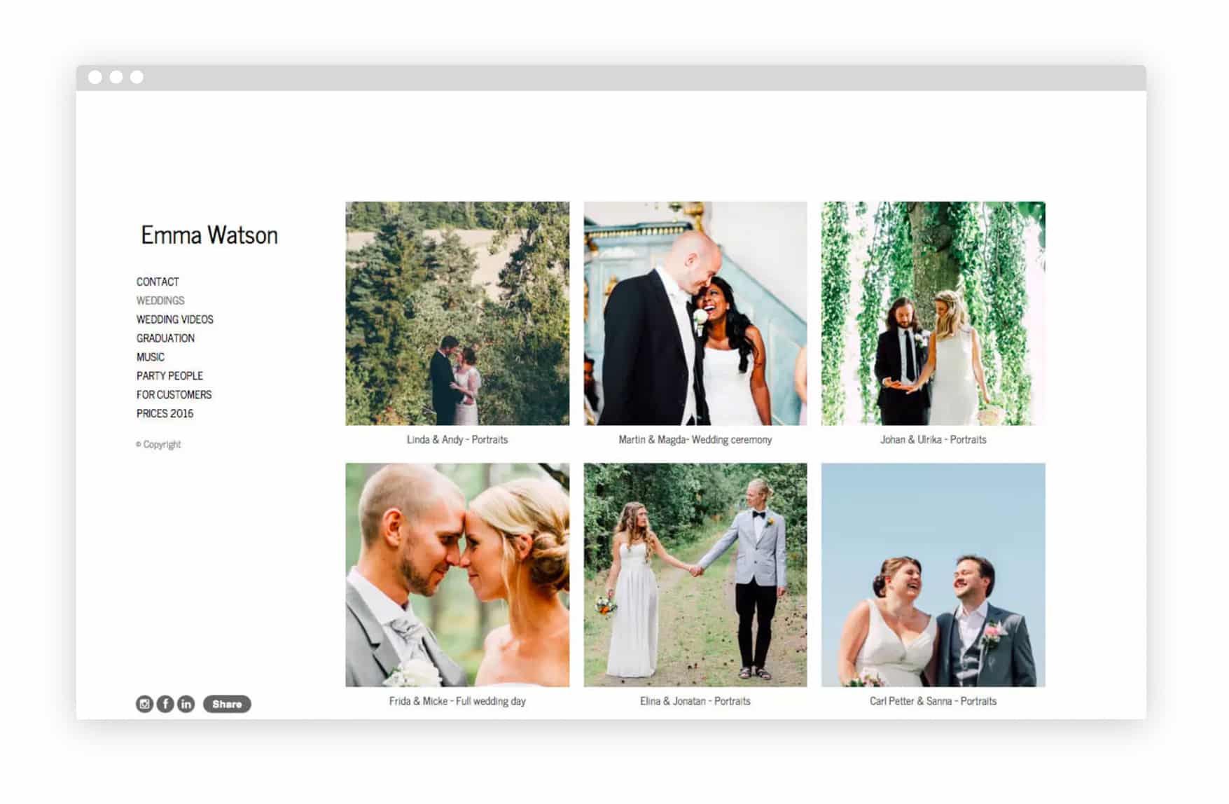
19. Emma Watson’s Online Portfolio
Emma Watson shows that sometimes simple is best with her clean, basic portfolio. The Sweden-based photographer’s wedding shots are neatly arranged in a grid, while a text-free horizontal scroll lets you browse images easily.
This article was originally published on June 8th, 2016, and updated on March 8th, 2019.
