It’s no secret that an outstanding online portfolio can open doors for people in the creative industry, which is why it’s important that your portfolio shows off your work in a way that will impress your industry colleagues and intrigue prospective clients. When it comes to your portfolio, every detail matters. Professional website templates can help you curate your work with precision and code-free customization in a way one-size-fits-all options simply can’t.
Ways Professional Photographers Benefit from Having a Portfolio Website
Photography is a visually-driven industry. There aren’t many other industries where clients focus on the end result with as much laser focus as they do in photography. As a result, having an online presence in the form of a personal portfolio website is an absolute must for photographers wishing to catch the attention of new clients. In addition to increasing visibility, a personal portfolio website:
Builds Credibility on your Behalf
The presence of a portfolio website helps you take your appearance from ‘amateur’ to ‘professional,’ which includes the ability to charge more for your time. That’s because the mere act of having an up-to-date portfolio website speaks to its owner’s commitment to their craft. Unlike other industries, the inherently creative nature of photography means that customers expect the website to act as an extension of the photographer’s brand, communicating their style and method as part of the web experience.
Allows you to Control your Brand Image
Your website is a place online that’s entirely yours. As part of your website experience, you can control every element: the work featured, the look and feel of the design, and the flow of information. Unlike other websites like photographer catalogs, which tend to be void of personality, this is a space where you can give your prospective clients a taste of your creative working style.
Grooms Qualified Leads
The reason it’s essential that your photography portfolio website encapsulates your style is that it acts as a funnel for potential clients entering your site. Communicating your creative vision and showcasing the areas of photography you specialize in saves you time. By expressing the type of client you hope to attract, it helps weed out irrelevant inquiries while simultaneously encouraging clients that are in your target audience.
These are just some of the reasons why having a personal portfolio website is key to your success in building your brand as a professional photographer.

Elements To Look for When Selecting Your Professional Website Template
With so many templates to choose from regardless of your profession, finding the perfect one for you can seem challenging. However, there are common elements across website templates that cater to the needs of photographers. These elements and features include:
Variety of visual design
Branding integration
Interactivity
Mobile-friendliness
Navigation
Gallery features
Ecommerce capabilities
SEO optimization
While individual portfolio needs vary, this list of elements covers most of the portfolio applications to ensure a satisfactory user experience, integration with other online destinations, and website discoverability. Let’s cover each of these elements and how they contribute to a stronger portfolio.
Variety of Visual Design
A photographer’s portfolio is different from other industries in being visual-driven, so it’s important to look for layouts that offer horizontal breadth for optimal display and including full-screen designs. It’s also good for templates to feature customizable layout features that allow you to remove or add elements for your specific needs.
Branding Integration
Your portfolio website template should allow you to prominently display your logo on the website and to easily register associated accounts like custom email and domain associated with your personal brand.
Interactivity
Interactivity means the capability of the template to support features that website visitors can interact with. These include everything from contact forms to video backgrounds. Interactive elements can be an effective way to engage your visitors and express your brand.
Mobile-friendliness
The measure of a mobile-friendly design is how well the content shows up on devices other than a desktop computer, such as smartphones and tablets. This is an important consideration as your customers are highly likely to be viewing your website on a smartphone when looking to secure a photographer for the job they have in mind. Mobile-friendliness is also sometimes referred to as mobile responsiveness, which means that the website design auto-conforms to the device and optimizes content display accordingly.
Navigation
Ease of build-in website navigation is essential to getting customers to stay on your website. A non-intuitive navigation, like a hard-to-find hamburger menu or abstract scrolling features, can detract from the functionality of the website and lead to visitor dropoff. Generally, websites that allow you to scroll up and down are said to have vertical navigation, while ones that allow you to scroll from side to side are referred to as having horizontal navigation. A website can also contain both when a feature like a gallery allows the viewer to scroll in a different direction than the rest of the site.
Client Galleries
Client galleries are a visual organization feature that allows photographers to share and sell photos directly from online galleries. The ease of access also helps deliver a better client experience than a cloud drive or an email chain, while serving the same purpose. Using a client gallery, a photographer can proof, sell, and enable client download of photos all from their website.
E-commerce Capabilities
Similar to galleries, a website’s e-commerce capabilities allow you to integrate sales into your website. The benefit of selecting a website with e-commerce capabilities is that it allows you to sell services and merchandise. Lastly, it brings an element of automation to bookings of basic photo services, meaning you can focus your attention on other things. E-commerce features on a photography portfolio are as unique as the photographers behind them, so a degree of customization is essential when choosing your template.
SEO Integration
Search Engine Optimization (SEO) helps your content get discovered by search engines. Not only is it important that photographers optimize each image for resolution, but they should also be adding relevant meta tags that help search engines classify and display your content. For example, if a potential client searches for “fine dining food photography in my area,” using tags and meta descriptions that help identify this content as part of the website design will help ensure that your work shows up alongside other relevant food photographers.
When Paying a Little more is Worth it with Professional Website Templates
When it comes to professional website templates, website templates on Format are loaded with features that make running a business as a creative professional easier without worrying about plugins and widgets. These templates feature quality written code that is optimized for speed and performance. In addition, purchasing a theme is still drastically less expensive and time-consuming than building your own website from scratch, while being able to maintain a high degree of customization over the end result.
Featured Format Professional Website Templates
Your website should be as unique as your work. Check out some of the most popular Format’s professional website templates below:
1. Surface
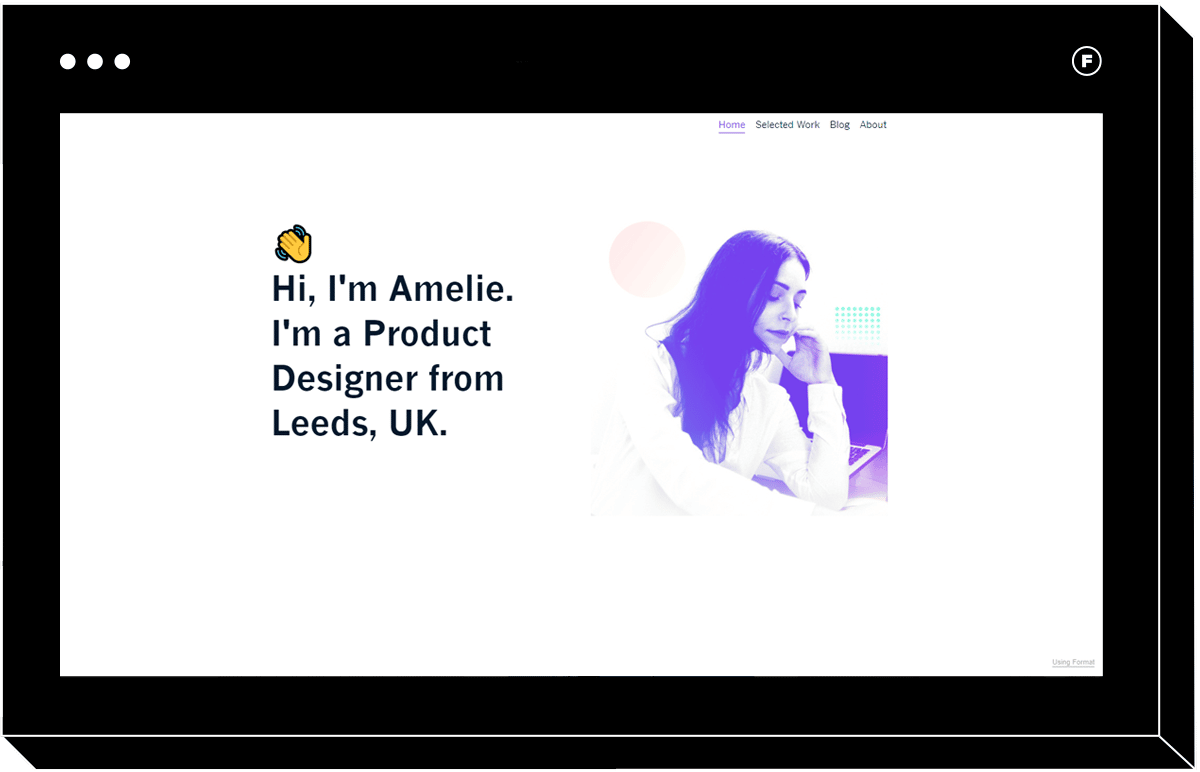
The Surface professional website template offers a unique and professional layout that draws the eye to your work. Its full page vertical image gallery ensures that your attention to detail showcases front and center by taking a “show vs tell” approach that allows you to expand on your work in equally visually impactful detail pages. In addition, a dynamic full-width view frames your work with impact for a user experience reminiscent of an editorial spread. A menu that scrolls with the page ensure key information is always within reach.
2. Polarize
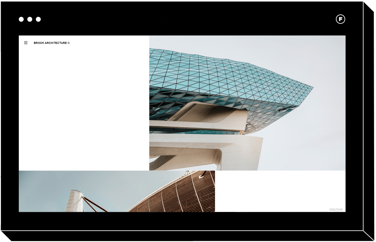
The Polarize professional portfolio template is striking in its design-forward delivery. Its fresh take presents itself with a staggered layout that doesn’t shy away from bold choices with staggering content. Another unique feature is that Polarize leverages various image sizes as part of the website layout. Vertically scrolling galleries help tell the story of each project with a sense of chronology. This hip and memorable portfolio is especially well suited to architecture and product design professionals.
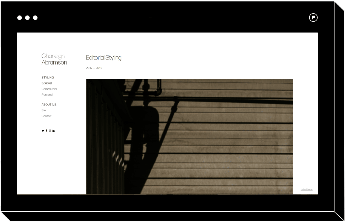
3. Mode
The fashion industry is one that understandings the value of content curation. With this in mind, the Mode template delivers a simplified portfolio experience that doesn’t distract from the main attraction – your work. Tailored for fashion professionals, the clean horizontal scroll ensures your projects get the attention they deserve. Last but not least, this smart design features a left-hand menu that makes it easy for visitors to navigate through galleries for a comprehensive view of the range of your work.

4. Iris
Favored by product photographers, the Iris template offers ample white space and a clean look. This minimalist portfolio layout features a staggered layout for a bold and design-forward appearance. Dramatic and impactful, the vertically-scrolling galleries feature helps you highlight the best of your work. The addition of bold typography gives it a memorable user experience that’s sure to impress. The responsive website template also delivers an equally unique experience on mobile.
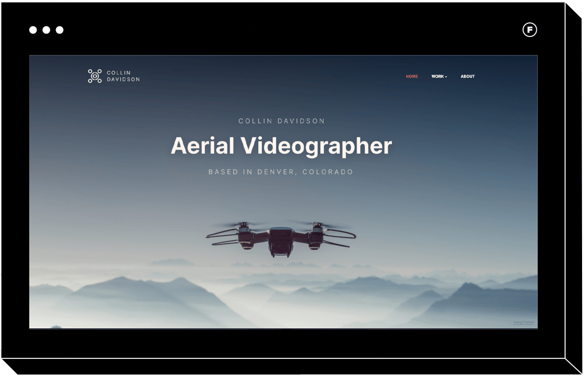
5. Range
The Range professional portfolio is designed with horizontal photography in mind. Vertical scrolling galleries are flanked by an optional slideshow to make your aerial photography–also known as drone photography–pop. This website template is built to set your images up for impact with an elegant and clean layout.
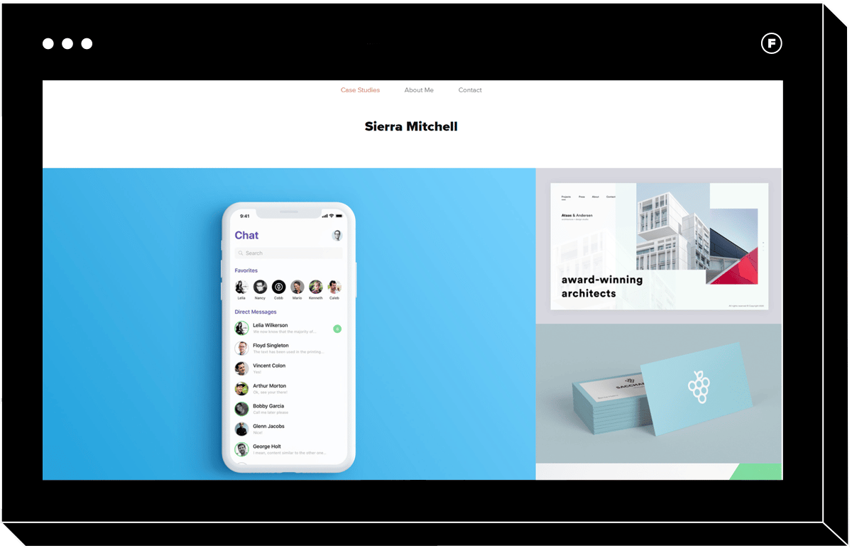
6. Sierra
As playful as it is professional, Sierra template is an example of a responsive website that delivers an equally impactful experience on mobile. Its vertical tiled layout adds a sense of cheerful professionalism while multiple image sizes find balance with full-sized, vertically scrolling galleries. Last but not least, appealing collections pages entice your visitors to explore the details of your individual projects by clicking on the tiles.
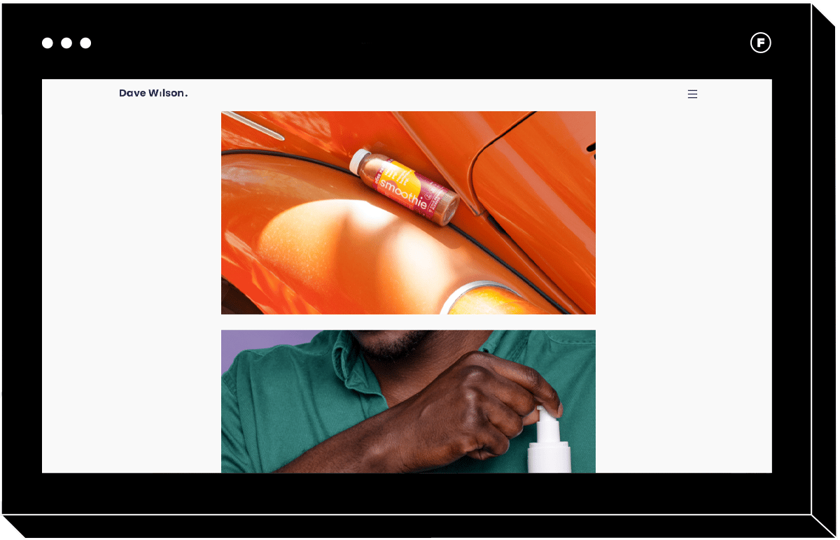
7. Shift
The Shift website template lives up to its name with an original layout perfect for innovative creative professionals such as art directors and copywriters. This larger than life layout wows with large-sized, vertically scrolling images perfect for showing off your cream-of-the-crop portfolio pieces. In addition, visitors can hover over the gallery images for a surprising and helpful collection title feature. An adaptive background beckons interaction as it changes color to match elements as the viewer scrolls over them for a portfolio worthy of a freethinker.
8. Meander
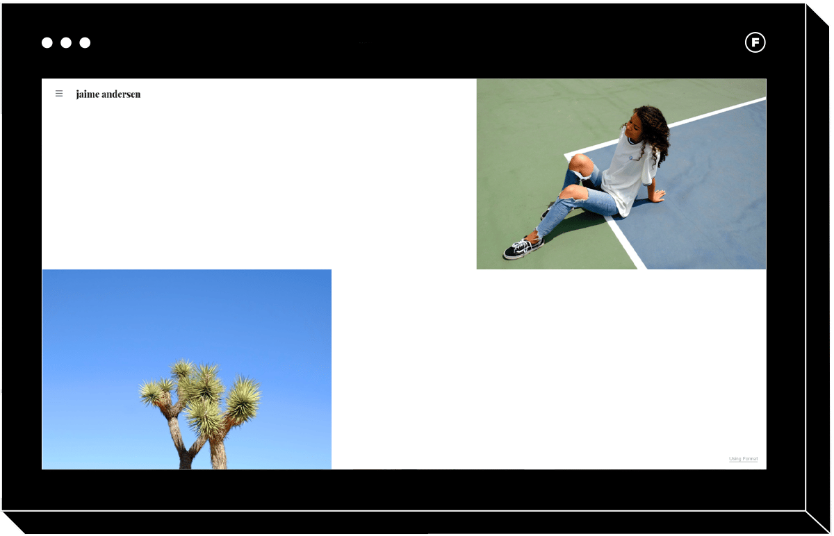
If you’re looking for a professional website template that isn’t trying too hard, Meander is the perfect layout for you. This portfolio site features a staggered layout suitable for multiple different image sizes. Hip to the bone, this theme’s adaptive background matches the image when scrolled over with a striking zoom effect. Its modern theme carries through the navigation with a unique type-driven menu bar. Perfect for photographers looking to showcase key pieces in their collection who aren’t intimidated by cropping, Meander delivers a casual and intriguing aesthetic.
9. Exhibition
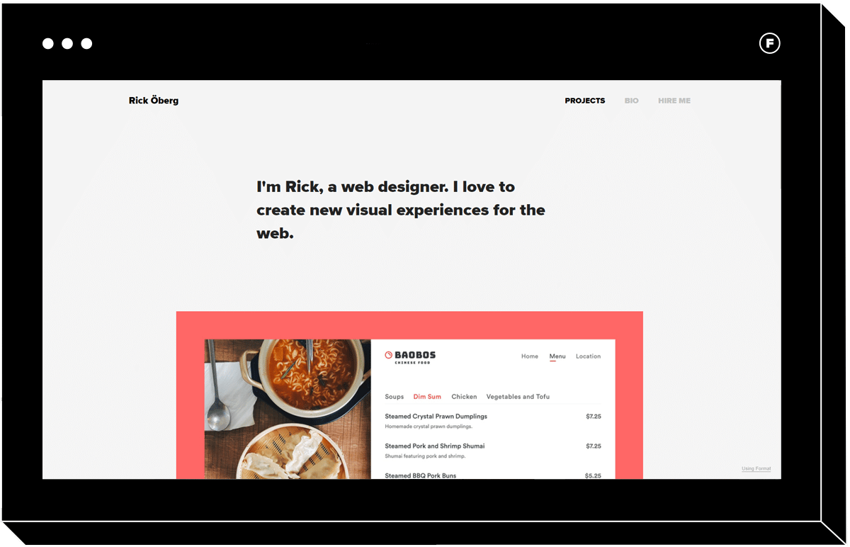
Exhibition is an example of a professional portfolio that knows to put its contents first. Offering plenty of white space, this layout’s vertical scrolling galleries and an optional slideshow take the visitor on a journey with big, bold images to make your portfolio pop. This layout is as well suited to showcasing images as it is videos with a simple and clean template. In addition, detailed project pages offer an elegant layout, perfect for including all the nitty-gritty details of an industry, like web design and web development.
10. Rise
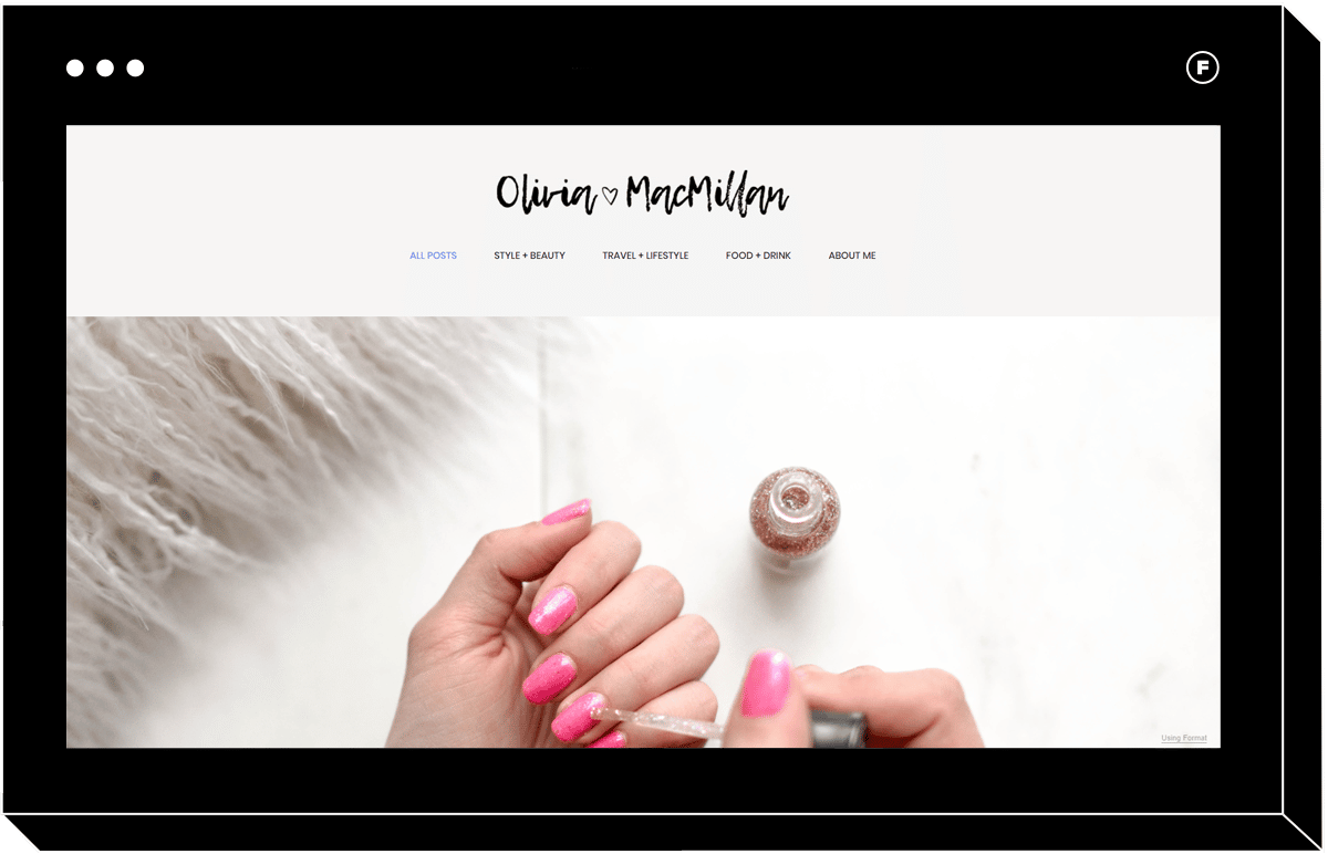
This blocky, visually-driven template features a vertical tiled layout that brings together a sense of play and professionalism. Striking a good balance between simple design and intrigue, it features effective connections pages, accommodates multiple image sizes and wows the audience with full-size image galleries that continue the story. Eye-catching and playful, this layout is perfect for curating product collections.
11. Exposure
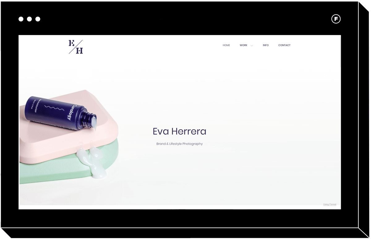
Exposure is an image-forward template with a youthful editorial feel that’s perfect for commercial photographers. Images span the width of the screen for impact, giving each project its own spotlight. In addition, the use of a pastel color palette throughout makes it easy to introduce different projects with a sense of cohesion. The prominent contact info in the menu bar comes with customizable mail capture that’s perfect for turning visitors into clients. Elegant with a sense of effortless style, Exposure is perfect for commercial photographers and art directors.
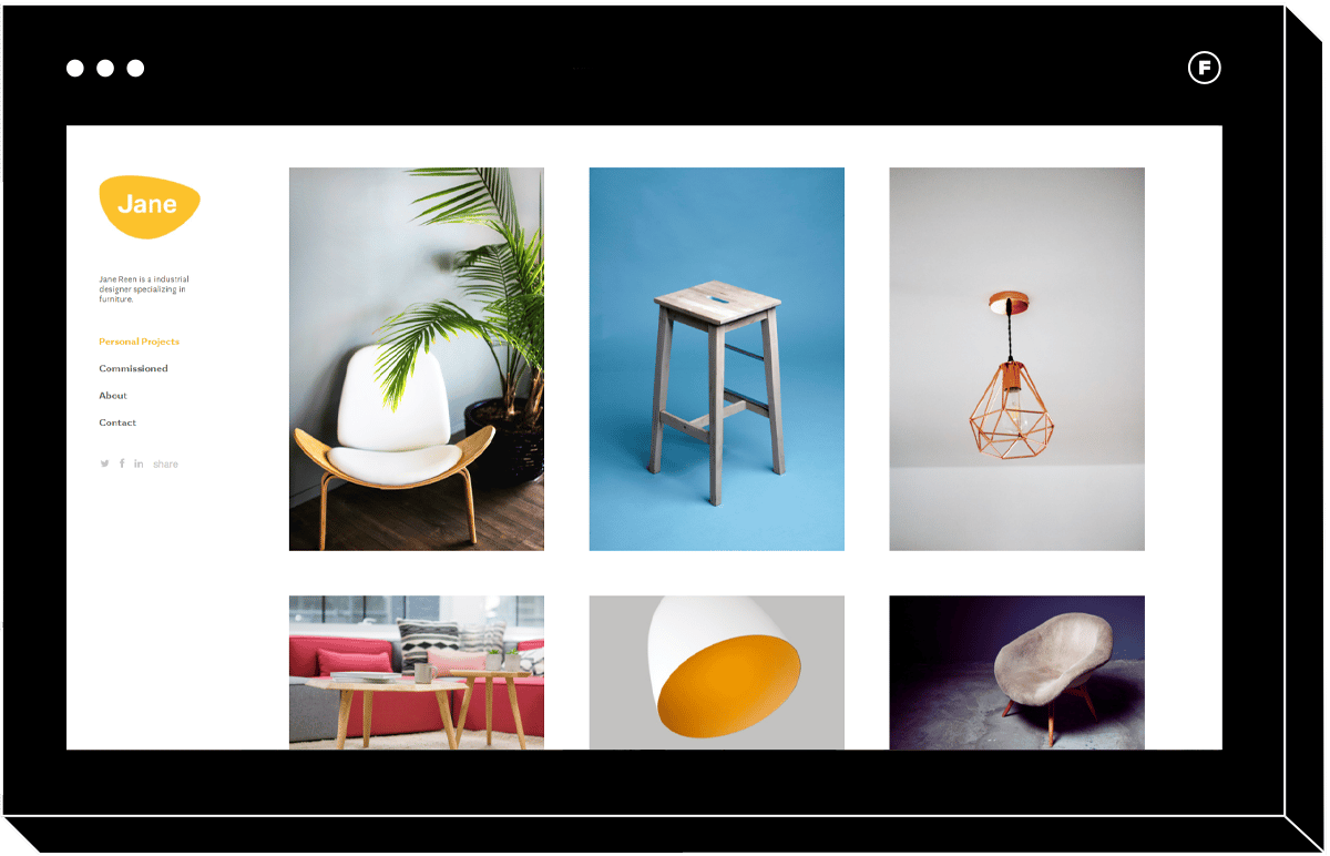
12. Sharp
With its scrollable tile layout, Sharp is a professional portfolio with a user experience reminiscent of Tumblr. Like its inspiration, Sharp makes it easy to provide an overview of a broad range of work at a glance. Its clean, simple, tiled gallery image design can be classified into four columns with a pop-out gallery view for further inspection. In addition, your professional logo remains static during the viewing experience to help your clients build brand recognition.
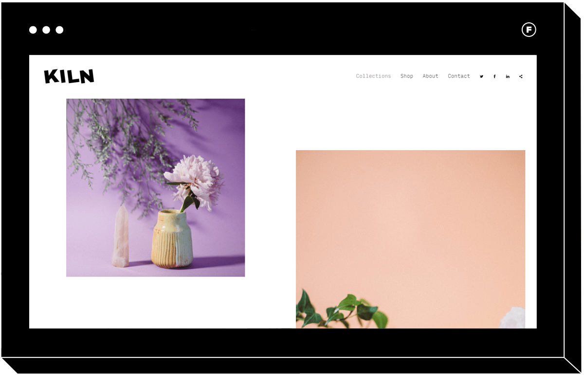
13. Kiln
The Kiln website template puts emphasis on big, bold images. This visually-driven template showcases images while keeping it light and airy with modifiable gallery and column spacing. Kiln puts you in the driver’s seat with multiple optional scroll indicators and personalizable collection pages that offer ample white space that doesn’t crowd the subject matter so your photography can truly shine. Lastly, impactful typography helps your personal brand stand out across every page.
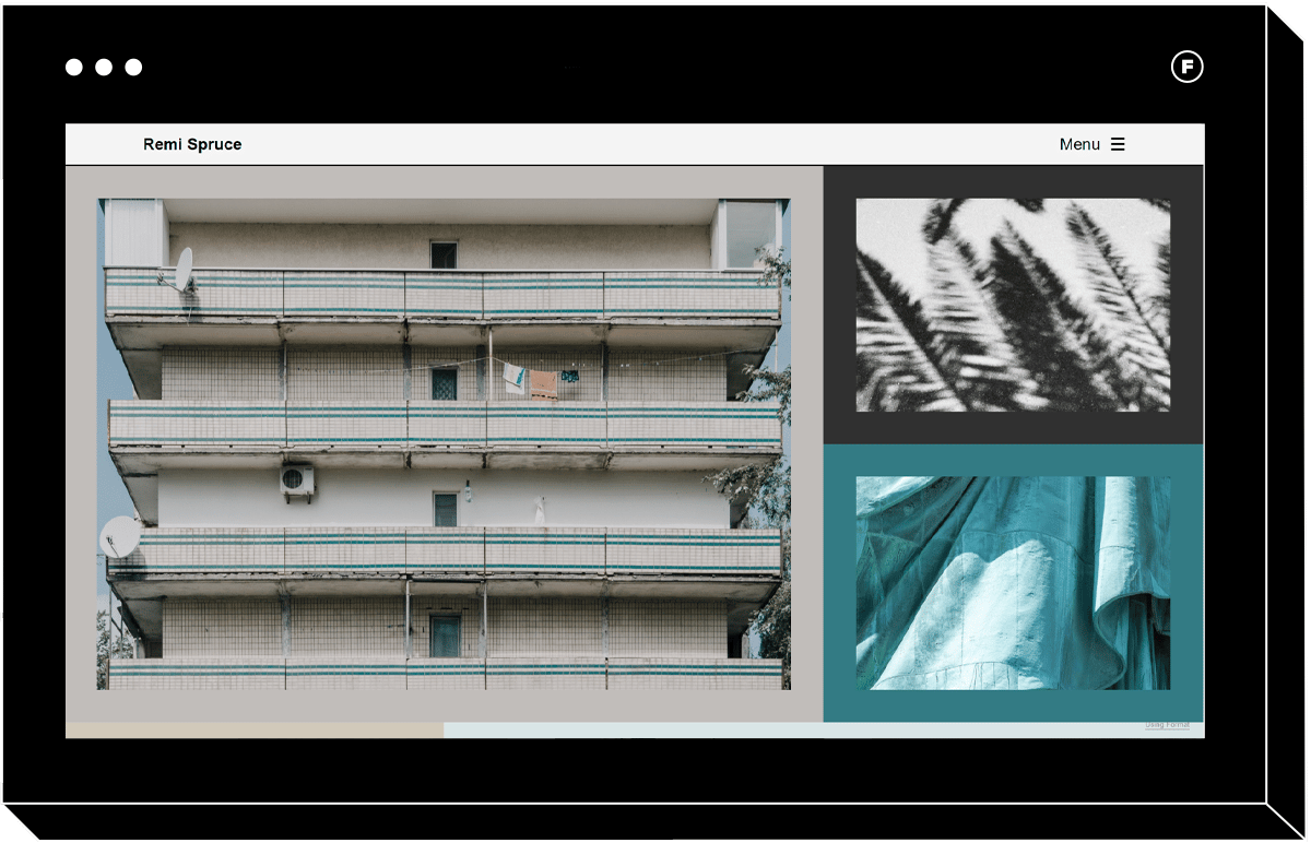
14. Spruce
The Spruce portfolio site puts the spotlight on the work with the artist taking a backseat. Perfect for event and journalism photography, a tiled effect draws the viewers toward showcased pieces and keeps attention with frames and background colors sampled from curated images. Consistent with its mission to put the work first, it includes a collapsible menu so you don’t ever have to worry about website elements intersecting or distracting from your work. Lastly, layouts offer customization with sets of two or four columns for the tiled effect.
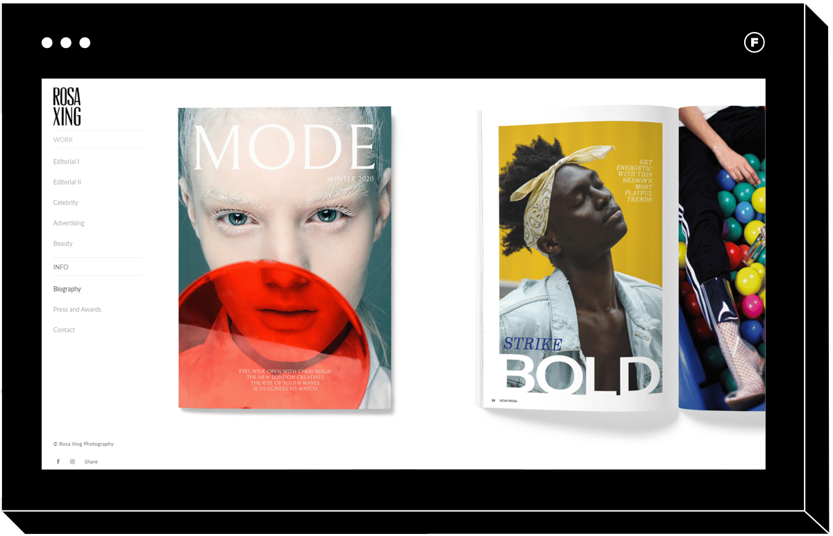
15. Gloss
One of Format’s most popular templates, Gloss delivers a polished editorial viewing experience that’s sure to impress even the pickiest clients. This intuitive layout includes large images and a caption feature that lead to individual collection pages for more detailed project overviews for more context. The fully customizable horizontal scroll gallery showcases the images one at a time as the visitor scrolls, taking them on a journey of your work. Last but not least, a left-hand menu helps direct visitors to different collections and access your About Me and Contact pages.
As you can see, professional website templates are not one-size-fits-all. Right layout and features can help frame up your portfolio in the best light, which is worth the investment in a paid template. Armed with the perfect template, you can rest assured your photography business is putting its best foot forward with potential clients and website visitors.
Once you’ve selected the perfect website template, try these tips to grow your business:
10 Ways to Promote Your Portrait Photography Business


