Whether you’re just starting your creative career or you want to refresh your online presence, creating a website that allows you to showcase your work in an attractive and easy-to-navigate way is a must. Since your portfolio website is like a digital studio or storefront, it’s important that it stands out.
One surefire way to make your website memorable is to opt for a one-page horizontal scrolling website. While a horizontal portfolio or a side- scrolling website hasn’t always been considered best practice from a user experience perspective, it has come a long way and offers a unique way to showcase your work, especially when your portfolio is viewed on a mobile device.
Worried about how to make a horizontal scrolling website? The good news is that you don’t have to worry about it.
Choose a horizontal scrolling template that does the job for you. By using a well designed horizontal scroll template, you can be sure that your web design isn’t sacrificing on user experience, so your user will stick around (and hopefully become a paying client!).
What is Horizontal Scrolling?
Horizontal scroll refers to a website navigation style where you can scroll from side to side, with content appearing as you move horizontally. It is an alternative or complement to the most commonly used navigation style, vertical scrolling.
Left to right scrolling websites that provide a horizontal gallery scroll are more intuitive than one-handed mobile experiences.
While any good web designer will tell you not to sacrifice usability for the sake of novelty, the ability to scroll horizontally can actually offer a great user experience, especially when it comes to portfolio websites where photos need to be prominently displayed.

What are the Benefits of a Horizontal Scroll website?
There are a lot of options out there when it comes to choosing a template to build the perfect website, and if you’re reading this article, you recognize the importance of planning your website.
If you’re wondering if the horizontal scrolling website style is right for your portfolio, you may want to consider these benefits when choosing a template.
1) It’s consistent across different devices.
When it comes to web design, horizontal scrolling is more than a fad. More and more people are accessing the internet from their phones rather than desktop computers, which is why adopting horizontal scroll pages is becoming a more intuitive design move—it’s not going anywhere.
While scrolling vertically is the most common way to navigate a website, the way many of us browse online has changed a great deal over the last decade.
For example, if you were visiting a website 10 years ago, chances are it was from a desktop or laptop. Nowadays, far more site traffic comes from mobile devices and tablets.
This means that in order to keep up with user behaviours, web pages have to be responsive.
Often, the mobile version of a site that was built for desktop forces content down the length of the page, so visitors have to scroll a long way to find what they’re looking for. Horizontal websites have the advantage of less content shuffling on different devices.
2) Horizontal scrolling pictures allow you to use the full width of your display.
A more standard website design often has a navigation menu on one side of the page, constraining the area where sites display your photos. With a side-scrolling website, you can fill the page with an image or even have it spill over horizontally.
This horizontal gallery scroll is perfect for nature photographers, architects, and interior designers, where the details in largescale photos can really stand out on a smaller screen.
3) It can be a neater design option if you are display lots of photos.
If you want to include tons of content in your sites but want to avoid a cluttered page, creating a gallery container for each section of your portfolio means that users can scroll vertically to access different sections, then horizontally to see the contents of the section.
This way, your portfolio website can look sleek while still displaying a large number of photos.
How to Create a Horizontal Scrolling Website?
While you can write custom code to make your site or elements of it scroll horizontally, this can be a tricky task. That’s because HTML lends itself most intuitively to vertical scroll designs. And if you don’t understand computer languages, you may need to hire someone that does like a web designer or a web developer.
Luckily, you don’t have to worry about how to create a horizontal scrolling website from scratch anymore.
The best way to get horizontal scrolling on your website is to use a website builder that offers horizontal scroll website templates. This way, you can avoid glitches and the common pitfalls that can make this navigation style difficult to use.
While you can find horizontal scrolling website tutorials and examples online using CSS’s overflow x property, even a web development pro might prefer to opt for a customizable template instead of starting from scratch using HTML or other code. Website builders enable anyone to quickly create a site and make it personalized with typography, colors, and branding elements.
By the time you’re through with your customizations, it will be a completely unique website.
If you do create your own horizontal navigation, one thing to keep in mind is that it’s important to make it obvious to the user that they should scroll from side to side. A tried and true way to do this is to make sure you leave a little bit of the next piece of content peeking out from the side.
Another consideration is that a scrollbar is not the best way to navigate horizontally. They can be annoying to use, especially without a mouse wheel. An alternative to the scroll bars that is more intuitive would be something like arrow buttons, and of course two-finger scrolling.
17 Horizontal Scrolling Templates to Make Your Photography Stand Out
Now that you know why this navigation style sets your portfolio website apart, get your portfolio website up and running with one of these templates. You’ll find stunning horizontal scrolling examples, no matter what kind of photography you do.
We’ve compiled a list of the best horizontal scrolling templates to give you inspiration for what you can achieve with your portfolio site.
Reel
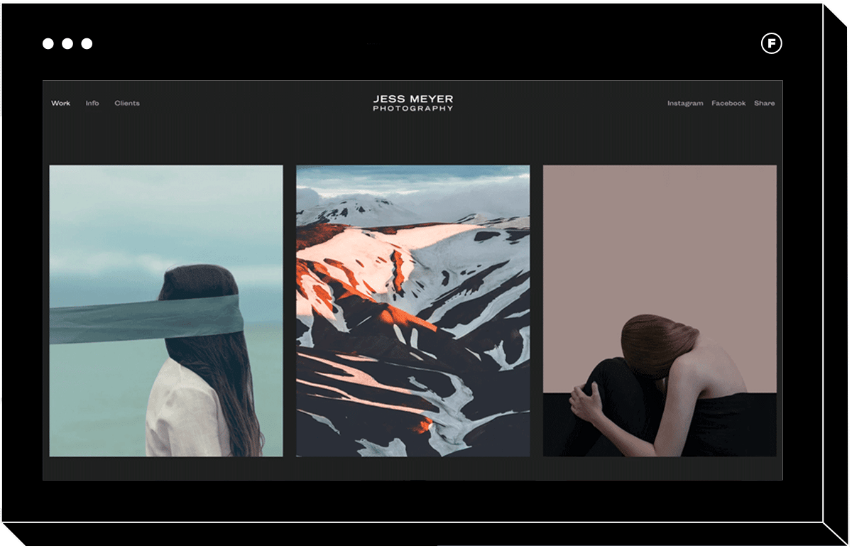
If you’re building a photography portfolio horizontal scroll website and shoot portraits, you’ll love Reel. This theme is ideal for those with dark and minimalistic branding, which fits seamlessly with Reel’s design.
The design allows you to scroll through the home page from left to right using a two-finger scroll, skipping the scroll bar and evoking the look of a film strip. You can make each home page image a button that links to a collection, making it super easy to organize your photos by project or theme.
Vantage
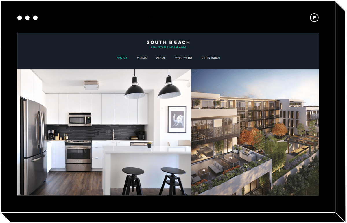
Vantage was designed with real estate photographers and videographers in mind. However, anyone who works in videography will find this theme to be perfect for showcasing footage.
Even if you don’t shoot video, you’ll appreciate the full-bleed image display. You can overlay text of your choice over a landing page background image for a professional look. If you want to make it very easy for clients to see your content, learn about you and your business, and write messages that land directly in your inbox, Vantage is a great option that checks all of these boxes for beautiful sites.
Skyline
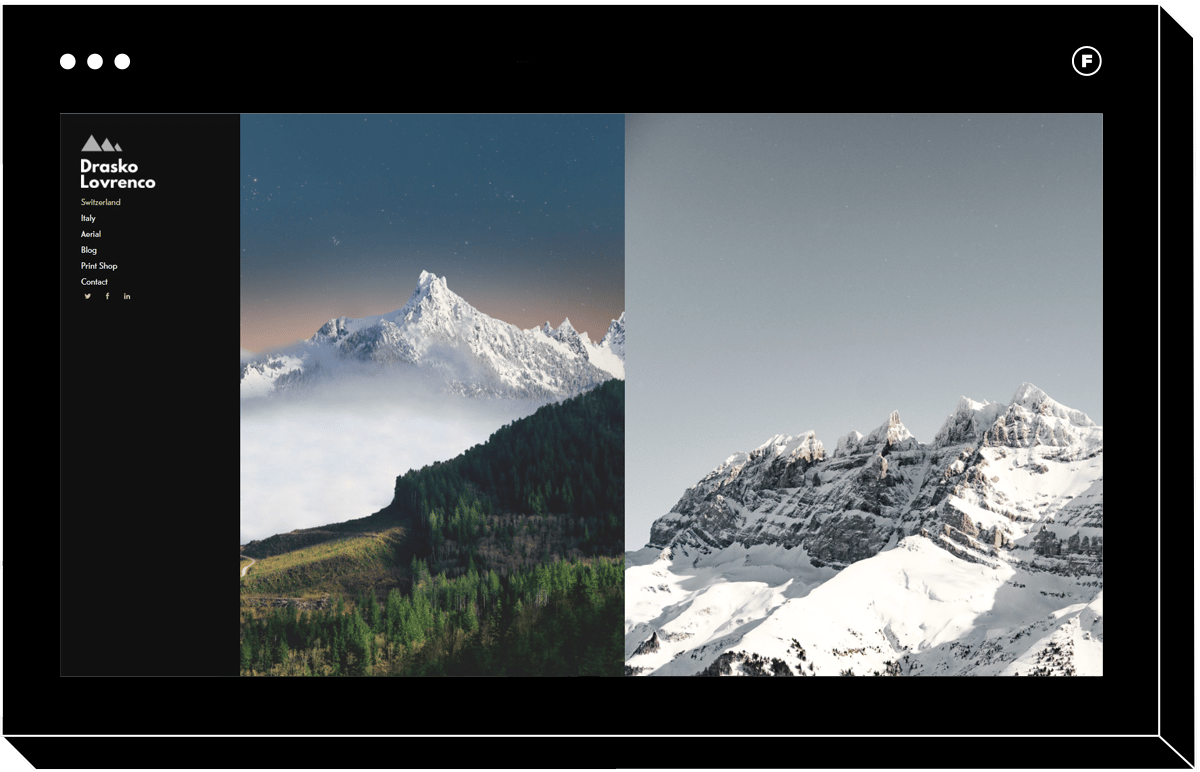
If you’re an architectural, travel, or landscape photographer, you know how much better your portfolio images look when displayed on a large scale. Much of the detail and texture of a travel or nature shot can be overlooked if the image is too small. That’s why Skyline is a wise choice if you do this kind of photography.
The full-bleed photos are beautifully displayed on any browser, and left-hand navigation makes it easy to click to different portfolio pages, such as specific projects, a print shop, and an about page. You’ll notice that when you start scrolling, the menu remains but becomes more transparent, so the image can go all the way to the edge.
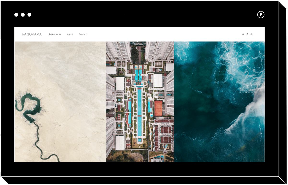
Panorama
Another gorgeous choice for landscape photographers is Panorama. Just as the name suggests, Panorama was designed with nature photographers in mind. This template translates large images to mobile and phone devices without losing impact.
If you like Skyline but would prefer a header menu and a lighter, simpler theme, Panorama is the choice for you. It lets your images do the talking, and any extra pages you may want to add can be easily accessed from the header.
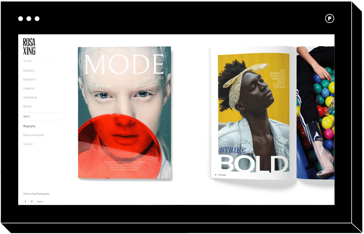
Gloss
A full-bleed display isn’t necessarily the perfect choice for everyone. For example, if you’re an art photographer or fine artist, you may want the option to add captions and descriptions to each image. Fashion photographers may also want to add publication titles to each image to give the site visitor context to the portfolio projects.
Gloss is an excellent choice if this sounds like what you might need for your own portfolio website. Clean and contemporary, Gloss makes it easy to add clickable captions to your homepage photos, which take the user to more content from that shoot or collection.
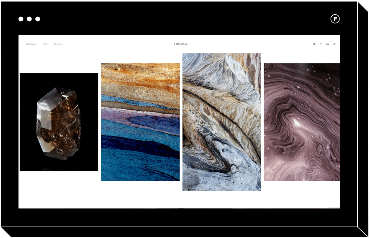
Obsidian
Sometimes, a lack of perfect symmetry can be memorable and attractive.
Obsidian is made with fine artists in mind and looks great even if your portfolio photos don’t necessarily go together perfectly.
With Obsidian, you don’t have to worry so much that your images are all uploaded with the same aspect ratio since the variation in white space as users scroll horizontally is part of the charm and gives Obsidian a pleasant collage feel no matter what browser is being used.
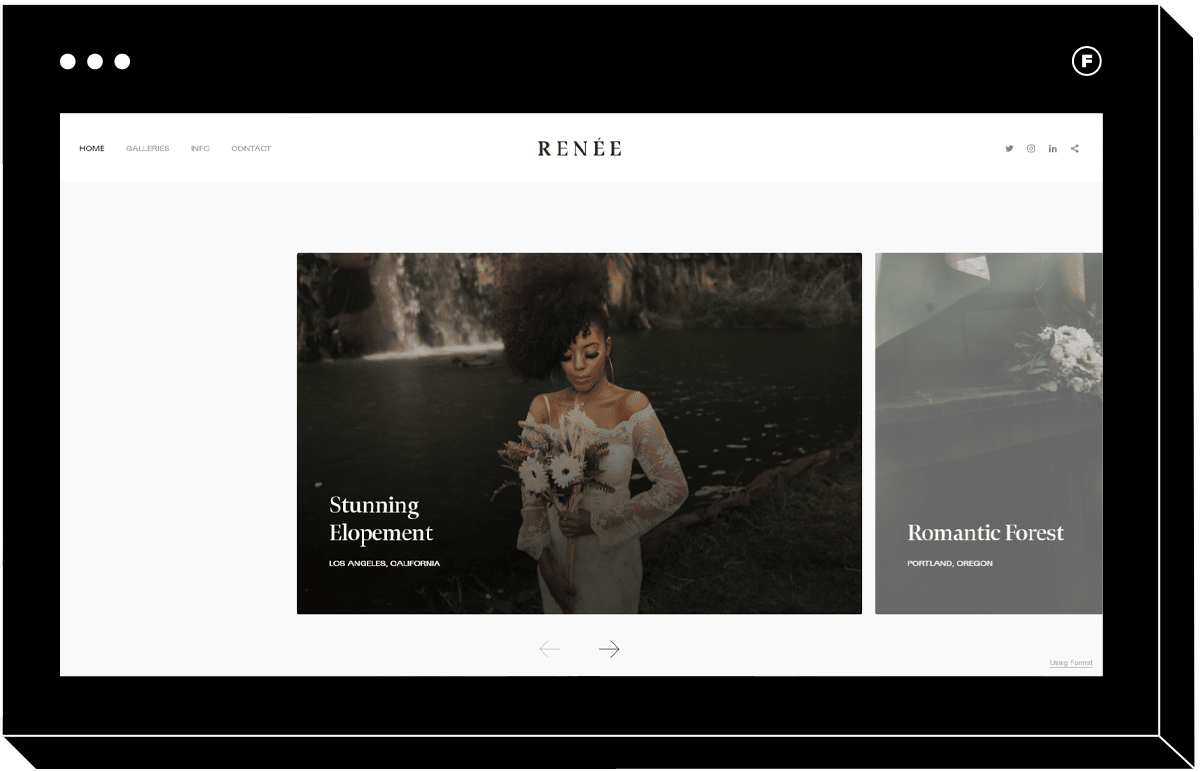
Reflection
Wedding photographers, you’ll want to check this portfolio template out.
Reflection is a fantastic choice if you need to include more than just images on your web page to really convey a story to your audience. It can be used to make a one-page horizontal scrolling website that combines horizontal scrolling with vertical scrolling. Along the top, display your best photos in a horizontal section. Then, as you scroll down, add sections for things like testimonials and descriptions of your services.
This template takes into account that for some photographers, it’s important that potential clients can quickly access the type of information they may need before they contact you. With Reflection, you can be sure your website is both beautiful and informative.
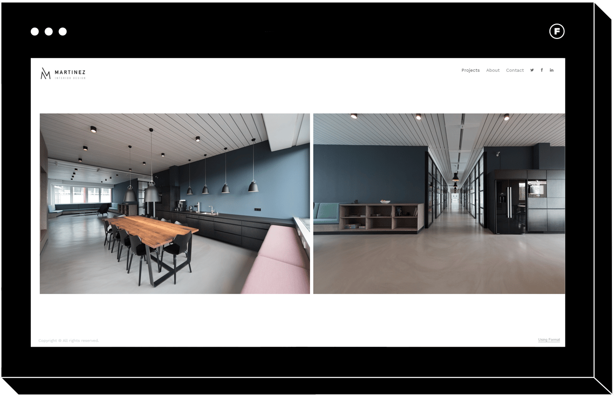
Meridian
If you shoot interiors, beautiful wide-angle photos probably make up the bulk of your portfolio.
Try the clean and simple Meridian theme, which is designed for these types of photos, while keeping the horizontal menu in view so that your potential clients will have no trouble navigating the site and sending inquiries that will land in your inbox. It’s also a perfect choice for design portfolios of all stripes.
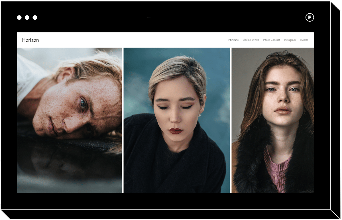
Horizon
A popular choice for a reason, Horizon is a clean and chic theme that is perfect for portrait websites.
The bit of white space between images gives them some breathing room, so even if you shoot against lots of different colored backgrounds you can still showcase your photos side by side without them clashing in this layout. Horizon is an excellent multipurpose theme that would suit creatives of all stripes and can be customized with your typography and brand elements. Whether you’re a wedding photographer or commercial photographer, Horizon makes one of the best website templates for any profession.
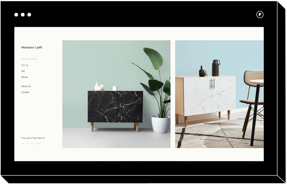
Horizon Left
If you love Horizon but prefer left-side navigation that doesn’t disappear, Horizon Left is the choice for you. It has all the minimalist, uncomplicated charm of Horizon, with a more obvious layout that will ensure your visitors can easily find exactly what they’re looking for.
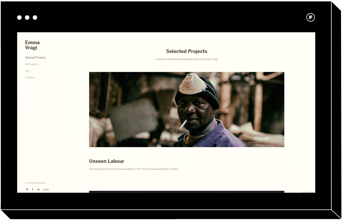
Medium
If you shoot editorial photography of any kind, Medium has some features that will help your portfolio shine. The landing page layout allows visitors to see an example image for each project, along with a caption and short description, as they scroll vertically. Once they click on a project, they’re taken to a horizontal page that starts with a text section where they can read more about your work before scrolling through the pictures.
This would be a great choice for a photojournalist or any photographer or artist who wants to provide some context for each image set.
Editorial
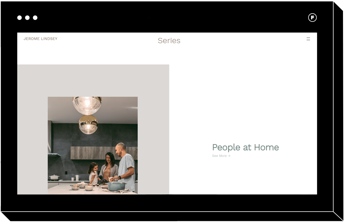
Do you want to give your online portfolio that magazine feel? Then Editorial might be the theme for you. Two great features unique to this theme are infinite scrolling, which lets users scroll to the next photo set when they get to the end of one, and the adaptive background. This theme will pull colors from your image, and change the background color to best display that image.
Dusk
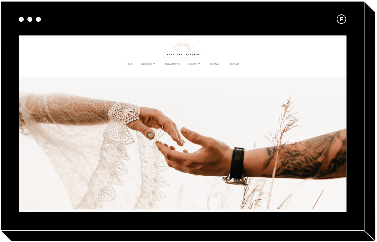
Dusk is the perfect theme for immersing your visitors in the mood of your wedding photos. It combines horizontal and vertical scrolling for a website that will feel like it’s designed just for you, especially once you customize it with your typography, logo, and any other branding elements you want to use to make it your own.
A beautiful feature is the links to specific projects, which overlay the project details over a background image from that photo set. Increase or decrease the font size to change the overall look of this section.
Beacon
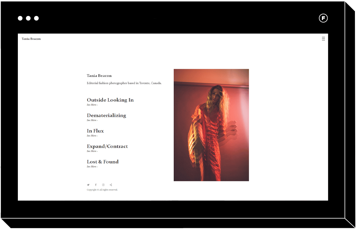
If you’re going for a very Editorial feel, Beacon is probably the best choice for you. The landing page lets your user hover over the titles of your projects to reveal an image from that collection, and once they click they are taken to a horizontally scrolling page with the unique feature of dynamic spacing. This means the white space between images adjusts based on the dimensions of each picture, so visitors to your portfolio are encouraged to focus on one photo in the browser window at a time before scrolling on the next. The asymmetry gives it the feeling of a trendy, high-end fashion magazine that fashion photographers will love.
Coral
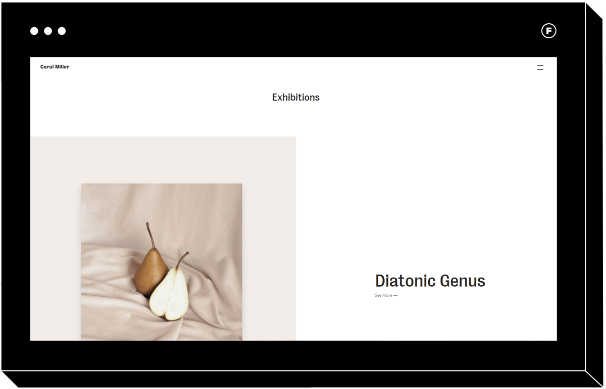
If you like the adaptive background feature of the Editorial theme, you’ll like Coral as well. It’s very similar, with one major difference being that when you navigate to a photo collection, you jump right into the content. With Editorial, there’s a section before the images start to include text about the project. It all comes down to personal preference and the needs of your creative business.
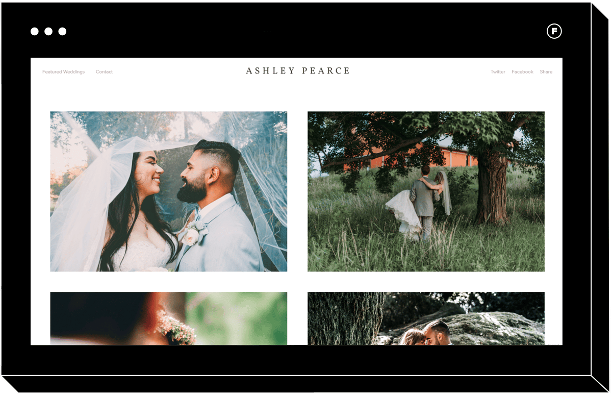
Illuminate
Perfect for the elegant, minimalist wedding photographer (or creative pro of any kind!), Illuminate puts your content center stage. While other themes designed with wedding photographers in mind contain multiple info sections on the landing page, Illuminate keeps it simple with nothing but cover photos for each of your projects. It also has a beautiful and simple header, so your potential clients can easily find your contact info, pricing page, privacy policy, news, and any other details you may want them to have access to.
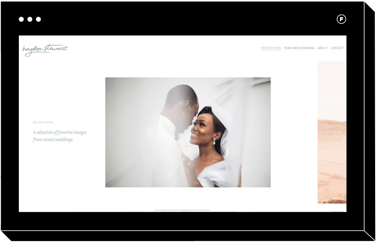
Converge
Wedding photographers who want to create a more editorial feeling website will gravitate to Converge, which makes use of dynamic spacing to draw the eyes to one image at a time. The header keeps it easy to navigate without sacrificing the elegant feel of the overall theme.
Get Started With Your Horizontal Scroll Website
With so many horizontal scrolling themes to choose from, you’re bound to find one that will bring your portfolio dreams to life.
Now that you know how to build a scrolling website using a template, you can get started with your own.
Remember, all of these themes are fully customizable, so even if you have no web development experience you can make them feel totally custom and look great on any browser.
Collaborating with clients is also made easy with the use of client proofing galleries, and by using a website builder you can be sure your user data is kept safe as well.
Horizontal scrolling is a great feature for websites that are unforgettable. Skip the javascript, CSS, and code, and have your unique portfolio site up and running in no time with Format templates.
Try a horizontal website template free, no downloads necessary.
You can build your portfolio website with a free 14-day trial using Format with no credit card required—We can’t wait to see what you create!
Want more tips for making your portfolio shine? Read on!
Update Your Portfolio: 6 Tips To Spring Clean Your Career And Portfolio
Our Ultimate Portfolio Inspiration List
How To Make a Photography Portfolio For College And University


