Great decision – you’ve decided to finally put your portfolio on display for the world to see and create your very own online photography website. Whether you’re new to the photography business, a hobbyist, or a seasoned professional, building an online portfolio is a pivotal step in your journey.
As a photographer, you’re aware of the importance of design and the importance of how people perceive your work. While you don’t need to be a web designer to have your very own customized website, there are several factors you should consider before selecting a theme. From layout to your logo, theme, color scheme, and background color, these website templates give photographers a diverse range of free theme options that will make an instant impact on those who are browsing for your business.
Choosing the right website template starts by envisioning how you want your site displayed. While all website templates are optimized for your mobile device, some themes are more user friendly to tablets and cell phones, while others may be best displayed on a large screen. What style best reflects your personal brand of unique photography? What layout best suits your images, and what content features you’ll want in addition to your photos are all items to consider when deciding on the type of website you want. Whatever theme best matches your vision, this guide will help you choose the best, cheap website template to help show off your work to the world.
Horizontal Scroll
With the advent of mobile technology came the rise of popularity in photographers choosing horizontal scroll themes. Years ago, in the early days of website portfolios, horizontal scrolling was shunned by the web design community who argued the layout didn’t comply with conventional design standards and potentially confused visitors with a scroll that wasn’t standard. As website design evolved and SmartPhones and tablets became standard, horizontal scroll themes quickly became viewed as an eye-catching, mobile-friendly option for displaying websites.
Web developer Kheira Oudejans recently documented her experience in creating a horizontal scroll website and some of her rationale in choosing such a theme. She emphasizes that such a design makes optimal use of screen space which translates perfectly to fill the width of modern widescreen monitors and helps her company instantly tell a story. This type of layout offers a user experience that instantly familiarizes visitors with your work and makes it hard to look away. The ability to quickly see and scroll through images side-to-side is a feature that any photographer should strive for, making horizontal scroll one of the more attractive design templates for many portfolios.
One of the things to consider when you choose horizontal navigation is to ensure navigation is obvious to users but also blends into the design of the website. If not being viewed on a mobile device, it’s best if website visitors are able to use their mouse wheel or arrow keys to navigate through the site pages and that images are laid out in a way that engages the audience. Users should not be left guessing as to how they navigate side-to-side to see your work as it will cause them to quickly leave your site and continue browsing beyond your website. In order for visitors to fully focus on your work, also ensure that the menu bar is simple and does not interfere with the viewing process.
What Can Horizontal Scroll Do for My Portfolio?
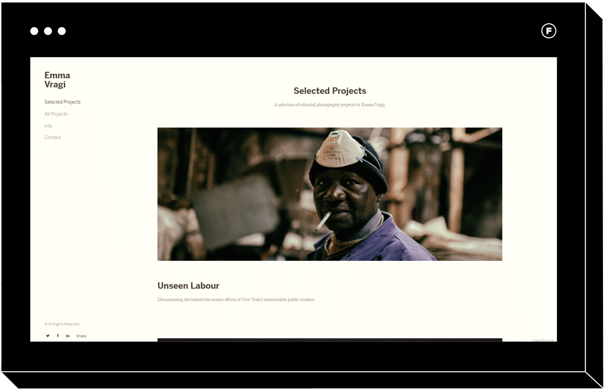
The Medium theme is a perfect example of one of the best website templates in terms of a horizontal scroll. Medium checks off the boxes above in terms of what constitutes as a well designed, user friendly, and eye-catching template for displaying your best photography and enhancing your business.
The Medium website template makes the perfect demo site for displaying the layout options available when it comes to horizontal scroll. A good template for telling a story through editorial photography, Medium allows you to build the website to showcase all your projects on the home page, as well as take a deeper dive into individual galleries. The template also gives the option for captions for giving photos some added context. Like with every good horizontal scroll website, users want to be able to easily identify the navigation without it being obtrusive and distracting. The simple white arrow on the portfolio provides visitors the option to scroll with one click or use their mouse wheel for seamless gallery viewing. The customization options available throughout horizontal scroll templates will allow you to pick navigation that best suits your style.
The portfolio also provides a good example of an effective menu bar that does not interfere with the gallery features. Visitors are able to scroll through and see both portrait and landscape photos that fill almost the entire width of the screen without the menu intruding upon the content. Keep in mind, this element also allows Emma’s contact form page one click away at all times, which will assist in growing her business.
Vertical Scroll
Touch screen devices have made the vertical scroll website template a more attractive option for theme developers working on sites for all different types of clients. As opposed to clicking and holding down a sidebar and repeatedly pressing down arrow keys on a keyboard, vertical scroll themes can easily be explored by the simple swipe of a finger while on a mobile or touch screen device. A vertical scroll allows browsers to quickly take in a large amount of content, including items such as images, a blog, a recipe, or a mix of different types of content. Good examples of effective vertical scrolling include social media sites like Twitter and Facebook, as well as photo-heavy blogs such as Buzzfeed.
In web design, the vertical scroll website template is used as a way to keep website visitors engaged with the content. This type of theme is ideal for photographers who wish to start a blog as part of their website or incorporate text into their galleries. The ability to endlessly scroll without clicking through multiple pages is a feature that’s been proven appealing to audiences. A vertically scrolling theme allows photographers to tell a story through their galleries. Be sure to select photos that will continue to capture your audience’s attention and encourage them to keep their attention focused on continuing to scroll further down the page. Whether photos are in chronological order or part of a bigger collection, vertical scroll portfolio websites provide visitors the chance to take a closer look at each individual photo while also gaining a broader perspective on your work.
Why Choose Vertical Scroll?
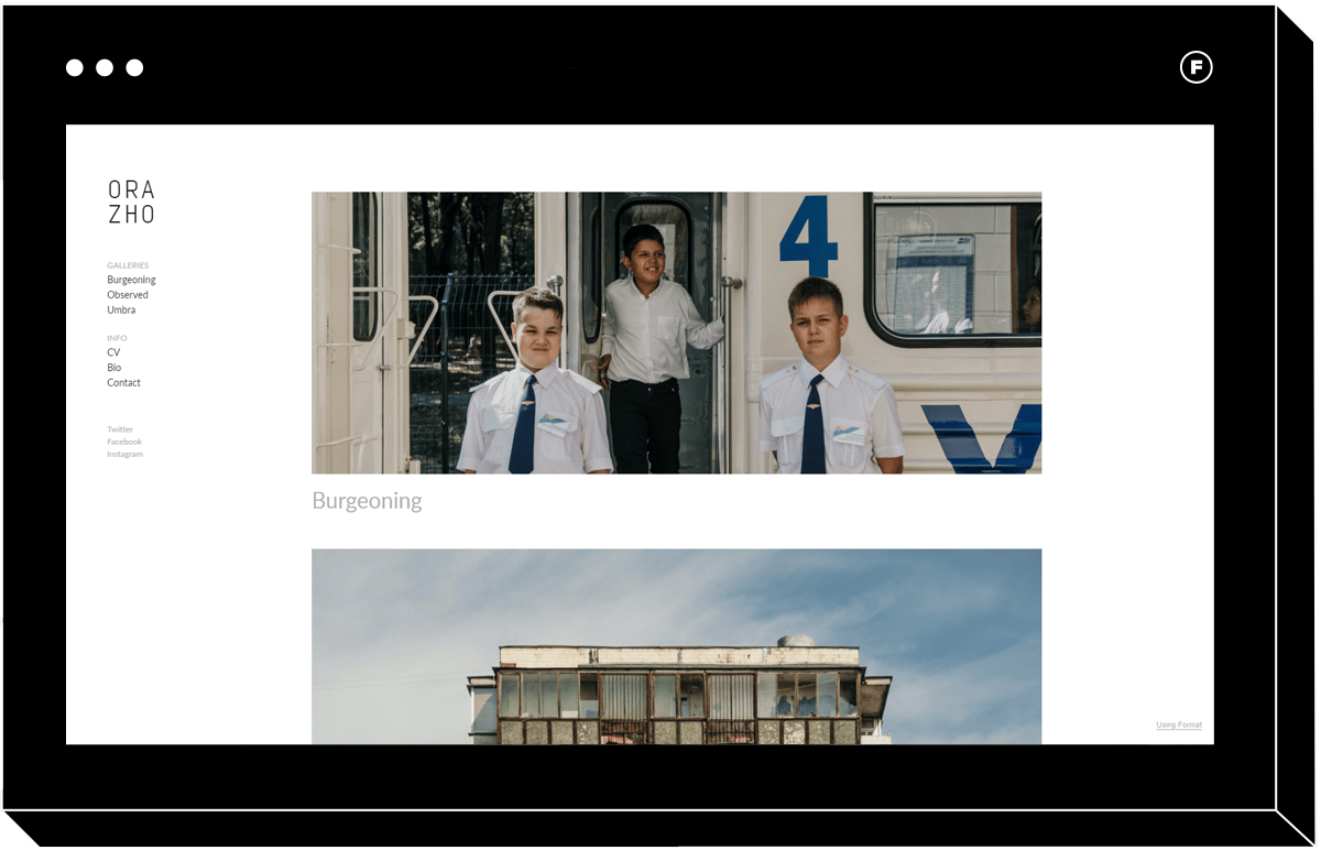
Once you’ve decided that vertical scroll is the design for you, it will be time to browse through the wide variety of free themes. The Ora theme is a perfect and simple example of what to expect should you choose a vertical scroll layout for your portfolio. A sleek and straight forward left-handed logo and menu bar provide the opportunity for visitors to scroll through galleries right on your homepage. Once a gallery is selected, photos can be organized on one single page to tell a story and can be viewed by using a mouse wheel or through the swipe of a finger on a touch screen device.
The design of a vertical scroll portfolio makes it ideal for horizontal images as they fill the width of the page. Landscape images on a vertical scroll also ensure that visitors are seeing the image in its entirety instead of having to scroll further to get the full picture. Vertical images are often more difficult to fit the screen on a vertical scroll template but can be done based on image dimensions and what device is used. Vertical scroll is often the template of choice for photographers who have a large collection of images and want to display them in abundance.
Tiled Theme
There’s something special about seeing your work displayed on a wall in a gallery. The layout, the flow, and the mood are all elements you choose to help portray your work the way it was meant to be consumed. Tiled themes work to recreate the magic of seeing your work front and center as part of a curated collection in a physical space. Like with selecting any theme, there are certain factors to take into consideration prior to building a tiled theme website to attract new business.
A fairly new theme in terms of the world of web design, tiled themes are made to mimic a mood board and offer people the chance to take a look at your individual collections in a new and unique way. Photographers use a tile theme to display collections all on one page, with photos placed side-by-side to establish an element of consistency. When deciding on a tiled theme, you want to ensure the colors used in collections complement one another and flow in a way that doesn’t disrupt or distract from the other photos on the page. For instance, placing a photo with a bright yellow background next to a darker or black and white image may distract from the other images in the gallery. Many photographers choose a tile theme if they want to communicate their style in a clear, concise, and orderly fashion. In many tile themes, photos are front and center on one page, allowing people to quickly gain an understanding of the scope of your work.
Is a Tiled Theme the Best Choice for My Website?
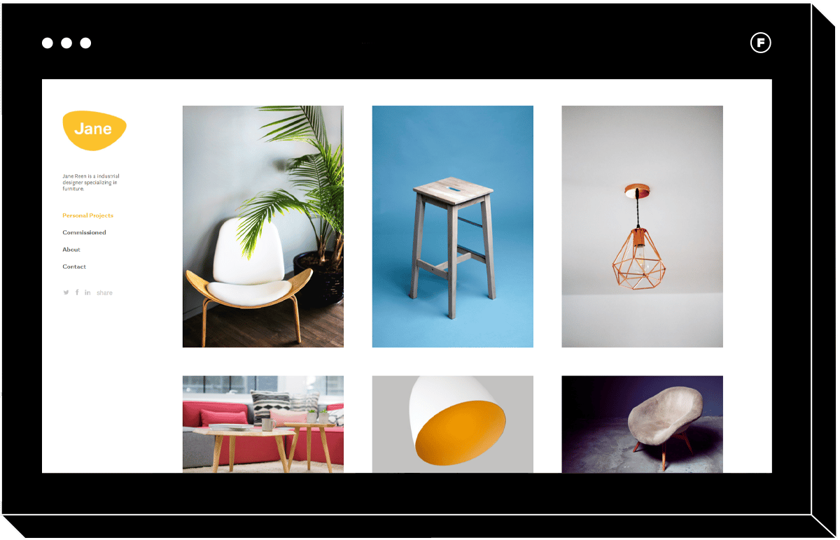
Reminiscent of a Tumblr type layout, the Sharp tiled website template is a perfect example of all features that make up a well designed tiled theme. The easy to navigate and theme offers a great overview of your work by organizing images into columns. A fully customizable layout that can be adjusted via the page builder, Sharp lets builders choose up to four columns to present their photos. The theme also has an interactive pop-up gallery which lets visitors get a closer look at each individual photo or scroll through using the pop-up feature. Letting people decide how they want to view your imagery is just one feature that makes the theme appealing to photographers.
Industrial designer Jane Reen has used the Sharp theme to display her collection of modern furniture. Organized into three columns, Jane is able to display a diverse range of designs in a way that flows. She has ensured no colors clash and images are laid out in a way that is appealing to the eye. The left-hand menu bar is non-obtrusive and allows visitors to easily navigate the site without being distracted by navigation. While Jane’s logo is bright yellow, it strategically matches colors within her photographs which helps to brand the site.
Fullscreen
You have those one to three photographs you consistently make front and center knowing they best represent the range of your photography abilities. Fullscreen layouts work to make an instant impact on visitors and make a bold statement about your business. Compatible with both vertical and horizontal scroll templates, a fullscreen template is an especially responsive design for mobile devices. Due to the edge-to-edge width of the design, a fullscreen website allows for more room for items in the menu bar as the header image tends to bleed into it. Because of this, it’s important to ensure that the top quarter half of the feature image does not interfere with the menu bar design. Full frame websites work best with high-resolution landscape orientation images where the crop can be flexible. For photographers, fullscreen templates instantly put your work at the forefront, making it impossible for visitors not to take a longer look.
Using Fullscreen to Build a Business
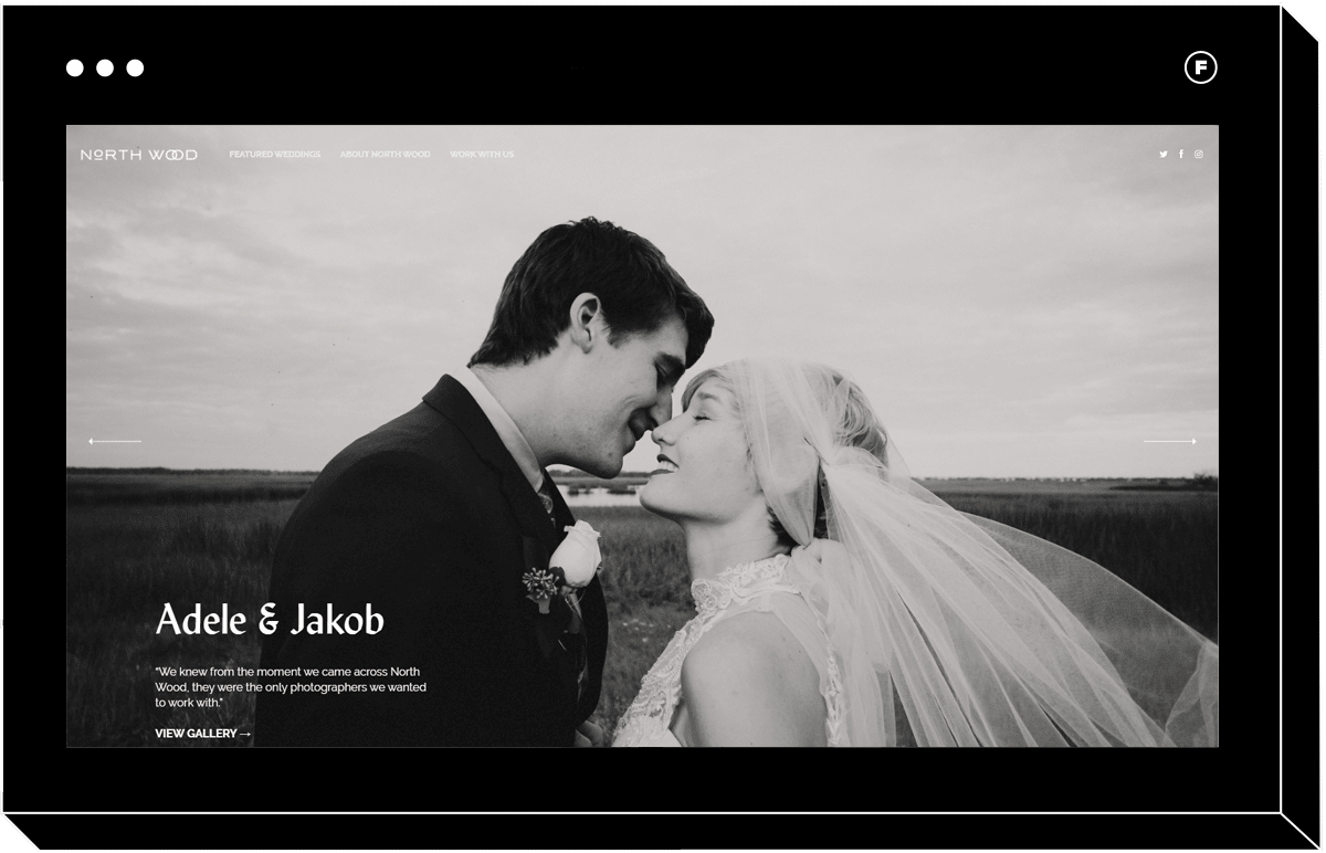
Fullscreen templates are a popular choice for those looking to build a wedding photography business. The elegance and romance captured at a wedding make the fullscreen theme an obvious choice for a portfolio website. The Fullfame theme (named after the style) shows off your photos with a stunning edge-to-edge slideshow that you can fully customize to fit your brand. Like with many full-frame themes, the header design seamlessly blends into the frame, allowing for simple and nonobstructive navigation.
Wedding photography business North Wood has used the Fullframe theme to establish their online presence as a contemporary studio. The theme displays gallery previews on the home page and allows visitors to scroll through the collection horizontally. Once a gallery is selected, a horizontal scroll allows potential clients to view all photos in a stunning slideshow that fills the screen and highlights every detail.
SlideShow
A slideshow theme goes well beyond what you may perceive to just be a glorified PowerPoint presentation. Slideshow themes work to keep users engaged with the movement and imagery that comes along with a slideshow theme. While critics argue that slideshows distract from the text on the page, a photographer’s dream is to keep clients focused on the images on the screen. Effective slideshows have easy and obvious navigation that lets people choose when they want to click on the next photograph. Make sure that sliders are not timed and navigation is put into the hands of the person viewing the page. Imagine wanting to really take in and focus on one image and suddenly the slide changes. Not the impression you want to make. Letting people decide how they want to view your website is a key element to building an effective and standout slideshow theme website. Slideshows are effective with both vertical and horizontal scroll websites, but keep in mind if the images you’re displaying are primarily landscape or portrait to decide what scrolling option will work best.
Sliding into a Slideshow Portfolio
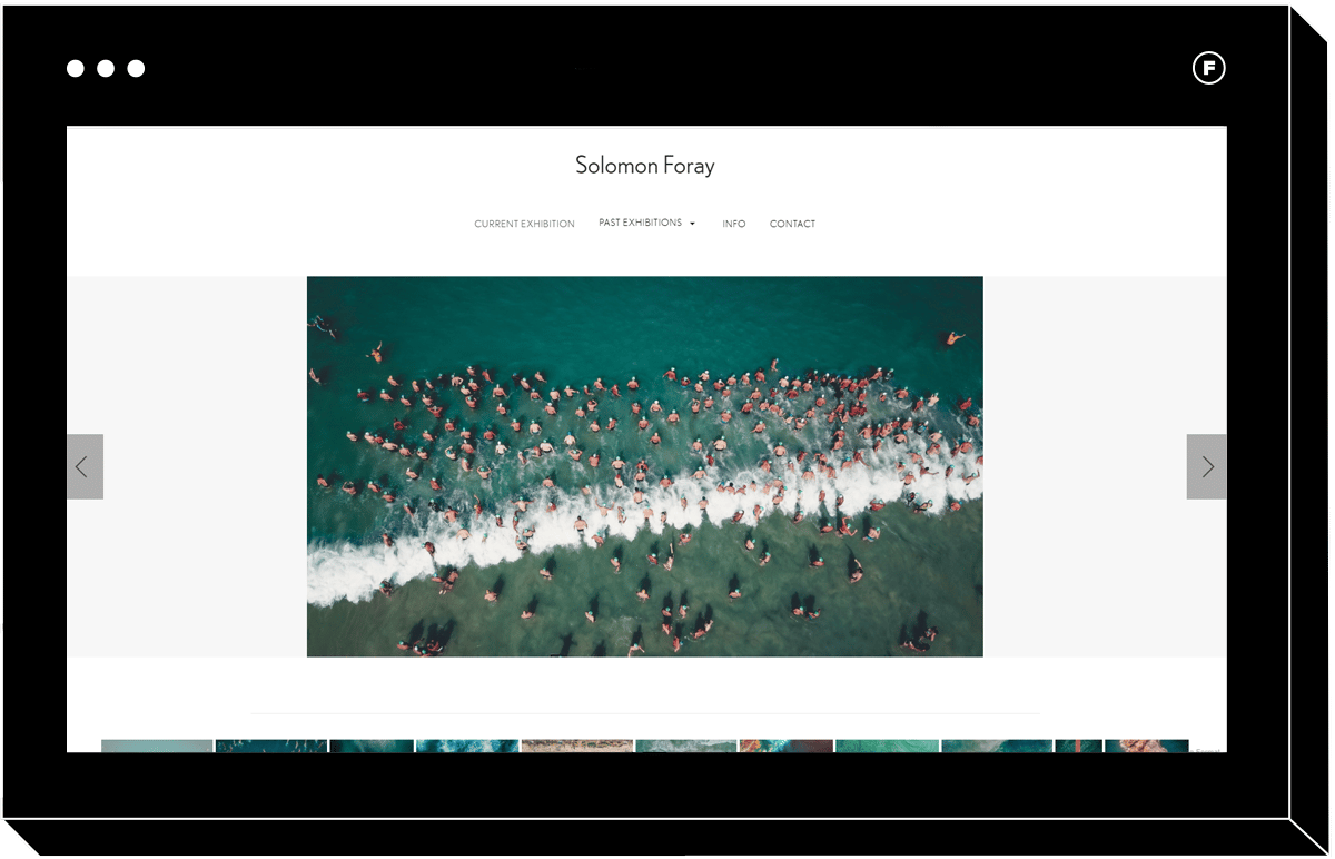
The simple and sleek Foray website theme puts your work front and center in an easy to navigate template. UK based photographer Solomon Foray displays his work using this easily customizable slideshow theme. Greeted by a slideshow, Solomon has chosen to display his most recent gallery front and center. Like with any user-friendly slideshow template, Foray lets visitors navigate through galleries side-to-side with one click. The layout also provides an option to browse thumbnails at the bottom of the page if you wish to skip ahead several images without clicking multiple times. The range of multiple gallery navigation options is an attractive feature when deciding upon a slideshow theme. A simple menu bar design does not distract from the galleries and allows users to easily learn about different aspects of Solomon’s business.
Looking for more resources to take your photography website up a notch? Check these articles out:
The 12 Best Website Templates for Photographers
Curate That Site: How to Choose Which Portfolio Images to Use
5 Things to Consider When Starting Your Photography Business


