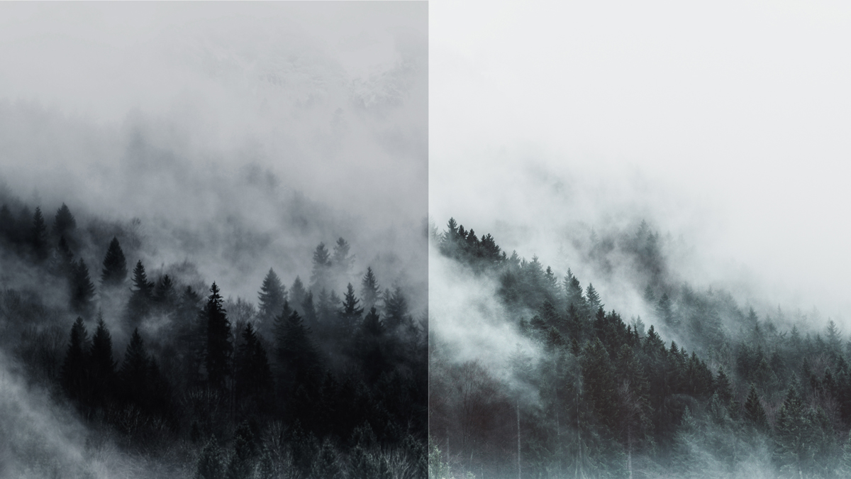
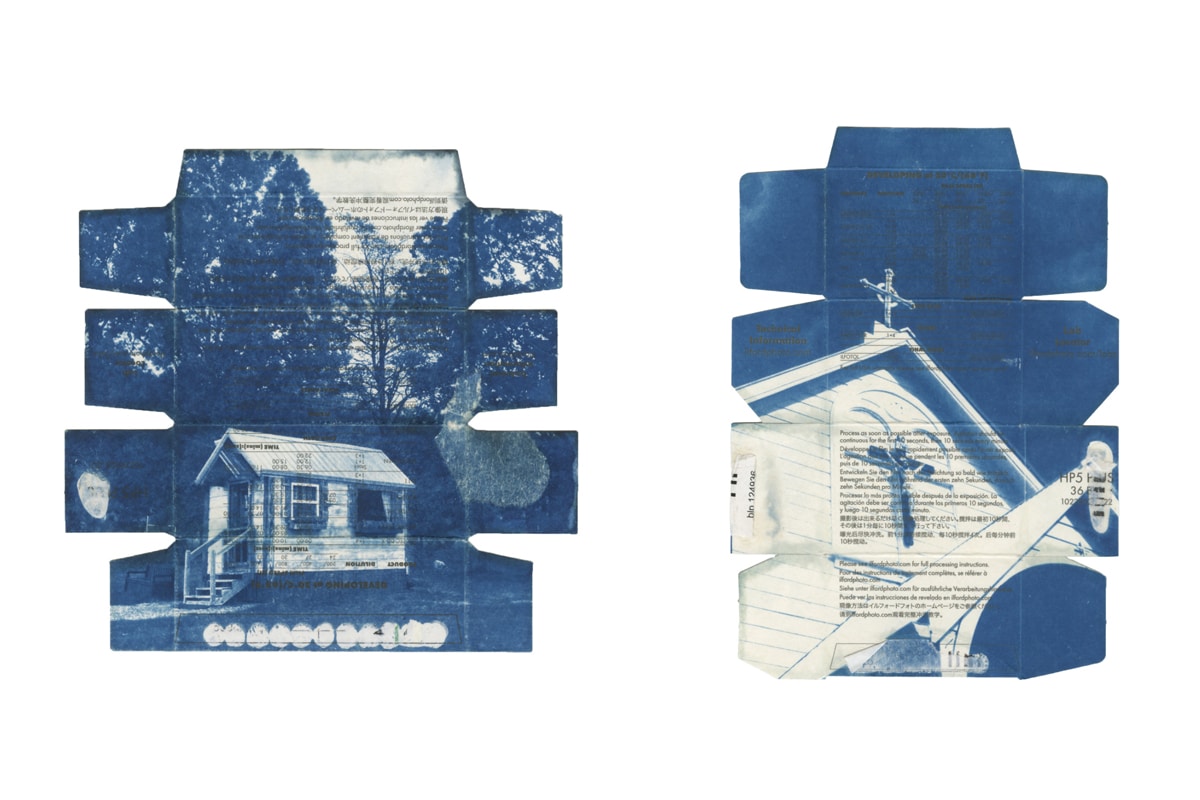
Photographic composition is how a photographer intentionally decides how to arrange visual elements in their photo frame. This may sound simple, but the composition of an image can impact things such as tone and mood, contribute to the story’s narrative, and ultimately help a viewer decide if they feel compelled by an image or not. It can be what takes a photographer from good to great.
You may have a beautiful scene in front of you, or a stunning model for a portrait, but if you don’t meaningfully compose your frame, you won’t do justice to your scene, and your viewer—whether knowing it consciously or not—won’t be as compelled by your photo. Whatever genre you specialize in, landscape or street photography, even portrait photography, composition always comes into play in making a great photo.
In this article, we’ll share some ideas around composition. Leading lines, symmetry and patterns, depth and perspective, contrast and color, even unconventional techniques—there are so many ways to incorporate composition beyond one of the most tried and true compositional rules—the rule of thirds. And hey, why don’t we define what that is now.
The rule of thirds is a classic (if not the classic) compositional rule in photography. This rule breaks the picture frame into 9 segments, composed by a 3×3 grid. Usually, a photographer will place either subject or key element on one intersection of the grid, leaving the rest of the shot (the remaining two thirds) more open. This creates visual interest and a type of balance in the frame. Now, we aren’t saying don’t use the rule of thirds, that’s still an important photographic composition technique! We’re just saying there are so many more ways to create compelling composition in your photography.
So read on and take notes!
Leading Lines
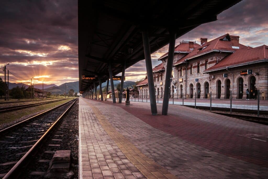
Leading lines is a compositional technique that incorporates lines within your frame to draw a viewer towards something. These can be elements such as roads and road markings, rivers, even doorways and shadows—anything that directs a viewer to something in the picture frame. Leading lines start and go somewhere, and can convey a sense of movement, even lengthening or shortening distance.
Diagonal Lines
Diagonal lines are a type of leading line that can create a sense of movement. As a compositional element, diagonal lines are especially useful when dealing with a deep depth-of-field, as they can emphasize distance and have the viewer’s eyes track back and forth from foreground to background.
Horizontal Lines
Horizontal lines are leading lines that can often be found in landscape or nature photography. As the line stretches across the image, they are especially useful when shooting with a wide-angle lens.
Vertical Lines
Vertical lines are a type of leading line that can be dramatic and powerful. The line or lines draw the viewer up or down the frame of the photo and can convey hierarchy within your photo. This compositional technique is popular in street and fashion photography.
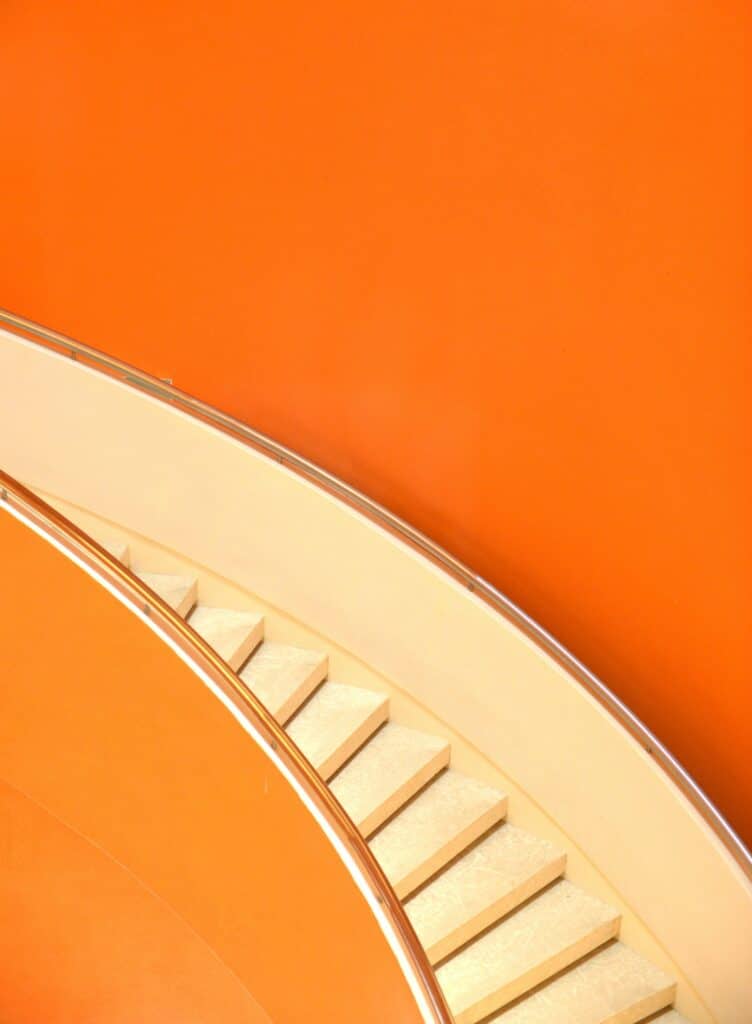
Curved Lines
Curved lines in photographic composition allow for the viewer to slow down, even suggesting within the photo a passing of time because it takes longer for the viewer to get from the start to the end of the line.
S-shaped Lines
S-shaped lines, aka ‘line of beauty’, are curved lines shaped in an S that run horizontally. These lines are commonly used in landscape photography, whether that be a body of water or a winding road. They give the scene depth and dimension, and similar to curved lines, can also slow down the image.
Zigzag Lines
Existing beyond the traditional horizontal and vertical, zigzag lines in photography can add a more dynamic sense of movement, even tension. Believe it or not, the triangle or Z-shape is also a natural flow for the human eye, as your viewer likely reads left to right, forwards, and backwards, and down a page.
Converging Lines
Converging lines in your photo frame mean that lines appear as if they are merging together. For this compositional trick, it’s best to place the subject of your image at the center of these lines. Converging lines are effective at drawing the eye to the convergence point.
Symmetry and Patterns
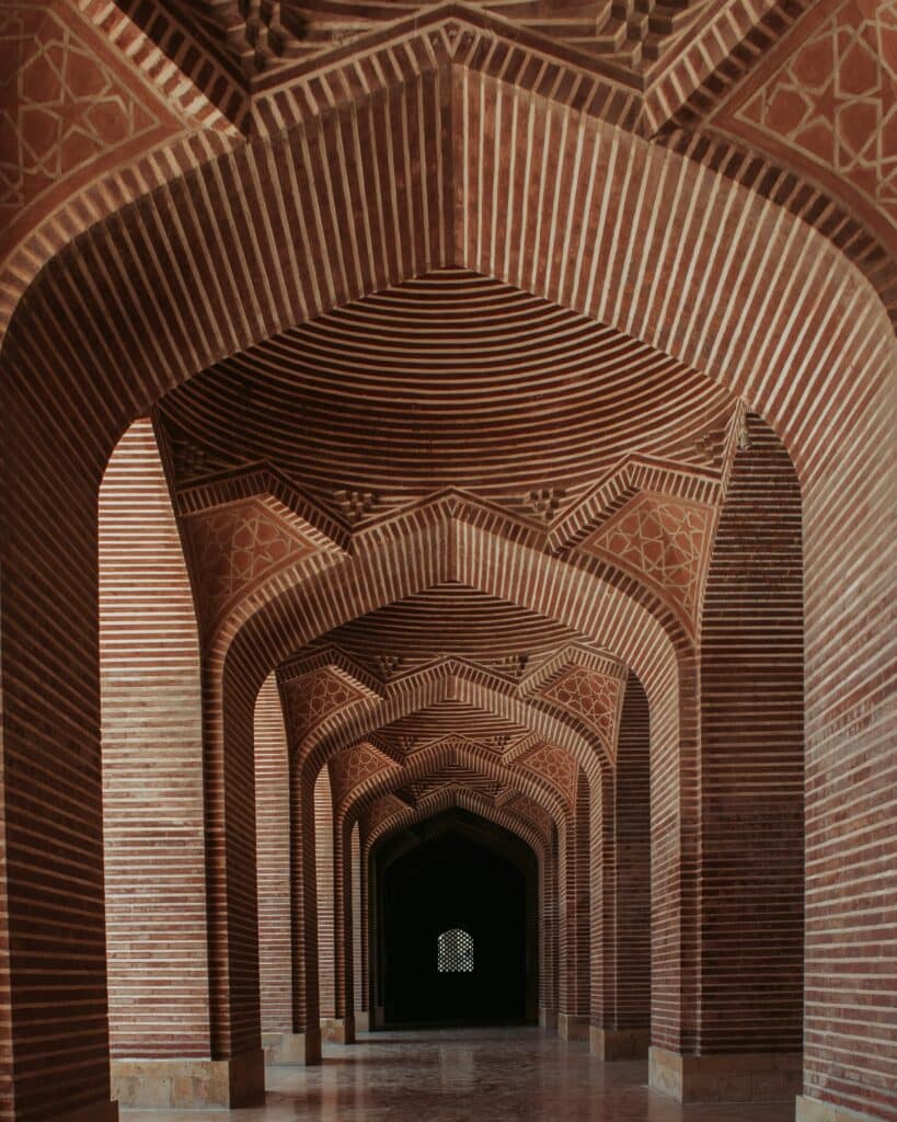
Imagery that is pleasing to the eye can be a great way to go when composing a photograph. This can happen naturally when you incorporate patterns or symmetry into your photo frame. There are many ways to do this, so read on!
Symmetrical Balance
In a symmetrically composed image, one half of the image is identical or near identical to the other, and the weight of visual elements is distributed equally on either side. FYI, balance in a photo doesn’t always have to be symmetrical. Asymmetrical balance is where different visual elements of unequal weight, often on either side of the frame, achieve a sense of balance in an image.
Radial Balance
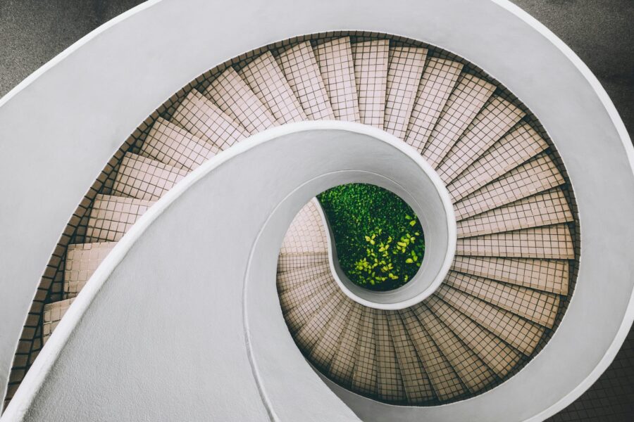
Radial balance is a type of symmetrical balance that is circular in look. Visual elements extend out from a central point, similar to a kaleidoscope or the seeds of a dandelion. Radially balanced designs are often circular, and there are many shapes and elements that naturally occur in our world that may provide initial inspiration, such as the human eye.
Repetitive Patterns
Another form of symmetry and pattern, repetitive patterns can act as a compositional element for your photo. Think of a staircase shot straight on. What makes that element more visually interesting? Likely the repetition! Now think of other repeating patterns you could find in your environment or build yourself to create a photo from.
Using Shapes
There are four shapes that can be helpful for photographic composition. Circles (e.g. tunnels) are most common and elicit a kind of harmony. Squares and rectangles (e.g. doors) represent order. Triangles can create a sense of drama, dynamism and movement. Triangles are harder to find, though many photographers will look for ‘implied triangles,’ aka, diagonals that meet at a center point.
Textures
Texture can add visual interest in your photo. Sometimes it can seem like there are endless options and ideas for composition, so with this compositional idea, start thinking about an element’s texture and how it could complement or juxtapose with other elements.
Reflections
Incorporating reflections in your photo adds a whole other scene—the reflection! Reflections can be great horizontal symmetry, but with these new compositional tricks you’re picking up, think of other ways to compose a reflection. Maybe there are interesting ripples in the water you can use as texture. Shooting a portrait? Consider incorporating a mirror in your shot and think of how to compose that new area of visual information.

Framing and Cropping
Framing and cropping can have a huge effect on your composition. By framing your photo before you take it, you are making decisions around your composition within the confines of the picture frame. By framing your photo after taking the picture, through actions such as cropping, you are adjusting your photo to an area of your frame that may, for instance, have stronger compositional elements.
Try to frame your photo first and foremost, then at least with cropping, you have a Plan B or fail safe to be able to adjust your image post-capture to adjust to something more compositionally appealing.
Architectural Framing
Architecture provides a great vehicle for framing a photo. Design elements such as arches, windows, and doorways create openings which can be the focus of your composition and can literally be framed within your frame. In compositional photography we refer to these as ‘a frame within a frame.’
Square Format
Using a square frame may be beneficial for composing your images if you’re working with a lot of negative space, looking to simplify your shot, or when you’re shooting elements that have strong geometric forms. Other ways square framing works well is in black and white photography, and when you’re shooting straight on with a central composition. Symmetrical photos or those with reflective elements can work well in square formats, too. Last piece of info to share: the human eye tends to move around a square frame in a circle (of course this all depends on how you compose your shot), so just be aware of this.
Panoramic Format
If your scene spans wider than a typical frame or aspect ratio, you may want to consider using a panoramic format. This type of wide-angle photo is 2:1 in width or wider (4:1 or 10:1 for instance). A sprawling natural or urban landscape are great examples of when a panoramic composition may be a suitable choice. There are so many ways of taking panoramic photos, so if you’re intrigued, start your research and start experimenting!
Golden Ratio
The Golden Ratio is a gold-standard compositional rule in photography. We won’t dive into its history and mathematics—for our purposes, what’s important to understand is that it creates balance in an image. The ratio appears in our natural environment (e.g. plants, the night sky, weather patterns) so it’s naturally appealing to our cognition. Some consider it the natural version of the rule of thirds. Try using the spiral (or Phi Grid or the Fibonacci Spiral in some software and apps) in your post-production. Experiment with cropping your image, centring the focal point at the center of the spiral.
Depth and Perspective
Depth and perspective can be a powerful compositional photography technique. They bring dimension to your two-dimensional photograph by creating a sense of depth, or by better defining the spatial relationship between elements. By harnessing their powers, you can make your image come even more alive. Depth and perspective have the power to capture or skew the scale of objects and bring certain elements into focus. There are plenty of ways to use depth and perspective to create a more compelling shot so read on.
Foreground Interest
Incorporating an element into your photograph near the foreground is a way of adding visual interest and a different sense of depth to your shot. Think of the elements in your photo frame. If you zoom out, are there elements that could add to your story? In focus or not, foreground elements can add something different to your photograph.
Linear Perspective
There is a lot of overlap between linear perspective and leading lines. Both are examples of how we can lead the eye in compositional photography. Linear perspective helps show the depth of a scene in your frame using parallel lines and a vanishing point. There are a few different types of linear perspective—one-, two-, and three-point perspective—so be sure to study and experiment with all three when you can.
Forced Perspective
Forced perspective is a compositional technique that uses optical illusion to make objects or elements in your photo frame appear closer or further away, smaller or larger. You may have seen the moon appear larger when an object in the foreground appears on the horizon line, like a building, or someone’s hand in the foreground appearing to pinch or pick up an extremely large object in the background. This is an example of forced perspective. It can really change how viewers perceive elements in your shoot and can create many different avenues for composing photographs.
Depth-of-Field
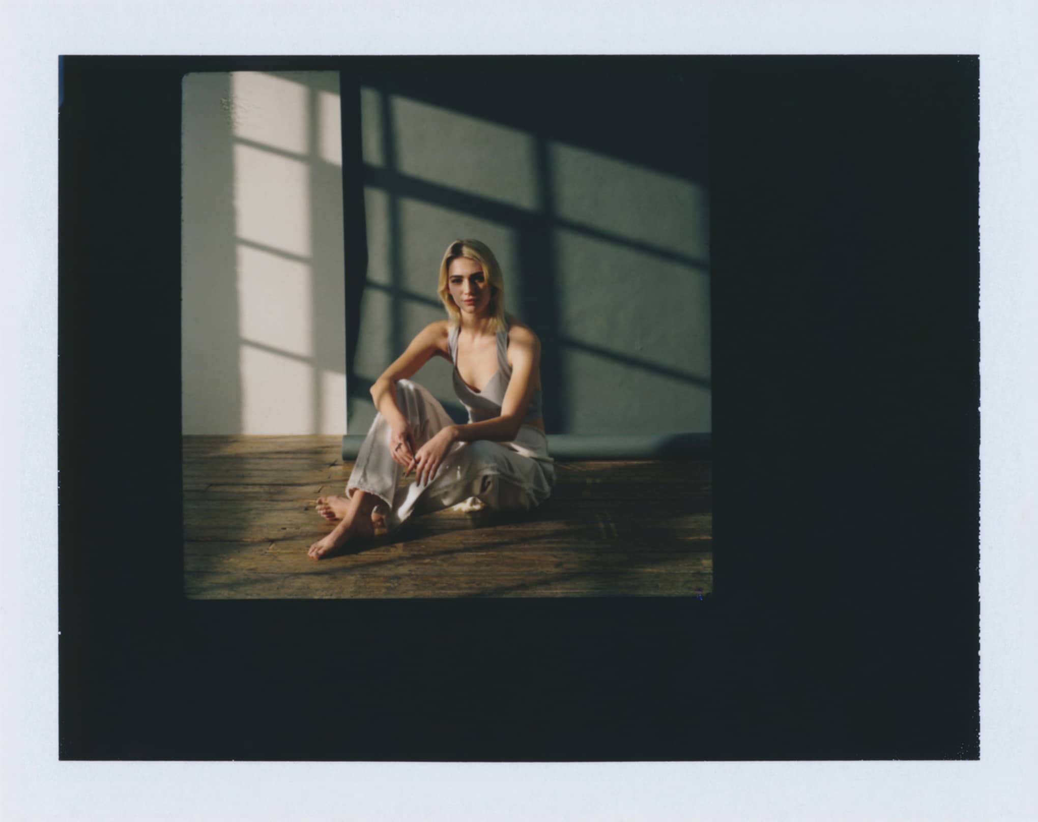
Depth-of-field is another way to (you guessed it) add depth to an image. Choosing a shallow depth-of-field, where appropriate, blurs your background (or foreground). Your depth-of-field is a choice you make for what to highlight in an image. For instance, a shallow depth-of-field is great for a portrait-style shoot, which brings your subject into focus and brings out the dimension between your subject and the background.
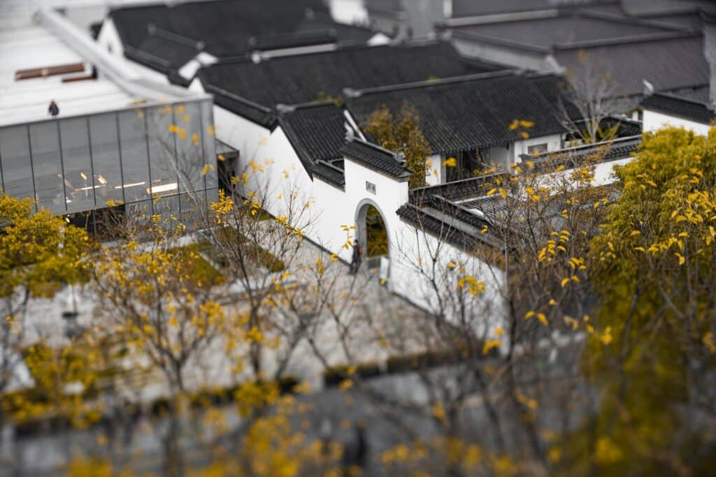
Tilt-shift Photography
Commonly used in architectural, landscape, portrait, product, and even miniature photography, tilt-shift photography can bring about creative depth-of-field effects. While it does require use of specialized lenses, tint-shift perspective is another compositional technique to try if the idea of playing with depth-of-field interests you, or if your shoot lends itself especially well to it.
Bird’s-eye View
A bird’s-eye view is another compositional choice based on the setting and mood you’re wanting to bring to your photograph. A bird’s-eye, also called an aerial or overhead shot, is an interesting angle you give your viewer, eliciting in many cases, a sense of surveillance.
Worm’s-eye View
A worm’s-eye view, sometimes referred to as low angle photography, is the opposite of a bird’s-eye view. In this way, you’re composing a view of the world from the bottom up, which allows the viewer to see a different take on a scene. This view could convey a childlike sense of wonderment or even a sense of inferiority—it all depends on how and what you choose to shoot.
Contrast and Color
You might wonder what contrast and color have to do with composition, but color theory can really strongly play into the success of your composition. Colors and tones have different visual values and weights, can be used to highlight or emphasize certain elements in your photo, and even change the mood of an image. So have a look at all the ways you can work color and contrast into your compositions to your advantage.
Color Contrast
Likely you may already see color in an astute way like many other artists and designers already do—through your own natural abilities. Getting to know the color wheel and how different colors and tones interact with one another is a great way to boost your artistic abilities. Whether itis colors contrasting with neutral backgrounds, or using complementary colors to create contrast, building your knowledge of color will only help boost your composition game.
High-Key Lighting
High-key lighting can help the strength of your composition in post-production, by honing in on your tonal values, and adjusting your brightness and exposure, you can help balance your photo. It can also help simplify your photo and drown out some of the visual clutter so your viewer can focus on what’s important.
Low-Key Lighting
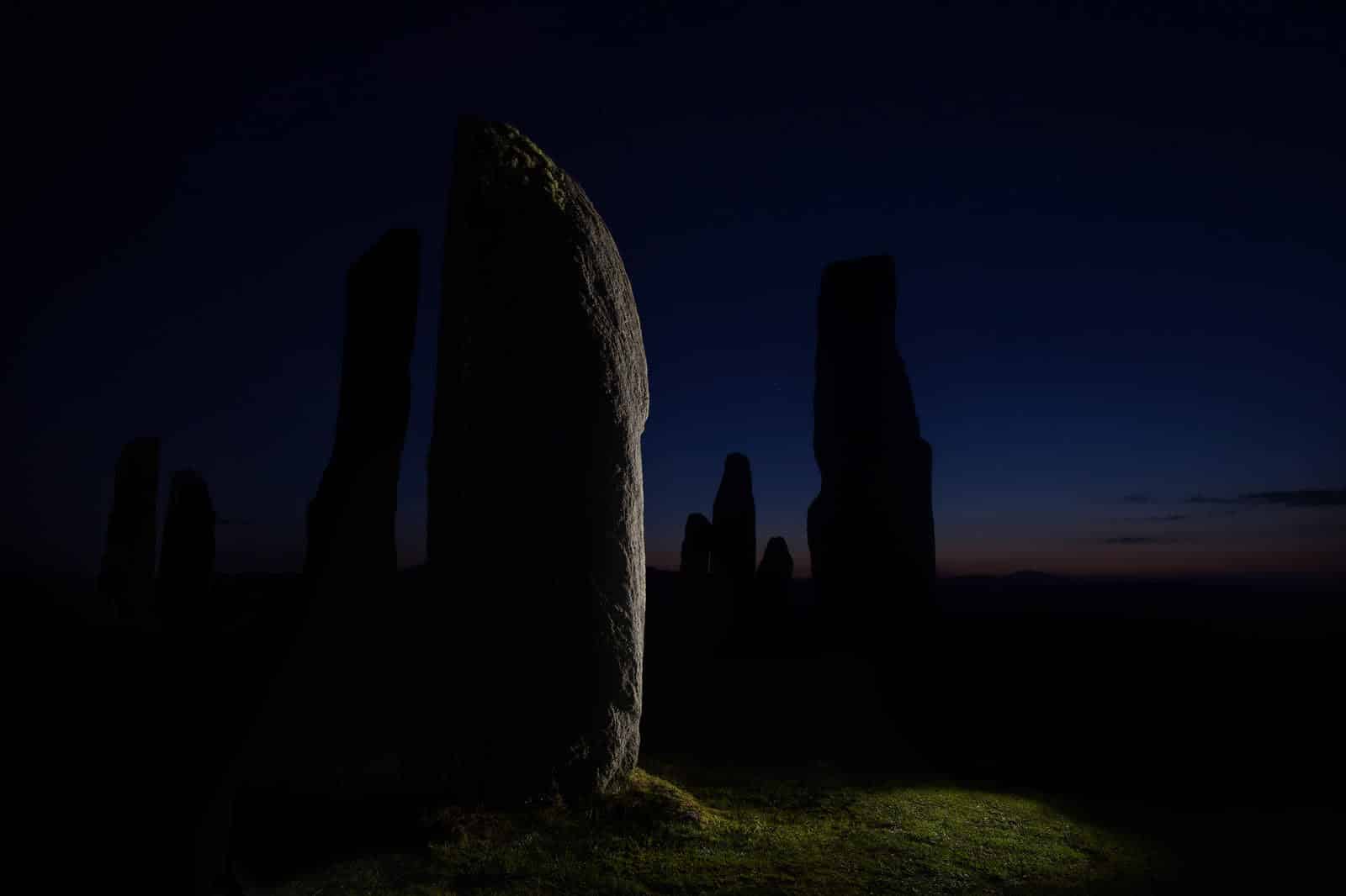
By reducing light in low-key photographs, the elements in your photographs can be in striking contrast to one another, an illuminated subject paired with dark tones and shadows. Just keep in mind you’ll still need enough contrast to actually see the composition (depending on your intent). Think of other composition ideas to pair with low-key photographs. Want some drama for a portrait? Maybe a square format center-composed portrait will pair well with low-key.
Black and White Photography
Black and white photography strips away much of the visual information in a photograph, namely color. In this way, you are especially reliant on composition to make your photo great. White, black, and the tones in between are all visually weighted differently, so when attempting this compositional technique, you’ll want to play around with how elements balance in your image—it will be quite different than if it were color!
Selective Color
Selective color is a choice a photographer makes in post-processing, where a select color or two will be added back into a black and white photo. This brings a new dimension to a black and white photo, so the choice of color, element to color, and its placement in the frame all affect the photo. This compositional technique can easily veer into cliché, so you’ll want to be careful how you attempt this and be really intentional.
Color Blocking
Color blocking is just that: blocking colors together, whether it’s in the studio or you’re able to make choices on what to photograph in a manufactured or natural environment. Are you in the studio and need to make some decisions around what colors to use, whether that be in styling food, product, fashion, or portrait photography? Consider using complementary colors, or the three color rule: picking one primary color and two other complementary colors for your scene.

Unconventional Techniques
Still looking for more compositional photography techniques? Let’s dive into some unconventional techniques that go beyond going beyond the rule of thirds. Some of these techniques may be considered more ‘artsy’ or might leave you with more questions than answers, but think about expanding your horizons and incorporating something here that might speak to you.
Negative Space
Negative space is a compositional photography technique that creates space around your subject or elements in your photo. This creates simplicity and breathing room for your subject and viewer. Using negative space will likely lend itself to using other compositional rules in combination, to frame the element you’re focusing within the picture frame, like the rule of thirds, natural balance, etc.
Extreme Angles
Extreme angles are anything out of the norm of how we typically view elements or objects—they are contradictions in perspective. While these could be considered bird’s-eye and low-angle, a technique such as a fish-eye may be more closely associated with an extreme angle. Research shoots from the 90s and give it a try, it’s especially fun to use human subjects with this technique.
Double Exposure
Double exposure can be a fun and impressive technique to produce. But it’s more than just the ability of creating the image. It’s composing your two photos so they intentionally complement or juxtapose one another. It’s important to do this thoughtfully, as the new image can convey new meaning and symbolism, or it can look busy and confusing and lose the intention of what you’re going for.
Extreme Zoom and Cropping
Close cropping (done after taking a photo) or zooming in (done while photographing) on certain elements of your photo are other ways to bring unconventional composition to your photo frame. By closing in on an area of your photo or scene, you are enhancing the intimacy between your subject and your viewer, which can change the way your photo is seen.
Play With Focus
We spend so much of our time focusing our photos, wouldn’t it be freeing to play with out of focus images? If this feels viscerally wrong to you, think about it for a second—blurring an image can change the mood of a shot, spark more curiosity in your viewer, even ask the viewer to use their own imagination to come to their own conclusions of the scene.
There you have it! We hope our series of tips and ideas for composing your photos beyond the rule of thirds has been helpful. Remember, the composition of your image has a huge impact on the success of your photo. From showcasing your technical prowess, range of artistic ability, and understanding of how composition really compels your viewers, your photography will reach new heights by exploring a range of creative techniques in composition.
We’ve gone through various ways to create leading lines, the many ways symmetry and patterns can impact composition and how to play with depth and perspective. We’ve also looked at how even contrast and color can impact your composition. Finally, we looked at some unconventional techniques to test out.
We’re sure you’ll have your own too, but we encourage you to get out and explore these new ideas! You may even find good combinations of two or more techniques that work for certain shoots. Bringing intention to your photography through careful composition we hope will bring you new inspiration, more successful shoots and clients, more work…the sky’s the limit.
