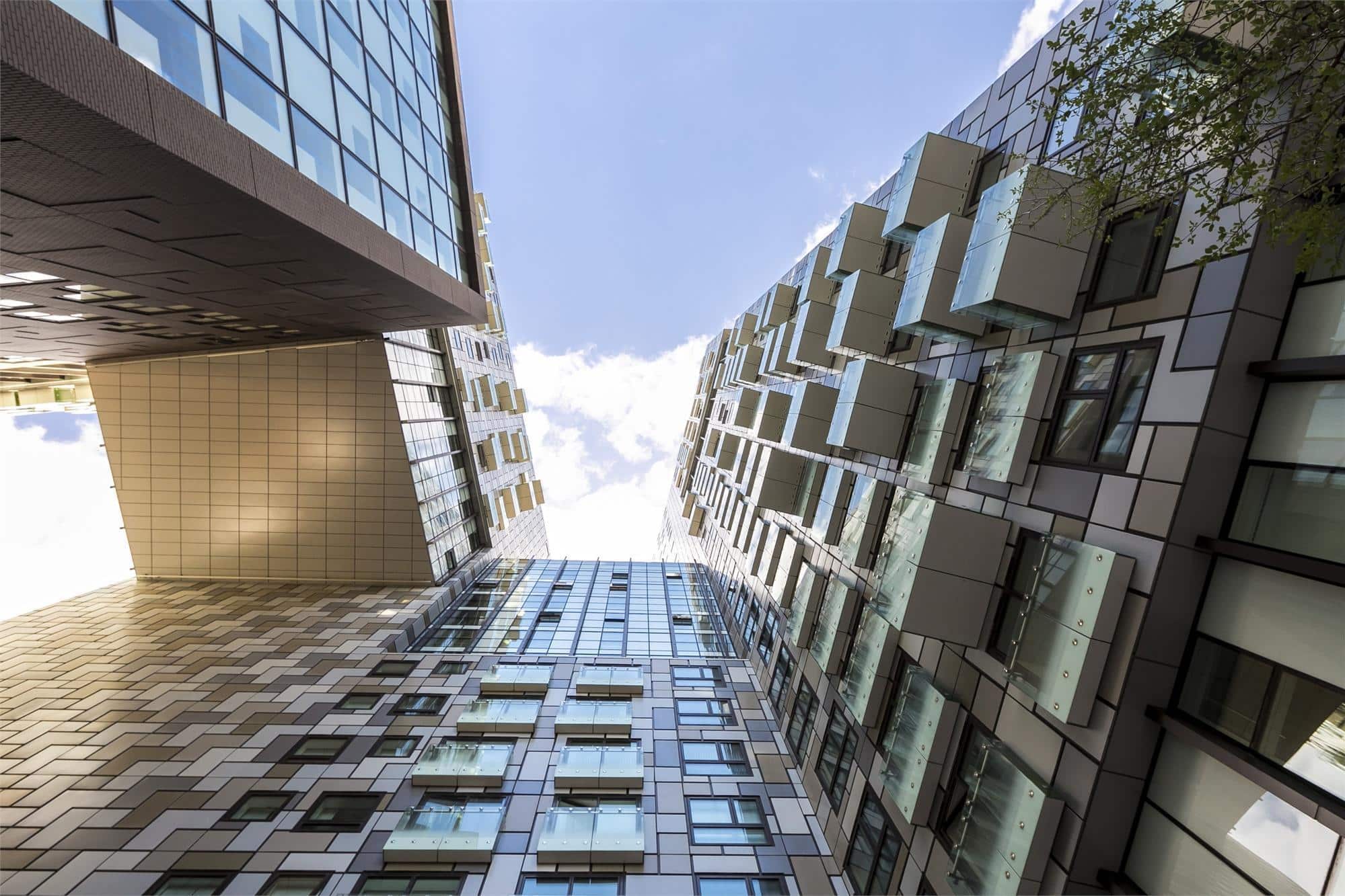
Every year, British architecture magazine Building Design awards the title of “ugliest building in the United Kingdom completed in the last 12 months” to some unfortunate work of architecture.
Last week, they announced the six nominees for architecture’s least prestigious award. Half are from London, as is to be expected, but smaller communities (Poole, Stoke-on-Trent) also have their share of bad architecture, and the North is represented too with a Sheffield university building making an appearance.
The winner has just been revealed as Lincoln Plaza, a 31-storey luxury housing tower located in the Isle of Dogs area of London’s East End. Take a look at Lincoln Plaza, and the other nominees, below.
A putrid, pugilistic horror show that should never have been built.
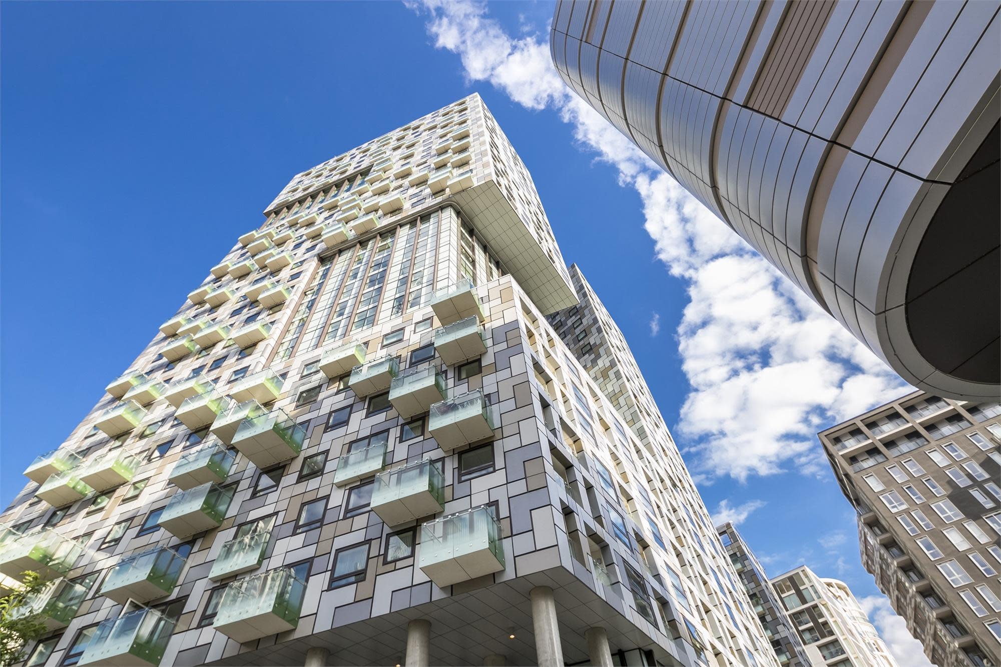
Winner: Lincoln Plaza, London
Described by Building Design as “the architectural embodiment of sea sickness,” BD also called this large housing tower, “a putrid, pugilistic horror show that should never have been built.” Designed by BUJ Architects, the building is comprised of two main apartment towers, and a 100-suite hotel.
“Putrid” seems a bit harsh for this structure, but “unimaginative” is probably a just description. There are so many apartment blocks just like this one, not only in London but in major cities worldwide, that calling out Lincoln Plaza for a disappointing lack of creativity feels like a more just criticism.
Responding to the verdict, developer Galliard Homes said, “Architectural design is art, and like all art, a matter of personal tastes. The scheme sold out to buyers, so clearly the project is liked by the purchasers.” In case you agree, Galliard Homes’ website lists 3-bedroom Lincoln Plaza apartments on offer for prices starting at just over $1 million.
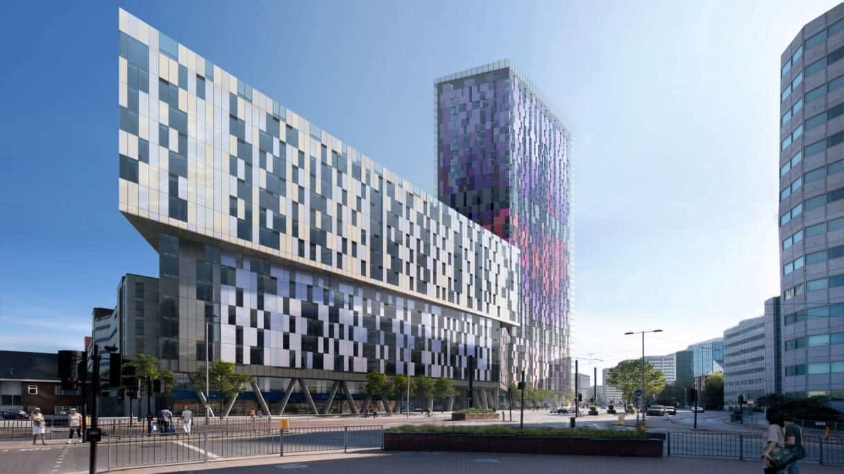
Saffron Square, London
A BD reader described this multi-hued skyscraper as having a “car crash of a facade.” Maybe its variegated orange and blue hues are a bit reminiscent of shattered headlights. Designed by Rolfe Judd, the structure looms 43 stories high over Croydon, which is a fast-growing borough of South London.
The glassy tower, which houses 413 apartments, is optimistically described as “iconic” and “impressive” by developer Berkeley Homes. In contrast, BD says of Croydon’s burgeoning economic growth, “One imagines that this is in spite of rather than because of its brand new tallest building.”
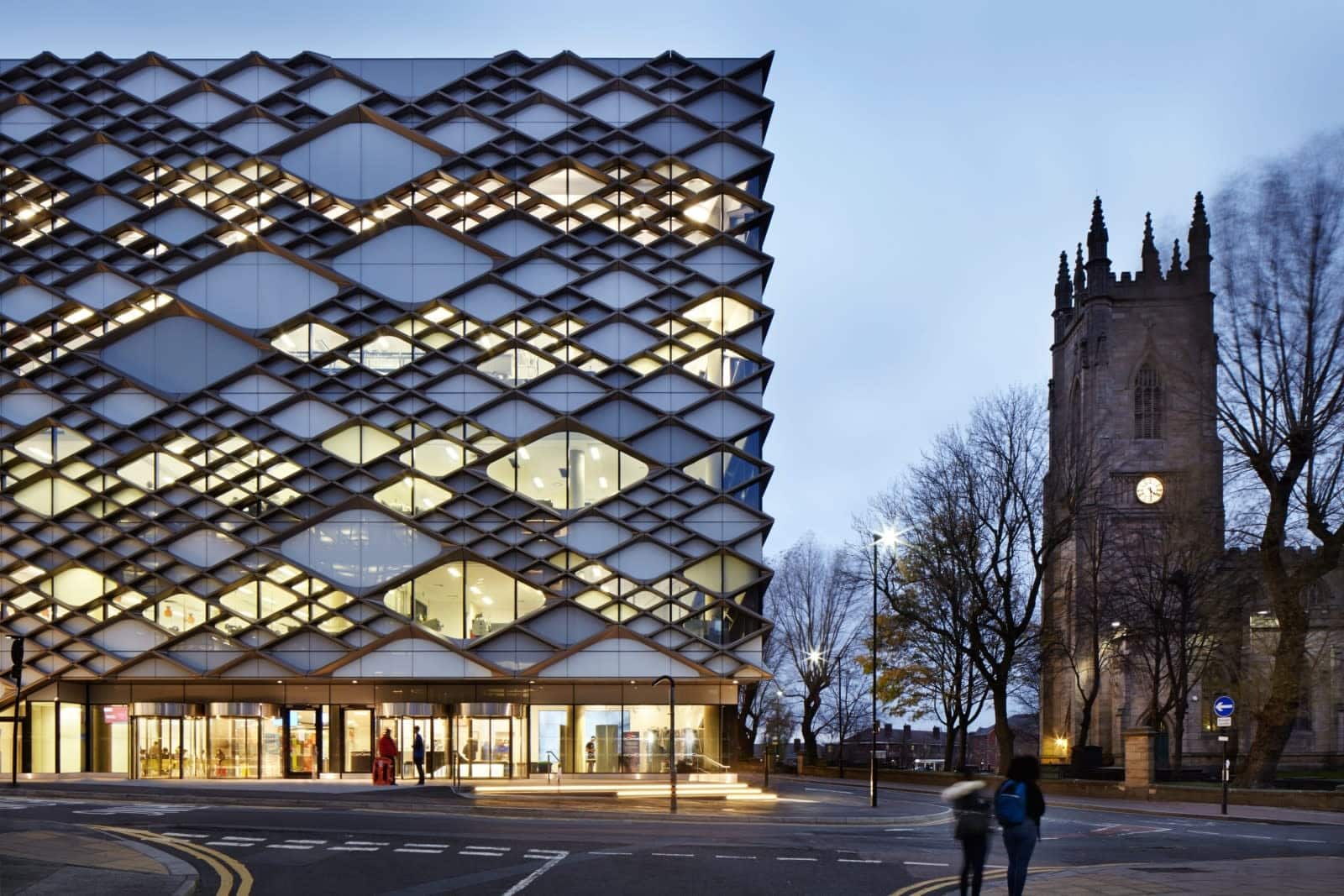
The Diamond, University of Sheffield
Of this glittering, geometrically-inspired engineering faculty building, BD notes an “unsettling similarity to a hydroelectric plant.” Designer Twelve Architects cites positive reviews of the geometric building from university staff. However, BD feels that its facade is “overpowering,” and fears that the surrounding historic buildings, including a former church and a Victorian-era former hospital, are dwarfed by the oversized Diamond.
An unimaginative grey box of bland, belligerent mediocrity.
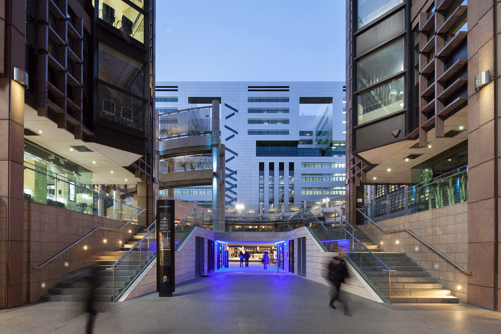
5 Broadgate, London
This headquarters for financial services firm UBS, designed by Make Architects, boasts a highly sustainable facade and was awarded BREAAM excellent, meaning that it is officially considered a sustainable building. Apart from their concern that this giant steel structure be environmentally friendly, Make also says that great care was taken to integrate it into the existing Broadgate district buildings. BD disagrees, describing 5 Broadgate as a “monster” which “flattened” the buildings that were previously in its place.
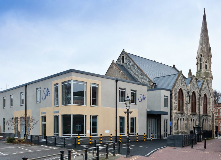
Poole Methodist Church Extension
BD describes the extension to this small church in the coastal town of Poole as “an unimaginative grey box” and accuses it of “bland, belligerent mediocrity.” The extension replaced a Georgian chapel and a later extension. It’s hard to argue much with BD’s criticisms here: this building looks more like a dental office than part of a church. Perhaps architects Intelligent Design Centre intended the yellow and grey color scheme to echo the stone of the original church, but somehow it only reinforces the anachronistic plainness of the boxy extension.
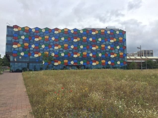
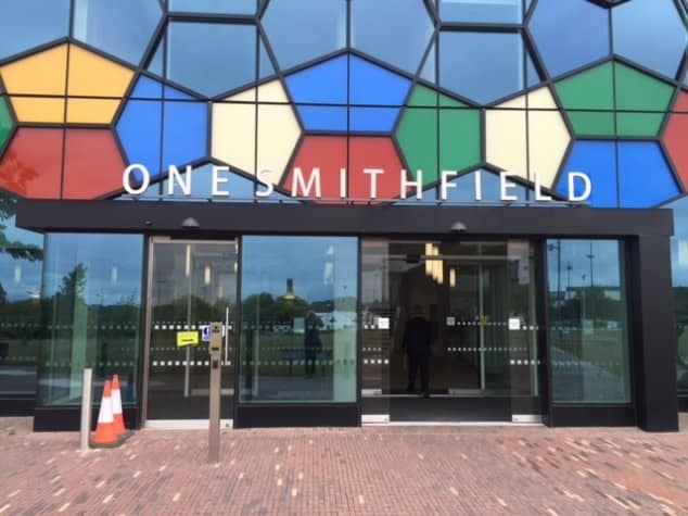
One Smithfield, Stoke-on-Trent
According to BD readers, the adjectives of choice to describe this rainbow-shaded, honeycombed building are pretty grim: “nasty,” “awful,” and “hideous,” say readers, while BD calls One Smithfield “an aesthetic mutation.” Intended to house the city council, the building by RHWL Architects had to open later than planned due to structural issues.
One Smithfield’s high cost (it’s part of a $73 million project) and outlandish facade have rendered it controversial among Stoke-on-Trent’s citizens. Local paper The Sentinel cites residents criticizing the admittedly pretty garish structure as “vulgar” and likening it to a Rubik’s Cube, a comparison also pointed out by BD.
Nasty, awful and hideous.
For more architecture roundups, check out our list of 2016’s best new buildings, or see some of our favorite well-designed hotels.
