The new, updated Google Fonts is a treasure trove of open source, totally free-to-use typefaces. From classic to creative, the new font selection supports over 135 languages, and is set up to let typography buffs easily discover new fonts by browsing through style categories like Serif or Handwriting.
Who are the designers behind Google’s favorite typefaces? We spoke to two of them to find out what it takes to design a font for Google. David Jonathan Ross, who runs his own type foundry DJR, and Eleni Beveratou, a Font Developer with London studio Dalton Maag, share some insight into the process of bringing a brand new font to life.
David Jonathan Ross
Font designer David Jonathan Ross is from LA originally, but now based in Boston, where he works with The Font Bureau, a leading type foundry with clients like The Wall Street Journal, Rolling Stone, and filmmaker Wes Anderson (they publish the font for Moonrise Kingdom created by Jessica Hische).
How did you get into font design?
“I became interested in typography while attending Hampshire College in Massachusetts. As part of my senior thesis, I designed a type series for the text and headlines of our student newspaper, as well as a handful of display faces including my Wild West font Manicotti. I was hired by The Font Bureau, where I learned so much working with other type designers on custom and retail type design projects. Recently, I launched my own foundry, DJR, and Bungee is one of my first releases.”
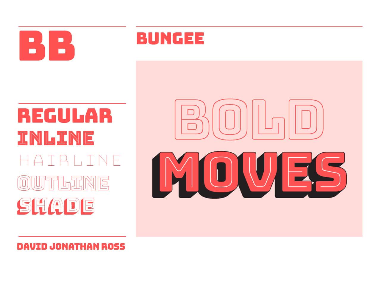
What inspired your Google font, Bungee?
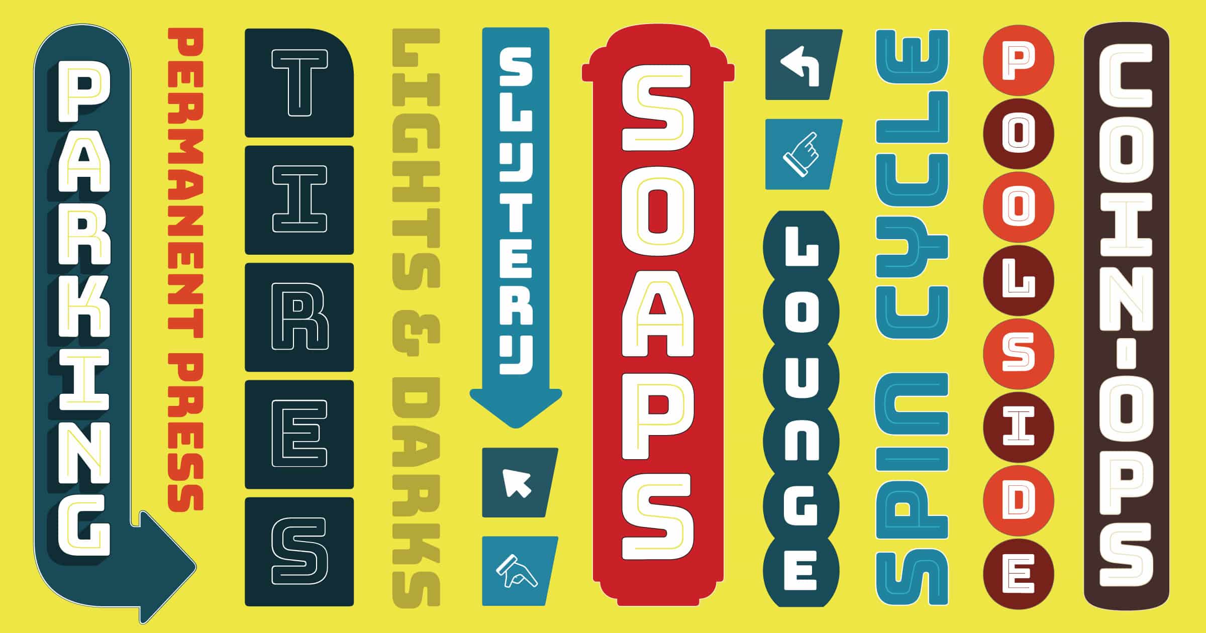
“When I lived in Cambridge, Massachusetts in 2011, there was a liquor store at the end of my block where the word LIQUOR was stacked vertically so the letters could be large and visible as possible without forcing the sign to stick out into the street. It wasn’t the most attractive sign, but it got me thinking about whether a typeface could be designed to succeed in a vertically oriented environment.
“I began photographing all sorts of similar signage in my travels, and decided to create Bungee as an homage to these kinds of urban signs. In appreciation of their colorful, decorative letterforms, I created inline, outline, and shade layers for Bungee, which can be overlaid in different colors to create a variety of chromatic effects. Bungee’s simple, open letterforms are reminiscent of Art Deco styles, and its straight-sided letterforms reinforce a sense of verticality. I researched how Latin text is set in East Asian languages, and created a set of capitals that can actually be typed vertically.
“I proposed Bungee to Google Fonts because I thought it would be well-suited to their open source library. Bungee is a good use case for color fonts and for vertical writing, so I wanted to make it freely available in order to encourage better support for these emerging features across all applications and browsers. Bungee comes with experimental color fonts, where information about color is stored inside the font itself. I hope these will become a useful resource to designers and developers who want to play with these features and push this technology forward.”
What makes a good font stand out from the rest?
“Since there are so many typefaces out there, at least for the Latin alphabet, I would say the thing that makes a good font is that it solves an interesting or unusual problem. It’s easy enough to draw an alphabet, but I find that the best ones are designed specifically to address a certain need, and these will often take a more novel approach to the same old alphabet.
“Fonts are software, and another thing that makes a good font is attention to detail (on a technical level). This includes carefully-drafted letterforms, even spacing, kerning tables, and OpenType features that help to make the character set accessible.
“I think one of the best parts about our little industry is that it is so small, but people come to it from a wide variety of backgrounds. Some come to typeface design as skilled calligraphers, and translate their talents with the pen or a brush into typefaces. Others use a vast knowledge of typographic history as the basis for their work. Some are excellent drafters, and bring a unique sense of shape to their work, making textures of black and white. Others come at it from a technological perspective, using their skill as computer programmers and software developers to make digital fonts do things that weren’t previously possible.”
Eleni Beveratou
Based in London but originally from Greece, Eleni Beveratou works at Dalton Maag, a font foundry with a number of big name corporate clients, including Amazon, Nokia, and Toyota.
How did you get into type design?
“I decided to study type design at the University of Reading to become a better graphic designer, but after completing my studies I decided to focus only on type.
“My title at Dalton Maag is Font Developer, and I joined the team four years ago. Dalton Maag is an international font foundry specializing in type design and digital font production. The company was founded by Swiss typographer Bruno Maag in 1991 and has grown over the past two decades to become one of the world’s most respected type foundries.”
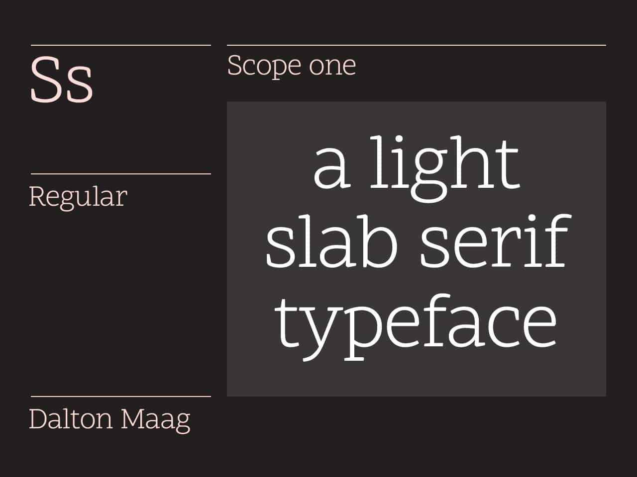
What inspired your Google font, Scope One?
“Scope One started from the idea that all applications of Google docs bring to screen something that once upon a time we used to carefully craft by hand, on paper. The tactility, practicality, and nostalgia of this surface is something that the Google Material Design team also felt the need to interpret for the screen.
Scope One aimed to bring back the feel, texture, and uniqueness of printing with metal type on paper through introducing unexpected, non-distracting twists. The concept focuses on the timeless, basic principles of design, in an effort to create awareness for the value of type design.
“We usually start by sketching by hand, and then as soon as we have an idea of where we are going with the design, we move to digital drawing on our computers. At Dalton Maag, we always develop new methods to improve our Font Development processes. When a font is developed, three aspects are necessary: the design, the engineering, and the screen optimization. For this project, Denis Jacquerye, Cosimo Lupo, and José Solé worked quite a lot to create a tool that would automatically combine those three aspects of the font process and generate the final font.”
What makes a good font stand out from the rest?
“A good font is one where all letters work nicely together as a system. They belong to each other and make sense when side by side. It is important to not focus on only one letter or ignore that it will coexist next to others. Nevertheless it is also important to make sure that the letters still have enough character. Finding the right balance between personality and functionality is key.”
