Ready to build your online portfolio website? The first thing you need is a really good theme—a style that truly fits your work. Furthermore, a portfolio theme can really make or break how other people gauge your worth as a creative professional. A study by Stanford University revealed that 46% of respondents consider web design an important fact on how they determine the credibility of a business. Whether you like it or not, you’re being judged by the design of your website.
What’s the easiest way to make sure that your portfolio is working for you, and not against you? Get a portfolio designed by a professional. Even better? A professional who understands that photographers, illustrators, artists, models, and designers have different needs than other businesses.
A study by Stanford University revealed that 46% of respondents consider web design an important fact on how they determine the credibility of a business.
“I wasted many years with all sorts of mad coding for a website. I spent a large portion of my time doing that, instead of creating work. That’s not a great feeling,” said photographer Sally Wanless, who uses Monocle theme to display her wide range of landscape, portrait and design work.
“When I switched to Format, I could concentrate on the craft and leave the website to do its thing. It’s clean looking, easy to use and has helped me tremendously. It’s led to some sweet collaborations including billboards in Times Square.”
To find out more about Format’s theme design process, we spoke to product designer Garry Ing. Alongside other members of the Format team, he’s responsible for designing, developing and maintaining all of the portfolio themes. He’s also has a background in net art and you should follow him on Twitter (@garrying) for obscure links to everything design/art/internet-at-large.
We asked Garry about how themes are created, how to decided which portfolio theme to use and what’s coming up for Format themes in the future. This is the real story behind how a portfolio theme is designed—and surprisingly, it includes GeoCities and Yayoi Kusama.
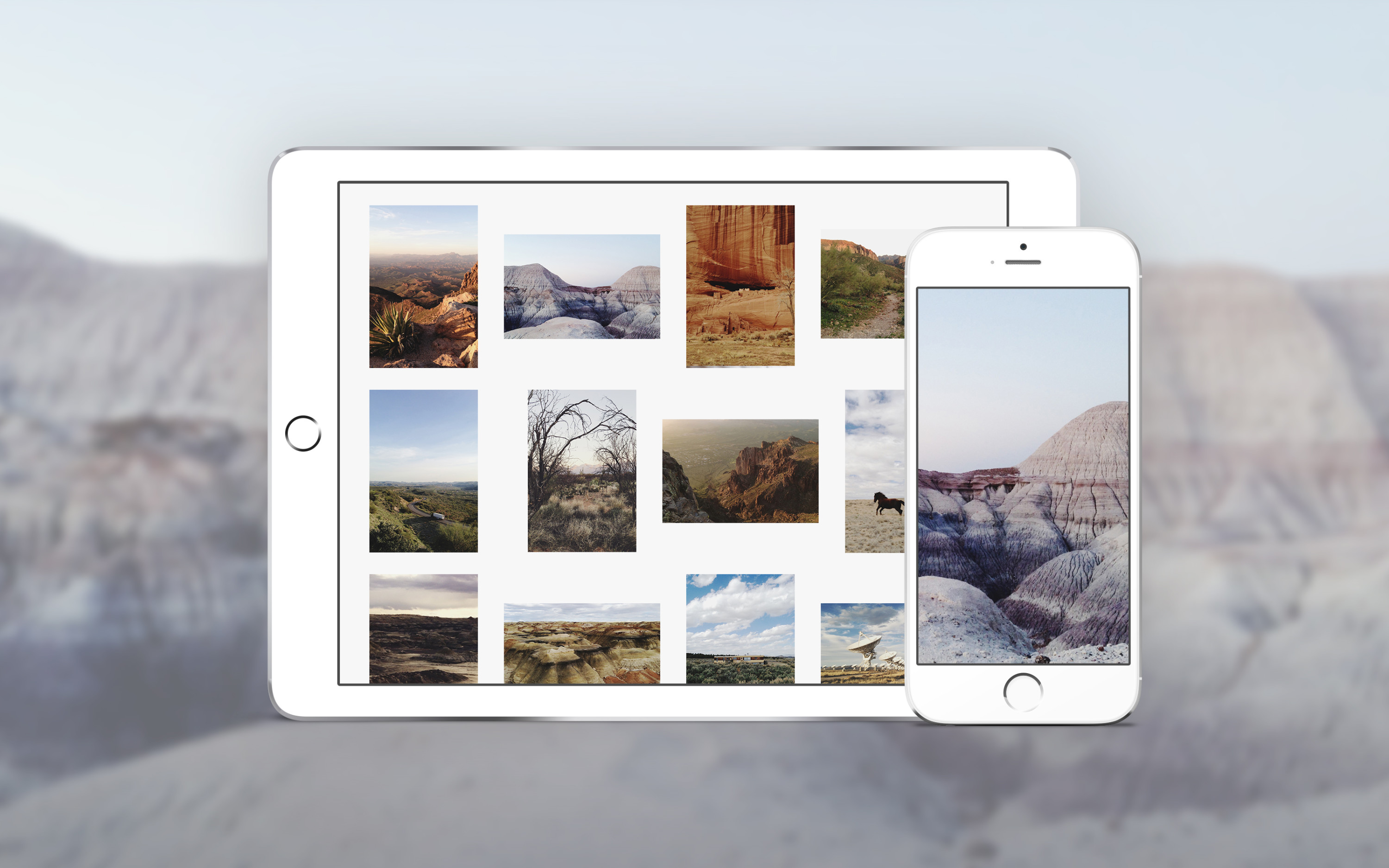
Want to see some of our best portfolios in action?
20 Mesmerizing Portrait Photography Websites
16 of the Best Animated GIF Portfolio Examples
20 Design Portfolios You Need to See for Inspiration
20 Incredible Illustration Portfolio Examples You Should Bookmark
A theme is more than a layout. The design goes deeper than just where the images go on the page.
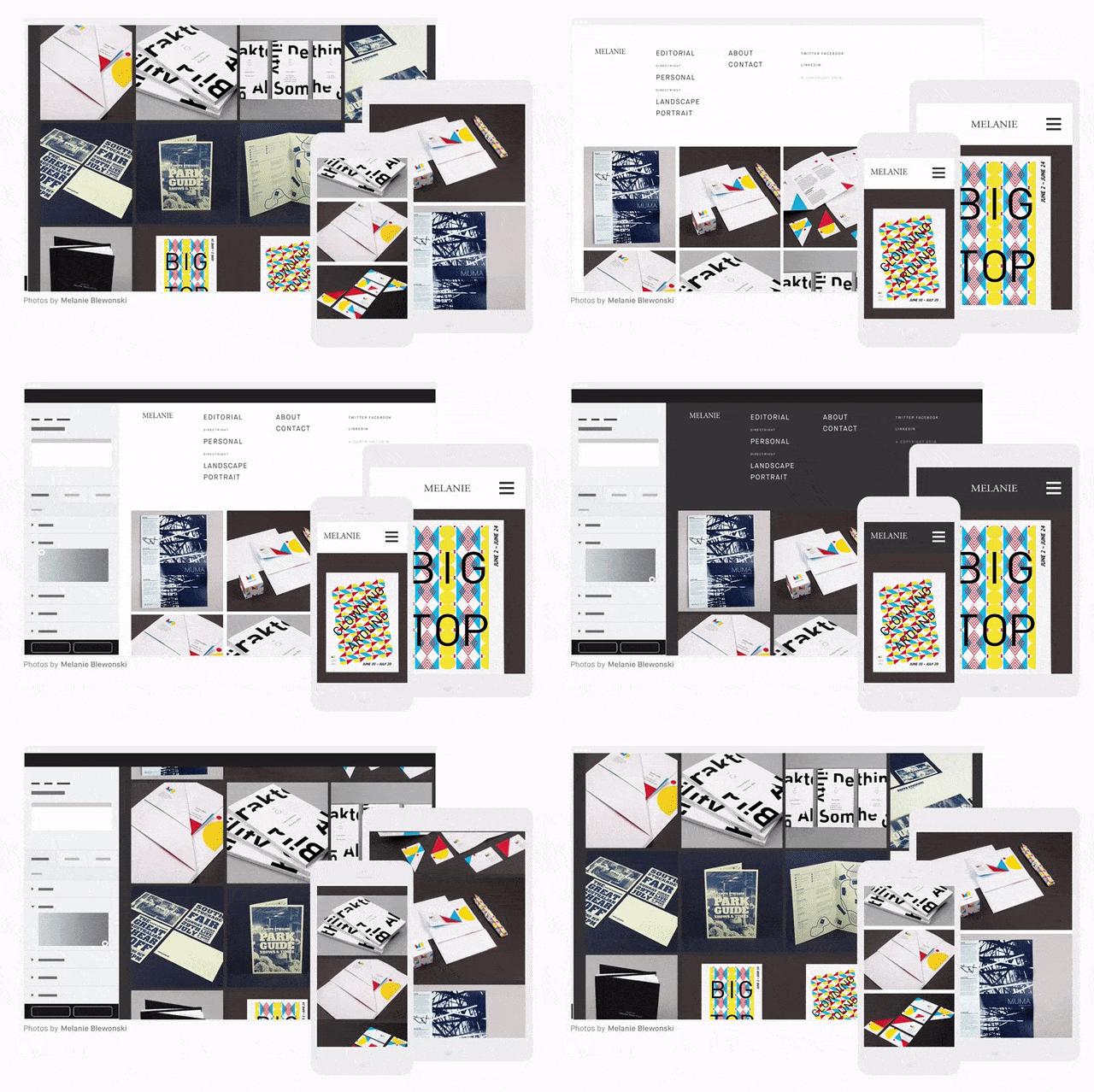
Garry Ing: “A theme is a collection of files. It controls everything from the layout and typography to how it functions—for example, the way it scrolls. The themes are designed so that you can make changes without the risk of breaking your site or losing work. If you want to just mess around with customizations, Format’s design editor lets you try out new combinations without changing your site until you’re ready. There’s no need to take it down and put it in ‘maintenance mode’.”
Before you pick a portfolio theme, make sure you have a good understanding of your work and your goals.
“I don’t believe there is a right or wrong approach to putting together a portfolio website—each theme has its own aesthetic values. A sensible starting point is really taking stock of the work you want to show in your portfolio and have some knowledge of what qualities should be highlighted.
“For example, if your work commands a lot of whitespace, then a theme with relatively small spaces in between images would be an off-putting choice. Generally, masonry themes are better for people who want a ‘collage’ style view where the images are juxtaposed against each other. Horizontal scroll themes mimic looking through a book or magazine. “
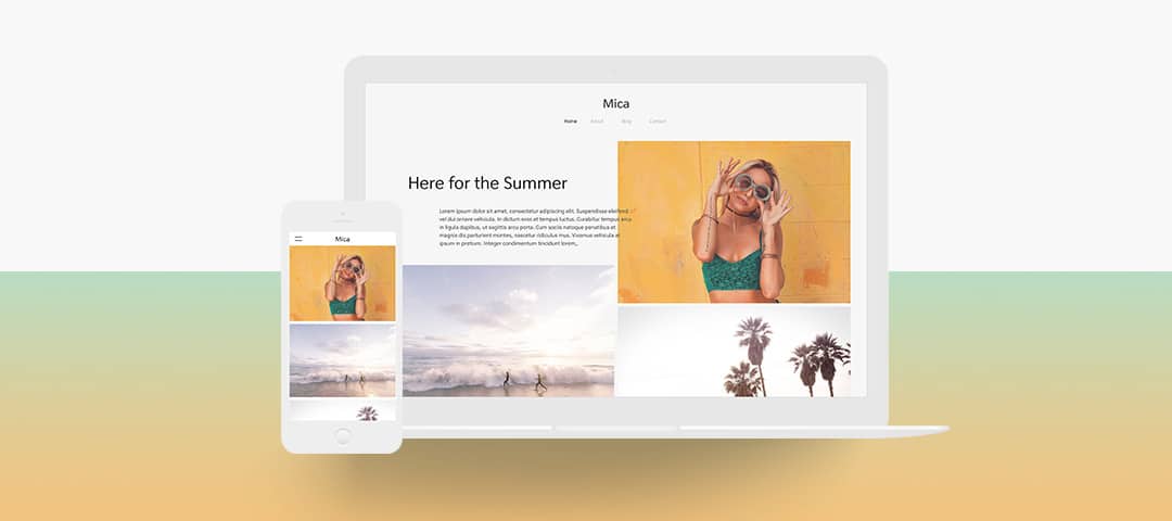
New themes are conceptualized from museum-worthy artistic inspirations—and GeoCities.
“For the Mica theme, we had a ‘design studio’ where different people from Format came together to brainstorm. I moderated the process and started with a presentation describing some of the touch points and ideologies for the theme we want to make.
“I look for inspiration and reference points that are not necessarily part of web design or design in general. In software, we often get so enamoured by a particular aesthetic. I really want to stay away from looking at other theme designs for inspiration or appropriating trends.
“At the Mica design workshop, I used was GeoCities as a reference for designing themes and understanding that design of the theme is not in this vacuum, this void of contemporary modernism, but rather understanding the history of web design.
I also used Yayoi Kusama’s work as an example of creating an open canvas in which people can enact their intent on. The reference was her The Obliteration Room which is an installation of a blank white living room that visitors changed by adding colored dots to every surface.”
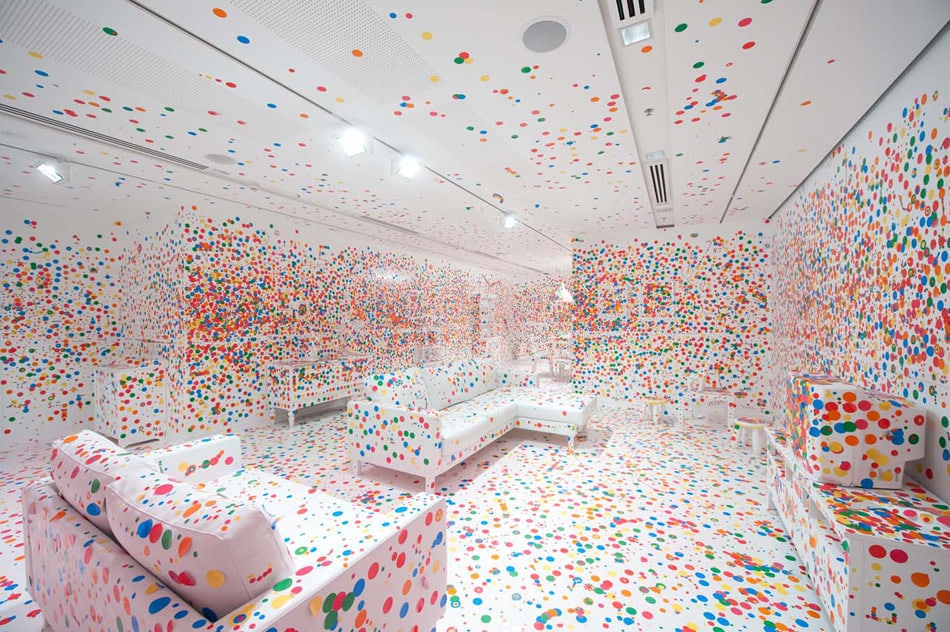
Yayoi Kusama’s The Obliteration Room via.
In the future, you could build your own Format theme.
“Right now there’s a high barrier to entry to actually making a theme from scratch because you have to know HTML, CSS and JavaScript and other things. I would love see easier tools that can help bring people who are not a web designers or developers to start building a theme.
“I think artists or people in editorial backgrounds or anyone who wants a web presence should be able to make a site. Part of that involves lowering the knowledge gaps between not knowing how to code and wanting to put together a site.
Format’s goal is to make themes that show your work with clarity. They’re timeless designs. By offering easier tools for building a theme yourself, the possibilities are endless and I’d love to see how creative people can get with their online portfolios. Format works for beginners who want to load the theme and publish right away, as well as advanced people who want to customize every detail.”
Check out Format’s templates here and contact our 24/7 customer success team at info@format.com if you have any questions.
