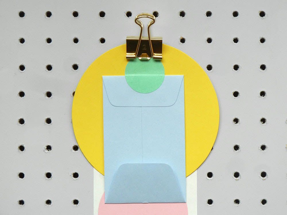
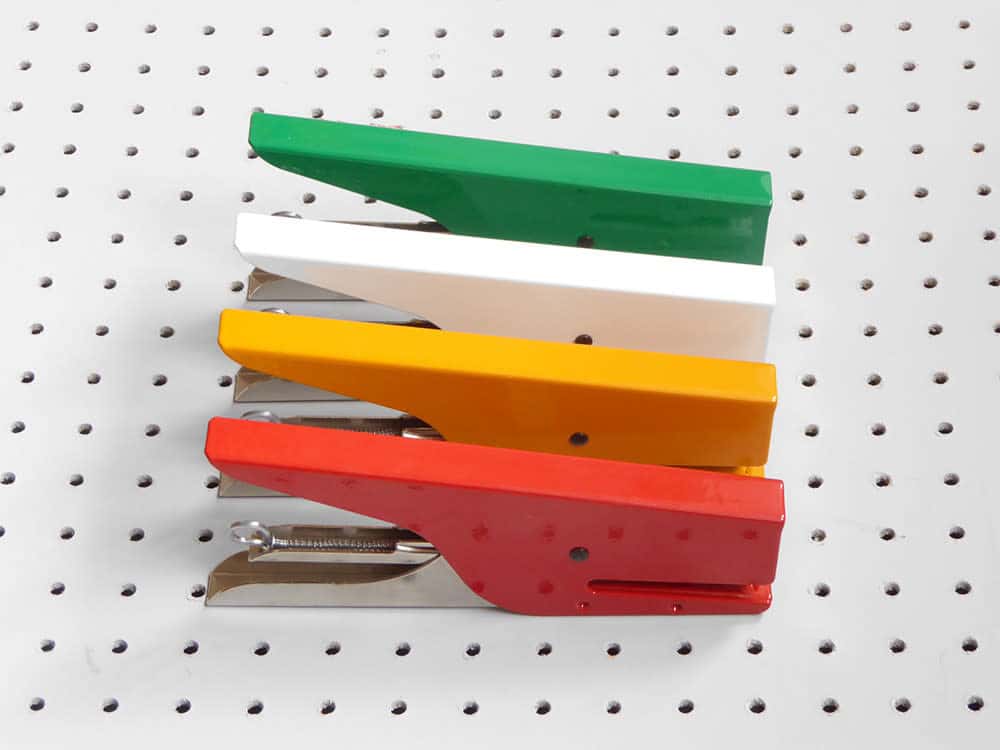
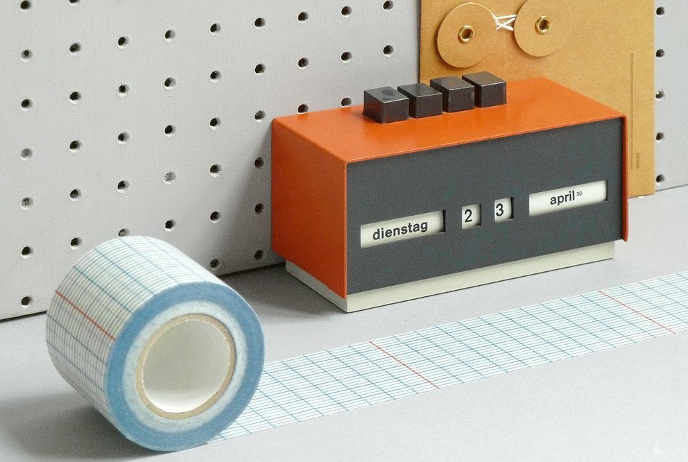
A small stationery shop with a serious cult following is changing the way people think about modern graphic design.
Located in London, Present & Correct has developed a loyal fan base due to their top notch supplies and a clean, retro aesthetic that would make Howard Hughes weak in the knees.
Scouring the globe for the crème de la crème of design tools antiques, as well as creating their own products, P&C have an approach to creativity that sits in the realm of neat and tidy nostalgia. Think “Mad Men” meets Danish modern.
Mass-produced items have a homogeny which I think people tire of, so they look to smaller designers, to the more unusual or rarer things. They feel more special.
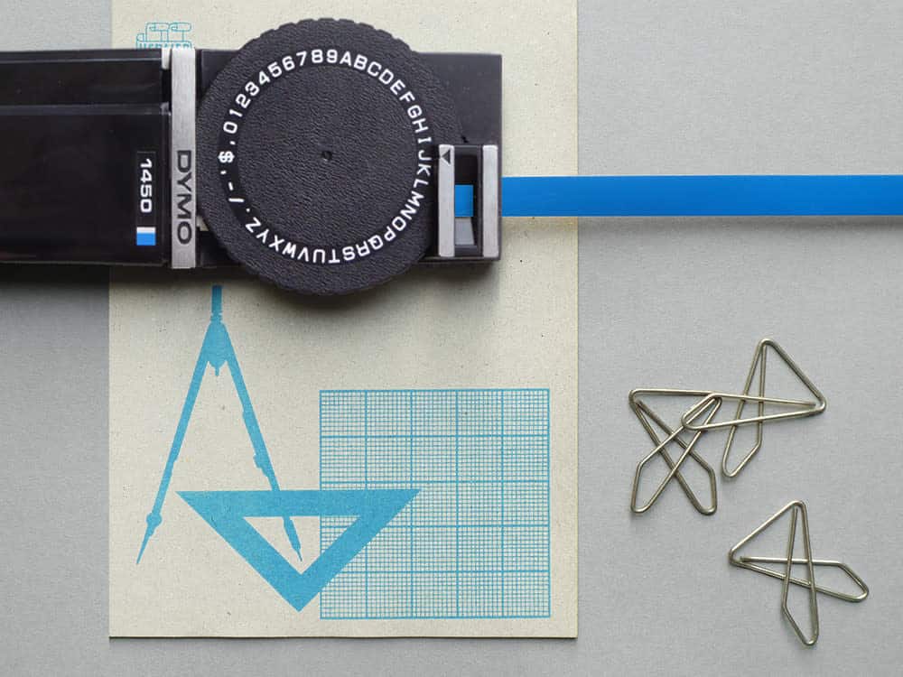
Designer and founder Neal Whittington began the business as a means to satisfy his desire to create a place that he would want to visit both online and in real life.
“It felt like an extension of what business partner Mark Smith and I already did,” Whittington explains. “P&C was always to be a place where we could sell our own designs, as well as the things we love to collect and show.”
Accumulating all things office-based, as well as mid-century toys and geometric puzzles, P&C has found a formula that makes their patrons want to work. There is something magical about purchasing a new calendar or notebook, sparking motivation to be more organized, more productive, more creative, even if the feeling is fleeting. Or maybe that’s just genius marketing at work.
A stationery fan for as long as he can remember, Whittington has early memories of buying his own office set (eraser, pencil, ruler, two notebooks) at age seven.
“I always got stationery and art supplies for Christmas and my birthday,” Whittington recalls. “I didn’t have toys. I had craft sets, pens, and paper.”
Aiming to rekindle and share this love of orderly creation, Whittington took it back the best way he knew how.
Focusing on all things analog, the majority of P&C’s designs eschew digital note-taking and communication while shedding new light on the beauty and simplicity of putting pen to paper.
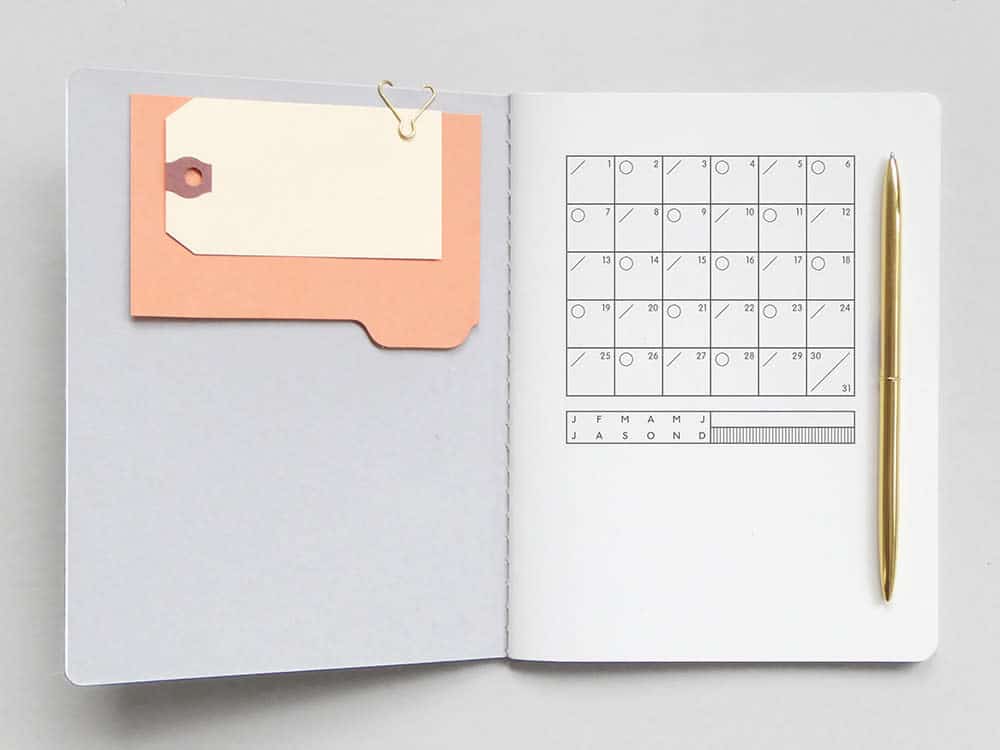
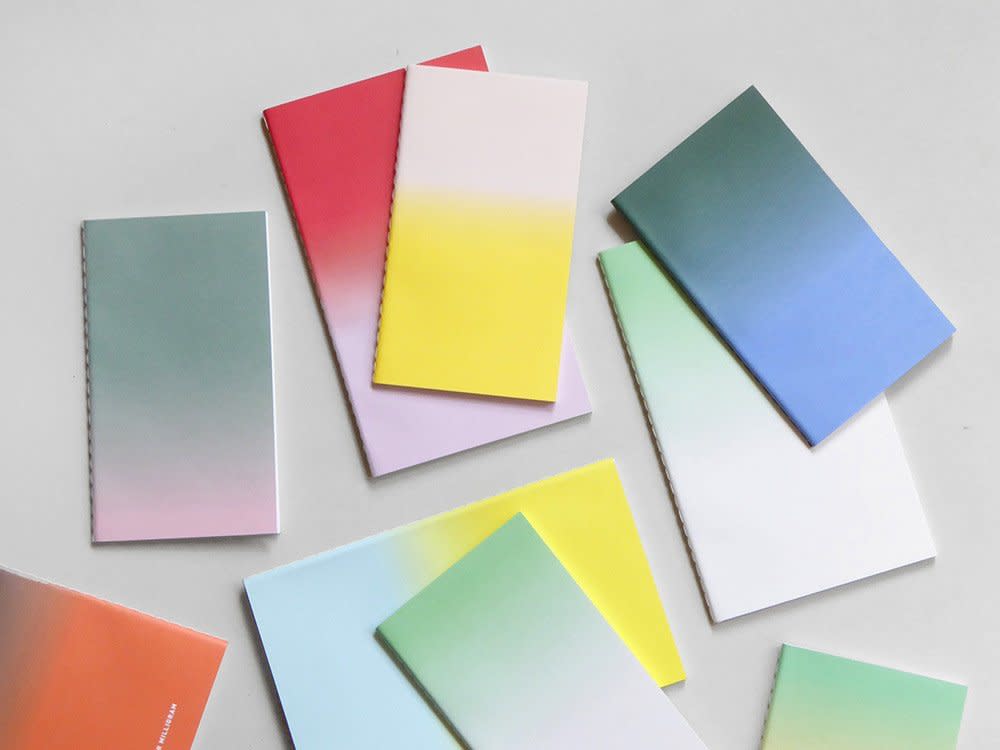
Sifting through the company’s online shop or their perfectly curated Instagram feed, it’s almost as if a portal has been opened where emails and iPhones have been replaced by the very things that inspired them. Letter-writing pads, envelopes, agendas, address books, and letterpress designs reign supreme. And let’s not forget typewriters.
One of Whittington’s earliest and most prized pieces was an Olivetti Valentine typewriter which he found at a market in London. Created with the intent of being an “anti-machine machine,” the lightweight and portable instrument is prized among design circles and antique collectors alike. One even resides in the MOMA as part of their department of architecture and design.
Looking at this offering of vintage items and throwback-inspired gadgets, you have to wonder if these retro goodies are influencing the work being created by its owners. Is your Palomino Blackwing pencil (used by the likes of John Steinbeck and Quincy Jones) or your 1970s graph paper roll going to alter how you write and design?
Apart from a current tendency to idealize the traditional methods of creating and note-taking, Whittington believes there are other factors at play when it comes to the aesthetic and trends taking place in design.
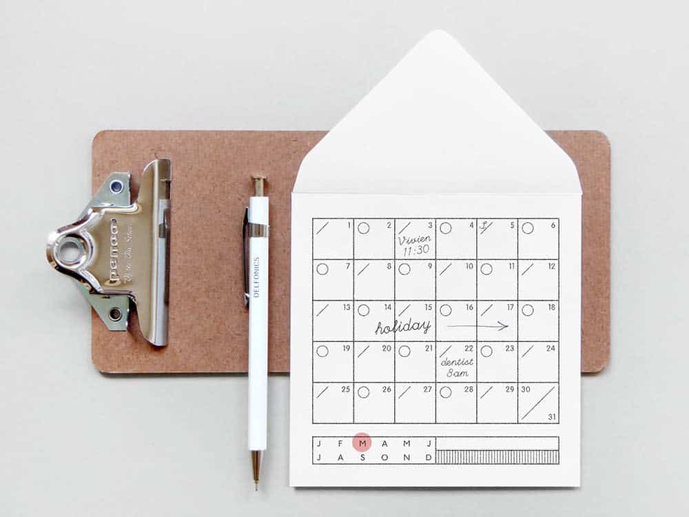
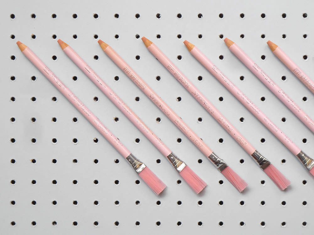
“It just so happens that right now we are going through a time saturated with technology and means of communicating which aren’t physical,” Whittington says. “Mass-produced items have a homogeny which I think people tire of, so they look to smaller designers, to the more unusual or rarer things. They feel more special.”
Whittington notes that we are often inspired by graphics from a bygone era, which also feeds into the old-school style that’s currently so trendy. Just look at Wes Anderson’s highly stylized films, Field Notes’ Futura-minded branding or Tuesday Bassen’s kitschy illustrations. The returned popularity of analog cameras and record players is another easy example.
While movements shift based on popular artists’ influence on younger generations, one constant remains: people always hanker for bygone eras. When it comes to the field of graphic design, this current direction is especially fascinating due to the field’s inherent technological base.
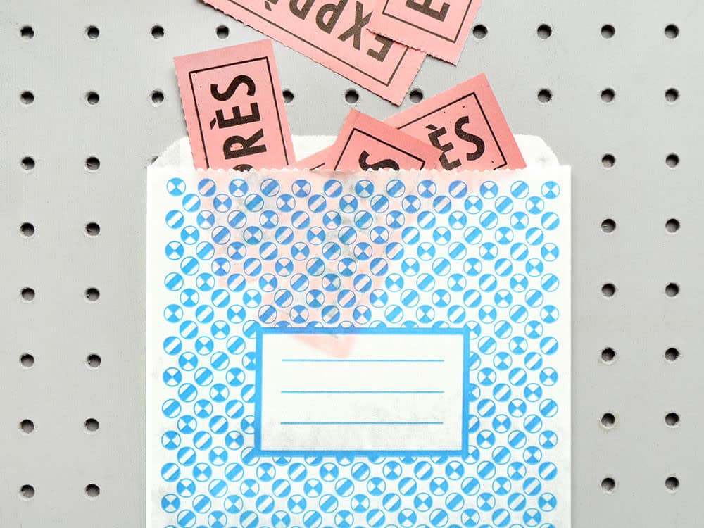
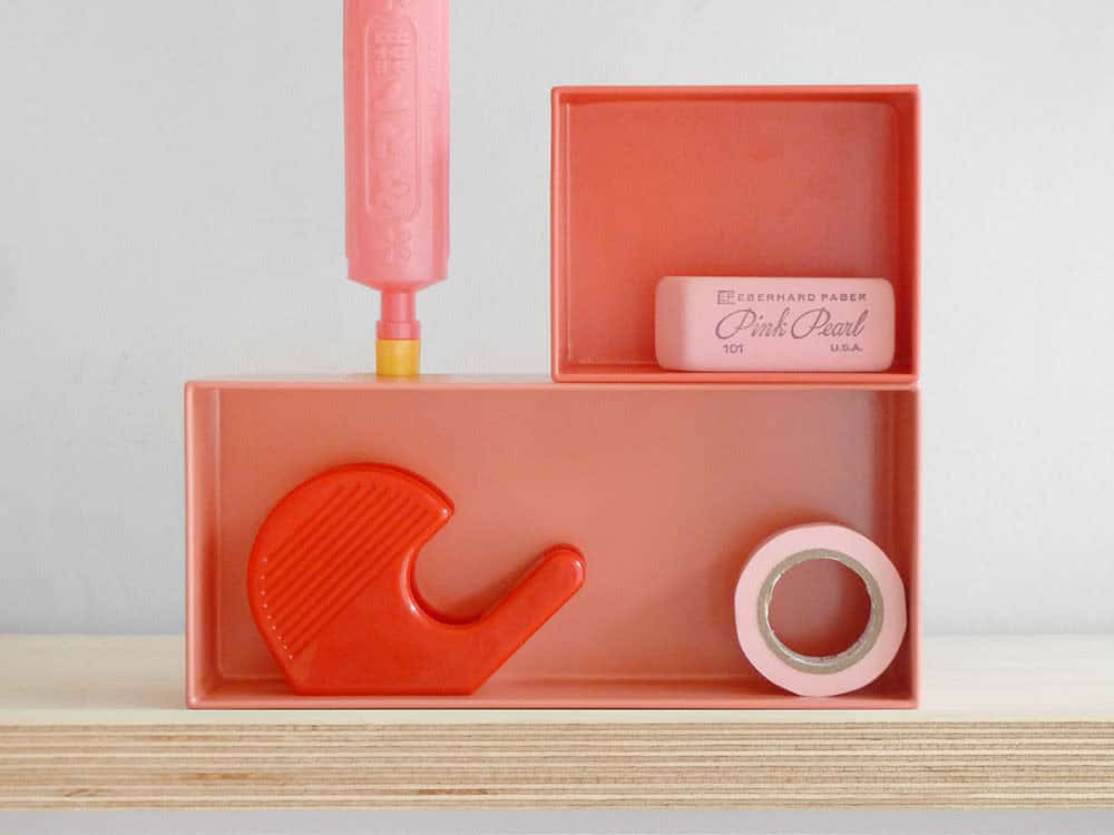
Believing that the current illustrative trend of 50s and 60s design was influenced by vector-based illustration, Whittington explains that craft, on a whole, has had a comeback, which innately feeds into graphic design.
“Craft has had a resurgence because people are more aware, and want to be more aware, of where things come from and who has made it,” Whittington says. “Again, this is a response to the mass-produced high street.”
The inclination to support small businesses, ethical production, and traditional tools and techniques are at the forefront yet again.
“To speak of these things has come to embody quality, almost like a status symbol,” Whittington says.
Working on collaborations with Monocle magazine, Chronicle Books, and Princeton Architectural Press, P&C is at the forefront of graphic design trends, and it’s a nostalgic place to be.
