Our weekly Portfolio Spotlight series is a close-up look at the talented people using Format websites to showcase their work. This week, we interview photographer Michelle Watt.
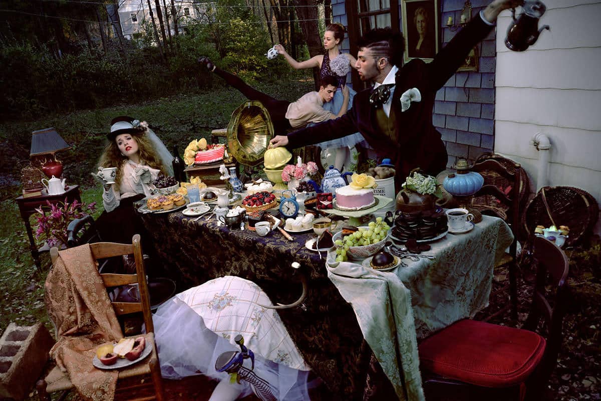
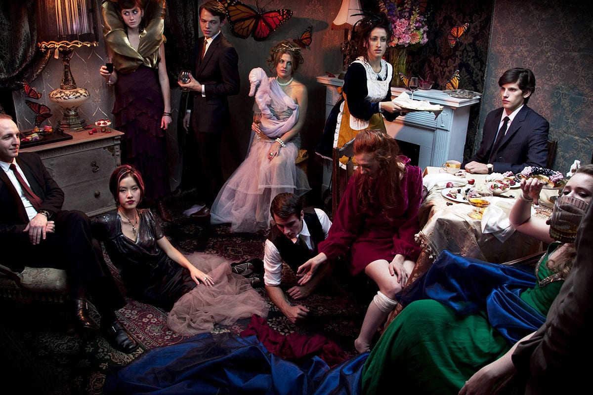
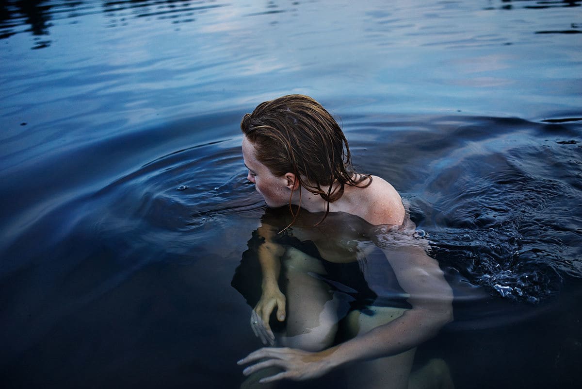
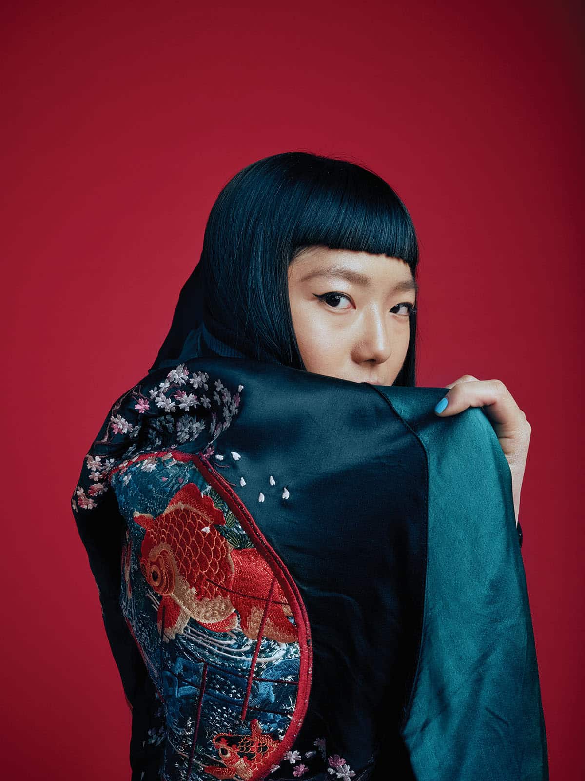
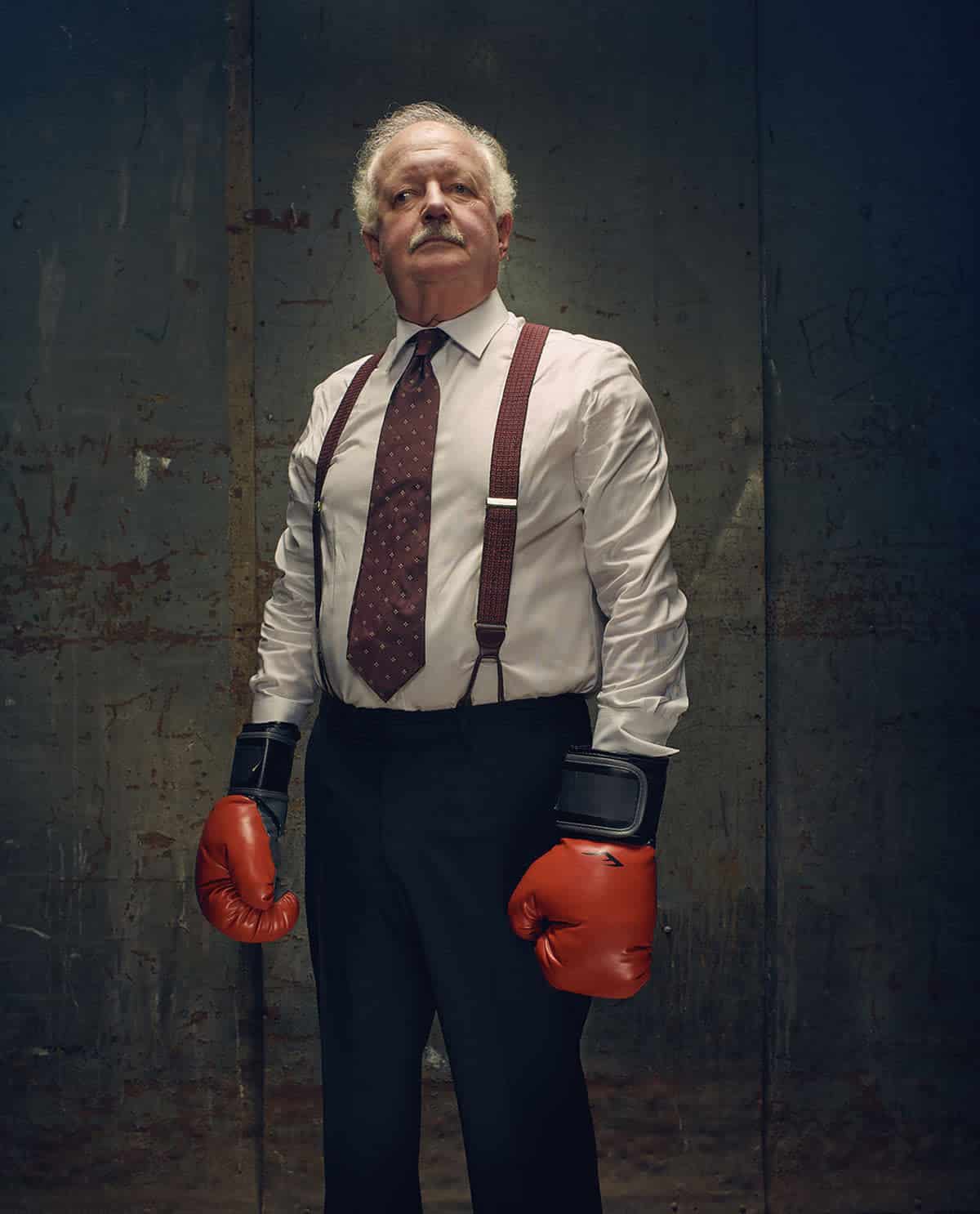
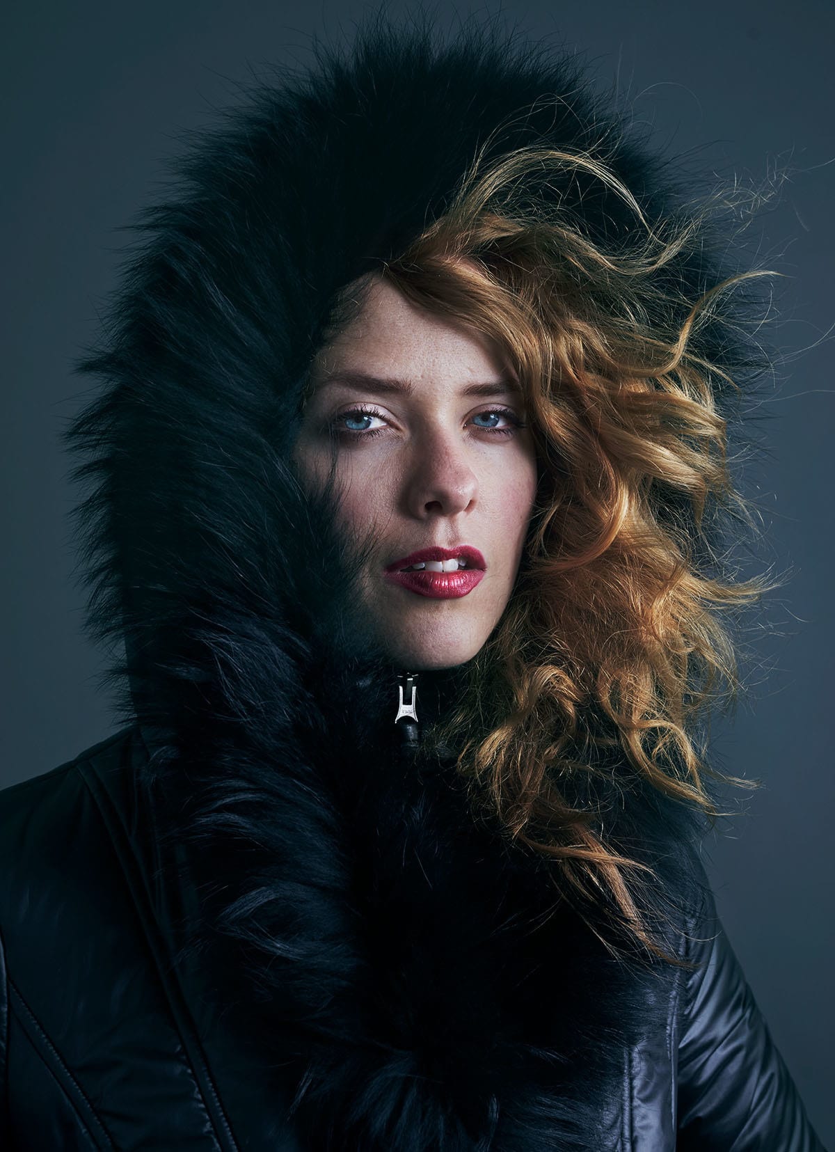
Whether it’s a commercial shoot or personal project, Michelle Watt’s photography always makes the most of the details. The New York-based photographer, who has published work in The New York Times and Village Voice, has a unique eye for composition. Her speciality is her dramatic tableaux series, intricate, colorful, and decidedly theatrical images that tell a story.
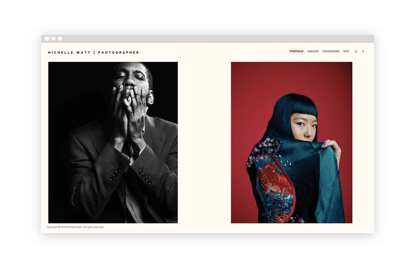
On her website, Watt pares her photography down to a few galleries of commissions, her tableaux works, and a gallery of highlights. A pale pink background adds a refined feel to her portfolio, while her use of both serif and sans serif fonts echoes the contemporary/classic contrast found in Watt’s work, which draws inspiration from fashion photography as well as 19th-century painters.
We got in touch with Watt to learn more about the inspiration behind her photography, and what goes into setting up one of her complex tableaux.
How did you first get into photography?
I picked up a camera at an early age, although I wasn’t sure I liked it at the time. I learned photography through an academic realm, one that championed intellectual explorations and revered modern fine art photographers, but none of it truly aligned with what I wanted to make. But as a teenager, it’s hard to know what you want, because you’re testing out so many life theories and ideologies at once, that the only way to know you’re going the right direction is if someone says, “Yes, you’re going the right direction.”
I was confused and thought the only photography worth anything had to be esoteric and conceptual. In hindsight, I think I was always seeking approval for the thing I wanted to shoot before I shot it. I wanted someone to point me to what I wanted to make, and say “This is good work,” which would liberate me and let me do it.
Later I found out that’s just something I need to say to myself, and my strongest work comes from that inner drive. It’s the moment when my inner voice says, “I need to make this thing sheerly because I need to lay eyes on it.”
On your website, you mention that 19th-century allegorical painting is an inspiration. Could you speak to this more? Are there any specific painters or works which stand out as influential to you?
I’m fascinated with the massive assembly of detail. The plainer the detail, the more engrossing it is. I love feeling the depiction of physical weight in suspended motion. The weight of a stance against a force of an action. A painfully gentle stroke. The curl of a toe. What is causing that unbearably subtle resistance? Ever notice how the draping of velvet can viscerally emulate the sagging of fat skin (Rubens’s cherubs)? Or between two writhing figures, is it intimacy or struggle? Often they meld into the same thing, causing an unsettling, metaphysical magnetism. Everything is suspended in oil and arranged into perfect composition. Even in the heaviest of paintings, there is a weightlessness.
All these seemingly discrete moments are made relevant simply because they’re plastered on the same canvas to tell a story. It’s the same thrill from facing a gleaming metropolitan high-rise and peering into people’s windows. You’re amounting to a larger narrative by illustrating a bunch of smaller ones happening simultaneously. An epic vista of quotidian constituents. There is poetry in that.
Earlier Flemish painting did something similar when they depicted holy beings carrying out diurnal activities. Epic beings doing non-epic things. One of my favorite classics, The Raft of Medusa, painted by Theodore Géricault in 1819, depicts the aftermath of a cataclysmic event, instead of the event itself. It is a painting about leftovers, not the feast itself. A plate of corpses and a few live ones hanging on. The painting is devoid of heroes but is undoubtedly heroic. It is a whopping 20 feet tall and totally awe-inspiring to gaze up from under. Because it’s so giant, you can swim in the details all day.
What else inspires your photography?
Instead of compiling existing “inspiration photos” for mood boards, lately I’ve been playing with the idea of image associations. It’s so simple it almost sounds dumb. Kind of like those ink blot tests, where you are given an ink blot and then asked about the first thing that pops into your head. Similarly, I take an object I’m looking at (usually the theme or subject of a shoot) and just freely list out the first things that pop into my head.
More often than not, those resulting items (or gestures) are really bizarre and don’t really have anything to do with the object, but it can ultimately make sense in a picture in a way you can’t rationalize. It’s about placing objects next to each other that you wouldn’t normally think to pair in order to transcend the individual objects themselves. Often times these combinations end up being simple.
I exercise this muscle every time I walk my dog. Today I saw some lush green ivy crawling up a wall, and I thought of a giant octopus scaling the building. Will definitely need to use that combination in a shoot. This process is a more active way of creating as opposed to a reactive way of regurgitating.
The idea arose out of a need to be better at art directing. I wanted to create something new instead of recreating something already out there. The ultimate trick is to find something in between the two, something that is yours, but something that is still relatable.
Could you talk a bit about the process behind your tableaux shoots?
The process is long and slow. I generally wait to absorb as much fodder as possible before I execute. I research a lot about the subject matter, I go deep into mythologies (written and depicted) spanning different cultures, I read short stories, I watch movies and television series with relevant themes, I flesh out narrative layers with my collaborators (stylists, set designers, etc.) who are hugely invaluable to the creation of each piece, and I practice creating narratives about strangers in public.
Sometimes I sketch, but I’m pretty awful at drawing so I end up sketching in my mind. I like to cast actors over models because actors are expert at conveying authenticity in pose. I give them motivations to play out, typically involving another character. I cluster them throughout so they create micro-narratives that give texture to the larger narrative. Ultimately I build a composition that coaxes the eye to move around the frame in order to move the viewer through the story.
Because each piece is so large in scale, involving a precise, multi-layered narrative, extremely limited budget, more than a dozen crew members and talent, and complicated location set ups, it takes an overwhelming amount of time, anxiety and patience to lay out all the moving pieces and fit them together. The whole process is super daunting.
How do you use your website to support your creative work?
As a working photographer, I should really limit the use my website to showcase the kind of work I want to get, the same way a portfolio book does. But because the website is also the main platform where I show multi-image projects or long-term photo series, it’s hard not to get carried away and just show all the latest cool stuff I’ve been working on.
In a way, because the format of the website allows me to showcase my series work in a meaningful way, I’m driven to create more series. Kind of strangely backwards but the process works!
What are you working on right now?
I’m currently working on my next tableau piece (hint: sirens and sailors) and an unconventional adventure series from various climbing trips I’ve made in the last decade.
Name two artists or photographers we should be following.
Lately I’ve been obsessing over Erik Madigan Heck’s Family Vacation series for Stern Germany, and Todd Antony’s Dekatora series of Japanese truck drivers in their ornately decorated cabins.
Think your Format portfolio should be featured in our Portfolio Spotlight series? Send us a link to be considered.
