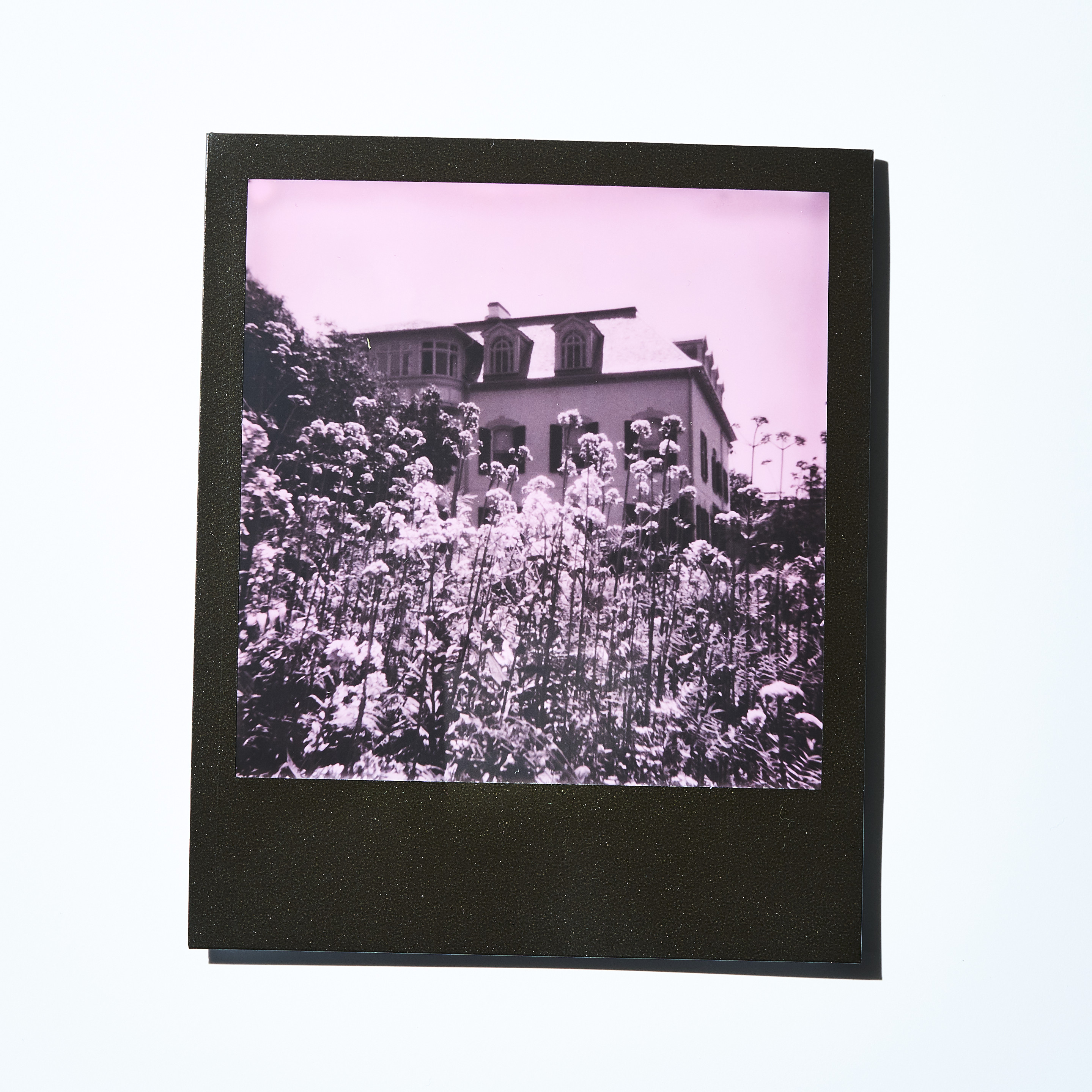
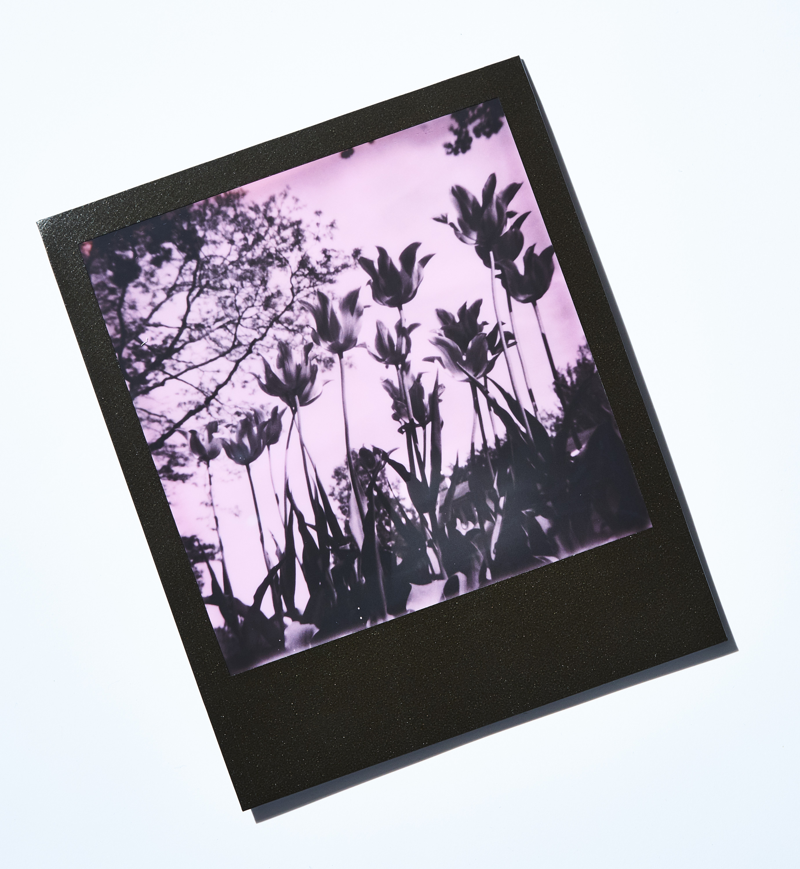
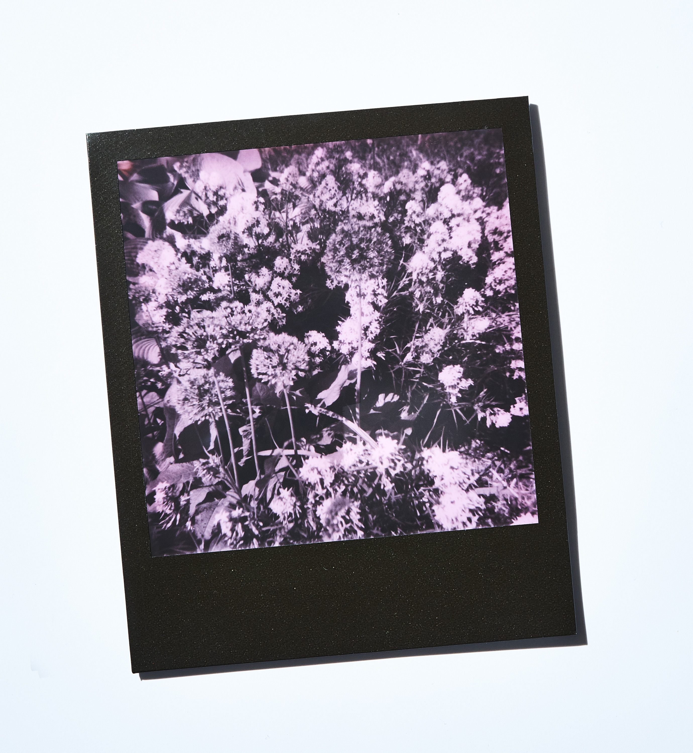
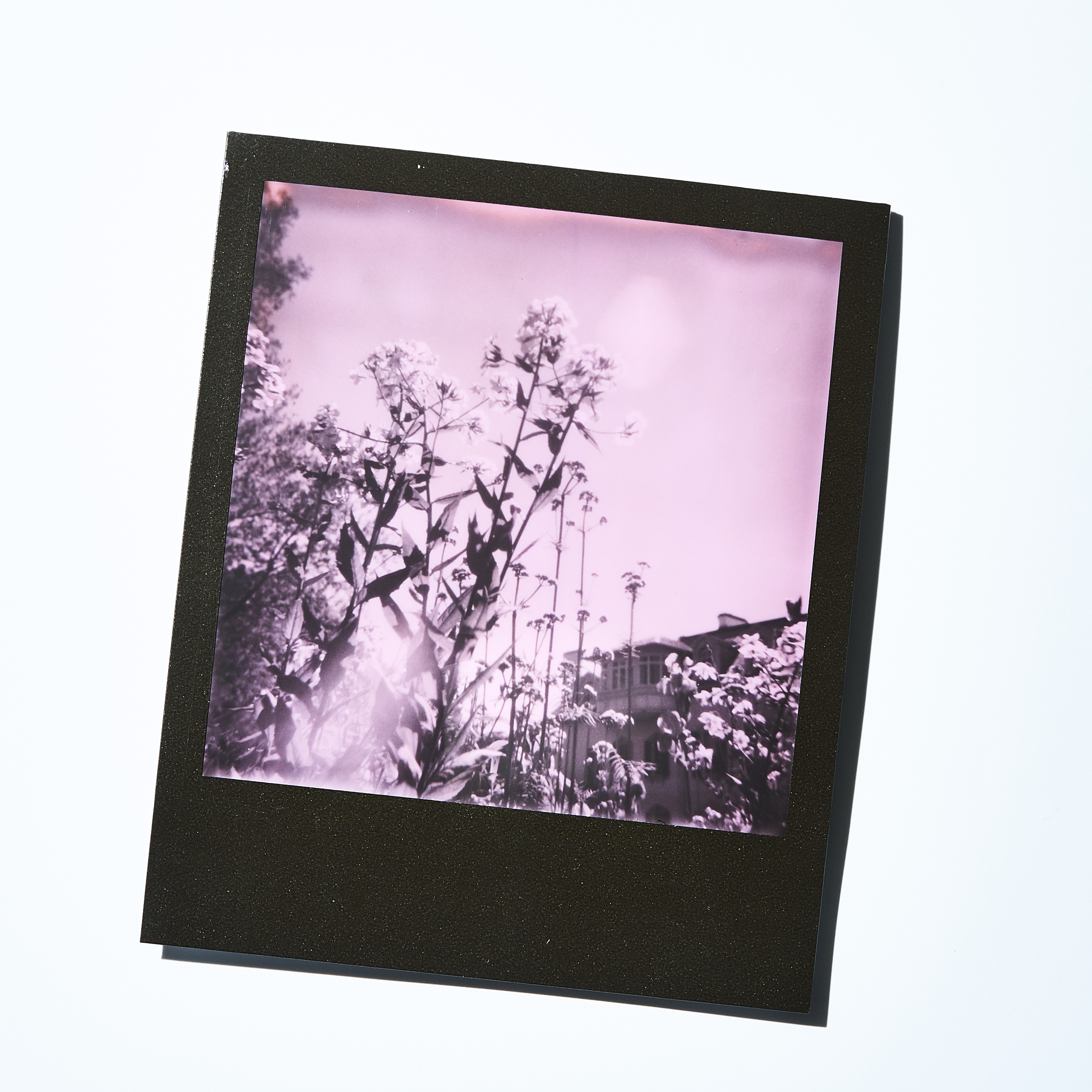
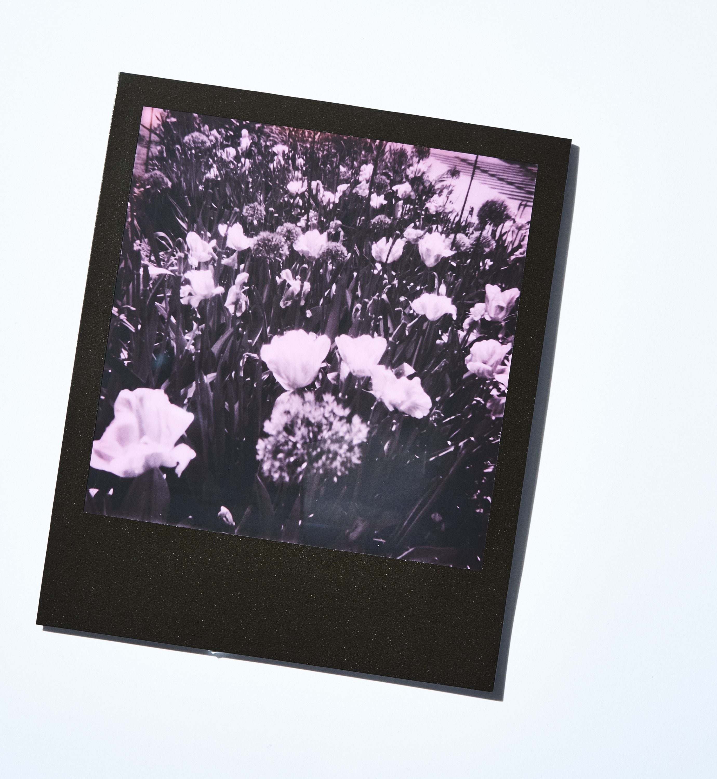
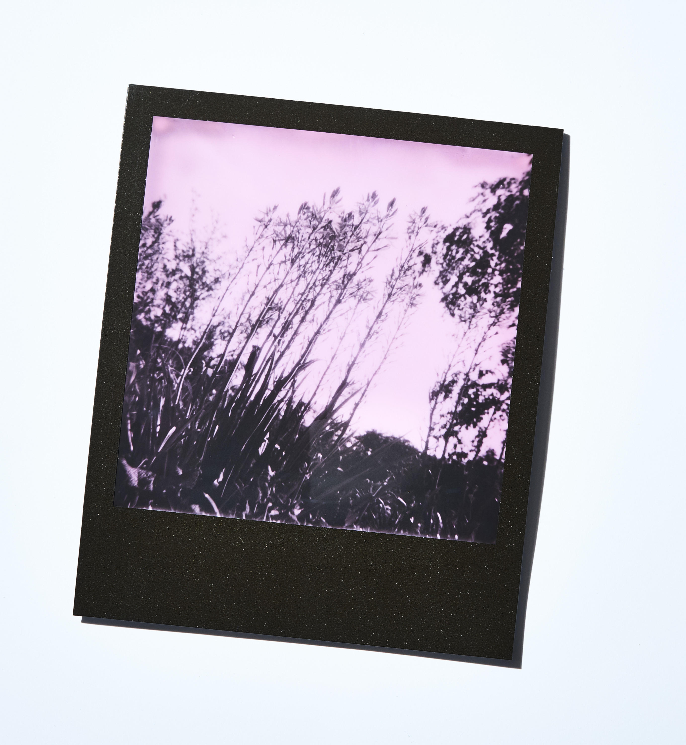
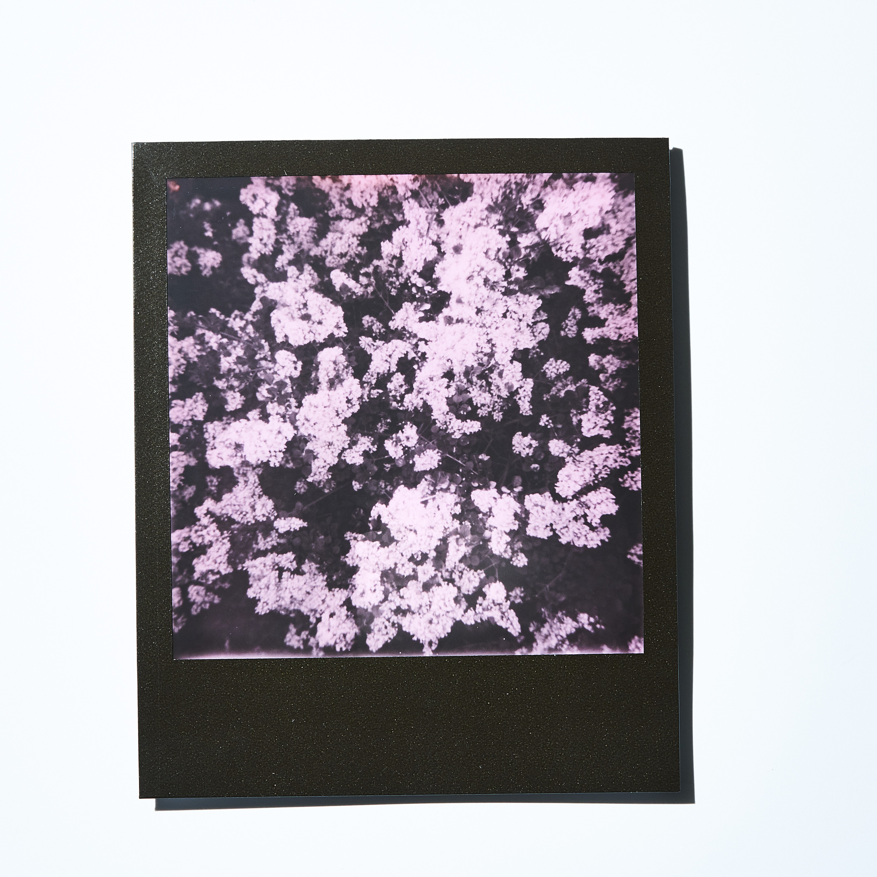
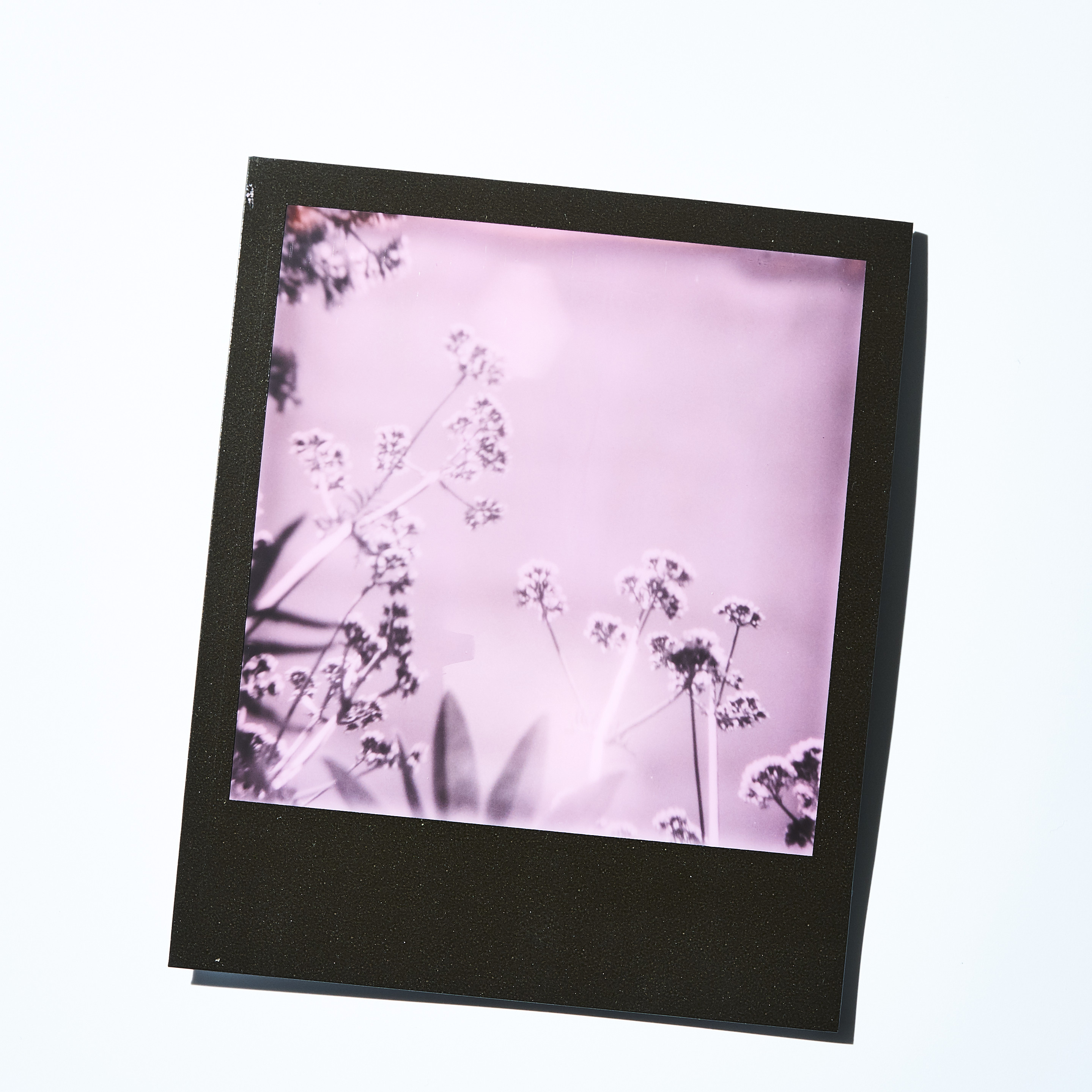
I was excited to use the new limited edition Impossible Black and Pink Duochrome film because I had virtually zero experience using instant film and welcomed the challenge. My previous experience was with the Fujifilm FP-100C and I found that it’s a rather difficult and finicky instant film to use. For example, it’s hard to load, especially if you’re on the move. The backs I was using for it (Hasselblad) didn’t use most of the area on the emulsion and thus wasted a lot of the film. Plus, the pull and peel system of processing led to many mistakes.
None of this was the case with the Impossible 600 film. It’s a more user-friendly experience which made it a lot more rewarding and fun to use. Every exposure I shot turned out and the results were consistent—you’d have to go out of your way to try to mess it up.
In case you haven’t heard about them, Impossible is a company that’s dedicated to keeping instant film alive. When Polaroid was shutting down in 2008, they bought the final 500,000 packs of Polaroid film ever made, and took over one of the last factories. The name “Impossible” comes from a quote by Edwin Land, the inventor of the polaroid camera and co-founder of Polaroid: “Don’t undertake a project unless it is manifestly important and nearly impossible.”
Since then, they’ve launched original instant film packages with metallic, color and round frames. The black and pink film I used is actually sold out now, but there’s a Black and Yellow option still available.
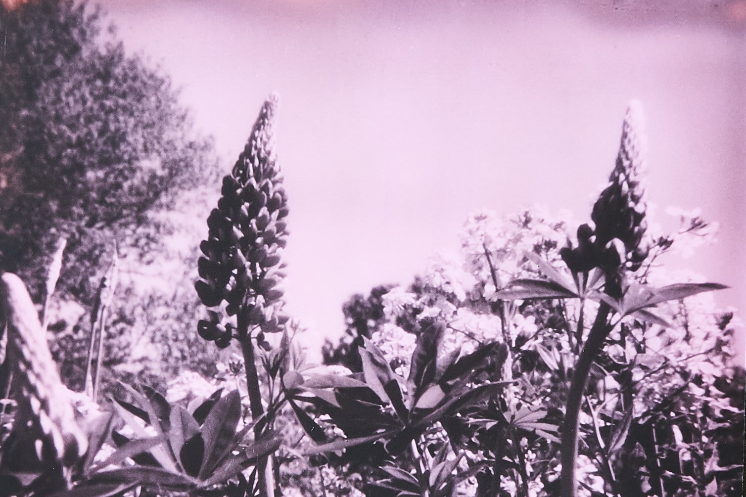
The black and pink duochrome effect is interesting. It’s essentially black and white, but as you guessed, the white is pink! It gives the photos a fun and experimental vibe. Black and white film already abstracts your subject matter, so the pink is an extension of that. You want to find very defined graphic elements within your composition, and separate your point of focus with the rest of the scenery, or background and foreground.
I tested the film with floral shots because it’s a subject matter I’m very familiar with. I found that setting flowers against greenery wasn’t as interesting as it would be in full colour because they would get jumbled together. Instead of using colours to draw the viewers attention, you are using light and dark, and strong shapes. Doing this makes your image easier to read and also creates a more dramatic effect.
The thing to keep in mind is that you are using a film stock that abstracts subject matter rather than rendering it in full fidelity, and you will want to play up and with that abstraction. I could see users finding this to be a limitation but keep in mind you aren’t choosing to use this film because it’s the same as every other.
The potential limitation is actually exactly what I found rewarding about this film stock. It made me see image-making in a completely different way and changed the way I approach a medium that I was entrenched on approaching a certain way. That’s something that other formats within other art forms would never yield: a new way to experience your own art making process. Impossible has managed to take something that other companies who produce film stock are so prescriptive about and turn it into a fun photo-mind game.
Daniel Neuhaus is the director of photography at Toronto Life magazine. Follow him on Instagram @dan_neuhaus.
