The most famous logos are the ones you’re automatically drawn to, without necessarily knowing why. Whether you’re Nike, Apple, or Coca Cola, successful branding means developing a logo that conveys excellence, reliability, and uniqueness in an image.
Big businesses aren’t the only ones who benefit from branding. As a creative professional or artist, the internet is your largest social and commercial arena. The first point of contact for clients, collaborators, and customers is your website, and it’s essential to make a memorable first impression online.
Creating a strong website logo for your creative business or artistic practice means capturing the aesthetic of your work, the individuality of your service, and the fact that you’re exceptional in your field, all without using words.
There’s no one right way of developing a balanced and striking logo. It’s both an intuitive and calculated process that incorporates your creative style, your audience’s preferences, and your understanding of the current culture and commercial climate.
Here are ten tips that will help you design a logo that’s specifically tailored to your creative brand.
1. Know yourself
Before you start thinking about what kind of logo is right for you, it’s important to have a strong sense of your image as a creative professional. Try to describe your aesthetic, personality, characteristics, strengths, and aspirations, and figure out how they fit together to create something distinctly unique.
Ask yourself these questions: What’s the purpose of your business? What are your short and long term goals? What are you offering? Who is your target audience? How do you want your work/your brand to be perceived? Who is your competition and how are they perceived? What makes you stand out?
Although you probably consider some of these factors in your day-to-day work, you may not have considered how they collectively communicate an impression of your creative business to the public.
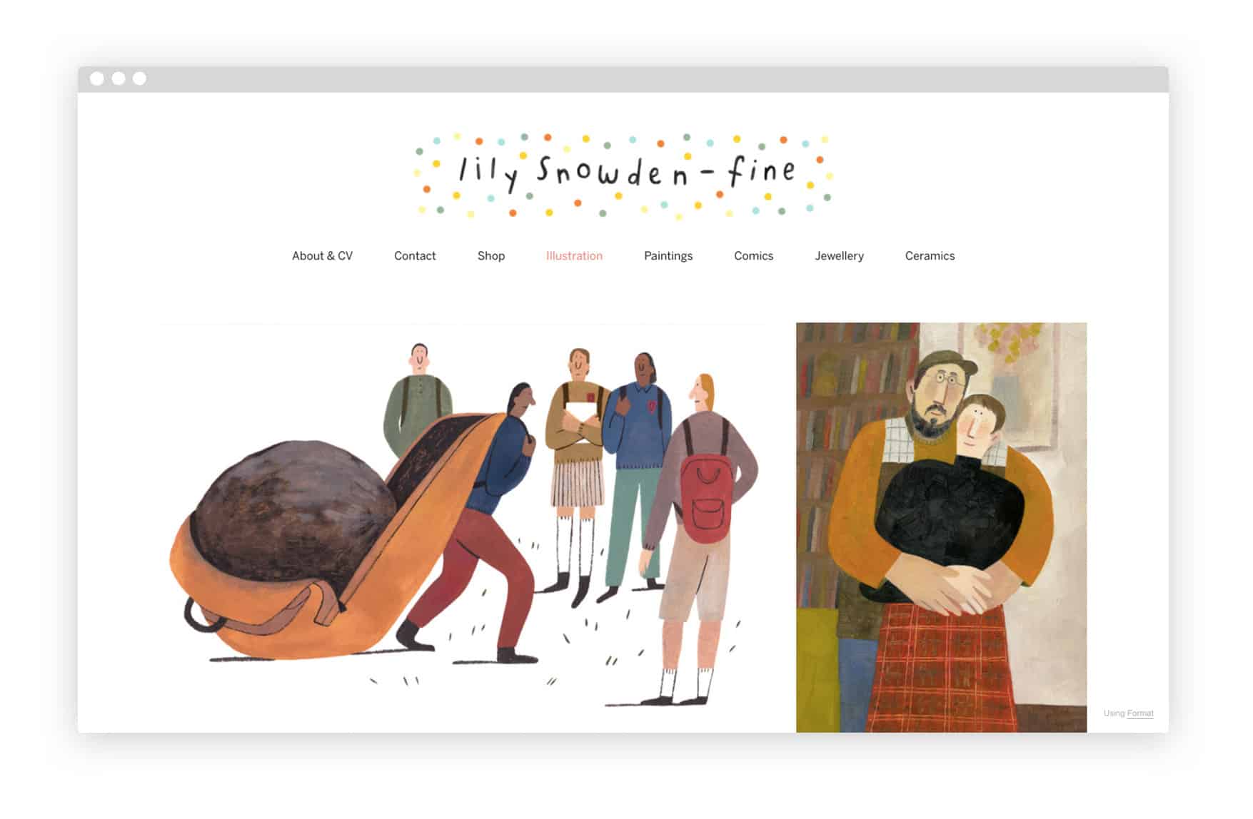
2. Create a mood board
Once you’ve thought about how you want your brand to be perceived, it’s time to explore how you want your logo to feel. Just like with any creative venture, designing an effective, polished image often requires an abstract conceptual process.
The best logos perform a task less tangible than merely communicating information—they create a positive feeling that potential clients can associate with your products and services. Your goal is for people to look at your logo and understand something valuable and unique about your business without having to put it into words.
Instilling this sense of inspiration in the final iteration of your logo requires being confident about your brand’s core aesthetic. Whether you’re a cinematographer, graphic designer, or illustrator, using a mood board to explore the tone of your brand before diving into the design process is an excellent way to maintain a depth and cohesion throughout.
Try collecting a series of colors, shapes, materials, images, quotes, and music that speak to you. Combine them in different ways and see what kind of aesthetic you come up with. Browse outside of your comfort zone on websites like Google Images, Pinterest, Instagram, Flickr, and Unsplash. Don’t just find logos from similar artists and leave it at that—the more diverse your mood board, the better. Remember to be inspired by your own portfolio of work as well, as that’s ultimately what you’re selling.
Go with what you’re intuitively drawn to, then pare your mood board down until you’re left with a look and feel that’s exciting and evocative, and build your logo design around it.
3. Avoid design cliches
The next step is to create the first iterations of your logo. The best way to start is by picking up a sketchbook and just drawing. This is your chance to explore lots of different visualizations, so don’t hold back. Try experimenting with concepts that you’re not positive are the right fit—you might be surprised by what you end up with.
As you narrow down your selection, cut anything that looks too familiar or procedural. Check out the logos of other brands in your niche. Especially as a creative professional, it’s imperative that you give clients the impression that your work is original. The last thing you want is for them to look at your logo and think about another artist.
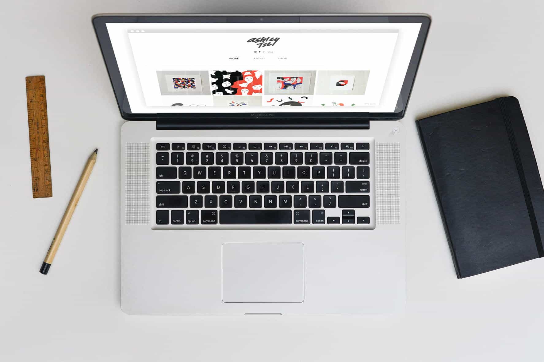
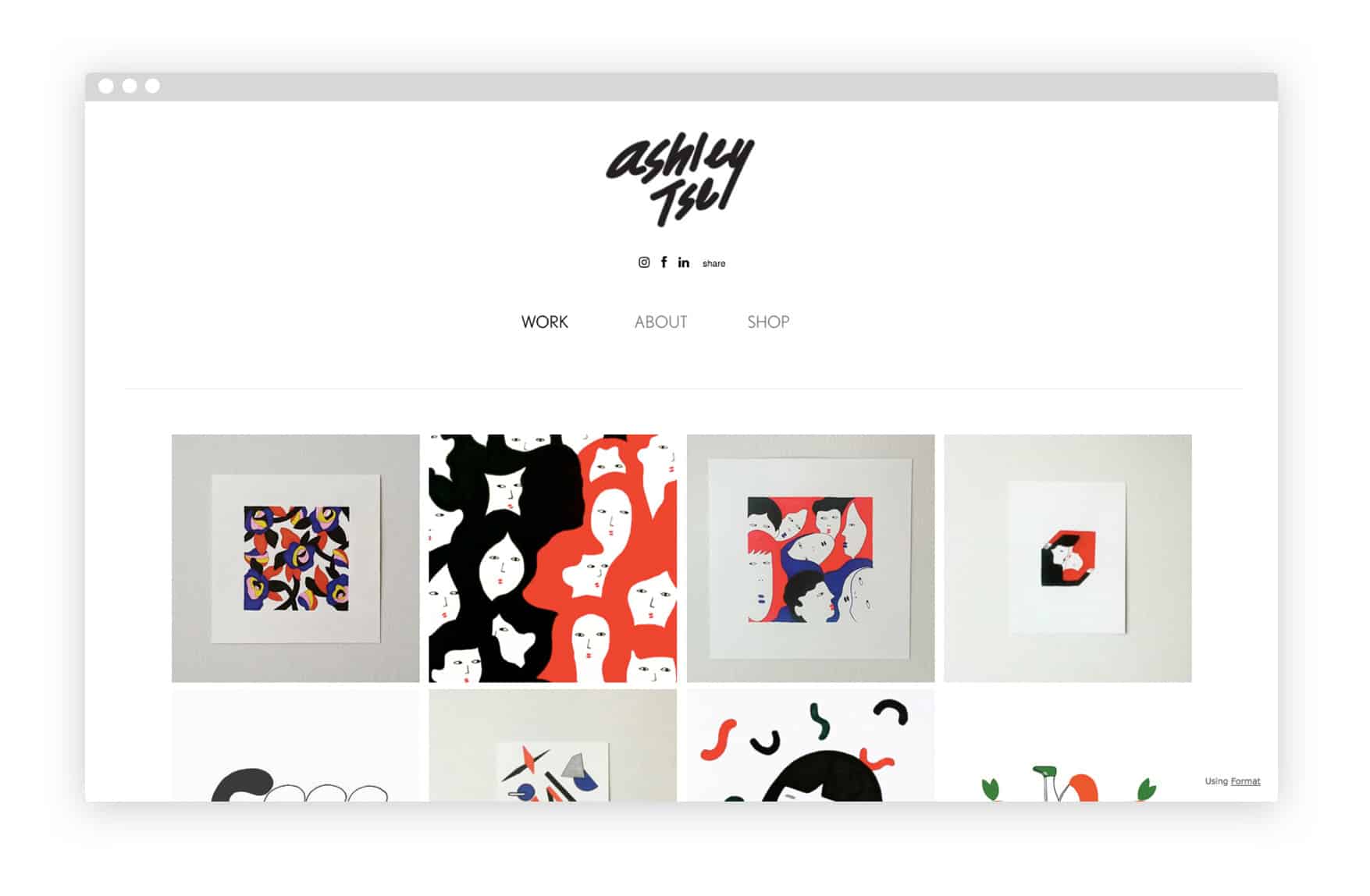
For some creative entrepreneurs, conceiving of the right logo comes in a moment of insight. “It took me almost a year to uniquely capture the qualities of my work in a logo,” says illustrator Ashley Tse. “Up until then, most of what I came up with was too complicated and rigid, probably because I was trying to focus on what was trendy instead of having confidence in my own style. The final version took me fifteen minutes to make. I was so exhausted and defeated that I pretty much said, ‘I’ll just write my name and be done with it.’”
An easy way to test the originality of your logo concept early on is by conducting your own market research with friends and family. This also gives you a sense of the immediate associations your logo conjures up. Although acquaintances will likely be biased toward admiring your work, if your logo makes them think of certain experiences, characteristics, or emotions rather than other products or brands, that means you’re on the right track.
4. Be clever
Sometimes designing a logo that stands out is about being clever—but not necessarily in the way you might think.
Many of the world’s most recognizable logos feature disguised imagery that the majority of people don’t notice. For example, the negative space between Fedex’s lettering forms a hidden arrow, Baskin Robbins’ “BR” logo contains the number “31″ to celebrate their wide selection of flavors, and the golden Matterhorn peak on Toblerone’s packaging secretly depicts a majestic bear.
Perhaps the cleverest well-known logo design belongs to NBC. Most people recognize the television network’s emblem, a half circle of rainbow colors shaped like flower petals. But if you’re under fifty years old, what you might not know is that the logo actually depicts a peacock designed to emphasize NBC’s early color programing. You also probably haven’t noticed that the bird is looking to the right to express forward thinking, or that its multi-colored feathers represent the network’s six divisions: News, Sports, Entertainment, Stations, Network, and Productions.
Logos like NBC’s aren’t effective because customers have an “Aha!” moment and recognize a series of hidden messages when they look at them. They’re successful because they make us feel cohesion, depth, emphasis, direction, and clarity subconsciously, without really knowing why we feel them. Strong branding offers customers the confidence, excitement, and originality of your vision without the effort of having to solve a puzzle. Choosing to be your client should feel natural, not orchestrated, and your logo is a central part of the process.
A great way to subliminally communicate your business’s ethos is to associate the aesthetics of your logo with the products you offer. Being self-referential can also help break down the artist-customer barrier by making your brand feel more accessible.
5. Dust off your color wheel
Color can be a powerful tool in any logo design. Every shade has unique connotations based on its historical and cultural associations. Tapping into these can help you create a logo that clearly expresses your brand without overemphasis.
Choosing the right colors requires a mix of science and intuition. It’s helpful to reference color psychology in your design process, but ultimately what matters is whether or not people feel something when they look at your logo. Start off by exploring the primary colors and their various meanings. There are over thirty-three shades of red, twenty-nine shades of blue, and twenty shades of yellow, and each one facilitates a slightly different experience.
Keep in mind that colors mean different things in different contexts. According to Martin Amsteus, a marketing professor at Linnaeus University in Sweden, blue can indicate hygiene, cleanliness, calm, peace, high quality, freshness, attractiveness, and effectiveness, depending on the situation in which its being presented. Black also has a range of associations, including power, expensiveness, high quality, luxury, death, fear, anger, sadness, mystery, and darkness. Red and white can remind a customer of Switzerland, England, or medical services, while red alone might make that same person think of romance, anger, or blood, depending on which shade you use. While you might be interested in the general connotations a given color has, incorporating it into your logo design effectively can be tricky.
Remember that the medium is the message. If you offer a wide array of products and services like NBC, creating a logo using multiple colors in a layered or blocked style helps make your brand feel diverse and inclusive.
On the other hand, if what you offer is more specialized, consider reflecting that by using a singular color or grayscale. “My illustrations are quite simple, with limited color, and easy shapes,” says Tse. “So my logo is just my name in black—a very easy and simple ‘Ashley Tse’ with no bells or whistles.”
6. Think long-term
Being color conscious can also help you achieve the most important goal in branding: timelessness.
Designing a logo that’s compatible with a variety of color schemes allows you to maintain your core image while simultaneously innovating along the way. As your brand becomes more recognizable and your client list grows, the value of your logo will increase. This is called brand recognition—a phenomenon in which a logo becomes synonymous with excellence independent of the competitive advantage of the products it represents. It means potential customers who see your logo have some level of subconscious preference for your business simply because your brand is familiar.
Taking advantage of brand recognition down the line is one of the main reasons you should develop your logo early on. A time-proof logo design considers both aesthetics and a broad spectrum of multimedia applications.
7. Custom typography is key
Like colors, fonts evoke a wide range of feelings. The typographical elements of your logo can be just as impactful as the graphics, so make sure to select a font that bolsters your overarching design and underscores the distinct feeling you’re trying to convey.
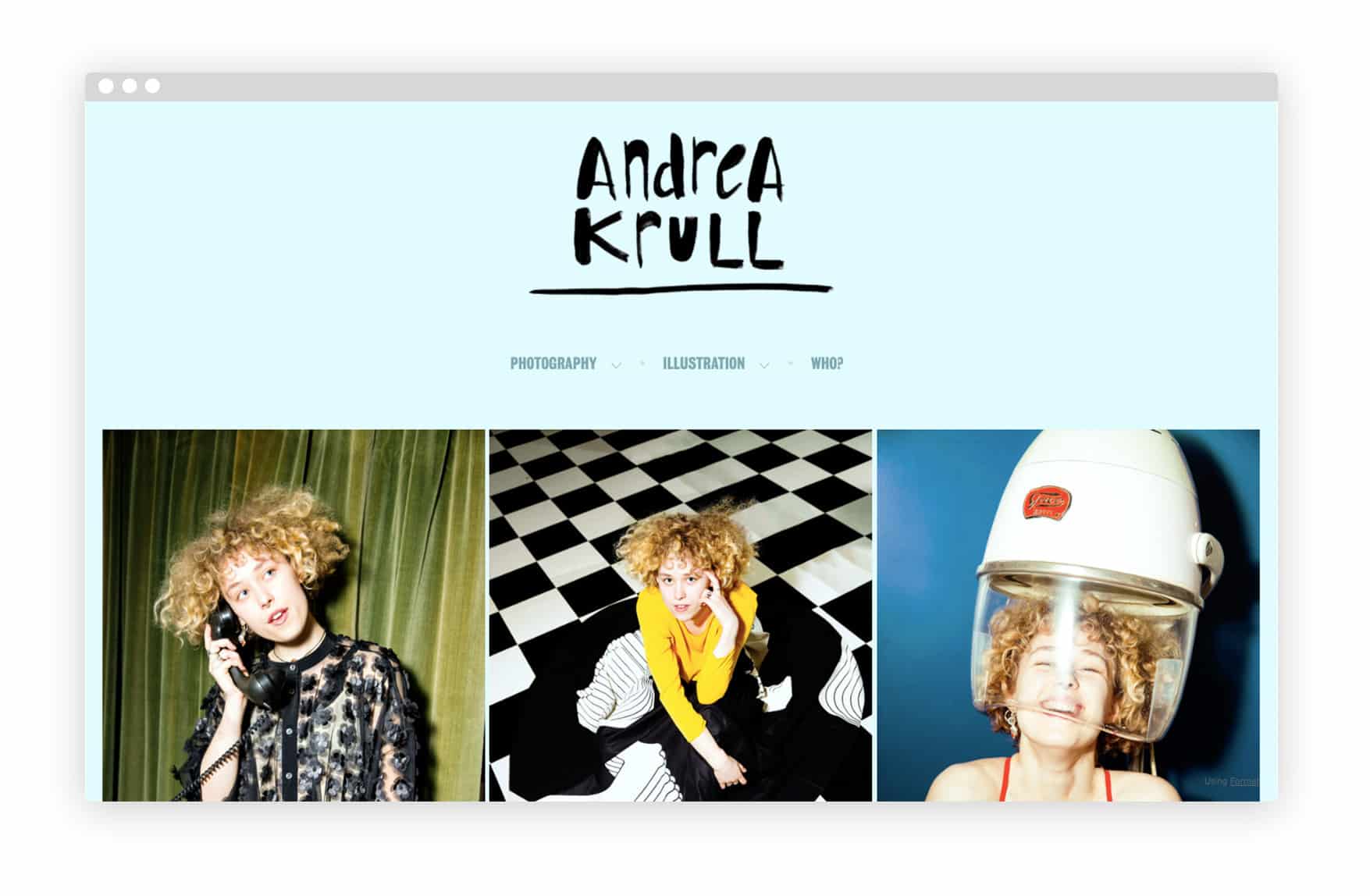
“I designed my own typeface because it was really important for me to use my own handwriting,” says Denmark-based photographer and illustrator Andrea Krull. “I wanted a simple and memorable logo with the same visual expression as my illustrations and artwork.”
Type shapes generally break down into two broad categories: serif and sans serif. If you’re a wedding photographer and want to appear traditional, use a font with serifs. Sans serif fonts, on the other hand, tend to feel more contemporary. Above all, choose a font that people aren’t used to seeing, especially in their own word processors. Designing a logo that looks like it was created using Microsoft Office Suite drastically degrades your professionalism.
A great way to ensure that your logo’s font is unique and fits with your brand’s ethos is to use custom type. There are many high quality, user friendly font creators available online. You can adapt several different existing typefaces using Metaflop, or design a font completely from scratch with FontForge. If you have a bigger budget and want to explore world-class custom fonts, check out the award-winning work of the design companies Webtype and Type Network.
No matter which typeface you land on, stick to one font and don’t choose anything too elaborate or cramped-looking. Just as you want to avoid using unnecessarily complicated graphics, logo text should feel effortlessly accessible.
8. Digital rendering
Now that you’ve designed your logo, it’s time to transfer it to a digital platform. There are many ways of doing this, depending on your software preferences and tech-savviness.
If you’re not a particularly high-tech person, try rendering your sketches the old fashioned way by simply scanning them. From there, you can edit your logo on any number of different design softwares. The most common prosumer editor for logos is Adobe Illustrator, but there are plenty of alternatives available on the web. A great option is Canva, a free graphic design website that lets you drag and drop a variety of images, graphics, and fonts to create a more than satisfactory logo.
The most import step in digitizing your logo is creating what’s called a vector. Vectorizing an image basically means converting all its pixels into individual graphic components that represent discrete elements of its composition. You can then adjust or delete each of these vectorized components as you like. This allows you to stretch a square into a rectangle, or turn an image configured as an email signature into a t-shirt graphic, without distorting or blurring the visual quality of your logo.
Vectors are most useful for working with simplistic graphics. For instance, vectorizing a high resolution photograph would greatly decrease its clarity, creating a blotchy, painterly color scheme.
Digitizing your logo can seem daunting. Luckily, in 2018 there are countless businesses that will do it for you at an affordable rate. A good place to start is Freelancer, a website where artists and designers from around the world offer their services at a range of price points.
If design is not your strong suit, you can even outsource the entire logo design process while working closely with a designer to develop an image that meets your needs.
9. Find your balance
One of the last steps in designing a logo that truly reaches customers is creating a balanced image. Balance is both a literal and figurative quality. It can be the intangible feelings of quality and daring embodied by Nike’s swoosh or the visual symmetry of Target’s bullseye.
According to Christopher McManus, a professor of Psychology and Medical Education at University College London, symmetry and asymmetry create aesthetic balance in different ways. While the literal balance of symmetry can be aesthetically pleasing, mirrored images sometimes have a sterility and rigidness that are absent in the dynamic, unpredictable pleasure of asymmetry.
Highly successful logos, like LG’s winking face, capitalize on both types of balance by featuring asymmetrical elements layered on top of a symmetrical motif. A balanced logo composition is one that feels right and is easy on the eyes. Whether you rely on science or trial and error, the final product should feel stable and pleasing.
10. Understand your moment
Designing an effective logo can be a precarious process that depends on many different factors. Following the above steps will help you distill your capabilities, values, and originality into a single image. The last thing to consider is whether you want to brand yourself as a creative company or as an artist.
When you’re selling an artistic service or product, one of the central challenges is figuring out how to be both unique and widely appealing. In the creative business world, where you fall on the spectrum between artist and corporation greatly determines what type of logo will suit your needs. But whether you’re a painter or a marketing copywriter, you need to tailor your brand to the cultural moment you’re in.
Creating a powerful logo in 2018 is as much about being relatable and exciting as it is about being aesthetically enticing. It’s about understanding both your ethos and your customers’ desires, and putting them together into a single image.
