It wasn’t enough for these cutting-edge contemporary galleries to house contemporary and modern art in a solid white square. Instead, they became art in themselves. From concrete slabs to delicate constructions of glass and metal, these museum extensions and galleries have viewers starting and ending their visits in awe.
Including daring work by Daniel Libeskind, classic Frank Gehry structures, and unique innovations by other top architects, this list rounds up ten of the best-designed galleries completed in the last 25 years.
Some of this architecture is in the form of additions to existing historic structures, while other buildings are completely new creations. All of these museums are fascinating examples of contemporary design, and of the way gallery buildings can be just as artistic as the works they display.
Guggenheim BilbaoBilbao, Spain, 1997
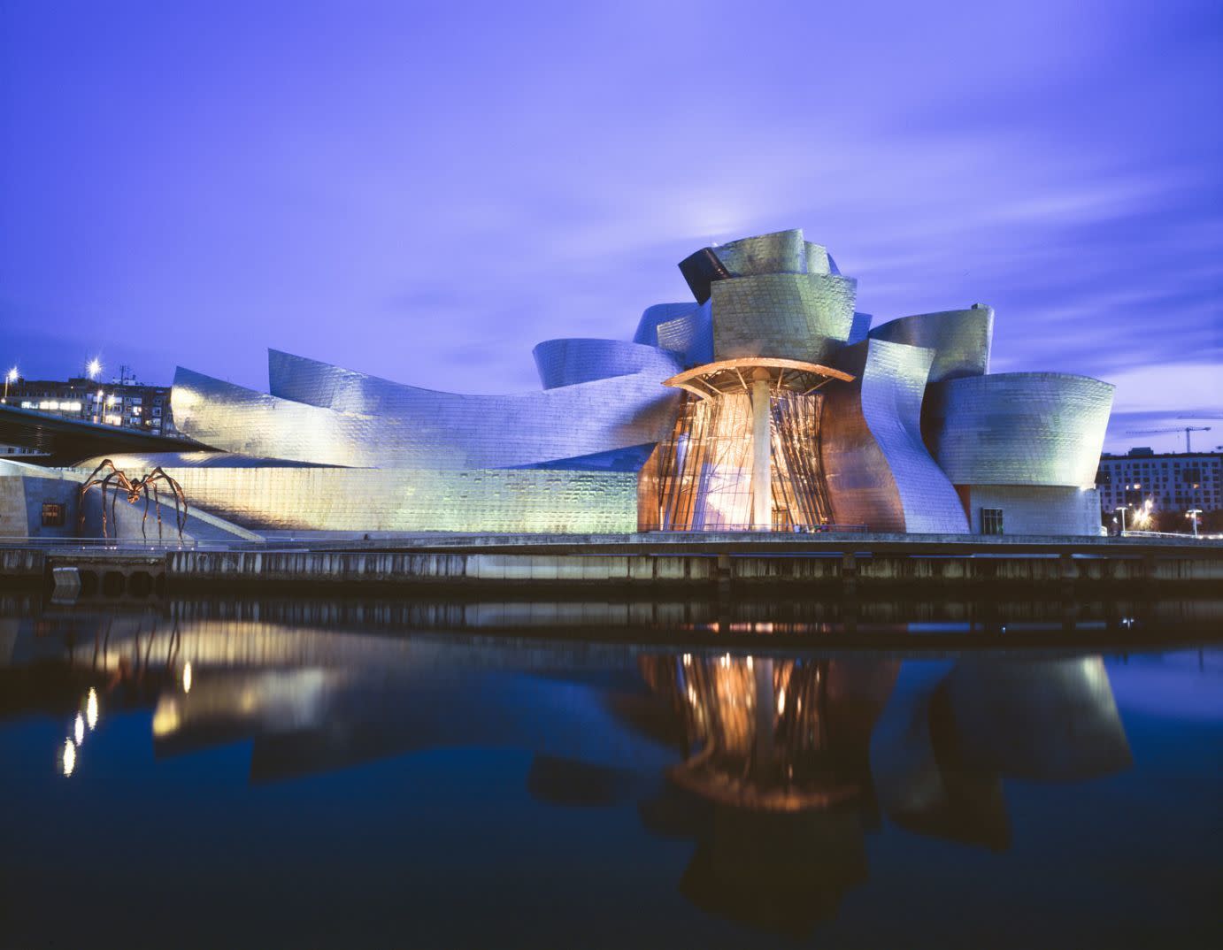
This Frank Gehry-designed museum in Spain has been known for its architecture for almost two decades, and still remains one of the best. The reflective titanium walls built in undulating geometric shapes sparkle and shine in the sun.
The building is designed to catch the light and reflect it, making it stand out while simultaneously blending in to its urban surroundings. Gehry also made use of limestone and glass for the Guggenheim Bilbao, creating a striking contrast between natural and artificial materials.
The Rosenthal Center for Contemporary ArtCincinnati, USA, 2003
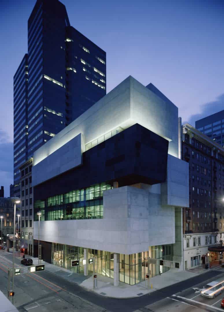
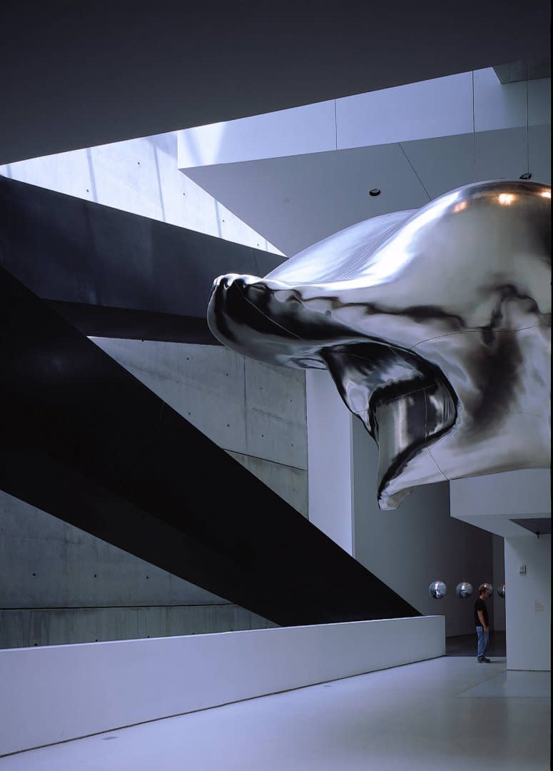
This gallery, which does not hold one permanent collection but rather rotates through exhibitions, needed an original design in order to reflect its ever-changing nature. The first female architect to complete a major museum project in America, Zaha Hadid designed the Rosenthal Center for Contemporary Art as a structure that would draw attention to the artwork it housed.
The gallery resembles different-sized stacked shapes in white, black, and clear glass. Hadid used concrete and matte black aluminum to create this facade, which fits together like an unfinished puzzle you can’t take your eyes off of.
The Akron Art Museum, Knight BuildingAkron, USA, 2004
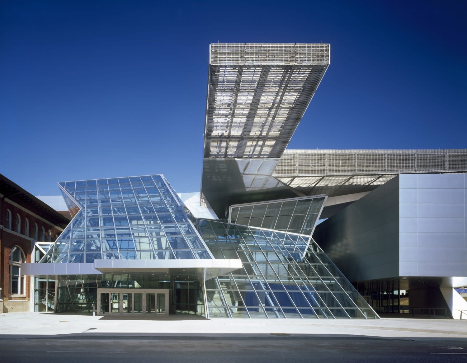
The architects at COOP HIMMELB(L)AU understand that an art museum in a city is no longer a place just to keep and view art, but also a contribution to an urban landscape. This was the thinking around their extension to the Akron Art Museum in Ohio, which stands in stark contrast to the original building. The original brick and limestone now has an added three stories of glass and steel.
The components of this new structure are: the Crystal, which serves as the entryway; the Gallery box; and the Roof Cloud that floats above the building. Besides designing the extension to be a must-see in the city, the architects took steps to ensure that the structure would conserve energy and bring in natural light while also providing necessary shade.
National Museum of ArtOsaka, Japan, 2004
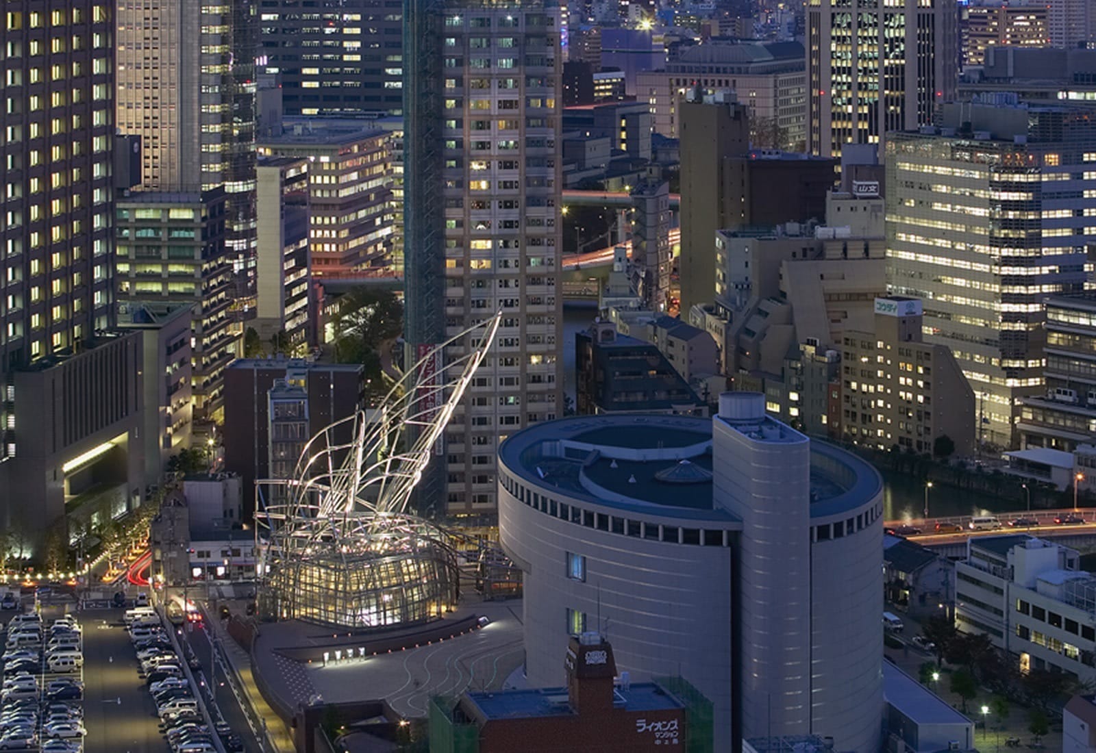
With most of this museum residing underground, the only visible part of the National Art Museum is a large metal structure resembling giant, insect-wings, and the huge glass and steel lobby area.
Architects Pelli Clarke Pelli were able to make this building feel light even though it is largely beneath the earth, occupying two floors below ground on Nakanoshima Island in central Osaka. Despite its subterranean location, the architects ensured that the museum receives enough natural light.
The delicate metallic sculpture that can be seen above ground is intended to “resemble reeds along a riverbank or arching stalks of a bamboo grove,” according to Pelli Clarke Pelli.
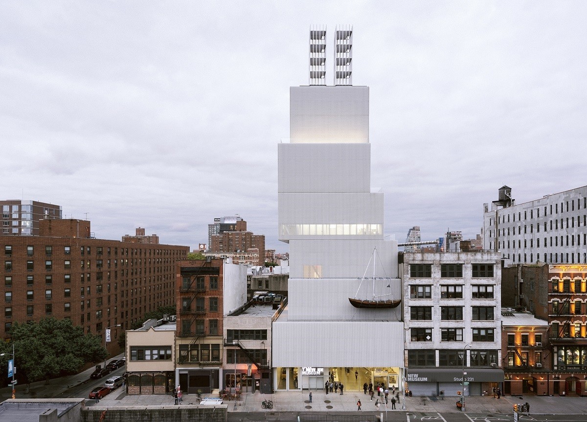
The New Museum on the BoweryNew York City, USA, 2007
This museum is housed in what looks like a stack of different sized boxes. Designed by Tokyo-based architects SANAA, the seven-story creation was an instant landmark, standing out among the diverse architecture of Manhattan’s Lower East Side.
Created to ensure that no columns would be needed in order to hold up the building, the architects were also careful to allow natural light into the interior. Each level of the building is unique, with different width, lengths, and heights, yet it all works together seamlessly.
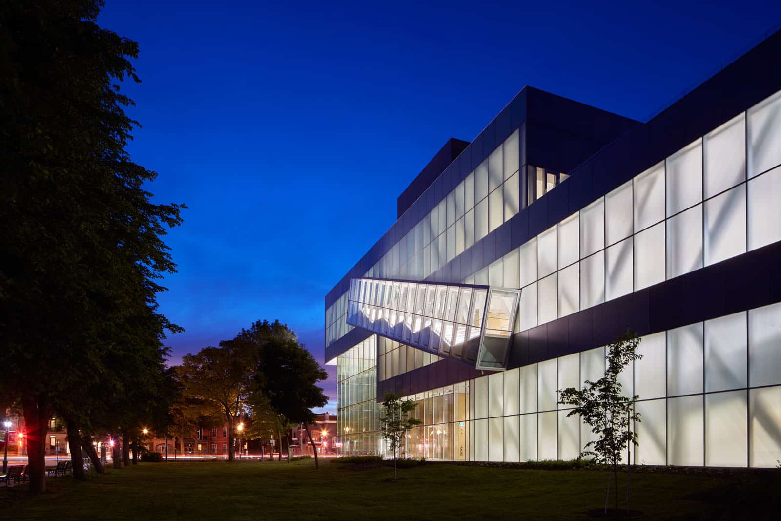
Musée national des beaux-arts du QuebecQuebec City, Canada, 2016
This renowned national museum in Quebec took design to the next level with the addition of the Pierre Lassonde Pavilion. Groundbreaking Dutch architecture firm OMA designed the pavilion, the fourth structure in a large multi-building complex surrounded by a park.
The building’s stacked gallery concept is wrapped in three layers of glass built to withstand the climate’s cold winters. Lights are placed behind the glass, illuminating the building from within, so that at night the whole structure glows in the centre of the park.
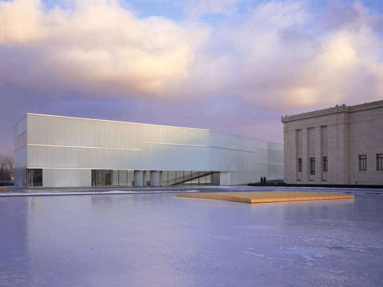
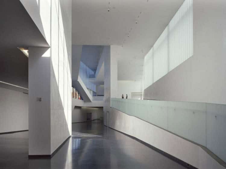
The Nelson-Atkins Museum of Art, Henry Bloch BuildingKansas City, USA, 2007
With walls created entirely out of translucent glass, this addition to a historic Kansas City museum can be lit entirely by natural light in the day, and glows like a lantern in the night. Built amidst green space, Steven Holl Architects wanted the structure to appear as if it belonged to the existing sculpture garden.
The aim was not to change the look of the original building from 1933, and to blend the new sections into the landscape. The addition is “composed of five interconnected structures as opposed to a single massive expansion” in order to fit harmoniously into the old museum.
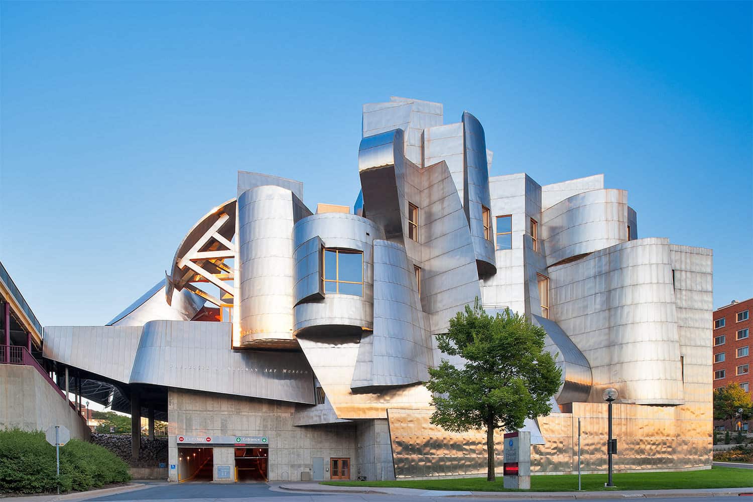
The Weisman Art Museum at the University of MinnesotaMinneapolis, USA, 1993
The Weisman Art Museum is in obvious Frank Gehry style, featuring the same metallic curves as the Guggenheim Bilbao. The titanium-clad curves include rectangular windows that let sun in at various angles, allowing gallery-goers to see the art in natural light. The side of the building that faces the University of Minnesota was created in brick so that it blends in with the campus, but walk to the other side of the structure, and the view is all glittering reflections.
When Gehry was asked to add an extension, he used concrete and structural steel for the addition, and continued to make sure sunlight was able to come through. Although the outside feels stark and heavy, the museum interior is light and airy.
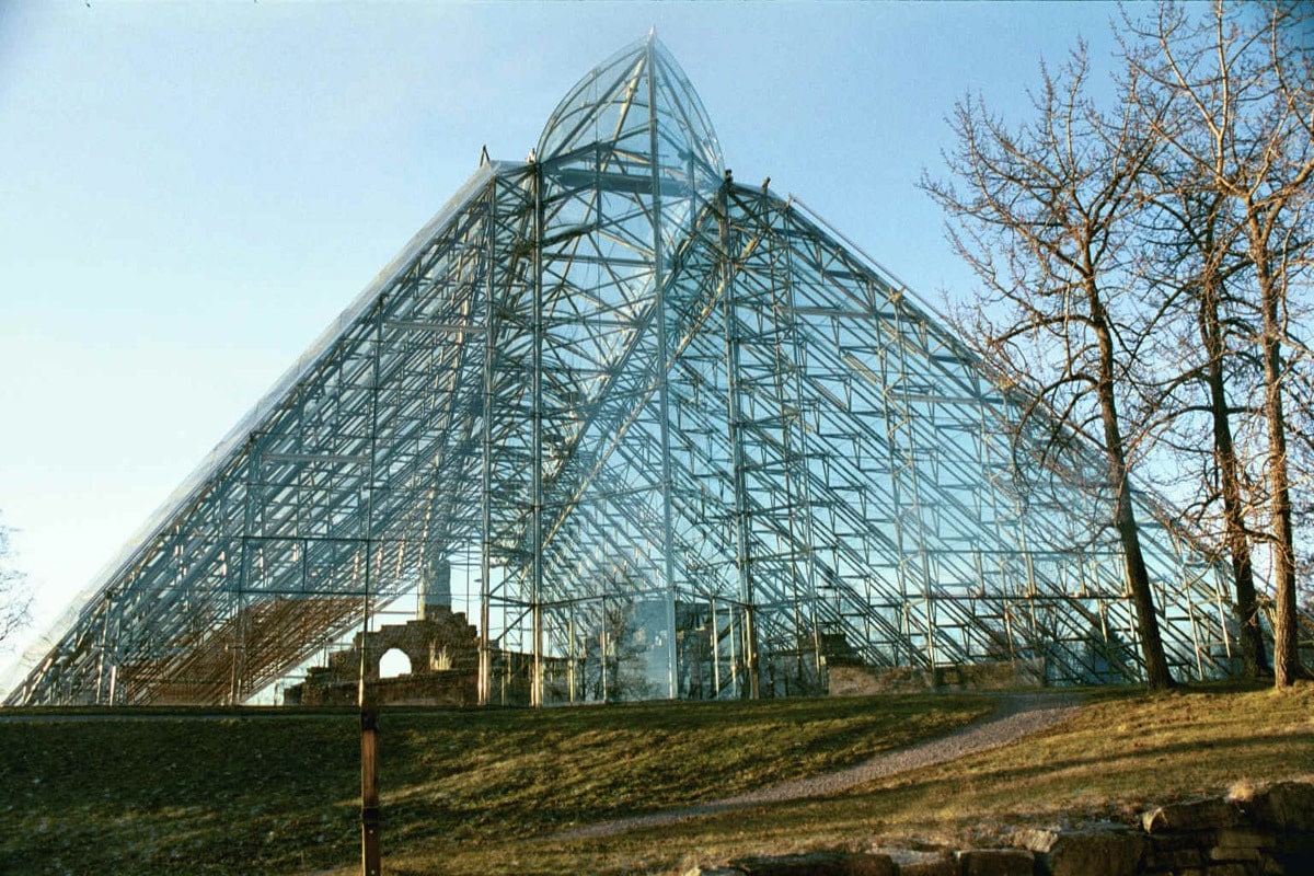
Hedmark MuseumHamar, Norway, 2005
The remarkable history of the Hedmark Museum shows through one half of the structure, the other half being a modern dome that works beautifully with the old. The medieval ruins of a cathedral have been covered by a giant glass sculpture. Instead of taking over the old building completely, the new structure highlights its beauty as well as protects it.
Over several decades of work culminating in 2005, the building was completed by two architects: Kjell Lund, from Lund & Slaato, and also Sverre Fehn. The final result is a comparison of the old and the new, showing their separate wonders while also allowing them to blend together in a composition that is very much what it protects: art.
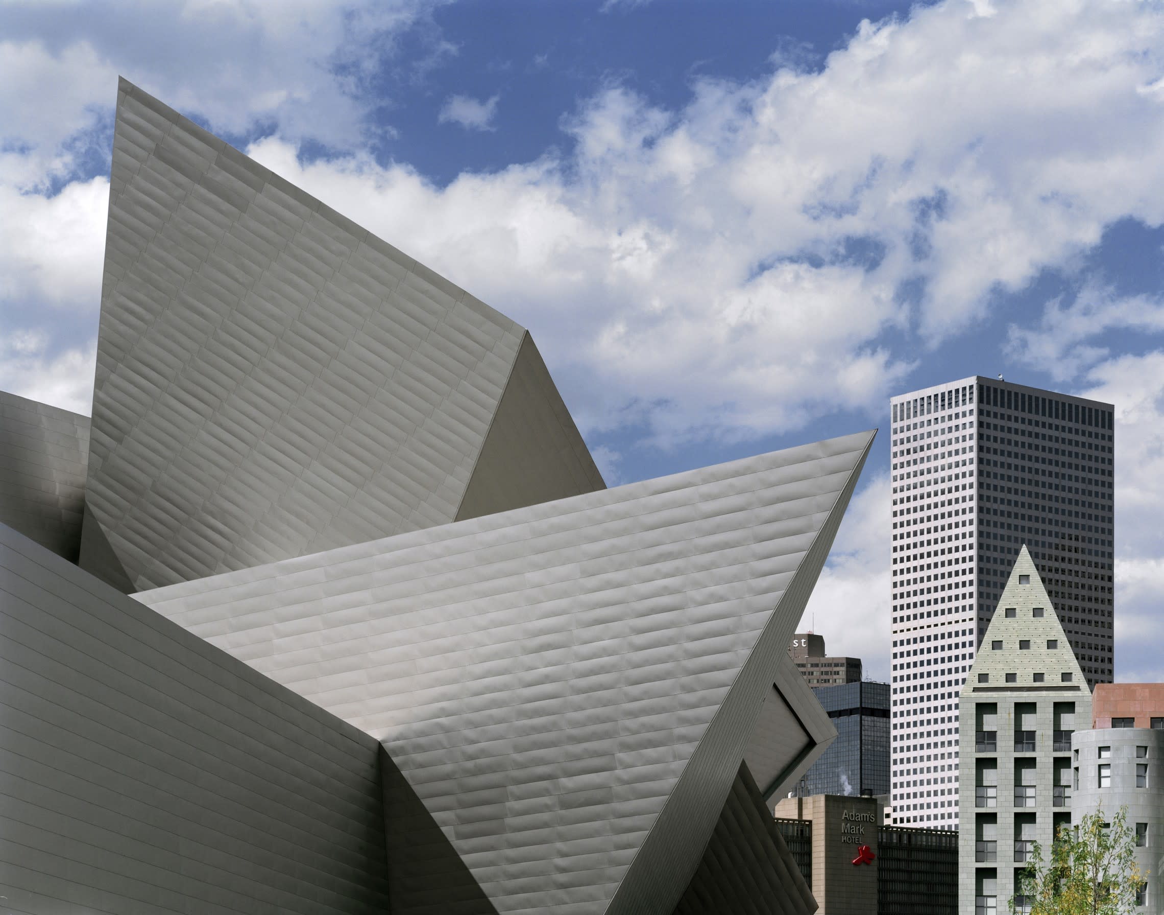
Denver Art MuseumDenver, USA, 2006
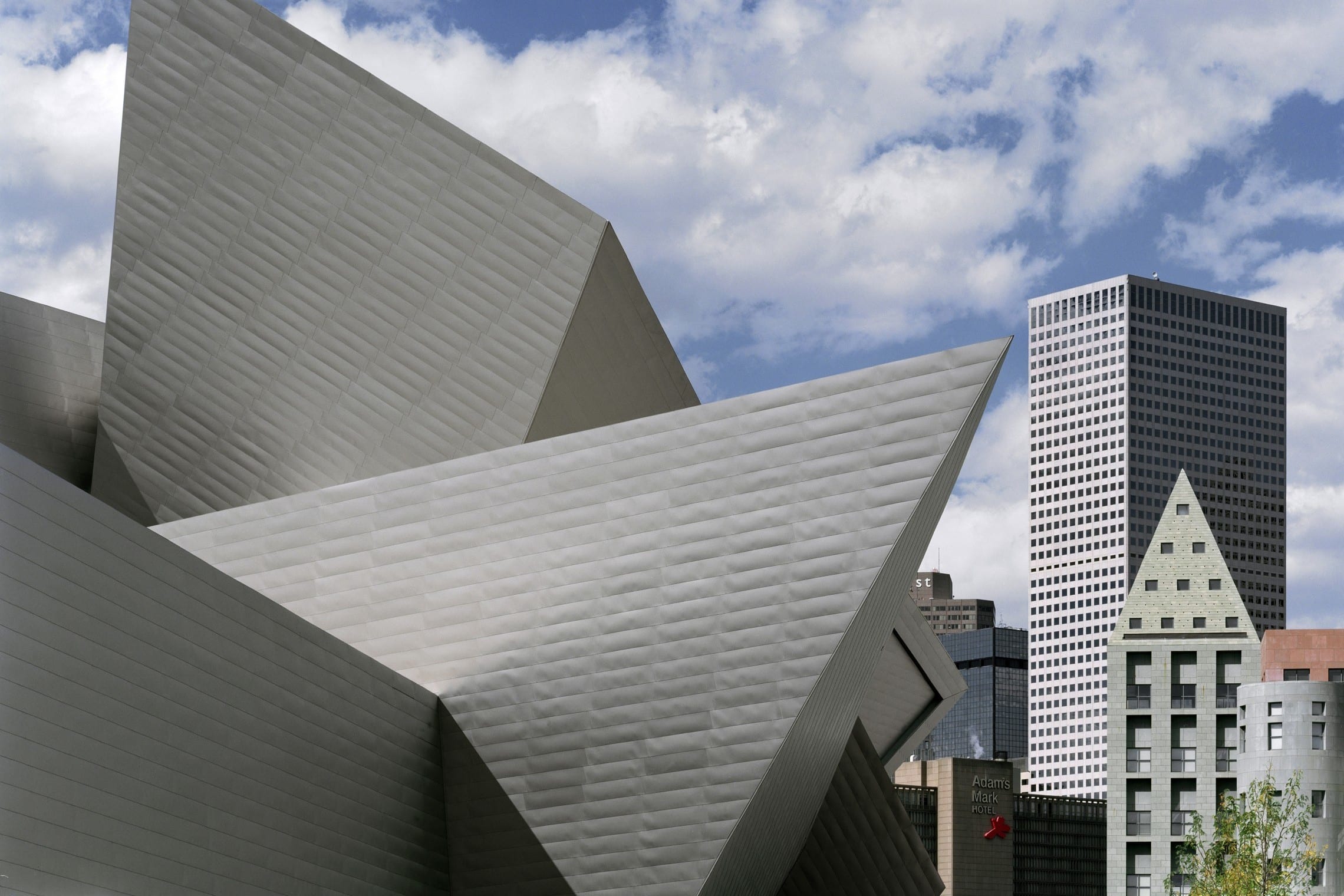
Daniel Libeskind’s extension of the Denver Art Museum blends in perfectly with the Rocky Mountains that live alongside it. This extension doubles the museum in size, housing new galleries and a lobby in Libekind’s trademark vertigo-inducing, sharply-angled rooms.
Once this extension was built, the area became central to the city, part of public space rather than its own separate entity. Libeskind’s goal was to show the growth that Denver had been experiencing, creating a museum that would represent part of the city’s new cosmopolitan identity.
Want more on contemporary architecture?
10 Best Designed Hotels Around the World
Is This The Worst Architecture Design in the UK?
19 Futuristic Buildings from the 2016 World Architecture Festival
