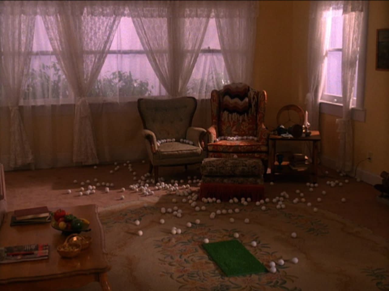
From zigzag floors to slabs of cherry pie, the Twin Peaks aesthetic is iconic. The world that David Lynch and Mark Frost created back in 1990 continues to influence artists of every genre, long after the final TV episode aired. To the delight of Peak Freaks (actually a term for fans of the show), the show is returning on May 21 with 18 episodes—but that’s pretty much all anyone knows. Will FBI Special Agent Dale Cooper get coffee at the Double R Diner? Can we expect to see Audrey Horne dance in the wood-walled Great Northern Hotel? Is Laura Palmer’s framed portrait still in her family’s living room? Even the promotional trailers are devoid of clues.
With a little bit of our own detective work, we tracked down the art director for Twin Peaks’s new episodes to see if we could dig up more dirt. Cara Brower is a seasoned professional with previous credits for the Coen brothers’s Hail, Caesar! and David Fincher’s Gone Girl. On the set of Twin Peaks, she worked closely with Lynch to make his vision a reality—which sounds like an enviable, albeit high pressure, job.
Without making some wild, completely unlikely, leaps (Brower told us she loves mid-century Scandinavian design—maybe the police station got a new Nordic look, or something), there are no spoilers in this interview. Lynch put the cast and crew on a non-disclosure agreement. That’s right, not one peep about the show until the five-year ban, which came into effect during production in 2015, is up.
“This project is very special to David,” Brower explained over the phone from Los Angeles. “It’s been percolating in his mind for a very long time and he just wants everybody to be as surprised as possible—the five year ban is the best way to ensure that no secrets are spoiled.”
We did, however, learn about how she got the opportunity to work on Twin Peaks and what it’s like to work for Lynch. She also told us her favorite set from the old episodes, the one that hooked her as a fan long before she got the gig. Plus, for anyone who’s interested in bringing their design skills to Hollywood, Brower’s career advice should be taken to heart. It’s not a mistake that she landed a coveted art direction credit for a cult classic.
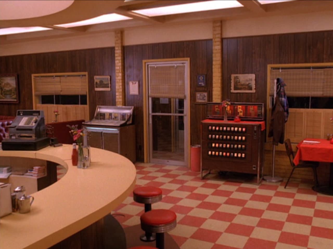
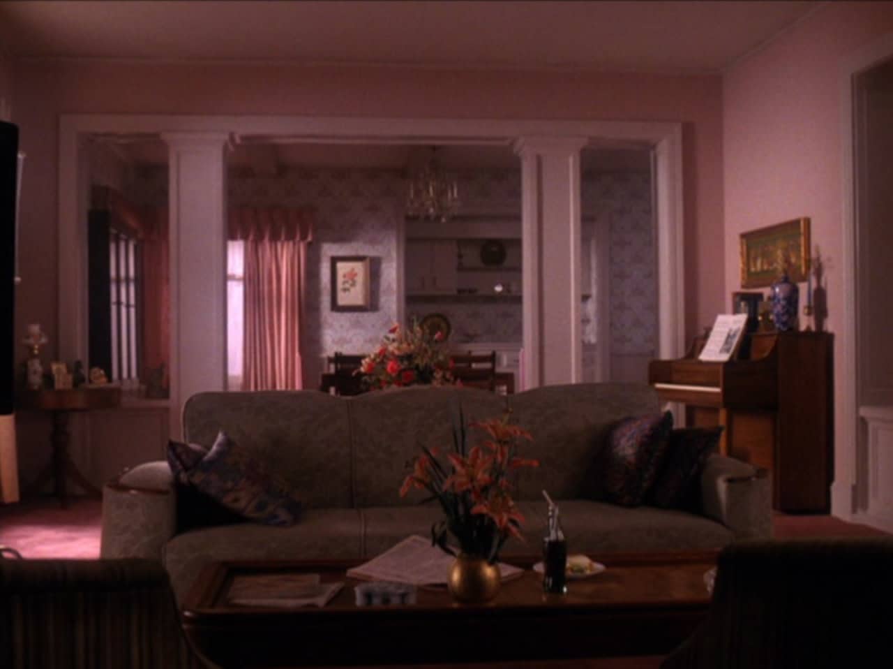
Format: Cara—Let’s just get right to it. How was working on Twin Peaks with David Lynch?
Cara Brower: I’ve always loved films and one of my favorite things about my job is getting to work with my heroes. Working with David Lynch was a highlight of my career so far. He’s everything that you would hope him to be. If you’ve ever seen an interview with him, he is that person. He is that quirky, down to earth, super creative, eccentric person that you want him to be, and I just adored him.
He knew everybody’s name on set. He would greet everybody in the morning. I think he probably has all of his projects in his mind already, it’s really fascinating. When you ask him a question he’ll shut his eyes and you can tell that there’s a film camera sort of projecting in his mind the scene already. He’s an icon for a reason and he lives up to every single thing that you would hope him to be.
As an art director, what exactly do you do?
The filmmaking world is a large machine. Everybody has a speciality so that all the bases are covered. There are teams that cover every single thing. The art department does sets—from illustrations of concepts to furniture and props. As the art director, it’s my job to understand the director’s vision and the production designer’s vision and make sure the sets are constructed to suit that vision.
Twin Peaks has such a specific vision. Did you feel like you were under a lot of pressure to deliver?
I was a huge fan of the show and my fear melted away when I met David. What’s really interesting is that he doesn’t see the show, or any of his films, as stylized. That’s just the way he sees the world, and that floored me.
I know you can’t talk about any of the new episodes, but is there art direction from the old episodes that really captured your heart?
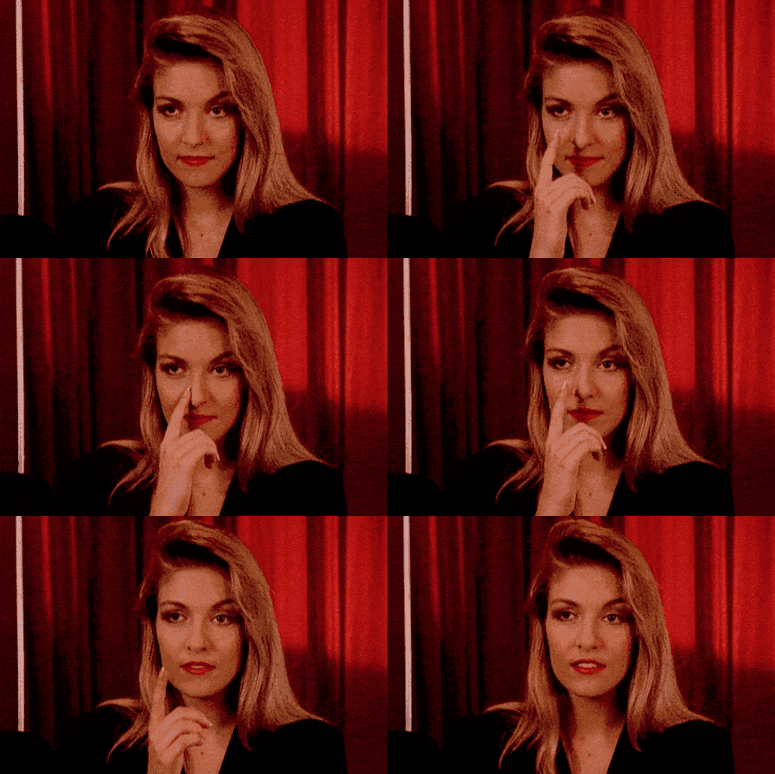
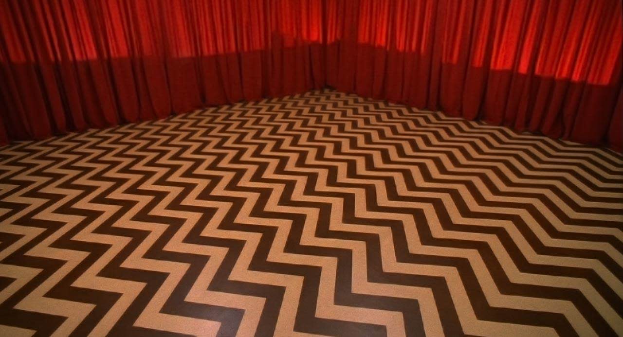
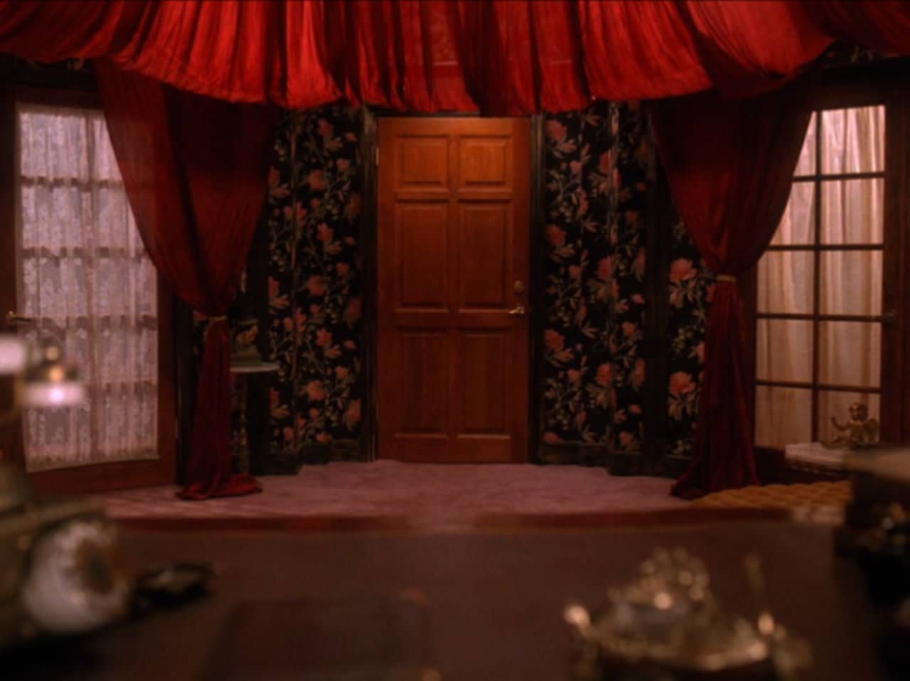
My favorite set from the original show has to be the Red Room. It’s iconic and completely a world that came directly from David’s mind. No one else could have created that set—it’s true art.
It’s so simple and effective as well. When you see the chevron black and white floors with the red curtains (or even just the red curtains) you know that you’re in the world of David Lynch. If you watch a lot of his earlier works, you can see the chevron motif running throughout—there’s even painted chevron flooring in Eraserhead.
The Red Room is a world where logic defies reality, anything can happen, and it’s a perfect example of the surreal and dreamlike worlds that make David’s work so unique, iconic, and ultimately Lynchian.
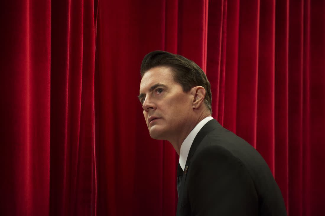
A rare photo of Kyle MacLachlan reprising his role as Dale Cooper. (Suzanne Tenner/Showtime)
Can you tell us a bit about how you came to work on these new episodes of Twin Peaks?
I studied set design at The Royal College of Art’s National Film & Television School in England. That’s where I got my start in film, in the UK, but I didn’t have a visa so I came back to the United States and moved to Los Angeles. If you’re going to work in film, this is the city to do it.
I knew a couple of people from England with contacts in L.A. and just worked my way up. I did as good of a job as I could on every single job and that led to more people knowing me, more introductions. I met Ruth De Jong through a friend and we really hit it off.
Ruth got her start through Jack Fisk, who is a very well-renowned production designer. Jack and David Lynch went to high school together. When David asked Jack to work on the new Twin Peaks episodes, Jack was busy with The Revenant and recommended his protégé Ruth. When Ruth became the production designer, she brought me on as the art director.
Did you know there would be new episodes when you were approached about the job?
I had seen the buzz on Twitter and thought, ‘I would pay to work on that!’ When I found out that Ruth got the job and she called me, I thought I was going to die. Honestly it was a dream come true. One of the best days of my life.
It’s amazing to hear that it was a good experience working on Twin Peaks because it could just as easily be, ‘David was awful, it sucked and everything was bad.’
Well, I’ve definitely had some bad experiences on other sets. I have a ‘no-fly zone’ list of directors—people in the industry that I’ve heard horror stories about and know to stay away from.
You worked with the Coen Brothers on Hail, Caesar!. What were they like?
Joel and Ethan are very fascinating to watch because they’re like one person, or really, two sides of the same coin. Joel is more outgoing, and Ethan is more reserved. It’s yin and yang, and you always see them together. They’re always together talking about everything and bouncing ideas off of each other. They’re very insular, I would say. You don’t get get to know them personally when you’re working on a project with them. They’re so passionate about what they’re doing that they’re in their own world, creating that world. It’s incredible to watch.
What’s your favorite part of being an art director?
Other than working with directors, I like the ability to explore time frames. One day I’ll be thinking of the 1950s and exploring that world in depth, then it’s Roman England for another project. You get to dive headfirst into different worlds way more than architects or interior designers do.
Do you have an interest in interior design?
I didn’t train in interior design but I’ve actually started doing interiors with Ruth De Jong in between film projects. She started a furniture and design company with her brothers called De Jong & Co. We just finished a restaurant in Santa Monica.
Do you have a look that you’re really digging right now?
My grandmother was a huge fan of mid-century Scandinavian design. After I finished Twin Peaks, I went to stay with her for a couple of months. She got really ill and ended up passing away. I’ve always been highly influenced by her as far as my design aesthetic. Lately I’ve been watching a lot of documentaries on Scandinavian designers she loved, like Alvar Aalto.
Do you have any advice for emerging production and art directors?
I would recommend that they study interior design, architecture, set design or theater set design—an area of design where you get architectural skills because that’s what is needed to create sets. If you want to get your foot in the door, you have to have skills that are useful. It makes you valuable and you’re going to move up quickly.
If you want to be in the art department, I wouldn’t recommend going to film school and making short films. Those people don’t tend to have skills that contribute to the team. As much as I want to hire those people, I can’t because you need to have tangible skills for construction.
Then I would say, don’t have an attitude. Be humble. Take every chance that you get and make the most out of it. I worked on a film that turned out to be a bad film, but it led me to valuable connections and friends that led to great films. You don’t instantly get a job like ‘production designer.’ You have to move up in the ranks, and the best production designers I’ve worked with have worked on every level of the art department. They fully understand how the department works and fully understand what makes a good set because they’ve been drawing sets for years.
It just comes down to working hard and creating a good reputation for yourself. You never know what connection is going to propel you into a different project or a different team. It’s a very small world and everybody knows everybody. Once you get a reputation of being a difficult person, it’s hard to escape it.


H/t In Twin Peaks for empty room screen grabs
