Louis Braille was injured in his father’s shop at the age of three. Just over a decade later, in 1824, he invented the tactile writing system that bears his name at the Institution Nationale des Jeunes Aveugles. In 1829, he published the first book that used the system. That was nearly 200 years ago.
While braille has long been the most popular tactile writing system for the visually impaired, it was developed based on now outdated technology and, as ELIA’s President and CEO Andrew Chepaitis points out over the phone from New York City, less than 1% of visually impaired people can read it. As per the company’s website, “The name ELIA is derived from our mission—to bring greater Education & Employment, Literacy and Independence to All people who have a visual impairment.” They plan to carry out that mission with ELIA Frames, a new and intuitive tactile writing system designed based on the standard Roman alphabet.
“It’s a font, so a person can load it onto their computer, and then it works just like a normal font,” Chepaitis says of ELIA Frames. “You can highlight text, you can change it from Times New Roman to Arial to ELIA Frames. And then you can size it to what the user needs. And then you would need to print it on a special printer, unless you just want to view it visually. It’s as simple as that at its core. It’s basically the standard alphabet customized for touch. It’s laid out so that a person can navigate it accurately and efficiently and quickly, and because it’s the normal alphabet, it can be learned in a matter of a couple minutes.”
While braille has done its fair share of making life easier for the visually impaired, there are still issues with the system. Those who lose their vision as adults—”roughly 98% of the population,” according to ELIA’s Kickstarter—don’t often end up learning braille. It’s a difficult system to master. On Kickstarter, ELIA also says that it can take about 10 months for previously sighted adults to learn braille, and as many as 11 years of study to work their way up to a reading speed of 23 words per minute (WPM). But ELIA Frames takes a matter of hours to learn, and ELIA believes that after just a few weeks a person can be reading at 25 WPM. People who lose their sight as adults are often already familiar with the standard Roman alphabet, so learning ELIA Frames can potentially offer a faster learning process for this reason. Braille isn’t scalable in size like fonts are, and requires “exceptional finger sensitivity and intellect.”

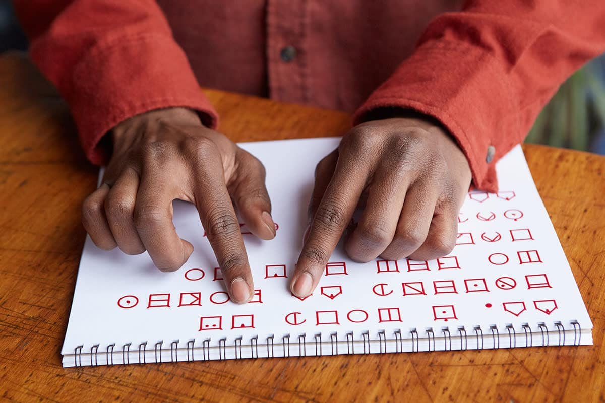
Reading ELIA Frames.
“That’s a challenge for a previously sighted person to discern tactilely, especially at a small size,” Chepaitis says. “Our alphabet, because it has a frame, it can be systematically explored, and people don’t get lost. They can systematically explore, and they can tell where one letter ends and another letter begins. So it has three benefits over braille. One is that it can be systematically explored like that without wondering if you’re on the right letter or not. Two, it builds on a person’s existing knowledge. And three, it can be shared with people who are sighted, who can also visually learn it in a few minutes.”
The frame part of what he’s saying is more important than you might think. Chepaitis’ grandmother lost her vision due to macular degeneration. His mother studied industrial design and started the initial design for ELIA Frames. She noted that part of creating something like this is building on a person’s existing knowledge, but also that a practice so ubiquitous as to be nearly unrecognizable is the use of frames. Think about it: if you go to the ATM, every option at your disposal is framed. The prompts are framed. Chepaitis breaks it down even further here, “from a nerd perspective:”
“Information that your eyes are gathering is broken down into different pieces of information, and the brain is very attracted to certain visual stimuli,” he says. “Believe it or not, one of the stimuli it likes very much is horizontal lines and vertical lines. The brain takes that information and processes that first. Whenever there’s a horizontal line or a vertical line, it’s processing that first because in nature, those are very important for survival. From a perception perspective, having a horizontal line meet a vertical line—that holds additional appeal. So when you have a square, a right angle, that’s more appealing to the brain that if it were slightly obtuse or acute.”
While ELIA tested frames that weren’t totally right angles, those turned out to be far less appealing than ones that were. “The brain loves when two lines intersect at a right angle,” Chepaitis adds. They’ve also tested it at multiple font sizes, versus braille, and versus the standard alphabet to see what features of a tactile letter work and don’t work and how people identify things with touch. But at no point were aesthetics really taken into consideration. And yet ELIA Frames is a beautiful-looking system. It’s sleek, simple, and it’s not hard to tell how easy it is to learn. The main concern when developing ELIA Frames, of course, was, ‘Does it work? Can you read it tactilely?’ The fact that it also turned out to be aesthetically appealing is simply because, as Chepaitis says, “form follows function.”
“There’s nothing in the font that’s extraneous or there from an aesthetic perspective,” he says. “I think if people find it beautiful, it’s because we tried to maximize the open space, because the open space is enormously helpful to people. They need as much open space as possible. One of the benefits of using a frame is that it takes the elements of a letter and it pushes it to the furthest reaches of a given space so that a person feeling that letter has a lot of real estate to move, and that real estate is used optimally.”
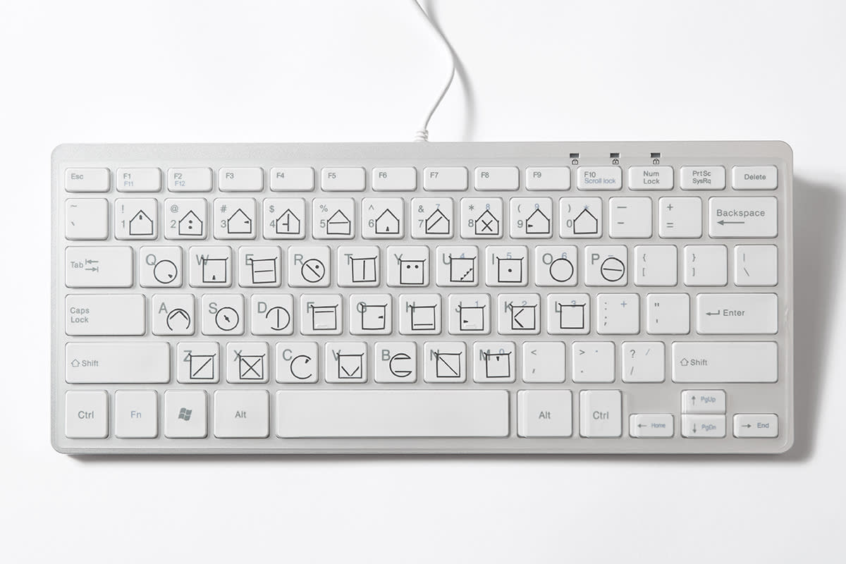
An ELIA keyboard overlay.
Responses to the project have varied so far, but have been mostly positive, Chepaitis says. There is a camp of people who are proficient in braille, after learning it at a young age, who are trying to teach young students and find the idea of ELIA Frames disruptive and unwelcome. But there are also previously sighted people interested in using the system to become more independent. A basic example would be those same people being able to label things in their household—like toiletries, clothing, or food—with a font that is quickly intuitive to them based on their prior knowledge.
The funds raised by the ELIA Frames Kickstarter will help the company get started. Some of the rewards include a keyboard overlay that places ELIA Frames over a standard computer keyboard (something gamers have shown a particular interest in); posters of the system; starter kits for learning it that come with instruction manuals and labels for common household items; classroom kits; and in-person workshops. Chepaitis says they’re also working on an electronic label maker, and have teamed up with Hewlett-Packard to develop a printer that can print the tactile text, which means people could easily change the font of an ebook to ELIA Frames, print it out, and be reading within minutes. Chepaitis is also hoping to soon get kits into the hands of places like the nonprofit organization Lighthouse Guild and the New York Public Library. All of this lines up directly with what ELIA is looking to achieve—to enable people who use their system to gain greater independence, literacy, employment, and education.
“Our goal is outcome-based,” Chepaitis says. “How can we help people in their lives with our alphabet or technology to the extent that 10 years from now, people who are using our font have a higher employment rate than they did before, or they can do things they couldn’t do without a tactile alphabet? That would be success for us.”
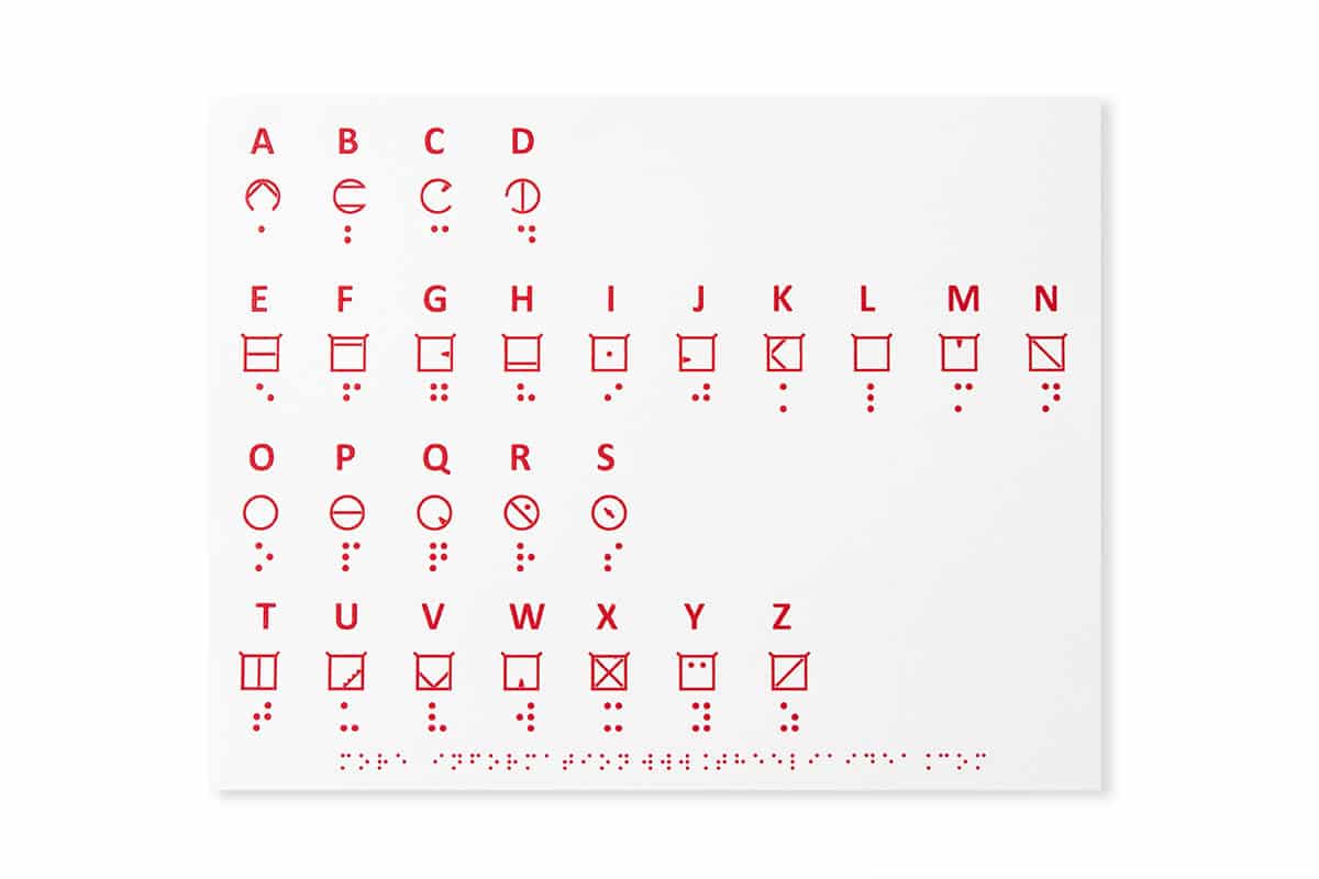
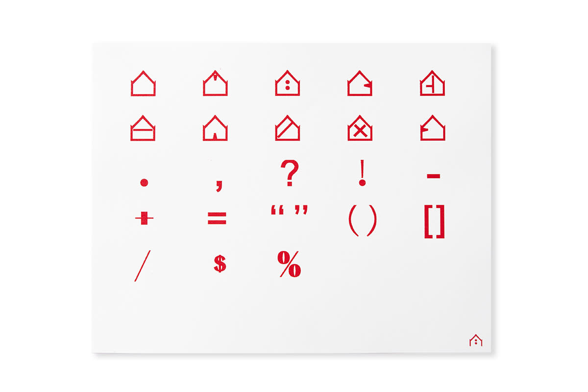
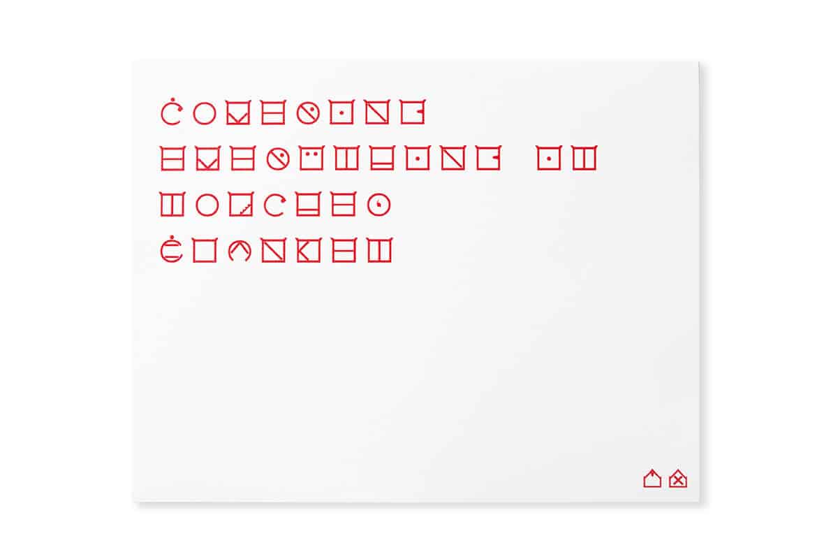
The ELIA alphabet, punctuation, and a sample message.
