For this month’s Format Picks, we’re logging off and looking out for the analog. From film photographs to freshly sharpened pencils, we want to celebrate the things in life that don’t require batteries. To do so we’re teaming up with Newspaper Club, an online print service that’s breathing new life into a classic analog format: newsprint.
Stay tuned for our contest announcement coming soon, and in the meantime, get inspired by this roundup of some of the best newsprint projects Newspaper Club has printed. Some of the world’s most creative designers, artists, and photographers are reinventing newspapers to share their work and stories. These ten creatives are using the inky, analog medium to make something different, from personal portfolios to independent magazines.
Mike McQuade, illustrator
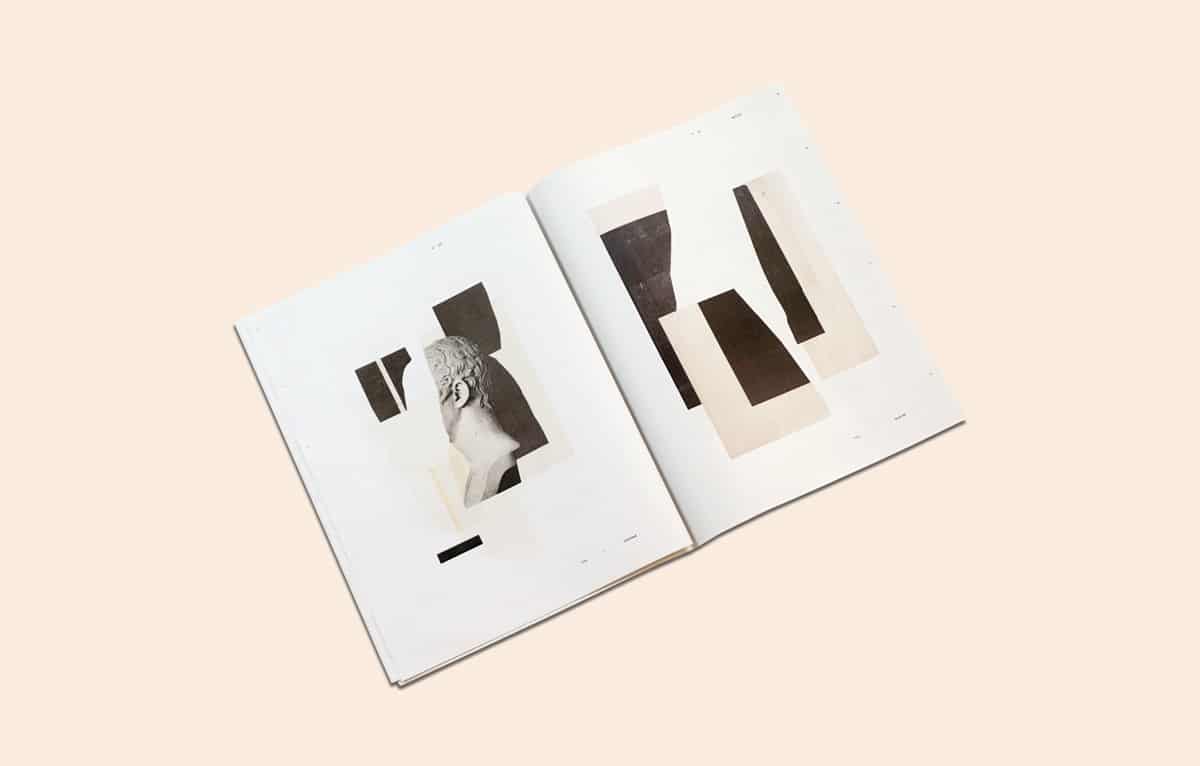
Mike McQuade’s distinctive illustrations have accompanied articles in The New Yorker, The New York Times, Wired and more. In his newspaper, MASS, McQuade showcases a collection of abstract collages that explore the process underlying his editorial commissions.
“Pretend that the whole of Mike’s published work is one of those overly thick wool knit sweaters. This is that sweater turned inside-out,” writes Matt Dorfman, art director of The New York Times Book Review, in his foreword to the newspaper. “Each one is an invitation to breathe and inhabit a space that he went out of his way to create without a computer and should thereby be enjoyed away from a screen in turn.”
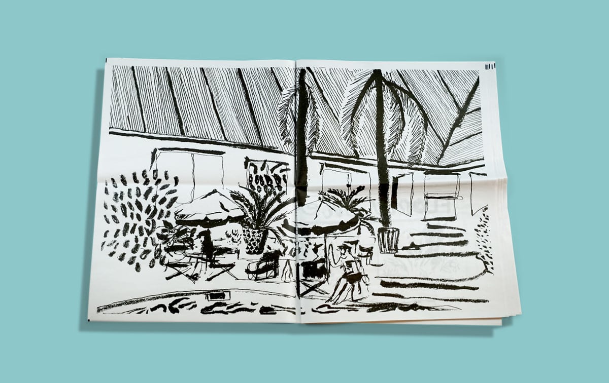
Maxime Cousseran, illustrator
French illustrator Maxime Cousseran turned sketches from a trip to Latin American— he visited Argentina, Bolivia, Peru, Colombia and Cuba—into a large-scale portfolio. Printed as a series of double-page spreads, each scene, rendered in Cousseran’s bold, monochrome brush strokes, makes a big impact.
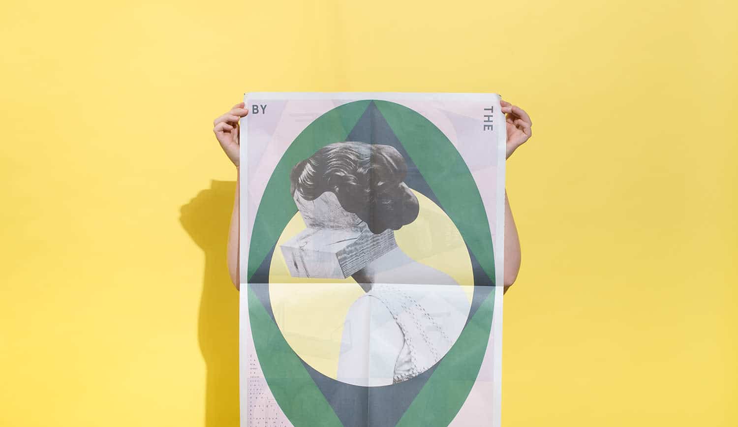
By The North, furniture studio
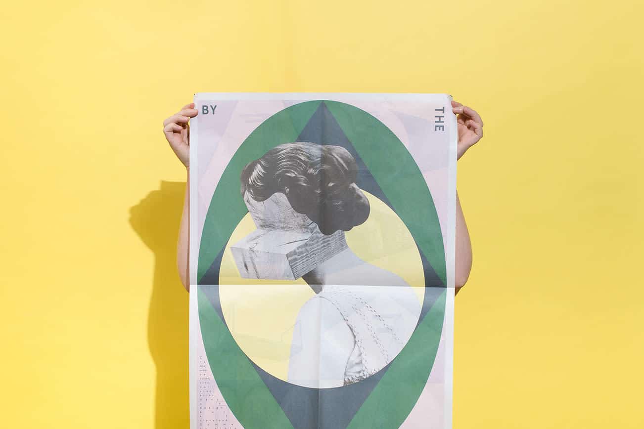
Sourcing wood from their family-owned forest, Montreal-based By the North crafts raw but sophisticated furniture. To show that their materials are always front of mind, the brand swapped faces for blocks of wood in a series of surreal newsprint posters that they hung in their showroom and sent out to clients.
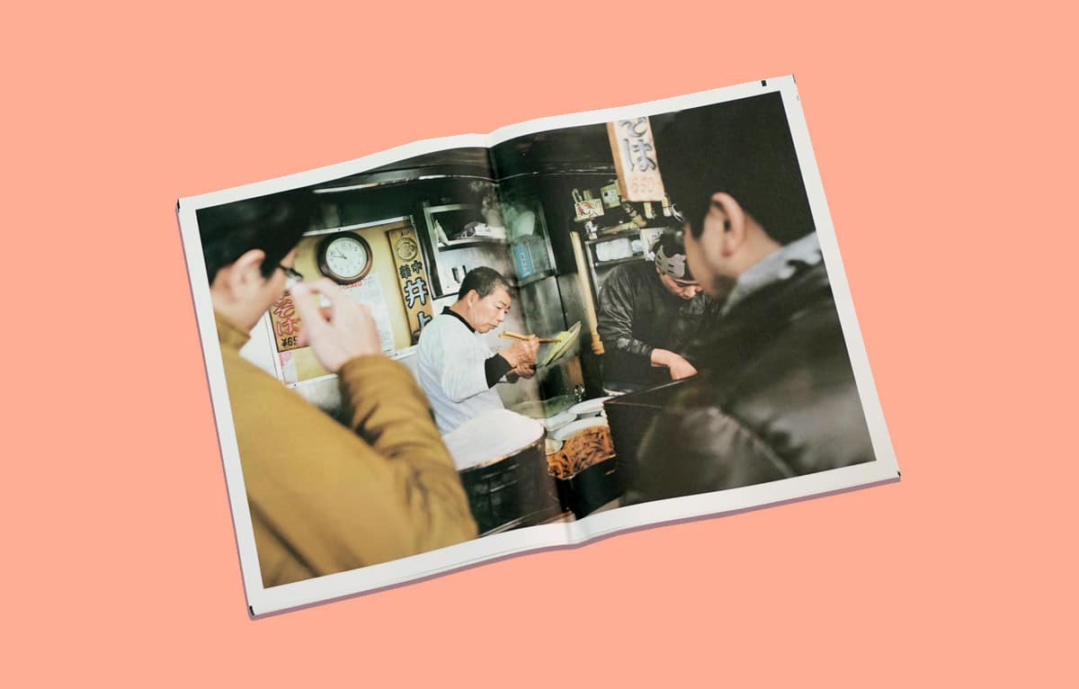
Kristin Teig, photographer
To promote a new cookbook project exploring food traditions around the world, photographer Kristin Teig sent a promo newspaper to publishers and editors. Teig says the newspaper was as much a creative exercise as a marketing tool: “The process of culling and editing my images helped me to refine goals and reassess how I present and market my business.”
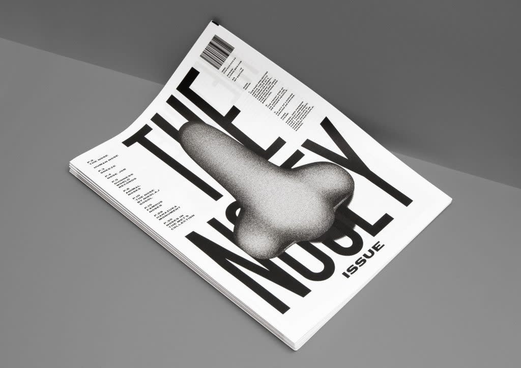
Johanne Lian Olsen, graphic designer
Here’s a fun way to keep your layout skills sharp: Copenhagen-based Johanne Lian Olsen practices editorial design by making newspapers about different body parts. First, she investigated the mysteries of eyes; more recently she did a deep dive into noses. (Did you know that bloodhounds have 40 times more scent receptors in their noses than humans?)
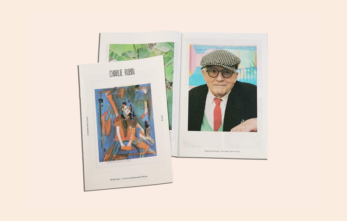
Charlie Rubin, photographer
“I love the texture of newsprint and it fits well with my imagery,” says New York-based photographer Charlie Rubin. With little text and lots of white space, Rubin lets his photography speak for itself in this mini newspaper. The portfolio showcases recent editorial work for likes of The New Yorker and Vice, and a lovely portrait of David Hockney he shot for The New York Times.
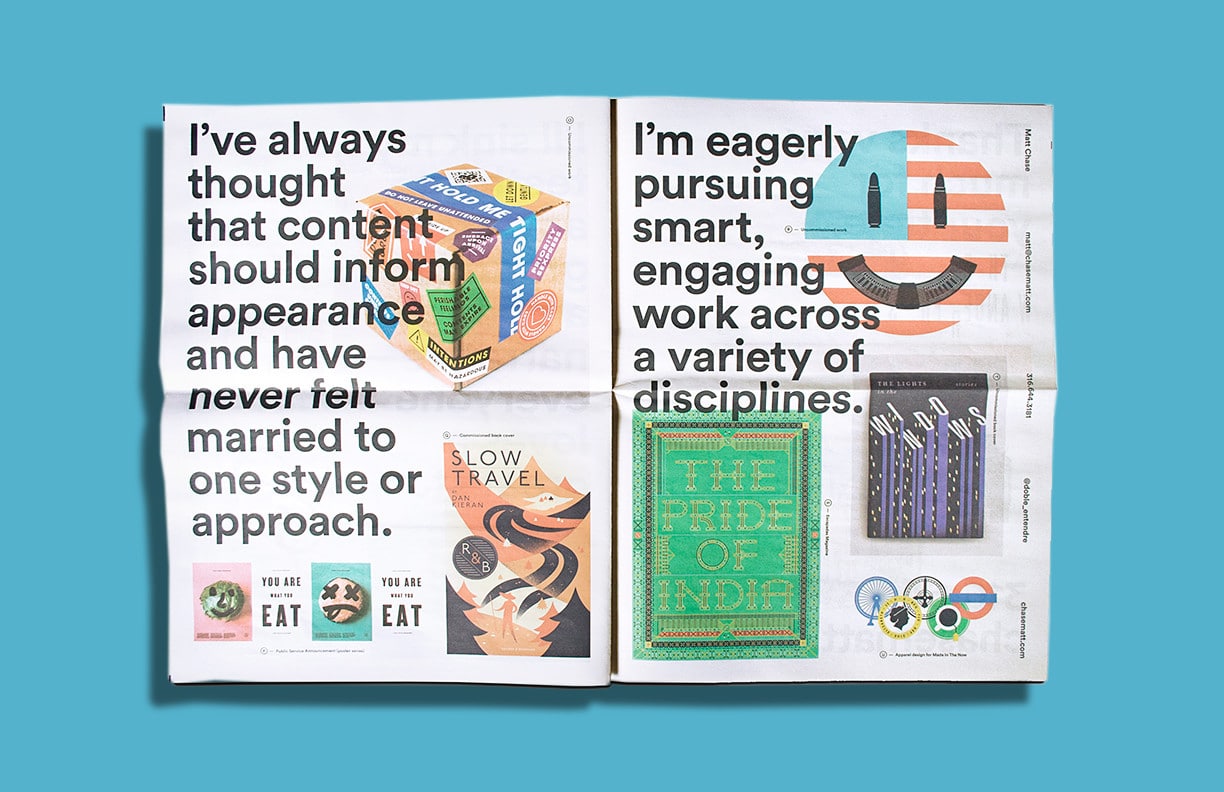
Matt Chase, graphic designer
Designer Matt Chase’s work runs the gamut from editorial illustrations to book jackets to posters. He put together one of the most eye-catching and varied portfolios we’ve printed, so it’s no surprise it helped him land more work. “The reception was overwhelmingly positive. I had several art directors call me the moment they received the piece,” Chase says. “Honestly, I barely expected it to garner enough commissions to cover the cost of printing, but I can happily say that it’s paid for itself nearly ten times over.”
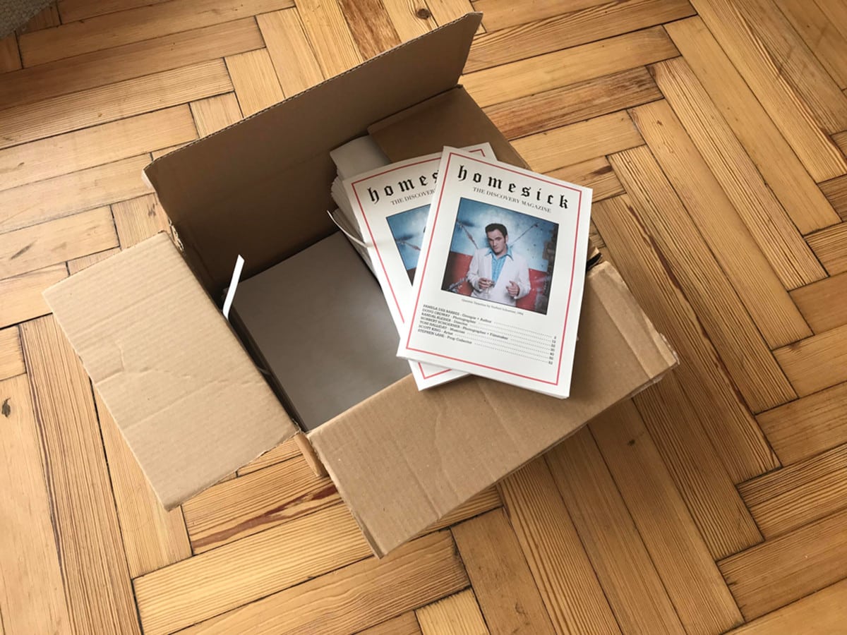
Reagan Clare, founder of Homesick Magazine
“I’m magazine-mad but increasingly disappointed by art and fashion magazines,” the archivist Reagan Clare told magCulture last year. “They are often so huge and so expensive, and just rinse the same photographers and models issue after issue.”
In 2017, Clare launched Homesick to shine a light on the lesser-known creatives behind iconic moments in pop culture. Subtitled The Discovery Magazine’ the newspaper features interviews with artists like Norbert Schoerner, who took the photo of Quentin Tarantino on the cover above. “I wanted to offer a complete alternative,” says Clare. “Straight to the artist, with frank conversation and visual content that can’t, for the most part, be found on the internet.”
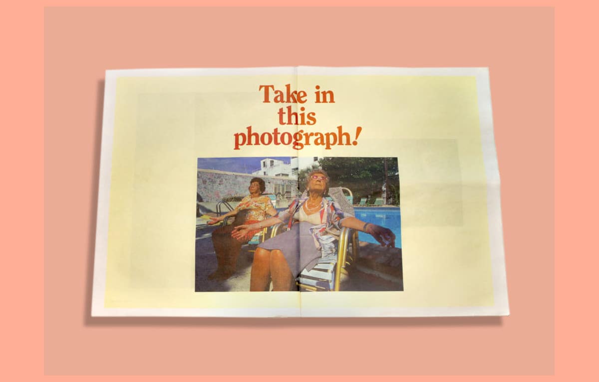
Naomi Harris, photographer
Words and images work together in this charming and fun portfolio from Canadian photographer Naomi Harris, with headlines playing off the characters she captures (see above). As designer Noah Phillips explains: “We wanted to bring the same curiosity and sense of humour from the photos into the layout.”
Jacob Pritchard, photographer
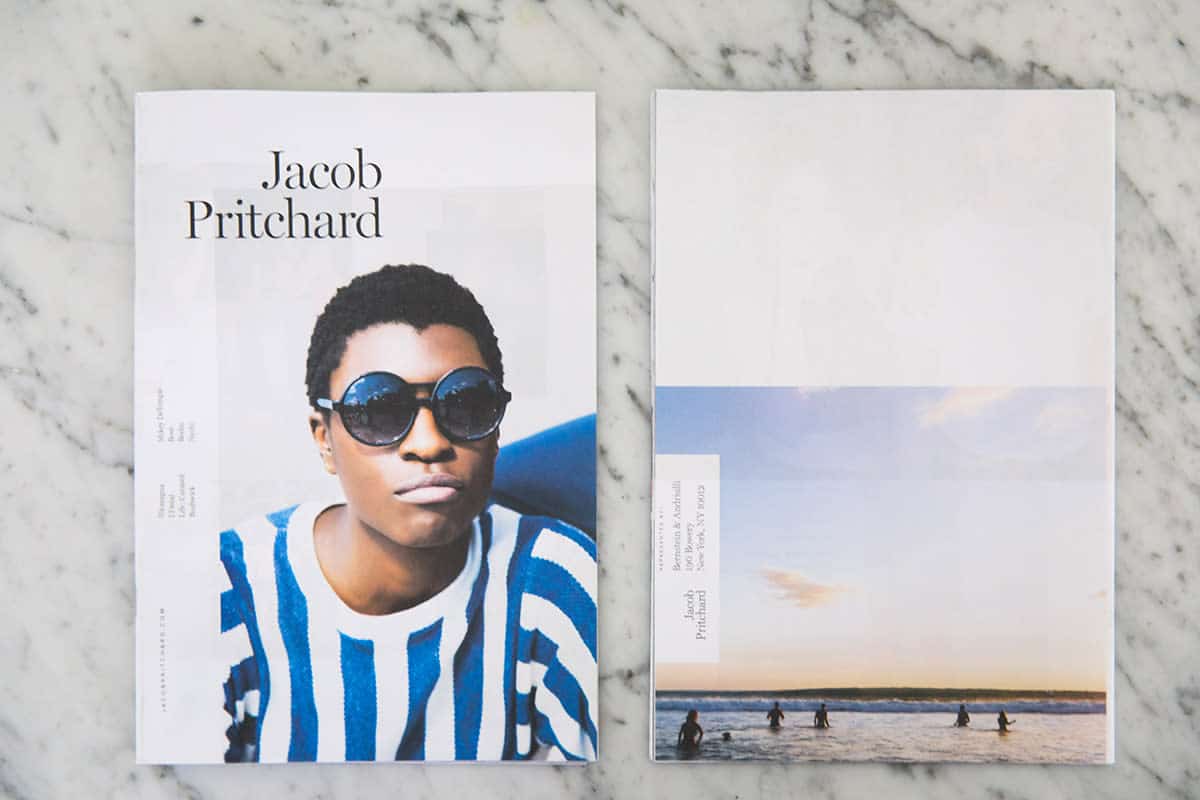
Brooklyn-based photographer Jacob Pritchard started his career shooting documentary features for newspapers. These days, he mostly works with commercial clients—like West Elm, Verizon, and Bose—but still draws on the storytelling skills he honed as a photojournalist.
“A lot of the work I do is about creating stories and libraries of photos,” Pritchard says. Stapled and trimmed like a magazine, this mini portfolio gives him space to “expand and share broader sets of stories.”
Want to print your own newspaper? Get started with free samples from Newspaper Club.
