Branding space, as in outer space: Now that’s a concept for the sci-fi section if we ever heard one. But, despite its abstract-seeming associations, this is not actually a conversation to file away for the far off future. After all, the commercial space industry is booming right this very second.
As reported by the Los Angeles Times, “Space start-ups have attracted more than $13.3 billion of investment… since 2000. Nearly two-thirds of that investment funding has come in the last five years.” Once upon a time, space travel was for governments, and wealthy ones at that, only. Now, we find ourselves entering into completely uncharted territory, one which is host to an abundance of new business models, varied products, and diverse services. And yet, so many players in this space seem to look, well, rather uninspired (think: Trekkie-inspired silver swooshes).
To get a better understanding of this very unique time in the outer space industry, we sat down with Andrew Sloan, founder and creative director of Cosma Schema. A design and strategy agency “dedicated to furthering humankind’s movement toward the cosmos,” Cosma Schema’s mission is simple: create greater understanding and accessibility and inspire excitement regarding outer space. Beautiful design and simple communication are just their weapon of choice.
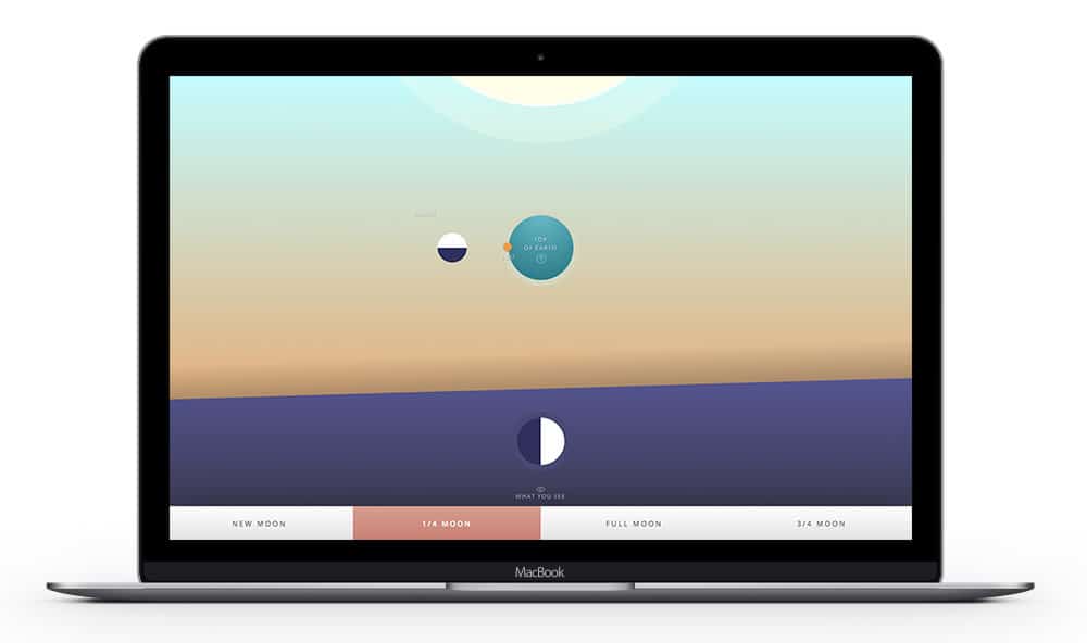
explain.space, a project by Cosma Schema
Hi Andrew! Tell me a little bit about what you do and your particular experience/expertise as it relates to space. What do you geek out about?
I’m the founder and creative director of Cosma Schema, a design agency set up to serve the needs of the space industry and space organizations. At this stage, we seek out clients that need help reaching their audiences. Cosma Schema was born out of this observation I made a some years ago that the current state of space design and communications was not in a good place. No one is paying attention to this element of the industry, and it’s failing in many ways.
I’m a huge space nerd and have been since I was little. I’ve owned telescopes for as long as I can remember, memorized the constellations, you know, all the things you do when you’re a kid obsessed with space. I’ve been fascinated by past space exploration and future possibilities, and I’ve just loved keeping up with what’s new and changing. Cosma Schema is a real blending of my two greatest passions.
Why do you think being a “space fan” puts you in a great place to strategize the branding of space?
The fact that I’m a big space nerd but don’t actually work directly in the space definitely feels like my competitive advantage. As a communicator, you need to know how to speak to the everyday person, a broad audience. And what I’ve found in my work is that, specifically with science clients, that can be a real challenge. The people in this space are engineers, scientists, and researchers. They’re deep in the insular world of their industry.
When it comes to speaking to a broader audience who does not have that specialized knowledge set, the complexities of space are often lost in a sea of jargon. My natural attraction to space, coupled with the fact that I am not involved in the technical side of space—astrophysics, rocket launching, whatever—makes me able to distill these amazing ideas and concepts and communicate them to that broader audience.
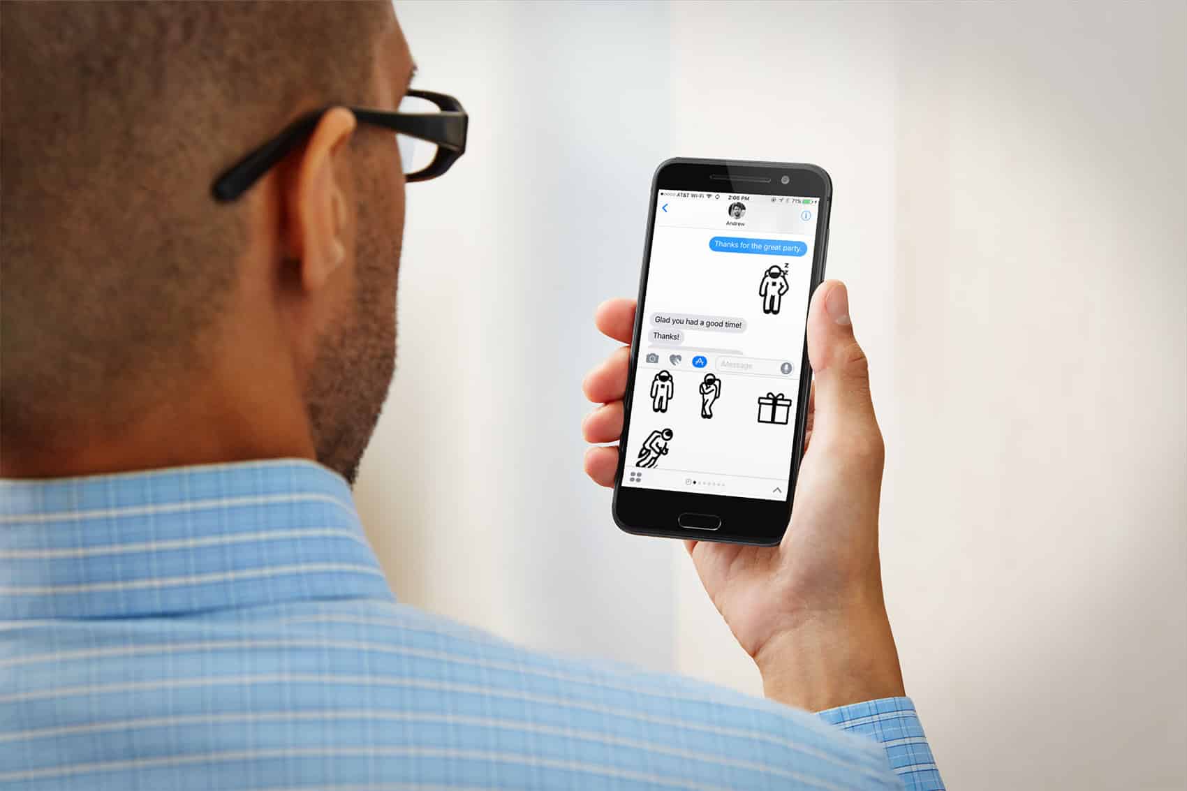
Lizzy the Astronaut, a project by Cosma Schema
Why is this a particularly exciting transitional moment for the space industry?
What’s happened is that ever since the “Space Age” began in the 50s, space travel has been prohibitively expensive and reserved only for parties with enormous budgets, namely governments. In the last 15-ish years, some of these technologies have started to trickle down, becoming cheaper and more affordable for private companies to begin working with.
So, what we’re seeing is this emergence of a private space sector, which is a really exciting thing. You have small companies doing things well beyond and outside of the traditional interest of nation-based space programs. This shift allows for competition, and with competition, comes increased rate of growth. Over the last five or so years, people keep using the “space race” 2.0 phrase. What we’re seeing now is likely just the beginning of a really exciting period of growth for businesses using space as their foundation.
How would you describe the typical branding/aesthetic of the space industry right now?
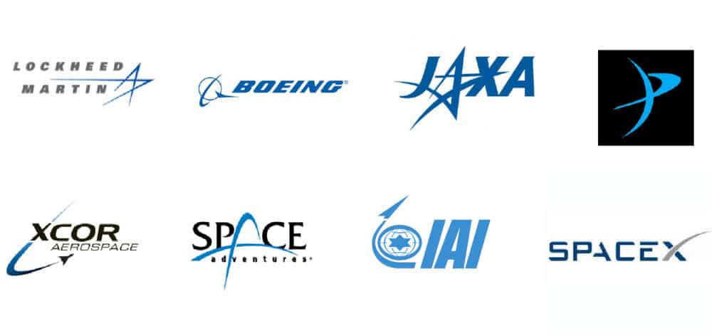
There’s a ton of work to be done. The landscape of branding in the space sector looks like it was designed by someone, a dude, honestly, in the 80s who was a huge fan of Star Trek. All blues and blacks, rocket swooshes and streams, spikey, so-called “futuristic” looking design. They feel dated. And everyone seems to be looking around at everyone else for design cues. There’s not much original thinking there yet.
What’s the problem with this?
No one is considering the singular product or service that they are offering, and then designing from that place that’s applicable to their unique needs.
When you approach a branding project, one of the first questions you ask yourself and the client would be “What experience do you want your audience to have when they’re introduced to your brand?” I would bet that the majority of the companies in this space have not done that. The irony is that this is one of the most forward-thinking industries in existence. Each of these companies are doing very distinct things, and yet their logos all look and feel the same.
When I see a SpaceX or a Boeing logo, you know, as businesses they are doing different things, but you don’t get that from their visual language, you’re not experiencing a different set of emotions or receiving a unique set of cues. So, what that means is that this lack of diversification limits the opportunity for brand loyalty and makes it terribly difficult to stand out from a crowd. As the space economy matures and these services increasingly need to be understood and approached by the public, this lack of differentiation is going to hurt brands that could otherwise stand out. It’s simply a missed opportunity.
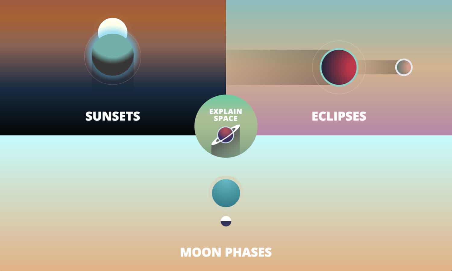
A screenshot of Cosma Schema’s explain.space
Why do you think design is an important part of bridging the gap between “hard science” and the average person?
This is something I’ve thought a lot about. The basic approach for good design is simplification. When complex ideas get written about in articles, or they appear in textbooks, or are presented somewhere at a conference, let’s say, the barrier to entry is still a little too high for your typical “space curious” person. From a communications standpoint, the power of design and simple, legible visual language is immense. Done well, design can cut through to the essence of what you’re trying to convey. This is something we tried to tackle with a website we worked on at Cosma Schema, explain.space.
We are looking at these really basic space phenomena that people experience, sunsets or moon phases, or eclipses, for example. Everyone who is a human looks at them and wonders, and you know, most people don’t know what’s happening during an eclipse. Visual design is such a powerful tool that can be used to demystify and engage people in something that is, by its very nature, interesting and full of wonder.
Are any space-oriented companies harnessing branding in an interesting/unique/inspiring way right now?
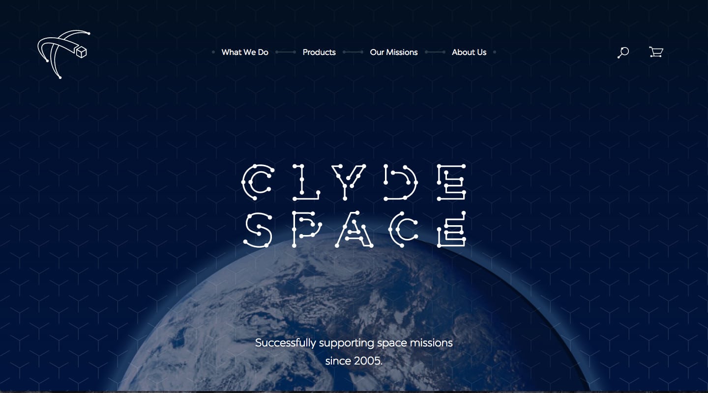
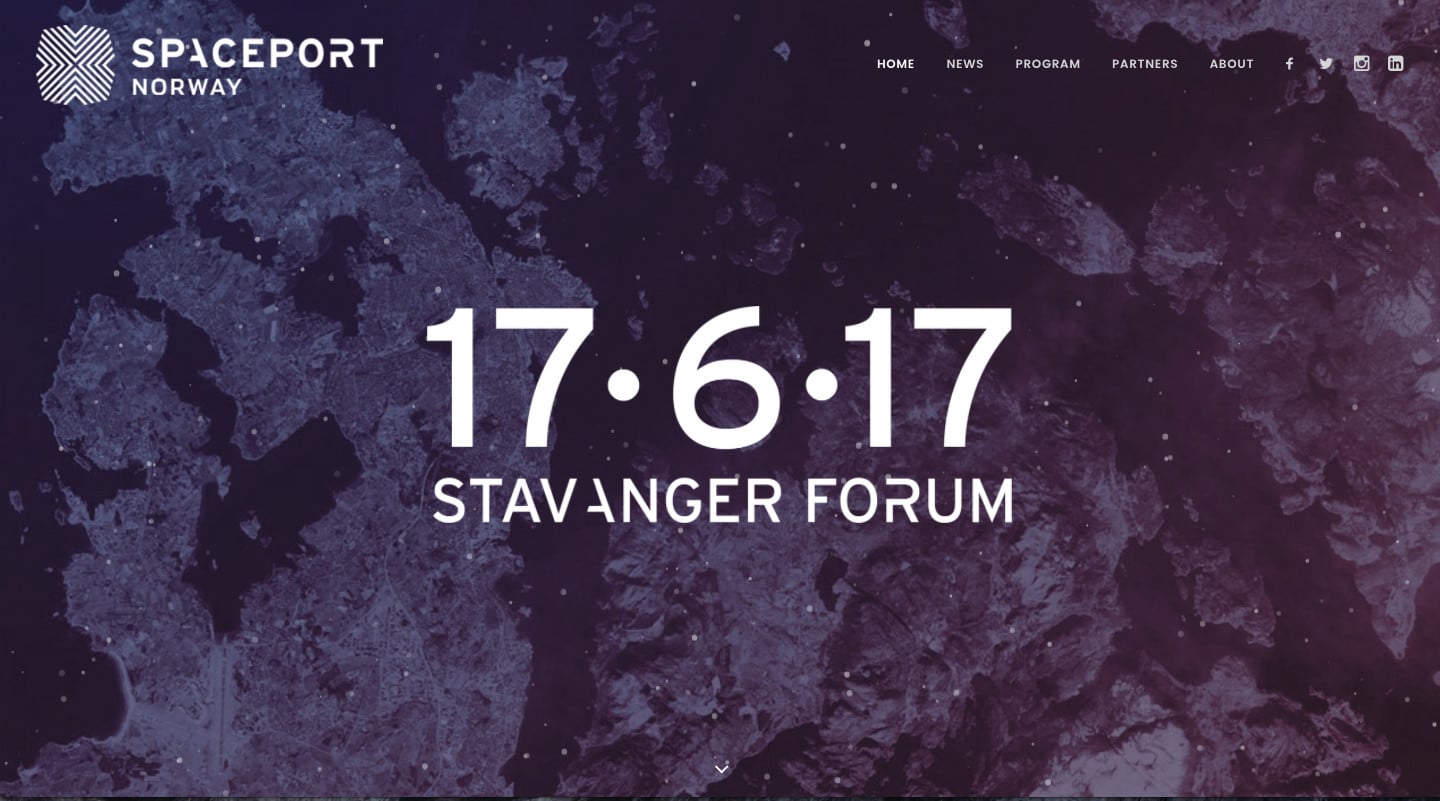
There are a few! Some that come to mind are Spire, a company focused on satellite-based data collection and analysis; Spaceport, a space industry conference in Norway; and Clyde Space, a satellite and satellite hardware manufacturing company.
What do you hope the future of the commercial space industry will look like?
I would like to see the space economy develop into a thriving, varied landscape. The real thing is, because there is such a variety of companies and services, I want to see tremendous variation among them. Bright colors, weird logos, cool font choices… just a ton more diversification and a pointed departure from the realm of blues and blacks that we see now. I want to see an embracing of the infinite possibilities that good design can afford. It seems only right. This is space we’re talking about.


This article originally appeared on Lingo Blog and was republished with permission.


