As Barack Obama’s presidency winds down, it’s safe to say that he’ll leave a legacy of launching the first digitally connected administration. His digital strategy team embraced social media and maintained accounts on Facebook, Twitter, Instagram, Youtube and Snapchat. From his website to his livestreamed State of the Union addresses, design was an integral part of effectively communicating important issues. And creative director Ashleigh Axios was integral to that design.
“As a creative director, I was in charge of a small design team and part of the larger Office of Digital Strategy. We worked as a start-up in the heart of the White House,” Axios explained on the phone.
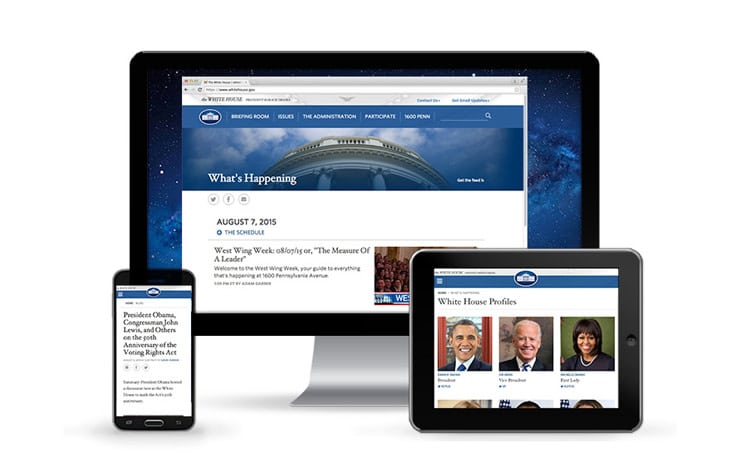
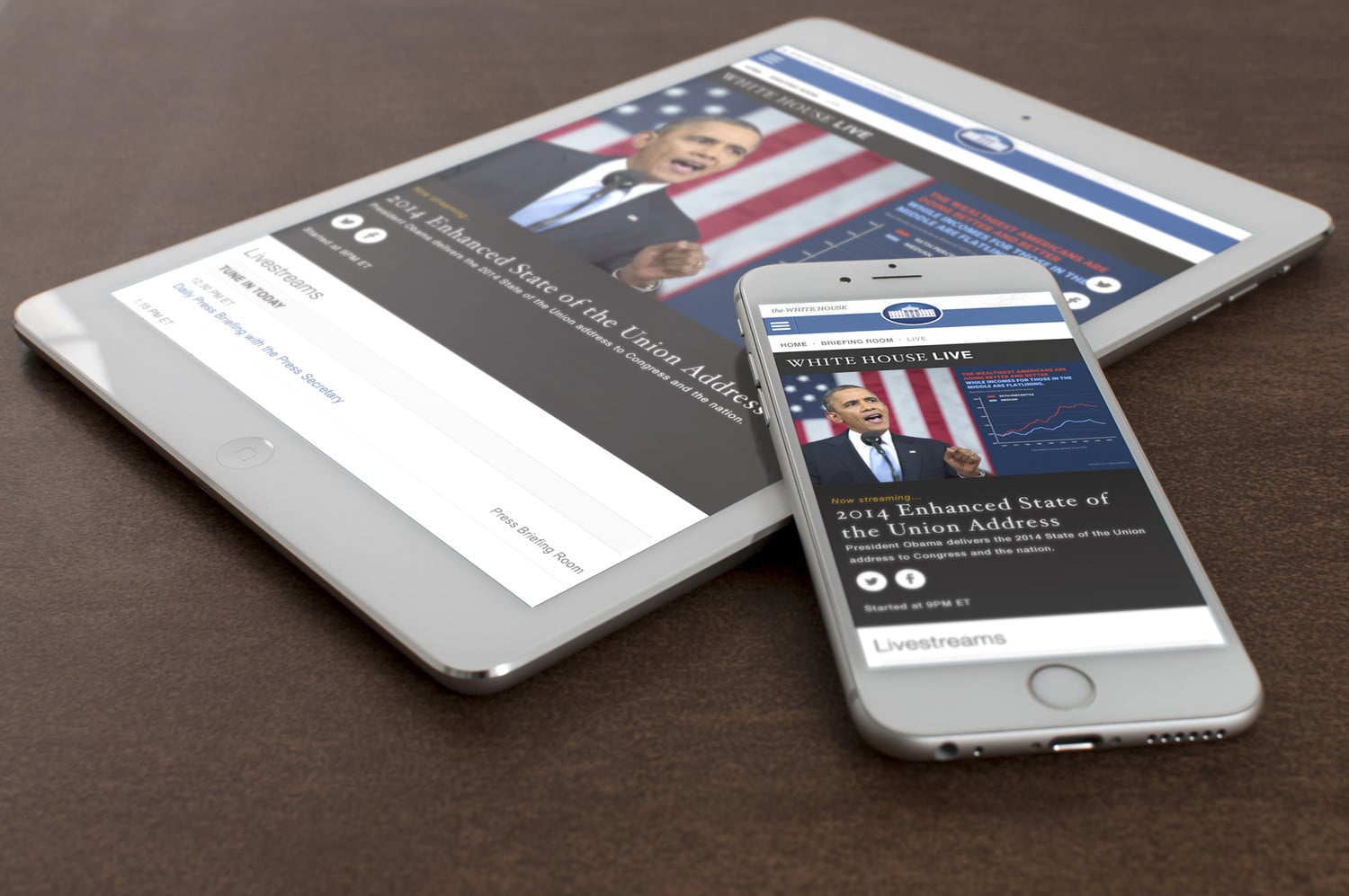
If you’re engaged with American politics, you’ve seen Axios’s work. She redesigned the White House website, to make it more human-centred and accessible, and the We the People petitions platform. For President Obama’s livestreamed State of the Union addresses, she created animated charts and infographics.
“My job was to find ways to make information accessible to the broader public. To break it down into bite-sized pieces and turn them into social graphics that would disseminate across all the social media channels in real time.”
Take a scroll through her Twitter feed and you’ll quickly see that Axios is passionate about her politics and outspoken in her support for diversity in the tech industry, prison reform and feminism. She’s an artist first and foremost (as evident in her quick “on the phone doodles”) who discovered that graphic design could be a tool for solving social injustices.
After finishing school, she moved to Washington D.C. and worked for non-profits, embassies and social groups until she got a call from the White House to join the Obama administration.
“When I was interviewed for the job I said, ‘Well, I’m not into commerce and I’m not an expert on health and human services.’ I felt the need to clarify that I’m not a subject matter expert on any of these government things. But, they understood that you kind of become a mini expert over time. I had the opportunity to work alongside some really brilliant people. There’s a lot of collaborating with people that you’re surprised to even be in the same room with. You’re discussing the Iran nuclear program with thought leaders on nuclear energy trying to figure out how we communicate the issue to the public. It was really a wild experience in that way for sure.”
Axios currently serves as an AIGA board member chairing the Racial Justice by Design efforts and has her eyes open for her “next big future challenge.” She’s definitely a person to watch, and a creative director to study. We asked her about the challenges of designing for the White House, the rumoured calligraphy office shrouded in secrecy and how she defines President Obama’s personal aesthetic. Hint: Hoefler with a side of Whitney—but never all Whitney.
Why design should be quick
“Before I took the job, I was concerned that government would move too slowly for design. It’s hard to get things done with lots of red tape. When it comes to policy, for example, that leads to a lot of problems. Our team, however, was really empowered to work quickly because after the 2008 political campaign there was a real understanding of what the power of design and the power of what technology could do—not only to get somebody elected into office, but to bridge the gap in communication between an elected official and the community who they’re representing.
“We got a lot of leeway to think outside of the box. We’d propose ideas and say, ‘I have no idea how we execute that but I want your permission to just run with it,’ and Obama’s team would say, ‘Yeah, sure,’ and then in 24 hours we’d figure out that first iteration.”
“You get better, over time, at designing well faster and illustrating well faster. You get the insights that you need to make a stronger user experience on the first shot, and then of course you iterate but you’re a little closer to being much faster at it after a certain amount of time.”
On the president’s aesthetic
“His style is so liberal and diplomatic. He counters all of the severity and strong history of the White House with a freshness and a newness. His friendly personality disrupts it. That was translated into things like our font choice. We used Hoefler to represent the White House formal side of things and we would counter that with Whitney bold or Whitney Light depending on the mood to show the president’s side of things.
“The colors too. The blue that we used reflects the president and what he’s doing. It’s brighter and it’s bolder and it’s a little bit more positive than a severe kind of darker blue. But we use severe blue to balance out the brighter blue because it’s not just a campaign. He’s President Obama, not just Barack. We wouldn’t just use Whitney and go all into that direction. We’re representing him as the president of the United States.”
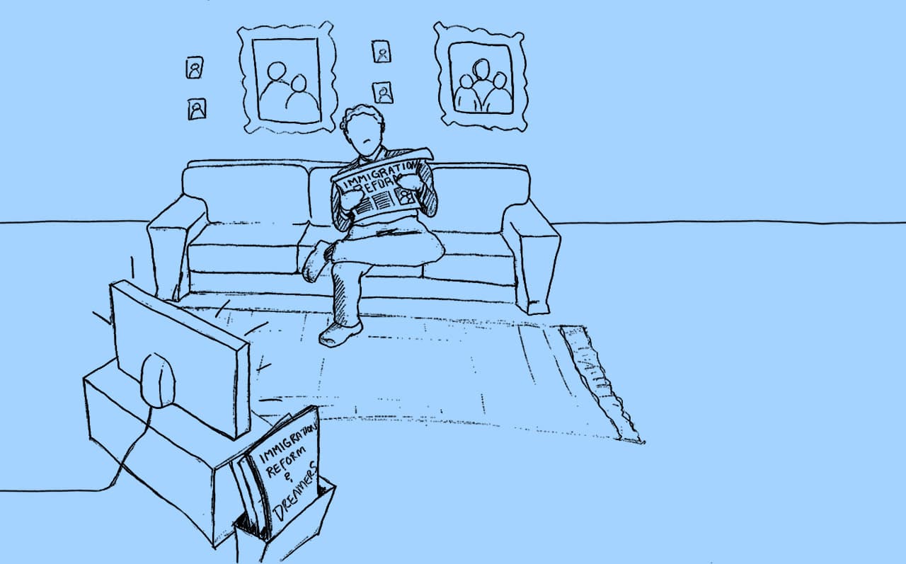
Immigration White Board Video project by Ashleigh Axios
On the White House secret calligraphy office
It’s true, there’s a calligraphy office. They’ve been so secretive about it. I think they keep the press low just in case people want to sensationalize the fact that the White House employs calligraphers. Not everybody understands how you can have so many calligraphers inside the White House.
They’re in charge of writing any invitations that go out, name cards and materials to help make sure that guests feel welcome and that they feel like they’re part of the history of the White House. There are events happening at the White House within all of the buildings every day.
The chief calligrapher is Pat Blair. She is one of the most humble and dedicated people that I know. Few people have been recognized for their success in calligraphy at the level that she has. She’s a Master Penman, and I believe there are just seven in the world right now. She has been recognized for her round hand style script which she used on the White House invitations.
Her advice for the next White House creative director
Keep pushing the envelope forward. I think especially if you’re a little more stylish, you can get into a rhythm with things and know a few things that you’re good at and want to stick to those. But I would advise them to challenge themselves and keep throwing new techniques and new mediums in the mix so that they continue to learn and grow and find areas where they’re able to reach people and surprise themselves.
On the relationship between the White House and social media platforms
In the course of my four years at the White House, we had to adapt and figure out platforms. Facebook algorithms change regularly so there are times when video does well and then all of sudden photos are the only things going through. It changes your perception; it changes what you’re working on for digital channels.
We got delayed for a while on Snapchat just because everything that we do in the White House has to be captured for the presidential records. It’s a real problem when content disappears because we need to make sure we have copies of it for the archives and presidential libraries. We have all sorts of agreements with the social media channels where it’s all being stored for us and saved.
On top of that, there are always new channels popping up. We’re already seeing 3D immersive experiences out there. We’ve tried our hand in it. We haven’t done anything that was too crazy or new so I’d be excited to see what future White House Creative directors do with that.
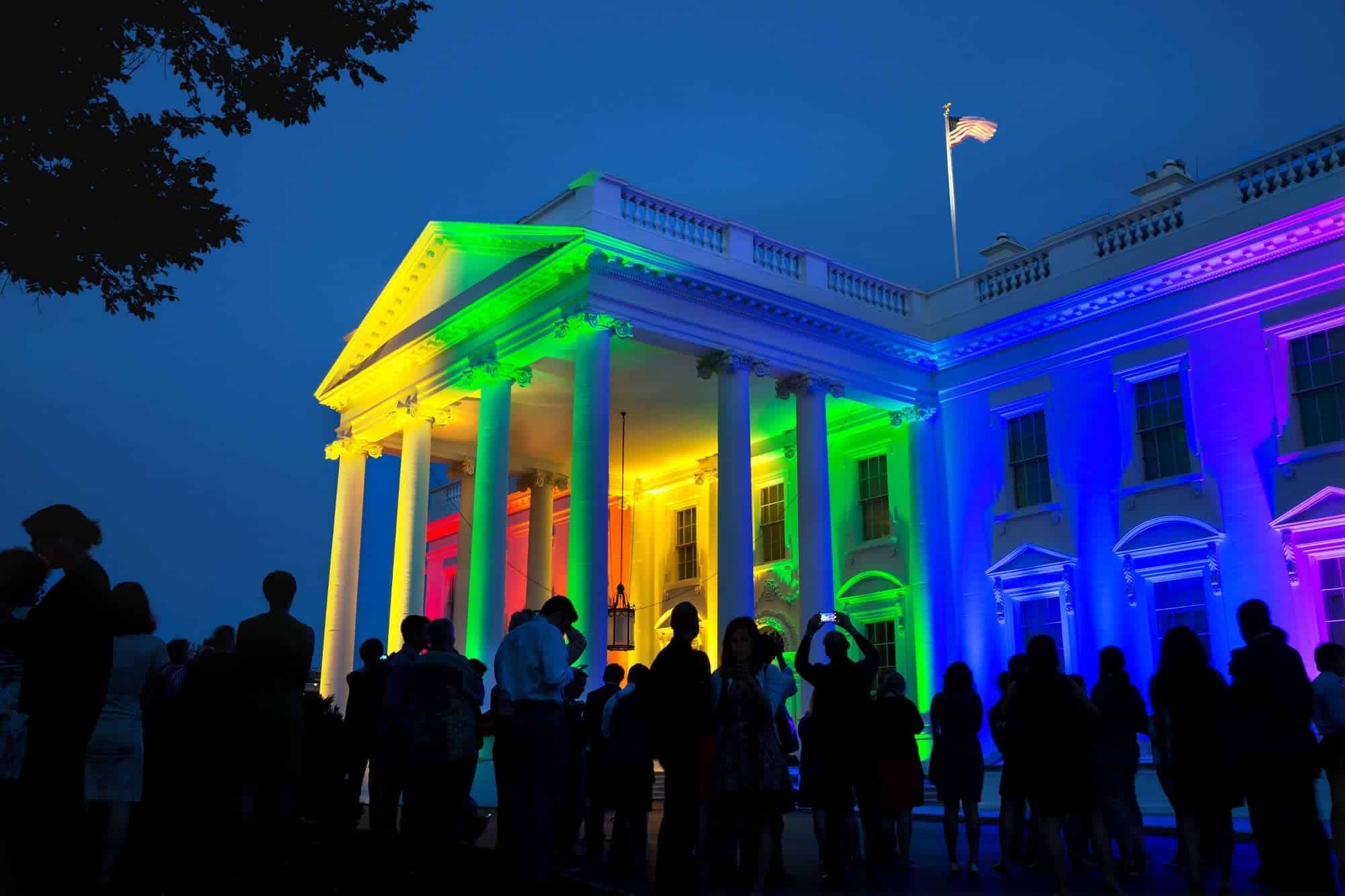
#LoveWins project/Photo by Pete Souza
Her suggestions for other organizations that could benefit from a creative director
There’s so many. I feel like designers need to look a little bit more at non-profit and public industry work. One big one that’s government related is the Department of Veterans Affairs. There’s still so much work to be done with that organization to make sure that they’re really centred around veterans and really figuring out what that means and then transforming the brand to meet that end goal. That’s a place where there’s really big opportunity right now.
Another one that comes to mind, and is close to my heart, is prison reform. There are so many organizations that have been around a long time that never had such public support as now to reform prisons and the industrial prison complex and the school-to-prison pipeline and the problems with recidivism that means more people keep going back into prison because when they are released there’s no support system for them.
The Vera Institute of Justice, for example, is actually a non-profit based out of New York that has offices in New Orleans and other key places across the country. They’ve been working with governments and private industry to try to solve all prison-related issues by doing case studies and really working behind the scenes. They’re just now figuring out that finally the public is in a place to actually be involved in the conversation. The public might not know the full breadth of it, but they want to learn more and they want to be involved with helping be part of the solution. There are big opportunities for Vera and other similar criminal justice reform organizations to jump in and create social dialogue and opportunities for real change—including rebranding themselves to be more public facing.
Ashleigh Axios is coming to Toronto November 3 & 4, 2016 for the Association of Registered Graphic Designers’ (RGD) annual DesignThinkers Conference. Now in its 17th year, DesignThinkers is Canada’s only conference exclusively focused on visual communications, and one of the most renowned design events in the world.
(Header image: Official White House Photo by Lawrence Jackson)


