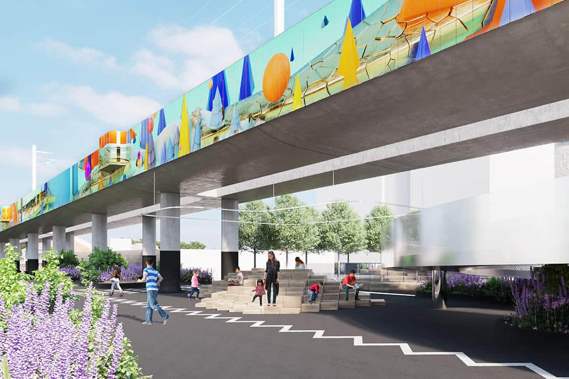
Toronto artist Alex McLeod has a huge commission on the road ahead of him. He’s making the largest digitally printed image in history. Metrolinx, a transportation agency of the government of Ontario, has commissioned McLeod to create a 1.4 km, two-sided artwork on the sides of a new raised rail line between Bloor Street and Davenport Road near Lansdowne Avenue in Toronto. McLeod’s original three-dimensional digital artwork, entitled SECRET PARK GATE, will be powder-coated onto the cladding on the noise barriers of a new elevated rail line. Prior to this project, the largest piece the artist had accomplished was AQUATICA, a seventy-five foot mural at 150 York Street in Toronto.
“I find myself in situations often where I am pushing things to the limit,” says McLeod. He sees big public commissions like this one as opportunities to problem-solve on a large and challenging scale: “I love problem-solving and hate saying no.” When asked if he enjoys pushing the limits, McLeod says that “If someone tells me, I want one of these pieces but it has to be larger than the CN Tower, I would say, we’ll figure out a way to do that.”
The call for submissions for McLeod’s Metrolinx project was released over a year ago. The contest had 315 responses and a shortlist of seven artists, which included some big names like Frank Stella and Martin Creed. Laura Berazadi of Metrolinx told Format Magazine that McLeod was selected because of his comprehensive consideration of the location of the project. McLeod’s design for the installation of digital images changes as the neighborhood changes, showing a nuanced approach to representing the communities around the site.
We got in touch with McLeod to find out more about the design process behind this record-breaking project.
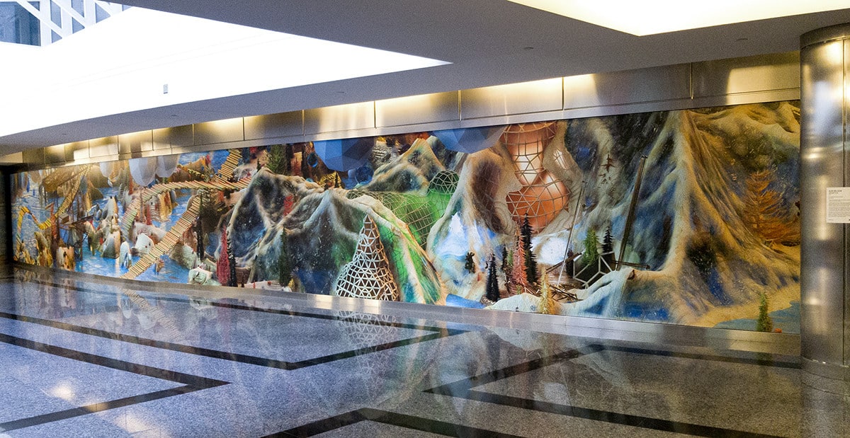
AQUATICA (2018) at 150 York Street, Toronto.
Are you excited about this project? How are you feeling?
It’s strange, it all felt so surreal. Working on something this scale seems near impossible. But everything fit together really well when we were putting it together. It doesn’t seem so unrealistic any more, even though it’s gargantuan.
How big is this piece in total?
1.4 km on either side of the piece.
Is the digital mural going to repeat, or be original on either side?
It is original on both sides. What’s happening is on one side the landscape has a view, but on the other side of the landscape it’s the backside of that landscape. It’s the same landscape but from two different vantages, so it’s not repeating. That’s what is so cool about making things in three dimensions—you can make one scene like a maquette and then photograph it from two different sides.
Was that the idea that you went into the project with originally?
As soon as we realized that there were panels on both sides, it just seemed so evident that that would be how I would treat it. I did something similar at the parking pavilion at Harbourfront Centre. There were three panels around this concrete entrance; it was one scene photographed from three vantages. This was another way to make something that’s digital seem more real.
So it’s a bit like a 3D window into space.
There’s something funny and magical about it.
Is there going to be any point where you could stand at the foot of the imagery so you can feel that you’re almost in it?
No. It’s pretty high up. I think 9 feet is the lowest point of the bottom plate, so with trick photography and a tall friend it might be possible to simulate that! It’s at that height because of the scale of the train, and the other reason is because they try to mitigate graffiti and things like that. You’ll have to enjoy it fully from afar!
That’s better. It protects the piece, but also prevents it from being selfie art.
I’ve always wanted my art to be selfie art. I feel like it’s not enough selfie art.
I’m sure you’ll have other pieces that let you do that!
I thought [my work at] the Commissary at the Drake would be selfie art, but not enough people are photographing themselves in front of it!
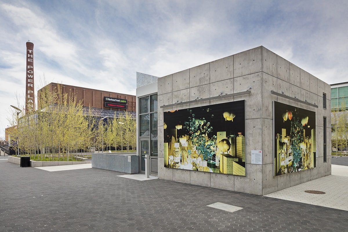
SPOTLIGHT (2016) at Toronto’s Harbourfront Centre.
Metrolinx told me that part of the reason why they selected you over the other proposals was because of the way you approached the residential neighborhoods. This new structure is going through new areas of the urban space. I really appreciate how you have designed the piece around that, and with sensitivity to the community. I’m wondering if you can put into words what you considered in that process in regards to urban planning and the spirit of the place?
Spirit of the place! That’s it. It has a special spirit because there are factories there. I had no idea how long the history of the neighborhood really was. My experience with it, and my peers’ experience, was coming in as artists working in the studios there. We saw a quick change and a lot of people gravitate towards the area. In our short window, we saw so much happen to that neighborhood. Who knows all the things that happened before and will continue to happen. I consider these things when creating a work that’s supposed to live in these liminal paths for a certain amount of time.
I’ve been abstractedly representing different kinds of structures, or structural plants and trees, and building them in certain ways so they give evidence to their creation. They’re evergreens—in Canada we have a lot of evergreens and we psychically identify with evergreens. They’re represented through me making the imagery digitally through a CAD-based program. I take all these points of references and mix them together in this digital stew.
How do you spread that out and make that unique over different areas? There were a few zones. I didn’t want to just make one thing that was going to be copied over the whole piece. I think that could be really boring, but also the people at Wallace are going to have different needs and wants, and sense of identity, from people further north. I think it’s important to give these micro-communities their own flag—their own landmark. For example, someone could say “I’ll meet you by the blue forest.” The kids could know where that is! At Wallace there is a more traditional landscape, but at the end of the digital piece is a scene where the imagery is almost down to the simplest forms, with trees and cones and spheres.
So the way that you’ve designed it, there’s an evolution to the narrative of the kinds of forms you’ve included. And you’ve also decided the transitions based on the neighborhoods that it passes through. It sounds like also there are areas where it is more public, like at an overpass, and then there are areas that are quieter and calmer at residential spots.
Yes, there are high-engagement and low-engagement areas. There’s a lot of areas. Half the mural might just be sky—blue panels without the same kind of content. They are for the low-engagement areas. Sometimes there are buildings almost against it, or there’s nowhere for people to see the work. We didn’t see the point in building something that people would miss. I think that’s frustrating. I wanted to transition the scenes to make it feel like the viewers were returning back to the sky. There are variations of blue in the sky and then it goes back to another scene. It was also a way to tie in all the different kinds of landscapes.
What do you think it’s going to feel like to stand in front of the Metrolinx work?
Each of these sections where you see the high-engagement areas, they’re 160 feet. It’s significant. It’s going from HD to 4K. It’s four times or at least triple the size. It will feel great—expansive and amazing! It’s not like, “Oh my god, will I be able to do that?” I’ve realized we can do anything!
When you’re working from 3D you’re working from computer screen size. It’s a lot smaller than the size of this mural’s scale, so it must be hard to imagine, no?
The height of it is so small compared to the length of it. It’s so long. It’s impossible to see on the screen. In real life it’s the same. It’s two sides and it’s so long. You can’t see it in its full expanse.
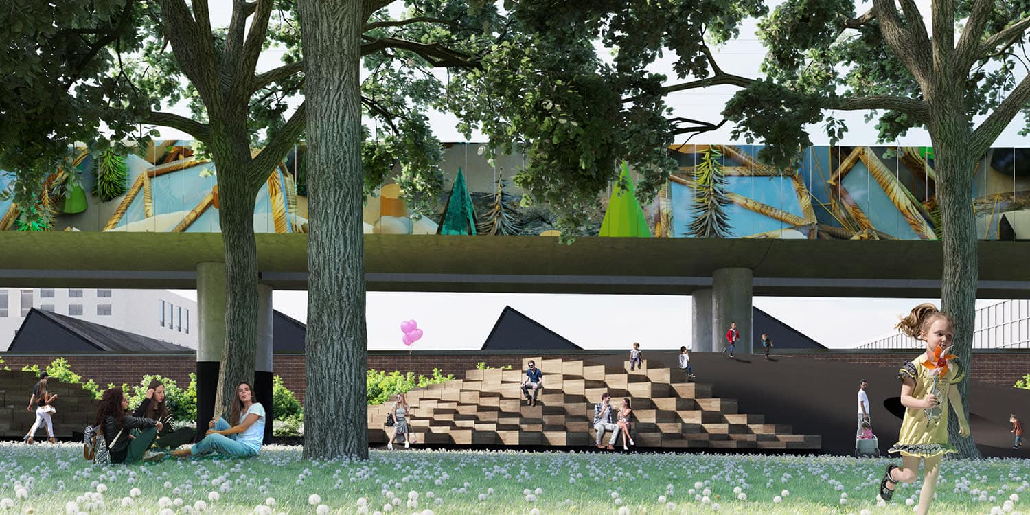
SECRET PARK GATE (2018) at Metrolinx Davenport Diamond.
I wanted to ask about being a Torontonian and doing something on this scale in your city. You seem like a diehard Toronto person. You grew up in Scarborough, and have lived downtown for 15 years. How did you draw on your personal experiences of the urban space of Toronto while deciding on the content for the project? Is this why you were attracted to the project?
I didn’t think in my wildest dreams I would be selected for this. It’s a huge honor to be one of very few Canadians even short listed, and then ultimately selected. I think it’s important to have international public art in cities. But in Toronto maybe those are better suited for financial cores or tourist areas.
How much time did you spend on the proposal?
We spent a long time. It was giant—a book. It was 95 pages. Samantha Viarruel, my partner, worked so hard on that proposal. She did 90 percent of it. We wanted it to be a turnkey solution. We wanted to have all the art, specs, treatment, the written component, and the prices done. Everything was supplied so nothing was in the air. It’s hard when you’re working on something so big and there are so many moving parts. We wanted to minimize any mystery or variables. “Can he do this?” “What am I looking at?” That’s a huge advantage that I have from working digitally; I know how long it will take and I can scale things up.
We worked on it for a long time. We had to figure things out on our own in some ways. We had some experience putting together proposals for public art, and I had worked on larger corporate commissions which helped validate me as an artist participating in this field. Of course I can do this—I did a 100 foot mural for TD Bank, this is just 100 times that! It’s all these things my past experiences have been building up to.
How did it feel to work on something to that extent without knowing if it would be chosen?
It felt like a school assignment. Not in the sense that it was busy work—more like when you work really hard on your master’s thesis. You think, I’m doing this, it’s going to be the best I can make it and I’m going to be proud of it. I’m not going to expect anyone to publish it. I’m just Alex! When they accepted the proposal I was like, “No way! What!” I didn’t believe it. Samantha would say there’s a chance, and I would argue with her.
Even though we supplied them with information as best we could, there were more senior artists, and 300 people applied. I was really just honored to be asked to make a proposal. Now, going forward, we have all this information so we can keep doing this. It was a huge learning experience.
It’s good advice to push forward and look at everything you do as an opportunity. Even if you didn’t get this, maybe you would amend what you did for another proposal later. It all moves forward.
Totally. [Take for example] Jeff Koons—do you think it’s that hard for him to put up a chrome dog anywhere? It’s a turnkey solution! He knows the fabricator, the size, how to ship it, the type of insurance it needs and the Windex he needs to clean that big dog. All these questions get answered if you work in the same way.
How will this work be weatherproofed? How difficult was it to resource those materials?
It’s a powder-coated printing system. It was a design solution that came out of the unique parameters of the project. We thought about tiling it at first, but that would have been insane. You’re working on this small scale digitally, but then you realize, wait, that would cost 100 million dollars. In smaller sections, tiles are great, but for this it didn’t make any sense.
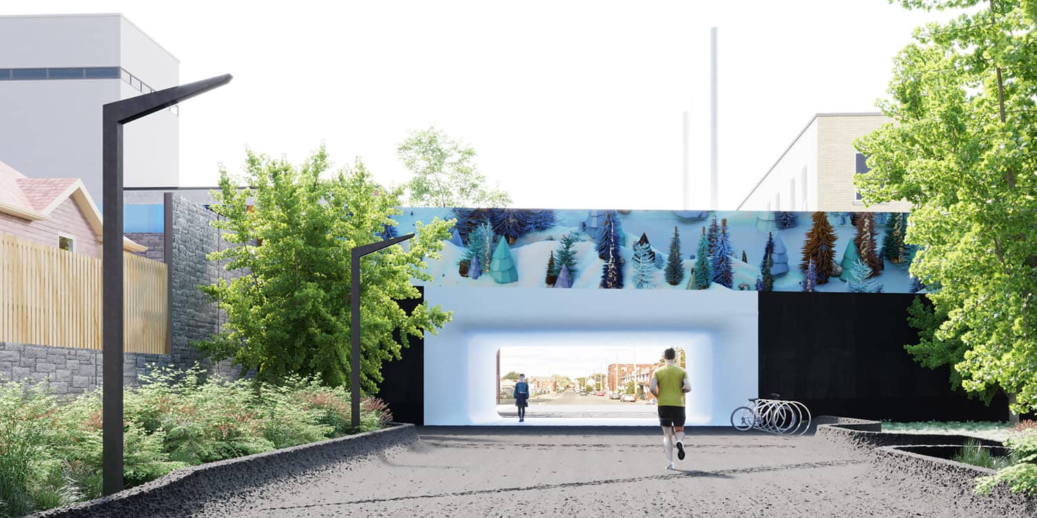
SECRET PARK GATE (2018) at Metrolinx Davenport Diamond.
How much work is still left to do? How long will it take?
It’s a really ambitious project. I don’t know exactly how long it will take. It’s mostly rendering that I have to do. I’ve designed the panels for the landscapes based on the preliminary dimensions that we had for the panels. Things change with all the factors, architects, community, engineers and everything. Once everyone figures out what it exactly is I’ll figure out how it’s rendered and printed. Whether it’s taller or wider, it’s not going to be very different. Maybe things get cropped in a different way. It’s creative modifying. The actual landscapes are already developed. It’s just 3km worth of rendering I have to do. That’s all.
You’re just creating a large-scale artificial world to scale at 1.4 km on either side with computers. No big deal!
It’s weird that it’s to scale! Those trees will be 9 to 14 feet tall. That is a tree to scale.
Has this project changed how you think about scale for the future? What’s next?
My new work at galleries, fairs, and commissions is video-based. So it hasn’t affected me that much because I don’t have that many opportunities to do print work. That being said, I would love to experiment with these powder-coated panels in a gallery setting. I would love to look at other methods of representation that are more architectural presentations of print work.
Are these appropriate to bring into the gallery? Or should they just exist in the public realm where they were birthed? We’ll see what happens! I have a show at Division Gallery next year. I don’t know, I think this project might inform the show, but I might keep public artwork where it is. I don’t know if it makes sense to start selling aluminum panels instead of printed paper.
I wasn’t necessarily meaning the materials, but any aspect of what you’ve learned from the project.
Oh, then completely. The work I did at 150 York Street is something I would love to print. It’s probably something where I would have to do multiple panels and hang it. I would love to have work that would take up the whole gallery wall. It would be really unnecessary. I think if we can’t have fun making art, who can?
All images courtesy Alex McLeod. Cover image: SECRET PARK GATE (2018).
