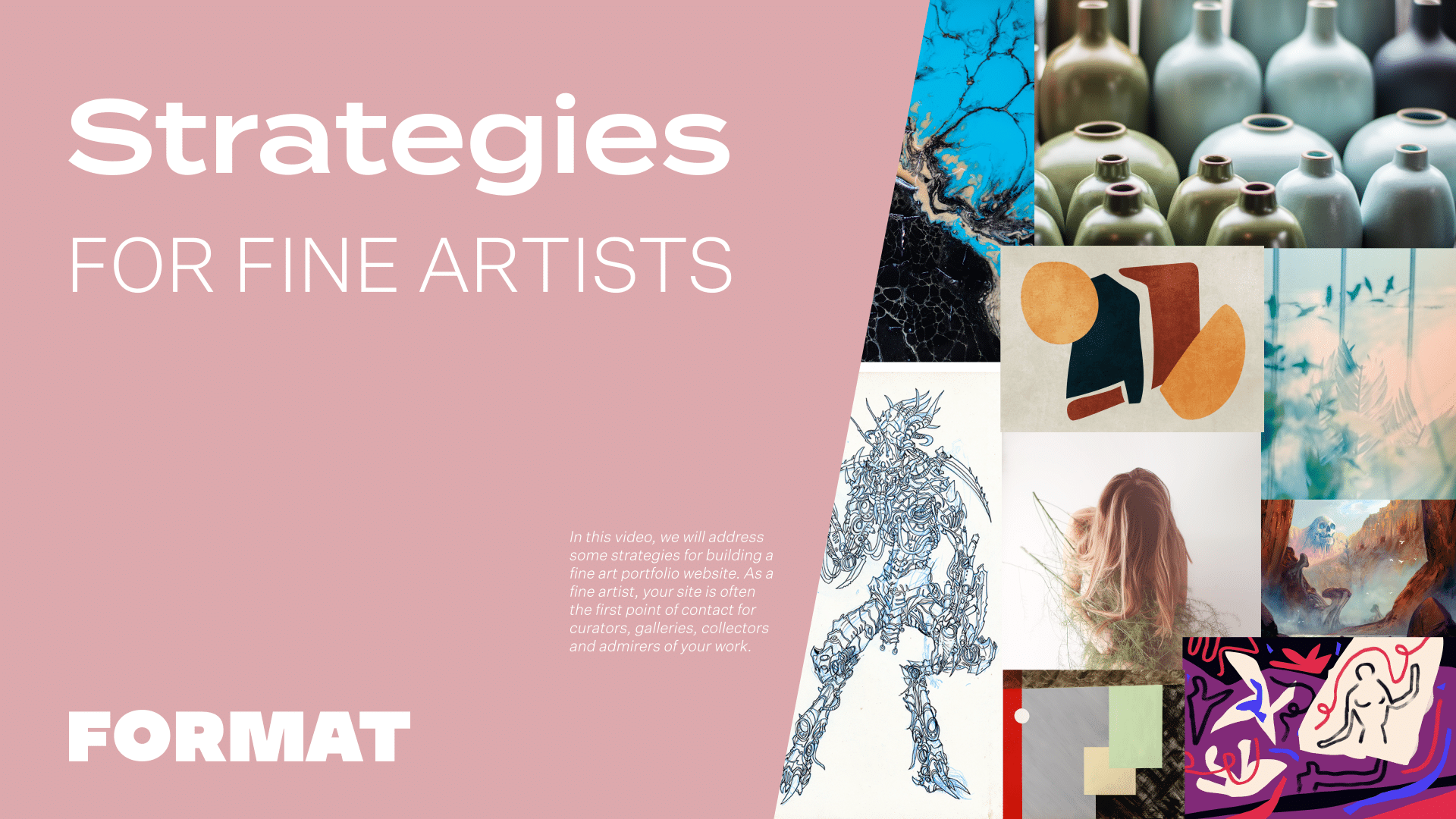
In this video, we will address some strategies for building a fine art portfolio website. As a fine artist, your site is often the first point of contact for curators, galleries, collectors, and admirers of your work. It’s essential to have a website that accurately represents your work and highlights your achievements, as well as providing a visually pleasing and user-friendly experience.
Throughout this video, we will be discussing how to effectively create a website that celebrates and showcases your unique talents. Here are a few key factors to consider:
Find a Theme That Works For You
Themes on Format affect the layout of your gallery pages, site menu and collection pages. The attributes and customization options vary from theme to theme so previewing themes to test these out with your own images is a great idea. Upload a few images on a gallery page and toggle between themes to find a layout that works best for you.
For fine artists, I generally recommend a large-scale vertical or horizontal scroll. This gives your site the feeling of an online exhibition- for this look, I recommend themes like Stockholm, Ora and Horizon Left.
Some artists opt for a tiled overview, which opens onto a slideshow. For this look I recommend themes like: Amazon, Peak and Object.
Create A Collection Page
First, group your work in a way that makes sense for you. Here are some of the most common:
- Exhibition/Series
- Media Type
- Year
Then create a collection page to show off these groupings.
If you have a lot of work on your site, group it in a way that will tell the best story about your practice. Are you an artist who works in series? Do you work in different media? Or do you want to show off a chronology? Create a gallery page for each section of your practice and then link these together on a collection page.
A collection page is an image navigation. When possible, I highly recommend collection pages over drop-down menus because it will allow people to get a snapshot of your best work, and it makes for a much nicer mobile experience.
A curadoria é fundamental
The biggest mistake I see on artists’ websites is including every piece they’ve ever made. Having short, succinct galleries makes for a great user experience on your site. Try to keep your gallery pages to around 20 images per page.
And, if you’re an emerging artist just starting out, don’t be afraid to have a single gallery page on your site. You should only have multiple galleries on your site if it serves the narrative of your practice. Showing only your strongest work shows confidence and a clear direction in your practice.
Use Captions and Text Elements to Annotate Your Projects
You often see artists including artist statements as separate pages of their sites. Instead, think about incorporating related texts within your gallery pages so that visitors to your site connect the writing with the work. Think of it like the didactic panels you see in museums – offering context is best done alongside your work.
On your Format sites there are many ways to add text. Add text captions to your images and use text elements within a gallery feed for longer blocks of text like Artist Statements and Essays. If you require more formatting options, custom pages offer tons of tools for incorporating image and text.
Custom Pages for Contact, About, and CV pages
Custom pages are just what they sound like: customizable pages where you can achieve your own layout by using different content blocks. Artists commonly use custom pages for Contact, About and CV pages. When you first go to make a custom page, you’ll see the option to start from scratch or from a template- both options are fully customizable. For Cvs especially, I recommend using one of our templates. These templates have been built by our designers to look great when optimizing for mobile.
When building these pages- keep in mind how paragraphs and sections will stack for mobile display. As you are working on a page, click “edit design” and toggle to mobile display to double- check your page layouts as you go.
