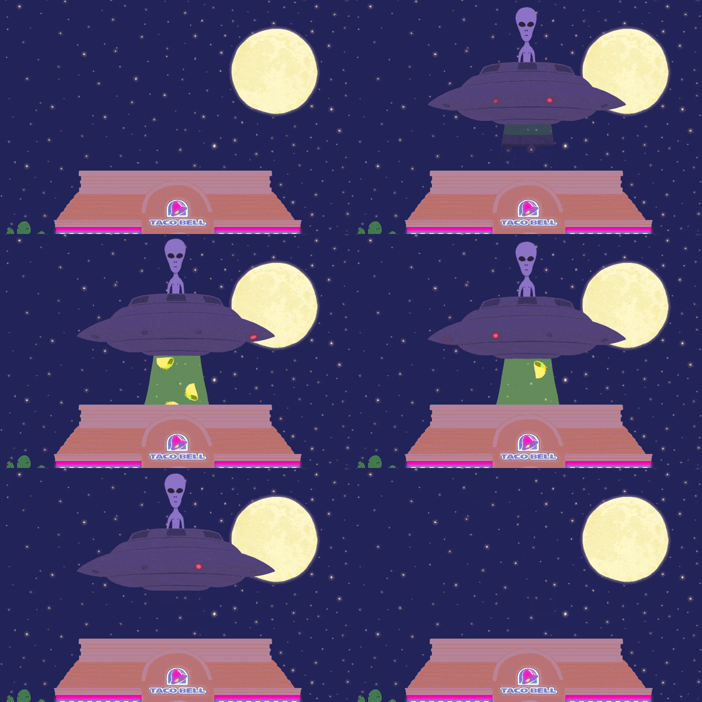
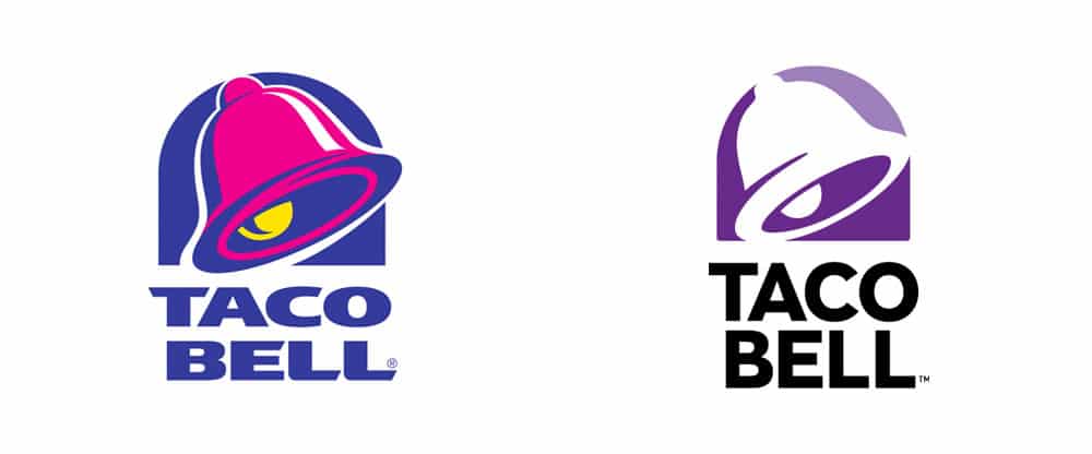
After 20 years of serving cheesy quesadillas and meat-stuffed burritos, Taco Bell decided it was time to relaunch their iconic yellow and fuschia logo. They nixed the trendy 90’s colors and opted for a streamlined purple avatar paired with a Gotham typeface. For some people, it was the end of an era. For others, like Taco Bell’s creative director Christopher Ayres, it was a necessary step for the brand to grow.
“Whenever a logo changes, everyone freaks out—Airbnb, Instagram. We’re all critics. However, with all due respect to everyone’s opinion, there’s a lot of strategy that goes into a rebrand and that strategy isn’t always known to the general public yet. From buildings to signage to apps, there’s a lot that goes into a logo redesign. It’s really daunting when you think about how far that symbol goes,” said Ayres on a phone call.
It’s been an interesting career trajectory for Ayres. His previous brand project was for the premium fitness experience of Barry’s Bootcamp. On his site de portfólio, he charts the company’s transformation from a cliche military identity with unbalanced design features to a sleeker, custom creative direction befitting of the $34 per class price tag.
“When the Taco Bell opportunity came up, I thought long and hard about going from a fitness-centric brand to something that seems diametrically opposed. But, you know what, it was true to myself because I have a great passion for Mexican food, as well as fitness, and there are things that Taco Bell offers creatively that sets it apart.”
Ayres calls Taco Bell an underdog (no, not that dog) and, as he points out, who doesn’t love an underdog? “We’re not a burger company, we’re outsiders,” he said. “There’s a renegade quality to how bold and unapologetic the marketing is. We’re not trying to be something we’re not. That underdog-ness permeates Taco Bell as a brand and allows us to use design to break the mold.”
Here’s what else we learned about Taco Bell’s new look, how Aziz Ansari influences their design and how to be passionate about chalupa wrappers.
Format: Hi Chris, what’s with the new Taco Bell logo?
Chris Ayres: Our logo didn’t represent us anymore. It was trendy when it was created, but now it’s limiting. It was suffocating. We want to move ahead with innovative retail merchandising, we want to make shirts with tacos all over them, but there was this logo from the 1990’s that we couldn’t make current. It was a “one size doesn’t fit all” problem. We needed to refine that bell, refine the typography and strip it back so that it works for new things.
This was all about t-shirt designs?
There are lots of areas of growth that haven’t been revealed yet. We have new restaurants opening in urban markets, rather than the suburbs. A couple of weeks ago we opened up a flagship Taco Bell in Las Vegas. It has a ‘Freeze Wall’ for alcoholic slushies. Plus, one of the things we talk about now, that wasn’t a thing ten years ago, is the distillation of the brand as an icon for social media or apps.
What’s your design philosophy for Taco Bell?
Because the brand is so unexpected, we’re given a lot of permission to break the rules and try new things. We can expand the brand, for example, through technology—apps, tablets, digital ordering. We try things out, like ordering Taco Bell through Slack, to see if that seed sprouts.
Even when it comes to designing something as mundane as a chalupa wrapper, essentially a piece of garbage that you’re going to throw away, we want it to be unique. We care about the experience.
It seems like Taco Bell doesn’t take itself too seriously, in a good way.
We don’t treat our customers as if they’ve never heard of us. They know who we are, and what we meant to them, and we can make jokes about it. There’s an effortless cool. I feel like I can come to work and not advertise em people. We’re just being who we are. With that sentiment in mind, our design approach is: How do we engage with you in ways that are not yelling at you to buy a product? How do we organically get your attention so that you want to engage with the brand?
Do you have an ideal taco-eater that you’re designing for?
If it’s just me talking to the team, and we’re working on a product, I might reference something Aziz Ansari said and be like, ‘This product is so Aziz Ansari right now. He would eat this. He is the person I want to hang out with eating it.’ It’s more abstract than that, but I think about it in those terms.
Let’s talk about how you got here.
From bootcamp to burritos.
Yeah, let’s go back to your work for Barry’s Bootcamp. How did you get that creative director job?
I had been working in the ad agency world in New York for seven years and hopping from client to client. There was lots of cool stuff, but at a certain point, when you’re designing social posts for tampon products, you’re like, ‘Hmmm, this doesn’t really resonate with me anymore.’
A friend took me to Barry’s Bootcamp and it was really great, but the branding felt off. So, just as a hobby, on nights and weekends, I started sketching in my notebook. The sketches turned into mock-ups. It was a pure passion project. I didn’t think anything would come of it.
One thing led to another and I had a 300 page presentation. When I think about it now, it sounds crazy. I just burned that midnight oil and stayed up until 4 a.m. It was lightening in a bottle, that doesn’t happen that often.
It sounds like you essentially hired yourself for the job and then showed them what they needed.
Artists and designers have an OCD gift where we can look at something and be like, ‘No, no, no, no, no, that’s not right for you.’ I think that’s one of the things that I do often, even if i’m not working on it. It’s just the way I view the world, and I think most creatives see the tonal dissonance—you see an ad and think ‘What’s wrong with that?’
What would you recommend for designers looking to make the jump to creative director?
People underestimate the power of networking. I don’t mean going to a bar mixer. You have to take opportunities even if you’re not totally feeling it. Through those experiences, you meet someone important to a future project, or they refer you to someone else. You have to get yourself out there and snatch up opportunities. There’s something to be said for just saying yes, just sharpening skills and getting experience to grow.
How does that translate to the type of designers that you hire?
Awhile ago, I was interviewing a designer and not very impressed with her portfolio. It seemed like she wasn’t that interested in the work her agency was doing. But then, she showed me this blog that she updated daily with logo concepts and sketches on napkins. Every day, something different. They weren’t official or published designs, it was just her hobby diary of creativity. I hired her because that’s the sort of passion I’m looking for. You don’t have to only show official work—exercise your skills as a creative on your own terms.
All great advice. However, when it comes to Taco Bell menu items, which is the most aesthetically pleasing?
Os naked chicken chalupa. It’s a chalupa but the shell is made of fried chicken. It’s delicious, spicy fried chicken. Of course you’re like, ‘Oh Taco Bell, with your frat boy Frankenstein food’ but it’s actually really good. We’re obvious famous for hijacking food and doing weird things, but it honestly delivers a good experience. Our in-house chefs are doing stuff like this every day and this one is getting the green light to move forward. I’m having a really fun time with our creative team’s concept on how to introduce it to the world. At the moment, it’s my favourite.
This interview has been condensed and edited.
Imagem do cabeçalho via Taco Bell
