It’s not just the cuisine that makes a restaurant stand out from the pack—the interior design and visual theme of a restaurant may be enhancing your meal without you even realizing it. As they say, you eat with your eyes first.
To find out more restaurant design, we spoke to three professionals about their work on top New York restaurants. They broke down their choices and inspirations for everything from light fixtures to color palettes. When you find yourself returning to Sarah Abdallah’s The VNYL, Michael Groth’s The Eddy and John Meadow’s American Cut Midtown, these designers want you to remember that it’s not just the food bringing you back.
Most people either like a space or they don’t—they really can’t identify why.
Sarah Abdallah, Principal/Owner of Functional Creative Design
Designer for The VNYL
Restaurant spaces are meant to be an extension of the hospitality you would offer at home—at least that is the way I see it. Growing up in an Egyptian-American household, my parents would entertain and cook for their friends almost every weekend. It was all about how they can be hospitable, from the moment their guests stepped into the door to the moment they left.
My background in psychology and art therapy has taught me how space planning, architectural materials, color palettes, and patterns can really affect someone’s emotions when they’re in a restaurant. Most people either like a space or they don’t—they really can’t identify why. Beside having the space functional for the staff and guests, I want people to feel as comfortable as they are at home.
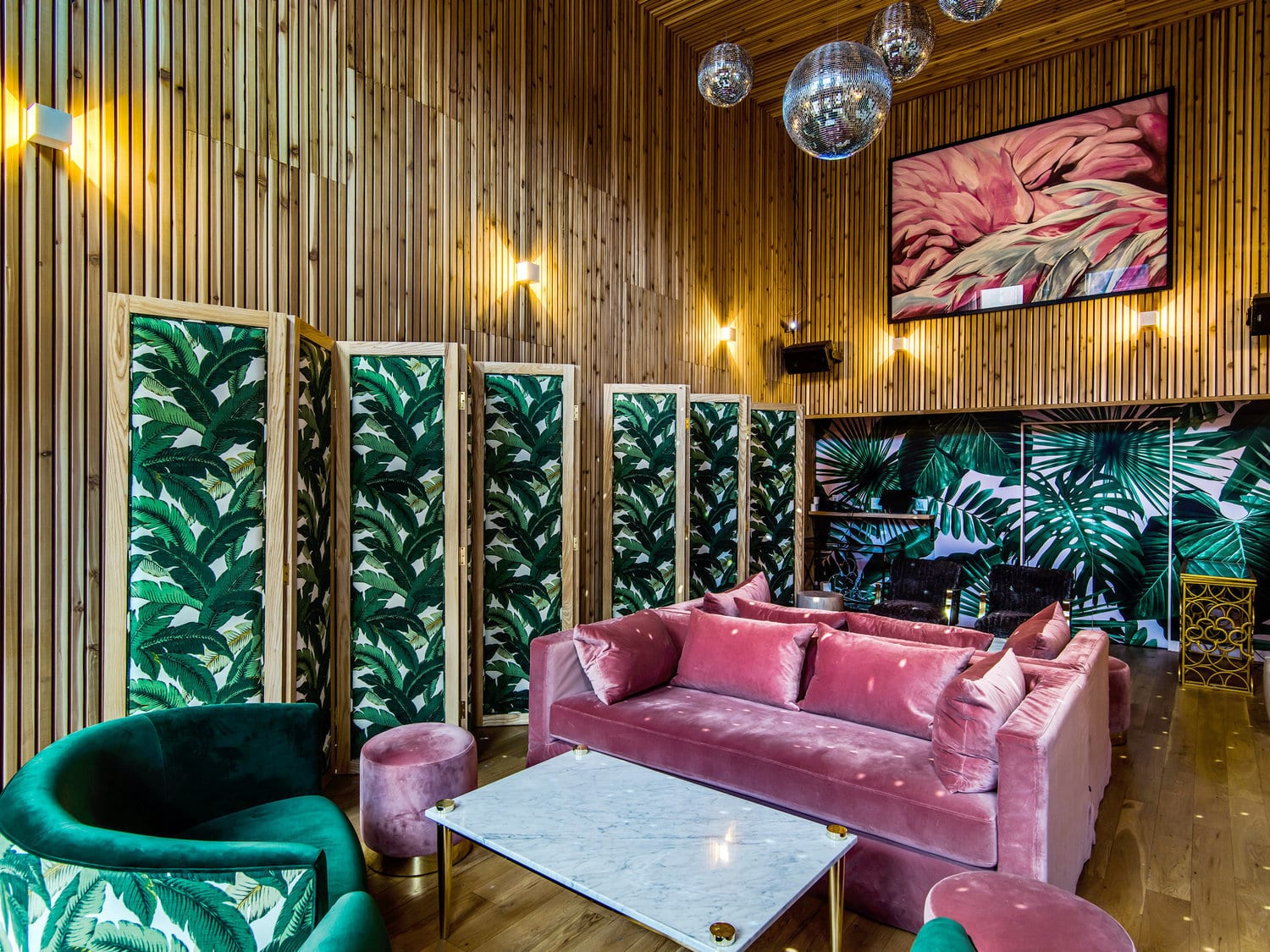
The VNYL is a fresh take on 70’s-inspired interiors with a layer of rock & roll. Each floor has a unique program that provides the guest with a new experience. The main floor of the restaurant has custom aqua blue linen-wrapped panels with CNC-routed walnut millwork to take you back in time. The eclectic custom furniture brings a lush moody residential feeling against a backdrop of the David Hicks wallpaper designed in 1970.
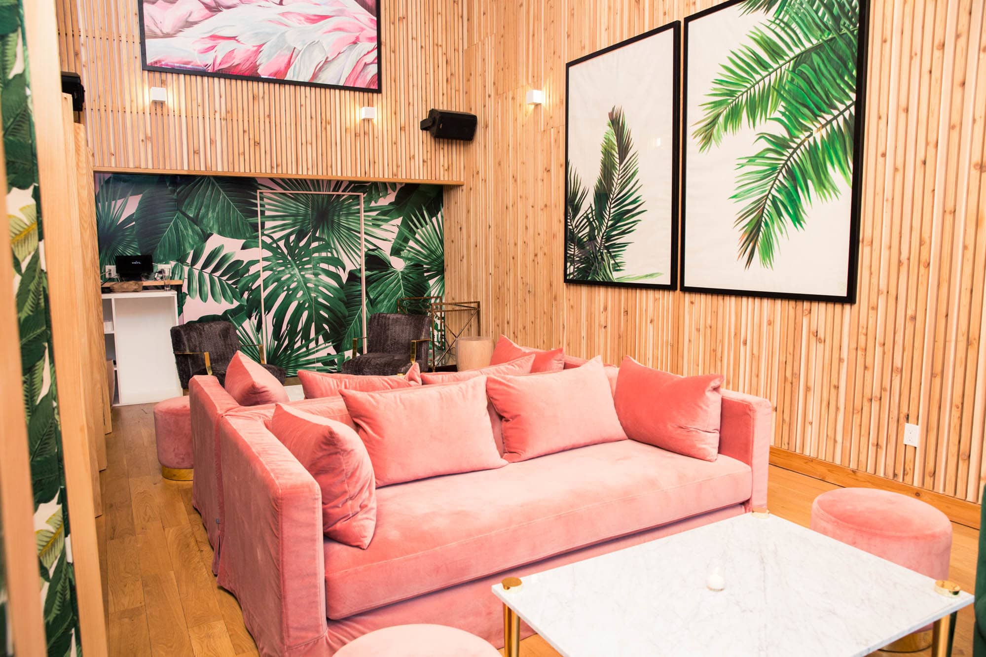
My favorite part of the design is the “champagne garden.” It has custom cedar strips on the walls with panels of Ghislaine Viñas’s Wild Thing wall paper. I love the plush pink velvets and hand-knotted macrame swing.
Everything starts with the client—I’m truly inspired by the people I get to work with.
Michael Groth, Principal/Owner of Michael Groth co
Designer for The Eddy
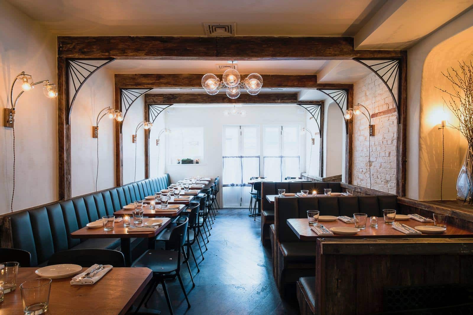
Everything starts with the client—I’m truly inspired by the people I get to work with. In the case of The Eddy, the materials and the overall feel were inspired by Chef Brendan McHale’s amazing cooking. He basically does great American food with a thoughtful modern perspective, so that’s what we tried to do with the design. A somewhat traditional, comfortable space with some unexpected twists.
The Eddy was a labor of love. We had a challenging space to work with and a tight timeline to turn everything around. I reached out to all my contacts to bring it together, and the entire space is completely custom and handmade locally, from the light fixtures and tabletops to the reclaimed-wood beams we installed throughout the space.
I hope that when people dine at The Eddy, they feel some escape from their day-to-day worries and are able to enjoy a few hours of good food, good drink and good company. I really love the bar—it was a tricky design challenge because it’s such a small space, but the end result is both functional and charming.
A friend told me that he goes on maybe one date per year, and it is always at The Eddy. I think that is about the best compliment I could ask for.
I want our guests to feel that they are participating in an elegant yet communal and lively dinner party.
John Meadow, Founder/President of LDV Hospitality
Designer for American Cut Midtown
I worked with with SLDesign’s Chris Sheffield to create a design concept for American Cut Midtown that would combine gritty New York City style with rock & roll. The design is expressed through the signature art pieces, the unique geometry of the lighting fixtures and sleek leather banquets.
The space itself was the former entertaining saloon of Sir Randolph Hearst’s mistress. This was a great exercise of adaptive reuse which involved incorporating the original crown moulding and adopting a grand ballroom style of yesteryear, for today.
I love the harmony between signature restaurant elements with the space’s original features, like stain glass vitrines. I want our guests to feel that they are participating in an elegant yet communal and lively dinner party.
The best feedback I’ve gotten from people is that it feels good to dine at American Cut because it offers a unique balance of comfort and glamour.
