Every piece starts with a pencil sketch—or rather a heap of pencil sketches.
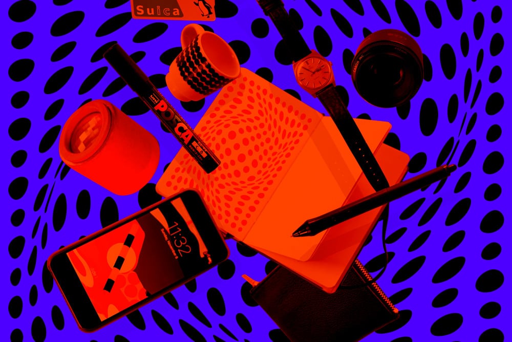
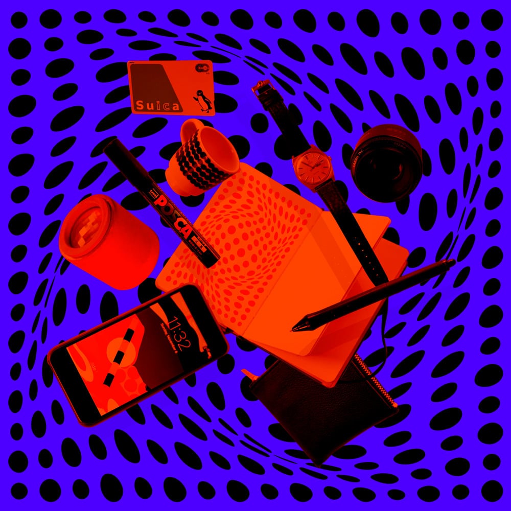
- Omega Genève Automatic 197?. From my Dad because I’m always late.
- Canon 50mm Lens. Great for portraits and still life, or to sit in your cupboard gathering dust.
- Wacom Intuos Pro 5. Every designer/illustrator should have this!
- Comme des Garçon Wallet. For the ridiculous amount of coins in Japan.
- iPhone 6. The coolest pocket size point and shoot camera. It makes calls too apparently.
- Kaleidoscope. Perfect for looking out the window and procrastinating with.
- Posca Paint Marker. My favourite marker used for everything from poster tubes to sketches.
- Marimekko Espresso Cup. Making coffee is probably my favourite thing to do after illustrating. The caffeine helps too.
- Suica Tokyo Metro Card. Necessary for the trips to the studio and art galleries. The penguin is pretty cool.
- Moleskine Notebook. Nice thick paper, perfect for paint markers.
Quem é você e o que você faz?
I’m Karan, an artist and illustrator. I’m self-taught and have focused on visual arts and illustration for the past 9 years, drawing inspiration from graphic design sensibilities and op-art minimalism. One of my proudest design moments was organizing and participating in a 12 hour illustration marathon to raise money for the Australian Cancer Council. The prints sold out and I fell asleep at the desk after. It was pretty rad.
Your work often features bright colors and mesmerizing patterns. Where does an illustration start (and where does it end?)
Every piece starts with a pencil sketch, or rather a heap of pencil sketches. I’ve found that not only is it a very quick way to test if an idea works, but the simplicity of pencil and paper allows me to be more exhaustive at this important stage. Ironically, for an illustrator, I’m a pretty mediocre free hander which is why I rarely scan my sketches. They’re mainly for compositional purposes as it helps me find a balance between a subject, foreground and background. Once I’m satisfied, I redraw everything on the computer and slowly begin to piece together elements.
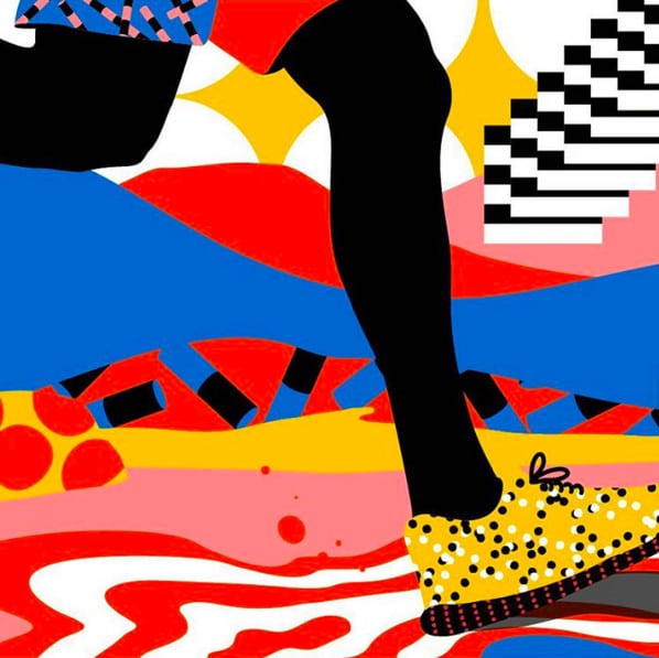
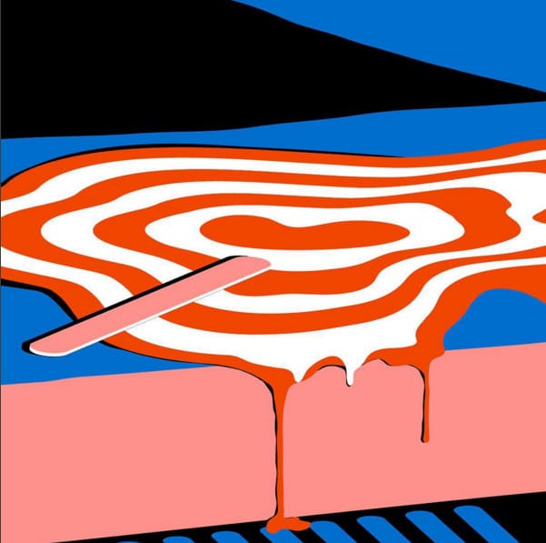
Coloring is usually what takes the most time. My objective is to communicate depth and dimension as effectively as possible with flat color. It becomes a bit a puzzle to solve which bits need to be in which color to be recognizable. Contrasting colors are pretty important to help create this definition which is why you’ll often see me use white and/or black with other pop colors.
2015 seemed to be the year of collaboration for you! What tips do you have for fostering healthy, working creative relationships?
Working with others brings you out of your comfort zone and gives you the opportunity to learn about how others work. For me, I’ve found creative relationships to come from interacting in person or social media with likeminded people. Often times they’ve come out of simple “Hey we should do something together emails”.
Working on collaborative projects can go two ways. On one hand, people tend to walk on egg shells in regards to their critique for fear of upsetting the other party, whereas on the other it’s the opposite and both artists want to take it their own way and neither is willing to budge. The best collaborative projects are when there’s a mutual respect and trust in each other. Those are the ones where you’re more creatively satisfied and learn the most.
Lastly—you recently moved to Tokyo, although you have lived everywhere from Australia to NYC. What do you keep on hand to make a new place feel like home?
I’d have to say my print collection. It’s that constant between apartments, whether in the same city or different country, that makes things feel a little more familiar.
