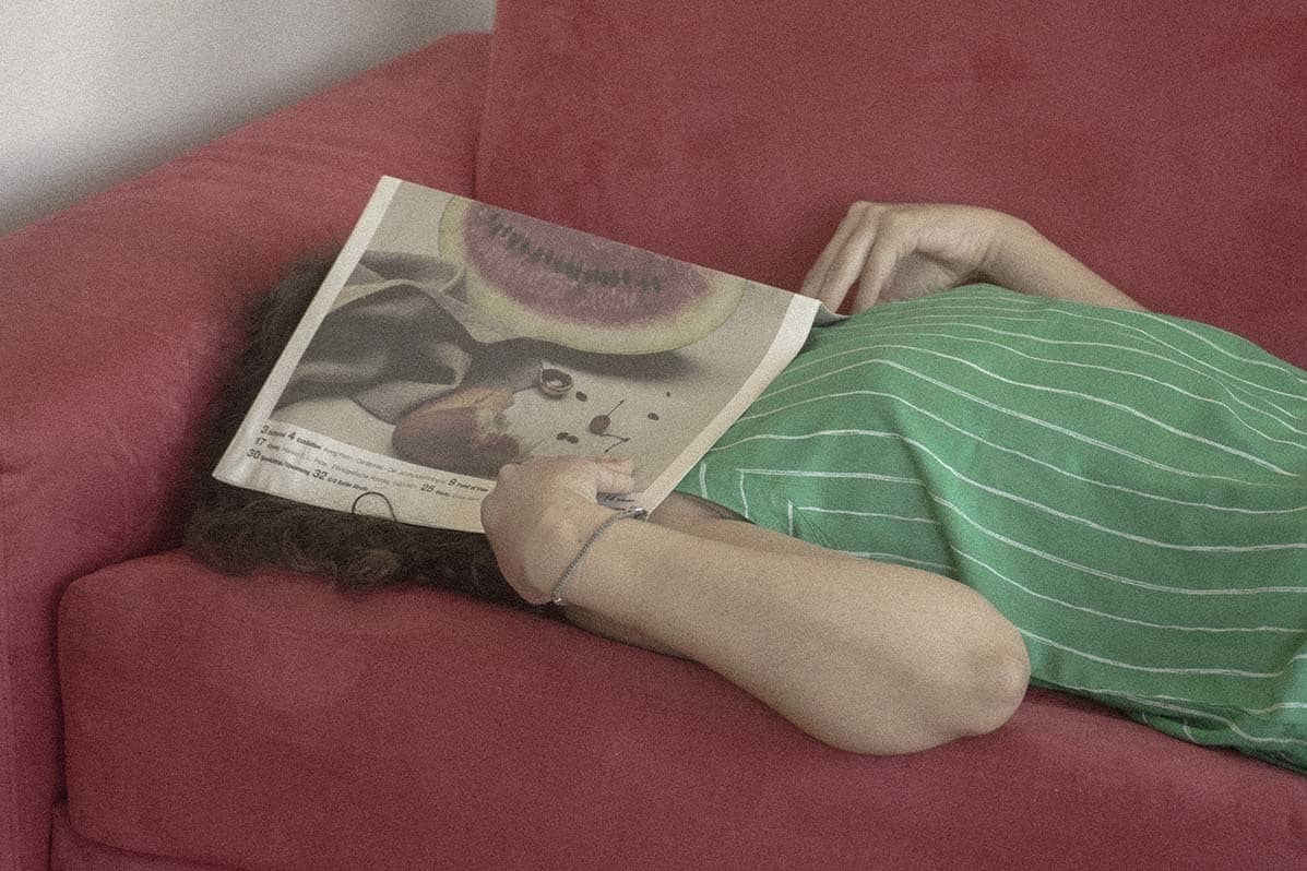
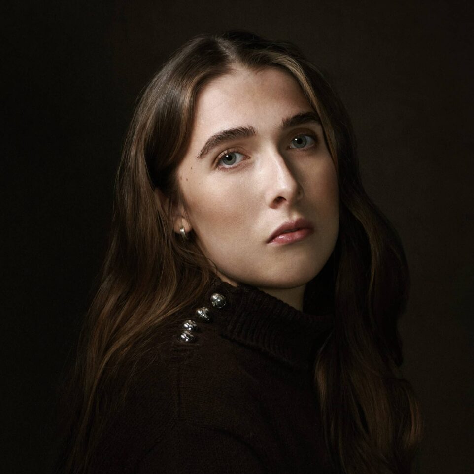
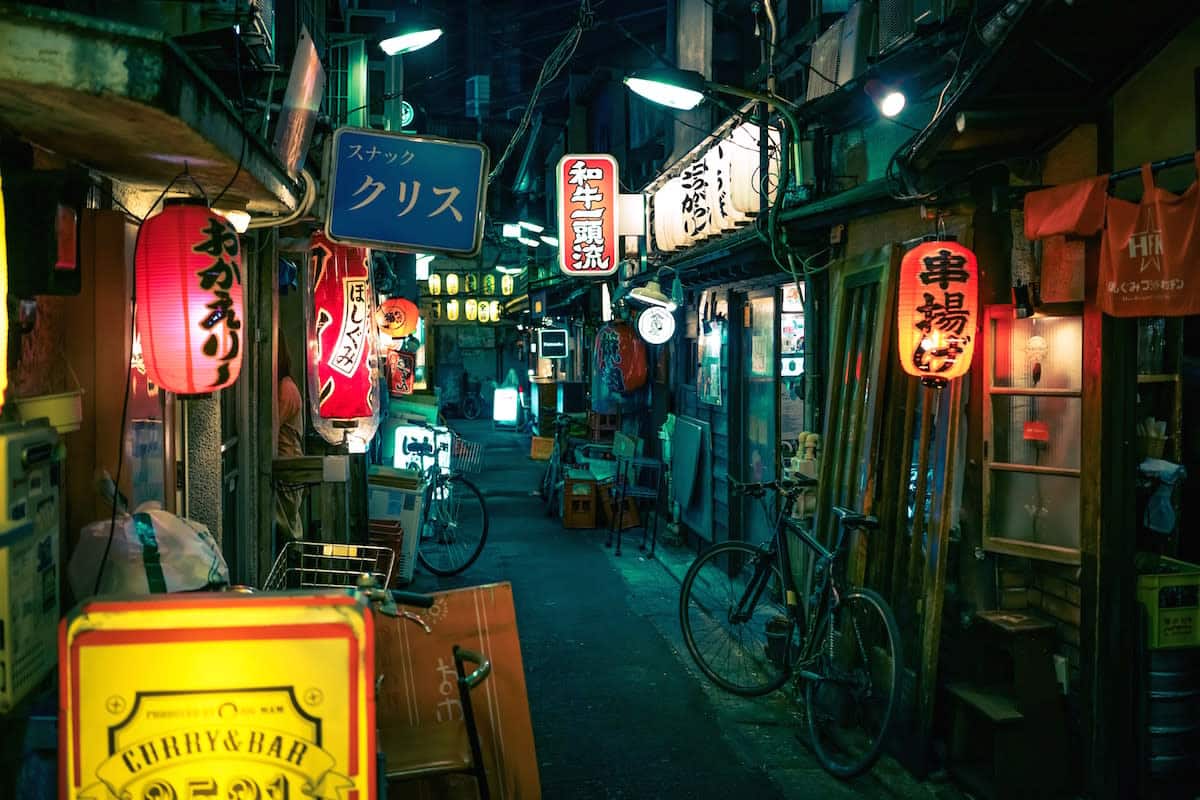
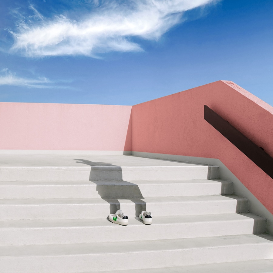
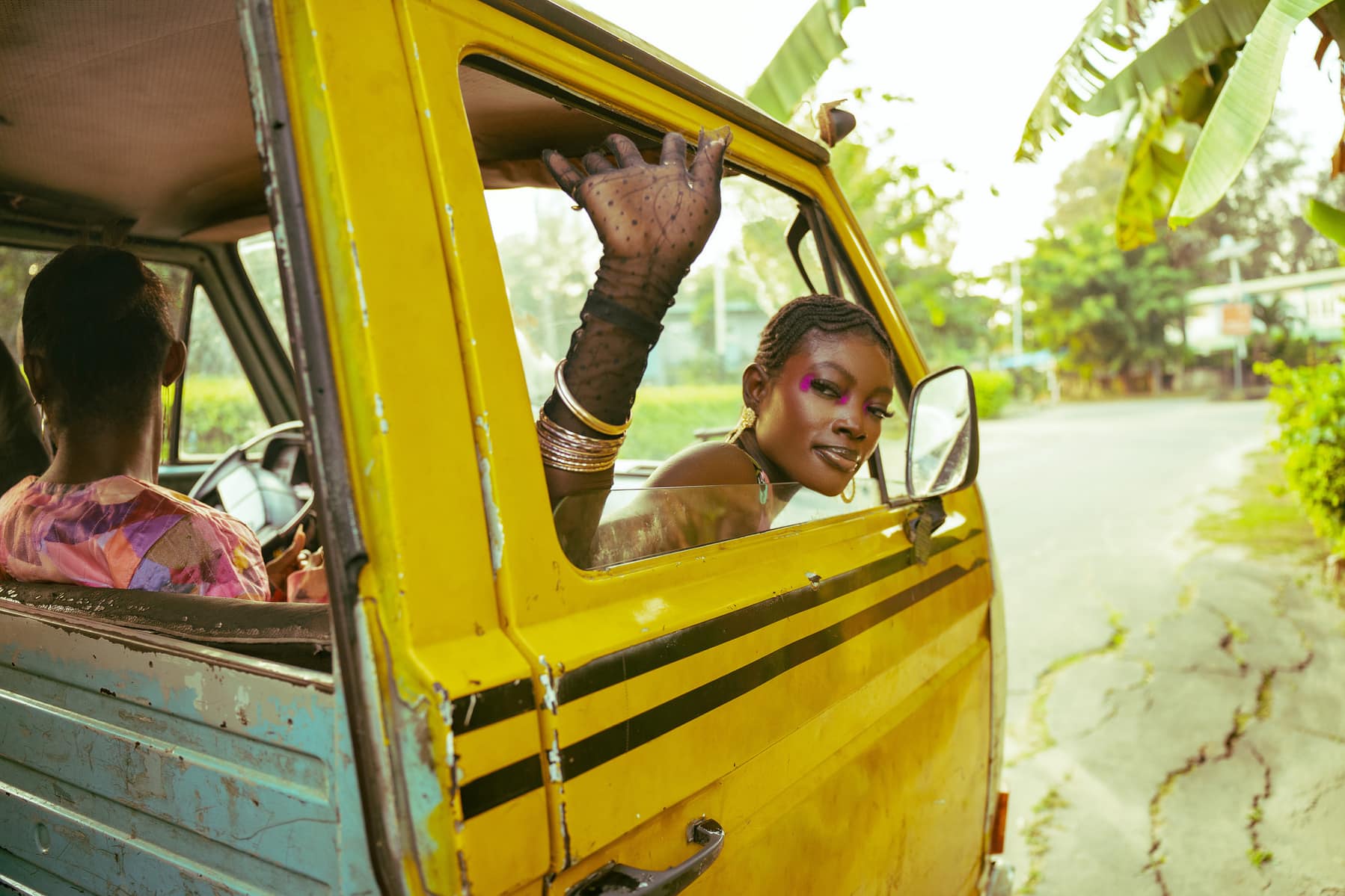
For our July edition of Choix du format, our ongoing creative contest series, we asked you to send in work inspired by the theme: print’s not dead. From conception graphique projects to analog photography to printed books, we saw loads of fascinating submissions.
Our winner for July’s edition of Format Picks was photographer Josh Nice, who stood out with a mesmerizing GIF of one of his self-printed photo zines. He’s won a $500 voucher to print his work through Newspaper Club.
We couldn’t resist sharing some more of July’s standout entries with you as well. Below, find our favorite picks from last month’s contest.
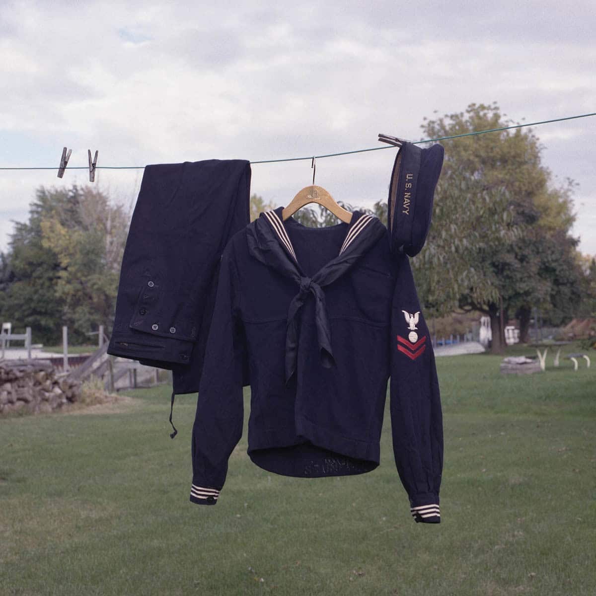
Kaitlin Molchen
“This image is titled ‘John’s Navy Uniform’ and is from my series Daydreaming of You. This body of work shows my grandparents love story through the eyes of their grandchild. I photographed not only my grandparents but the objects that make up their story. The love letters, his navy uniform, her wedding dress, the Bible my grandmother gifted my grandfather when he was in the navy, these physical objects that reflect their story. I chose to shoot only medium format film on my Hasselblad and Mamiya for this project because I wanted to slow down. I wanted to spend time with the people, places & things to better understand their memories together. Shooting film helped me achieve that and has continued to help in this way in many different projects as well.”
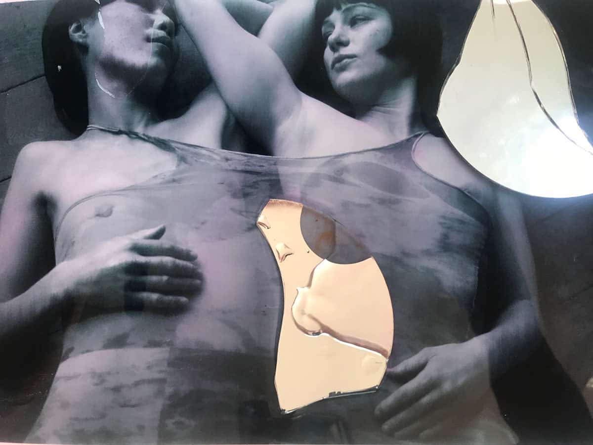
Paula Rae Gibson
“This is a collage. My work, for its final effect, needs to always be printed.”
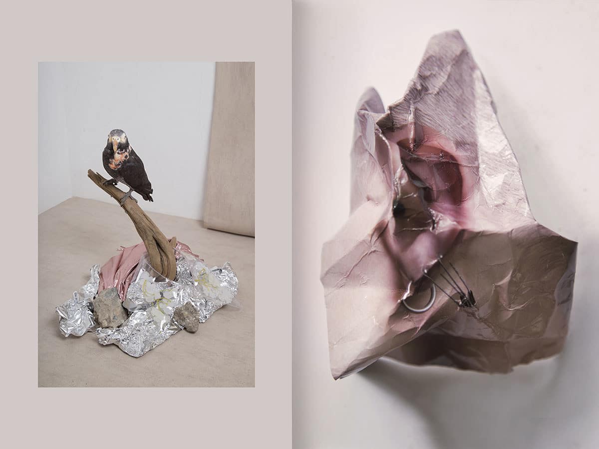
Alice de Kruijs
“This body of work symbolizes the artificial world of beauty and plastic fashion standards. I used a technique of printing and photographing it again to create a new image.”
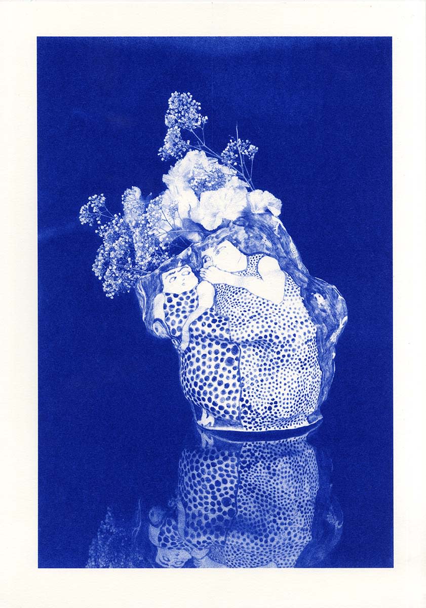
Marie-Yaé Suematsu
“My work is essentially about drawing on diverse support media such as paper, ceramic, fabric… I like to see how an image reacts through different techniques. For instance this image is a monochrome risoprint of a photograph from Billy Thomassin of one of my porcelain vases on which I drew two women, one whispering something to the other. I was very pleased with Billy’s photographs, but when I tried to print them it felt weird to see them in color. Then I tried the risoprinter and I loved the result because it feels like all of it— the vase, the flowers, the characters, their reflection—was a drawing. Print is definitely not dead. It brings the images back to life in our hands.”
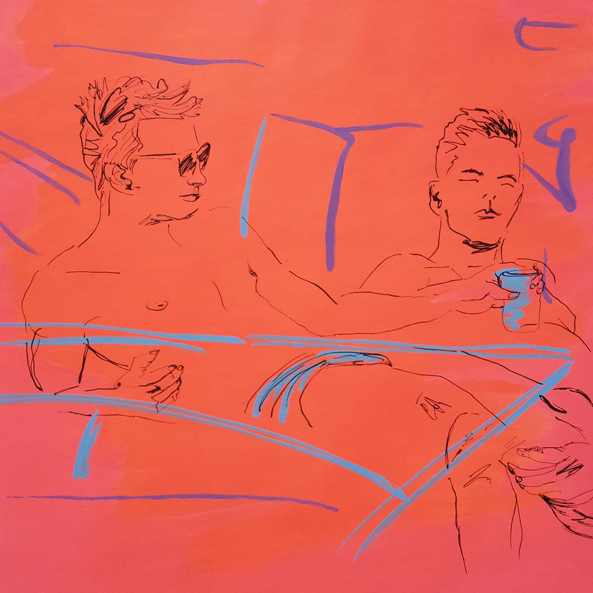
Tintin Cooper
“This is a painting from a series all based on printed newspaper images, and reinterpreted into simple lines and colors by myself. The original newspaper images are of sportsmen, footballers and celebrities.”
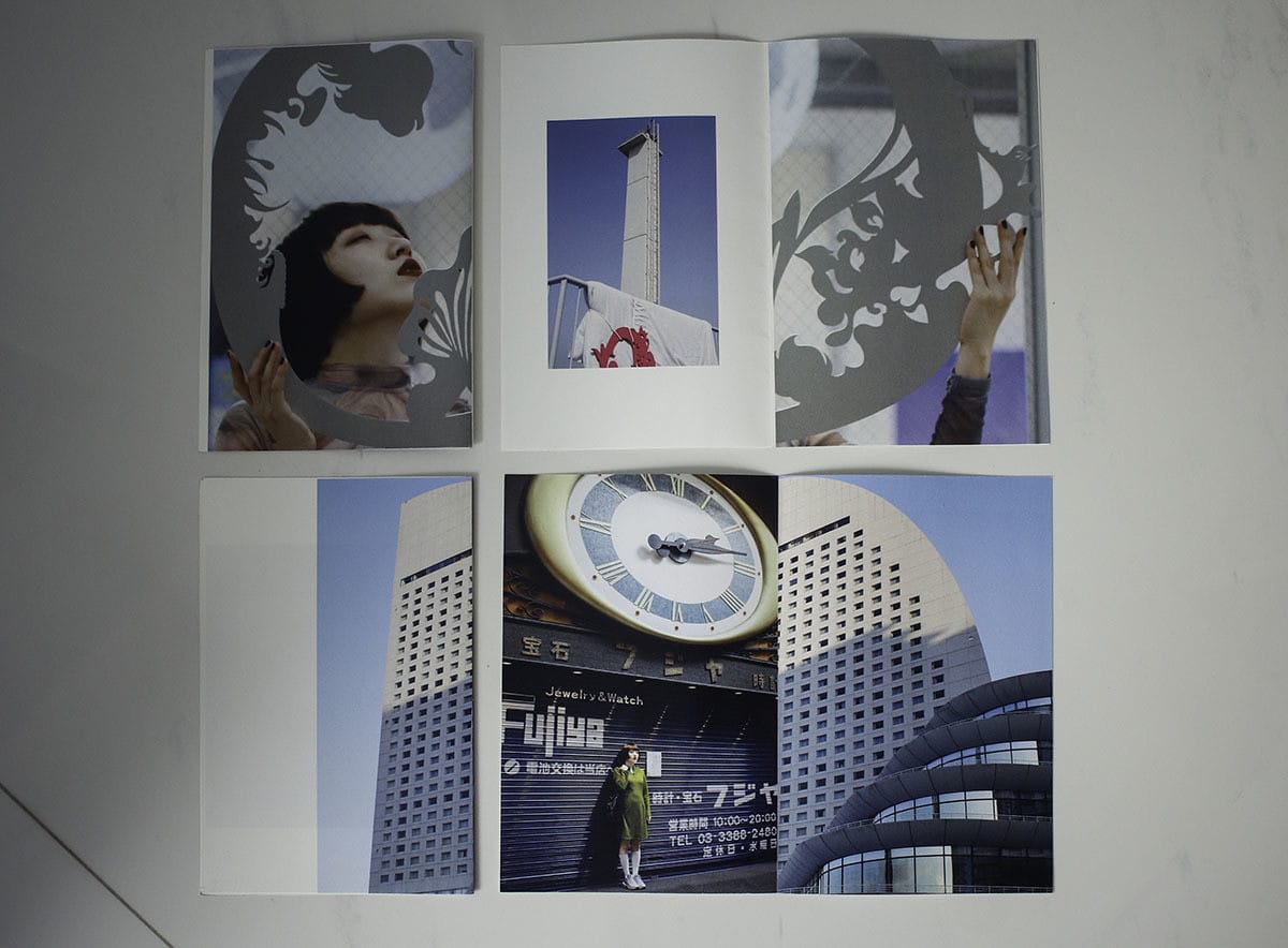
Yi Jing Zhou
“This image shows a few pages from a zine project that I did. I was very frustrated with the constant misprints, because I was printing in double-sided but the images did not align on both sides of the paper so I could not finish binding the zine. That’s when I tried arranging and reading them in different orientations and that brought about interesting outcomes. I feel that with design and craftsmanship, we are always looking for perfection, but learning to embrace the imperfections often give us pleasant surprises, if not at least some form of relief and reminder that it is okay to fail. This is the kind of mistake and surprise that I would not have encountered if not for the process of printing. The tactile quality of flipping through paper and arranging with real materials in hands is never going to lose its charm. If anything, those qualities are only magnified in today’s digital age.”
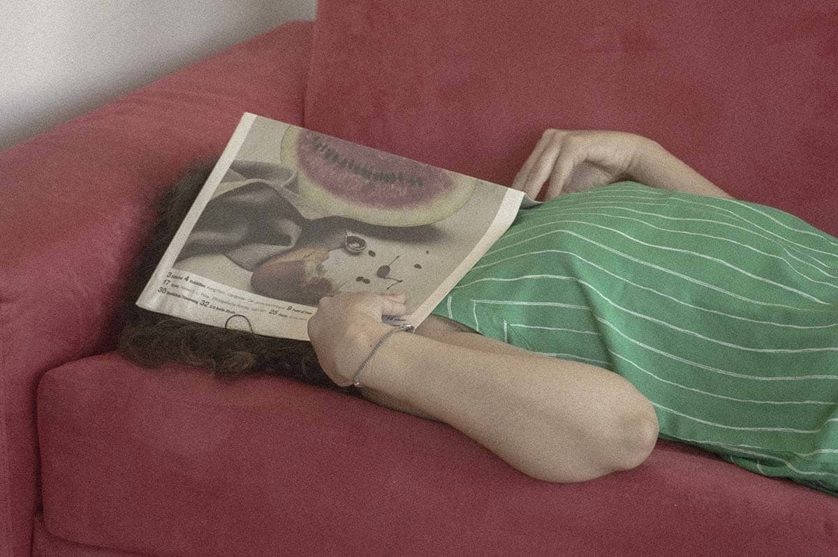
Mariam Soliman
“The love of print is a love hard to explain, but surely a love to immerse oneself in. This picture depicts that love.”
The best of previous Format Picks editions:
How 10 Artists Document Their Travels
Comment 10 artistes voient l'environnement qui les entoure
Comment 10 artistes voient la ville
