Digital portfolios have become non-negotiable tools for artists and creatives of all stripes, and architects are no exception. In this article, we’ll arm you with the tools necessary to create a one-of-a-kind portfolio that is purpose-built to help you make an impact and land more clients. From curating your projects and images to ensuring your website design supports your goals, all the tips you need to create or refresh your portfolio are right here.
The Power of Unique Design Elements
Since photographs and mock-ups of your work will take center stage, it’s easy to forget the impact that other design elements make on the overall presentation of your portfolio. But these elements are exactly what tie your work together and make your portfolio look professional, memorable, and uniquely yours.
Viewed together, the design elements of your architectural portfolio give your visitors important information about your design business, making you a more compelling option. Let’s take a look at exactly how this works in action, with examples from Format members in the architectural design field.
Portfolio layout
Layouts emphasize different elements of your architectural photographs, so it’s important to think about what you want to communicate when choosing a layout for your portfolio.
A clean, minimalist layout can emphasize tradition and professionalism, while an asymmetric or unconventional grid structure adds a contemporary, modern touch. The size of the images in your layout also matters, with large images making an impressive impact and drawing the viewer’s eyes to the finer details of your work, while small images enable you to showcase more projects at once, emphasizing the scope of your experience as an architectural designer.
Nicholas Gurney
For example, take a look at the portfolio of Australia-based architect Nicholas Gurney.

Thème du format : Sierra
The minimalism of this portfolio layout is perfectly suited to reflect the minimalism of the architect’s designs. Here, staggered grid evokes simplicity and modernity. These are exactly the qualities that the designer’s target audience would value, so reflecting them in the portfolio layout is the perfect way to capture their attention.
Another benefit of this layout is that it emphasizes Gurney’s adaptability to different types of projects and styles, helping prospective clients quickly zero in on projects that are of particular interest to them.
HK Associates Inc
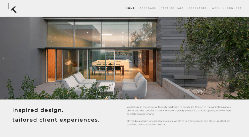
For a different approach, take a look at the portfolio of HK Associates Inc.
Thème du format : Horizon
This husband-and-wife team primarily works on airy, spacious homes in the beautiful landscape of Arizona. Choosing a portfolio layout that features a carousel of large, edge-to-edge images draws attention to their gorgeous, wide-open interiors. Plus, since the homepage image is dynamic, this layout choice doesn’t limit the firm in terms of how many projects can be displayed at the top of the page. By making use of a carousel layout, size doesn’t have to come at the expense of variety.
Batay-Csorba Architectes
Another way to use larger images while still displaying multiple projects can be seen in this example for Batay-Csorba Architectes, based in Toronto.

Thème du format : Horizon gauche
Instead of a carousel, this layout uses a unique horizontal scrolling effect. As users scroll with their fingers, the images scroll from right to left, revealing new projects and text. Since vertical scroll is far more common in web design, this unexpected element makes the layout particularly captivating.
Couleur
Color communicates a great deal when it comes to portfolio design. The colors you choose should reflect your brand colors, but refrain from overpowering your architectural images. The most common palette for architectural portfolios, as you can see in the examples we’ve looked at so far, is a crisp, clean white with black text.
However, you don’t necessarily have to limit yourself to this. For example, HK Associates Inc opted for a light gray and black combination. Gray, stone-like materials are frequently used in their design, so this choice perfectly reflects their design aesthetic.
Matt Elkan
The portfolio of Australia-based Matt Elkan also departs from the usual white background:

Thème du format : Horizon
Choosing dark gray, or even black, reflects the recent trend toward designing in dark mode. As people spend more of their days staring at screens, landing on a page designed in a dark mode style can feel particularly soothing for the eyes, inviting users to linger longer. Plus, this choice makes the colors in his portfolio images, from the earthy greens to the warm browns, pop even more.
Typographie
Even the most sparse, minimalist design portfolio will include some text, so choosing the right typography is a must. Make sure your choice of font doesn’t work against the overall message of your portfolio.
For example, if your design style is modern and contemporary, you’re best off opting for a stylish, professional sans-serif font like the ones used in the examples above. If your design practice is more traditional or you work on historical homes, a respectable serif font might be better suited to conveying the stateliness of your projects.
Whatever you choose, refrain from choosing a very trendy, stylized font anywhere other than your logo. These tend to distract from the main event—your architecture projects—and can also sacrifice readability.
Innovative Presentation Techniques
Beyond traditional static layouts, you can further differentiate your portfolio and make sure it impresses your target audience by incorporating interactive elements that invite users to actively engage with your projects.
This could take the form of interactive 3D models, virtual walkthroughs, or dynamic sliders showcasing the evolution of your designs. As you add innovative elements to your portfolio keep in mind that the goal is offering a more immersive experience to the visitor. Including cool elements just because they’re novel isn’t generally a good idea: the aim should be to enrich your audience’s understanding of your work.
A good way to ensure your portfolio stays on message is to think in terms of storytelling. Instead of just displaying images, try taking your audience on a journey. You could do this through photo series, or by accompanying text to articulate things like the design challenges you faced, inspirations, and innovative solutions.
Venturing beyond photography to include other multimedia elements, like videos, renderings, animations, and even audio can help further bring your designs to life by helping visitors gain a more complete sense of your projects. Using different forms of media and new technologies can give your portfolio a massive leg up over the competition, by inviting visitors to fully experience the world or your architecture projects rather than just showing them a snapshot of it.
Focusing on Memorable Details
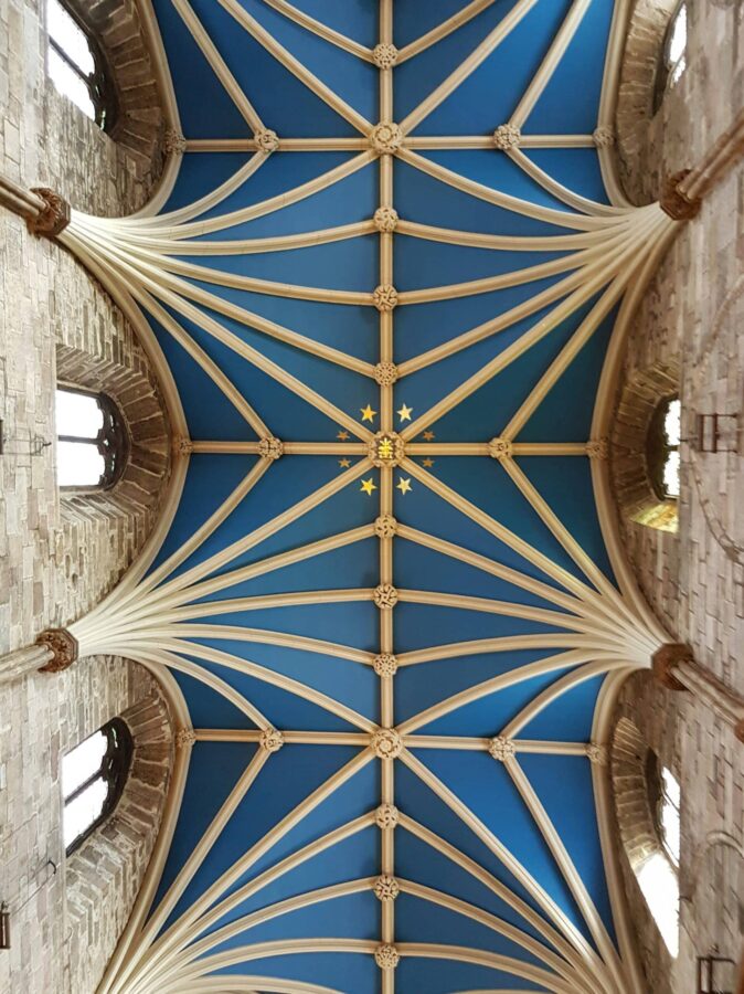
Unlike, say, a painting or piece of graphic design, architecture projects are more challenging to display on a computer screen because they can’t fully be captured in a single image. It’s your job to hone in on the most important details of each project and to curate your images to draw attention to them. It can be tempting to want to include every little detail of a build, but in reality, your best bet is to be ruthless about what the most memorable aspects are and to highlight those. Your aim should be to get at the essence of your project without overwhelming—or boring—your audience.
Remembering the importance of storytelling, think of the narrative you want to convey for each project when selecting your most impactful images. Here are some tips to help you curate like a pro:
- Avoid monotony – Strive for a balance between variety and coherence. While showcasing memorable details, use diverse perspectives and angles to maintain visual interest.
- Quality images – Whatever you choose to feature, opt for high-quality images that showcase your project in the best light. Pay attention to composition, framing, and lighting to accentuate the most memorable details effectively.
- Focus on the wow factor – Highlight standout architectural elements that define the character of the project. What are the things that your clients were most excited about? That’s a good clue as to what you should showcase.
- Consider scale and proportion – showcase images that effectively convey the scale and proportion of your designs. Choosing a busy page layout or small images can prevent an airy, spacious interior from making a visual impact.
- Diversity of shots – Include a mix of close-ups, wide-angle views, and contextual shots for a comprehensive visual representation.
- Capture human interaction – If applicable, incorporate images that showcase how people interact with and experience the space.
Balancing Consistency and Diversity
Just as you have to be strategic when choosing the images for each project, you should be thoughtful about which projects to include in your portfolio. It may be tempting to include every little thing you’ve ever worked on, but that can confuse your target customer. Showcasing your range through a variety of projects, styles, and scales is a great idea, but make sure you don’t sacrifice the cohesive narrative of your business and brand in the process.
Who is your target customer? What projects are they likely to be interested in? Those should be front-and-center, helping your target audience more easily visualize working with you.
The narrative tying together your various projects might be your frequent use of favored materials, your environmentally-conscious design approach, your unique problem-solving acumen, or some other thread that ties your work together and defines your approach as an architect.
Incorporating Client Testimonials and Stories
A gorgeous design displayed in an eye-catching portfolio will draw in prospective clients, but aesthetics aren’t the only thing that matters to them.
What is it like to work with you? Do you complete projects on time and on budget? Do you make clients feel confident that their home or property is in good hands? Do you exceed their expectations with an extra wow factor that has them recommending you to everyone? These are questions new prospects may have, and an impactful way to answer them is with client testimonials and stories.
Since your home page is best dedicated to your projects, a good way to showcase these is on a dedicated page accessible through your website menu. Remember all those multimedia options we mentioned earlier? This is the perfect place to use them. For example, you might have walkthrough videos of a project with audio of a client giving an oral testimonial on this page.
Including testimonials on your portfolio website adds an element of authenticity and credibility that only social proof can provide, so don’t skip this important step.
Building a Strong Online Presence with Format
Your website and social media presence should work together to convey a strong, unified online presence that speaks to your intended audience.
Format can help by giving you the tools to create a stunning portfolio website that will look just as good on mobile as it will on a desktop, ensuring that no matter how prospects find your website, they have a positive experience. Images and videos are beautifully and quickly rendered, keeping visitors on the page and reducing bounce rates.
Format also has built-in tools to ensure your portfolio website and social media work together: for example, you can embed your Instagram feed directly into your portfolio website, keeping it fresh with new images without the need to directly update it all the time.
With over 90 professionally designed themes to choose from, you can create the perfect home on the web for your architecture business. Whether people discover you on social media or in real life, directing them to a powerful, conversion-boosting portfolio website can help you land more clients and expand your professional network.
Développez votre audience
Easy-to-use portfolio and SEO tools allow you to customize your site and search engine results in minutes.
Whether you’re a new architect or a seasoned pro, creating an architectural portfolio that helps your business stand out is possible with the right tools and techniques.
Be mindful of the design elements you use, particularly layout, colors, and font, to ensure you’re on-brand and communicating your value as a designer. Don’t shy away from innovative presentation techniques, especially those made possible by the use of multimedia. When selecting projects for your portfolio, aim to balance consistency and diversity, and focus on visuals that draw attention to the most memorable details of your projects. Finally, don’t forget to incorporate testimonials for a personal touch.
Employing these strategies can help you make a lasting impact on your prospective clients and collaborators, helping you reach new heights in your architecture practice.


