Quebecois cartoonist Guy Delisle’s best work—particularly his travelogues Pyongyang: A Journey in North Korea, Shenzhen: A Travelogue from China and my favorite, Jerusalem: Chronicles from the Holy City—has always demonstrated an acute knack for capturing moments in time that convey tons of meaning.
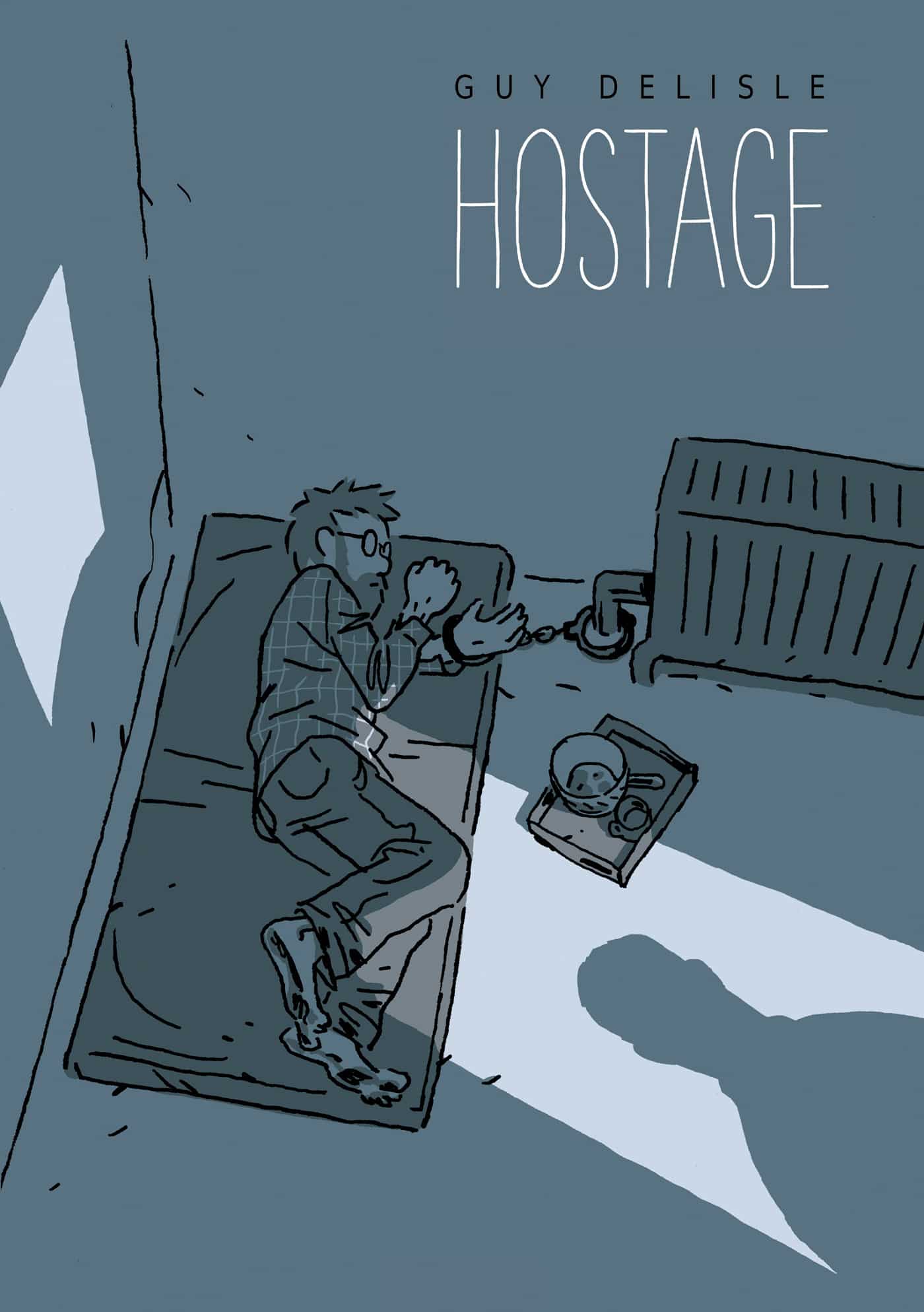
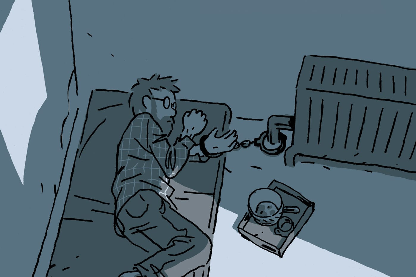
This particular skill is a large part of what makes his new graphic novel, Hostage so captivating. In Hostage, Delisle tells the the true story of Doctors Without Borders administrator Christophe André’s kidnapping in the Caucasus region. With nothing but his subject’s story to go on, Delisle brings André’s three months of solitary confinement to tense, stimulating life in swathes of muted greys and slate blues, colors chosen to mimic the tediousness and seeming hopelessness of the situation.
The book’s drabness has the potential to deter the more aesthetically-inclined. It’s not lush and whimsical like the vivid watercolors of Brecht Evens or dense and rich like the inventive, graphic-style creations of Chris Ware, but in Hostage, that’s not really the point. Instead, the subdued palette makes the reader empathize with the length of time that André is forced to pass, alone in an unknown location and unable to communicate with friends or those who may (or, he fears, may not) be working on his release.
That’s a harder thing to do with comics than one might realize. And while conveying the passage of time in a visual medium is a challenge at the centre of creating comics, it’s one that illustrators, designers and photographers face, too. There’s a lot they could learn about illustrating the passage of time from Hostage.
§
First, a quick explanation of how time works in comics. It starts with “closure,” a concept described in Scott McCloud’s seminal Understanding Comics as the “phenomenon of observing the parts but perceiving the whole.” After learning object permanence as infants humans learn to make connections where there are disconnections; games like peek-a-boo, for example, enforce that even when you can’t see a person, they still exist. In comics, we perform closure in the white spaces between panels, inferring the action that happened between panels even though we haven’t technically seen it happen. Referred to as “the gutter,” those white spaces between panels are where time passes in comics. And in Hostage, Guy Delisle makes beautiful use of it.
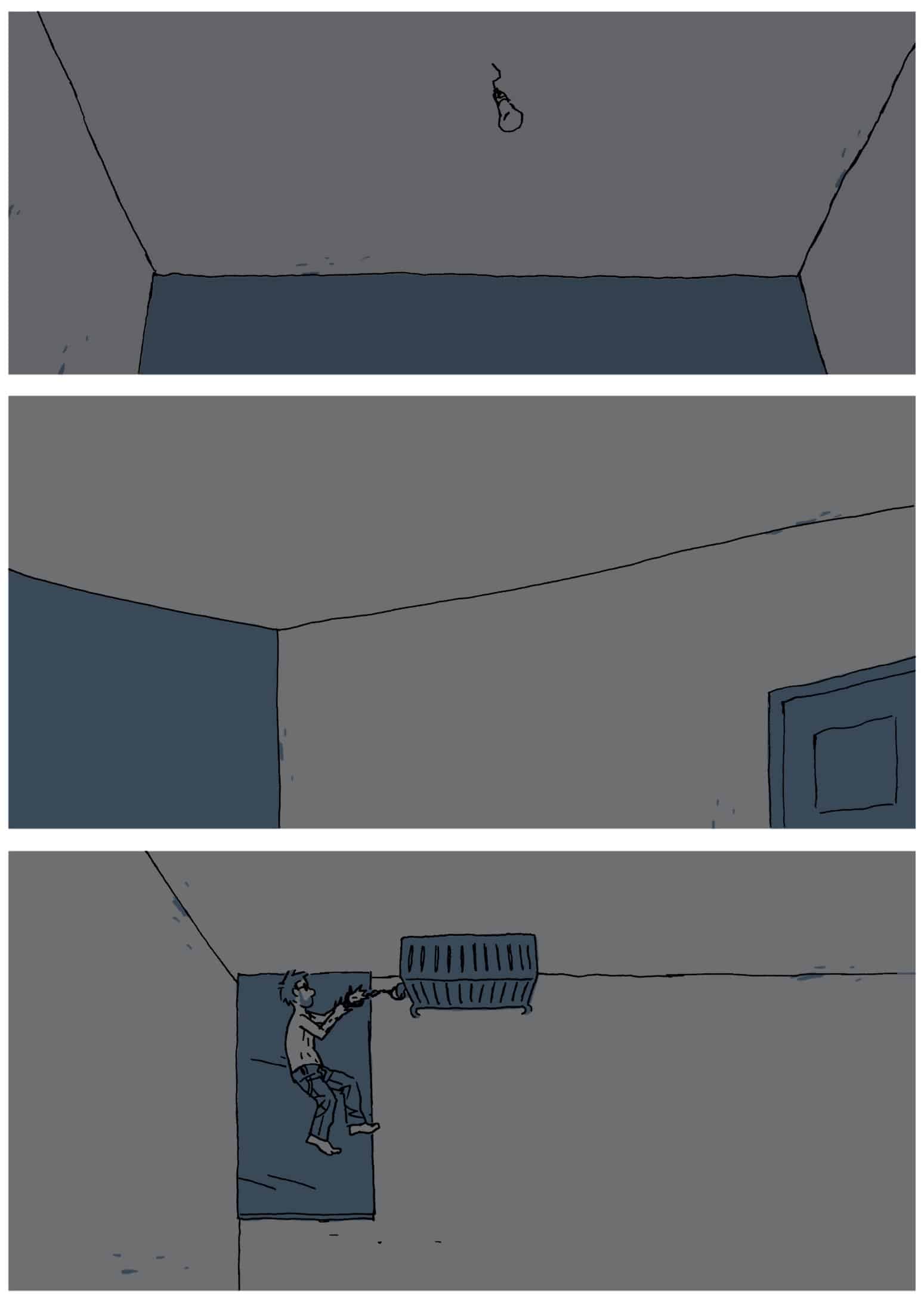
On the Hostage page above, André awakens alone, captive in a dark room. There are just three panels at work here, but there’s meaning to this simplicity.
Don’t let your eyes just tumble down the page; absorb what you see. These are snapshots of things happening across time. In the first panel, we see just a light bulb hanging from the ceiling; in the second, another ceiling shot; and, in the third, André laying on his side. Like a film camera establishing the size of a room, the shots give us context for André’s situation, but they also pass the time. In the gutters between the panels, our brains performed closure, concluding that the room is large but empty, with just the bare essentials (light and, from the radiator, warmth), and that André is alone.
Closure is pretty simple stuff (you’re not an infant!), but the passage of time is a little more complex. In the first panel, the angle at which we see the ceiling light bulb suggests we might be seeing it from André’s point of view. If that’s the case, then panel two suggests that, in the gutter between it and the first panel, André has perhaps turned his head to another part of the room. The third panel suggests otherwise, though; André is laying on his side, not on his back, meaning either the first two panels were not from his point of view—or they were, and he’s shifted. Was he asleep for those first two panels instead? How much time has actually passed?
The third panel is, thus, a minor revelation: maybe just a minute has passed between it and panel two; maybe an hour has. That we’re unsure and disoriented might be exactly the point, too. Delisle told Public Radio International in a recent interview that, “I really wanted to have the reader feel the time go by, so you get into Christophe’s head and really experience what it is to have no control over your life.”
Here, and throughout the book, Delisle conveys André’s own sense of isolation and disorientation to the reader through his images, rather than simply with textual exposition. It makes pages like this, which seemed quite simple on first glance, feel dense with meaning and intent.
§
Because time moves through space in comics, panel size is also crucial to its language. The bigger a panel is, the longer the eye lingers, the more time passes—which, in Hostage, is perfect for conveying the slowing of time that Christophe André must have experienced as his isolation deepened. Take, for example, page 226 and 227 (below) where, after thinking he might have been about to be saved, André loses hope again.
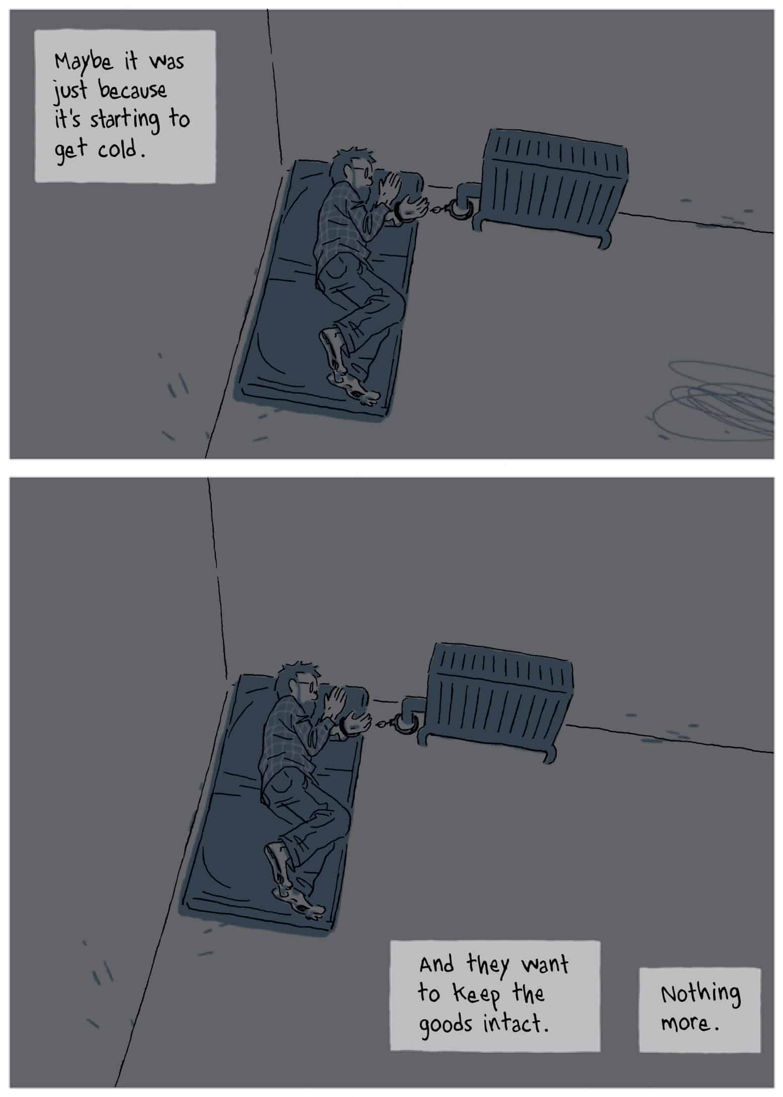
In the last panel of page 226, which takes up about 1/3 the page’s height, André becomes “less sure” that help is on the way. By the next panel, at the top of page 227, our point of view has broadened but emptied as his isolation sets in; this panel is taller, about 2/5 or 40% of the page, emphasizing the emptiness surrounding André. The final, largest panel conveys the largest amount of time passing by demanding a commensurately long look at it. Here, as the character’s state of mind worsens, time seems to almost come to a halt.
The final panel of the book, a full-page panel on page 432, offers a final illustrative example of expressing time in comics. I don’t want to spoil anything, but should you have a copy of the book, drink it in; it’s a full standstill, a long moment splashed across as much space as the book’s size affords in order to convey contemplation and the passage of time. Like the rest of Delisle’s sharp, engrossing Hostage, it’s not simply designed to look beautiful; it’s designed to make you think.
