Este artículo apareció originalmente en Lingo Blog and was republished with permission.
According to a recent Gallup poll, 60% of American adults believe that marijuana should be legal. Before the November 8 election, about 50 percent of states had legalized medical marijuana. Californians recently passed Proposition 64, legalizing the use of recreational marijuana. Nevada and Massachusetts have also followed suit, and the future looks bright for more states to do the same.
All signs point to a world where, in the not so distant future, a typical Friday evening might involve popping into your local purveyor to select a joint for you enjoyment, much like you would a bottle of wine. There’s plenty of high points to get excited about on the social and criminal justice side of the equation, to be sure, but we’re here to talk about the emergence of a brand new world of marijuana branding.
The Prevailing Aesthetic
According to James I. Bowie, a sociologist studying patterns and trends in logo design using quantitative analysis, writing for Slate, “analysis of United States Patent and Trademark Office records shows that 44 percent of logos registered as trademarks for marijuana-related businesses feature the familiar cannabis leaf.” The crunchy aesthetic, coupled with the only “brick and mortar” shops associated with the industry, head shops, makes for one highly unsophisticated landscape. Think: Psychedelia and swirling neon hues, Rastafarian motifs and the like. Slate also reports that last year, more than 1 in every 500 new U.S. logos registered, featured a cannabis leaf. Not exactly aspirational in innovation or aesthetic standards.

A surf-themed head shop.
The Problem
As negative connotations of smoking pot are increasingly shed, the challenge becomes standing out from the crowd and attracting new, curious consumers. The recreational marijuana industry is a business like any other. They hope to encourage brand loyalty, tempt curious nonusers into the fold, and to ultimately become the most used brand of marijuana out there. However, there’s very few clues being given to the average consumer to help understand differences amongst brands and individual identities and nuances.
For Slate, Bowie goes on to draw an important distinction: For a business where the service being offered is more important than the brand’s vibe or associated lifestyle (he uses dentistry as an example), it’s no big deal if the average consumer can’t tell one brand from another. But for the marijuana industry, there’s so much more room to think about what type of feelings and experiences a brand is offering when it comes to their product. It’s from this place of inspiration that we hope the industry begins to draw.
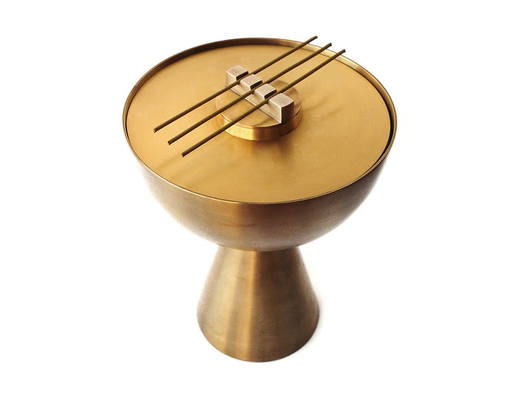
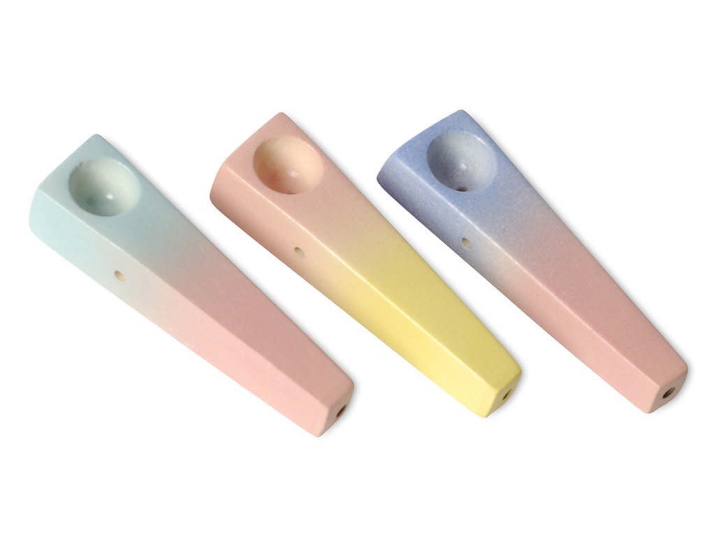
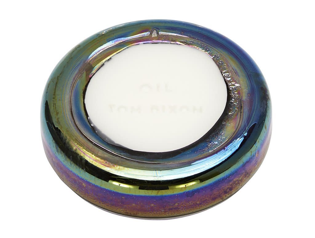
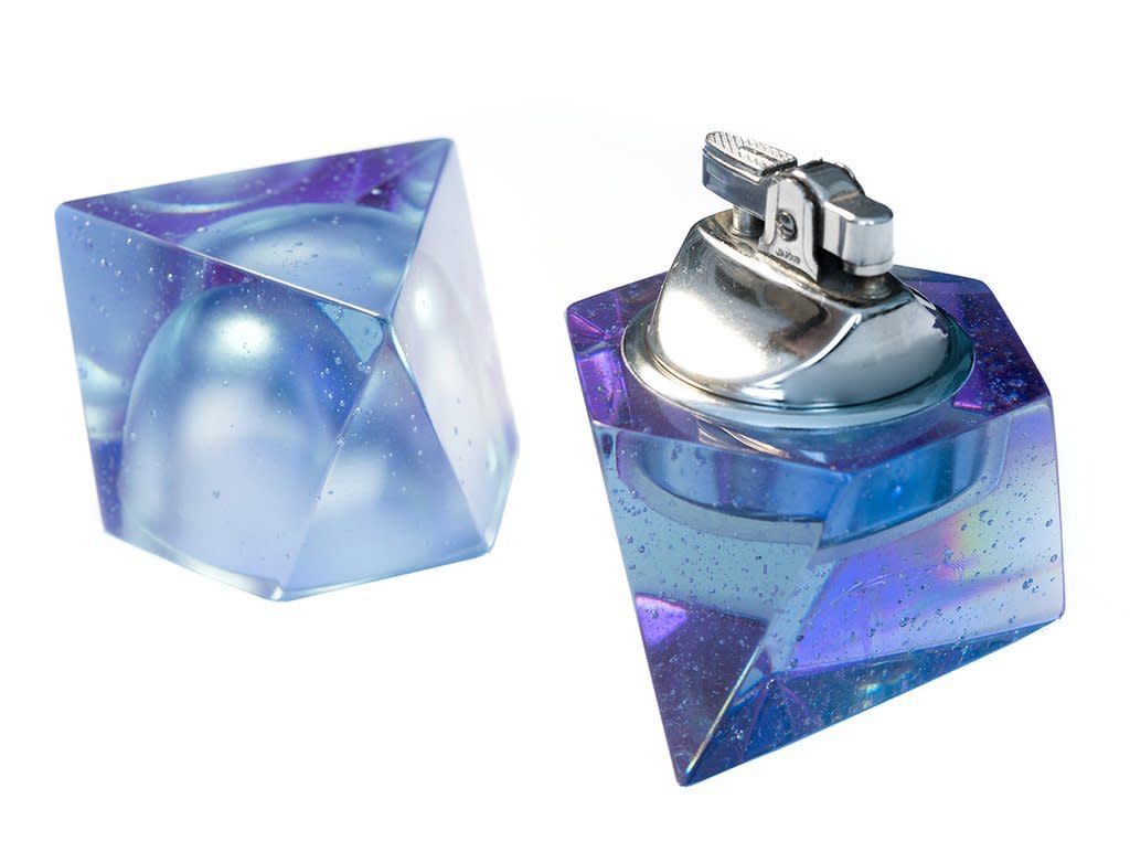
Clockwise from top left: Apparatus incense burner, Haciendaware pipes, Tom Dixon oil diffuser, Andrew O. Hughes lighter.
The future is now
The short of it: A successful, valuable product offers a solution to a specific problem. While alcohol has long been billed as the secret to making you the life of any party, pot is an entirely different animal. The messaging will likely skew in an aspirational direction that speaks to artists and creatives, those seeking a state of mental bliss or escape, even heightened creativity and thoughtfulness.
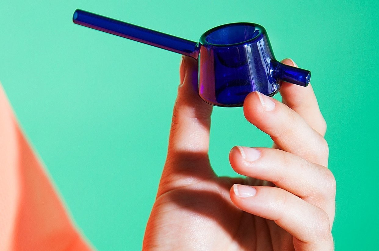
As the “lifestyle choice” of being a smoker becomes more popular, the lifestyle elements associated with pot brands will become increasingly important. Tetra, one of the first high-end retail experiences in the space, offers “designer smoking objects” that speak to Tetra’s belief in “smoking as an opportunity to sit down, relax, and be present — an antidote to the harried, tech-obsessed pace of modern life.” You can find Tom Dixon oil diffusers, a $1,250 lighter-and-ashtray-meets-table-sculpturey Apparatus-designed incense burners, alongside minimalist pipes fashioned from pristine porcelain by Miwak Junior and pastel ombre pipes inspired by Bauhaus.
Sweetflag, an online retailer using the tagline “products for a lifted lifestyle,” includes “Before” “During” and “After” categories to browse on their site. The ‘Before’ section features chic incense burners and flower vases—the type of earthy, handsome sundries that will transform your home into a vibey sanctuary. ‘After’ includes an elevated take on post-toke toys like copper head massagers, technicolor-tinted sunglassesy beautiful meditation balls.
Going a different route is Good Chemistry, a chain of dispensaries with locations in Colorado, Illinois, and Nevada. Taking design cues from Apple, The Clinic created a flagship in Denver that strikes a balance between art and science. According to The Clinic’s CEO, the intention was to create a retail experience that wasn’t pot-centric, and that could instead stand out in any industry.
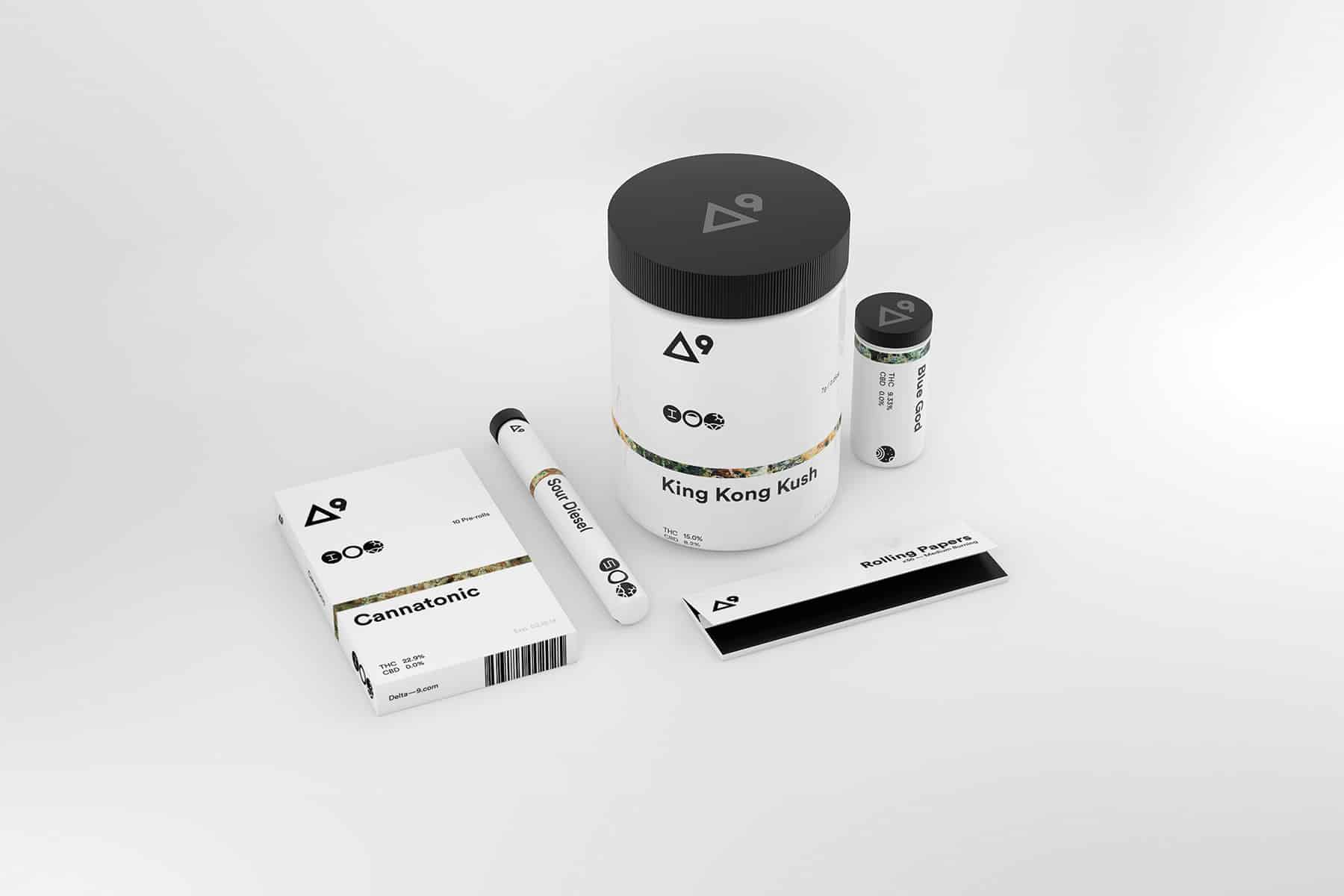
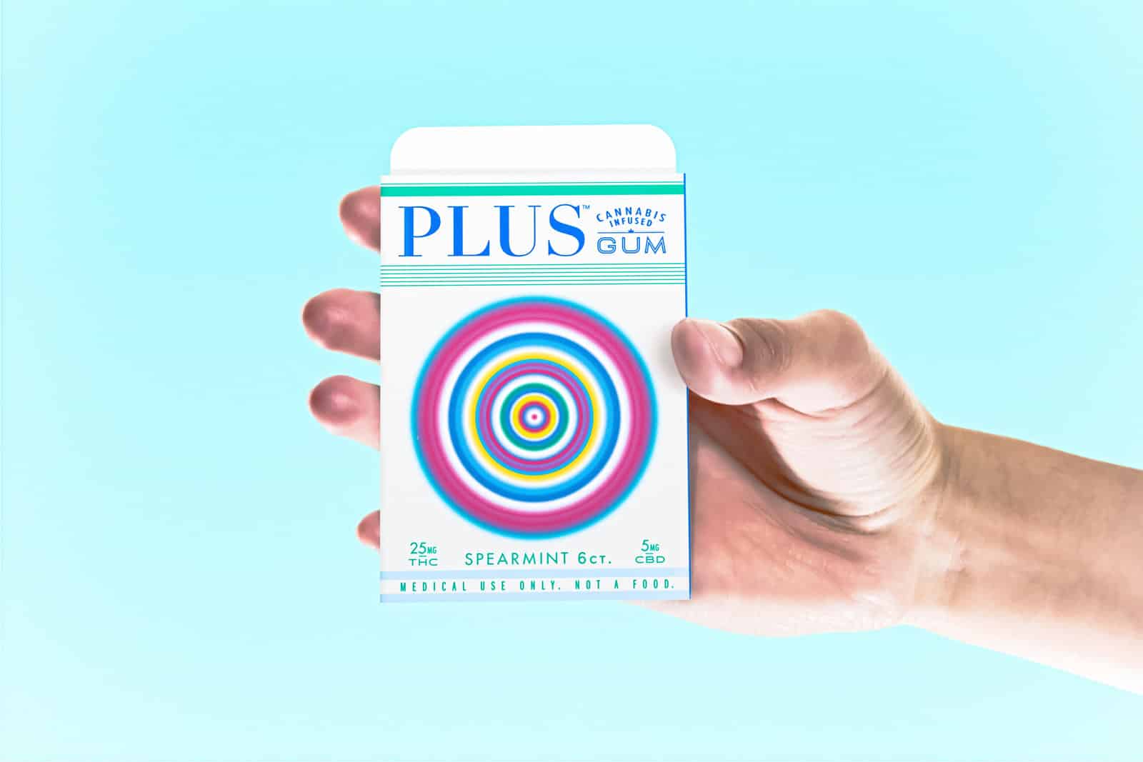
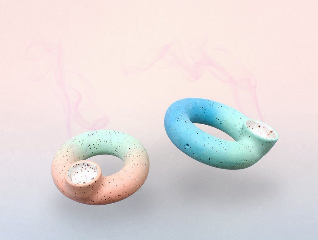
Top to bottom: Berger & Fohr design concept, Plus Gum by Phillip Fivael, Ring Pipe by artist Lindsay Hamilton.
The Opportunity
Clearly, as the marijuana industry continues its journey into the mainstream, we’ll continue to see more and more businesses and brands of varied styles with just as many intended audiences. We’ll see branded cafes, shops, hotels (The Nativ Hotel in downtown Denver made headlines as the city’s first 420-friendly hotel), publications that tout new releases and special strains, as well as the emergence of design studios devoted to the marijuana market. We hope to see a broadening of the aesthetic in all directions—artful, minimal, feminine, soft, vibrant, quirky, bold, you name it. As for the green pot leaf? Hey, we get it. We’re just thinking that maybe it’s time to put origin stories and iconic symbolism aside and look to the future.
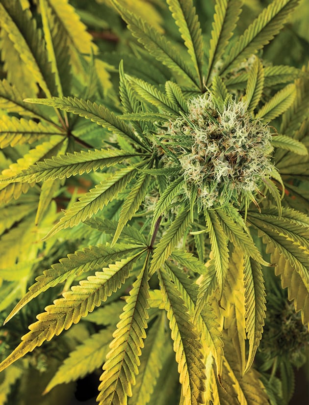
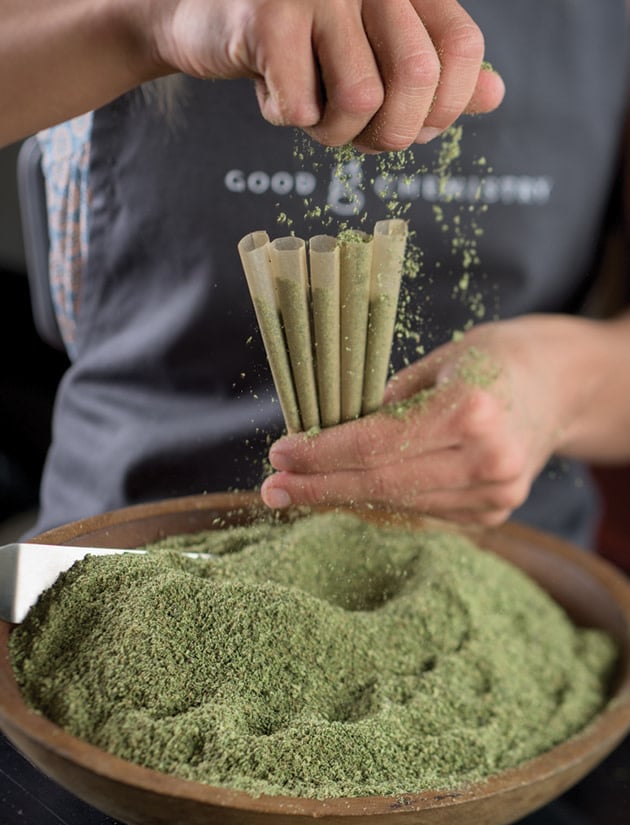
Images via Good Chemistry.
Cover image features the Balance Pipe by Tetra.
