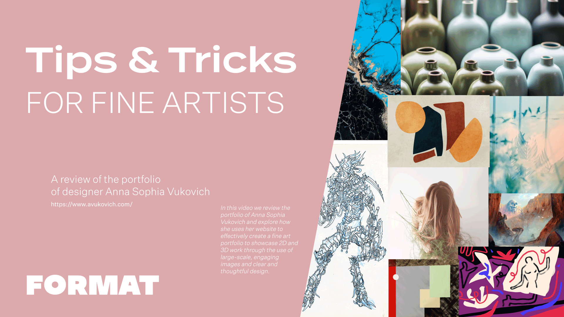
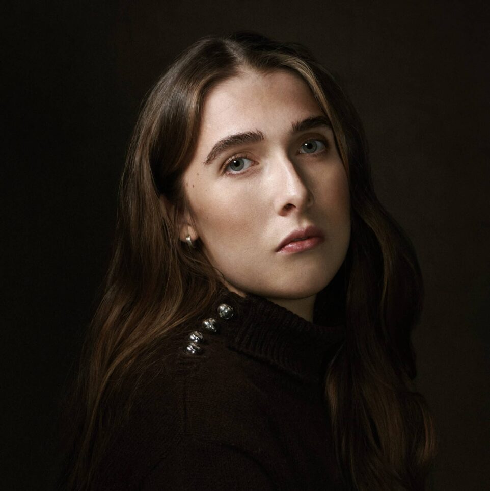
Today we are reviewing the website of Anna Sophia Vukovich, who is an accomplished artist and a Format Expert. Anna Sophia is known for her spatial drawing and painting installations, which are poetic reflections on direction and place. Her website is a great example of how to effectively create a fine art portfolio to showcase 2D and 3D work through the use of large-scale, engaging images and clear and thoughtful design. By following the tips and tricks discussed in this video, artists will gain valuable insights on how to build a website that effectively represents their work, highlights their achievements, and provides a visually pleasing and user-friendly experience.
Thema: Ora
Anna Sophia’s website uses the Ora theme. This theme has a large vertical scroll and a left-hand menu, giving it the feeling of an online exhibition. Images are large and let you focus on the details. Because she has organized her work by exhibition, the left hand menu of this theme makes it easy to toggle between the different bodies of work.
Professional Images With Consistent Lighting
For websites featuring non-digital or non-photobased work, images and the quality thereof is a huge consideration. One big issue we see in fine art websites are pages where there is inconsistent lighting or inconsistent white space around images. The quality of Anna Sophia’s images are very high and the color and light balance is consistent within all of the images of a series.
Incorporating Text Within Galleries
Because her work is installation based, the descriptions of Anna Sophia’s images are really important. She adds details to each image with the title, dates, dimensions, materials, and when applicable, the location of the exhibition venue. In addition to these image captions, many of her galleries also include an artist statement or interviews about a particular series. Because she has several distinct bodies of work, having these texts embedded within her galleries add important context to her images.
Using Custom Pages to Mix Up Gallery Styles
For her page titled “Drawings,” Anna Sophia has used a tiled layout instead of the vertical scroll she employs throughout the rest of her sitel. Because this section is different from her other exhibitions, she gave this page a different vibe and scroll behavior by using a custom page. On custom pages, you can use an image set to embed galleries of images within a custom page. This is a great way to make bespoke layouts for specific selections of images when you want to switch it up from your regular theme gallery layout.
Image Navigation for Focus
The “Exhibition” page on Anna Sophia’s website is a collection page, or image navigation, which highlights her different exhibitions. By organizing these pages into a collection page, she allows you to get a preview of each exhibition to show the breadth and variety of her installations. Collection pages are a great way to highlight areas of your practice and increase engagement with your pages by making clickable links showing off a selection of your best work.
