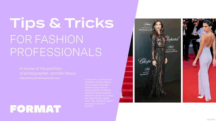
Today I am reviewing the website of Jennifer Mazur, who is an accomplished Fashion Stylist with an impressive list of celebrity clients and press features.
Jennifer is known for styling eye-catching red carpet looks. Her website is a great example of a fashion portfolio. By following the tips and tricks discussed in this video, fashion professionals will gain valuable insights on how to build a website that effectively represents their work, highlights their achievements, and provides a visually pleasing and user-friendly experience.
Theme – Horizon Left
Jennifer’s website uses the Horizon Left theme. This theme has a large horizontal scroll and a left-hand menu, giving it the feeling of a fashion magazine. Because she has organized her work by style and type, the left hand menu of this theme makes it easy to toggle between the different galleries showing off her skills.
Professional Imagery and Balance of Colour.
A big consideration for portfolios are the images you choose to show off your work. Jennifer’s site features great, professional photography. For her homepage, she’s focused on red carpet looks that have the same feeling as those used in magazine layouts. By choosing in-situ photos, she makes the connection between her speciality, celebrity styling, and the end product, the magazine feature. If she were to feature images taken in her studio or otherwise out of context, it wouldn’t give the same visual impact as these red carpet looks.
Quality images show the level of professionalism of your work.
Jennifer has also played with the balance of colors throughout this page so that there is a nice visual flow. Whenever possible, she separates photos of outfits that are the same color so that there is a visual difference from image to image. There is even a nice visual separation between images that feature the red carpet so that this doesn’t get distracting.
Add social media links
For fashion portfolios, making the connection between your professional portfolio and your social media is critical. Your website is the hub for your curated, professional calling card- but your social media is a great way to show the behind-the-scenes of your practice and to give more insights about the way you work. Jennifer has connected her instagram with icons at the bottom of her site menu. You can click on the icon, making it easy for visitors to her site to get more info about her and her work.
Use your Website Footer to add contact info to every page
One great hack is to use your website’s footer to add your contact info to every page. Because Jennifer is using the theme horizon left, the footer for her site is at the bottom of her site menu. For other themes, the footer of your site might appear at the bottom of each page. Regardless of your layout, adding details like your phone or email to your site footer will mean that they appear on every page of your site automatically. This makes it easy for clients to get in contact with you. You can even add a mailto link to your email address so that clicking the link instantly copies your email address to their clipboard.
Add copies of press clippings to a gallery page
We all know it’s important to add a record of your press clippings. Many professionals will do this by adding links out to articles on their CV or About Me Page. On Jennifer’s site she’s done something really smart–she’s added image copies of the actual press clippings and made these a gallery page on her site.
Don’t rely on URL links alone–URLs from outside sites like magazines can go inactive and then you lose your press clipping. Follow Jennifer’s example and make your own copy and add it to your site. It also makes for a really impressive showing because on Jennifer’s site she includes the logos with the press clippings so we make the connection between her work and big names like Vogue and Bazaar.
